Categories
By ChartExpo Content Team
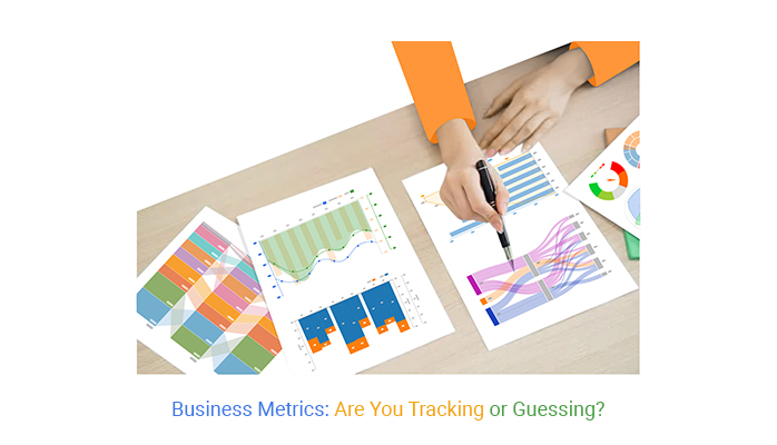
Numbers tell a story. Business Metrics turn that story into action.
Whether tracking sales, customer retention, or cash flow, these numbers reveal what’s working and what needs fixing.


Without Business Metrics, decisions rely on guesswork. A growing revenue stream means nothing if costs are climbing faster. A high conversion rate loses value if customer retention drops.
The right metrics keep businesses focused on what truly matters.
Every business, big or small, needs Business Metrics. They highlight trends, guide investments, and keep teams accountable. Ignore them, and you’re flying blind. Track them, and you’ve got a roadmap to smarter decisions.
First…
Business metrics are your company’s scoreboard. They track performance, tell you what’s working, and expose what’s not. Sales, marketing, customer retention, cash flow—if it’s measurable, it can be a metric.
But here’s the catch: not all numbers matter. The right metrics give you insights that fuel decisions. The wrong ones? They distract.
That’s why picking the right business metrics is like picking the right tools for a job—track too many, and you’ll drown in data. Track the right ones, and you’ll spot problems early, seize opportunities, and make smarter moves.
Think of business metrics as your company’s health checkup. They measure efficiency, profitability, and growth. If revenue is climbing, customer retention is strong, and costs are under control—you’re on track.
If churn is spiking, expenses are eating profits, and your sales funnel is clogged—you’ve got work to do.
The best companies don’t guess; they measure, analyze, and adjust. A business without metrics is like a driver with no dashboard. Are you going too fast? Too slow? Running out of gas? Without metrics, you won’t know.
Successful businesses don’t just track metrics and KPIs for the sake of it. They use them to:
Ignoring business metrics means operating in the dark. Tracking the right ones puts you in control.
Tracking too many metrics creates data clutter, not clarity. If your dashboard is overloaded, you’ll waste time sorting through data instead of using it. The key to strong data quality? Focus on metrics that directly impact your goals.
All metrics are not created equal. Some drive profitability, while others are vanity metrics—big numbers that look impressive but don’t improve your bottom line. Thousands of website visits sound great, but if nobody buys, does it really matter? Always ask: Does this metric help my business grow? If not, it’s just noise.
Markets shift. Customer behavior changes. A metric that mattered last year might be irrelevant today. Reassess your key metrics regularly. If they’re no longer aligned with your goals, it’s time to adjust. Metrics should evolve as your business grows.
Business metrics and KPIs often get mixed up, but they’re distinct tools. Business metrics measure a company’s overall health, covering a wide range of data points.
KPIs, or Key Performance Indicators, focus on specific targets critical to success.
Think of it this way: all KPIs are business metrics, but not all business metrics are KPIs. This distinction helps managers pinpoint areas needing improvement without getting lost in data.
Choosing between business metrics and KPIs depends on your goals. Use business metrics for a broad view of your company’s performance. This could include data on customer satisfaction or operational efficiency.
KPIs come into play when you need to track progress toward specific objectives, like increasing sales by 20% or reducing customer churn by 5%. It’s like choosing the right tool for a job—selecting the correct measure can make all the difference.
One major mistake is using too many KPIs. It’s tempting to track everything, but this can lead to confusion and diluted efforts. Focus on a few that truly reflect your strategic goals.
Another common error is failing to update your metrics. What worked last year may no longer be relevant. Regular reviews ensure effective tracking. Additionally, neglecting data interpretation can be harmful—numbers alone don’t tell the full story. Without proper context, they may lead to misguided strategies that do more harm than good.
Sales growth tracks increases in a company’s revenue over time, showcasing its market expansion. Monitoring this metric helps businesses spot trends, plan for future growth, and adjust strategies.
Average deal size, another vital metric, measures the typical revenue from each transaction. By increasing the average deal size, companies boost their overall revenue without necessarily increasing the number of sales.
Pipeline velocity refers to the speed at which leads move through the sales funnel to become customers. A faster pipeline velocity indicates efficient sales processes and effective closing strategies, leading to higher revenue.
The lead conversion rate is essential for evaluating the effectiveness of marketing strategies and sales pitches. It shows the percentage of potential customers who make a purchase, thus gauging the success of conversion tactics. A higher conversion rate often translates to better-targeted leads and more effective sales teams.
The customer acquisition cost quantifies the total expense involved in convincing a potential customer to buy a product or service. Lowering this cost while maintaining or increasing the quality of customer service can significantly improve profitability.
A funnel chart is a powerful tool for visualizing sales performance across different stages of the sales process. It helps businesses identify where prospects drop off and which stages yield the highest conversion rates.
This visual tool allows for quick assessment and adjustments to be made, enhancing overall sales efficiency. By understanding each stage’s performance, companies can fine-tune their sales strategies, allocate resources more effectively, and ultimately increase their conversion rates.
Do you know what really drives a marketing strategy? It’s the metrics that tell the tale of effectiveness and efficiency. Consider conversion rates, a pivotal metric. This figure shows the percentage of visitors who fulfill a desired action. It’s like knowing how many guests at a party took a slice of your cake!
Next, let’s tackle cost per lead. This metric calculates the cost to acquire a potential customer. It’s similar to figuring out how much you spent to invite one person to your event.
Lastly, there’s the return on ad spend (ROAS). This measures the revenue earned for every dollar spent on advertising. Think of it as checking how much party food is eaten compared to what you spent on it. All these metrics are vital for tweaking your marketing sails in the right direction.
When building a brand, how far your message spreads organically is crucial. Organic reach refers to the number of people who see your content without paid distribution. It’s like word-of-mouth in digital form.
Referral traffic, on the other hand, tracks visitors coming from other sites. It’s like tracking the number of guests referred by a friend to your party.
Social engagement measures how interactively your audience connects with your brand on social platforms. It’s akin to noting who talks about your party and shares it online. These metrics collectively help paint a picture of your brand’s visibility and appeal.
Imagine mapping out exactly how guests move through your party, from arrival to the various activities they engage in. That’s what a Sankey diagram does for customer journeys. This tool illustrates how customers move through a series of events toward a final goal, typically a purchase.
Customer journey analytics highlight where people drop off and which routes they prefer, providing clear insights into consumer behavior. This visual tool is indispensable for marketers looking to streamline the path to purchase and enhance customer experience. By analyzing these flows with customer journey analytics, strategies can be adjusted to encourage deeper engagement and longer interactions.
The following video will help you to create a Sankey Chart in Microsoft Excel.
The following video will help you to create the Sankey Chart in Google Sheets.
Gross margin reveals the percentage of revenue remaining after accounting for the cost of goods sold. It’s a telling sign of production efficiency and pricing strategy. A healthy gross margin suggests a firm can effectively manage production costs while maintaining competitive pricing.
Net profit margin, on the other hand, measures what percentage of revenue remains as profit after all expenses. It’s a clear indicator of overall operational efficiency. A robust net profit margin implies that a company is adept at controlling its costs and generating revenue.
Return on investment (ROI) gauges the profitability of investments made within the business. It helps in assessing the effectiveness of different financial undertakings, guiding future investment decisions. A high ROI indicates that the investments are generating favorable returns, boosting the company’s financial health.
Operating cash flow focuses on the cash generated from regular business activities. It’s a pure measure of a company’s ability to sustain operations independently. Consistent positive operating cash flow suggests a firm can maintain its operations without external financing.
Free cash flow, meanwhile, is the cash a business has after it covers its operating expenses and capital expenditures. It’s an important metric for investors because it shows how much cash is available for distribution among shareholders or for reinvestment. A positive trend in free cash flow signals a company’s growth potential and financial stability.
A Waterfall chart is an excellent tool for visualizing how sequential factors contribute to a final result. In financial analysis, it helps break down the cumulative impact of progressively introduced positive and negative values.
This visual analytics representation simplifies understanding individual contributions to overall financial performance, making data insights more accessible and actionable.
Understanding customer loyalty involves tracking retention and churn rates. High retention rates show strong customer loyalty and satisfaction. A key metric, Customer Lifetime Value (CLV), reflects the total revenue a business can expect from a single customer account.
It helps businesses strategize investments in customer retention. Calculating CLV involves averaging the revenue from a customer over the period they remain a customer, minus the costs of acquiring and serving them.
Meanwhile, churn rate, the percentage of customers who stop using your business over a certain period, acts as a critical health check. A low churn rate indicates that strategies to keep customers engaged are effective. Businesses should aim for a balance where the cost of retaining a customer doesn’t exceed the revenue they generate.
Net Promoter Score (NPS) and Customer Satisfaction Score (CSAT) are vital for gauging customer sentiments.
NPS measures customer willingness to recommend a company’s product or services. It categorizes customers into Promoters, Passives, and Detractors. A high NPS suggests that customers are happy and likely to act as brand advocates.
The CSAT score, usually derived from customer survey responses, measures how products or services meet or surpass customer expectations. A high CSAT indicates immediate customer happiness, but tracking changes over time can help businesses detect emerging problems before they escalate.
A gauge chart offers a straightforward visual representation of where customer happiness stands at any given time. This tool can display key metrics like NPS and CSAT as a dial, visually indicating whether customer satisfaction is low, moderate, or high.
Businesses can set benchmarks for what constitutes acceptable levels of customer happiness and monitor fluctuations in real-time. This immediate visual feedback helps companies respond quickly to changes in customer sentiment, maintaining high standards of customer satisfaction.
Measuring workforce productivity involves several key metrics. Employee output assesses the work completed per employee. It’s a direct measure of efficiency in your team.
Calculating cost per hire helps businesses understand the investment required to recruit new staff. This includes advertising, recruiting events, and employee training costs.
Absenteeism rate is another critical metric. It shows the frequency of unscheduled absences among employees. A high rate can indicate underlying issues such as poor job satisfaction or workplace environment problems.
These metrics provide insights into how effectively resources are used within the company. They help managers make data-driven decisions about workforce management, aiming to boost productivity and reduce costs.
In managing a supply chain, order fulfillment time is crucial. It tracks the duration from receiving an order to delivering it to the customer. Faster times often lead to higher customer satisfaction. Inventory turnover, another vital metric, measures how quickly inventory is sold and replaced over a period.
High turnover can indicate strong sales or effective inventory management.
Together, these metrics allow businesses to fine-tune their supply chain operations. They aim to enhance customer satisfaction and maintain cost efficiency by minimizing inventory holding costs.
A Box and Whisker Plot is a powerful tool for identifying operational inefficiencies. This graphical method displays data distribution and highlights the median, quartiles, and outliers in a dataset. It’s particularly useful for spotting variations in operational metrics that could suggest inefficiencies.
For example, using this plot to analyze the range of order fulfillment times can reveal outliers or unusual variations. These insights enable managers to pinpoint specific areas that need improvement, such as supplier issues or distribution bottlenecks, thus driving strategic decisions to enhance operational efficiency.
Let’s talk about how sticky your website really is! Bounce rate refers to the percentage of visitors who leave your site after viewing just one page. A low bounce rate means visitors find your content engaging enough to stick around.
Session duration measures the average time a visitor spends on your site during a single visit. More time spent can signal more engaging content or effective user interface design.
Page views per visit tell you how many pages the average visitor checks out before leaving. Higher numbers here can indicate more captivating content or a well-structured website that encourages exploration.
Now, let’s switch gears to how well your site turns visitors into action-takers. Click-through rate (CTR) is the percentage of visitors who click on a specific link compared to the total viewers of the page or ad. High CTRs often reflect compelling calls to action and relevant offerings.
Form submission rates are another key metric, showing the percentage of visitors who complete and submit online forms. High rates here could point to clear, user-friendly forms and strong incentives for users to provide their information.
Visual learners, gather around! Multi-axis line charts are fantastic for displaying multiple trends over time. These charts let you track the rise or fall in metrics like user engagement and conversion rates, all in one snapshot.
This tool can reveal correlations between different actions and outcomes, helping tweak strategies to better meet business goals. For instance, you might notice that changes in session duration impact your conversion rates, prompting a deeper look into content adjustments or page layouts.
Monthly Recurring Revenue (MRR) is pivotal for assessing the financial health of a SaaS company. It measures the predictable income generated each month, providing a clear view of earnings from subscriptions. Understanding MRR helps in forecasting future revenue and planning growth strategies effectively.
Annual Contract Value (ACV) complements MRR by showing the worth of a contract annually. This metric is crucial for understanding the longer-term commitment of your customers. It aids in comparing revenue across different subscription terms and shaping strategic decisions regarding pricing and customer retention efforts.
Both MRR and ACV are essential for tracking financial stability and growth in SaaS businesses. They allow managers to predict cash flow and make informed decisions about investments and resource allocation.
Active user metrics provide insights into customer engagement and product usage. They help identify how many users consistently interact with your software, which is critical for gauging customer satisfaction and product value. Higher active usage typically indicates satisfied customers and contributes positively to overall retention rates.
Net Revenue Retention (NRR) is a key indicator of a company’s health, measuring revenue retained from existing customers after accounting for churn. It reflects not only customer retention but also the expansion of revenue through upselling or cross-selling. A strong NRR suggests that a company is not only keeping its customers but also successfully increasing their value over time.
These metrics together paint a comprehensive picture of customer loyalty and revenue sustainability, guiding strategies to enhance user experience and reduce churn.
A Pareto Chart is an effective tool for identifying which customers or accounts generate the most revenue. It follows the Pareto Principle, or the 80-20 rule, which states that 80% of effects come from 20% of the causes. In SaaS metrics, this means a small fraction of customers typically represents a large portion of total revenue.
By analyzing customer data through a Pareto Chart, businesses can pinpoint key accounts that contribute most significantly to their revenue. This insight directs focus towards nurturing these valuable relationships and tailoring services to meet their specific needs.
Social media metrics can sometimes be misleading. Metrics such as likes and followers often get the spotlight. Are they just vanity numbers, or do they hold real value?
Social media analytics tools show that likes and followers may seem impressive but don’t always translate into business success. They can inflate perceptions without contributing to actual revenue. While their role in brand awareness is undeniable, they do not guarantee business growth.
The real question is: do these metrics influence purchasing decisions? Research suggests a complex relationship. While they boost visibility, their direct impact on sales varies. This highlights the need for a deeper analysis beyond surface-level numbers using social media analytics tools.
True engagement measures the quality of interaction. Shares and comments reflect deeper user involvement than mere likes. They indicate that the content resonates enough to prompt action.
Sentiment analysis adds another layer. It assesses the emotions behind comments, categorizing them as positive, neutral, or negative. This insight helps businesses understand public perception.
These metrics offer a clearer picture of engagement. They show how content moves and influences the audience. This is crucial for shaping marketing strategies that truly connect with viewers.
Growing a social media following is often celebrated as a key success. But does a larger audience translate to more sales? The connection is not always direct, and audience analysis can help uncover deeper insights into what truly drives conversions.
A big follower count increases a brand’s reach. However, conversion rates—that is, turning followers into customers—depend on engagement. If followers are not engaged, they are less likely to buy.
Businesses should focus on converting their existing followers into customers. Strategies include targeted content, special offers, and direct calls to action. This approach ensures that follower growth aligns with actual sales.
A radar chart is an effective tool for comparing multiple social media platforms. It visualizes strengths and weaknesses, helping marketers make informed decisions.
Each axis represents a different metric, such as engagement, reach, or demographic appeal. This allows for a comprehensive comparison at a glance. Marketers can quickly see which platforms perform best for specific goals.
Using a radar chart simplifies complex data. It supports strategic planning by highlighting where to allocate resources for maximum impact. This visual tool is invaluable for optimizing social media strategies.
Organic clicks refer to visits to a website from unpaid search results. They are vital as they reflect genuine interest and relevance. Higher organic clicks indicate more effective SEO strategies.
Keyword rankings describe a website’s position in search engine results for specific keywords. Top-ranked sites attract more traffic, boosting visibility and potential revenue.
Domain authority measures a website’s strength and predicts its performance in search results. Higher authority scores suggest better credibility and trustworthiness, supporting higher rankings.
Click-through rate (CTR) measures the percentage of users who click on a link compared to those who see it. High CTRs show compelling content and effective SEO.
Dwell time tracks how long visitors stay on a page after arriving. Longer dwell times often imply content relevance and quality, signaling search engines that a page is valuable, which can improve rankings.
A mosaic plot visualizes different traffic sources to a website. This tool helps marketers understand which channels drive the most visitors, such as direct traffic, referrals, or social media.
By analyzing these patterns, businesses can tailor their strategies to boost underperforming channels and further capitalize on successful ones. This targeted approach leads to better resource allocation and improved overall traffic quality.
In the realm of email marketing, the pulse of your campaign’s success often beats in the metrics of opens and clicks.
Open rates tell you the percentage of recipients who opened your email. A healthy open rate indicates that your subject lines resonate with your audience, compelling them to explore further.
Meanwhile, click-through rates (CTR) measure the percentage of openers who clicked on a link within the email. This metric sheds light on the effectiveness of your email content and its calls to action.
An often overlooked but critical metric, the engagement score, combines various interaction signals like clicks, opens, and time spent reading the email, offering a holistic view of how engaging your email was to recipients.
Together, these metrics paint a vivid picture of your campaign’s reach and impact.
List health serves as the backbone of email marketing effectiveness. Key indicators include bounce rates, unsubscribes, and spam complaints.
Bounce rates reflect the percentage of emails that could not be delivered to the recipient’s inbox. High bounce rates may signal outdated or incorrect email addresses, or issues with your email server.
Unsubscribes tell you how many people opted out of your email list after receiving an email, a direct reflection of content relevance and frequency.
Lastly, spam complaints occur when recipients mark your emails as spam, a severe warning that your content is not resonating or feels intrusive. Monitoring these metrics helps maintain a clean, engaged email list, vital for the long-term health of your email campaigns.
A Likert scale chart is an excellent tool for gauging audience sentiment towards your email campaigns. Typically, this involves asking recipients to rate their feelings about the content, from strongly agree to strongly disagree.
This feedback is invaluable as it provides direct insights into how your audience perceives your emails. Are they helpful? Are they engaging? The responses can guide you in tweaking your content to better align with your audience’s preferences and expectations, ultimately boosting engagement and satisfaction.
Employing a Likert scale can transform subjective sentiment into actionable data, steering your campaign strategies with precision based on recipient feedback.
In the bustling realm of HR, quick and cost-effective hiring is key. Time to hire measures the days from job posting to offer acceptance. A shorter time often signals efficient HR processes. Cost per hire sums up all expenses of recruitment, divided by the number of hires. Lower costs, coupled with efficient hiring, reflect a streamlined recruitment process. Quality of hire assesses new employee contributions to the company. Higher productivity and longer tenure indicate a successful hire.
Employee satisfaction holds the key to company stability. Engagement surveys measure how invested employees are in their roles. Higher engagement typically leads to better performance and less absenteeism. Turnover rates offer a glimpse into retention success. A lower turnover rate suggests employees are content and less likely to leave. Together, these metrics guide improvements in workplace conditions and HR strategies.
A clustered column chart is a visual tool crucial for comparing HR metrics across departments. This format displays values in columns grouped by category, making differences and patterns easy to spot. For HR, this can highlight departments excelling in areas like hiring efficiency or employee satisfaction. It also pinpoints where improvements are necessary, providing clear data to back strategic decisions.
Sales efficiency in retail hinges on two pivotal metrics. Units per transaction (UPT) measures the average number of items sold in each transaction. A higher UPT indicates more effective cross-selling and up-selling by staff. This metric directly impacts the overall profitability and efficiency of the sales process.
Another critical metric, revenue per employee, gauges the income generated by each staff member. This figure helps retail managers assess staff productivity and the overall effectiveness of their workforce allocation. A robust revenue per employee ratio suggests a well-trained, efficient team that maximizes sales opportunities.
By monitoring these metrics, retailers can pinpoint strategies that either boost or hinder sales efficiency. Adjusting staff training or scheduling may improve these key performance indicators, thereby enhancing overall store performance.
Efficient inventory management is vital for maintaining retail health. Stock turnover, or the rate at which inventory is sold and replaced, highlights the effectiveness of inventory control. A high turnover rate often indicates strong sales and effective inventory selection. Conversely, a low turnover might suggest overstocking or misaligned product offerings.
The sell-through rate, calculated by comparing the amount of inventory sold to the amount received, offers insights into sales success for specific items during a certain period. A high sell-through rate often signals strong demand and effective buying decisions. Monitoring these metrics allows retailers to make informed decisions on purchasing and sales strategies, avoiding stockouts and reducing overstock.
A treemap chart serves as a powerful visual tool for analyzing product performance in retail. This chart segments products into colored rectangles, each size corresponding to a specific sales metric, such as sales volume or revenue. Best-selling items are instantly recognizable by larger rectangles, often shaded in warmer colors.
Conversely, smaller, cooler-colored rectangles highlight underperforming products. This immediate visual representation aids retailers in swiftly identifying which items are excelling and which are not meeting sales expectations. By using the best colors for graphs, merchandising teams can enhance clarity and make informed decisions on promotions, discounts, or discontinuations to optimize inventory and boost sales.
When diving into ecommerce metrics, understanding the purchase funnel is key. It starts with assessing the add-to-cart rate. This metric reveals the percentage of visitors who add items to their shopping cart. A higher rate suggests that the product pages are convincing and user-friendly.
Moving further down the funnel, checkout completion rate comes into play. This metric measures the proportion of shoppers who complete the purchase after adding items to their cart. If you notice a drop here, it might indicate issues with the checkout process. Simplifying this process can boost completions.
Both metrics offer insights into where potential sales are lost. Addressing these points can significantly enhance sales conversions.
Now, let’s focus on customer value metrics. Average order value (AOV) is a crucial metric. It calculates the average dollar amount spent each time a customer places an order. To increase AOV, strategies like cross-selling and upselling are effective. They encourage buyers to add more items to their carts.
Repeat purchase rate (RPR) tracks how often customers come back to buy again. A high RPR indicates satisfied customers and effective loyalty programs. Boosting this metric can lead to more consistent sales and a stronger brand.
Both AOV and RPR are instrumental in understanding how much value each customer brings to your business. They help tailor marketing efforts to boost profitability.
A funnel chart is a powerful tool for visualizing where potential customers drop off during the purchase process. It illustrates the number of visitors at each stage of the shopping journey, from landing on the site to completing a purchase.
By analyzing this chart, you can pinpoint the stages with the highest drop-off rates. This insight allows you to identify and address the specific issues causing potential customers to leave without buying.
Effective use of a funnel chart can lead to a smoother purchase process and increased sales. It helps focus improvements in the areas that will most impact your bottom line.
Understanding how often and how widely your product is used can reveal much about its success. Metrics like active users measure the number of unique users interacting with your product within a specific timeframe. This metric is vital for gauging the reach and impact of your product on a daily, weekly, or monthly basis.
Feature adoption rates provide insights into which parts of your product are most engaging or useful. Tracking which features are frequently used and which are ignored can guide future development and refinement. Frequency of use also plays a crucial role; it shows how often users return to your product, indicating its value and stickiness.
These metrics collectively paint a clear picture of user engagement and product reliance, essential for strategic decision-making in any business environment.
Customer feedback is a gold mine of insights. Metrics such as the Net Promoter Score (NPS) help gauge overall customer satisfaction and loyalty. NPS categorizes customers into promoters, passives, and detractors. A high NPS indicates that customers are happy and likely to recommend your product, which can be a significant driver of growth through word-of-mouth.
Product satisfaction scores, obtained through direct surveys, provide a granular view of how users perceive different aspects of your product. These scores help identify strengths to build on and weaknesses that need attention. Regularly collecting and analyzing customer feedback allows businesses to maintain a pulse on customer sentiments and continuously improve the user experience.
A Sunburst Chart offers a vibrant, intuitive way to visualize complex data about how users interact with different features of your product. This chart displays hierarchical data as concentric circles, with each ring representing a deeper level of the product’s features.
Utilizing a Sunburst Chart can immediately highlight which features attract the most engagement and which are less popular. It’s an effective tool for quickly spotting trends in user behavior without sifting through rows of data. By integrating this visual tool into your metric analysis, you can make more informed decisions about product development and enhancements.
In the realm of business metrics, less is often more. Companies sometimes track an excessive amount of data, cluttering their analyses and clouding key insights. This can lead to “analysis paralysis,” where decision-making is stalled due to an overload of information. It’s vital to identify which metrics truly matter to your business objectives and focus on those. This approach not only simplifies your data analysis but also enhances the clarity and relevance of the insights gained.
Metrics lose their impact without context. Imagine assessing a surge in website traffic without considering a recent marketing campaign; the analysis would be incomplete. Benchmarking against industry standards, previous periods, or competitive baselines provides the necessary context to interpret your data effectively. Without this, businesses might either underplay significant achievements or overlook emerging challenges. Therefore, benchmarking is not just helpful; it’s essential for accurate business assessments.
A tornado chart in Excel is a valuable tool for visualizing how different variables may impact a specific outcome. It’s especially useful in risk analysis and decision-making processes. By displaying a range of possible outcomes for varying inputs, a tornado chart helps businesses prioritize which factors have the greatest influence on their goals. This visual approach aids in quickly identifying areas that require more attention or could be leveraged for better results, making it a critical tool in strategic planning.
Business metrics are more than numbers. They tell you what’s working, what needs attention, and where to adjust. Ignoring them leads to guesswork. Tracking them helps you make informed decisions.
Every business, big or small, benefits from the right business metrics. They guide sales, marketing, finance, and operations. When measured correctly, they expose trends, risks, and opportunities that shape the future.
The challenge isn’t collecting data—it’s knowing what to track and how to use it. Focus on metrics that align with your goals. Avoid distractions that don’t drive results.
Make business metrics a habit, not an afterthought. Review them regularly, act on the insights, and stay ahead of challenges before they grow.
Numbers tell a story. Make sure you’re listening.
Net Promoter, NPS, NPS Prism and many other terms related to NPS are registered trademarks of Bain & Company Inc., Satmetrix Systems Inc., and Fred Reichheld.
How much did you enjoy this article?


Calculate accounts receivable turnover ratio to measure credit collection speed, improve cash flow, and strengthen your financial strategy. Read on!

Change Management KPIs are the key to tracking adoption, performance, and ROI during transitions. Find out which metrics matter. Read on!

Data collection methods and techniques determine the quality of every insight you act on. Explore key approaches for gathering reliable data. Read on!


