• Home
  • Tools dropdown img
    • Spreadsheet Charts

      • ChartExpo for Google Sheets
      • ChartExpo for Microsoft Excel
    • Power BI Charts

      • Power BI Custom Visuals by ChartExpo
    • Word Cloud

  • Charts dropdown img
    • Chart Category

      • Bar Charts
      • Circle Graphs
      • Column Charts
      • Combo Charts
      • Comparison Charts
      • Line Graphs
      • PPC Charts
      • Sentiment Analysis Charts
      • Survey Charts
    • Chart Type

      • Box and Whisker Plot
      • Clustered Bar Chart
      • Clustered Column Chart
      • Comparison Bar Chart
      • Control Chart
      • CSAT Survey Bar Chart
      • CSAT Survey Chart
      • Dot Plot Chart
      • Double Bar Graph
      • Funnel Chart
      • Gauge Chart
      • Likert Scale Chart
      • Matrix Chart
      • Multi Axis Line Chart
      • Overlapping Bar Chart
      • Pareto Chart
      • Radar Chart
      • Radial Bar Chart
      • Sankey Diagram
      • Scatter Plot Chart
      • Slope Chart
      • Sunburst Chart
      • Tornado Chart
      • Waterfall Chart
      • Word Cloud
    • Google Sheets
      Microsoft Excel
  • Services
  • Pricing
  • Contact us
  • Blog
  • Support dropdown img
      • Gallery
      • Videos
      • Contact us
      • FAQs
      • Resources
    • Please feel free to contact us

      atsupport@chartexpo.com

Categories
All Data Visualizations Data Analytics Surveys
Add-ons/
  • Google Sheets
  • Microsoft Excel
  • Power BI
All Data Visualizations Data Analytics Surveys
Add-ons
  • Google Sheets
  • Microsoft Excel
  • Power BI

We use cookies

This website uses cookies to provide better user experience and user's session management.
By continuing visiting this website you consent the use of these cookies.

Ok

ChartExpo Survey


Home > Blog > Microsoft Excel

Top 10 Customer Service Metrics and How to Measure Them

These aren’t just boring numbers or confusing charts and graphs. They’re crucial tools that distinguish between a thriving business and one struggling to survive.

Who fuels your business?

Customer Service Measures

Customers, right?

It makes sense to keep your customers satisfied.

This is where customer service metrics come in. They help you understand what’s working, what’s not, and where you need to tweak things.

It’s like having a magical compass that points you directly toward success.

Here, we will explore the art of analyzing customer service measures. You’ll learn to track and analyze customer service metrics to predict your business’s success and revenue growth.

That’s not all – You’ll also learn how to sprinkle some magic words during customer service conversations. This will surely leave your customers feeling like they just won the lottery.

And for those who think customer service training is just an expense, think again. It’s the secret sauce to retaining customers and enhancing your brand image.

Table of Content:

  1. What is Customer Service?
  2. What are Customer Service Metrics?
  3. Why it’s Important to Measure Customer Service Metrics?
  4. Top 10 Customer Service Metrics to Measure
    1. Clint Satisfaction
    2. Customer Effort Score (CES)
    3. Net Promoter Score (NPS)
    4. Social Media Metrics
    5. Customer Churn
    6. First Response Time
    7. Overall Resolution Rate
    8. First Contact Resolution Rate
    9. Customer Ticket Request Volume
    10. Average Ticket Handling Time
  5. Types of Customer Service Performance Metrics
  6. Methods for Measuring Customer Service KPIs
  7. How to Measure Customer Service Metrics?
  8. How to use Customer Service Metrics for your Business?
  9. FAQs About Customer Service Metrics
  10. Wrap Up

Let’s get cracking and turn those complaints into compliments.

What is Customer Service?

Definition: Customer service is all about crafting a pleasant encounter for the customer. It’s more than just completing a transaction; it’s about making an impression that will last. It is a blend of empathy, communication, and problem-solving that aims to exceed expectations and build long-lasting relationships.

What are Customer Service Metrics?

Definition: Customer service metrics are the statistical measures that can help you gauge the quality and efficiency of your customer service.

Think of the metrics as a health check-up but for your customer service department.

They’re performance indicators showing you how well you support your customers.

  • Are your customers satisfied?
  • Are their queries and concerns being addressed promptly?
  • Are they likely to stick around?
  • Are they considering jumping ship?

These are the questions that customer service metrics can help you to answer.

Some of the tested and proven metrics include:

  • First Response Time measures how quickly your team responds to a customer’s inquiry.
  • Consumer Satisfaction Score asks customers to rate their satisfaction with your service.
  • Net Promoter Score (NPS) asks customers if they’d recommend your business to others.
  • Average Handle Time (AHT) measures how efficiently your team resolves customer issues.

In short, customer service metrics are your eyes and ears in customer experiences.

This is because they provide invaluable insights that can guide your efforts to improve your service, retain customers, and ultimately, grow your business.

Customer service metrics can shed light on the following:

  • The proficiency of your support team in customer service.
  • The effectiveness of your key messages.
  • The customers’ perception of your brand.
  • The efficiency and smoothness of your sales operations.

Why it’s Important to Measure Customer Service Metrics?

Customer service metrics are important because they provide valuable insights into the quality and efficiency of your service operations.
By analyzing data like response times, resolution rates, and customer feedback, companies can enhance customer experiences, increase loyalty, and streamline operations.
Ultimately, using the right customer service metrics allows organizations to make informed decisions that drive growth and improve overall service quality.

Top 10 Customer Service Metrics to Measure

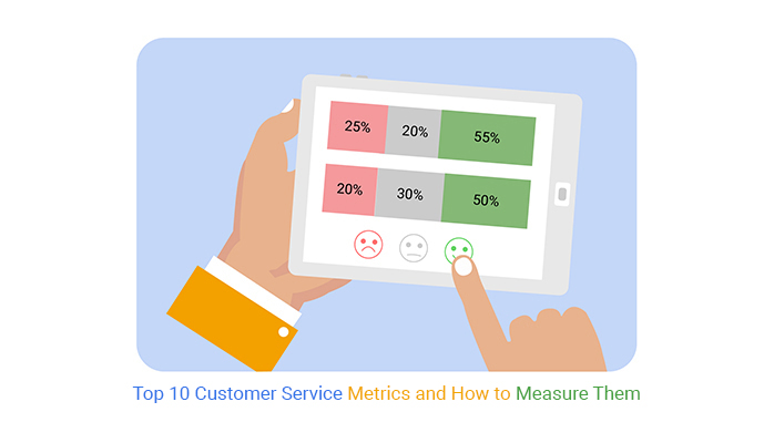
Below’s a look at the top 10 Metrics and KPIs for customer service.

Let’s dive in.

  1. Clint Satisfaction

CSAT is a popular key performance indicator to gauge client satisfaction.

To measure it: Check out the formula:

(Number of satisfied customers [those who responded with 4s and 5s] / Total number of survey responses) x 100 to find the percentage of content customers.

Helpful hint: Assess consumer satisfaction following each interaction with a customer service representative.

Over time, these ratings can provide a clear picture of how individual agents or teams are performing.

customer service metrics 4
  1. Customer Effort Score (CES)

The Customer Effort Score quantifies the effort a customer needs to put in to resolve an issue, fulfill a request, make/return a purchase, etc.

How to measure it: Use surveys to ask customers numerical questions. And then average the scores.

Check out an example of a question to ask, “On a scale of 1-7, how much effort did it take to get your question answered?”

Average the responses to get a CES score.

Tip: Customer Effort Score (CES) is one-dimensional. To get a fuller picture, blend this information with other metrics on this list.

customer service metrics 3
  1. Net Promoter Score (NPS)

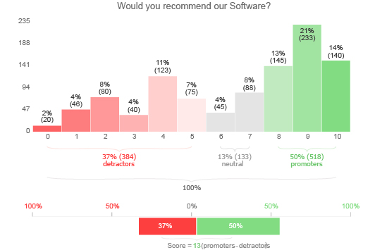
Use Net Promoter Score in customer experience programs.

You can get NPS scores via a single-question survey and reported as a number from 0-100, the higher, the better.

Respondents are categorized into:

  • Promoters (9-10)
  • Passives (7-8)
  • Detractors (0-6)

They provide a comprehensive view of loyalty.

How to measure it: Subtract the percentage of detractors from the percentage of promoters.

Ideally, you want your NPS score to be as close to 100 as possible.

Tip: Just like Consumer Satisfaction, NPS measures customer loyalty.

customer service metrics 1
  1. Social Media Metrics

Many customers express praise and complaints on social media.

However, only a few brands actively respond, leading to a one-sided experience.

How to measure it: Regularly collect and analyze data from each social media platform. This will help you gain insights into market sentiments.

Tip: Collaborate with your social media team to develop a robust social media data storytelling strategy.

  1. Customer Churn

The customer service metric tracks customers discontinuing your products or services.

Measuring this metric is complex. There’s no single predictor of churn.

How to measure it: Identify potential reasons for churn and track them over time.

Tip: By analyzing your data, you can gain predictive insights into the churn.

  1. First Response Time

Forrester’s research shows that 77% of consumers appreciate quick responses.

This means tracking the first response time ensures swift resolution of customer queries.

How to calculate it: Subtract the time of the customer request from the time of the first response.

Tip: Plan a framework for your team to respond quickly and timely.

  1. Overall Resolution Rate

This customer service metric indicates the effectiveness of your customer support team.

If issues are left unresolved, customers may hesitate to remain loyal.

How to calculate it: Divide the total number of tickets by the number of tickets solved.

Tip: Analyze frequent questions, queries, suggestions, or complaints and create a FAQ.

  1. First Contact Resolution Rate

Customers prefer having their issues resolved at the first point of contact.

This means it is not wise to pass them around between agents. The first contact resolution rate metric quantifies the cases resolved in a single customer contact.

How to calculate it: Determine the (number of issues resolved on first contact / total number of issues).

Tip: Measure the average number of replies required for issue resolution. Also, track the time it takes from ticket submission to resolution.

  1. Customer Ticket Request Volume

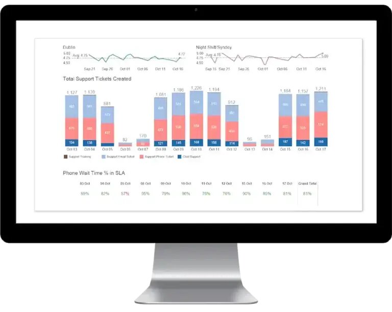
High customer interaction and an accessible ticketing system are good signs.

However, an excessive number of requests could indicate a problem. Monitoring this operational metric can help you spot potential issues early.

How to calculate it: Compare the volume of support tickets on a fixed timeframe, like weekly or monthly.

Pay special attention to spikes following a new product release. Tip: If ticket volume overwhelms, add more customer support agents or updated self-help resources.

customer service metrics 2
  1. Average Ticket Handling Time

This metric measures an agent’s time on a single case.

Shorter times indicate greater team efficiency. However, focusing solely on this metric may compromise quality customer service. How to calculate it: Aim for a shorter handling time to enhance productivity.

Use a time-tracking system to record time spent per ticket. Also, review the average time over a week and a month. Compare it with previous data to identify long-term trends.

Tip: Avoid overlooking instances of agents being tied up on long calls. These could point to underlying issues needing improvement in the customer experience or process optimization.

Types of Customer Service Performance Metrics

  1. Response Time: Measures how quickly customer inquiries or issues are addressed.
  2. Resolution Time: Tracks the time taken to resolve customer problems or complaints.
  3. Net Promoter Score (NPS): Evaluates customer loyalty and likelihood to recommend the business to others.
  4. First Contact Resolution (FCR): Determines the percentage of issues resolved during the first interaction.
  5. Customer Effort Score (CES): Assesses the ease of customer experience when interacting with support.
  6. Service Level Agreement (SLA) Adherence: Measures compliance with agreed-upon response and resolution times.
  7. Customer Retention Rate: Calculates the percentage of customers retained over a specific period.
  8. Quality of Service (QoS): Assesses the quality of interactions based on predefined criteria.
  9. Agent Performance: Evaluates individual agent performance in handling customer inquiries or issues.

Methods for Measuring Customer Service KPIs

Measuring customer service performance is an undisputed game-changer for your business. These methods will help you gauge customer satisfaction levels and improve their overall experience.

  • Surveys: Customer satisfaction surveys are commonly used to gauge customer service quality. You can administer these surveys through various channels, such as email, online forms, or in-person interviews. Use a mix of rating scales and open-ended questions to gather quantitative and qualitative feedback.
  • Customer feedback analysis: Collect and analyze customer feedback and complaints. Monitor customer reviews, comments on social media, and emails to identify common issues, trends, and improvement areas. Pay attention to positive and negative feedback to understand what customers appreciate and what needs attention.
  • Metrics monitoring: Track and measure key performance indicators (KPIs) and metrics related to customer service. Examples include average response time, first contact resolution rate, customer retention rate, and customer effort score. These metrics provide quantifiable data on the efficiency and effectiveness of your customer service team.
  • Mystery shopping: Employ mystery shoppers who pose as customers and interact with your customer service representatives. This helps evaluate the quality of service, identify improvement areas, and ensure consistency across different customer interactions.
  • Interviews and focus groups: Conduct in-depth interviews or organize focus groups with a select group of customers to gather qualitative insights. This allows you to delve deeper into their experiences, expectations, and perceptions of your customer service.
  • Social media monitoring: Monitor social media platforms for mentions, tags, and comments about your brand and customer service. Analyzing social media conversations can provide real-time feedback, identify customer sentiment, and address issues promptly.
  • Customer service analytics: Utilize data analytics tools to analyze customer service interactions, such as call recordings, chat logs, and email exchanges. This can help identify patterns, bottlenecks, and improvement areas in your customer service processes.

How to Measure Customer Service Metrics?

Data is an intricate resource that holds immense value and cannot be overlooked. Although Excel is an excellent tool for data organization, it falls short in data visualization. Fortunately, with ChartExpo, you can elevate your Excel charts and graphs to new heights.

ChartExpo transforms your data into appealing, insightful visualizations that effortlessly enable you to glean insights.

How to Install ChartExpo in Excel?

  1. Open your Excel application.
  2. Open the worksheet and click on the “Insert” menu.
  3. You’ll see the “My Apps”.
  4. In the office Add-ins window, click “Store” and search for ChartExpo on my Apps Store.
  5. Click the “Add” button to install ChartExpo in your Excel.

ChartExpo charts are available both in Google Sheets and Microsoft Excel. Please use the following CTA’s to install the tool of your choice and create beautiful visualizations in a few clicks in your favorite tool.

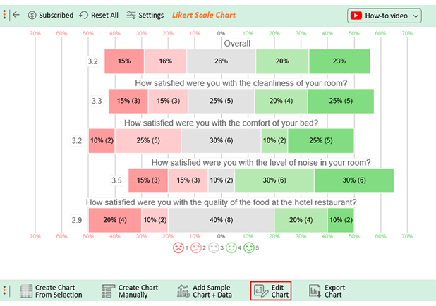
Assume the customer service feedback survey data has been organized into a table format, as shown below.

Timestamp How satisfied were you with the cleanliness of your room? How satisfied were you with the comfort of your bed? How satisfied were you with the level of noise in your room? How satisfied were you with the quality of the food at the hotel restaurant?
10-13-2023 17:47:33 Extremely Satisfied Dissatisfied Neutral Satisfied
10-13-2023 17:47:33 Extremely Satisfied Neutral Extremely Satisfied Neutral
10-13-2023 17:47:33 Neutral Neutral Extremely Dissatisfied Extremely Satisfied
10-13-2023 17:47:33 Satisfied Extremely Dissatisfied Dissatisfied Neutral
10-13-2023 17:47:33 Extremely Satisfied Dissatisfied Satisfied Extremely Dissatisfied
10-13-2023 17:47:33 Satisfied Dissatisfied Satisfied Neutral
10-13-2023 17:47:33 Extremely Dissatisfied Neutral Extremely Satisfied Satisfied
10-13-2023 17:47:33 Neutral Satisfied Neutral Neutral
10-13-2023 17:47:33 Extremely Dissatisfied Extremely Satisfied Extremely Satisfied Satisfied
10-13-2023 17:47:33 Extremely Satisfied Extremely Dissatisfied Satisfied Neutral
10-13-2023 17:47:33 Dissatisfied Neutral Extremely Satisfied Extremely Dissatisfied
10-13-2023 17:47:34 Neutral Neutral Extremely Dissatisfied Neutral
10-13-2023 17:47:35 Dissatisfied Neutral Extremely Satisfied Dissatisfied
10-13-2023 17:47:36 Neutral Extremely Satisfied Satisfied Extremely Dissatisfied
10-13-2023 17:47:37 Neutral Extremely Satisfied Dissatisfied Extremely Satisfied
10-13-2023 17:47:38 Extremely Dissatisfied Extremely Satisfied Dissatisfied Neutral
10-13-2023 17:47:39 Extremely Satisfied Satisfied Extremely Dissatisfied Extremely Dissatisfied
10-13-2023 17:47:40 Dissatisfied Dissatisfied Satisfied Neutral
10-13-2023 17:47:41 Satisfied Dissatisfied Extremely Satisfied Dissatisfied
10-13-2023 17:47:42 Satisfied Extremely Satisfied Satisfied Satisfied

This table contains example data. Expect many responses and questions in real life.

  • To get started with ChartExpo, install ChartExpo in Excel.
  • Now Click on My Apps from the INSERT menu.
insert chartexpo in excel
  • Choose ChartExpo from My Apps, then click Insert.
open chartexpo in excel
  • Once it loads, choose the “Likert Scale Chart” from the charts list.
search likert scale chart in excel
  • Click the “Create Chart From Selection” button after selecting the data from the sheet, as shown.
Create Chart From Selection ce380
  • When you click the “Create Chart From Selection” button, you have to map responses with numbers manually. The Likert scale has this arrangement:
    • Extremely Dissatisfied = 1
    • Dissatisfied = 2
    • Neutral = 3
    • Satisfied = 4
    • Extremely Satisfied = 5
  • Once all is set, click the “Create Chart” button.
Map Likert Responses to Numbers ce380
  • ChartExpo will generate the visualization below for you.
Customer Service Measures Design Template
  • If you want to have the chart’s title, click Edit Chart, as shown in the above image.
  • Click the pencil icon next to the Chart Header to change the title.
  • It will open the properties dialog. Under the Text section, you can add a heading in Line 1 and enable Show.
  • Give the appropriate title of your chart and click the Apply button.
Apply Title on Chart ce380
  • Let’s say you want to add text responses instead of numbers against every emoji.
  • Click the pencil icon next to the respective emoji. Expand the “Label” properties and write the required text. Then click the “Apply All” button.
  • Click the “Save Changes” button to persist the changes.
Apply Label on Chart ce380
  • Your final chart will appear below.
Final Customer Service Measures

Insights

  • 45% of customers reported satisfaction with the cleanliness of their room. 30% were dissatisfied, and 25% had no strong feelings either way.
  • Regarding bed comfort, 35% expressed satisfaction, while another 35% were dissatisfied.
  • Regarding noise level, 60% were satisfied, while 30% were dissatisfied.
  • The food quality was a mixed bag, with 30% satisfied and another 30% dissatisfied.
  • Overall;
    • 43% of customers expressed satisfaction with the hotel’s services, with 23% extremely satisfied.
    • 31% expressed dissatisfaction, with 15% of those being extremely dissatisfied. The remaining 26% remained neutral.

How to use Customer Service Metrics for your Business?

Start by identifying key metrics that align with your goals, such as response time, customer satisfaction (CSAT), or first call resolution (FCR). Regularly monitor these metrics to track performance and spot trends.

Analyze the data to identify areas where service can be enhanced, such as reducing wait times or improving agent training. Leverage self-service analytics to gain deeper insights from these metrics, enabling you to make informed decisions, optimize processes, and implement strategies that lead to better customer experiences. This approach ultimately drives customer loyalty and business growth.

FAQs About Customer Service Metrics

What are some methods of measuring customer service?

Methods of measuring customer service include the following;

  • Customer satisfaction surveys.
  • Customer feedback and complaint analysis.
  • Customer service metrics monitoring.
  • Mystery shopping.
  • Interviews and focus groups.
  • Social media monitoring.
  • Customer service analytics.

What is the key performance measure for customer service?

The key performance measure for customer service can vary depending on the organization. However, common indicators include average response time, first contact resolution rate, customer retention rate, and customer effort score. These metrics help assess the effectiveness and efficiency of customer service operations.

Wrap Up

Analyzing customer service measures is crucial for any organization striving to enhance customer satisfaction and loyalty. By implementing effective measurement techniques, you can gain valuable insights into the quality of your customer service. Consequently, identify areas for improvement and act accordingly.

To analyze customer service measures effectively, you should adopt a comprehensive approach. This involves regularly collecting and reviewing data, identifying patterns and trends, and benchmarking performance against industry standards. Doing so lets you identify strengths to leverage and weaknesses to address.

Furthermore, analyzing customer service measures should not be limited to numerical data alone. It is equally important to consider qualitative feedback from customers, such as their perceptions, experiences, and suggestions. This qualitative information provides valuable context and helps you understand the emotional aspects of customer interactions.

Charting is key to gaining a better perspective on your business’s customer service. ChartExpo will help you make sense of your customer service measures data. Best of all, you don’t have to be a coding expert to use ChartExpo. It has an intuitive interface that is easy to use, even for newbies.

How much did you enjoy this article?

ExcelAd1
Start Free Trial!
128222

Related articles

next previous
Microsoft Excel8 min read

Excel Task Tracker Template for Smarter Task Insights

Task tracker template in Excel organizes tasks, tracks deadlines, and boosts efficiency. Learn its benefits, and explore expert tips to simplify task management.

Microsoft Excel10 min read

Invoice Tracker Template in Excel for Better Insights

An invoice tracker Excel template helps track invoices, due dates, and payments. Learn how to use this template for better financial management.

Microsoft Excel12 min read

Key Performance Indicators in Healthcare for Better Insights

Key Performance Indicators in healthcare track patient care and efficiency. Learn about these KPIs, top examples, and how to use them to improve outcomes.

Microsoft Excel10 min read

BMI Calculation Formula in Excel for Better Fitness Insights

The BMI calculation formula in Excel helps track and analyze body mass index. Explore step-by-step instructions and tips to simplify BMI tracking in Excel.

Microsoft Excel29 min read

How to Create a Tornado Chart in Excel? A Complete Guide

Click to learn how to plot a Tornado Chart in Excel using easy-to-follow steps. Also, we’ll address the following question: what is a Tornado Diagram?

ChartExpo logo

Turn Data into Visual
Stories

CHARTEXPO

  • Home
  • Gallery
  • Videos
  • Services
  • Pricing
  • Contact us
  • FAQs
  • Privacy policy
  • Terms of Service
  • Sitemap

TOOLS

  • ChartExpo for Google Sheets
  • ChartExpo for Microsoft Excel
  • Power BI Custom Visuals by ChartExpo
  • Word Cloud

CATEGORIES

  • Bar Charts
  • Circle Graphs
  • Column Charts
  • Combo Charts
  • Comparison Charts
  • Line Graphs
  • PPC Charts
  • Sentiment Analysis Charts
  • Survey Charts

TOP CHARTS

  • Sankey Diagram
  • Likert Scale Chart
  • Comparison Bar Chart
  • Pareto Chart
  • Funnel Chart
  • Gauge Chart
  • Radar Chart
  • Radial Bar Chart
  • Sunburst Chart
  • see more
  • Scatter Plot Chart
  • CSAT Survey Bar Chart
  • CSAT Survey Chart
  • Dot Plot Chart
  • Double Bar Graph
  • Matrix Chart
  • Multi Axis Line Chart
  • Overlapping Bar Chart
  • Control Chart
  • Slope Chart
  • Clustered Bar Chart
  • Clustered Column Chart
  • Box and Whisker Plot
  • Tornado Chart
  • Waterfall Chart
  • Word Cloud
  • see less

RESOURCES

  • Blog
  • Resources
  • YouTube
SIGN UP FOR UPDATES

We wouldn't dream of spamming you or selling your info.

© 2025 ChartExpo, all rights reserved.