Clustered Bar Chart
More Bars, More Insights
Bar charts are one of the most universal types of visualization. The Clustered Bar Chart adds to this value by including more dimensions of data.
Creating bar charts with multiple variables and data series allows you to dive deeper into your data and extract valuable and actionable intelligence.
Empower your visual analysis with Clustered Bar Charts and see the entire story behind your data.
Google Sheets
Microsoft Excel
Free 7-day trial (no purchase necessary). Pricing starts at $10 per month.
 ChartExpo for Google Sheets is
 used by 695,000+ users worldwide!
Click this link to watch a ChartExpo for
Google Sheets single-user installation video.
Click this link to watch a ChartExpo for
Google Sheets admin installation video.
Click this link to watch a ChartExpo
for Excel single-user installation video.
Click this link to watch a ChartExpo
for Excel admin installation video.
What Is a Clustered Bar Chart?
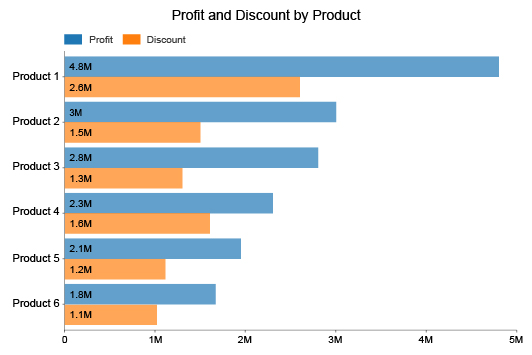
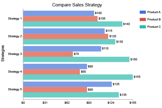
A Clustered Bar Chart is much like any other type of bar chart. The main difference is the bars appear in clusters. This adds an extra layer to the chart and enhances the potential of your visual analysis.
There are many added elements to the clustered bar graph that help you see more insights with greater clarity. The flexibility of this visualization makes it a winning option in all types of comparative analysis.
Learn how versatile and powerful the Clustered Bar Chart is.
Clustered Bar Chart Definition
A Clustered Bar Chart functions much like any other bar graph. The primary difference is that this visualization presents multiple data series through the use of clustered bars.
Each cluster of bars depicts a top-level category containing smaller subcategories. These subcategories are the same across each grouping, allowing you to cross-compare results across the various primary containers.
For example, a traditional bar chart could show you your total sales data for each quarter. Meanwhile, a Clustered Bar Chart could show your quarterly sales figures by location.
This added dimension gives you greater insight into your sales data and allows you to take location-specific action to improve results.
In this example, each cluster represents a quarter of sales. The bars within each cluster show the money for each location per quarter. If you were mapping data for 4 areas, your visualization would include 16 separate bars (4 locations per 4 quarters equals 16).
The axis opposite your categorical data expresses the numerical count data for each item and series. Since Clustered Bar Charts can be vertical or horizontal, it will change whether your count data is on the X or Y-axis.
Some Clustered Bar Charts even include multiple axes. This occurs when subcategories have different scales or units of measure. However, this is a rare case.
What’s the Difference Between Column Charts and Bar Charts?
Bar charts and column charts share a close relation, as do the clustered variation of both types. You can use these terms interchangeably in many cases because all column charts fall under the bar graph category.
However, this relationship doesn’t always work the other way, meaning not all bar charts use columns.
Essentially, the difference between a column and a bar chart has to do with the orientation of the bars themselves. The label “bar charts” covers graphs using either horizontal or vertical bars.
On the other hand, columns only appear vertically. So, a clustered column chart only shows labels up and down. There is no horizontal model.
Clustered bar charts don’t fall into this restriction because they have the versatility of being vertical or horizontal. When necessary, you can place bars vertically. At other times, you can create a horizontal clustered bar chart with labels that read more naturally.
The “clustered” or “grouped” tag in these chart names has to do with the arrangement of the bars. Instead of each bar being equally spaced out, like a regular column or bar chart, these visualizations show close clusters of bars.
Each cluster represents items grouped under a single main heading or category.
Types of Clustered Bar Charts
The Clustered Bar Chart itself is a variation of the bar graph category. That said, there are also variations of this grouped design.
Understanding the different types of Clustered Bar Charts is important. It helps you make the most of your charts by matching the best visualization to your data.
When you select the correct chart type, your visual analysis process goes smoothly, ensuring you uncover the maximum insights.
Let’s explore the different uses for each type. This will help you better understand when to utilize each variation.
Stacked Clustered Bar Chart: While Clustered Bar Charts add an extra dimension of data, you can include even more information using the stacked variation of this visualization.
A stacked chart divides each bar into smaller components that contribute to that item’s results. Essentially, this adds another layer of detail and another source of comparisons.
For example, a competitive sales team is trying to decide which long-time employee to promote to an executive position. They have 3 people in mind for the promotion.
Consistency of sales is a significant factor in this promotion. To visualize this information for each employee, they look at each employee’s total sales over several years. In this clustered bar chart example, each cluster shows sales data for the three employees.
They divide each bar into smaller parts to reflect the quarterly sales of each employee within that year. This gives management a complete view of each employee's sales and how consistent they have been over every quarter in the last few years.
100% stacked Clustered Bar Chart: This is a similar visualization as the above. However, each individual bar has the same height, representing a 100% value. Thus, you aren’t comparing the sizes of each bar in the cluster. Instead, you’re only comparing the individual stacked parts of each vertical or horizontal bar.
Clustered column line chart: Some clustered bar charts appear with a line through the graph. This line typically reflects an average value between a cluster. It can also show a max or minimum value, depending on your analysis needs. Adding this line is entirely optional.
Clustered Bar Chart Examples
Looking at real-world examples of Clustered Bar Charts is the best way to understand how this visualization works. You’ll be able to see how this chart type helps different teams understand their data results and how to improve them.
Let’s dive into some examples of Clustered Bar Charts.
Clustered bar chart example 1: A company wants to track the sales throughout the year for various products. This analysis will help their marketing and sales teams understand when certain items are in high or low demand.
Each cluster shows quarterly sales data across various product lines. You can track these product lines across each quarter to see when sales spike or dip. This gives you a clearer idea of when to begin marketing and pushing offers for these items.
Clustered bar chart example 2: Mary is an office manager with a budget of $650 to spend on new supplies and equipment. Unsure how to spend this money, Mary decides to poll each team in the office on what they want most.
Since it’s a large office with hundreds of employees, she receives a lot of responses. To make sense of all of this data, she graphs the results using a Clustered Bar Chart.
In this clustered bar chart example, each department has its own cluster. The individual bars within the set show the responses to Mary’s survey. Thus, she can see each team’s most requested item.
Thanks to this visualization, Mary can accurately assess the items with the highest demand and compare results between teams to identify common requests across different groups.

When to Use a Clustered Bar Chart
The versatility of the Clustered Bar Chart creates many use cases for this visualization. There is a long list of Clustered Bar Chart examples that have helped organizations make sense of their complex data.
Using a clustered bar graph to make comparisons shows you a complete view of the story behind the numbers. You can use Clustered Bar Chart insights to make accurate decisions that grow your results.
Discover how to use a Clustered Bar Chart for your analysis needs.
Visual Data Storytelling Is Vital for Effective Analysis
The reason why you make a clustered bar graph is the same reason you make any type of chart. It’s easier to analyze a chart than raw data on its own.
This is why we perform visual analysis. It helps us make sense of complex figures and overloaded datasets.
It’s the old saying, “a picture is worth a thousand words.” It’s easier to show someone a picture than explain what that picture shows. You could argue that a chart is worth a thousand numbers.
The reason visuals are better information delivery systems than raw data has to do with how our brains work. If you think about it, your brain has been processing visual data since the first moment you opened your eyes as a newborn.
Over the years, it’s become pretty darn good at it. The human brain processes visual data several thousand times faster than numbers or text. Plus, it’s easier to recall visuals and remember them for longer.
The Clustered Bar Chart excels at visual data storytelling because of its ability to display large volumes of information in a single visualization. The advanced chart design shows you all the elements you need to start drawing comparisons and making data-driven decisions.
Complex Data Requires More Advanced Charts
Big data creates a dilemma for organizations. The exponential growth of data means the size of your information quickly gets out of hand. Large datasets are overwhelming and cause analysis fatigue.
Charts help you overcome overloaded datasets by visualizing the information in a more accessible format.
You need to use more advanced charts when you have massive, complex datasets. In these circumstances, regular bar charts won’t cut it. They don’t visualize enough dimensions to show you the complete story behind your data.
You may have to create multiple bar charts to accurately display each relevant dimension of your data. This slows your analysis because you have to look at numerous charts instead of just one. You may have to tab between several reports and visualizations to gain any actionable intelligence.
This is where the Clustered Bar Chart comes in handy. The clusters of bars create new layers to your charts and visual analysis, allowing you to present multiple series of data in your visualizations.
Rather than making several individual bar charts, you can simply make one clustered bar graph. This puts all of your analysis and insights in one place, so you don’t have to refer back to other charts.
Clustered bar charts also make your reporting clearer and more concise because they limit the number of charts you need to present to audiences.
Make Comparisons across Multiple Series of Data
Comparisons are more valuable when you have more data in the mix. Imagine shopping for a new car, but the only information available is the price and color of the vehicle.
It’s not enough to make a decision, is it? You want to know the style of car, features, mileage, etc. To do this, you need to compare a series of data, not just one dimension of information.
This is the power of Clustered Bar Charts. You can draw more comparisons when you have more data depicted in your charts.
One of the ways that a bar chart with clustered data empowers your comparative analysis is by allowing you to draw comparisons horizontally and vertically.
It’s worth mentioning that this doesn’t relate to the orientation of your bars but the way you make comparisons. Typical bar charts only allow horizontal comparisons, where you’re looking across different categories and measuring the differences and similarities in their results.
In a clustered bar graph, you can also make vertical comparisons by studying the sizes of each bar within a cluster.
If you use a stacked Clustered Bar Chart, these comparisons appear with even greater detail.
A robust clustered bar graph can showcase the entirety of your dataset, giving you a complete view of every part’s role in performance.
You Need a More Flexible Comparison Chart Template
The charting process is rarely ever the same journey twice. Each dataset is unique and creates its own set of challenges in charting.
Data also changes over time and grows rapidly. The size of your datasets contributes to these challenges.
In other words, how you chart your data now may not work so effectively in the future.
The Clustered Bar Chart is one of the best visualization tools because it is flexible. It can easily accommodate growing data and help you overcome unforeseen challenges in your analysis.
The flexibility of the clustered bar chart manifests itself in two ways.
Scalability: You want a chart type that can grow with your data needs. The Clustered Bar Chart allows you to include more dimensions and categories in your visualization. You can add or remove elements as your analysis needs and demands change.
Versatility: There are many different types of bar charts available to data users. The clustered bar graph also has its own variations, like the stacked Clustered Bar Chart, clustered line bar chart and others.
The various designs of the clustered bar chart give you immense freedom in how you present your data. Many of these choices, like the stacked clustered chart, allow you to include extra data dimensions in your charts, creating a more thorough visual data story.

How to Create a Clustered Bar Chart
Knowing how to make a Clustered Bar Chart in Excel, Google Sheets and other platforms is vital to your analysis success. Without this knowledge, you can’t begin making the valuable comparisons you need to understand what’s happening in your datasets.
The added dimensions of the clustered bar graph produce challenges in chart creation. Luckily, ChartExpo resolves these obstacles with exceptional ease.
See how easy it is to create clustered charts through the ChartExpo interface.
An Analysis Question Starts Your Chart
The first step in creating a chart, any chart, is to ask a question. This question serves as the purpose or goal for your visualization.
The question needs to be relevant and specific. Its answer should provide you with actionable intelligence that you can use to improve your results.
For example, you might ask, “How efficiently are my sales growing over time?” Another example of an analysis question would be, “What’s my best performing strategy for drawing website traffic?”
Whatever your question is, it should help explain the purpose and intent of your visualization efforts. It tells you why you’re making this chart in the first place.
This analysis question becomes your goal, dictating what chart type to use and the data you need to gather. Without this heading or objective, it’s easy to become distracted by irrelevant data or change your analysis halfway through the process.
It’s worth putting your analysis question or goal down in writing, so you can refer back to it as needed.
Sometimes, you may have to pause your chart creation and analysis. Other projects may take your attention elsewhere. When you return to the data visualization, you’ll have this goal handy to identify the chart’s purpose.
Gather and Prepare Your Data for Charting
The second half of the charting process is adding the data. This isn’t as easy as it sounds. Plenty of issues appear when transforming raw figures into compelling charts.
These problems are particularly prevalent in Clustered Bar Charts because of how much information you can depict with one visualization.
You may find yourself charting data from different sources. You need to edit these datasets to ensure they align correctly. Otherwise, you’ll run into problems that will hurt your chart and potentially lead to inaccurate insights.
Some of these issues include:
- Errors Even the most well-maintained dataset will have some inconsistencies, like missing values, typos, etc. You need to remove these problems before charting to ensure these errors don’t hurt the accuracy of your visualization.
- Duplicates: When joining data from different sources, some values may repeat because each set tracks the same information. You don’t want to count these items twice in your analysis because it will produce huge inaccuracies.
- Units of measure: Datasets may count the same information using different metrics or units. When you combine these sets, you need to normalize the labels so that these values can “talk.” For instance, if you’re pulling sales data from different countries, you need to convert the currencies into one universal measure.
Preparing your data takes time, but removing these potential issues guarantees that your charts are accurate and function correctly.
How to Create a Clustered Bar Chart in Excel
Before you can capitalize on any of the advantages of this visualization, you need to first know how to make clustered bar charts in Excel. There are a few ways you can approach this.
First, you can learn how to make a multiple bar graph in Excel itself. The problem is that Excel Clustered Bar Charts require you to adjust your data and change several settings before your visualization is perfect. It’s not a very efficient method.
Our recommendation of the best approach for how to make a clustered bar chart in Excel is to use a clustered bar graph maker add-in.
While many of these tools and clustered bar graph makers exist, the best data visualization tool to use is ChartExpo. It is the easiest and fastest way to make professional charts of any type.
Using ChartExpo when creating a bar graph with multiple independent variables in Excel is incredibly easy. If you follow these steps, you can learn how to draw Clustered Bar Charts in Excel quickly.
First, download the ChartExpo Excel add-in from the Microsoft App Source. The next time you open Excel, you can find the tool under “Insert” and “My Apps.”
ChartExpo’s interface is exceptionally straightforward and simple to navigate. You’ll first need to select your chart type by entering “Clustered Bar Chart” into the search bar.
Select your chart type to begin entering your data. You have two options at this stage. You can click and drag to grab the data you want to visualize.
If you’re happy with your selections, the only step left is to click the “Create Chart” button. Your new Excel Clustered Bar Chart appears instantly.
That’s the entire ChartExpo process. There are no unnecessary obstacles or settings. It’s just choose a chart type and select your data.
How to Make a Clustered Bar Chart in Google Sheets
If you know how to make a clustered bar chart in Excel, you have a head start on making a Clustered Bar Chart in Google Sheets.
To begin making a Google Sheets clustered bar chart, click the “Extensions” tab from the site’s top toolbar. Next, position your mouse over “Add-ons.” New menu options will appear. From these results, select “Get add-ons.”
This process will open the Google Workspace Marketplace. You can download the ChartExpo Google Sheets clustered bar chart maker from this page. After installing the extension, it will appear under the “Add-ons” menu mentioned previously.
Clicking ChartExpo will open the tool’s impressive chart gallery. You can scroll through all of the available visualizations or search the clustered chart by name.
Again, you have two options to input your data for your clustered chart. You can grab selections from your spreadsheet directly or input what sections you wish to visualize by hand.
Finalizing the chart takes only one click; your chart will load immediately and appear next to your Google Sheets data.
If necessary, you can make minor edits to the colors, labels and other details of your new clustered bar graph in Google Sheets.
Don’t forget to save your chart creation for your reports and communications.

The Benefits of Using a Clustered Bar Chart
The value of a Clustered Bar Chart is extensive. There are many advantages to using this visualization, especially when it comes to comparative analysis.
Even if your dataset is large and complex, the clustered bar chart allows you to draw meaningful comparisons. You can compare results across categories and within each series. This gives you a complete view of what’s happening in your data.
Experience all of the ways that the Clustered Bar Chart excels at data visualization.
One of the Most Effective Comparative Analysis Visualizations
Comparisons are most effective when you have more data and information to make those judgements. It’s easier to detect similarities and differences when you have more clues.
Clustered bar charts are a highly effective comparison analysis tool because they include more dimensions and items than other comparative chart types. So, you can see and analyze more using just one chart.
The advantage of clustered bar charts isn’t just a factor of having more bars. If that was the case, you could simply create traditional bar charts with more columns or rows.
The advantage is how you arrange the bars in this visualization. The clustered bars allow you to make comparisons across each main category or cluster, as well as the individual items within that series.
More importantly, the bars within each cluster depict a new dimension of data. This added layer gives you a further understanding of the information and another level to draw from to make comparisons.
In other words, Clustered Bar Charts give you a more complete view of the data. With this added information, you have more details to compare and contrast.
This improves the accuracy of any conclusions you draw. When you have limited information, you don’t have a lot of evidence backing the comparisons you make.
Having a visualization with a more thorough view ensures the insights you extract from the data are concrete and don’t require extra analysis to check.
Display Bars Horizontally or Vertically
We’ve already discussed the flexibility of the Clustered Bar Chart. One of the ways this benefit showcases itself is the orientation of the bars.
You can display clusters horizontally or vertically. This is unlike clustered column charts that restrict users to only showing vertical bars.
While horizontal clustered bar charts are less popular, they have some advantages.
Labeling is one concern. Vertical bars tend to be better for comparative analysis, but labeling each one with vertical text is problematic.
We aren’t used to reading text up and down; we read it left to right. While you can try to stagger labels with columns or angle them, it doesn’t always work. Long titles just don’t work well vertically.
In a Clustered Bar Chart, you have many more items to label. You can use a legend to cover most of the individual bars within each grouping. But, long primary category labels still need to appear along an axis.
If you have long labels, a horizontal Clustered Bar Chart doesn’t have these issues. You can display labels with the natural orientation they’re meant to be read.
You may also want to show your bars one way or the other out of preference or because of space constraints. Clustered bar graphs give you the freedom to choose where column chart types don’t.
Clustered Bar Charts Offer a Familiar Visual Analysis Tool
Bar charts are universal. Everyone has made, analyzed, created or otherwise interacted with this type of visualization at some point. It’s even one of the first charts we learn about in school.
This familiarity with bar charts is an exceptional advantage to the clustered graph. Even though this chart type showcases more bars than the traditional model, the framework remains the same.
Since everyone knows and understands how bar charts and clustered bar graphs work, you don’t need to include any type of explanation with your reports or presentations. People already understand how to read bar charts and make comparisons within the visualization.
This isn’t the case with other types of visualizations. Many advanced charts include elements and designs that aren’t so universal. This hurts the readability of your reports. To guarantee the audience properly analyzes the chart, you may have to include an explanation along with the visual.
Not only does this slow down your visual analysis because people have to read instructions on how to read the chart, but it also distracts the audience from the visualization itself.
Clustered bar charts are an example of an advanced chart that avoids these issues. This creates a visual analysis environment where you can display complex data and insights without spending extra time explaining how to interact with the chart.
Track Data over Time and Make Time-Based Comparisons
Time is an ever-present and valuable variable to track and measure with your charts. The Clustered Bar Chart is one of the best visualization tools for comparing how data fluctuates over different periods.
Time-based comparison analysis has many applications and can reveal valuable and actionable insights to guide your decisions. Let’s look at examples of clustered bar charts using time as a variable.
Performance over time: Growth and performance change over time, whether for better or worse. Naturally, you want these things to be improving and not declining. Thus, you must track growth and performance annually, quarterly and even daily.
Thanks to the design of the Clustered Bar Chart, you can easily compare the performance of several series over time. You can measure the speed of growth and overall performance increase.
Plus, you can compare which series or items contribute the most and least to this growth. You can use this intel to optimize your efforts more accurately because you have a clear idea of what’s working and what needs more work.
Trends in performance: If you track your performance over an extended period, you start to notice repeating patterns. These peaks and valleys reflect semi-predictable points where performance rises and falls.
Clustered bar charts can help you forecast when these points occur, giving you the ability to adjust strategies accordingly. You’ll also know when significant spikes or dips are expected due to the timing or when there is cause for concern and immediate action.
Impact of controllable and uncontrollable factors: Certain events, strategies and other factors, whether external or internal, will impact your performance. Clustered bar charts can help you see how performance changes before, during and after one of these events.
For instance, if you appoint a new manager, it’s good to have benchmarks to judge their performance. How did the company perform before this new manager took over? How did performance change in their first few months? What about after a year?
Many companies are using this comparative analysis approach to look at data before, during and after the coronavirus pandemic and subsequent lockdown period.

Why ChartExpo Is the Best Charting Tool to Make a Clustered Bar Chart
ChartExpo is a strong candidate as the best charting tool available. It has a straightforward interface that makes charting faster and more accessible.
If you’re struggling with script-dependent charting tools or have problems keeping up with charting demands, you need a change. Don’t let these tools prevent you from becoming a data-driven organization.
Improve your data visualization and visual analysis efforts with ChartExpo.
No More Headaches from Clunky Scripts and Confusing Settings
How familiar are you with JavaScript, Python and other programming languages? The answer will dictate how effective you are at using the majority of Excel chart creator add-ins or Google Sheets extensions.
The way to create clustered bar charts and other visualizations that don’t already exist in Excel and Google Sheets is through coding. What most data visualization software really offers is a library of Google Sheets and Excel templates with prewritten scripts to insert new chart types into these programs.
To use these tools, you need some background in coding to understand how to edit these scripts with your data, labels, ranges, etc.
This creates several problems that dramatically slow down your analysis process. The most obvious obstacle is editing these script templates. Even with an expert coder working on your charts, it still isn’t as fast as an automated system like ChartExpo.
Manually coding also leads to errors. Inputting the wrong value or accidentally clicking the wrong button on your keyboard will create errors and problems with your chart. It will add more time on the clock to find where these issues are in the script and resolve them.
The other issue is these data visualization tools add an unnecessary skill gap to charting. Only those with a background or knowledge of coding can effectively make charts with ease.
Everyone else has to struggle with learning to use these confusing scripts or wait for someone with the proper skills to create their charts. This produces damaging traffic jams in your organization’s ability to visually process data.
ChartExpo’s simplistic interface is accessible to all users. No coding is required because ChartExpo does it for you in the background. It works instantly and without error.
The Most Straightforward Charting Tool Out There
ChartExpo creates a near-effortless charting experience by distilling the process down to its core components. This simplification removes all the unnecessary obstacles from your chart creation.
Not only does this save you ample time in your visual analysis, but it also ensures you have the agility to react to your ever-changing data. After all, you don’t want to constantly be playing catch-up with changes in your data. You want to be ahead of what’s happening.
The ChartExpo process is simple. In some cases, you’ll be able to create Clustered Bar Charts in Excel or Google Sheets in as little as 3 clicks. It’s all thanks to the easy 3-step process:
Step 1, Choose Your Chart Type: The first thing you see when you open the ChartExpo data visualization tool is the top menu of the chart gallery. You can scroll through the available options or search your desired chart by name.
Step 2, Select Your Data: The second component of chart making is the data. You can quickly click and drag to select the parts of your spreadsheet you want to use. Depending on the chart type, there may be some extra details to add as well.
Step 3, Create Your Chart: This is the easiest step. If you have your chart type and data selected, you click “Create Chart.” The process is complete; your chart appears instantly next to your dataset.
The ChartExpo system focuses on the parts of the charting process that matter most. It automates the lesser steps, so you don’t have to waste your time.
This is how charting should be.
A Complete Chart Gallery with More Visualization Options
Don’t invest in ChartExpo just to make Clustered Bar Charts. Invest in ChartExpo because you have advanced charting needs and you want a tool that makes data visualization easier and more effective for your team.
ChartExpo offers more than twice the number of charts available in Excel, Google Sheets, etc. These new charting options bring substantial value to your analyses.
With such a variety of choices, ChartExpo ensures you always have the best chart for your data. The advanced charts work well for even the most complex datasets.
ChartExpo also showcases several different charts and graphs for specialized types of data. There are options for marketing metrics, competitor analysis, customer journey analytics and more.
You’ll never have to look for new charts because ChartExpo already includes what you need. Plus, the team adds new visualization options over time.
More charting options also mean you can extract greater understanding from your data. You can visualize the same data using different chart types, giving you new and valuable perspectives on the information.
There isn’t just one chart capable of presenting your data. Often, you have multiple options and each one has its own benefits. Using more than one chart for your data allows you to see the entire picture.
You’ll spot new insights you didn’t see from the first chart.
Build a Solid Data Culture with Improved Charting and Reporting
Giving more people the tools and ability to make charts and visually analyze their data has a profound effect on an organization.
The push for businesses today is to become data-driven, meaning you use facts and figures to make decisions, instead of relying on guesswork or gut feelings.
To achieve this data-driven approach to decision-making, you need a concrete data culture. This means using data across your organization and sharing findings and insights between teams and levels.
Reporting is at the center of a solid data culture. ChartExpo’s powerful charting tool helps you create better reports to strengthen your data culture in several ways.
Streamlined reporting: Data moves and changes very quickly. Your charting and reporting need has to be extremely agile to keep up with this pace. Otherwise, you’ll be reporting on outdated information.
ChartExpo’s fast chart creation process allows you to create visualizations swiftly, without lowering quality. You can save every chart you make as an image or PDF file, making it incredibly easy to share your results with others.
More access to charts: By removing the need to manually edit scripts to make advanced charts, people can create charts on their own. They don’t need help from someone with coding experience.
Not only does accessible charting give more people the freedom to make their own charts, but it also encourages collaboration in the analysis process. Teams will brainstorm what analysis question to answer next and what actions to take in response to the newest insights.
ChartExpo Pricing
ChartExpo for
Google Sheets
$10*
per month
(no purchase necessary)
*pricing starts at $10
per user per month.
Only in-app purchase available
ChartExpo for Google Sheets
single-user purchase video.
ChartExpo for Google Sheets
admin purchase video.
ChartExpo for Google Sheets
single-user installation video.
ChartExpo for Google Sheets
admin installation video.
ChartExpo for
Microsoft Excel
$10*
per month
(no purchase necessary)
*pricing starts at $10
per user per month.
Only in-app purchase available
ChartExpo for Excel single-user
purchase video.
ChartExpo for Excel admin purchase video.
ChartExpo for Excel single-user
installation video.
ChartExpo for Excel admin
installation video.
Custom Pricing
Blogs
How to Make a Multiple Bar Graph in Excel? Easy Steps
Click to learn how to plot a Multiple Bar Graph in Excel? We’ll also address the following question: What is a Multiple Bar Graph?

How to Create a Clustered Bar Chart in Google Sheets?
Click to learn how to visualize your data using Clustered Bar Chart in Google Sheets.
How to Visualize Futures’ Data with Bar Chart?
Click to discover more about the Bar Chart Futures. You will also learn when should you use them? And how to visualize futures’ data with bar chart.
How to Make a Bar Graph With 3 Variables in Excel & Google Sheets?
Click to learn how to make a bar graph with 3 variables in excel & google sheets. Bar charts are the best chart to display data of 3 variables.
How to Create IELTS Band Score Charts?
Click to learn how to visualize data with IELTS Band Score Charts? We’ll also address the following question: what is the IELTS band score?
