Categories
Learning of languages, such as English, is gauged using various metrics, such as reading and listening scores.

To gain in-depth insights into whether students are improving or declining their IELTS (International English Language Testing System) scores, you’ve got to use best-suited visualization designs.
Some of the tested and proven charts for visualizing IELTS band scores include:
Why?
The aforementioned graphs are recommended because they’re easy to interpret. Besides, they’re unrivaled in displaying IELTS band scores.
So how can you access ready-made charts (mentioned above)?
Google Sheets is the logical choice in this situation. However, the freemium data visualization tool lacks ready-to-use Radial, Grouped Bar, Double Axis Line and Bar, and Gauge charts.
It turns out there’s a particular add-on you can install your Google Sheets to access the ready-made IELTS Band Score Charts.
IELTS Band Score is a measure mostly used to measure your proficiency in languages, such as English.
In other words, it’s the assessment of English language skills relative to band scores. These band scores range from 0 to 9 with each value corresponding to a level of English language competence.
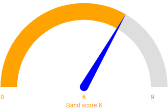
For example, a band score of 6 corresponds to a competent user who has an effective command of the language despite minor inaccuracies and misunderstandings. Individuals with an IELTS score of 6 understand can understand complex English sentences and words.
The band score you get in IELTS covers speaking, reading, writing, and listening. The band scores are rounded up to the nearest half or whole band score. For example, if you get a 6.5 in reading, 5 in writing, 7 in speaking, and 6.5 in listening, the average IELTS score would be 6.25.
The best-suited graph you can use to visualize language proficiency is an IELTS Band Score Chart. And this is because the chart is amazingly easy to interpret. Besides, it displays insights into IELTS band scores without clutter.
How to create an IELTS Band Score Chart should never be a stressful affair. Keep reading to discover more.
The overall IELTS band score is the average of the four component scores, rounded to the nearest whole or half band. More so, the component scores are weighted equally.
If the average of the four components ends in .25, the overall band score is rounded up to the next half band. And if it ends in .75, the overall is rounded up to the next whole band.
For each section of the test (writing, reading, listening, and speaking) you receive a band score from 1 to 9. The average of the aforementioned score forms your overall IELTS band score. This may be a full score (e.g., 5, 6) or with decimals (e.g., 7.5, 8.5).
The list below rates each band score against an English skill level.
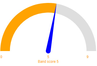
The chart used below is a Gauge Chart. It’s one of the best IELTS Band Score Charts you can use in your data stories.

The test taker has a fully operational command of the language. Furthermore, his or her use of English is appropriate, accurate, and fluent. Besides, it shows a deeper understanding of complex vocabularies.

The test taker has a fully operational command of the language with only occasional inaccuracies and inappropriate words. Also, they may misunderstand some things in unfamiliar situations.

The test taker has operational command of the language, though with occasional inaccuracies, inappropriate usage, and misunderstandings in some situations.
Furthermore, he or she can handle complex language well and understand detailed reasoning.
The test taker has an adequate command of the language despite some inaccuracies, inappropriate usage, and misunderstandings. More so, they have a fair understanding of the language, particularly in familiar situations.
The test taker has partial command of the language, although they may make mistakes.

The test taker’s basic competence is limited, even in familiar situations. In other words, he or she cannot use complex words and sentences during a conversation.

The test taker has a limited understanding of the English language. More so, they may be prone to breakdowns in communication.

The test taker has a greater difficulty understanding spoken and written English.

The test taker lacks an acceptable level of English proficiency. They can only communicate using a few isolated words.

The test taker lacks a total understanding of the English language. He or she cannot decode the meaning of any English word or sentence.
Not every chart can visualize the IELTS band score in a coherent and easy-to-interpret manner. The best-suited visualization designs for the task are, namely:
In the coming section, you’ll learn how to create an IELTS Band Score Chart using easy-to-follow examples. Keep reading.
We’ll use a Radial chart maker (one of the best IELTS Band Score Charts) to display insights into the table below.
Let’s get started.
Can you provide coherent insights into the data by looking at the table below?
| Measures | Scores |
| Overall | 6.66 |
| Speaking | 6.76 |
| Reading | 6.57 |
| Writing | 6.31 |
| Listening | 7 |
Now, note the difference after visualizing the data.

Dual Axis Bar and Line Chart use two axes to display relationships between two variables with varying magnitudes and scales of measurement. The relationship between two variables is referred to as correlation.
We’ll use the Double Axis Line and Bar Chart to visualize the data below in this example.
| Age Group | No. of Responders | IELTS Score |
| Under 26 | 202 | 7.4 |
| 26-29 | 411 | 5.47 |
| 30-39 | 432 | 7 |
| 41-49 | 368 | 5.87 |
| Over 49 | 364 | 5.3 |
Take a look at the chart below. You can easily provide a story of what’s going on.

Students under the age of 26 years have a higher IELTS score than other age groups. Conversely, elderly students (over 49 years) have a lower band score than others.
A Grouped Bar Chart (also called Clustered Bar Chart) is a composite graph you can use to display part-to-whole relationships of variables in data.
Take a look at the table below.
How easy is it to extract meaningful insights into the data below?
| Countries | Reading | Writing | Listening | Speaking |
| Malaysia | 5.42 | 5.48 | 6.7 | 7.68 |
| Indonesia | 5.89 | 5.03 | 7.9 | 7.96 |
| Bangladesh | 7.23 | 5.02 | 5.06 | 7.44 |
| India | 7.79 | 7.62 | 5.65 | 5.33 |
| Thailand | 6.11 | 7.06 | 7.37 | 6.94 |
Take a look at the Grouped Bar Chart below.

You can easily tell a coherent story from the table. For instance, Malaysia and Indonesia lead in speaking proficiency. On the other hand, India is the worst performer in speaking skills in English.
Google Sheets has built-in charts you can use to display insights into your raw data.
However, the freemium spreadsheet application lacks ready-to-use and visually stunning IELTS Band Score Charts, such as Radial Graphs for your analysis. The most viable option is to supercharge the usability of Google Sheets with a tested and proven add-on called ChartExpo.
ChartExpo does not require coding or programming skills, unlike other data visualization-based add-ons. More so, it has an ultra-friendly UI for everyone to use. This tool comes pre-loaded with over 50 advanced charts, including Chord diagrams, to offset the missing ones in Google Sheets.
Use ChartExpo to generate easy-to-read and interpret IELTS band Score Charts, namely:
How to create an IELTS Band Score Chart in Google Sheets should never be a nerve-wracking affair. Use ChartExpo to overcome the aforementioned challenge. You’ll learn more about this cutting-edge tool in the next section.
ChartExpo comes as an add-on for Google Sheets.
Essentially, it turns your Google Sheets into a reliable data visualization tool capable of delivering hidden insights into your data, irrespective of the size or complexity.
The premium IELTS Band Score Chart maker comes with a 7-day free trial.
The key benefit of ChartExpo is that it produces charts that are easy to read and interpret. More so, it allows you to save charts in the world’s most recognized formats, namely PNG and JPG.
ChartExpo is cloud-hosted, which makes it extremely light. You have a 100% guarantee that your browser won’t be slowed down.
In the coming section, we’ll show you how to visualize data using ready-made IELTS Band Score Charts in ChartExpo.
This section will use a Radial Chart in ChartExpo to visualize the data below.
| Measures | Scores |
| Overall | 6.66 |
| Speaking | 6.76 |
| Reading | 6.57 |
| Writing | 6.31 |
| Listening | 7 |


You can use the same steps as shown above to create other charts like Grouped Bar Chart, Double Axis Line and Bar Chart, and Gauge charts in Google Sheets or Excel using ChartExpo add-on.
IELTS Band Score is a measure mostly used to measure your proficiency in languages, such as English.
It’s the assessment of English language skills relative to band scores. And these band scores range from 0 to 9, with each value corresponding to a level of English language competence.
IELTS is no more difficult than any other exam. The questions are straightforward and designed to assess how well you can use your English not to trick you or test your opinions. As with any exam, IELTS requires thorough preparation.
Always remember to check the score you need before you take the test.
Learning languages is gauged using various metrics, such as reading and listening scores.
To gain in-depth insights into whether students are improving or declining their IELTS scores, you’ve got to use best-suited visualization designs.
Some of the tested and proven visualization designs for the task are called IELTS Band Score Charts. They include the following:
These graphs are recommended because they’re easy to interpret. Besides, they’re unrivaled in displaying IELTS band scores.
Google Sheets is the logical choice in this situation. However, the freemium data visualization tool lacks ready-to-use Radial, Grouped Bar, Double Axis Line and Bar, and Gauge charts.
We suggest you install ChartExpo in your Google Sheets to access ready-made and visually stunning IELTS band Score Charts. ChartExpo comes loaded with ready-to-use IELTS band Score Charts, plus 50 other advanced visualization designs, which are visually stunning and easy to interpret.
How to create an IELTS Band Score Chart in Google Sheets should never throw a curveball at you again. Use ChartExpo for a change.
Unlike other tools, you don’t need programming skills to visualize your IELTS scores using the ChartExpo add-on.
Sign up for a 7-day free trial today to access visually appealing and ready-to-use IELTS Band Score Charts in Google Sheets.
How much did you enjoy this article?


SUMPRODUCT in Google Sheets handles multi-condition calculations without extra columns. Master its syntax, uses, and errors. Read on!

An annual budget template in Google Sheets organizes your yearly finances, tracks every dollar, and reveals spending patterns. Read on!

Learn the best graph to show profit and loss with practical examples and use cases. Discover how to visualize your business data, track trends, and make smarter financial decisions.


