Categories
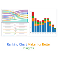
A ranking chart maker helps turn data into clear rankings for fast comparison. Learn Excel steps, examples, and tools to improve data visualization.
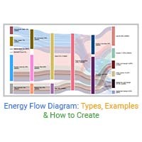
Learn how Energy Flow Diagrams simplify complex energy systems. Visualize energy flows, improve efficiency, and make informed decisions.
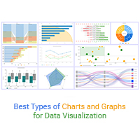
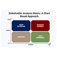
Explore the most important types of charts and graphs for data visualization and learn when to use each chart to transform complex data into clear insights.