Categories


Charts tips & tricks, how-to and step-by-step guides that will help you save time and money.

An annual budget template in Google Sheets organizes your yearly finances, tracks every dollar, and reveals spending patterns. Read on!
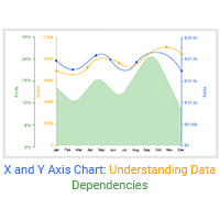
Learn how to create effective X and Y-axis charts in Excel. And use it for sales performance,identify trends and business success growth.
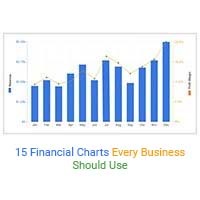
Explore 15 best financial charts to track revenue, costs, and profits, simplifying analysis and helping businesses make smarter financial decisions.