Track Growth and Loss in Your Data
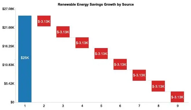
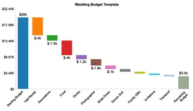
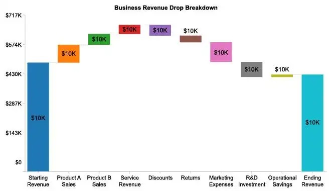
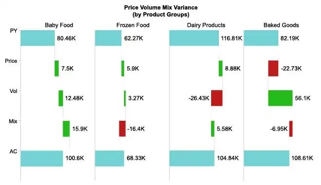
Data constantly moves up and down because of positive and negative factors. The Waterfall Chart helps you identify the severity of these factors.
By making and analyzing a Waterfall Chart, you can determine how to increase your growth and minimize your losses. It’s a proven recipe for success!
See what Waterfall Charts can do for your data.
Free 7-day trial (no purchase necessary). Pricing starts at $10 per month.
ChartExpo for Google Sheets is Click this link to watch a ChartExpo for
Google Sheets single-user installation video.
Click this link to watch a ChartExpo for
Google Sheets admin installation video.
Click this link to watch a ChartExpo
for Excel single-user installation video.
Click this link to watch a ChartExpo
for Excel admin installation video.
A Waterfall Chart is a variation of a bar graph that shows how an initial value changes due to other factors over time. It is also known as a Waterfall Graph, a Bridge Chart in finance or a floating brick chart.
The purpose of a Waterfall Chart is to show a before and after picture of your data. It depicts each step in the journey and shows which factors help or hurt the progression.
Knowing the ins and outs of Waterfall Charts enables you to use this visualization for your own data effectively.
Many people consider the Waterfall Chart a financial charting tool. This is mainly because a strategic financial consulting firm, McKinsey & Company, helped popularize this visualization.
McKinsey & Company needed an effective visualization to show clients to help them better understand their money.
More specifically, the consulting firm needed a way to visually demonstrate to clients where their money was going and what factors contributed to its growth or loss.
After all, it is easy to get lost when talking about raw financial figures. When we hear things like a $10,000 loss or a $6,700 gain, we register the information and know what the values mean. However, we don’t always understand the context of those figures.
This is where a visualization like the Waterfall Chart comes in handy. You can physically see how your money behaves, even across multiple investments or factors.
McKinsey & Company was able to use their Waterfall Chart creation not only to acquire new clients, but also to build relationships with existing ones. People love seeing exactly where their money is going to and coming from!
Since its creation, many variations of the Waterfall Chart have appeared. These visualization tools adapt this financial model to fit into other spaces and analysis methods.
Thus, the cash flow Waterfall Chart is only the tip of the iceberg regarding ways to use this powerful visualization!
Understanding how to read a Waterfall diagram is vital to properly utilizing this chart type with your own data.
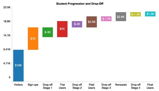
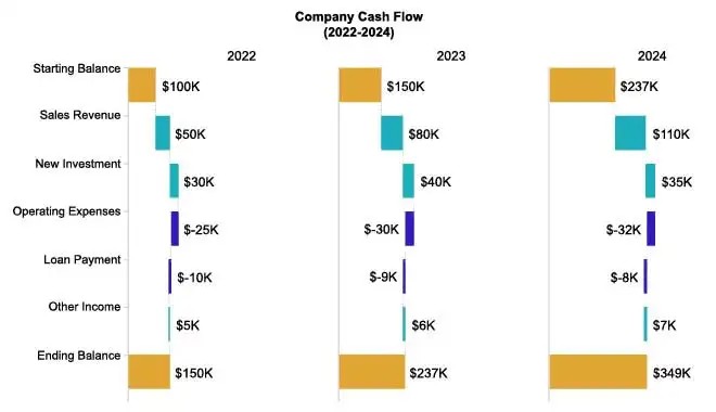
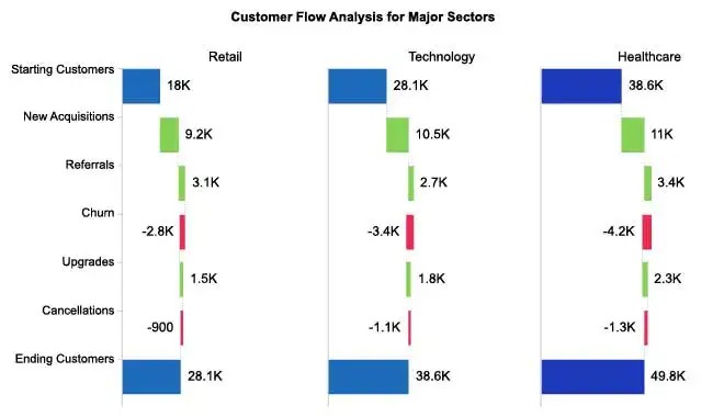
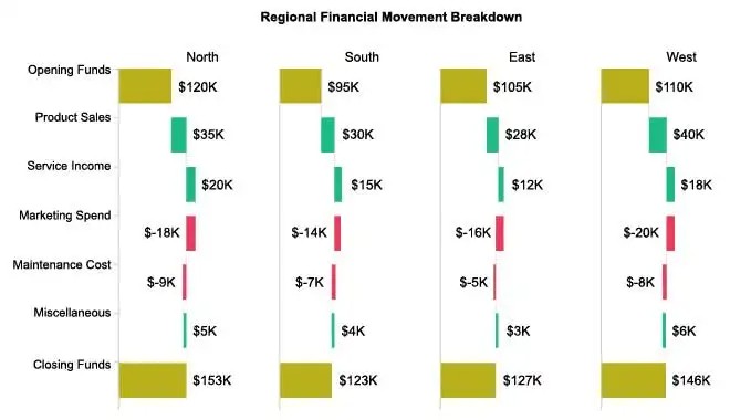
The appearance of the Waterfall Chart can be challenging to understand right away. We’re used to seeing bar charts with a common baseline. However, Waterfall Graphs have a mix of full bars and floating ones.
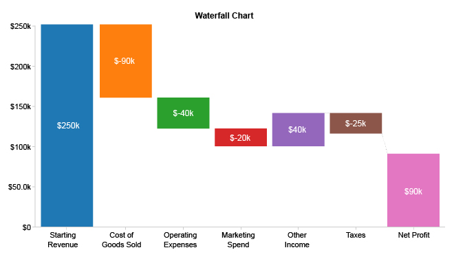
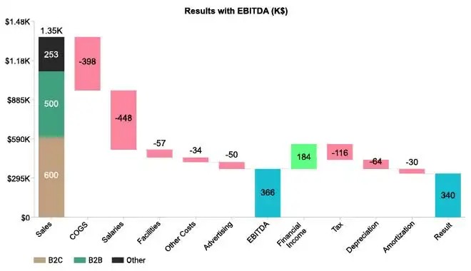
Often, there is a fuller bar on the left-hand side of the chart, showing your starting value. Moving from left to right (or top to bottom in the case of a vertical Waterfall Chart), there are several “floating bars.”
These chart components are smaller and “floating,” meaning they don’t share a baseline. They reflect the impacts of various categories or factors on the initial value.
The size and placement of these bars show the magnitude of each item and its impact, good or bad, on the results.
Collectively, these components show all of the plus and minus values that change the starting value throughout the chart. The individual floating bricks are often labeled or colored to reflect negative and positive values.
Most Waterfall Charts will show a final large bar to express the end value of your data. So, if most of your contributing factors are positive, you’ll have a larger ending value than the initial one. The opposite is true if you experience a high level of loss during the period.
Like many chart types, there are a few variations to the Waterfall Plot that are helpful to know. Every kind of Waterfall Graph has slightly different functions, which can impact the advantages and disadvantages of this visualization.
Let’s look at some of the popular Waterfall Chart models.
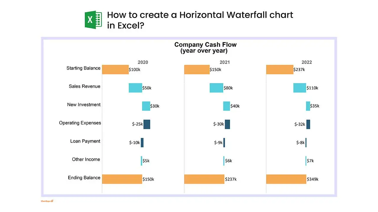
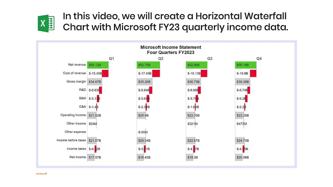
Horizontal Waterfall Chart: This is the standard and most popular Waterfall visualization. The individual bars and floating bricks appear along the X axis, while the Y axis shows the numerical measure (usually dollars, but not always).
The horizontal shape is ideal because it can include multiple factors and creates the true “bridge” shape for which this chart is known.
Another benefit of this Waterfall Chart template is that it creates a more natural structure of reading left to right when telling the story of your data’s journey from start to finish.
Vertical Waterfall Chart: While less common, vertical Waterfall Charts do have some practical benefits to users.
The biggest advantage is labeling. When you have lots of data items in your Waterfall Chart, readability can be an issue in the horizontal structure.
Vertical Waterfall Charts allow you to display labels as we naturally read them: horizontally. It’s much better than staggering or angling them.
You can make a vertical list of your values, including damaging losses, and then chart the data next to it with the vertical Waterfall Chart. It results in a clean, concise look that is perfect for a Waterfall report in Excel or other programs.
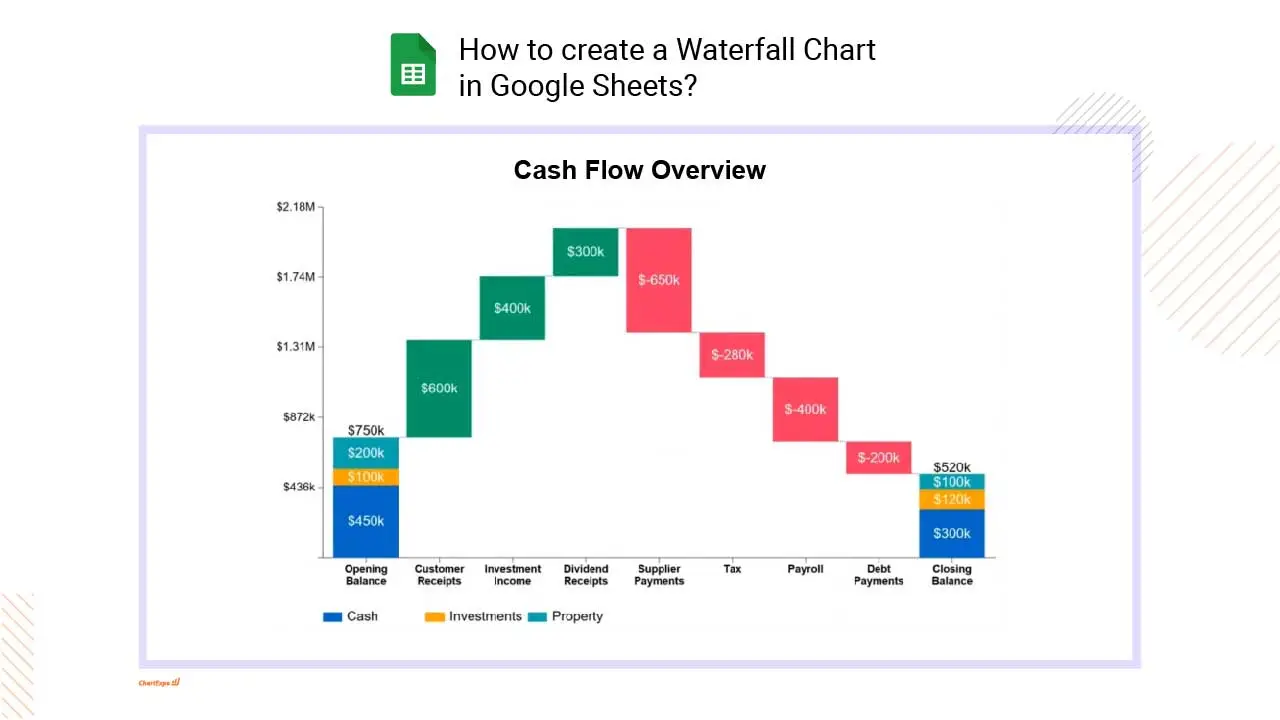
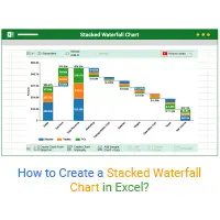
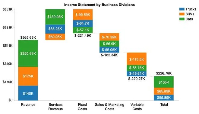
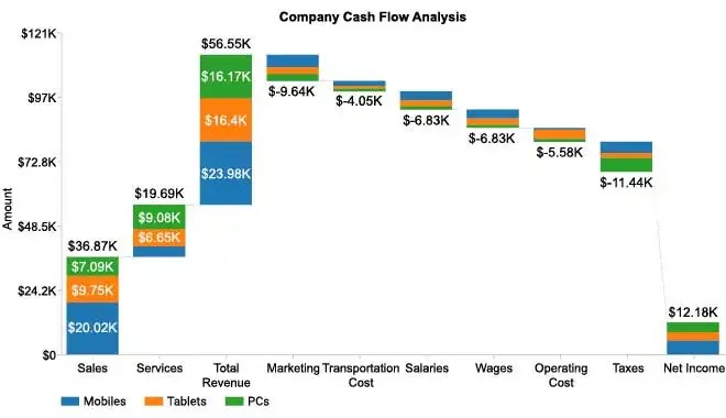
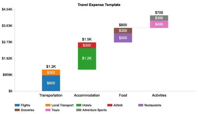
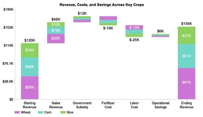
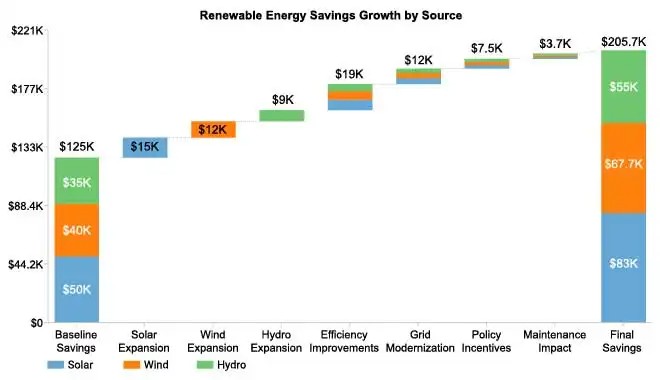
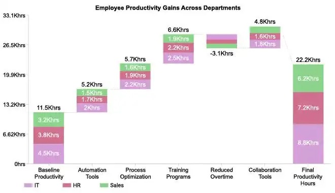
Stacked Waterfall Chart: Sometimes, your Waterfall Chart components are divided into smaller sections to give your visualization an added dimension.
For example, let’s say a chain of restaurants takes a look at the company’s total gains and losses. They look at factors like utilities across all locations, rent, staffing, etc.
With a stacked Waterfall Chart, they can take each category and divide the bars into components that show data for each location.
You’re not only seeing the most costly or rewarding components, but also the locations producing the best (or worst) results across different categories.
To finish answering ‘What is a Waterfall Chart?,’ it’s helpful to look at examples of Waterfall Charts. These Waterfall Chart examples will provide real-world context behind this visualization’s functionality and value.
Waterfall Chart Example 1: Megan is a small retail business owner. She has a limited budget and has to work hard to stretch every dollar and reinvest her revenue into expanding and growing her store.
She needs to keep an ultra-close eye on her incoming and outgoing finances. So, she creates a Waterfall Chart with stacked bars to track her money every single day and see gains and losses.
The visualization gives her the full view she needs to monitor her money and know when she can safely spend on improvements to her store.
Waterfall Chart Example 2: A large corporation headquarters realizes it is losing lots of money through training so many new employees because its turnover rates are so high.
Oscar is the director of the HR department and immediately begins working to better understand why so many employees are leaving.
He takes the company’s total staffing data, including all employees across every department. He charts both the number of leaving employees and new hires for each team using the Waterfall Graph.
This allows him to see which departments are creating the biggest problems for turnover rates. He can then explore possible reasons behind this and begin formulating a solution.
Waterfall Example 3: Mary owns a B2B software company. Her entire business model thrives on lead generation. She wants to develop a visualization that helps her achieve two goals:
The Waterfall Chart helps her secure both goals with one chart. Mary can see the progression of her overall leads and recognize which channels are producing the highest volume.
Mary can add even more value to her chart by including the conversion rates for each channel. Thus, she’ll be able to see the best sources for driving leads and conversions.
There are many ways to use a Waterfall Graph, from financial analysis to comparing results and detecting risk factors. Professionals in several fields can use this chart to extract understanding and insight from critical datasets.
This versatility means it is a chart type you can rely on for many of your analysis projects. It’s one of the best data visualization tools for understanding the factors that impact your performance results.
Discover the power of the Waterfall data visualization for yourself.
Before making a Waterfall Chart, it is a good idea to know the best times to use this visualization.
Most people will tell you that Waterfall Charts are for financial data only, but that’s not the case. You can use this visualization type any time the following criteria are met.
Your data is categorical or a variable shown over time: Waterfall Charts tend to show the impact of different factors or categories on another measure.
For instance, if you were using a Waterfall Chart to look at website traffic, you’d use different categories to represent positive and negative factors on visitors to your website.
Alternatively, you may use a single variable over time as your factor in showing how a value changes from beginning to end.
You want to display a change from a starting value to a final one: The primary purpose of a Waterfall Chart is to showcase how a number went from point A to point B.
Typically, you want to see how an amount grew or declined due to the various factors responsible for pushing and pulling the particular data you’re investigating.
In a Waterfall financial model example, your starting value is a dollar investment or account. Then, the cash flow Waterfall Chart shows you the gains and losses contributing to the end value.
You might also use a Waterfall Graph to show how employment numbers have changed from the beginning of the year to the end. This is an example of a non-financial Waterfall Chart.
You need to identify and evaluate the factors contributing to the final total: When a data value changes or progresses from one point to the next, there are likely several factors, whether negative or positive, impacting those changes and results.
Waterfall Charts are exceptional visualization tools for identifying these factors and depicting their significance. You can quickly determine the best contributors and worst detractors.
There are both positive and negative factors affecting your data value: Waterfall Charts aim to display both negative and positive factors that contribute to a value’s journey from start to finish.
If your data only has positive values or only negative ones, you can still use the Waterfall Chart. However, there are better chart types for displaying factors or only a plus or minus nature.
Many people consider Waterfall Charts to be exclusive to the financial space. As mentioned in earlier sections, this has much to do with the chart’s origins as a tool for financial consulting firms.
In finance, the Waterfall Chart is commonly known as a “Bridge Graph.” This is because the various floating bars in the middle of the visualization create a bridge-like shape between the first and last values.
You can argue that a Bridge Chart is a fitting name because the visualization “bridges” your understanding of the initial value versus the final one.
There are many reasons why the Waterfall Chart is a popular financial model.
Budgeting and cash flow Waterfall Charts: In a business setting, you must be careful with your cash flow. You only have so much money to budget for marketing, advertising, product development, distribution, etc.
The Waterfall Graph shows you the direct factors improving and hurting your cash flow. Thus, you can identify which budgets need to be increased or decreased.
Overall, it is a helpful visualization for staying on top of your money and understanding company profits.
Private equity Waterfall model: A Waterfall-like model is used when there are multiple investors involved in the same project. It dictates how to properly distribute profits from the investment based on several factors.
Waterfall real estate financial model: Real estate investors use a similar model to measure the value and profits of building projects. Homeowners may also use this model to understand buying a new property or how the value of current property assets gain and lose financial integrity.
After all, so many factors can positively or negatively impact the value of real estate, like the state of the market, physical damage or changes to the property, etc.
While Waterfall Charts may have started as financial visualization tools, it didn’t take long for the HR industry to get a hold of this data tool.
Today, many HR professionals use a Waterfall Chart model to explore employee headcounts, retention rates and other critical details.
When companies want to reduce turnover and grow their staff, a Waterfall Chart is an excellent data visualization tool for finding which teams and departments are growing in employment versus declining.
This serves two crucial objectives. First, the HR department can identify specific areas of the company that are causing disruptions in employment. Simultaneously, the team can start to learn the particular roles or fields where new talent is needed most.
The team can then investigate why certain departments have higher turnover rates than others. Is it a condition of the job itself or something happening within this specific organization that’s causing people to leave these positions in high numbers?
In situations where the latter is the case, the HR professionals can investigate, find and resolve the problem, whether it is an unruly manager, poor working conditions or another factor.
Thanks to Waterfall Charts, you always have a complete view of your human capital!
Aside from specific industries that can use Waterfall Charts, it’s important to note that this visualization is useful whenever you want to identify and compare positive versus negative influences of growth or performance.
It is common for data to ebb and flow, showing spikes and dips in other visualizations. The Waterfall Chart can further your understanding of why these events occur. In other words, you can identify and compare the factors that pull data in either direction.
This is useful in marketing, distribution, time management, strategy optimization and so on.
By comparing negative and positive growth factors, you begin to understand which items create the most substantial differences in your performance. These are the critical factors that you can’t ignore because they pose too much potential gain or loss for your results.
Comparing these values is vital to understanding how to spend your time and which actions to take to generate the best results. If you know that one item produces substantial loss, you want to spend your time resolving that item to mitigate the losses as much as possible.
Remember, these factors are likely going to change depending on certain conditions. Thus, Waterfall Charts become handy tools to rely on to continuously stay on top of your most significant growth contributors and detractors.
The most valuable insights are the ones that help you minimize risks and losses, while simultaneously maximizing value and gains.
The Waterfall Chart effectively shows you factors that impact your results over time, allowing you to focus on the details that matter most.
Waterfall Graphs help you see the pictures behind the numbers even when your dataset is large and complex.
Explore all of the advantages of charting data with the Waterfall Graph
We create charts to help us better understand the meaning behind complicated figures and numbers. It’s much easier to process and comprehend visuals than raw data.
To put some figures behind this claim, Science tells us that visuals are 60,000 times more effective than raw text or numbers. That’s a massive difference!
The best visualizations are the ones that solve complex data through simple visuals. This is when you have that “Aha” moment in data analysis. It’s the point where everything becomes clear.
Waterfall Charts certainly have this quality, especially regarding complex figures and factors contributing to the loss or gain of your results.
When you look at a Waterfall diagram and begin your Waterfall analysis in Excel, Google Sheets, etc., several vital points jump off the page.
Comparing the start to the finish: One of the first objectives of any Waterfall Graph is to show a starting value versus an end one. You can immediately draw effective comparisons between where the data was to where it is now.
These insights allow you to see how rapid and effective your growth between the two points has been, allowing you to forecast future numbers and plan ahead.
Seeing growth and loss factors: The floating bars in the middle of the visualization are the second significant component in how to use a Waterfall Chart. They represent the factors, whether good or bad, impacting the data change from beginning to end.
These bar chunks or floating bars allow data users to better understand the conditions that push or pull data in either direction. You can determine the best sources of growth and worst cases of loss.
Not only do these insights help you understand your data, but they also enable you to make smarter and more optimized decisions.
Waterfall Charts are excellent visual analysis tools for showing the journey of your data. These diagrams show an initial value and its path towards a final result or second stage.
Usually, the middle parts of the Waterfall visualization show categorical factors to the progression of the data from start to finish. However, you can also use the floating bricks to show individual points in time.
For example, let’s say you wanted to pay closer attention to your household finances to see how your money behaves throughout the month.
Instead of using individual sources of spending, you could visualize your Waterfall Chart to show each day depicted by its own floating bar element.
Thus, you can see which days your money is coming in and which days you’re spending dramatically. You can use this intel to better plan your cash flow for future periods.
There are several advantages to showing changes in data over time.
When you look at data over time, patterns and recurring trends appear that you may not have noticed before. Recognizing these routine events (and their impact on your results) helps you predict shifts in performance.
Moreover, visualizing data over time helps you track results and understand when it is an appropriate time to intervene. Your data will decline at times; it doesn’t always mean you need to swoop in and correct the problem.
When you track changes over time, it is much easier to differentiate regular dips from ones requiring your attention and intervention.
When you have many factors contributing to your data, the Waterfall Chart is superb at helping you evaluate which of those conditions are the most crucial.
In large datasets, you may have several items acting all at once. It isn’t always clear what the most prominent opportunities or risks are. Yet, these are the most vital components to identify.
In the Waterfall Chart, you can look at the suspended bars in the middle of the visualization to identify the most crucial details worth focusing on.
The size of the floating bars dictates the significance of each factor. For instance, a substantial gain in results would be a more extensive bar than a minor increase.
The same concept is true for your losses, especially if you’re looking at a Waterfall Chart with negative values.
When you look at a Waterfall Chart, your eyes will immediately recognize the most sizable floating bars in the visualization. This helps you zoom in on the factors that are creating the biggest changes in your results.
You’ll be able to swiftly identify your most successful contributing factors, while also spotting areas of substantial loss.
This insight tells you how to prioritize your time to focus on the most critical details.
Recognizing the ups and downs contributing to the progress of your data results in incredibly actionable intelligence.
Once you know the most significant factors behind your gains and losses, you can start taking immediate steps to amplify your gains and mitigate future losses.
This is the core of optimization and data management. You need to effectively know when and how to improve performance through positive changes, while also avoiding problems by resolving potential risks.
Speed is an asset in this endeavor. The faster you act on your data, the better the results. After all, data is constantly changing. You may notice a new trend in your Waterfall Chart or see a shift in your most considerable revenue sources. Acting quickly guarantees the most value from this occurrence.
Agility is even more crucial when it comes to adverse factors. The longer you wait to resolve an issue, the bigger the problem becomes. It’s much easier to fix a small leak than to stop a flood.
Thanks to your Waterfall Chart, you always have a next step and know the best ways to spend your time. You can focus on mitigating risks and losses that would cause your performance to decrease.
When there are no more issues to resolve, you can start looking at the most promising opportunities in your data and amplifying their success.
Before you can capitalize on any of this visualization’s powerful benefits, you need to know how to create a Waterfall Chart.
While it is possible to make a Waterfall Chart in Excel, it’s not the most effective method. The charting interfaces of Excel and Google Sheets are often tricky to navigate and require multiple steps.
If you want the most effective, straightforward method of making a Waterfall Chart in Excel, Google Sheets and other platforms, then you need ChartExpo.
One of the worst mistakes you can make when visualizing data is creating charts without a purpose or intention behind the work.
Some data users create charts for the sake of making them, meaning they have no goal behind their visualization efforts. They may just be testing data that seems interesting. Unfortunately, this leads to insights that are irrelevant and not actionable.
The best way to start any chart is to ask a question. This query will give your Waterfall Chart (or any other visualization) a clear intention and purpose.
Your analysis question should support your organization’s overarching goals. In other words, it must directly provide value and understanding to your teams that help them to complete key objectives.
Having this goal provides several significant advantages that ensure an efficient analysis process. These benefits include:
Gathering the proper data: When you have a clear goal in mind, you know the exact Waterfall data you need and which information to ignore. This is incredibly useful and leads to more efficient charting and analysis.
Selecting the correct chart type: Similarly, having an analysis goal can help you choose which chart type to use. You’ll be able to understand what you need to answer the question and select a chart type that fits best.
Staying on task during the analysis process: It’s easy to get misguided or distracted by new and exciting information during analysis. If you have a clear objective, you’ll be less distracted and able to finish answering one question before moving on to the next.
Returning to an analysis or adding someone new: There may be instances where you’re returning to an analysis or someone new joins. With a recorded goal, you know exactly what the analysis’ purpose is and can dive into the work immediately. You don’t have to spend valuable time trying to remember or figure out the project’s intent.
Since Waterfall Charts often visualize data from several sources, there are some preliminary steps you must take to prepare the information for charting.
Essentially, you need to structure each dataset so it can properly “talk” to the others. This is a multistep process where you correct inconsistencies and other issues that can occur when joining these sets.
This process includes the following steps:
Removing errors: Whether you’re joining multiple datasets or not, you must, must, must check for errors. Errors in your data lead to inaccuracies in your charts. The results can be devastating when you make decisions based on mistakes or flawed data.
You should commit ample time to reviewing and triple-checking your data for errors and removing any you find.
Checking for duplicates: You may have more than one tool or system tracking the same data. When you merge these sources, you want to ensure you’re not double-counting duplicate information.
For example, your website analytics tool and Google Ads dashboard both show you have 100 conversions. You want to remove the duplicate values so you don’t accidentally assume you have 200 conversions.
Converting units: Sometimes, you may investigate data spread across different sources that use other units of measure for the same values.
For instance, you may be analyzing sales data in dollars and euros. It’s crucial to choose one unit of measure and convert values to that single unit.
Merging labels: Similar to units of measure, you may have sources that use different titles for the same metric. One source may use “impressions,” while another labels it as “ad views.”
These two labels mean the same data and must be joined under one universal label.
After resolving these inconsistencies, take one final look through your dataset as a last check for errors.
Despite their many obvious advantages, Waterfall Graphs aren’t a highly popularized chart type. This means they aren’t commonly a native visualization choice in tools like Excel.
Thus, to learn how to make a Waterfall Chart in Excel, you need an outside tool, like ChartExpo, to use this graph with your Waterfall data.
Using ChartExpo to create a Waterfall Graph in Excel is incredibly easy and straightforward. There’s an easy process to follow. Your first step is to download the ChartExpo Excel chart maker.
To do this, you need to access the Microsoft AppSource site. Enter “ChartExpo” into the search bar and you’ll find the tool immediately.
After following the instructions to download ChartExpo, you can access the data visualization software through the “Insert” menu from the top toolbar. You’ll then select either the “My Apps” or “Add-ins” submenu, depending on your version of Excel.
If you don’t see these options, you may need to go to “File” and then “Manage” to find your add-ins. Again, it will depend on your Excel version.
Opening ChartExpo will show you a top view of the visualization library. Here you can enter “Waterfall Chart” into the search bar to find the Excel Waterfall Chart template.
After selecting it, you’ll need to grab your data for your Waterfall Plot in Excel. You can begin building a Waterfall Chart in Excel by clicking and dragging to highlight the data you want to use.
If you’re creating an Excel Waterfall Chart with multiple series of data, you may want to input the information manually. This will ensure greater accuracy from your Waterfall in Excel.
Hit the “Create Chart” button once you’re satisfied with your selections for the Waterfall Chart Excel template. Your new Waterfall visualization appears immediately.
You can make minor edits to the Waterfall in Excel, or save it to show in emails, reports and presentations.
Now that we’ve covered creating Waterfall Charts in Excel, let’s look at how ChartExpo helps users with how to make a Waterfall Chart in Google Sheets.
The process of using the Waterfall Excel template versus the Google Sheets one is much the same. The most significant difference is getting started and actually downloading this data visualization chart creator for Google Sheets.
While you’re viewing a Google Sheets page, click on “Extensions” from the top toolbar. From the resulting submenu, hover over “Add-ons” and select “Get add-ons.”
These steps will open the Google Workspace Marketplace, a site for downloading extensions, add-ons and other tools for Google’s suite of programs.
After you download ChartExpo for Google Sheets, you’ll find it through this same process (“Extensions” followed by “Add-ons”). Opening the tool starts the same process in Excel.
You’ll start creating a Waterfall Chart in Google Sheets by choosing the respective chart type. You can enter “Waterfall Chart” by name to find it faster.
Next, you need to add data to your Google Sheets Waterfall Chart. For a simple Waterfall bar chart, you can simply highlight the information you want to visualize.
When it is a more advanced Waterfall Chart Google Sheets template, you should manually input the data values.
After you create any Waterfall Chart examples, it is crucial to review your visualizations and save your work.
You can save every Waterfall in Excel or Google Sheets as either a PDF or image file, making it exceptionally easy to include charts in all forms of communication.
With ChartExpo, you can transform complex data into compelling, professional charts in only three clicks. This means you waste no time during chart creation and get straight to visual analysis and discovering insights.
ChartExpo also makes charting more accessible, giving everyone on your teams the chance to visually interact with their data.
Watch how easy it is to create a Waterfall Chart and other visualizations with ChartExpo.
When you install ChartExpo, you’re not just downloading a Waterfall Chart creator. You’re actually getting a complete library of charting options to fulfill your data visualization needs.
ChartExpo more than doubles the number of charting options compared to tools like Excel or Google Sheets.
With so many options, you always have the right chart type for your data. You’ll never have to go looking for another charting tool again.
ChartExpo’s team is constantly looking at the latest data trends and finding new ways to assist users with innovative visualization options.
Having so many charting options will even increase the number of insights you extract from your datasets.
Rarely is there just one chart that fits your data. It’s more likely to have several ways to display your data, each with its own advantages and disadvantages.
Using a chart gallery as large as ChartExpo’s means you always have multiple options for visualizing your data. This allows you to look at the same information from every angle and get a complete understanding of the story behind the numbers.
When you pair this with ChartExpo’s straightforward interface, you can quickly view your data using a multitude of different chart types.
No insight will go unseen thanks to this charting library.
ChartExpo is one of the best data visualization tools because of its simplistic approach to making charts.
This data visualization software removes every unnecessary step from the charting process, leaving only the two core essential parts: chart type and your data.
By simplifying the process, ChartExpo allows you to transform data into compelling, professional charts in just three easy steps. You can actually create a high-quality Waterfall Graph in as little as three clicks!
After downloading ChartExpo for Excel, Google Sheets, etc., your first click is to select a particular chart type. Remember, ChartExpo includes many new visualization options you’ll want to explore!
Next, you’ll click and drag to highlight the parts of your dataset you wish to visualize. If you’re working with complex tables, you may have to resort to the longer approach of inputting these values and ranges by hand.
The last and final click is to hit the “Create Chart” button to finalize your work. Your new Waterfall Chart instantly appears alongside your data.
Every advanced chart in Excel or Google Sheets can be saved and used elsewhere, like in emails, presentations or other reports.
You won’t find another data visualization tool as simple and straightforward as ChartExpo. You can’t beat professional charts made in a fraction of the time compared to other graph makers!
The most significant factor in ChartExpo’s straightforward charting system is its removal of pesky scripts and coding.
What most other Google Sheets or Excel chart makers offer are JavaScript templates that allow you to insert chart types not found in these tools.
The problem with this approach is that these tools require you to manually edit these templates with your own data and settings. You have to change the coding directly for your chart to appear the way you want.
On the other hand, ChartExpo eliminates the need to edit these scripts manually. It does all of the work for you. When you make a change in the tool’s interface, the data visualization software automatically adjusts the coding to fit your selections.
This saves you tremendous time and other headaches. No matter how proficient you may be at coding to edit these scripts, it doesn’t happen instantly.
Plus, simple mistakes, like mistypes or wrong inputs, can cause errors that prevent your chart from appearing. You may have to go back and look through the coding line by line to find the problem and resolve it.
That’s even more time added before you can even begin analyzing the chart and discovering insights.
These pesky scripts also limit the accessibility of charting. Only individuals with a background in coding can efficiently use these tools to make professional charts and graphs.
Meanwhile, ChartExpo’s intuitive, straightforward interface enables anyone to create advanced charts in Excel and Google Sheets. There is no coding or programming experience necessary.
ChartExpo’s accessible chart maker and data visualization software has a powerful and direct connection to helping organizations become more data-driven.
Data-driven decision-making means relying on facts and raw numbers as evidence to guide choices and new strategies. It’s the better alternative to the opinion-driven approach, where assumptions, gut feelings and other emotions rule decision-making.
Many organizations are pushing to become data-driven for obvious reasons. However, for a data-driven decision-making approach to be effective and practical, you need a solid culture that regularly relies upon and uses its data and metrics.
ChartExpo helps you develop this foundational culture by making charting accessible to more users. With everyone participating in the data visualization process, charting and data become common ground between departments and teams.
People begin sharing their latest insights, collaborating on analysis projects and collectively using data to plan activities. In other words, data becomes a popular theme and topic of conversation between teams and departments.
Not only does this improve internal communication, but it also reduces data silos and analysis redundancy.
This is the type of culture where data-driven decision-making happens organically and without resistance from traditional thought processes that want to rely on assumptions and opinions.
ChartExpo helps you make the change to a data-driven company.
ChartExpo Pricing
ChartExpo for
Google Sheets
$10*
per month
(no purchase necessary)
ChartExpo for Google Sheets
single-user purchase video.
ChartExpo for Google Sheets
domain-users purchase video.
ChartExpo for Google Sheets
single-user installation video.
ChartExpo for Google Sheets
admin installation video.
ChartExpo for
Microsoft Excel
$10*
per month
(no purchase necessary)
ChartExpo for Excel single-user
purchase video.
ChartExpo for Excel domain-users purchase video.
ChartExpo for Excel single-user
installation video.
ChartExpo for Excel admin
installation video.
Custom Pricing