Categories
Extracting reliable and actionable insights into qualitative data, such as keywords, is complex and challenging, especially if you’re starting out.


You can easily get overwhelmed.
You need a tool that can pore through the qualitative data for low-hanging insights. Going manual is not an option.
This is where text visualization charts come in.
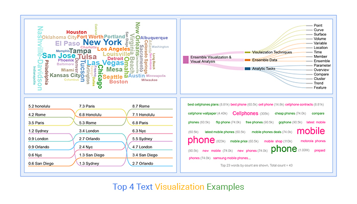
The charts use simple text analysis to help you visualize and summarize qualitative data, such as customer feedback and search terms. Below are some of the text visualization charts we recommend you try these:
So, how can you access the charts highlighted above?
Google Sheets lack Word and Tag Clouds, Slope, and Sankey Charts.
You don’t have to do away with Google Sheets for other expensive tools. You can supercharge it by installing third-party add-ons to access easy-to-use text visualization charts.
In this blog, you’ll learn the following:
Before diving into the main theme, we’ll address the following question: what is text visualization?
Definition: The text visualization chart is the graphical representation of qualitative data frequency, such as keywords or customer feedback.
The graph gives greater prominence to words that appear more frequently in a source text. The larger the word, the higher its frequency.
You can use the chart to perform exploratory textual analysis by identifying words that frequently appear in a set of interviews, documents, or other text. Also, you can use it to communicate the most salient points or themes in the reporting stage.
Check out the uses of text visualization charts below:
Automatically highlight key terms in a series of texts, and categorize text by topic, sentiment, and more, saving hours of reading time.
With a text visualization or data visualization dashboard, you can understand text data at a glance.
Our brains process visual data 60,000 times faster than texts and numbers. Text visualization examples effectively simplify complex data and communicate ideas and concepts to team managers.
Customer feedback holds a trove of insights. Through text visualization examples, you can get an overview of the features, products, and topics that are most important to your customers.
You can easily analyze and visualize insights over time to detect fluctuations, and quickly find the root cause.
Extracting reliable insights from qualitative data sets, such as keywords, should never be an Achilles Heel for you. Keep reading because we’ll address the following question: why do we need text visualization?
You can use the chart to understand your audience’s feelings about a topic/situation. Besides, you can leverage the chart to summarize data-driven views. The chart can help you summarize the market feedback using first-hand data.
You can easily get live feedback from your audience in real-time
The chart can help audiences feel part of your data story.
The Word Cloud is incredibly engaging and visually appealing to many audiences. The chart can be an icebreaker or an entry point for a topic of discussion.
Our brains process visual content 60,000 times faster than texts and numbers. This provides a logical rationale for using the Word Cloud generator to analyze your textual data for actionable insights.
Generating text visualization examples is easy to follow. Yes, you read that right. Besides, the chart can provide you with insights into large data sets.
In the coming section, we’ll cover the following: text data visualization examples.
Word Clouds are charts that display insights into qualitative data frequency.

The visualization design gives greater prominence to words that appear more frequently in a source text. The larger the word, the higher its frequency. You can use the chart (one of the text visualization examples) to perform exploratory textual analysis by identifying words that frequently appear in a set of interviews, documents, or other text.
Also, you can use it to communicate the most salient points or themes in your data stories.


Tag clouds or text clouds are ideal if your goal is to pull out the most pertinent parts of textual data, from blog posts to databases.
You can use the tag cloud as a text visualization tool to compare and contrast two different pieces of text for similarities and differences.
Slope Charts show transitions, changes over time, absolute values, and even rankings. Besides, they’re also called Slope Graphs.
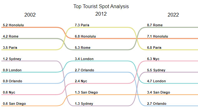
You can use this chart to show the before and after story of key variables.
Slope Graphs (one of the text visualization examples) can be useful when you have two time periods or points of comparison and want to show relative increases and decreases quickly across various categories between two data points.
The best way to explain the value of and use case for slope graphs is through a specific example.
This chart packs in a lot of information. In addition to the absolute values (the points), the lines that connect them give you the visual increase or decrease in the rate of change (via the slope or direction). This approach is a great example of information design, where each element is carefully crafted to enhance the clarity and effectiveness of the data presentation.
Note: Slope Charts require immense patience to create because you can’t find ready-made templates in most visualization tools.
Whether a slope chart will work in your data story or not depends on the nature of your data. For instance, if many lines overlap, your chart will lose effectiveness. And this is due to clutter.
However, you can overcome the above challenge to some degree by highlighting a single line category that has either increased or decreased over time.
A Sankey Diagram visualizes “a flow” from one set of values to the next. The two items being connected are referred to as “nodes.” The connections are labeled as “links”.
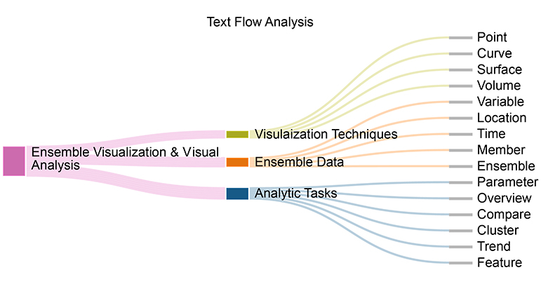
Besides, it’s named after an Irishman, Capt. Matthew Sankey first used them in a publication on the energy efficiency of a steam engine in 1898. Sankey diagrams were initially used to visualize and analyze energy flows, but they’re a great tool to depict the flow of money, time, and resources. Flows in the chart can display energy, materials, fluids, revenue, or costs.
These visualization charts make dominant contributors or consumers stand out. Keep reading because we’ll address the following in the coming section: how do you visualize text data?
Google Sheets has default charts you can use to extract answers from your data.
However, you’ll never find ready-to-use text visualization examples, such as Word Cloud Charts, for your analysis. The most viable option available for you is installing a particular third-party add-on (we’ll talk about later) to access ready-made text-based charts.
You don’t need to do away with the Google Sheets.
We recommend you try the ChartExpo add-on for Google Sheets because of the reasons listed below.
ChartExpo does not require coding or programming skills, unlike other data visualization add-ons. It has a super-friendly user interface (UI) for everyone to use.
This tool comes pre-loaded with many ready-made charts to offset the missing ones in Google Sheets. Use ChartExpo to produce text visualization examples that are incredibly easy to read and understand.
How to make text visualization examples, such as Slope Charts, should never be time-consuming. Use ChartExpo to overcome this. You’ll learn more about this cutting-edge tool in the next section.
So, what is ChartExpo?
ChartExpo comes as an add-on for Google Sheets.
Essentially, it turns your Google Sheets into a usable data visualization tool capable of delivering hidden insights into your data, irrespective of the size or complexity.
The premium Text Visualization Maker comes with a 7-day free trial period.
The key benefit of ChartExpo is the fact that it produces charts in Excel and Google Sheets that are easy to read and interpret. More so, it allows you to save charts in the world’s most recognized formats, namely PNG, PDF, and JPG.
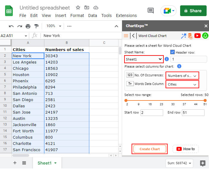
This section will use a Word Cloud Chart to display insights into the table below.
| Cities | Numbers of sales |
| New York | 30343 |
| Los Angeles | 14203 |
| Chicago | 18563 |
| Houston | 10902 |
| Phoenix | 6295 |
| Philadelphia | 8294 |
| San Antonio | 713 |
| San Diego | 2581 |
| Dallas | 2423 |
| San Jose | 24197 |
| Austin | 13235 |
| Jacksonville | 1860 |
| Fort Worth | 11977 |
| Columbus | 800 |
| Charlotte | 4121 |
| San Francisco | 41907 |
| Indianapolis | 2768 |
| Seattle | 16954 |
| Denver | 9305 |
| Washington | 670 |
| Boston | 13200 |
| El Paso | 20504 |
| Nashville-Davidson | 23383 |
| Detroit | 10108 |
| Oklahoma City | 10755 |
| Portland | 12213 |
| Las Vegas | 24755 |
| Memphis | 1539 |
| Louisville | 15800 |
| Baltimore | 4300 |
| Milwaukee | 1935 |
| Albuquerque | 8136 |
| Tucson | 20762 |
| Fresno | 3104 |
| Mesa | 18367 |
| Sacramento | 11069 |
| Atlanta | 5987 |
| Kansas City | 12998 |
| Colorado Springs | 7268 |
| Omaha | 19422 |
| Raleigh | 2066 |
| Miami | 8576 |
| Long Beach | 235 |
| Virginia Beach | 16860 |
| Oakland | 955 |
| Minneapolis | 2619 |
| Tulsa | 24412 |
| Tampa | 21184 |
| Arlington | 8846 |
| New Orleans | 16273 |
To Get Started with the text visualization examples, such as Word Cloud Chart, install the ChartExpo add-on for Google Sheets from the link and then follow the simple and easy steps below.


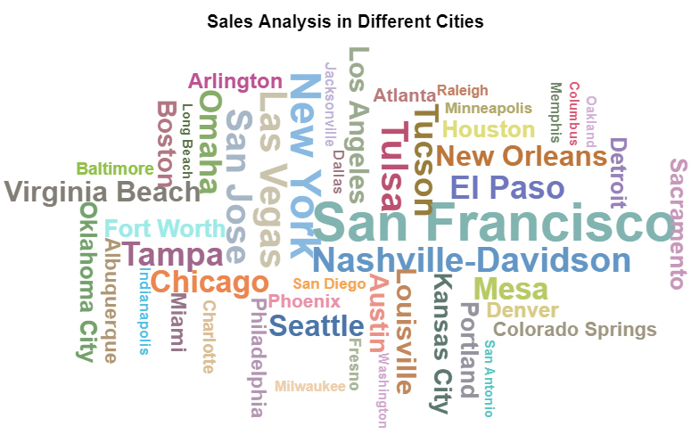
The most prominent keywords are:
In the coming section, we will show you how to create a Word Cloud in Excel.
In the following video, you will learn how to Create a Word Cloud in Excel.
In the coming section, we’ll address the following: what is the importance of visualization?
The different types of charts for representing data we’ll talk about can improve productivity and efficiency in the workplace. In other words, you can leverage data to predict risks, such as declining productivity.
Charts and graphs can help you track productivity metrics in real time. With a solid business analytics strategy, you can easily point out gaps and improvement areas in your workplace or business.
Today’s market craves products and services that can meet their individual needs.
One of the benefits of text visualization charts is that they can help you keep track of your target market’s tastes, preferences, and needs. You can leverage data from various attributions, such as social media and websites, to create a reliable persona for the market.
Most companies are still betting on intuition rather than facts and data.
One of the key reasons for this could be a lack of access to quality data to back up decision-making processes. Text visualization examples can help you distill signals from noise in your raw data. This can save massive amounts of time.
Imagine the competitive advantage you would enjoy by relying on data to make strategic decisions.

We use graphs, such as Word Cloud Text, to display qualitative data frequency, such as customer feedback during text analysis. The charts give greater prominence to words that appear more frequently in a source text.
You can use the chart to perform exploratory textual analysis by identifying words that frequently appear in texts.
Texts are added to charts and graphs to guide the audience and provide context. Headlines, legends, and other labels provide extra information about the graph.
Headlines provide context which the audience can use to interpret data. X and y-axes offer extra information, such as measurements used.
Extracting reliable and actionable insights into qualitative data, such as keywords, is easier said than done.
You can easily get overwhelmed, especially if the data is complex and bulky. You need a tool that can pore through the qualitative data for low-hanging insights.
This is where text visualization examples, such as Word Cloud, come in.
The charts use simple text analysis to help you visualize and summarize qualitative data, such as customer feedback and search terms. Some of the text visualization charts we recommend you try these:
So how can you access the charts highlighted above?
Google Sheets lacks text visualization examples, such as Word and Tag Clouds. You don’t have to do away with Google Sheets for other expensive tools.
So, what’s the solution?
Download and install third-party apps, such as ChartExpo, to access ready-to-go text visualization examples, such as the Word Cloud Chart.
ChartExpo is an easy-to-use application you can easily download and install in your Google Sheets app. Besides, this tool comes loaded with insightful and ready-made text visualization designs. You don’t need programming or coding skills to visualize your data using ChartExpo.
Sign up for a 7-day free trial today to access easy-to-interpret and visual text visualization charts.
How much did you enjoy this article?


SUMPRODUCT in Google Sheets handles multi-condition calculations without extra columns. Master its syntax, uses, and errors. Read on!

An annual budget template in Google Sheets organizes your yearly finances, tracks every dollar, and reveals spending patterns. Read on!

Learn the best graph to show profit and loss with practical examples and use cases. Discover how to visualize your business data, track trends, and make smarter financial decisions.


