Categories
By ChartExpo Content Team
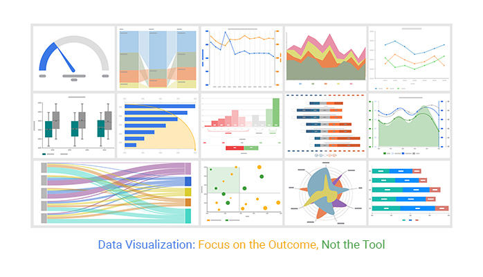
Data visualization fails when it tries to impress instead of inform.
Charts that don’t push decisions waste time. They sit in reports. They get passed around. No one acts. That’s the real problem.


The mistake? Starting with the data, not the decision. Data visualization should begin with a clear outcome. What needs to change? What needs action? Without those answers, visuals are noise.
Data visualization isn’t about colors or shapes. It’s about behavior. Will someone do something after seeing it? If not, the visual failed.
Want better charts? Start with the action you need. Build backward from the outcome. Focus every visual on one job: pushing a decision forward. Data visualization done right earns its place in the spotlight. Always.
Decisions first, data second. It’s easy to get lost in numbers and graphs. But if you’re not starting with a decision, you’re putting the cart before the horse. The decision is the destination. Data is just the fuel to get there. So, ask yourself: What decision needs to be made? Once you know that, you can figure out what data you need to support it.
Think of it like building a house. You wouldn’t start by buying random materials. You’d start with a blueprint. The same goes for data visualization. Start with the decision. Then find the data that will help you build the path to that decision.
| Data Visualization Types and Their Decision Roles | ||
| Chart Type | Best Used For | Example Decision Scenario |
| Area Chart | Visualizing cumulative trends | What is the total revenue contribution over time? |
| Bar Chart | Comparing categorical data | Which department had the highest cost this quarter? |
| Box Plot | Identifying outliers and variation | What’s the distribution of delivery times by region? |
| Clustered Stacked Bar Chart | Scheduling project timelines | What is the project timeline and task dependencies? |
| Column Chart | Tracking performance across periods | Are monthly sales improving or declining? |
| Comparison Bar Chart | Comparing performance to the target | How close are we to hitting the quarterly sales target? |
| Funnel Chart | Tracking step-wise conversion or drop-off | Where are users abandoning the sign-up flow? |
| Heat Map | Identifying density or intensity | Which regions show the highest support call volumes? |
| Histogram | Understanding frequency distributions | How are response times distributed? |
| Multi Axis Line Chart | Identifying time-based trends | How has user engagement changed over the year? |
| Sankey Diagram | Showing proportions (a few categories only) | What percentage of revenue comes from each region? |
| Scatter Plot | Visualizing correlation or spread | Is there a relationship between hours worked and output? |
| Sunburst Chart | Similar to a pie but with a central space | How do customer segments contribute to total churn? |
| Waterfall Chart | Explaining the cumulative effect of sequential values | What factors contributed to profit changes? |
Why show something that doesn’t lead to action? If a visualization doesn’t prompt action, it’s like a fire alarm that doesn’t make a sound. It’s pointless. Every visualization — whether it’s a Waterfall Chart or any other type — should be a call to action. If it doesn’t encourage a response, it’s not worth displaying.
Think of your audience as drivers on a road trip. Your visualization is the sign pointing them in the right direction. If they see the sign and keep driving without turning, the sign has failed. Make sure every visualization has a clear path to action.
Visualizations need to earn their keep. If it doesn’t have a job, it doesn’t belong. Each one should answer a question or solve a problem. If it can’t do either, it’s time to let it go. It’s like having an employee who doesn’t contribute. You wouldn’t keep them around, would you?
Imagine a toolbox filled with broken tools. That’s what a collection of aimless visualizations is. Each tool should have a purpose. If it doesn’t, it’s clutter. Keep only what helps get the job done.
| Business Pressures Mapped to Data Visualization Tactics | ||
| Business Trigger | Strategic Focus | Suggested Visualization Tactics |
| Cost | Expose cost centers and inefficiencies | Clustered Stacked Bar Chart, Waterfall Chart, Heat Map |
| Risk | Highlight anomalies or leading indicators | Multi Axis Line Chart, Bullet Variant, Control Chart |
| Retention | Visualize engagement or dropout trends | Sankey Diagram, Funnel Chart, Cohort Analysis |
| Growth | Track and forecast opportunities | Multi Axis Line Chart, KPI Dashboard, Sunburst Chart |
| Cost | Compare the before and after cost impact | Comparison Bar Chart, Timeline Trend Chart |
| Risk | Map risk clusters or exposure zones | Heat Map, Risk Matrix Visual, Pareto Chart |
| Retention | Segment by behavior or feedback | Sentiment Line Chart, Survey Response Dashboard |
| Growth | Drill into high-performing segments | Sunburst Chart, Contribution Analysis Bar Chart |
Every chart should have a purpose. It should connect to a business trigger like cost, risk, retention, or growth. This link makes the data relevant. For example, a bar chart might show customer churn. This ties directly to retention efforts, helping teams focus on keeping clients.
Consider a line graph tracking monthly sales growth. It’s not just numbers. It’s a visual representation of business health. A dip in the line signals a need for change. The chart becomes a guide for boosting growth, not just a display of past performance.
Start with the desired outcome and work backward. What decision needs support? Identify the action that will lead to this result. Then, create a visual that highlights this path. Think of it as reverse engineering a solution. This ensures the visualization serves a clear purpose, often reinforced through structured reporting like healthcare dashboard examples that connect data directly to decisions.
Imagine a company wants to reduce costs. The outcome is clear: spend less. The action might be cutting unnecessary travel expenses. A heat map showing high-cost travel destinations becomes the visual. This approach keeps the focus on action, ensuring the data isn’t just decorative.
| Outcome-to-Action-to-Data Visualization Framework | ||
| Desired Outcome | Recommended Action | Visualization Type |
| Improve customer retention | Identify churn patterns and segment risk | Sankey Diagram |
| Boost website conversions | Analyze user drop-off points | Funnel Chart |
| Reduce operating costs | Spot inefficiencies in resource use | Clustered Stacked Bar Chart |
| Increase cross-sell opportunities | Correlate purchase history by customer segment | Sunburst Chart |
| Enhance campaign effectiveness | Compare channel performance over time | Multi Axis Line Chart |
| Improve team performance | Track task delays and completions | Comparison Bar Chart |
| Minimize delivery delays | Identify delay patterns across regions | Heat Map |
| Identify sales bottlenecks | Compare deal stages by region | Clustered Stacked Bar Chart |
| Enhance customer experience | Analyze feedback trends | Sentiment Line Chart |
| Reduce service call volume | Identify frequent issue categories | Pareto Chart |
| Speed up executive decision-making | Summarize key KPIs across units | Dashboard KPI Tiles |
Visuals should prompt action, not idle curiosity. They should wake up the viewer to an immediate need. Think of a line chart showing a sharp decline in customer satisfaction. This isn’t just an interesting trend. It’s a red flag that demands attention now.
Creating urgency means highlighting what’s most important. Use bright colors to show danger zones. Make key numbers stand out. This design strategy moves the viewer to act quickly. It turns a passive glance into an urgent call to action.
A project was on the chopping block. Resources were scarce, and it seemed like a dead end. But then, a simple scatter plot told a different story. It showed a clear upward trend in customer interest, supported by insights from a correlation matrix in Excel that highlighted strong relationships in the data. The data revealed the project’s hidden potential.
This visualization changed minds. It wasn’t just data; it was a lifeline. The project got a second chance because the right information came to light. This story illustrates the power of effective visuals. They can turn around decisions and save valuable company initiatives.
Imagine you’re handing someone a postcard. They should get the gist of the message in the time it takes to read it. The same goes for data visualizations. The 7-second test is your friend here. It checks if your visualization communicates its main point in a snap. If someone needs to linger longer, it might need a bit of tweaking.
Try this: show your visualization to a friend. Ask them to explain it after a glance. If they succeed, you’ve nailed it. If not, refine it. Simplify the design, reduce clutter, and highlight key points.
Make sure the takeaway is front and center. This way, your visualization stands on its own, even if you’re not there to explain it. A frequency chart in Excel can help you test clarity by making data patterns easy to interpret at a glance.
Not all data is created equal, and neither are visualizations. Each serves a different purpose. Strategic visuals focus on long-term goals. They help leaders make big-picture decisions. Tactical visuals dive into specifics like project timelines. They assist in managing resources and tasks. Operational visuals keep the wheels turning. They show day-to-day performance metrics.
So, how do you tailor your visualization for the right context? Start by understanding your audience. What decisions are they making? Use this to guide your design. Strategic visuals might show trends with line graphs. Tactical ones could use bar charts to compare project phases. Operational visuals might employ dashboards to track daily stats. Matching the visual to the context helps decision-makers see what they need, when they need it.
| Data Visualization Fit by Strategic-Tactical-Operational Level | ||
| Decision Level | Audience | Suggested Visualizations |
| Strategic | Executives, Senior Leadership | Multi Axis Line Chart, KPI Dashboard, Sunburst Chart |
| Tactical | Department Managers, Project Leads | Clustered Stacked Bar Chart, Funnel Chart, Comparison Bar Chart |
| Operational | Analysts, Team Leads | Heat Map, Sankey Diagram, Sentiment Line Chart |
| Strategic | Board Members | Index Chart, Forecast Line Chart, Sunburst Chart |
| Tactical | Product Managers | Gantt-like Project Timeline View, KPI Trends, Funnel Chart |
| Operational | Customer Support Supervisors | Pareto Chart, Issue Volume Heat Map, Bar Chart |
| Strategic | Corporate Planners | Budget Allocation Pie Variants, Multi-Axis Trends |
| Tactical | Sales Team Managers | Conversion Step Analysis, Comparison Bar Chart, Heat Map |
| Operational | Marketing Analysts | Campaign Response Heat Maps, Keyword Funnel Chart |
A well-crafted visualization leaves no room for confusion. It answers questions before they’re asked. Think of it as a silent teacher, ready to guide without words, whether it includes trends like a sparkline in Excel or other summary visuals. Start by knowing your data inside out. What are the key takeaways? Highlight these with color, size, or placement. Simplicity reigns supreme here. Less is more when it comes to reducing clutter and distractions.
Imagine walking through a museum. Each exhibit has a plaque with clear information. Your visualization should do the same. Use labels and legends wisely. They provide context and clarity. Avoid jargon and complex terms that might trip up your audience. The goal is to create a seamless experience where the viewer leaves with a complete understanding, without needing to ask, “What does this mean?”
| Data Visualization Clarity vs. Cognitive Load Matrix | ||
| Data Density & Load | Viewer Experience | Simplification Tactic |
| Low Density, Low Load | Quick scanning and immediate insight | Use KPIs, large fonts, and simple comparisons |
| Low Density, High Load | Data is sparse, but interpretation is complex | Include guided annotations and contextual explanations |
| Medium Density, Low Load | The viewer can absorb moderate details easily | Use grouped bar charts or dashboards with clear segmentation |
| Medium Density, High Load | Moderate content but cognitively demanding | Reduce jargon, break content into visual steps |
| High Density, Low Load | An expert audience can handle complexity | Use advanced dashboards with filters and layering |
| High Density, High Load | Risk of overload and misinterpretation | Simplify visuals, chunk content, and use progressive disclosure |
Imagine turning a lengthy presentation into a single, impactful image. That’s the power of a well-thought-out visualization. It can take complex data and distill it into something digestible at a glance, sometimes using formats like a Segmented bar graph to simplify comparisons across categories. This isn’t magic. It’s about choosing the right elements to tell your story. Focus on the essence of the message. What would you communicate if you only had one minute?
Think of it as packing a suitcase for a short trip. You only take what you need. Your visualization should do the same. Remove unnecessary elements that don’t add value. Highlight the most important insights. This way, viewers get the full picture without the long explanations. It saves time and keeps the audience engaged. A well-designed visualization is a shortcut to understanding, replacing tedious walkthroughs with instant clarity.
| Design Mistakes That Undermine Data Visualization | ||
| Design Mistake | Impact | Correction Strategy |
| Too many colors or fonts | Distracts from the key message | Limit to 2–3 consistent styles for clarity |
| Overloaded with data | Overwhelms the viewer | Focus each chart on one core insight |
| Missing labels or legends | Causes confusion | Use direct labeling for readability |
| Unclear axis scaling | Leads to misinterpretation | Ensure consistent, labeled scales |
| Inappropriate chart type | Misrepresents the data | Choose a chart based on the data shape and goal |
| No clear takeaway | Leaves the viewer uncertain | Add a title or annotation that states the message |
| Jargon-heavy text | Alienates non-technical audiences | Use plain language with tooltips if needed |
| Redundant decoration | Adds noise, not value | Remove shadows, 3D effects, and background images |
| Inconsistent formatting | Reduces trust and comprehension | Standardize visuals across reports |
| Not mobile-friendly | Hard to view on small screens | Design for responsiveness or adaptive layout |
The following video will help you create a Chart in Microsoft Excel.
| Data Visualization Time Scale Guide | ||
| Time Scale | Best Used For | Suggested Visualization Types |
| Daily | Capture short-term fluctuations or campaign momentum | Heat Map, Sparkline Chart, Daily Trend Line |
| Daily | Monitor service desk volumes | Daily Volume Line Chart, Issue Heat Map |
| Daily | Identify system downtime patterns | Downtime Distribution Chart, Control Chart |
| Weekly | Track team progress and detect early shifts | Clustered Stacked Bar Chart, Funnel Chart, KPI Summary |
| Weekly | Evaluate marketing experiment performance | Funnel Chart, KPI Dash Panel |
| Weekly | Visualize customer retention weekly | Sankey Diagram, Weekly Churn Funnel |
| Monthly | Assess strategic outcomes and allocate resources | Multi Axis Line Chart, Comparison Bar Chart, Sunburst Chart |
| Monthly | Review budget spend vs. target | Waterfall Chart, KPI Trend Chart |
| Monthly | Track revenue growth vs. industry | Multi Axis Line Chart, Strategic Dashboard |
Visualizing data at different time scales can reveal unique insights. Think of daily data as capturing momentum. This is where you spot trends and fluctuations that might go unnoticed in longer time frames. A daily graph can show how a marketing campaign impacts website traffic hour by hour.
Weekly data, on the other hand, helps in understanding direction. It provides a broader view, smoothing out daily volatility to reveal more meaningful trends. This is where you see if a strategy is truly gaining traction or losing steam.
Monthly data visualizations focus on allocation. They help in assessing resource distribution and planning. Over a month, you can see how different strategies contribute to the overall goals. This perspective is crucial for making informed decisions about where to allocate resources moving forward.
Creating visuals that cater to both quick overviews and detailed analysis is key. Fast reads should highlight key metrics and trends at a glance. Use bold colors and simple shapes to direct the eye to what matters most. Avoid clutter that distracts from the main message.
For those who need a deeper understanding, offer interactive elements. Allow users to click or hover for more details. This dual-use approach caters to both casual viewers and data enthusiasts. It’s like offering two books in one: a quick guide and a comprehensive reference.
In data visualization, less is more. Visuals serve as interfaces between data and the viewer. They should convey information without unnecessary embellishments. Avoid distracting elements that don’t add value. Focus on clarity and simplicity to ensure that the message is clear.
The goal is to guide the viewer’s eye naturally through the visualization. Use consistent colors and typography to build a cohesive look. This approach makes it easier for users to understand the data and draw conclusions. Think of your visualization as a map that leads the user straight to the insights.
Aligning data visualizations with the way users work can dramatically increase engagement. If a visualization mirrors a user’s workflow, it becomes a natural extension of their process. This alignment ensures that the data is relevant and actionable.
Consider a sales team that relies on weekly reports. A visualization that highlights weekly sales figures and trends will resonate more than a monthly summary. It fits into their routine and supports their decision-making process. This alignment turns data from an abstract concept into a practical tool that supports daily work.
Picture this: You show a bar chart to a room full of executives. What happens next? Do they nod, or do they start talking strategy? Those first 10 seconds matter. Your visual should trigger a response. It’s like a movie trailer. It needs to grab attention and make you want more. If people stare blankly, something’s wrong. Your graph should scream, “Do this now!”
How do you make that happen? Consider your audience. Are they decision-makers or analysts? Tailor your visuals to speak their language. Use colors and labels that are intuitive. Make it impossible to miss the point. Those 10 seconds should lead to a discussion, not a yawn. Engage them fast and keep them thinking long after.
| Data Visualization Response Timing: From Glance to Action | ||
| Time Range | Viewer Behavior | Recommended Visual Tactic |
| 0–3 seconds | Immediate recognition | Use KPI tiles, bold numbers, and traffic light colors |
| 3–7 seconds | Rapid comprehension | Use simple bar charts, annotated visuals, single insight |
| 7–15 seconds | Quick evaluation | Use dashboards with grouped metrics or mini-charts |
| 15–30 seconds | Exploration begins | Use interactive elements, highlight patterns |
| 30–60 seconds | Contextual analysis | Use multi-axis charts, comparisons, and supporting notes |
| Over 60 seconds | In-depth interpretation | Use layered dashboards, filters, and narrative support |
Think of a signal stack as a traffic light. First, you get a cue, a color change. Then, contrast grabs your attention. Finally, another cue confirms your action. In data visualization, start with a cue. Maybe it’s a big red bar showing a problem area. Next, contrast it with a small green bar. Your audience sees the difference immediately. Finish with another cue, perhaps a highlighted action point. This guides them on what to do next.
This method keeps viewers engaged. They don’t have to search for meaning. It’s right there, plain and simple. They see the cue, notice the contrast, and know exactly what to focus on. This approach reduces confusion and boosts clarity. Your audience doesn’t just see data. They see a path to follow and a story unfolding.
“Interesting” is a trap. It’s a word that means nothing gets done. When someone says a chart is interesting, ask them what they’ll do about it. Data should provoke a shift, not just a nod. If your visuals are merely interesting, they’re not doing their job. They should uncover problems, point out opportunities, and demand change. They should challenge the status quo.
How do you move beyond interesting? Focus on what needs action. Instead of highlighting a positive trend, showcase the outliers. Highlight the risk, the gap, the opportunity. Make it impossible for viewers to ignore what needs fixing. Your job is to turn passive observation into active engagement.
Every chart should face the audit test. Ask yourself: Would this visual make me change my behavior? If the answer is no, rethink it. A chart isn’t just for information. It’s a tool for transformation. Visuals should push people to act, to think differently, and to make decisions, just as insights from population pyramid types can influence planning and strategy. If they don’t, they’re not doing their job.
To audit a chart, strip it down. Remove the fluff and focus on the message. Is the key point clear? Does it lead to a natural next step? If it’s cluttered or ambiguous, fix it. A good chart is like a good book. It leaves you with a sense of direction. Make sure your visuals guide the viewer to the right conclusion and the right action.
| Data Visualization Audit Checklist | |
| Audit Question | Improvement Tip |
| Is the visualization understood in 7 seconds? | Simplify the layout, highlight the key point |
| Does it lead to a specific decision or action? | Add annotations or direct labels to guide action |
| Is there unnecessary visual clutter? | Remove extra shapes, borders, or colors |
| Does it match the intended audience? | Adjust detail level, language, and chart type |
| Is it aligned with a business pressure (cost, risk, growth, retention)? | Refocus content on the most urgent metric |
| Are key values and trends visible? | Use contrast and emphasis to surface signals |
| Does it include relevant benchmarks or context? | Add comparative data or trend lines |
| Is the chart visually balanced and not misleading? | Ensure proper scaling and axis integrity |
| Would someone act differently after seeing it? | Reframe data to focus on the behavior trigger |
| Is the legend or labeling intuitive and complete? | Use direct labeling or simplify the legend structure |
Not all data needs the same treatment. Reporting and escalation serve different purposes. Imagine reading a book versus watching a movie. One is a slow journey; the other is a rollercoaster. Regular reports are like a book. They offer a steady stream of information. It’s about tracking progress and understanding patterns.
Escalation-grade visuals, though, are the movie. They’re fast-paced, urgent, and action-packed. They aren’t for routine updates. They’re for when something demands immediate attention. It’s vital to know when to switch gears. Use reports for regular insights. But when the storm hits, escalate with visuals that cut through the noise.
| Data Visualization Use Cases Requiring Escalation Design | ||
| Scenario | Escalation Purpose | Escalation Visual Design |
| Sudden drop in revenue | Trigger immediate review | Use a Multi-Axis Line Chart with annotations and threshold markers |
| Spike in customer churn | Activate the retention team | Use a Funnel Chart showing critical funnel exit points |
| Security breach alert | Initiate incident response | Use Heat Map and alert overlays for affected systems |
| Operational system failure | Escalate to IT support | Use Red Alert Dashboard or Control Charts with spike detection |
| Negative press or social sentiment | Alert the communications team | Use Real-Time Sentiment Line Chart with flags |
| Budget overrun detected | Freeze discretionary spending | Use a Waterfall Chart showing budget variance escalation |
| Regulatory compliance failure | Notify risk and compliance heads | Use a Bullet Comparison Chart with failure bands |
| Employee safety incident | Escalate to HR and legal | Use Visual Log Tracker with time stamps and red flags |
| Supplier disruption | Alert procurement and logistics | Use Supply Chain Flow Chart with impact highlights |
Spike charts can be tricky. They show sudden increases or decreases. But not every spike means danger. Sometimes, it’s just a blip on the radar. This is where the false panic filter comes in. It helps separate real concerns from noise. Imagine seeing a spike in sales. It might look good, but is it sustainable? Or is it just a seasonal boost?
This filter works like a detective. It examines spikes, asks questions, and seeks context. It digs deeper to understand why a change happened. This approach prevents knee-jerk reactions. It helps teams focus on genuine issues, not temporary fluctuations. With the false panic filter, decisions are informed, not impulsive.
Data without action is like a car without fuel. It might look good, but it won’t get you anywhere. This is where escalation-grade visuals shine. They don’t just highlight problems. They suggest the next steps. Think of them as a GPS for decision-making. They guide teams toward solutions.
These visuals answer the question, “What’s next?” They provide actionable insights. They highlight areas needing immediate attention. They suggest changes that can make a difference. This turns data into a powerful tool for change. It’s not about just seeing the problem. It’s about knowing how to fix it.
| Common Failures in Data Visualization and How to Prevent Them | ||
| Failure Mode | Resulting Issue | Prevention Strategy |
| Ambiguous message | No clear insight or next step | Add title and annotation with action or finding |
| Excessive complexity | Viewers get overwhelmed or confused | Simplify the layout and remove non-essential elements |
| No behavior change | Data doesn’t prompt action | Refocus on the decision trigger and urgency |
| Visual distortion | Misrepresents values or trends | Use proportional axes and avoid 3D effects |
| Irrelevant data | Distracts from core insight | Filter for only decision-relevant dimensions |
| Low contrast | Important values go unnoticed | Use strong visual contrast for key metrics |
| Disconnected from the workflow | Ignored by users | Align format and cadence to team usage patterns |
| Inconsistent format | Delays in understanding or trust | Standardize across visuals and teams |
| No comparative reference | Viewers lack context | Add benchmarks, targets, or time trends |
| Hard to scan quickly | Fails the 7-second test | Use visual hierarchy and minimize clutter |
When the stakes are high, structure is your best friend. Imagine your data visualization as a well-layered cake. The base layer holds the core data. It’s the foundation of your story. The second layer provides context. It adds depth without overwhelming the viewer. The top layer highlights the key takeaway. It’s the cherry on top that leaves a lasting impression.
Dividing data into manageable chunks helps, too. Seven is a magical number in this context. It’s the sweet spot where the mind can easily process information. Each chunk should convey a single idea. This keeps the viewer focused and engaged, leading them smoothly to the desired conclusion.
| Data Visualization Layers for High-Stakes Communication | ||
| Layer Name | Purpose | Design Application |
| Core Data Layer | Foundation of raw, accurate data | Include validated metrics and key variables only |
| Context Layer | Gives meaning and orientation | Add benchmarks, trend lines, comparisons, or targets |
| Highlight Layer | Directs viewer attention | Use color, annotation, or movement to emphasize insight |
| Action Layer | Suggests or signals next steps | Include callout boxes or visual prompts for action |
| Narrative Layer | Explains relevance and timing | Add headlines or embedded text summarizing the story |
| Urgency Layer | Indicates time sensitivity | Use temporal cues like countdowns or sharp contrasts |
| Trust Layer | Reinforces credibility and consistency | Apply branded templates, cited sources, or standards |
Interpretive overhead is like static on a radio. It distracts from the message. To eliminate it, be ruthless with your design. Remove anything that doesn’t directly support your message. Unnecessary legends, extra shapes, and fancy effects add noise. Stick to the essentials.
Simplicity is key. Use direct labels instead of complex legends. This way, readers don’t have to pause to interpret. The goal is a seamless experience where the message flows effortlessly to the audience. The clearer the path, the stronger the impact.
Data doesn’t exist in a vacuum. Presenting it without context is like showing a photo without a caption. Adding context helps prevent misinterpretation. Provide background information that frames the data properly. This includes historical trends or benchmarks that offer perspective.
Context helps in debiasing the narrative. It prevents the audience from jumping to conclusions based on incomplete information. A well-grounded narrative guides the viewer to a more accurate understanding. This approach builds trust and credibility in your visualizations.
Imagine a company showing steady sales over a year. Looks fine, right? But add another layer showing the industry average growing faster, and the story changes. This visualization contrasts flat growth with hidden losses. It reveals a need for strategic shifts.
This approach can be a wake-up call. It prompts decision-makers to rethink their strategies. It’s not just about what the data shows, but what it implies. By framing the data against broader trends, the visualization provides insights that drive action.
When it comes to making decisions, different levels need different kinds of information. At the strategic level, you’re looking for signals. These are the big-picture data points that guide the ship. They’re not about the tiny details but rather the broad strokes that indicate where to steer. Imagine spotting a lighthouse when you’re out at sea; it’s a clear signal of where to head.
Tactical decisions, however, thrive on patterns. Think of it like piecing together a puzzle. You’re not looking at each piece in isolation, but at how they fit into the larger picture. Recognizing patterns can help you predict the next move. Operational decisions, on the other hand, deal with friction. It’s about the day-to-day grind, where small issues can cause big headaches. Here, the focus is on smoothing out processes and resolving immediate problems.
In a world overflowing with data, it’s easy to get lost in numbers. But what matters most isn’t always what’s easily counted. Think about your priorities. What are the goals that truly drive your mission? Focus on those, even if they don’t come with neat metrics.
Consider a chef in a bustling kitchen. The number of dishes served might be measurable, but the satisfaction of the diners is what truly counts. Data should guide you, not dictate every move. Focus on what brings value, not just what’s easy to quantify.
Choosing the right visual for your data isn’t just about the tools you have. It’s about how well it communicates your message. Imagine telling a story. You wouldn’t use a PowerPoint slide to read a bedtime tale. The same goes for data. Pick visuals that match the conversation you’re having.
Think of a coach explaining a play to a team. A chalkboard sketch might work better than a complex diagram. The goal is to make sure everyone’s on the same page. Your visual should enhance understanding, not complicate it.
| Data Visualization Pitfalls When Tools Drive the Message | ||
| Tool-Driven Mistake | Resulting Issue | Correction Strategy |
| Defaulting to complex chart types | Confuses rather than clarifies | Start with the decision and data needed, not available templates |
| Using tool features just because they exist | Adds unnecessary clutter | Choose features that serve a specific insight |
| Forcing data into popular visuals | Distorts meaning | Let the data shape the visual, not the tool’s trends |
| Ignoring audience needs | Mismatch between format and user | Adapt the format to how and where the visual is consumed |
| Over-customization | Wastes time and reduces clarity | Use templates only if they support rapid comprehension |
| Skipping context framing | Data lacks interpretation | Add titles, captions, or benchmarks to complete the message |
| Tool-driven color schemes | Distracts or misleads | Customize colors to align with meaning or brand |
Mapping the trust chain sounds fancy, but it’s simple. Think of it as tracing how information flows in an organization. Who shares data? Why do they share it? Understanding this helps build a network of trust. When everyone knows their role, data sharing becomes smoother.
Consider it like passing a baton in a relay race. Each person knows their part. They trust the person before and after them. This trust ensures the data moves accurately and efficiently. The more you map out these roles, the more trust grows within the organization.
Reusing visuals isn’t about being lazy. It’s about establishing credibility. When you see the same visual language repeatedly, it becomes familiar. Familiarity breeds trust. People begin to associate these visuals with reliability and accuracy.
Standardizing visual language is like establishing a brand. Think of those logos you recognize instantly. They communicate consistency. Your data visuals should do the same. When everyone in the institution uses the same visual guidelines, it’s like speaking the same language. Misunderstandings decrease, and credibility increases.
Consistency doesn’t just build trust; it speeds things up. When people are familiar with visuals, they understand them quicker. It’s like reading a favorite author. You know their style, so you dive right in without hesitation.
This familiarity leads to faster buy-in. Decision-makers don’t waste time interpreting new visuals. They recognize the patterns and get to the heart of the data swiftly. In a fast-paced business world, every second counts. Consistent visuals save time and foster quicker decisions.
Imagine a world where one visual communicates everything you need. It’s not far-fetched. A powerful visual can answer questions before they even arise. It’s like a well-told story that leaves no room for doubt.
Decisions made in 45 seconds sound magical. But with the right visual, it’s possible. When a visual is clear and concise, it cuts through the noise. It delivers the message directly. The result? Decisions are made quickly and confidently, saving time and resources.
Data visualization isn’t about looking good. It’s about doing a job. Every chart should help someone make a decision, fast and with confidence.
Start with the outcome. Then build backward. What action does this chart support? What question does it answer? If it doesn’t move the needle, drop it.
Use data visualization to show what matters most. Tie each visual to a business need. Cost. Risk. Growth. Retention. Match it to the moment, not the tool.
Make it pass the seven-second test. If it needs a walkthrough, it’s too slow. Good charts explain themselves. Great ones push action.
Your charts should live where work happens. In workflows. In meetings. In decisions. Not in slides, no one reads.
Data visualization earns its place by what it changes. Not what it shows.
How much did you enjoy this article?


Calculate accounts receivable turnover ratio to measure credit collection speed, improve cash flow, and strengthen your financial strategy. Read on!

Change Management KPIs are the key to tracking adoption, performance, and ROI during transitions. Find out which metrics matter. Read on!

Data collection methods and techniques determine the quality of every insight you act on. Explore key approaches for gathering reliable data. Read on!


