Categories
Extracting actionable insights from qualitative data is not easy.
You can easily get overwhelmed, especially if the data is complex and bulky. It would help if you had a tool that can scan through the qualitative data to cherry-pick low-hanging insights.
This is where a Word Cloud Chart comes in.
The chart uses simple text analysis to help you visualize and summarize qualitative data, such as customer feedback and search terms.
So how can you access a Word Cloud Chart?
You don’t have to do away with Google Sheets for other expensive tools. You can supercharge it by installing third-party add-ons to access an easy-to-use awesome Word Cloud Chart.
In this blog, you’ll learn the following:
Definition: Qualitative data provides rich insights into human experiences. It’s a window into the intricate tapestry of thoughts, feelings, and behaviors. It’s non-numerical, focusing on meanings and contexts.
Qualitative data interpretation is subjective, considering emotions and nuances. Researchers immerse themselves in the data to identify patterns and themes. Then use the insights to inform decision-making.
Likert Scale Chart in Power BI for Qualitative Data
Likert Scale Chart in Microsoft Excel for Qualitative Data
Likert Scale Chart in Google Sheets for Qualitative Data
Qualitative data can be observed and recorded.
Besides, the data type is non-numerical, and it’s collected through methods such as observations, one-to-one interviews, and conducting focus groups. Qualitative data is categorical because it can be organized based on the attributes and properties of the data.
Utilizing data visualization tools can further enhance the analysis of qualitative data by categorizing and displaying these attributes visually, making the insights easier to interpret.
We recommend tested and proven charts, such as Tag Cloud, to display insights into qualitative data, such as keywords or search terms.
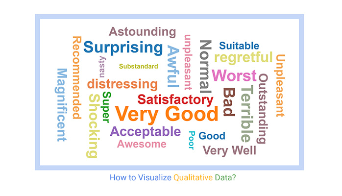
Take a look at the table below.
How easy is it to tell a reliable data story by simply looking at the chart?
| Feedback | No. of Feedback |
| Good | 247 |
| Very Good | 499 |
| Super | 303 |
| Satisfactory | 105 |
| Acceptable | 415 |
| Bad | 435 |
| Worst | 191 |
| Normal | 382 |
| Substandard | 117 |
| Poor | 195 |
| Awful | 400 |
| Terrible | 390 |
| distressing | 421 |
| regretful | 345 |
| unpleasant | 308 |
| nasty | 193 |
| Good Taste | 125 |
| Recommended | 380 |
| Outstanding | 290 |
| Satisfactory | 391 |
Note the difference after visualizing the data above. You can easily tell what’s going on. For instance, ‘satisfactory’ and ‘very good’ are widely repeated in the qualitative data.

You can use the chart to understand your audience’s feelings about a topic or situation. Besides, you can leverage qualitative-based charts, such as Word Cloud, to display insights. Most data visualization experts use the chart to summarize the market feedback using first-hand data.
You can easily get live feedback from your audience in real time.
The qualitative charts can help audiences feel part of your data story.
The qualitative data-oriented visualization designs, such as a Word Cloud, are incredibly engaging and visually appealing to a majority of the audiences. The chart can be an icebreaker or an entry point for a topic of discussion.
Our brains process visual content 60,000 times faster than texts and numbers. This provides a logical rationale for using the Word Cloud generator to analyze your textual data for actionable insights.
Charts are easy to follow and serve as effective text visualization tools. Besides, they can provide you with insights into larger qualitative data sets.
Following sources you can consider to collect qualitative data.
One-on-one interviews are commonly used in gathering qualitative data due to the personal approach.
You can easily collect data directly from respondents on a one-on-one basis. The interview may be informal and unstructured conversational. Use the Open-Ended Questionnaire spontaneously.
Focus groups are done in a group discussion setting.
The group is mostly limited to 6-10 people, and a moderator is assigned to steward the ongoing discussion.
In most focus groups, the respondents usually have something in common. For example, a researcher conducting a study on track runners will likely choose athletes who specialize in track and have sufficient knowledge of the subject matter.
This entails the use of the already existing documents as the key data source. You can use this second-hand information to inform your new research.
This method entails keeping a close eye on your research subjects for in-depth insights.
This method involves taking notes, video and audio recording, photography, and other similar methods.
It entails collecting data on the same source repeatedly over an extended period, often referred to as a longitudinal survey.
It’s a form of observational research method that goes on for a few years and, in some cases, decades. It aims to find correlations through an empirical study of subjects with common traits.
This method entails gathering data via case studies.
The versatility of this method is demonstrated by how you can easily analyze simple and complex subjects. The strength of this method lies in the combination of one or more qualitative data collection methods to draw inferences.
This approach involves identifying and analyzing recurring themes or patterns within the data. Researchers systematically code segments of text, recognizing meaningful concepts.
These codes are then grouped into overarching themes that reflect the underlying content of the data. Thematic analysis is versatile, making it suitable for various research questions and data types.
Grounded theory aims to develop theories grounded in empirical data. Researchers start without preconceived notions, allowing concepts to emerge organically from the data.
Through iterative data collection and analysis cycles, researchers create a theory that explains the observed phenomena. This approach is particularly useful for exploring social processes and interactions.
Content analysis objectively and systematically categorizes textual, visual, or audio data. It involves coding content into specific categories, revealing patterns and trends. It’s commonly used to analyze media, documents, or any form of communication to extract meaningful insights.
Narrative analysis centers on understanding the stories people tell. Researchers examine narratives’ structure, content, and context to reveal how individuals construct their experiences and identities. This approach is often employed in studying personal accounts, interviews, and life histories.
Phenomenology aims to delve into the core of firsthand experiences. Researchers immerse themselves in participants’ narratives, striving to unveil the intrinsic characteristics that shape these encounters. This method centers on grasping the participants’ realities from a subjective standpoint.
Discourse analysis examines how language and communication shape and reflect social realities. Researchers scrutinize spoken and written language, considering the power dynamics, ideologies, and cultural contexts embedded in the discourse. It’s useful for studying how language constructs social meaning and influences behavior.
The following steps should be considered when doing qualitative data analysis.
Once you have collected qualitative data, it’s essential to organize and clean it.
The first step entails arranging it systematically.
Arranging data means converting all the data into a text format. You can either export it into a spreadsheet manually or by using computer-assisted analysis tools.
Coding is one of the best ways to compress a tremendous amount of qualitative data. Besides, it entails categorizing and assigning properties and patterns of the data points.
After assigning codes, build on the patterns to extract in-depth insights into your qualitative data.
Validating data is one of the crucial steps of qualitative data analysis.
Since data is quintessential for research, it’s imperative to remove incomplete variables and other errors. Data validation is a recurring step that needs to be followed throughout the research process.
There are two dimensions to validating data:
NVivo is a leading software for qualitative data analysis. It allows users to organize, code, and visualize qualitative data such as interviews, surveys, and focus groups. With features like word clouds, cluster analysis, and mind maps, NVivo helps uncover patterns and trends in qualitative data for easier interpretation.
ChartExpo is a simple yet powerful data visualization tool that integrates with Excel and Google Sheets. While it’s widely used for quantitative data, it also provides excellent options for visualizing qualitative data, such as word clouds, sentiment charts, and other customizable visualizations. ChartExpo is easy to use, even for those without technical expertise, making it ideal for transforming qualitative insights into clear, compelling visuals.
Atlas.ti is another comprehensive tool for qualitative data analysis, offering features like coding, organizing, and visualizing data from interviews, surveys, and multimedia sources. Its visual tools, such as network diagrams and concept maps, allow users to explore relationships between different themes and concepts, enhancing the understanding of complex qualitative data.
How to visualize qualitative data should never be stressful or even time-consuming. Keep reading to discover more.
Finally, we’re in the section, where you get to learn how to visualize qualitative data in Google Sheets. You don’t want to miss this.
The add-on you need for visualizing Qualitative Data in Google Sheets is ChartExpo.
So, what is ChartExpo?
ChartExpo is an add-on you can install in Google Sheets to access visually appealing and ready-made qualitative data charts, such as a Word Cloud.
ChartExpo produces charts that are incredibly easy to interpret. Besides, it comes loaded with a lot of ready-made and visually appealing CSAT charts you’ll never find in Google Sheets.
You don’t need to learn programming or coding to use ChartExpo.
Yes, you read that right.
Benefits of ChartExpo
This section will use a Word Cloud Chart to display insights into the table below:
| Feedback | No. of Feedback |
| Good | 247 |
| Very Good | 499 |
| Super | 303 |
| Satisfactory | 105 |
| Acceptable | 415 |
| Bad | 435 |
| Worst | 191 |
| Normal | 382 |
| Substandard | 117 |
| Poor | 195 |
| Awful | 400 |
| Terrible | 390 |
| distressing | 421 |
| regretful | 345 |
| unpleasant | 308 |
| nasty | 193 |
| Good Taste | 125 |
| Recommended | 380 |
| Outstanding | 290 |
| Satisfactory | 391 |
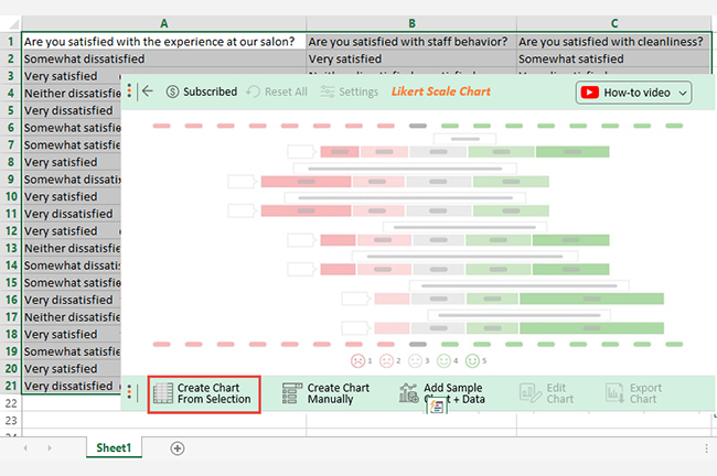
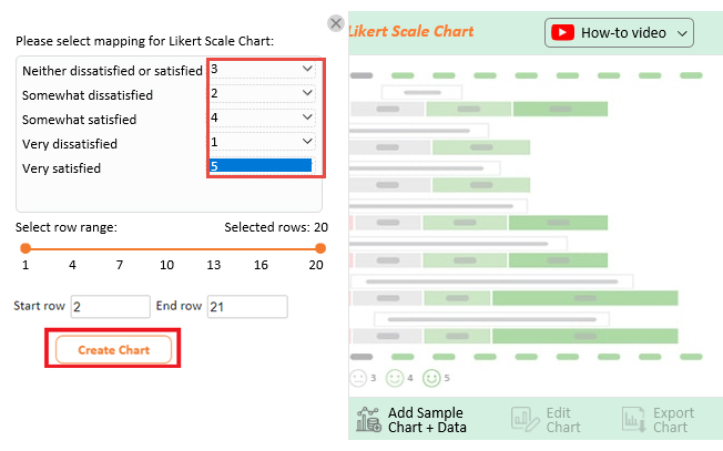
Install the ChartExpo add-on for Google Sheets by clicking this link to learn more. Then follow the simple and easy steps below.


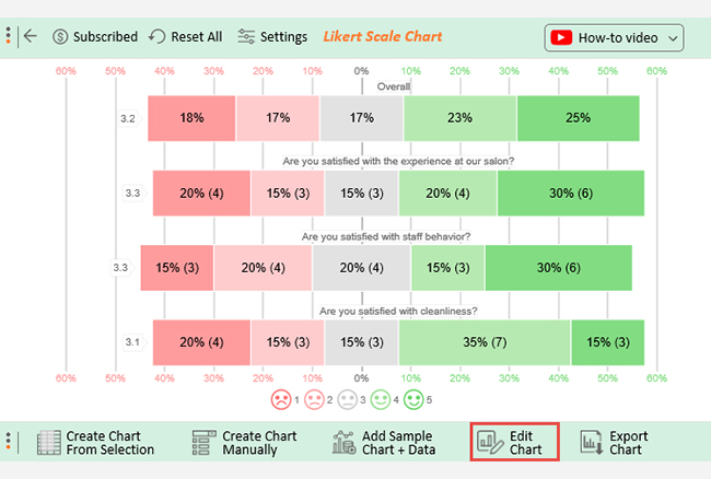
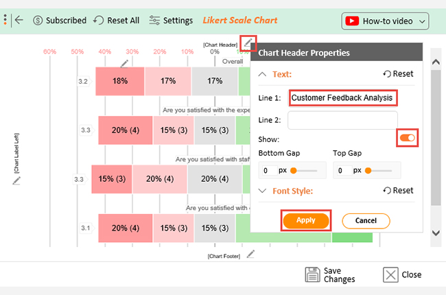
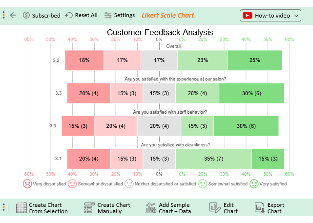
Let’s say you conduct a salon customer satisfaction survey with the following questions;
Customers respond to these questions using the Likert scale below.
Assume your survey yields the data table below.
| Are you satisfied with the experience at our salon? | Are you satisfied with staff behavior? | Are you satisfied with cleanliness? |
| Somewhat dissatisfied | Very satisfied | Somewhat satisfied |
| Very satisfied | Neither dissatisfied nor satisfied | Very dissatisfied |
| Neither dissatisfied nor satisfied | Somewhat satisfied | Somewhat dissatisfied |
| Very dissatisfied | Very dissatisfied | Neither dissatisfied nor satisfied |
| Somewhat satisfied | Neither dissatisfied nor satisfied | Very dissatisfied |
| Somewhat satisfied | Very satisfied | Very satisfied |
| Very satisfied | Very dissatisfied | Somewhat satisfied |
| Somewhat dissatisfied | Somewhat satisfied | Somewhat satisfied |
| Very satisfied | Very dissatisfied | Somewhat dissatisfied |
| Very dissatisfied | Very satisfied | Somewhat satisfied |
| Very satisfied | Neither dissatisfied nor satisfied | Neither dissatisfied nor satisfied |
| Neither dissatisfied nor satisfied | Somewhat dissatisfied | Very satisfied |
| Somewhat dissatisfied | Somewhat dissatisfied | Somewhat satisfied |
| Somewhat satisfied | Neither dissatisfied nor satisfied | Very dissatisfied |
| Very dissatisfied | Somewhat dissatisfied | Somewhat satisfied |
| Neither dissatisfied nor satisfied | Very satisfied | Very dissatisfied |
| Very satisfied | Somewhat dissatisfied | Somewhat dissatisfied |
| Somewhat satisfied | Very satisfied | Somewhat satisfied |
| Very satisfied | Very satisfied | Neither dissatisfied nor satisfied |
| Very dissatisfied | Somewhat satisfied | Very satisfied |
This table contains example data. Expect many responses and questions in real life.


You can easily highlight key terms in a series of texts, and categorize text by topic, sentiment, and more, saving hours of reading time.
With a qualitative data dashboard, you can extract high-level insights.
Our brains process visual data 60,000 times faster than texts and numbers.
Qualitative charts, such as Word Cloud, simplify complex qualitative data and communicate actionable insights to team managers.
Customer feedback holds a trove of insights.
Through a qualitative data chart, you can easily get an overview of the features, products, and topics that are most important to your customers.
You can easily analyze and visualize insights over time to detect problems and their root causes.
The tested and proven way of visualizing qualitative data is using a Word Cloud Chart.
The chart is amazingly easy to decode.
Frequent words or phrases are shown in larger, bolder fonts. On the other hand, less-frequent words or phrases are shown in a smaller font.
Our brains process visual data 60,000 times faster than texts and numbers. Qualitative charts, such as Word Cloud, simplify complex qualitative data and communicate ideas and concepts to team managers.
You can easily analyze and visualize insights over time to detect problems and their root causes.
Four common methods for analyzing qualitative data are thematic analysis, grounded theory, content analysis, and narrative analysis. These approaches involve systematic coding, categorizing, and interpreting data to uncover patterns, theories, meanings, and narrative structures.
Extracting actionable insights into qualitative data is not a walk in the park.
You can easily get overwhelmed, especially if the data is complex and bulky. It would help if you had a tool that could scan through the qualitative data to cherry-pick low-hanging insights.
This is where a Word Cloud Chart comes in.
The chart uses simple text analysis to help you visualize and summarize qualitative data, such as customer feedback and search terms.
So how can you access a Word Cloud Chart?
Google Sheets does not natively support Word Cloud Chart. You don’t have to do away with Google Sheets for other expensive tools.
To access ready-made qualitative-based charts, such as Word Cloud, we recommend you install third-party apps, such as ChartExpo, into your Google Sheets.
Essentially, ChartExpo is an add-on you can easily download and install in your Google Sheets app. More so, the tool comes with insightful and ready-to-go qualitative-oriented charts.
How to visualize qualitative data should never consume your precious time.
Sign up for a 7-day trial to enjoy unlimited access to simple and visually appealing qualitative data charts, such as a Word Cloud.
How much did you enjoy this article?


Calculate accounts receivable turnover ratio to measure credit collection speed, improve cash flow, and strengthen your financial strategy. Read on!

Change Management KPIs are the key to tracking adoption, performance, and ROI during transitions. Find out which metrics matter. Read on!

Data collection methods and techniques determine the quality of every insight you act on. Explore key approaches for gathering reliable data. Read on!


