Categories
By ChartExpo Content Team
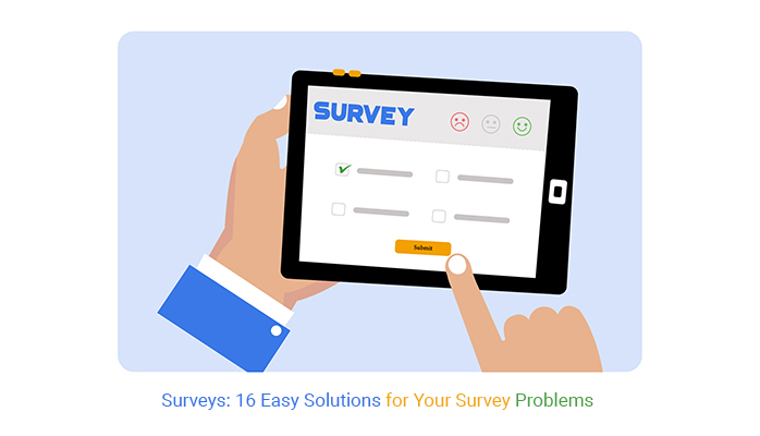
Why do surveys fail so often? Low response rates, unclear questions, or survey fatigue can all wreck your results.
Imagine sending out a survey and hearing… nothing. Or worse, getting data so off-base it feels pointless. That’s not just frustrating—it’s a missed opportunity.


Surveys should work for you, not against you. They should bring back clear, honest, and actionable feedback that helps you make smart decisions.
The good news? Fixing survey problems is easier than you think. Whether it’s keeping surveys short, adding incentives, or using fun designs, small tweaks can make a huge difference.
Think of surveys as a conversation, not an interrogation. When you respect people’s time, ask clear questions, and maybe throw in a perk or two, you’ll turn those crickets into clicks.
Ready to turn your surveys around? Let’s dive into some easy, no-nonsense fixes that can boost participation, get better data, and make your surveys something people actually want to answer.
First…
Ever noticed how quickly enthusiasm dips when you’re asked to fill out yet another survey?
That’s survey fatigue right there—when people get bombarded with too many surveys, they often start one, then give up halfway through because, well, who has the time?
It’s like deciding to bake a cake, then realizing you’ve got to clean up the whole kitchen afterwards. Who wouldn’t want to skip that?
Think about surveys like coffee dates. If you ask someone out for coffee every single day, they’re probably going to start dodging your calls. It’s similar with surveys. If you space them out, people won’t feel overwhelmed, and they’ll be more likely to give you the feedback you need.
Ever been trapped in a “quick chat” that turned into an hour-long saga? Nobody likes that. It’s the same with surveys. Telling people upfront how long it will take can make the difference between a completed survey and one that gets ditched. If it’s a five-minute affair, say so. Honesty builds trust.
Imagine being asked irrelevant questions—frustrating, right? With tools like Microsoft Forms, you can apply conditional logic to skip unnecessary questions. It keeps your survey smart and respects the respondent’s time, creating an engaging experience—just like a conversation that sticks to meaningful topics.
Why should surveys be dull? They don’t have to be! Throw in a Likert Scale Chart or add some visual scales. It’s like turning a plain vanilla questionnaire into a colorful magazine quiz. It not only looks better but feels easier to engage with. Who said feedback can’t be fun?
Ever noticed how quickly enthusiasm dips when you’re asked to fill out yet another survey?
That’s survey fatigue right there—when people get bombarded with too many surveys, they often start one, then give up halfway through because, well, who has the time?
It’s like deciding to bake a cake, then realizing you’ve got to clean up the whole kitchen afterwards. Who wouldn’t want to skip that?
Think about surveys like coffee dates. If you ask someone out for coffee every single day, they’re probably going to start dodging your calls. It’s similar with surveys. If you space them out, people won’t feel overwhelmed, and they’ll be more likely to give you the customer feedback you need.
Ever been trapped in a “quick chat” that turned into an hour-long saga? Nobody likes that. It’s the same with surveys. Telling people upfront how long it will take can make the difference between a completed survey and one that gets ditched. If it’s a five-minute affair, say so. Honesty builds trust.
Imagine being asked a bunch of irrelevant questions—frustrating, right? With tools like Microsoft Forms, you can use conditional logic to skip unnecessary ones. This approach ensures your survey questions for business remain focused and relevant, respecting the respondent’s time. It’s like having a good conversation that sticks to meaningful, engaging topics.
Why should surveys be dull? They don’t have to be! Throw in a Likert Scale Chart or add some visual scales. It’s like turning a plain vanilla questionnaire into a colorful magazine quiz. It not only looks better but feels easier to engage with. Who said feedback can’t be fun?
When survey questions are unclear, respondents struggle to understand what’s being asked. This confusion leads to answers that are off the mark—answers that can skew the data you’re trying to collect.
Imagine asking, “How frequently do you exercise?” without defining what “exercise” includes. Does walking to the fridge count, or are we talking heart-pumping gym sessions? It’s easy to see how different data interpretations can muddy your data pool.
To cut through ambiguity, use simple language. No fancy terms, no industry jargon—just plain speaking. If a ten-year-old can’t grasp it, it’s too complicated.
Before you roll out your survey to the masses, why not let a few people take a test drive? This pilot test can highlight any confusing questions while the stakes are still low. It’s like a dress rehearsal for your survey.
Questions should be as neutral as the news. Leading questions, like “Don’t you hate it when brands spam you?” push people towards a certain answer. Keep it balanced to get honest feedback.
Google Forms not only lets you craft and send out surveys swiftly but also provides the flexibility of seamless editing. Using a Google Forms survey template, you can quickly fix any confusing questions in real-time, ensuring your data remains accurate and clean.
When a survey question nudges respondents towards a specific answer, it’s not just a minor issue—it messes up your whole dataset.
Imagine you’re trying to find out what flavor of ice cream is the most popular in town, but your question sounds like, “Don’t you just love chocolate ice cream?”
This kind of framing doesn’t give you the real scoop; instead, it scoops the answers in one direction before anyone can even respond!
The key here is to keep your questions as neutral as a referee at a tennis match. You wouldn’t want the ref cheering for one player, right?
So, when crafting survey questions, ditch any language that might seem to cheer for a particular answer. Instead of asking, “Don’t you think our customer service is awesome?” try “How would you rate our customer service?” It’s simple, direct, and doesn’t push respondents toward a specific response.
Use “Agree,” “Neutral,” and “Disagree”. Options in your survey should be like a well-balanced diet—offering a range from agree to disagree, with a healthy dose of neutral in the middle.
This setup encourages people to give their true feelings rather than feeling nudged towards “agree” or “disagree” just because those are the only choices on the plate.
Remember, two (or more) heads are better than one! Before you finalize those questions, pass them around the office or to friends. Fresh eyes might catch suggestive phrasing that you’ve glossed over.
It’s like proofreading your essay in school—sometimes you need a buddy to catch the typos. Getting this feedback ensures your survey questions are as clear and unbiased as possible, helping you gather data that’s truly useful.
Ever noticed how a survey with too many text fields starts to feel like a homework assignment? That’s respondent fatigue for you.
When participants face a barrage of open-ended questions requiring written responses, it’s no surprise they might start eyeing the exit door. This isn’t just annoying—it can seriously skew your survey results because tired respondents tend to give shorter, less thoughtful answers, or worse, drop out entirely.
Here’s a fact: people like things easy. When a survey feels like filling out tax forms, participants are more likely to quit before finishing. What you’re left with is either half-baked data or none at all. And let’s face it, no one wants to sift through incomplete insights that don’t tell the full story.
Who doesn’t love a good multiple-choice question? They’re quick, they’re easy, and they get straight to the point. By replacing some open-ended questions with multiple-choice, you not only speed up the response process but also make data analysis a breeze. It’s like choosing between a stroll in the park and a marathon—most would opt for the stroll, right?
Keep it simple. Limit the number of open-ended questions to a maximum of one or two per survey. This way, you give respondents a breather and a chance to provide quality answers where it counts. Think of it as focusing on quality over quantity, ensuring that the insights you gather are both meaningful and manageable.
Throw in a CSAT Survey Bar Chart for some quick and easy visual feedback. This not only mixes up the format to keep things interesting but also provides immediate, quantifiable insights at a glance. It’s like giving your respondents a quick thumbs-up/thumbs-down option, making the surveying experience as painless as possible while still gathering valuable data.
The following video will help you to create a Likert Scale Chart in Microsoft Excel.
The following video will help you to create a Likert Scale Chart in Google Sheets.
The following video will help you create a Likert Scale Chart in Microsoft Power BI.
Picture this: you start a survey, eager to give feedback. Ten minutes pass, then twenty, and it’s still going. Frustration kicks in. Why? Because nobody enjoys spending half an hour filling out a survey. The longer it drags on, the more people tap out. It’s a direct line from long surveys to high drop-off rates.
The sweet spot? Keep surveys under 10 minutes. Quick, to-the-point questions not only respect the respondent’s time but also boost completion rates. It’s a win-win. Shorter surveys get straight to the heart of what you need to know without any dilly-dallying.
Got a lot to ask? Break it down. Instead of one marathon survey, consider a series of shorter ones spread over time. This approach keeps fatigue at bay and maintains interest. It feels less like an interrogation and more like a casual chat.
Nothing spells motivation quite like seeing a progress bar inch closer to completion. Tools like Microsoft Forms come equipped with this feature, giving respondents a visual cue of how close they are to the finish line. It’s a simple trick to keep motivation high and the end in sight.
Ever tried filling out a survey on your phone and felt like tossing the device out the window? You’re not alone. When a survey isn’t optimized for mobile, frustration levels can skyrocket. People today expect smooth digital experiences. If your survey doesn’t deliver, they won’t hesitate to abandon it. They’ll drop out faster than you can say “submit.”
Don’t just design your survey on a desktop and hope it works on mobile. That’s like baking a cake without tasting the batter! Test your survey on various smartphones. See how it looks and feels. Does it load quickly? Are the buttons easy to tap? These are the questions you need answers to.
Keep it simple, folks! Complex designs with fancy formats may look great on a big screen, but on mobile, they often turn into a cluttered mess. Stick to clean, straightforward layouts that make it easy for users to view and respond, even on smaller screens.
Ever been bombarded with questions at a party? Overwhelming, right? It’s the same with surveys. Showing one question at a time keeps things clear and focused. It guides the respondent smoothly through the survey, one step at a time, without overwhelming them.
Plus, it makes it easier for you to keep their attention from start to finish.
Imagine trying to read a book where every page has different fonts, sizes, and styles. Sounds frustrating, right? That’s exactly how respondents feel when your survey design is all over the place. It’s not just about looks; messy designs can seriously hurt your survey’s credibility and make it hard for users to focus, potentially skewing your results.
Choosing one font and sticking to a consistent layout throughout the survey is not just about aesthetics; it’s about making the content accessible and easy to navigate. Think of it as creating a clear path through a park – it’s much easier to enjoy the stroll if you know where the path leads.
Why start from scratch when you can use tools that do the heavy lifting for you? Google Forms and Microsoft Forms come equipped with design templates that are not only visually appealing but also easy to use. These templates ensure that your surveys look professional without requiring a degree in design.
Charts and visual elements like a CSAT Survey Chart can break up the monotony of text and give respondents a quick, clear insight into what’s being asked. They’re like the pictures in a guidebook, showing you at a glance what to expect next.
Have you ever felt a tad lost when crafting a survey, wondering if your questions hit the mark? That’s the snag with unclear objectives—they muddle the entire effort. Without a solid aim, your survey might as well be a ship without a rudder, aimlessly floating without direction.
Imagine launching a survey and collecting heaps of data, only to realize it doesn’t answer your key questions. Frustrating, right? That’s what happens when goals are as clear as mud. Data without direction is like a puzzle with missing pieces—it just doesn’t work.
Start with the end in mind. What’s the big question you’re trying to answer? Whether it’s measuring customer satisfaction or gauging employee engagement, knowing your target is step one.
Every single question should have a purpose. If it doesn’t serve your main goal, it’s just fluff. Keep it lean and mean—every question should pull its weight!
Last but not least, don’t rush to hit ‘send’. Take a moment to review your survey. Are your objectives crystal clear? Will the answers truly serve your purpose? A final check can save you a lot of head-scratching later.
When your survey questions are dry, respondents likely give lackluster responses. Imagine asking, “Do you agree with the statement?” It’s so vague and uninspiring!
Why not spice things up a bit? Instead of formalities, write as if you’re chatting with a friend. This shift not only makes the survey more enjoyable but also keeps the respondents engaged.
Who wouldn’t want to answer that? It’s a simple tweak but adds a layer of fun to any survey. Suddenly, respondents are eager to share their thoughts because the question is relatable and enjoyable.
Throw in a Likert Scale with visually appealing types of charts and graphs. This not only breaks the monotony of text but also provides a quick and easy way for respondents to interact with the survey. Think of it as a mini-break that keeps their engagement high.
Ever sent a survey and heard… nothing? You’re not alone. Timing messes up more surveys than bad questions.
Send surveys when people are busy? Expect crickets. No one wants to click through questions during their morning rush or evening downtime. Timing can make or break your response rates.
Timing matters. Hit your audience when they’re ready to respond. Let’s make sure your surveys get some love.
Are your people early risers or night owls?
Holidays and weekends? Survey black holes. People are checked out. Schedule around vacations or busy periods. Give your survey a fighting chance.
Don’t guess. Test different days and times. Use tools like Google Forms to automate your sends. See what sticks. Adapt and win.
When you complete a survey, don’t you sometimes wonder, “Did anyone even read my answers?” That’s a common frustration! Many organizations drop the ball by not closing the feedback loop after collecting survey responses.
This lapse can make respondents feel undervalued and less likely to participate in future surveys.
When someone takes the time to fill out your survey, they’re not just ticking boxes. They’re providing insights that can shape decisions and strategies. Acknowledging their input is not just polite; it’s smart. It shows you value their contribution and encourages active participation.
Why keep the findings to yourself? Share a summary of the survey results with your respondents. Let them see how their feedback contributes to the big picture. It’s a win-win: you demonstrate transparency, and they get to see the impact of their input.
Never underestimate the power of a “thank you.” A quick note expressing gratitude can significantly enhance respondents’ willingness to engage in the future. It’s a small gesture that can make a big difference.
Make life easier by using tools that automate follow-up messages. Whether it’s a simple thank you or a detailed report on survey outcomes, automated emails ensure no respondent goes unacknowledged. It’s efficient and effective, ensuring everyone gets the closure they deserve.
Picture this: you’re up to your eyeballs in survey responses, each one screaming for attention. You’re stuck in the slow lane, crunching numbers manually. It’s not just time-consuming; it can zap your energy faster than you can say “spreadsheet fatigue.”
Why wait when you can have insights at your fingertips? Platforms like Microsoft Forms not only collect responses but also analyze them on the fly. Imagine swapping hours of manual labor for a few clicks and getting beautifully organized data in return. Sounds like a fair trade, right?
Ever tried reading raw data and felt lost? Flip the script by using a CSAT Survey Bar Chart. It turns your complex data into a visual feast that’s easy on the eyes and simple to understand. You’ll spot trends faster than a hiccup, making it easier to make data-driven decisions.
If you’re not a tech wizard, no worries! ChartExpo is your new best pal. It plugs into Excel and Google Sheets and transforms drab numbers into dazzling charts. It’s so user-friendly that you’ll feel like a data analyst pro without even trying.
Ah, the classic case of missing demographics—like throwing a party and forgetting to invite half the neighborhood! When we overlook key groups in surveys, we might as well be looking through a telescope with one eye closed. Not ideal, right? Let’s peel back the layers on why this happens and how it skews our insights.
Imagine you’re making a giant batch of salsa but only use tomatoes—no onions, no cilantro, not even a hint of lime. Sounds incomplete, doesn’t it? That’s what happens when sampling bias creeps into your survey.
If your sample is too narrow, you miss out on the rich flavors other demographics can bring to the table. Without their input, your insights could end up as bland as that tomato-only salsa.
Skipping out on diverse demographics in survey data collection is like listening to a choir without the altos and basses. Sure, the sopranos are hitting the high notes, but you’re missing the depth! The whole picture changes, and suddenly, you’re making decisions based on high-pitched assumptions. Not the best move.
Don’t just stick to one method to gather your survey responses. It’s like fishing in the same pond every day and wondering why you only catch carp. Mix it up! Use social media, emails, apps, even good old-fashioned mail to cast a wider net.
Who’s on the other end of that survey? Knowing who’s responding is like having a roadmap while you’re driving. It helps you navigate better and reach your destination more effectively. Make sure you’re asking the right demographic questions to get a clear picture of your audience landscape.
If you’re only using email to send out surveys, you’re missing a trick! Dive into the world of social media, apps, community boards, and more to spread your net far and wide. Think of it as handing out invitations to that big bash—you want as many different people to show up as possible, right?
How often do folks try to give the “perfect” answer in surveys, right? It’s like they’re trying to impress rather than express. They tick the boxes they believe you want to see ticked, not necessarily the ones that reflect their true thoughts or experiences.
Here’s a classic scenario: someone completes a survey thinking, “What does the surveyor want to hear?” This mindset skews the data, making it less about true feedback and more about perceived expectations. It’s not just unhelpful—it can lead the researchers down the wrong path.
Why do folks do this? Sometimes, it’s about seeking approval. Other times, it’s about avoiding conflict or criticism. Whatever the reason, the end result is the same: you get data that’s as bland as oatmeal, with none of the genuine insights you’re after.
Anonymity can be a game-changer. When respondents know their identities won’t be tied to their answers, they’re more likely to be honest. It’s like voting; people can express their true choices without worrying about the side-eyes.
Throw in a control question to catch folks off guard—in a good way! These questions can help you figure out who’s just cruising through the survey without paying much attention. It’s like a speed bump; it slows them down enough to consider their answers more carefully.
Ever noticed how a question’s wording can nudge you toward a certain answer? That’s why keeping questions neutral and balanced is crucial. It prevents leading someone to respond in a way that doesn’t reflect their true thoughts. Think of it as keeping the scales even—no tipping allowed!
Imagine sitting down with a report filled to the brim with numbers and charts, yet it feels as if it’s saying nothing! This scenario is what we call visual boredom.
When the data presentation is as dry as dust, even the most significant insights can be overlooked or forgotten. It’s like watching a movie with no plot; no matter how beautiful the scenes are, you’ll end up losing interest.
Here’s a quick truth: dull reports create a thick fog around your data. Think about a time when you had to sift through pages of monotonous graphs and text. It’s tiring, isn’t it? And when your audience is tired, they miss the critical insights that could have sparked a decision or an idea.
It’s like hiding a treasure under a pile of rocks — it’s there, but no one will find it unless they really look.
Charts are your best friends when you need to give your reports a visual punch. Take the CSAT Survey Chart, for example. It doesn’t just show numbers; it visually represents satisfaction scores, making it instantly clear where improvements are needed. It’s like turning on a light in a dim room — suddenly, everything is clear and visible!
Why keep your data static when it can be dynamic? Interactive dashboards are the secret sauce to engaging reports. They invite stakeholders to play around with the data, filter it, and see the results change in real time. It’s not just a report; it’s a playground for the curious mind!
Lastly, never underestimate the power of clear visuals in data storytelling. A well-designed graph or infographic can tell a story at a glance. It’s about making the insights jump off the page and into the viewer’s mind, ready to be remembered and acted upon. Think of it as giving your data a voice, loud and clear enough to be heard over the noise.
Surveys are only as good as the responses they generate. By tackling the common issues—low response rates, survey fatigue, biased questions, and more—you can transform them into a powerhouse of insights.
Every problem has a straightforward fix: keep it short, make it engaging, and think mobile-first. Use tools like Google Forms, Microsoft Forms or ChartExpo to simplify and beautify your data collection process.
Don’t forget your audience. Clear objectives, intentional targeting, and honest feedback mechanisms are the keys to meaningful results. Review your approach, refine your questions, and always thank respondents.
When your surveys respect the respondent’s time and effort, the data you gather will be richer and more actionable.
Remember, good surveys don’t happen by accident—they’re built with thought, care, and a touch of strategy. Make every question count and watch your insights grow.
After all, the best results come from asking the right questions at the right time.
How much did you enjoy this article?


Google Forms to Google Sheets keeps your data organized and current with every submission. Learn the steps, methods, and tips now!

Product survey questions reveal what customers truly think. Learn how to ask the right ones and act on the survey results. Read on!

Learn how the 5-Point Performance Rating Scale improves employee evaluations with clear, consistent, and fair performance reviews across teams.


