Categories
You have a bunch of numbers, and you want to make them look good. You could just throw them all onto a spreadsheet and call it a day.
But where’s the fun in that?
Instead, you can use presentation of data methods to bring your data to life and make it more engaging. Data presentation is like a fancy dress party for numbers. Here, data puts on their finest outfits and strut their stuff.


But, like at any party, there are different ways to make an entrance. Various methods of data presentation can make your information shine brighter than a disco ball.
You can dress them up in bar charts, line graphs, pie charts, etc. Each method has a unique style and purpose. All you have to do is choose the one that best suits your data. Then, tailor it to tell your story.
Let’s explore the different methods of data presentation and discover how to transform data into a captivating spectacle.
But first!
Definition: Data presentation is the process of using charts and graphs formats to display insights into data. The insights could be:
Data Analysis and Data Presentation have a practical implementation in every possible field. It can range from academic studies, and commercial, industrial, and marketing activities to professional practices.
In its raw form, data can be extremely complicated to decipher. Examples of data presentation, such as chord diagrams, are an important step toward breaking down data into understandable charts or graphs.
You can use tools (which we’ll talk about later) to analyze raw data, which is a crucial part of what a data analyst does. Once the required information is obtained from the data, the next logical step is to present it in a graphical presentation, such as a Box and Whisker plot. The presentation is the key to success.
Once you’ve extracted actionable insights, you can craft a compelling data story. Keep reading because we’ll address the following in the coming section: the importance of data presentation in business, including how tools like a Sunburst Chart can enhance your analysis.
Data presentation is vital, especially when crafting data stories for the top management. Top management can use data presentation charts, such as Sankey, as a backdrop for their decision.
Presentation charts, maps, and graphs are powerful because they simplify data by making it understandable & readable at the same time. Besides, they make data stories compelling and irresistible to target audiences.
Big files with numbers are usually hard to read and make it difficult to spot patterns easily. However, many businesses believe that developing visual reports focused on creating stories around data is unnecessary; they think that the data alone should be sufficient for decision-making.
Visualizing supports this and lightens the decision-making process.
Luckily, there are innovative applications you can use to visualize all the data your company has in dashboards, graphs, and reports. Data visualization helps transform your numbers into an engaging story with details and patterns.
Let’s take a look at the five data presentation examples below:
A Waterfall Chart is a graphical representation used to depict the cumulative impact of sequential positive or negative values on a starting point over a designated time frame. It typically consists of a series of horizontal bars, with each bar representing a stage or category in a process.
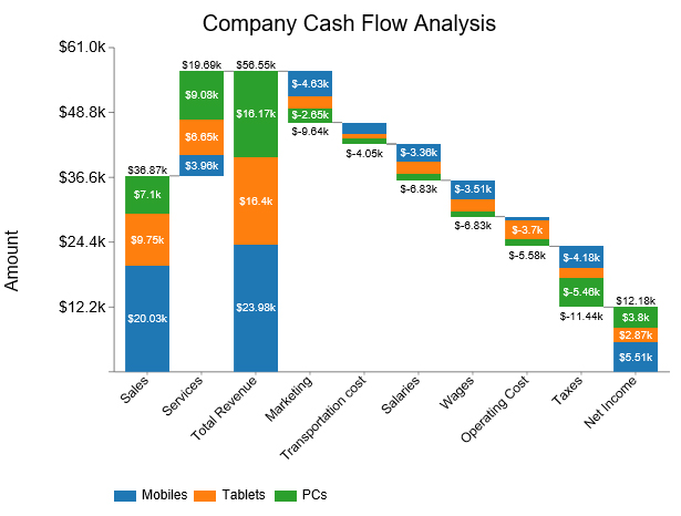
These bars are stacked to show the progression of values, with upward bars indicating positive changes and downward bars representing negative changes.
Waterfall charts are commonly used in financial analysis, project management, and other areas to visualize the flow and accumulation of data. When presented as financial charts, they make it easier to understand trends and the factors contributing to changes over time.
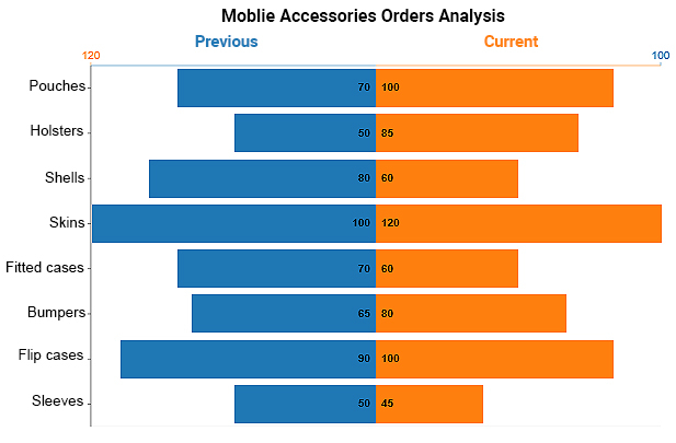
A Double Bar Chart displays more than one data series in clustered horizontal columns, similar to a clustered stacked bar chart. Each data series shares the same axis labels, so horizontal bars are grouped by category.
This arrangement allows for direct comparison of multiple series within a given category. The chart is amazingly easy to read and interpret, even for a non-technical audience.
Slope Charts are simple graphs that quickly and directly show transitions, changes over time, absolute values, and even rankings.
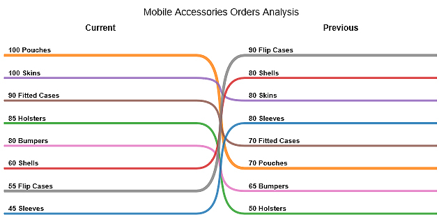
Besides, they’re also called Slope Graphs.
This is one of the data presentation examples you can use to show the before and after story of variables in your data.
Slope Graphs can be useful when you have two time periods or points of comparison and want to show relative increases and decreases quickly across various categories between two data points.
A TreeMap is a data structure that stores key-value pairs in a sorted order using a Red-Black tree, ensuring efficient search, insertion, and deletion operations.
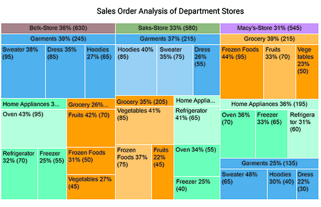
Take a look at the table below. Can you provide coherent and actionable insights into the table below?
| Store | Items | Category | No. of Orders |
| Macy’s-Store | Garments | Sweater | 65 |
| Macy’s-Store | Garments | Dress | 30 |
| Macy’s-Store | Garments | Hoodies | 40 |
| Macy’s-Store | Home Appliances | Refrigerator | 60 |
| Macy’s-Store | Home Appliances | Freezer | 65 |
| Macy’s-Store | Home Appliances | Oven | 70 |
| Macy’s-Store | Grocery | Fruits | 70 |
| Macy’s-Store | Grocery | Vegetables | 50 |
| Macy’s-Store | Grocery | Frozen Foods | 95 |
| Saks-Store | Garments | Sweater | 75 |
| Saks-Store | Garments | Dress | 55 |
| Saks-Store | Garments | Hoodies | 85 |
| Saks-Store | Home Appliances | Refrigerator | 65 |
| Saks-Store | Home Appliances | Freezer | 40 |
| Saks-Store | Home Appliances | Oven | 55 |
| Saks-Store | Grocery | Fruits | 45 |
| Saks-Store | Grocery | Vegetables | 85 |
| Saks-Store | Grocery | Frozen Foods | 75 |
| Belk-Store | Garments | Sweater | 95 |
| Belk-Store | Garments | Dress | 85 |
| Belk-Store | Garments | Hoodies | 65 |
| Belk-Store | Home Appliances | Refrigerator | 70 |
| Belk-Store | Home Appliances | Freezer | 55 |
| Belk-Store | Home Appliances | Oven | 95 |
| Belk-Store | Grocery | Fruits | 70 |
| Belk-Store | Grocery | Vegetables | 45 |
| Belk-Store | Grocery | Frozen Foods | 50 |
Notice the difference after visualizing the table. You can easily tell the performance of individual segments in:
Radar Chart is also known as Spider Chart or Spider Web Chart. A radar chart is very helpful to visualize the comparison between multiple categories and variables.
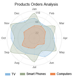
A Radar Chart is one of the data presentation examples you can use to compare data of two different time ranges e.g. Current vs Previous. Radar Chart with different scales makes it easy for you to identify trends, patterns, and outliers in your data. You can also use a Radar Chart to visualize the data of Polar graph equations.
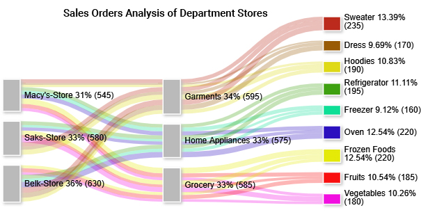
You can use the Sankey Chart to visualize data with flow-like attributes, such as material, energy, cost, etc.
This chart draws the reader’s attention to the enormous flows, the largest consumer, the major losses, and other insights using a Sankey diagram Excel.
The aforementioned visualization design, including the Mosaic plot, is one of the data presentation examples that use links and nodes to uncover hidden insights into relationships between critical metrics.
The size of a node is directly proportional to the quantity of the data point under review.
So how can you access the data presentation examples (highlighted above)?
Out of the five data presentation, this is the simplest one.
Just write your findings coherently and your job is done. The demerit of this method is that one has to read the whole text to get a clear picture. Yes, you read that right.
The introduction, summary, and conclusion can help condense the information.
Data on its own is less valuable. However, for it to be valuable to your business, it has to be:
No matter how well manipulated, the insights into raw data should be presented in an easy-to-follow sequence to keep the audience waiting for more.
Text is the principal method for explaining findings, outlining trends, and providing contextual and design information. A table is best suited for representing individual information and showcases both quantitative and qualitative data effectively.
On the other hand, a graph is a very effective visual tool because:
Text, tables, and graphs are incredibly effective data presentation examples you can leverage to curate persuasive data narratives.
Statistical dispersion is how a key metric is likely to deviate from the average value. In other words, dispersion can help you to understand the distribution of key data points.
There are two types of measures of dispersion, namely:
To avoid the complexities associated with qualitative data, utilize the visualization of qualitative data through tables and charts to display insights effectively. This approach serves as a clear example of data presentation, where values are organized in rows and columns. Each row and column corresponds to specific attributes, such as name, year, gender, and age, allowing for a straightforward understanding of the information.
Graphical representation uses charts and graphs to visually display, analyze, clarify, and interpret numerical data, functions, and other qualitative structures.
Data is ingested into charts and graphs, such as Sankey, and then represented by a variety of symbols, such as lines and bars.
Data presentation examples, such as Bar Charts, can help you illustrate trends, relationships, comparisons, and outliers between data points.
Tables are one of the most straightforward and widely used methods for the presentation of data. They consist of rows and columns, with each cell containing data. Tables are handy for presenting structured and detailed information in a clear and organized format. They excel at showing precise values and directly comparing categories or data points.
Charts and graphs visually simplify complex data, enhancing comprehension. Charts employ bars, lines, or columns for data display. On the other hand, graphs use points, lines, and curves to illustrate variable relationships.
Charts and graphs come in various types:
Infographics merge text, graphics, and visuals to present data concisely and captivatingly. They excel at simplifying complex ideas and presenting statistics in an easily understandable, visually pleasing way. They find common use in marketing, journalism, and education, enhancing data accessibility for a wide audience.
Dashboards are dynamic, tailor-made interfaces that provide real-time data visualization and analytics. They streamline monitoring Key Performance Indicators (KPIs) and metric tracking and facilitate data-driven decision-making.
Heatmaps use color intensity to represent data values, showing the concentration/distribution of data across a specific area. They are valuable for visualizing data patterns, such as website user activity (click heatmaps). Or areas of high and low interest in an image.
Excel, the old stalwart of spreadsheets, is excellent for crunching numbers and organizing data. But when it comes to data visualization, it doesn’t quite “excel.”
We have a solution – ChartExpo.
ChartExpo breathes life into your Google Forms survey data when analyzed in Excel.
How?
It turns your survey data into captivating visual masterpieces, all in just a few clicks.
Benefits of Using ChartExpo
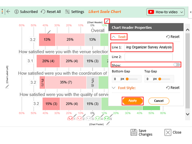
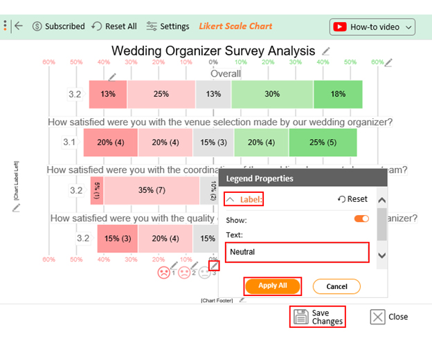
How to Install ChartExpo in Excel?
ChartExpo charts are available both in Google Sheets and Microsoft Excel. Please use the following CTA’s to install the tool of your choice and create beautiful visualizations in a few clicks in your favorite tool.
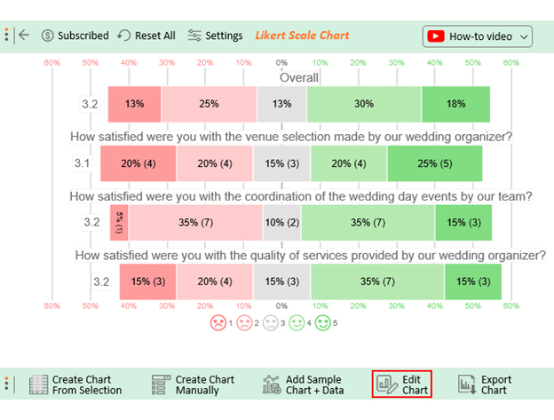
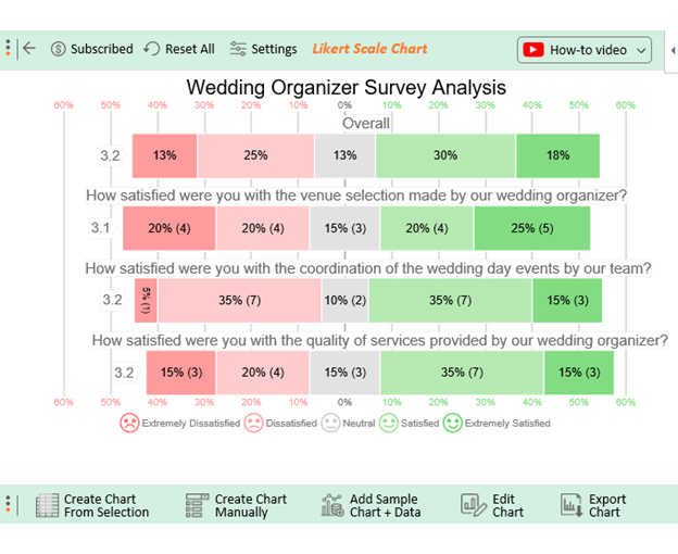
Assume the responses to your survey are as shown in the table below.
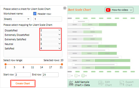
| Timestamp | How satisfied were you with the venue selection made by our wedding organizer? | How satisfied were you with our team’s coordination of the wedding day events? | How satisfied were you with the quality of services provided by our wedding organizer? |
| 10-13-2023 17:47:33 | Neutral | Dissatisfied | Neutral |
| 10-13-2023 17:47:33 | Satisfied | Satisfied | Dissatisfied |
| 10-13-2023 17:47:33 | Extremely Dissatisfied | Dissatisfied | Neutral |
| 10-13-2023 17:47:33 | Extremely Satisfied | Dissatisfied | Neutral |
| 10-13-2023 17:47:33 | Dissatisfied | Extremely Satisfied | Extremely Dissatisfied |
| 10-13-2023 17:47:33 | Satisfied | Dissatisfied | Extremely Dissatisfied |
| 10-13-2023 17:47:33 | Dissatisfied | Satisfied | Satisfied |
| 10-13-2023 17:47:33 | Satisfied | Neutral | Dissatisfied |
| 10-13-2023 17:47:33 | Extremely Satisfied | Satisfied | Satisfied |
| 10-13-2023 17:47:33 | Dissatisfied | Satisfied | Satisfied |
| 10-13-2023 17:47:33 | Extremely Dissatisfied | Dissatisfied | Satisfied |
| 10-13-2023 17:47:34 | Neutral | Extremely Satisfied | Extremely Satisfied |
| 10-13-2023 17:47:35 | Extremely Satisfied | Extremely Satisfied | Satisfied |
| 10-13-2023 17:47:36 | Extremely Satisfied | Satisfied | Dissatisfied |
| 10-13-2023 17:47:37 | Dissatisfied | Neutral | Extremely Satisfied |
| 10-13-2023 17:47:38 | Extremely Satisfied | Dissatisfied | Extremely Dissatisfied |
| 10-13-2023 17:47:39 | Satisfied | Satisfied | Extremely Satisfied |
| 10-13-2023 17:47:40 | Neutral | Dissatisfied | Satisfied |
| 10-13-2023 17:47:41 | Extremely Dissatisfied | Extremely Dissatisfied | Satisfied |
| 10-13-2023 17:47:42 | Extremely Dissatisfied | Satisfied | Dissatisfied |
This table contains sample data. Expect many responses and questions in real life.


Check out more benefits of data presentation examples below:
You can interpret vast quantities of data clearly and cohesively to draw insights, thanks to graphic representations.
Using data presentation examples, such as charts, managers and decision-makers can easily create and rapidly consume key metrics.
If any of the aforementioned metrics have anomalies ‘ie. sales are significantly down in one region’ decision-makers will easily dig into the data to diagnose the problem.
Data visualization can help you to do trend analysis and respond rapidly on the grounds of what you see.
Such patterns make more sense when graphically represented; because charts make it easier to identify correlated parameters.
You can use data presentation charts, such as Sankey or Area Charts, to build dashboards and turn them into stories.
Why?
Data storytelling can help you connect with potential readers and audiences on an emotional level.
We naturally process visual images 60,000 times faster than text. A graph, chart, or other visual representation of data is more comfortable for our brain to process.
Thanks to our ability to easily interpret visual content, data presentation examples can dramatically improve the speed of decision-making processes.
Effective data presentation is essential for conveying information clearly and engagingly. Here are tips to help you achieve effective data presentation:
Data presentation methods include;
Data analysis involves examining and interpreting data to extract insights and patterns. Data presentation focuses on visualizing those findings to make information understandable and engaging.
Discovery and communication are the two key objectives of data presentation.
In the discovery phase, we recommend you try various charts and graphs to understand the insights into the raw data. The communication phase is focused on presenting the insights in a summarized form.
Understanding the different methods of data presentation is essential for effective communication in our data-driven world. Tables, charts, infographics, dashboards, and other techniques enable us to transform complex data into clear, engaging visual stories.
Each method has unique strengths, making it suitable for specific data types and audience preferences. For instance, tables enhance simplicity, charts, and graphs promote clarity, and infographics improve visual appeal. Either way, each method enhances comprehension and enables informed decision-making.
Moreover, interactivity facilitated by dashboards and heatmaps empowers you to explore data independently. This fosters a culture of data-driven exploration and analysis.
Ultimately, data presentation goes beyond mere aesthetics; its core purpose is to infuse data with meaning. When we tell stories with data, we can inspire change, improve understanding, and unlock the power of information.
Choose the right method, practice effective design, and know your audience. These are the keys to presenting data that informs, engages, and makes a lasting impact.
How much did you enjoy this article?


Calculate accounts receivable turnover ratio to measure credit collection speed, improve cash flow, and strengthen your financial strategy. Read on!

Change Management KPIs are the key to tracking adoption, performance, and ROI during transitions. Find out which metrics matter. Read on!

Data collection methods and techniques determine the quality of every insight you act on. Explore key approaches for gathering reliable data. Read on!


