Categories
By ChartExpo Content Team
Everyone nodded. No one understood.
That’s the trap of the sunburst chart. It looks clear. It feels aligned. But it hides confusion behind clean circles and color.
The sunburst chart makes people believe they’re seeing the full picture. They’re not. Most walk away with surface-level takeaways, missing the real story buried in the layers.
It pulls attention to the center, not the insight. The first arc tells the wrong story. The deep layers lose the crowd. The sunburst chart doesn’t explain. It distracts.
You want quick decisions. You want alignment. But if the chart fools the room, you’ve already lost. The sunburst chart doesn’t clarify; it conceals. Use it, and be ready to defend every segment. Use it, and know when to throw it out.
Before you rely on a sunburst chart again, ask this: Will it reveal the truth, or hide it behind pretty rings?
Data owners often dive deep into their logic, weaving a tapestry of connections, but it’s a tapestry only they can see. You know the drill, your mental model is perfect. Yet, when someone else glances at the visualization, they’re lost in translation. It’s like speaking a private language, one that doesn’t extend beyond the team. The issue isn’t the data; it’s how it’s framed. Interpretation gaps appear, and suddenly, your masterpiece is a mystery.
Imagine crafting this intricate web of data, convinced of its brilliance. Then, someone outside the team takes a look, and you realize: they see a maze. The nesting you swore by reflects your mind, not theirs. That’s the crux of it, inside your circle, it sings, but step outside, and it’s a different tune. The challenge is finding a way to bridge that gap. To turn what’s internal into something the external world can grasp.
Extra layers can feel like hidden gems, waiting to reveal more. But often, they serve formatting, not function. It’s easy to get carried away with the idea of more being better. And before you know it, the chart is a sea of rings, each less clear than the last. You might not notice it at first, but the audience does. They’re left wondering if they missed a memo, while you’re trying to remember why that third ring was crucial.
The allure of detail can be deceiving. Those additional layers, meant to provide depth, can turn into a fog. You know the feeling, standing in front of a chart, realizing you’ve padded it with subcategories that don’t add value. It’s the classic case of mistaking complexity for insight. The truth is, if you can’t explain why it’s there, neither can they. And that’s when the visualization fails its purpose, leaving everyone scratching their heads.
You nailed the structure; the hierarchy is as it should be. But here’s the kicker: it doesn’t hit home. Technically accurate, for sure, but what’s the point if it doesn’t deliver a message? You’ve got perfect nesting, but it’s strategically off. The takeaway should leap out, grab attention, and steer decisions. But instead, it’s hidden behind layers of correctness. It’s a common pitfall, thinking structure alone will carry the weight.
Imagine having every piece in place, yet missing the mark. It’s like constructing a flawless argument with no punchline. The hierarchy fits like a glove, but the message? It vanished. You’ve been there, right? Where everything looks pristine, but the audience walks away without a clear takeaway. It’s not enough to be right; the point is to be heard. And that’s where many visuals falter, perfect form, absent impact
Visuals that demand narration are fragile. They crack under pressure when questions fly and time is short. If you’re relying on your voice to fill the gaps, rethink it. A chart should stand alone, speaking volumes even in silence. It should be a silent partner in the room, echoing your insights without a word from you. When your chart needs a narrator, you might as well have skipped the visual altogether. It’s like handing out a book with missing pages and expecting the reader to fill in the blanks. Not ideal, right?
Here’s the thing: you crafted that hierarchy with care, but executives? They skim. They’re looking for the punch, not the preamble. What gets noticed isn’t the layers you built; it’s the headline they can act on. Your deep dive into data might be impressive to you, but they just want the snapshot. Think of it as the difference between reading a novel and scanning the back cover. They need the gist, fast. If they’re not catching the key takeaway at a glance, the chart’s lost its power.
The first instinct with a sunburst chart is to think inner rings mean priority. But that’s a trap. Visual weight needs intention. Just because something’s central doesn’t mean it’s crucial. It’s about what you highlight, not where it sits. If your chart doesn’t scream what’s important, it’s whispering in a room full of noise. You’ve got to assign meaning, not let the rings decide for you. Think of it as arranging a gallery; what’s at eye level gets the attention.
You know what you want them to remember. But what do they take away? That’s another story. Misalignment between intent and retention is where many charts falter. You might be highlighting the third ring, but they’re stuck on the first. It’s about aligning visuals and memory, ensuring the design doesn’t just look good but stays with them. If what they remember isn’t what you highlighted, the chart didn’t do its job. It’s like a song with a catchy tune but forgettable lyrics. You want them to hum the right part long after the meeting’s over.
Ever tried cramming your data into one of those prebuilt sunburst chart templates? It feels like trying to squeeze into last year’s jeans. The template seems to guide the structure, offering a comforting sense of order. But here’s the twist: that so-called order might just be leading you astray. When you let the tool dictate the form, you’re building a house on shaky ground, convinced it’s rock solid. This disconnect between the template’s neat layout and your actual data logic can create a misleading sense of confidence. It’s like believing the map without checking if it’s the right one.
The real danger? You stop questioning. You trust the template to do the heavy lifting. But does it? Often, it doesn’t. This false assurance can lead you to overlook critical insights. You end up with a chart that looks like it knows what it’s talking about, but misses the mark entirely. The format fits, sure, but does it answer the questions that matter? Not likely. The alignment between data and visuals should be intentional, not accidental.
It’s easy to fall into autopilot mode with templates. You see those default segmentations and think, “Perfect, I’ll just drop my data right in.” But wait, have you asked yourself if those segments even make sense for what you’re presenting? This is where many go wrong, just filling in the blanks without considering if the blanks should’ve been there in the first place. Default settings can be a trap, luring you into thinking the work is done when it’s barely begun.
Remember, the tool’s pre-set structure wasn’t made for your data. It’s generic, broad, and often misses the nuances that make your data unique. When you don’t question the nesting, you might be overlooking the very questions that could lead to real insights. It’s like following a recipe without tasting the dish. Sure, the ingredients are there, but does it all come together? That’s the critical piece you miss when you don’t take a moment to challenge the defaults.
We’ve all been there, drawn to the allure of a pretty chart. It’s symmetrical, with gradients that could rival a sunset. But here’s the kicker: sometimes, it says absolutely nothing. It’s easy to get lost in the aesthetics, thinking the shine equals substance. But if the audience only remembers the colors and not the message, what’s the point? A visually appealing chart with no depth is like an empty book with a stunning cover. Looks good on the shelf, but it doesn’t tell a story.
Relying on beauty over brains means missing the true goal. Your chart should communicate, not just captivate. It’s about the story behind the visual, the message you need to get across. When you focus on symmetry and gradients, you risk losing the message in a sea of colors. The best chart isn’t the one that makes people say “Wow,” it’s the one that makes them say “Aha!”
Imagine this: You’ve crafted a stellar chart that makes perfect sense in your workspace. But when it hits the boardroom, it lands like a lead balloon. The chart may be genius in a controlled setting, where you have time to explain it, but here’s the kicker: executives don’t have that luxury. They need instant insight, not a guided tour.
In the boardroom, time is the most precious commodity. Executives aren’t waiting for you to walk them through complex visuals. They want the bottom line, and they want it fast. When your chart requires a narrative to be understood, you’ve already lost their attention. The moment demands simplicity, even if the data behind it doesn’t.
When the top brass walks into a meeting, they’re often looking for trends and patterns. They want to know what’s moving the needle, not how many layers your chart has. A straightforward line or column chart might have served the purpose, giving them a quick snapshot of the data they need. But instead, they’re stuck trying to decipher a labyrinth of nested information.
Complex hierarchies can bury the most important insights. If your visual doesn’t shout the key takeaways, it’s easy for them to miss the point entirely. In the end, if they can’t grasp your main message in seconds, they’re likely to tune out and move on. Simplicity wins the room, not complexity.
Colors can be a double-edged sword in data visualization. Used well, they highlight crucial information. Used poorly, they can lead to confusion or, worse, bias. Unintended emphasis through color can mislead decision-makers, pulling their focus away from what truly matters. It’s easy for a color scheme, intended to guide, to instead distort the message.
When colors shift attention to less important details, they can derail the conversation. Decisions based on misleading visuals can drift away from the data’s original intent. It’s crucial to manage visual cues carefully, ensuring they support, not sabotage, the intended narrative.
You’ve poured hours, maybe weeks, into perfecting this visual masterpiece. But here’s the reality: In a high-pressure meeting, your audience gives your work a mere glance. If it doesn’t deliver immediate clarity, it’s as good as invisible. No one in that room is looking to explore; they’re looking to decide.
The hard truth is that if the insight doesn’t leap off the page the moment they see it, the chart fails its mission. It’s a bitter pill to swallow, but one that underscores the need for visuals that work under pressure. Anything less simply doesn’t stand a chance in the fast-paced world of executive decision-making.
Picture this: A visual where every ring tells a story. Each layer adds value, and there’s zero fluff. That’s when a visual hits its stride. This isn’t about impressing anyone with complexity; it’s about delivering insight. When every part matters, understanding flows seamlessly.
Imagine a room full of skeptics turning into engaged participants. A well-crafted visual can change the room’s energy. Suddenly, instead of defending choices, you’re collaborating and building ideas. People shift from critiquing to engaging because they see the value right there in front of them.
There’s magic in a visual that speaks for itself. No need for long-winded explanations when the structure is clear. It’s like a silent agreement between the presenter and the audience. Trust builds instantly, and conversations become more meaningful. The slide does the talking before you even start.
When people stop talking about the visual itself and focus on what it means, you’ve hit gold. The best visuals don’t scream for attention; they quietly deliver their message. The format fades, leaving only the insight. That’s when you know it worked.
The real win isn’t hearing compliments about the visuals’ design. It’s seeing minds shift and decisions evolve. You look competent and credible. The visual didn’t just look good; it changed the direction of the conversation. That’s the payoff worth chasing.
Ever seen a sunburst chart that looks perfect, yet something feels off? It happens when the structure is solid, but the data is shaky. You might have organized every ring flawlessly, but if what’s inside doesn’t match reality, it’s all for nothing. It’s like building a beautiful house on sand.
Smart teams often fall into this trap. They focus on making the layout logical while ignoring the accuracy of the data. Each layer might align perfectly, but if the foundation’s faulty, the whole thing collapses. Always question the data, not just the design.
Inheriting a chart with pre-set categories can feel like getting a hand-me-down sweater. It fits, but does it look right? Teams often pass down taxonomies without a second thought, like old family recipes. But what if those categories no longer make sense?
Lazy reuse of inherited categories leads to confusion. You might assume they’re right because they’ve always been used. Yet, without checking their relevance, you risk presenting outdated or irrelevant insights. It’s vital to reassess and ensure they still hold value before you show them off.
Picture this: a sunburst chart that paints a rosy picture, but the numbers tell a different story. Seems familiar? It’s the classic case of a chart that looks convincing but hides a different truth. When metrics and visuals don’t align, trust takes a nosedive.
This mismatch can be a political minefield. The chart might get nods in the meeting, but when someone digs into the numbers later, the discrepancies become glaring. This erodes confidence faster than a misplaced decimal. Always ensure your visuals and data tell the same story, no surprises.
Ever dressed up a chart just because it looked cool? That’s the trap. A flashy chart grabs attention but often misses the mark on delivering actual value. We’ve all been there, drawn in by the allure of a multi-layered visual. But when the meeting rolls around, what everyone wants is solid, straightforward numbers. The kind that answers questions, not raises them.
Think about it. You’ve got a room full of decision-makers, and they’re not there for an art show. They need data that speaks clearly and effectively. A sunburst chart might look like a masterpiece, but if it doesn’t offer immediate insights, it’s just decoration. Real impact comes from clarity, not complexity.
Ever tried squeezing flat data into a complex chart just because it seemed fancy? It’s like putting lipstick on a pig. A sunburst chart with no real segmentation adds layers without adding meaning. You’re left with a pretty picture that says nothing. If the data is straightforward, keep it that way.
Hierarchy for the sake of hierarchy is a losing game. When there’s no depth in the data, adding layers only builds confusion. Skip the frills. Stick to the basics. Sometimes a simple number or two tells the story better. You don’t need a wall of color and shapes to convey a simple point.
Have you ever noticed how in some charts, only one segment really matters? That’s your cue. If everyone’s attention is on the first ring, that’s where the story is. Stop building a multilevel chart when the essence lies in a single piece. It’s like writing a novel when a short story would do.
The sunburst chart can be a distraction when the main event is that first ring. If that’s where the weight is, focus there. The rest is filler. You’re not just making it simpler for the audience; you’re giving them exactly what they need. It’s about making sure the vital part doesn’t get lost in the noise.
Tables are the unsung heroes of data visualization. They’re straightforward, direct, and leave little room for misinterpretation. Especially when you’re dealing with numbers that need to be unambiguous. CFOs love them for a reason. They get to the point fast.
In a world where charts can sometimes feel like puzzles, tables offer a breath of fresh air. They lay everything out plain and simple. No guessing, no assumptions. Just clear, concise data that’s easy to digest. It’s not about being fancy; it’s about being effective. Sometimes, simplicity is the smartest choice.
You pour hours into creating a dynamic visualization. Drill-downs, hovers, and tooltips make it a masterpiece in the making. Then, you hit export. Bam! Your interactive wonder turns into a flat, lifeless image. It’s like watching a movie with the sound off. All those features that made your work pop simply vanish, leaving behind a static picture that barely tells your story.
Imagine presenting to a room full of execs. You hand out PDFs of your once-interactive masterpiece. They stare at the page, expecting insights to leap out, but it’s just not happening. Without the interactive elements, your chart fails to engage. The ability to click and explore is gone. It’s crucial to ensure that your visuals stand alone. When interactivity is stripped away, they should still communicate the essence without needing a narrator.
Executives don’t click around. They barely have time to look up from their phones. They want insights fast. If your chart doesn’t scream its message at a glance, it’s already lost. The focus should be on what they see instantly, not what they might discover if they clicked around.
Think about the meeting room. There’s a brief moment when everyone glances at the screen. That’s your window. If the insight isn’t blazing clear, they’ll move on. You don’t have time for them to explore. Design with that in mind. Your visuals need to shout their story without requiring interaction. Otherwise, they end up being skipped over, their potential wasted.
Color can be a double-edged sword. It’s meant to highlight, clarify, and guide the eye. But sometimes, it does the opposite. Automatic gradient logic can turn a coherent chart into a mess of mismatched hues. Instead of directing focus, it confuses, leading viewers astray.
Colors can whisper lies if you’re not careful. A slight variation in shade might suggest importance that’s not there. Or worse, it could obscure crucial differences. It’s like a magician’s trick, distracting from what’s important. The challenge lies in managing color so it supports, rather than distorts, the message. Without that control, your chart could convey the wrong story altogether.
Trying to show change over time with a radial chart? Good luck. It’s like trying to fit a square peg in a round hole. Time sequences want linearity, a clear path from past to present. Radial formats just don’t provide that clarity. They twist and turn information into a circle, losing the straightforward narrative that time demands.
When everything radiates from a central point, chronological logic collapses. You end up with a jumble of segments that don’t naturally lead from one to the next. For time-based data, other formats, like line or bar charts, are your friends. They guide the eye naturally along a timeline. If you’re trying to capture change, leave radial to rest and let linear lead the way.
Gut check time. Not “Does it look good?” but “Will it hold up when the stakes are high?” If you can’t confidently say yes, it’s time to go back to the drawing board. The pressure in that meeting room is real, and no one wants to be caught with a chart that crumbles. It’s not just about looking good; it’s about being solid.
The next time you’re about to present, think about how much you’re betting on that visual. If it’s the kind of thing that might buckle under scrutiny, don’t risk it. Your credibility isn’t just on the line; it’s the whole line. So before you hit ‘send,’ make sure it can handle the heat.
Five seconds. That’s all the time you get. If the main point isn’t glaringly obvious in that brief window, you’re in trouble. People don’t have time to dig through layers of detail. Your chart should scream its message loud and clear at first glance.
Think of it like speed dating for data. You need to make sure that your chart tells its story up front. If it takes more than those few seconds for someone to get it, then it’s not ready. That main insight must hit them right between the eyes.
Been there, done that, and it didn’t work. If you’ve watched people squint at the screen, trying to make sense of your masterpiece, it’s time to rethink. Even the smartest teams fall into the trap of repeating the same mistakes. It’s time to break the cycle.
Repetition is the enemy of progress. If you know a chart has been misread in the past, why risk it again? Force yourself to learn from those past blunders. The goal is to move forward, not circle back to old failures.
Feedback isn’t just for the faint of heart. Find the person who’s known for never holding back and get their take. What they say in private is what they’ll say in the meeting, and you need to be prepared for that. Listening is the key here because it’s not just about hearing, it’s about understanding.
Your harshest critic is your best asset. They’ll tell you what others won’t. Take their feedback seriously and use it to strengthen your presentation. The goal is to address potential issues before they become public problems.
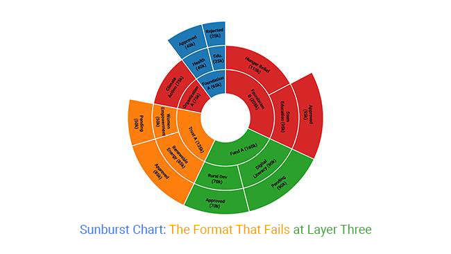
A sunburst chart can look useful on the surface. It gives the sense that everything is clean, clear, and aligned. But most of that confidence fades once the chart moves past the second layer.
The format leads with visual order, but that order often hides disagreement, confusion, or gaps in understanding. A single glance might suggest that a team agrees. In truth, they might not. That disconnect costs time, focus, and trust.
It’s easy to think a polished chart means a strong structure. But structure isn’t what the chart shows; it’s what the chart depends on. If the layers hide flaws or if the layout misguides focus, the chart can fail without warning.
If your message lives in the third layer, you’ve likely lost your audience before you’ve said anything important. That’s not a design issue. That’s a communication breakdown.
So before picking a sunburst chart, ask the hard question: will people get what they need without effort? If the answer is no, the chart isn’t helping.
How much did you enjoy this article?


Calculate accounts receivable turnover ratio to measure credit collection speed, improve cash flow, and strengthen your financial strategy. Read on!

Change Management KPIs are the key to tracking adoption, performance, and ROI during transitions. Find out which metrics matter. Read on!

Data collection methods and techniques determine the quality of every insight you act on. Explore key approaches for gathering reliable data. Read on!


