Categories
You’ll agree when we say storing and organizing data in tables is convenient. You can easily infer quick insights from tabular data . But you can only go far with tables in data analysis.

Why?
Picture this: you have a gigantic data set that occupies tens of thousands of rows and columns.. How can you extract reliable insights from such huge tables efficiently?
Assuming persistence is one of your values, how long can it take you to extract meaningful insights? You guessed right. It could take you hours, if not days.
This is where graphs come in.
Graphs can help you distill critical insights from noise and outliers. Remember, a huge chunk of any data is always noise. Essentially, you stand to save a ton of time and effort when dealing with bulky and complex data.
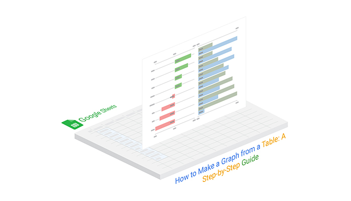
In this blog, you’ll learn how to make a graph from a table using easy-to-follow and straightforward steps.
We’ll use a Progress Chart to visualize the table below.
| Products | Previous Sales | Current Sales |
| Bread | 141 | 176 |
| Butter | 181 | 166 |
| Jelly | 148 | 128 |
| Pasta | 121 | 172 |
| Cheese | 146 | 158 |
| Ice Cream | 149 | 192 |
| Soda | 100 | 152 |
| Ketchup | 124 | 191 |
To install ChartExpo into your Excel, click this link.


Data visualization designs allow you to interpret vast quantities of data clearly and cohesively. Besides, you can easily extract insights, draw conclusions, and see perspectives.
Using different business charts and graphs, you can keep track of crucial and strategic metrics of your business or workplace. Furthermore, you can easily spot anomalies, such as outliers, which can easily misinform your decisions.
You can use graphs to uncover risks and opportunities surrounding your business or workplace.
Graphs can help you spot emerging trends and respond in real-time.
Patterns and trends make more sense when graphically represented.
Certain relationships in your data may be apparent, primarily if you use tables. But to uncover hidden insights, you need visual representations like dot plots, which are beyond the capacity of tables.
Tables, especially long ones, are not recommended if you want your data story to be compelling. Data visualization experts use graphs, charts, and maps to help their target audiences understand key takeaways without struggle.
Let’s agree on this: You’ll be using visual diagrams, such as graphs from tables and storytelling with funnel charts, to create compelling data stories for your audience (and readers).
Take a look at the tabular data below.
How to make a graph from a table like the one below?
| Year | Topic | Positive | Negative |
| 2019 | Quality of food | 11 | 12 |
| 2019 | Ease of ordering | 29 | 50 |
| 2019 | Services | 20 | 33 |
| 2019 | Parking | 2 | 4 |
| 2019 | Cleanness | 55 | 12 |
| 2019 | Ease of reading the menu | 12 | 7 |
| 2019 | wait time to be seated | 16 | 11 |
| 2019 | Seating space in the waiting area | 8 | 8 |
| 2019 | menu and drink choices | 4 | 3 |
| 2019 | Attitude of Waiter | 3 | 5 |
| 2019 | Payment method | 12 | 15 |
| 2020 | Quality of food | 15 | 12 |
| 2020 | Ease of ordering | 51 | 1 |
| 2020 | Services | 28 | 12 |
| 2020 | Parking | 4 | 2 |
| 2020 | Cleanness | 45 | 11 |
| 2020 | Ease of reading the menu | 12 | 8 |
| 2020 | wait time to be seated | 16 | 18 |
| 2020 | Seating space in the waiting area | 13 | 18 |
| 2020 | menu and drink choices | 4 | 1 |
| 2020 | Attitude of Waiter | 3 | 8 |
| 2020 | Payment method | 17 | 16 |
| 2021 | Quality of food | 18 | 12 |
| 2021 | Ease of ordering | 59 | 20 |
| 2021 | Services | 30 | 10 |
| 2021 | Parking | 2 | 0 |
| 2021 | Cleanness | 55 | 7 |
| 2021 | Ease of reading the menu | 18 | 10 |
| 2021 | wait time to be seated | 22 | 14 |
| 2021 | Seating space in the waiting area | 13 | 16 |
| 2021 | menu and drink choices | 4 | 1 |
| 2021 | Attitude of Waiter | 2 | 4 |
| 2021 | Payment method | 13 | 14 |
Let’s extract insights from the table above using a graph.

The above data visualization design (comparison bar chart) makes things a little easier. You can easily infer the key issues customers raised during the survey.
In the last three financial years (2019-21), the two most significant issues that customers have raised concerning the restaurant brand are:
ChartExpo is a trusted tool that thousands of professionals worldwide use to create insightful and easy-to-understand graphs from tables. As a reliable chart-maker tool, it helps users transform data into clear visualizations. Besides, it comes as an add-on that you can easily install to get the most from your data.
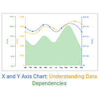
ChartExpo comes loaded with many advanced data visualization designs, such as the Sankey Diagram, Pareto Chart, Comparison Charts, Control Charts, Area chart design, x and y-axis chart, and Funnel Charts, to ensure you never struggle to generate a graph from the table.
Tables are best suited for storing and organizing raw data. For anything beyond the aforementioned, you should opt for graphs.
Yes, you read that right.
Data in tables can be displayed as text, using words and numbers. Besides, tables make it easy to compare pairs of related values (e.g., quarterly sales in a given financial year).
Remember, you cannot use tables exclusively to display quantitative information. For more complex data relationships, such as when you have multiple sets of values with a direct relationship, a Sunburst Chart can be an effective alternative to a table for organizing and visualizing the data.
For example, some professionals often use tables to display meeting agendas with particular times, topics, locations, and speakers.
So when should you use graphs instead of tables?
When the data grows beyond the reasonable scope, you need to explore data visualization to display insights easily.
Graphs are essentially a visual display of data along two axes (x and y-axes). There’s scientific reasoning behind why data stories with visual designs such as a Mekko graph are more compelling than those without one. Did you know our brains can interpret visual content 60,000 times faster than words and numbers?
Use interactive data visualization designs in your data stories to arouse the interest of the target audience. Graphs and charts, like line graphs with multiple lines, can reveal insights from bulky data in a way that’s easy to process.
Data visualization is a quick, easy way to convey insights into raw data. You can use visual designs, such as bar charts, graphs, and maps, to achieve the following:
When debating table versus graph, do the following:
Tables are convenient for storing and organizing raw data. However, when the complexity and size of data start growing: you need to explore other more innovative options, such as data visualization.
This is where graphs come in.
Well-constructed visualization designs can complement your data stories. You can use them to uncover hidden patterns, trends, and outliers in your data.
Freemium tools come with pretty basic data visualization designs, which require a lot of editing. And this means you stand to spend a lot of time.
We recommend our readers use the ChartExpo add-on to supercharge their favorite spreadsheet app (Google Sheets).
Why?
ChartExpo comes pre-loaded with over 50 graphs that are easy to read and interpret. Besides, it has an ultra-friendly user interface (UI), which means you don’t need coding or programming skills to visualize your data.
Sign up today to save the time you can take to generate a graph from tables.
How much did you enjoy this article?


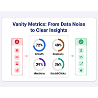
Vanity metrics can mislead teams into tracking numbers that never drive results. Discover what makes a metric truly actionable. Read on!
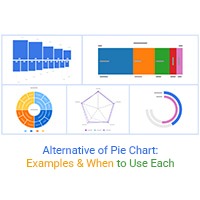
Explore the best Alternative of Pie Chart to improve clarity and accuracy in data visualization. Compare charts like bar, sunburst, and treemap with real use cases.
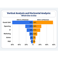
Vertical analysis and horizontal analysis reveal how financial statements shift over time and within a period. Learn both methods now!