Categories
Tracking progress in Excel is essential for managing projects, monitoring goals, and ensuring tasks are completed on time.
A Progress Bar in Excel helps you visualize how much work has been completed versus what remains. This makes it easier to track milestones, identify delays, and communicate progress clearly to stakeholders.
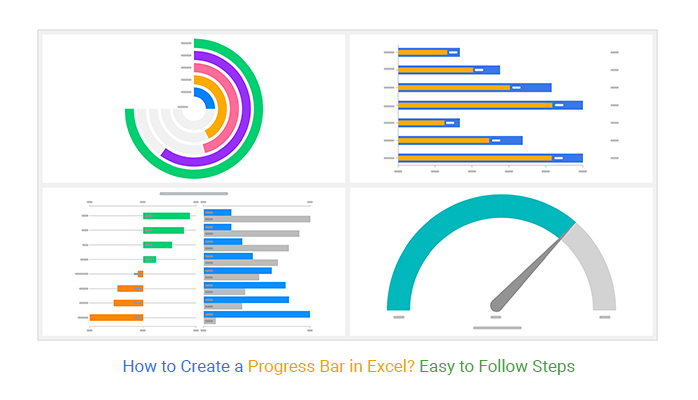
But here’s the challenge:
Excel’s default progress bar options are limited and often lack the visual impact needed for professional reporting. Creating advanced progress charts like Gauge Charts, Overlapping Bar Charts, or Radial Progress Charts can be time-consuming without the right tools.
Whether you’re managing projects, tracking KPIs, or building dashboards, this guide will help you create clear and effective progress visualizations in Excel.
Before we dive in, let’s start with the basics.
Definition: A Progress Bar in Excel is a visual chart that shows how much of a task, project, or goal has been completed compared to the total.
It typically uses a filled bar to represent completed progress and an unfilled portion to show what remains. This makes it easy to track performance, monitor milestones, and communicate progress at a glance.
Progress bars are commonly used in:
This guide will walk you through the process of creating progress bars in Excel:
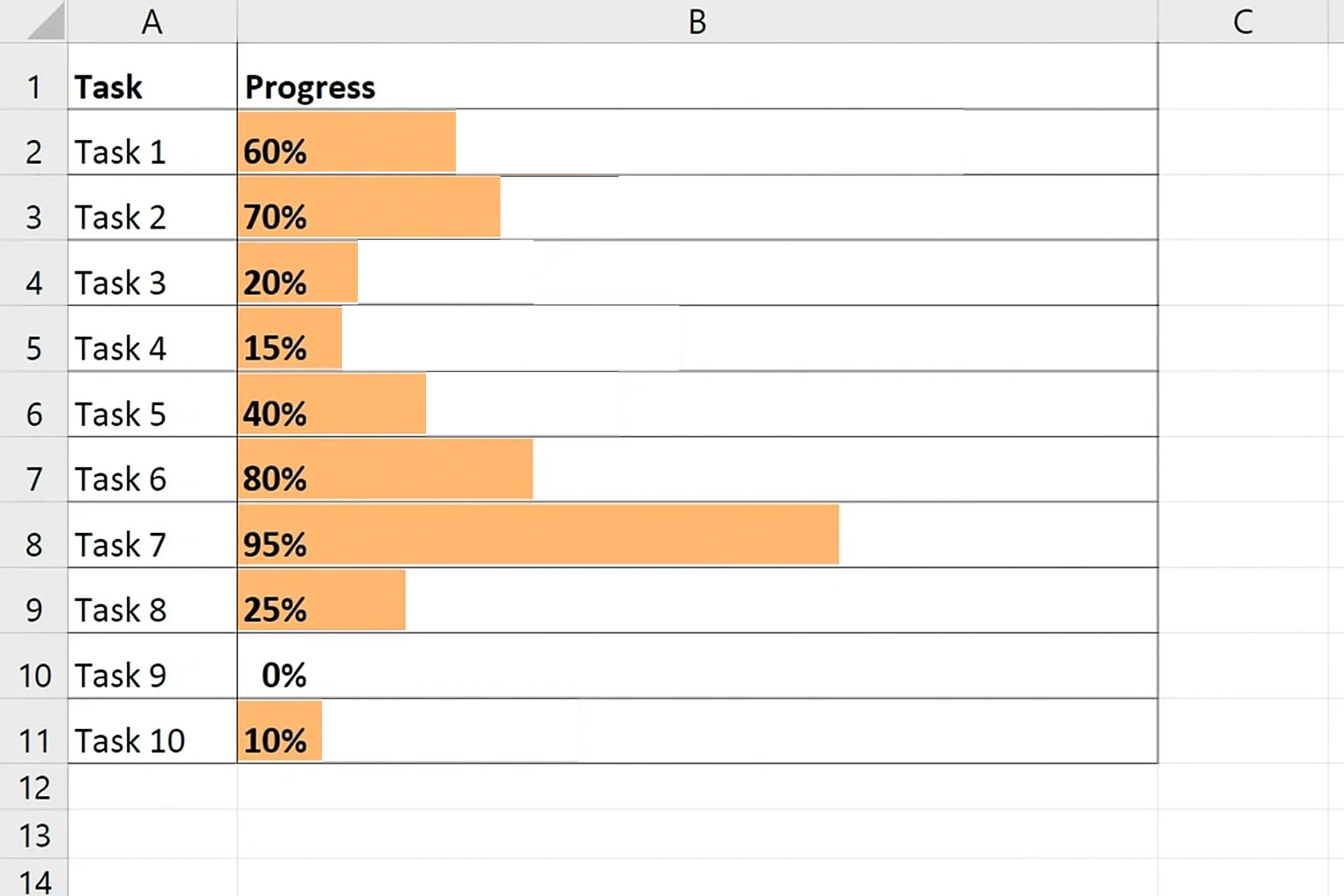
Start by entering data that represents the progress percentages for 10 different tasks.

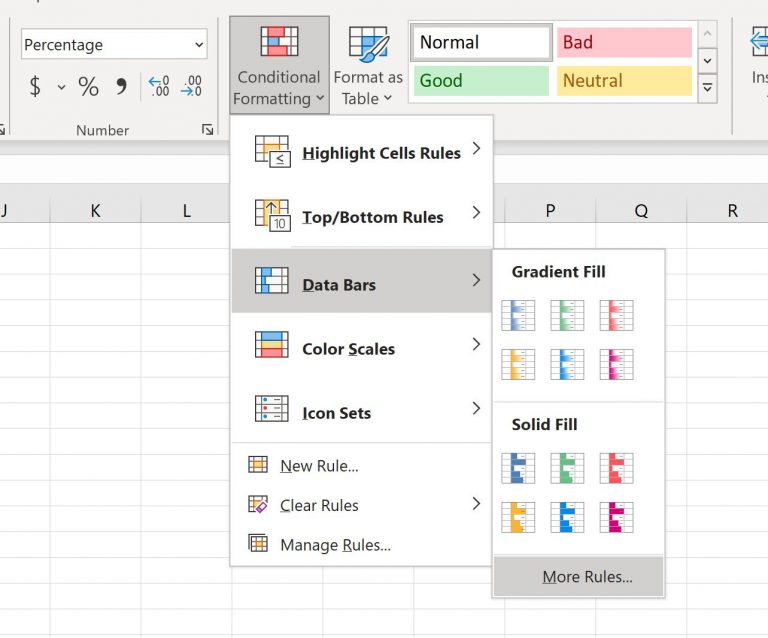
Highlight the range B2:B11 where your progress percentages are stored. Then, go to the Home tab and click on the Conditional Formatting button. From the dropdown, select Data Bars, and then click on More Rules.
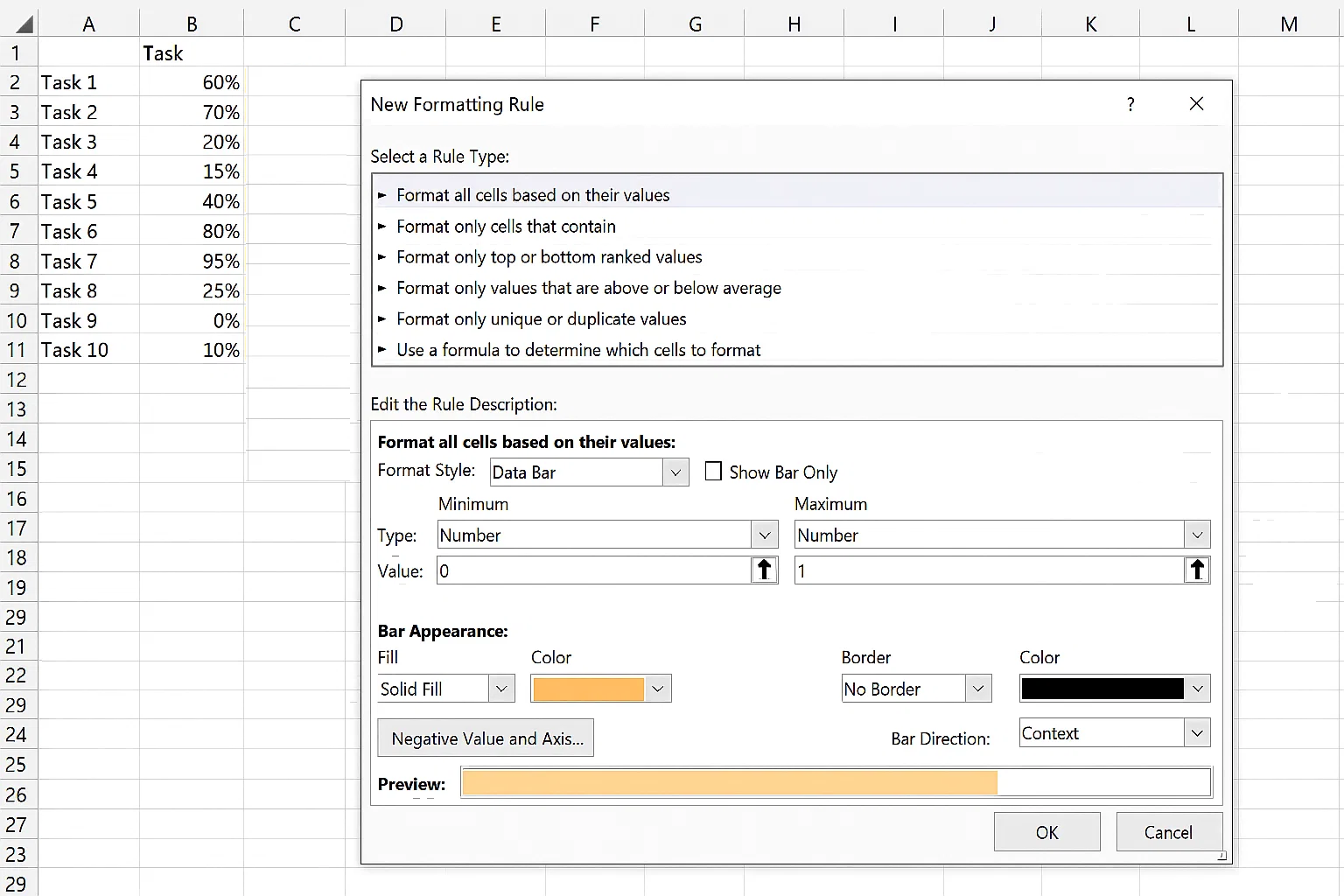
A window will pop up for further customization.
Choose a color for the bars (e.g., light green) and click OK.
This will apply progress bars to each cell in column B.
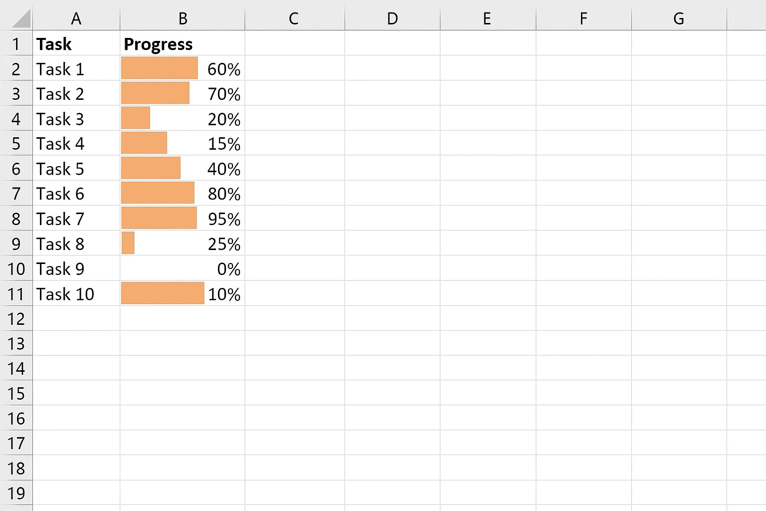
You can now adjust the column and row widths to make the progress bars more visible.
Additionally, you can add borders around the cells and align the percentage text to the left side for better clarity.
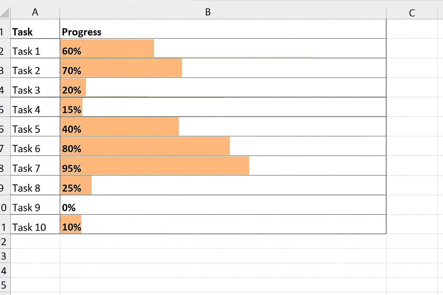
Whenever the percentage is updated, the length of the progress bar will automatically adjust accordingly.
Suppose we change the last progress to 30%
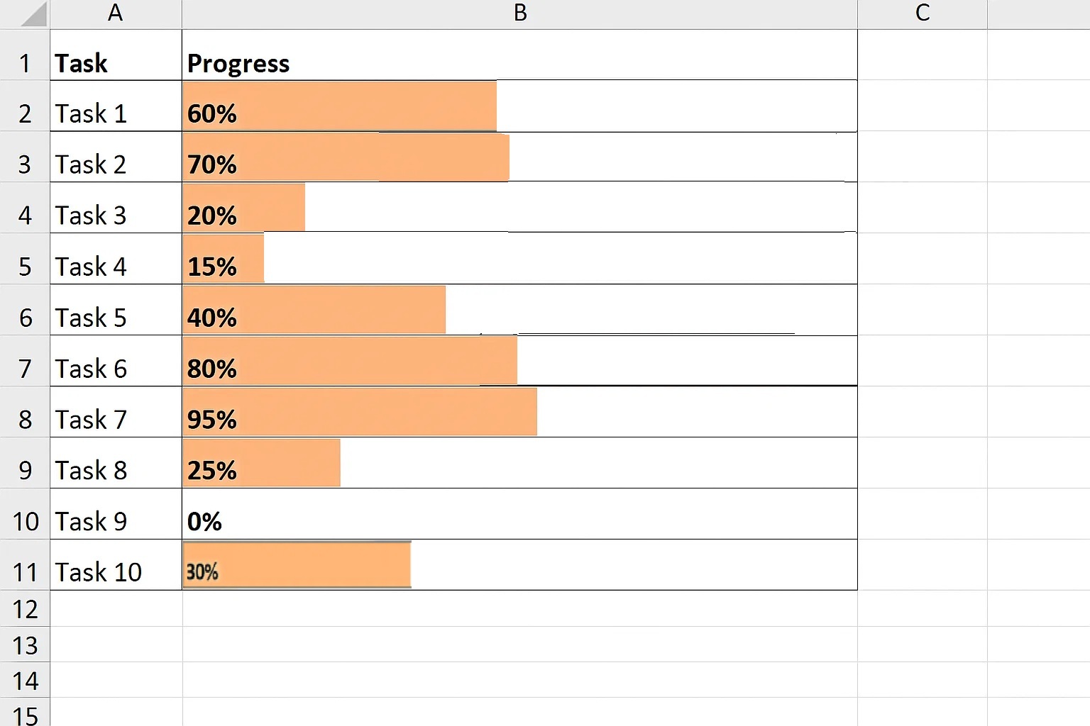
This method uses Excel’s built-in data bars to quickly visualize progress.
This method uses Excel formulas to create text-based progress bars.
This method uses a stacked bar chart to create a clean and professional progress bar.
Create two columns:
An Overlapping Bar Chart is used to compare two values, such as actual vs target progress.
Unlike a stacked bar chart, both bars start from the same baseline, making it easier to compare differences visually.
Best for:
This chart uses color contrast to clearly show how far a task or goal is from completion.
A Gauge Chart (also called a speedometer chart) displays progress using a dial and a needle.
It shows how close a value is to a defined goal by placing it within a range, such as low, medium, or high performance.
Best for:
The color segments in the chart make it easy to identify whether performance is on track or needs improvement quickly.
A Radial Bar Chart represents progress in a circular layout using bars arranged around a center point.
Each bar’s length indicates the level of progress, making it visually engaging and easy to interpret.
Best for:
This chart is especially useful when you want to display multiple progress indicators in a compact space.
The Progress Chart is a specialized visualization designed to compare results side by side and highlight the difference.
It uses color indicators to improve readability:
Best for:
This type of chart is not available by default in Excel and typically requires an add-in like ChartExpo.

| Projects | Expectation | Progress |
| Breeze | 100 | 66 |
| Point | 100 | 88 |
| Mecha | 100 | 60 |
| Synergy | 100 | 88 |
| Zen | 100 | 52 |
This will make the actual progress bar appear over the target bar.
Optional: Use green for completed progress and red for below target.

In the following video, you can learn how to create an Overlapping Bar Chart in Excel. You can use this chart to show the progress of different tasks and projects.
Quickly shows the status of tasks, projects, or goals, allowing managers and team members to grasp progress without analyzing raw numbers.
Clearly highlights differences between actual and target progress, making it easier to track performance and identify gaps.
Converts large or detailed datasets into simple, intuitive visuals that are easy to read at a glance.
Improves project dashboards, KPI tracking, and reporting by presenting data in a visually appealing and organized manner.
Enables quick decision-making by showing which tasks are on track and which need attention.
Colors, bar lengths, and layouts can be adjusted to emphasize priorities, deadlines, or performance thresholds.
Makes it easier to present progress to clients, executives, or team members, improving clarity and engagement.
Using a progress bar in Excel can visually enhance your data, helping track progress toward goals or project completion. Here are some best practices for creating effective progress bars:
Leverage Excel’s conditional formatting to create dynamic progress bars that change color based on progress. This makes it easier to visually assess progress at a glance.
Choose a range of data that accurately represents the progress you want to track. Whether it’s task completion, sales progress, or project milestones, ensure the data is aligned with the intended purpose.
Label each progress bar clearly with relevant information, such as percentage completed or milestones achieved, to make interpretation straightforward.
Avoid cluttering your progress bars with too many design elements. A clean, simple bar is often more effective and easier to interpret.
Ensure the progress bar is updated regularly as data changes. Manual updates can be time-consuming, so automate updates when possible using formulas or VBA scripts.
Double-check your formulas and data ranges to ensure that the progress bar reflects accurate and up-to-date information.
Excel progress bars, usually made with conditional formatting or data bars, have restricted styling options. You can adjust colors and basic fill effects, but customizing shapes, gradients, or adding icons often requires complex workarounds or VBA.
Unlike dedicated project management tools, Excel does not offer a native, ready-to-use progress bar feature. Users typically have to build one manually using formulas and formatting, which can be time-consuming, especially for beginners.
In many cases, the progress bar depends on user-entered values or formula-driven percentages. If data changes frequently, you must ensure your progress bar updates correctly; otherwise, it can display misleading information.
For simple tasks, Excel progress bars work fine. But for more complex, multi-stage projects, they can’t automatically track multiple dependencies or update dynamically without advanced scripting. This makes them less reliable for detailed project tracking compared to specialized tools.
Adding too many conditional formatting rules or graphics-heavy progress bars in large workbooks can slow down Excel’s performance. This is especially noticeable when working with big datasets or shared files.
Excel progress bars are static visuals. Unlike dashboards in Power BI or other reporting tools, they don’t offer interactive drill-downs or automated status updates beyond what’s built with formulas.
A Progress Bar Chart is a visualization design you can leverage to display the progress made in a task or project. The visualization design is best suited to monitor and prioritize your objectives, providing critical data for strategic decision-making.
It uses filled bars to display milestones achieved in a project.
Progress Bar Charts are amazingly easy to read and interpret. You can use the chart to track the milestones achieved against a particular target or deadline.
The visualization design uses a series of red and green bars to depict decline and growth, respectively.
Yes. You can automate progress bars using formulas with Conditional Formatting, the REPT function, or Excel add-ins like ChartExpo. The bars update automatically as your data changes.
Tracking progress is essential for completing tasks and projects on time and within budget. Progress Bar Charts in Excel make this easy by turning data into simple, visual insights that are quick to read and interpret.
While Excel offers basic chart options, creating ready-to-use, visually appealing progress bars can be time-consuming. Using an add-in allows you to access advanced Progress Bar Charts without programming skills.
With ChartExpo, you can:
Ready-made charts save time, reduce errors, and make your data stories more effective. Sign up for a 7-day free trial to explore Progress Bar Charts and other advanced Excel visualizations.
See More: