Categories
Excel is one of the readily available tools available for small businesses to visualize data.
You’ve got to purchase the Microsoft Office Suite package to access the application. Alternatively, there’s a free version of the application called Excel online.
The data visualization tool comes with a sizable number of charts that are basic and need more work in editing. Besides, it lacks a substantial number of graphs for crafting compelling data narratives. For instance, you’ll never find Sankey and Pareto Charts.
We’re not advocating you ditch Excel.
You have an option of installing a particular add-in to access ready-to-use Excel charts,
In this blog, you’ll learn the following:
Before we address the main topic, we’ll address the following question: what are Excel Charts?
Excel is part of the Microsoft Office Suite. You can also access the online version, which is free. However, the online version lacks all the features of a premium version.
To access all the charts in Excel, follow the simple steps below:

The steps involved in creating data visualizations in Excel depend on the type of graph or chart-like Area graph or chord diagram you choose. For basic visualizations, the process is largely the same. More complex datasets and illustrations may require additional steps.
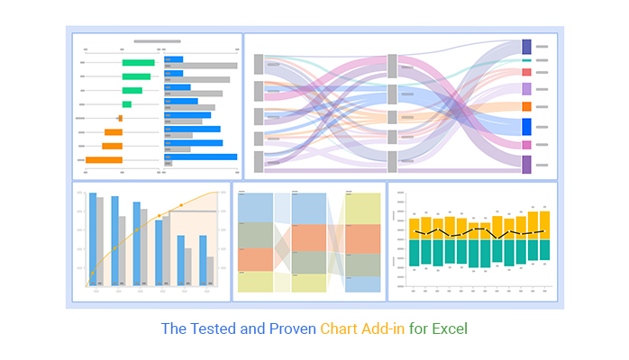
We’ll take you through the tested and proven chart add-in for Excel in the next section. Also, we’ll address the following question: what is the use of add-ins in Excel?
Excel generates very basic charts. And this means you’ve got to spend extra effort and time editing the chart.
You don’t have to undergo all this.
Download and install a particular chart add-in for Excel to access ready-made charts for data stories. In other words, the use of add-ins in Excel is to help you access ready-made visualization designs. Also, you can access charts missing in the spreadsheet app, such as the tornado chart, Pareto, and Sankey diagram in Excel.
There are thousands of add-ins purposely designed for Excel.
To simplify things, we’ve tested over 40 data visualization-based add-ins. We’ve narrowed down our results based on the following factors:
The Excel add-in that met all our conditions is ChartExpo.
Let’s take a closer look at ChartExpo.
CartExpo is a chart add-in for Excel Mac with a super-friendly user interface to ensure that any professional can visualize data, irrespective of their coding or programming skills. With features like Side-By-Side Bar Chart, users can easily compare different data sets and gain insights with just a few clicks.
The tool supercharges your Excel by expanding its library with a large number of visually appealing and ready-to-go charts, including dynamic funnel charts.


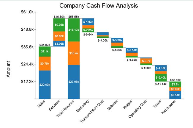
A Stacked waterfall chart in Excel is a dynamic visual tool meticulously crafted to unveil the intricate dance of data fluctuations over time or across diverse categories.
It ingeniously melds a cascade of stacked bars into a Waterfall chart, each bar a sentinel of statistical significance, standing tall or bowing low to depict the ebb and flow of numerical narratives.
This kaleidoscopic arrangement unveils the narrative arc of cumulative impacts, revealing the interplay of positive surges and negative descents with an artistic precision akin to a symphony conductor orchestrating a crescendo.
A stacked Waterfall Chart can display:

A Sankey Diagram visualizes “a flow” from one set of values to the next. The two items being connected are referred to as “nodes.” The connections are labeled as “links.” Besides, it’s named after an Irishman, Capt. Matthew Sankey first used them in a publication on the energy efficiency of a steam engine in 1898. Sankey diagrams were initially used to visualize and analyze energy flows, but they’re a great tool to depict the flow of money, time, and resources. Flows in the chart can display energy, materials, fluids, revenue, or costs.
You can use the visualization design, including the chart maker, to visually show complex processes, focusing on a single aspect or resource you want to highlight. Additionally, the chart offers the benefit of supporting multiple viewing levels, and a ranking chart maker can be especially useful for simplifying comparisons across different categories.
Audiences can get a high-level view, see specific details, or generate interactive views.
Flows in the chart can display:
You can use the visualization design to visually show complex processes, focusing on a single aspect or resource that you want to highlight. Besides, the chart offers the added benefit of supporting multiple viewing levels. Audiences can get a high-level view, see specific details, or generate interactive views.
These visualization charts make dominant contributors or consumers stand out.

A Comparison Chart is a visualization design that uses composite-colored bars to show comparison insights in a specified period. The graph is ideal if your goal is to compare more than two key data points.
To access a visually stunning and ready-to-go Comparison Bar Chart, we recommend downloading ChartExpo (chart add-in for Excel).

A Sentiment Trend Graph is one of the best data storytelling charts for demonstrating the trend of sentiments. The chart is amazingly critical, especially if your goal is to show the growth and decline of key variables.
The line curve in the chart shows the overall pattern and trend of a key variable over a specified period.
To access a ready-made Sentiment Trend Graph, we recommend you download ChartExpo (chart add-in for Excel).
A Progress Bar Chart is a visualization design that displays the progress made in a task or project. You can use the chart to monitor and prioritize your objectives, providing critical data for strategic decision-making. Additionally, you can create a graph from a table to visualize this progress more effectively.
The Progress Bar in Excel uses filled bars to display how much of the planned activity or goal has been completed. To access a ready-made Progress Bar Chart, we recommend downloading ChartExpo (a chart add-in for Excel).

A Pareto Chart is one of the creative data visualization examples that empowers you to categorize occurrences based on their impact on a common strategic goal or objective.
This visualization design aims to categorize key variables in your data based on their frequency of occurrence. Due to this property, you can use it in many ways, such as in a descriptive analytics approach, quality control processes, healthcare, and visualizing marketing data using a Pareto Chart.
In other words, this chart provides you with in-depth and high-level insights into problems that require urgent attention and resources.
The Pareto Chart is based on the classic 80/20 rule.
It’s critical to choose the right type of chart or graph, such as a Mekko chart maker, to create an effective data visualization. Consider the type of data you’re using, the size of your dataset, and your intended audience.
For instance, if you are dealing with hierarchical data, using a Sunburst Chart in Excel can provide a clear and intuitive visualization that can help your audience easily understand complex relationships within your dataset.
A mismatch between the type of data being leveraged and the visual used to present it can be detrimental to viewers’ understanding of the information.
Whether you’re working with qualitative or quantitative data, for example, impacts how you should display the information. A frequency chart in Excel is often a good choice for quantitative data because it clearly shows how values are distributed and helps improve interpretation.
For inspiration and best practices, you can refer to data story examples to see how different data types are effectively visualized.
Ultimately, your visualization’s quality is only as good as that of the data you use. For this reason, it’s important to clean data after it’s been collected to remove any irrelevant or inaccurate information.
This process is often referred to as data wrangling or data cleaning.
Failure to thoroughly clean data before using it can be detrimental to its integrity and lead to inaccurate or misleading charts. Misleading charts can result from such errors, compromising the reliability of data visualizations.
Include a key or legend and additional context to help viewers make sense of your illustration.
To form a clear understanding of the presented information in a graph like a Treemap, viewers need to know details such as the period being examined, the data source, and what each color represents.
Finally, the key to crafting a compelling visualization is to use data to tell a story.
If the data illustrates a trend or supports a hypothesis, your visualization, such as a Radar Chart, should make that clear. After all, the purpose of charts is to present findings in a way that’s easy for viewers to digest and understand.
Telling a story makes your visualization more interesting and engaging and aids in data-driven decision-making. Using tools like a Mosaic plot in Excel can further enhance your ability to present data clearly and effectively.
Humans interpret visual data 60,000 times faster than numbers and texts.
And this means to make your data story more compelling, you’ve got to use charts and graphs. You can easily uncover hidden trends, patterns, relationships, and other insights.
Charts are representations of data that tell a story using symbols.
No, not all the Excel add-ins are free. This is because add-ins are third-party apps developed by different vendors. It’s up to the vendor to decide whether the chart add-in for Excel will be free or priced.
Add-ins, such as ChartExpo, cost about $10 per month.
Excel is one of the readily available tools available for small businesses to visualize data. For you to access the application, you must purchase the Microsoft Office Suite package. Alternatively, there’s a free version of the application called Excel online.
The data visualization tool comes with a sizable number of charts that are basic and need more work in editing. Besides, it lacks a substantial number of graphs for crafting compelling data narratives. For instance, you’ll never find Sankey and Pareto Charts.
We’re not advocating you ditch Excel.
You have an option of installing particular add-in access to ready-to-use Excel charts, such as:
We recommend you try ChartExpo because it’s one of the most trusted add-ins for Excel. Besides, it has a super-friendly user interface for everyone, irrespective of their computer skills.
Create simple, ready-made, and easy-to-interpret graphs today using our chart add-in for Excel (ChartExpo).
How much did you enjoy this article?


Learn how to use sparklines in Excel to quickly visualize trends inside cells. Discover types, creation steps, customization, use cases, benefits, and best practices.

Learn what a confidence interval graph is, how to create it in Excel, and how to interpret results to make more reliable, data-driven decisions.

A correlation matrix in Excel helps identify relationships between variables. Learn how to create, read, and use it for effective data analysis.


