Categories
When making decisions, you’re likely to waste a lot of time chasing things that don’t matter. A Tornado Chart swoops in and cuts through the confusion, helping you prioritize effectively.

This unique visual tool tackles the challenge of identifying which factors have the biggest impact on your desired outcome. By visualizing uncertainty and potential impact simultaneously, a Tornado Chart empowers you to focus on the elements that truly move the needle, leaving analysis paralysis in the dust.
Wouldn’t it be great to have a way of resolving conflict and confusion with objectivity and evidence?
The Tornado Chart in Excel provides a viable way to identify those factors whose uncertainty drives the most significant impact. And this means you can focus objectively on what is essential.
Besides, you can save a ton of time, reduce frustration, and increase efficiency.
Excel does not have Tornado Chart native support.
You don’t have to ditch the spreadsheet app for other super-expensive data visualization tools.
You can easily supercharge your Excel to access ready-made Tornado Charts. Yes, you read that right. You can achieve the above by installing third-party add-ins (which we’ll discuss in the coming sections).
Definition: A Tornado Chart is a visualization you can use to compare two contrasting variables in your data, and it is a bar graph visualization that orders data from largest to smallest. It has two contrasting colors to show the differences in the metrics under investigation. This creates the signature look of the Tornado Chart.
Data visualization experts use the chart to depict the sensitivity of a result to changes in key variables. Also, it shows the effect on the output at varying values of input variables.
We recommend you choose a “low” and a “high” value for each input when plotting the chart.
The result is then displayed as a special type of bar graph, with bars for each input variable showing the variation from the nominal (or baseline value), mostly zero.
Plotting the bars horizontally is standard practice, then sorting them from the widest to the narrowest.
The sensitive variable in your data is modeled as having an uncertain value, while all others are held at baseline values (stable). This allows testing the sensitivity risks associated with one uncertainty/variable.
For example, imagine you intend to visually compare 100 budgetary items using a visual analytics example to identify the ten items to focus on. It’s nearly impossible to do this using a standard Bar graph.
In a Tornado Chart of the budget items in Excel, the top ten bars will represent the items that contribute the most to the variability of the outcome, and, therefore, your key target. However, sometimes budgeting items can be figured out using another chart, such as a stacked waterfall chart or a simple Waterfall chart. Here we use a tornado chart for this purpose.
The chart uses contrasting colors to show variation clearly.
Applying color to different parts of the Tornado Chart in Excel allows you to tell a more effective data story that engages your audience at an emotional level and captures their attention quickly.
More so, well-chosen and contrasting colors reduce the time your audience needs to decode insights faster.
To reiterate, a Tornado Chart in Excel is an ordered bar chart. The bars appear horizontally in descending order, with the most significant values at the top and the lowest magnitudes or frequencies at the bottom.
This creates the upside-down Pyramid chart or tornado shape from which the chart gets its name.
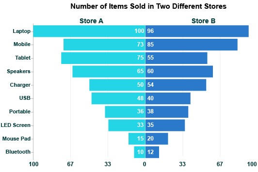
Typically, a Tornado Graph in Excel will look at two series of data across the same categories. For instance, you might use this data visualization to compare sales data from two stores across each month this year.
With this analysis approach, you can identify the largest and smallest values in your dataset and compare the results over different categories and series.
Ordering the data is particularly valuable. You can start at the bottom of the visualization to see why these lower values aren’t higher on the list. There may be previously undetected issues limiting results for these categories.
Alternatively, you can start at the top and move down the list. After all, the top of the Tornado Chart in Excel reflects the most important items in your dataset.
This top-down approach is particularly valuable when using the Tornado Chart in Excel for risk analysis or conducting a Tornado Plot sensitivity analysis.
In these cases, the biggest bars are the ones that need the most attention, while smaller ones pose no issue and don’t require any work.
A Tornado Diagram is a unique visualization that operates slightly differently from more traditional bar charts.
To understand how this chart functions, it’s valuable to go through each part. This will enable you to read and analyze Tornado Diagrams effectively.
Each bar in a Tornado Chart reflects one of the items or categories in your dataset. The length of the bar shows the value, range, or frequency of each part, depending on the scope of your Tornado Diagram.
Along the vertical axis are the labels for your different bars. This helps you distinguish which items belong to each chart component. When you notice something that needs further analysis, you can follow the bar to this axis to find out what that item is.
Often, Tornado Charts show bars of different colors diverging from one another. This allows you to compare two primary categories across multiple items. Typically, you’ll have two bars heading in opposite directions, but you may have more categories you want to visualize.
You may want to include a key in your Tornado Chart that lets viewers know what each color means.
In between these diverging bars is a centerline. Not only does this divider separate these bars, but it can also act as a midpoint for your scale. The range of the scale and the value of this middle will depend on your data and the type of Tornado Chart analysis you’re conducting.
The range mentioned above puts numbers and values behind the lengths of each bar. Sometimes, this range will go from negative to positive values. Or, it may show the same values on either side of the centerline, giving you an excellent visual analysis tool for comparing results from two separate categories.
Like many types of bar graphs, the Tornado Chart is incredibly versatile. There are many ways you can apply this visualization to understand your data better and drive action.
Tornado Charts assist with sensitivity analysis, risk and project management, monthly budgeting in Excel, and more.
With so many ways to apply Tornado Charts to make sense of your data, this visualization will quickly become one of your favorites.
See all the ways to use a Tornado Graph to unlock insights in your data.
Any visualization that helps you order your datasets has immediate use for identifying the most important items.
Sometimes, you’re analyzing hundreds or even thousands of individual pieces of data. Quickly knowing the highest and lowest values is an extremely crucial insight that can lead you to make critical decisions based on your results.
Depending on the goal of your analysis, your highest and lowest values may determine what’s working and what isn’t, the best-selling items versus the worst, the highest and lowest risks, etc.
The items at the top of any Tornado Chart always reflect the most significant factors in your data. At the bottom of the visualization are the least concerning items. The purpose of this design is to help you prioritize high-value targets.
That said, don’t neglect the items at the bottom of the chart. In some cases, these nominal values may also hold crucial insights.
For example, if your Tornado Chart shows sales for each month, you can quickly recognize your best-selling times of the year. But, investigating the times with the worst sales is also crucial.
Is there a way to bolster revenue during these low points or, at the very least, explain why sales are so low at these times?
You can use Tornado Charts to improve results throughout your data by understanding what works or has value and what doesn’t.
Tornado Diagram sensitivity analysis is a popular method of using this chart type. This approach tests the impact of certain factors on the performance of your data variables or items.
Since Tornado Charts present data in an ordered list, you can use this visualization to quickly evaluate the items affected the most or least by the factor you’re measuring, including comparisons across population pyramid types in demographic analysis contexts.
It’s particularly useful when you have a large dataset that contains many items. Tornado Charts help you navigate this volume of information with exceptional clarity.
Essentially, the items at the top of the chart (the ones with the largest bars) are your most sensitive items. This means they are affected the most by the dependent variable.
Let’s say you’re using a Tornado Chart to investigate how much time certain daily duties require to complete. The most time-intensive activities appear at the top of the chart, while the fastest tasks are at the bottom.
Thanks to this visual analysis, you’ll be able to swiftly detect which details in your data require attention and which are functioning at an acceptable range.
By prioritizing your time to resolve the most significant activities or items, you can produce the most significant improvements to your results.
Think of it like a report card from school. You don’t improve your grades much by turning an A into an A+. Instead, you must look at your weakest marks and start improving them first.
Sensitivity analysis using a Tornado Chart works the same way. It assesses performance across all your different variables and tells you which ones need the most work.
One of the ways that Tornado Charts and sensitivity analysis help teams is by solving uncertainty about what to do next. Without data, you may waste time and other limited resources optimizing things or controlling factors that don’t matter that much.
You may even have instances where people are in a heated debate over what the most effective strategies, products, investments, etc.
These discussions can slow down key processes that help your business move forward and grow.
People become so rooted in their assumptions and opinions that they refuse to budge. This damages your internal culture and may prevent your teams from seizing key opportunities.
The problem with most of these assumptions is that they lack quantifiable evidence. You need numbers and data behind your data-driven decision-making to ensure you’re making the correct steps and not needlessly wasting your time!
You should use Tornado Charts during these times of uncertainty or conflict. This data visualization tool injects objectivity and evidence into these conversations and enables teams to definitively know, not guess, what the next move should be.
The Tornado Chart allows you to test different qualitative variables and present the findings in a straightforward format. Even the most stubborn objectors won’t be able to argue with the evidence.
In other words, Tornado Charts save time, reduce frustrations and arguments, and allow you to steadily improve your results by focusing on what matters most.
The reason that data and evidence are so vital to decision-making is that they prevent you from wasting money on strategies and other investments that don’t produce positive returns.
There are countless examples of businesses wasting millions of dollars on costly, wrong decisions. In almost every case, companies made these decisions without the proper research or evidence. Instead, they used gut feelings and opinions to make the choices.
Opinion-driven choices only work sometimes, meaning you can’t make these decisions with high confidence. When you have data and research guiding your actions, the chance for error is much, much smaller.
Tornado Charts help you prioritize your budget and resources by showing you the factors that positively or negatively impact how you utilize these resources.
Once you can identify these factors and the magnitude of their impact on your resource expenditures, you can better plan and prioritize your activities. This means limiting strategies that overspend your budget or result in negative returns while maximizing those producing positive results.
Over time, you’ll learn the best way to utilize these resources and stretch your budgets to their limits. As you maximize the results from your resources, growth will increase their availability, allowing you to pursue even greater opportunities.
Let’s explore some Tornado Chart examples to show the different ways to utilize this visualization. This will also help you understand the various parts and how they work.
A growing retail business has two locations and wants to visualize its monthly sales performance across both stores.
The Tornado Chart allows this team to make a side-by-side comparison of the two stores across each month.
Most chart types list each month chronologically (January, February, March, and so on). Tornado Charts list these items in order of their significance or value.
Thanks to this design element of the Tornado Diagram, decision-makers for this retail business will also identify the best and worst months from a sales perspective. This intel will help them time marketing campaigns and other strategies more effectively.
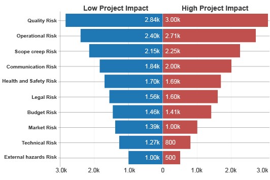
A startup company is uncertain of the value and risk associated with several strategies. This uncertainty is creating a lot of discussion and arguments within the team. Everyone has their own opinion but lacks the data or evidence to support their claim.
One team member has the wise idea to create a Tornado Diagram sensitivity analysis visualization. This chart will depict the impact of uncertainty on each item’s value and allow the team to determine whether there is a low or high risk for each potential change.
When they chart the data, the team finds marketing penetration and technology investments at the top of the list. This means that their inexperience and uncertainty will cost them the most in these areas.
They need to research and plan carefully to improve results in these areas. There is a high risk of overspending without the proper strategies.
Meanwhile, there is a low impact on value regarding price per unit. The team realizes the best strategy is to lower prices or offer discounts. In turn, this will drive marketing upside without nearly as much risk and increase penetration.
In the ensuing section, we’ll cover the importance of a Tornado Chart.
Here are some key reasons why tornado graphs are important:
Use a Tornado Diagram in Excel to identify the general trend of your key variables in your raw data.
Data points in this chart are grouped based on how close their values are, making it easier to identify outliers. Interestingly, the nature of the correlations can also be estimated based on a specified confidence level.
Tornado Chart in Excel is widely used by seasoned data visualization experts to display the causal relationships between two variables.
The relationship between variables can be positive or negative.
You can use this insightful chart to uncover hidden correlational relationships that exist in your raw business data.
Besides, interpreting the Tornado Diagram in Excel is incredibly easy.
The key to interpreting this chart is to always remember the following: independent variables (metrics) are found on the horizontal axis (x-axis). And, the dependent variables are situated on the vertical axis (y-axis) in a Cartesian plane.
Excel is a trusted data visualization tool because it’s familiar to many. However, the spreadsheet application lacks a ready-made Tornado Chart in Excel.
We understand switching tools is not an easy task.
This is why we’re not advocating you ditch Excel in favor of other expensive data visualization tools.
There’s an easy-to-use and amazingly affordable visualization tool that comes as an add-in you can easily install in your app to access ready-made sensitivity analysis-based charts, such as Tornado Chart, Butterfly Chart, and other types in Excel. The tool is called ChartExpo.
So, what is ChartExpo?
ChartExpo is an incredibly intuitive add-in you can easily install in your Excel without watching YouTube tutorials.
With many ready-to-go visualizations, the Tornado Graph in Excel generator turns your raw data into a compelling, easy-to-digest graph maker that tells data stories in real-time.
Let’s learn how to install ChartExpo in Excel.
ChartExpo charts are available both in Google Sheets and Microsoft Excel. Please use the following CTA’s to install the tool of your choice and create beautiful visualizations in a few clicks in your favorite tool.
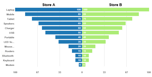
This section will use a Tornado Chart to display insights into the table below.
| Product | Store A | Store B |
| Laptop | 100 | 100 |
| Mobile | 85 | 85 |
| Tablet | 75 | 75 |
| Speakers | 65 | 65 |
| Charger | 60 | 60 |
| USB | 55 | 55 |
| Mouse Pad | 20 | 20 |
| Portable | 40 | 40 |
| LED Screen | 35 | 35 |
| Bluetooth | 10 | 10 |
| Routers | 15 | 15 |
| Modem | 5 | 5 |
| Keyboard | 10 | 10 |


The many uses of the Tornado Chart visualization produce powerful advantages for data users. Accessing valuable insights hidden behind confusing datasets is only the beginning of these benefits.
Tornado Charts will generate meaningful conversations in your organization about the best strategies to implement. This is a vital component of developing a solid data culture.
If you find yourself struggling with tedious analysis and overwhelming data sets, the Tornado Chart can help.
Experience the transformative force of Tornado Diagrams in your analysis and charting processes.
Time is money. It’s an adage every business owner knows, understands, and follows. After all, you can’t buy more time in a day, right?
Knowing the best ways and activities to spend your time is critical. Otherwise, you won’t make the most of this limited resource. Even worse, you may waste your time on dead-end strategies.
Tornado Charts can order your data and allow you to spot the activities that are worth your time. Prioritizing these items better ensures that you’re spending your time correctly and not wasting it on ineffective strategies. Additionally, using skills matrix templates can help you identify the strengths and weaknesses within your team, further enhancing your strategic focus.
You can use Tornado Charts to visualize time-based factors directly. Using this approach, you might take your sales data for each day of the week and chart it with the Tornado Diagram.
This visualization would reveal which days are your busiest or best for sales. You could also compare two years’ worth of data across multiple variables or items, like comparing year-to-year revenue for different products.
Alternatively, you can use this chart type to look at another variable, like value or costs, and then use these insights to judge how to spend your time.
For instance, you might conduct a Tornado Chart sensitivity analysis showing how a specific factor impacts costs or another variable. You can use this visual to better plan your strategies, which in turn helps you optimize how you spend your time.
Businesses are increasingly pushing to become data-driven. This means that key decisions are made with quantitative numbers and figures, rather than opinions and assumptions.
However, some parts of the process still fall on qualitative details, meaning opinions and past experiences matter. Thus, what businesses should strive for is to become data-informed.
A data-informed team uses a holistic approach that combines statistics and data with intuition and the team’s expertise. It pulls the best of both approaches to decision-making.
Tornado Charts are excellent at putting qualitative context behind quantitative data and vice versa. You can use this chart to validate your assumptions with evidence. Or, you can look at the data to discover new qualitative details worth exploring.
For instance, if sales are down this quarter, you can use a Tornado Chart to explore what factors and conditions negatively impacted revenue for this period and use these details to make adjustments moving forward.
With this holistic decision-making approach, there’s less internal turmoil. Data facilitates better (and more civil) discussions that lead to easy decisions and compromises.
No one will feel like their voice or opinion isn’t heard. Yet, you won’t be ignoring data to pursue things that lack any objectivity or evidence.
Data holds plenty of value to those who are willing to take the time to turn raw numbers into actionable insights.
However, the path to these insights is wrought with challenges and potential pitfalls. One of these potential issues is analysis paralysis.
Analysis paralysis occurs for several reasons. The most direct source of analysis paralysis is when you have tons of stuff, usually data that needs analyzing. The overwhelming volume of information causes you to mentally recoil.
Paralysis Analysis can also occur when you understand the data but can’t decide what to do next. You may have too many possible solutions or no clear ones. In either case, your forward progress halts, and you fail to act on your insights promptly.
Tornado Charts help in both scenarios. It’s a visualization capable of presenting and making sense of large volumes of information. It simplifies even the most overwhelming datasets and allows you to understand what’s happening.
Since Tornado Charts orders items by value or significance, it’s also ideal for helping you decide what to do next.
You can simply go down the list of items and optimize results for each thing as you go. This ensures that you start with the most significant items or the ones that matter most.
With a clear path of what to do next, you’ll easily avoid analysis paralysis and fatigue.
There are so many different chart types available to data users. Having one as versatile as the Tornado Chart is a great asset.
A versatile visualization means one that works for many different analysis projects. That’s exactly what you have with the Tornado Chart.
As we’ve discussed, you can use this visualization for risk and sensitivity analysis. You can also use it for budgeting, comparison analysis, marketing optimization, and more.
With so many ways to use the Tornado Chart, it’s a visualization you can return to again and again. You can use it to answer many analysis questions and uncover insights in many unique areas.
One of the ways that makes the Tornado Chart so versatile is the order in which it displays data. Any visualization that orders your data by value or significance is automatically applicable under several circumstances.
Since Tornado Charts function similarly to bar graphs, they are immediately familiar and understandable by all audiences. This means they are also very versatile in reporting.
You don’t have to explain how to read the chart or understand its insights. People are already used to interpreting bar charts.
There are just so many useful ways to put Tornado Charts to work for your analysis needs! It is an incredibly reliable chart type.
Understanding tornado diagrams can initially seem daunting. The visual representation of sensitivity analysis, with bars shooting off in different directions, might make you feel like you’ve stumbled into a maze. But fear not! With a little guidance, navigating through the complexities of a tornado diagram becomes as easy as following a recipe.
One of the key challenges when working with tornado diagrams lies in ensuring the accuracy of the underlying data. Just like a detective meticulously scrutinizes evidence to solve a case, you need to meticulously examine the data points feeding into the diagram. Any inaccuracies or inconsistencies can lead to misleading conclusions, akin to following false leads in an investigation.
Another hurdle to overcome when dealing with tornado diagrams is the presence of subjective assumptions. Much like different witnesses providing varying accounts of an event, stakeholders may have differing opinions on the variables and their impacts. This subjectivity can introduce bias into the analysis, skewing the results and clouding the true picture.
While tornado diagrams offer a valuable visual summary of sensitivity analysis results, it’s essential to recognize their limitations. Like a snapshot capturing a single moment in time, tornado diagrams provide a simplified representation of complex relationships between variables. They condense multifaceted data into a concise format, potentially oversimplifying the nuances of the underlying dynamics.
Another limitation of tornado diagrams is their static nature. Unlike a dynamic dance performance that evolves, tornado diagrams depict a single scenario at a specific point in time. They don’t account for changes or fluctuations in variables over time, limiting their ability to capture dynamic relationships and trends.
Tornado diagrams excel at highlighting the most influential variables within a predefined set. However, they may fall short of capturing the full spectrum of potential factors impacting the outcome. Like a spotlight illuminating select features on a stage, tornado diagrams prioritize certain variables while leaving others in the shadows. This limited scope can lead to overlooking critical factors that may exert significant influence under different circumstances. To mitigate this limitation, it’s essential to complement tornado diagram analysis with a comprehensive exploration of all relevant variables, ensuring a more holistic understanding of the underlying dynamics.
In the following video, you will learn how to make a Tornado Chart in Excel without any coding in a few clicks using Tornado Chart Creator.
A Tornado Chart is a visualization you can use to compare two contrasting variables in your data.
Data visualization experts use the chart to depict the sensitivity of a result to changes in key variables. It shows the effect on the output at varying values of input variables.
The Tornado Chart, also known as a Butterfly or Divergent chart, is a type of bar graph visualization used to compare the impact of different variables on a particular outcome. In this chart, data points are represented as horizontal bars aligned on the same X-axis, resembling butterfly wings.
No. Excel lacks a Default Tornado Plot. So, the application is not reliable, especially if you work extensively with data. You don’t have to ditch Excel in favor of other expensive data visualization tools.
Download and install add-ins, such as ChartExpo, in your Excel to create ready-made Tornado Charts.
When making decisions, you’re likely to waste a lot of time chasing things that don’t matter.
Sometimes, you might find yourself in shouting matches over what’s most important. To make matters worse, you can easily drift into analysis paralysis, unable to move the ball forward in this situation. And if you fail to move forward, you risk losing sight of the upside and inadvertently destroying the opportunities you’re trying to create.
The Tornado Chart Excel Template provides just such a way by clearly identifying those factors whose uncertainty drives the largest impact. This means you can focus objectively on what is important, leveraging the insights offered by tools like the Tornado Chart Excel.
Besides, you can save a ton of time, reduce frustration, and increase your efficiency.
Excel does not have Tornado Chart native support.
So, what’s the solution?
We recommend you install third-party apps, such as ChartExpo, to access ready-to-use Tornado Charts in Excel.
ChartExpo is an add-in for Excel that’s loaded with insightful and ready-to-go Tornado Charts. You don’t need programming or coding skills to use ChartExpo.
Sign up for a 7-day free trial today to access ready-made Tornado Charts that are easy to interpret and visually appealing to your target audience.
How much did you enjoy this article?


Learn how to use sparklines in Excel to quickly visualize trends inside cells. Discover types, creation steps, customization, use cases, benefits, and best practices.

Learn what a confidence interval graph is, how to create it in Excel, and how to interpret results to make more reliable, data-driven decisions.

A correlation matrix in Excel helps identify relationships between variables. Learn how to create, read, and use it for effective data analysis.


