Categories
By ChartExpo Content Team
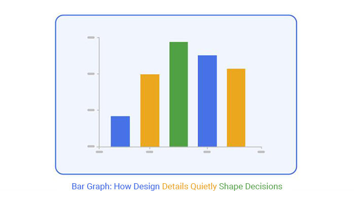
Graphs talk before you say a word. A bar graph doesn’t wait for your explanation. Your audience sees it and forms a quick opinion. It’s instant. A graph shows what matters faster than words. But here’s the catch: sometimes it speaks louder than intended.
Think about the last graph you saw. Your eyes jumped to the tallest bar, right? That first impression shapes what follows. A small change, maybe the order or color, flips the message completely. Move bars around, and a weak story looks strong. Change colors and calm turns to panic.
A bar graph can seal a decision before your presentation begins. Done right, it’s your quiet ally. It helps the audience grasp your key message fast. But done poorly, it misleads and confuses. Every choice in graph design counts. Make each bar count toward the outcome you want.
A glance at a graph can spark decisions even before the labels catch up with the brain. It’s the magic of visual processing; our brains consume visual information faster than text. The bars themselves tell a story, urging viewers to form opinions and conclusions in a heartbeat. It’s as if the bars whisper secrets to the mind, long before the labels try to chat.
This fast-paced interaction with data can be a double-edged sword. While it accelerates decision-making, there’s a risk of misinterpretation. The mind races ahead, sometimes leaping to conclusions without fully understanding the context. This is why the design and layout matter so much; they guide the viewer’s journey and help avoid missteps.
| Visual Biases Triggered by Bar Graphs | ||
| Bias Triggered | What It Does | How to Neutralize It |
| First bar bias | Overweights the initial bar and skews the interpretation | Order bars by relevance or message, not default sequence |
| Color bias | Creates emotional responses not based on data | Use colors intentionally to match meaning |
| Size illusion | Exaggerates the significance of larger bars | Normalize scale and spacing across bars |
| Grouping bias | Imposes false relationships between grouped items | Label groupings clearly and explain the rationale |
| Contrast bias | Draws attention to high-contrast elements regardless of importance | Apply contrast only to emphasize key insights |
| Flat bar pattern | Suggests stability where volatility may exist | Include trend lines or annotations |
| Visual anchoring | Sets expectations based on the first visible element | Lead with the insight, not arbitrary order |
| Misleading spacing | Suggests unequal importance or scale | Maintain consistent bar width and spacing |
| Faded or de-emphasized labels | Downplays important data | Keep all critical labels visible and legible |
First impressions matter, and in the world of visuals, they’re everything. The initial view of a graph frames the entire discussion. It captures attention, sets expectations, and occasionally seals an outcome before further explanation. Each color and height whispers a narrative, guiding thoughts and framing perceptions.
But beware, for the first impression can also misguide. A poorly designed graph might lead viewers down the wrong path, planting seeds of confusion instead of clarity. It’s crucial to craft a visual that tells the true story, avoiding embellishments that could mislead. The initial impression should serve as a reliable guidepost, not a deceptive mirage.
| Psychological Effects Triggered by Bar Graph Design | ||
| Visual Feature | Common Viewer Reaction | Design Implication |
| Tallest bar shown first | Anchoring effect that biases interpretation | Place bars based on importance or relevance, not default order |
| Red bar in a sea of blue | Triggers alarm or perceived risk | Use red only to signify legitimate warnings |
| Equal-height bars | Gives the illusion of stability or uniformity | Confirm true equality or annotate hidden differences |
| Small font or faded labels | Signals unimportance or invisibility | Use strong, readable labeling for key insights |
| Overlapping bars | Creates visual tension and confusion | Separate bars clearly with space or patterns |
| Bar with bold highlight | Draws disproportionate attention | Reserve highlights for critical insights only |
| Bars rising from negative to positive | Perceived turnaround or momentum | Use consistent axes and explain context |
| Bars descending left to right | Creates a sense of decline or loss | Arrange data to reflect actual trends or importance |
| Abrupt color shifts | Distracts or signals false change | Use gradients or consistent color schemes where appropriate |
When crafted with precision, it becomes your silent ally. It nudges the audience toward a conclusion even before your words fill the room. The right design and data alignment can preemptively answer questions, helping to seal decisions with subtlety and finesse.
This power lies in its simplicity and clarity. A well-constructed graph highlights key insights, drawing attention to the most critical elements. It acts as a silent advocate, supporting your presentation by emphasizing the data’s story. The audience feels informed and ready, making your task of persuasion much smoother.
| Types of Bar Graphs and When to Use Each | ||
| Bar Graph Type | Best Use Case | Why It Works |
| Vertical bar graph | Compare categories | Clear and direct visuals for discrete items |
| Horizontal bar graph | Long category names | Improves label readability and comparison |
| Stacked bar graph | Part-to-whole comparisons | Shows how subcomponents add up to totals |
| Grouped bar graph | Compare groups side by side | Visualizes categorical comparisons within sets |
| 100% stacked bar graph | Show percentage composition | Highlights the relative contribution of components |
| Segmented bar graph | Break down performance over time | Useful for viewing evolution within a single bar |
| Floating bar graph | Range between two values | Useful for min-max, confidence intervals, or deltas |
| Diverging bar graph | Show positive vs negative values | Highlights polarity, such as profit and loss |
| Bullet bar graph | Compare performance to the target | Good for KPIs and benchmarks |
| Gantt-style bar graph | Timelines or durations | Visualizes stages and task progress over time |
Changing the order of bars changes everything. It’s not just about following a sequence. It’s about how viewers perceive the information. By organizing bars differently, you can subtly shift the narrative.
Consider arranging bars by size instead of time. This can highlight the most significant data points. The viewer’s eye naturally follows the tallest bars, focusing their attention on what’s most important.
Sorting bars alphabetically can be misleading. It might seem objective, but it can hide poor performance. Imagine a company with poor sales appearing next to one with stellar results. The alphabetical order makes them seem comparable.
This kind of sorting creates a false sense of security. It levels the playing field in a way that doesn’t reflect reality. Alphabetical sorting is great for lists, but it can be deceptive in graphs.
Changing the order of one bar can alter the story completely. Imagine a scenario where a project seemed to be underperforming. By simply moving a bar, the narrative shifted from failure to success.
This reorder can be the key to getting approval. Decision-makers might see the same data in a new light. By presenting the strongest results first, you can create a more favorable impression.
Sometimes, the first bar gets undue attention. It can seem like the star, even when it’s not. This misplaced focus can skew the interpretation of data.
Viewers might assign too much importance to this initial bar. It becomes the hero of the story, overshadowing other data points. This can lead to misguided conclusions, impacting decisions that rely on accurate data interpretation.
| Common Pitfalls of Bar Graphs and How to Avoid Them | ||
| Pitfall | Why It’s a Problem | How to Avoid It |
| Placing the wrong bar first | Skews audience focus | Order bars by relevance or impact |
| Shrinking the y-axis | Minimizes perceived change | Use consistent, proportional scaling |
| Using red unnecessarily | Triggers a false alarm | Use red only for critical signals |
| Flat bars across time | Masks volatility | Add trend lines or variance indicators |
| Too many bars | Overwhelms viewer | Limit to around 5 key bars |
| Alphabetical sorting | Obscures true performance | Sort by performance or strategic priority |
| Color overload | Causes visual confusion | Use a minimal, purposeful palette |
| Averaging volatile data | Hides underlying fluctuations | Present range or variance from the average |
| Omitting key bars | Leads to an incomplete story | Ensure all essential data is included |
| Ambiguous labels | Leads to misinterpretation | Use precise, concise, and intuitive labels |
The following video will help you create a Clustered Stacked Bar Graph in Microsoft Excel.
The following video will help you create a Clustered Stacked Bar Graph in Google Sheets.
Equal bars might suggest stability. Yet, they could be hiding significant threats. Think of a company’s financial performance. Equal bars might show steady revenue across different quarters. But what if one quarter faced unreported challenges?
Consider a manufacturing plant. Equal bars might represent consistent production levels. However, one line might be operating at full capacity while another is barely functioning. This discrepancy could lead to future disruptions. Equal bars offer a sense of balance but might conceal risks that need attention.
| Common Bar Graph Mistakes and How to Fix Them | ||
| Mistake | What It Causes | How to Correct It |
| Bars out of meaningful order | Misleads or confuses viewers | Sort by magnitude or narrative logic |
| Shrinking the y-axis | Distorts actual differences | Use a consistent zero baseline |
| Ignoring outliers | Misses critical exceptions | Include or annotate outliers |
| Color inconsistency | Confuses viewer focus | Apply a deliberate and consistent color scheme |
| Too many bars | Overwhelms the viewer | Limit to top performers or group categories |
| Missing labels | Ambiguity in interpretation | Ensure all axes and bars are labeled clearly |
| Overuse of red | Creates an unnecessary alarm | Use red only for true warnings or alerts |
| Flat bar heights | Implies false stability | Add variation indicators or additional context |
| Excessive color variety | Distracts from the message | Stick to a minimal palette |
| Unexplained category grouping | Causes misinterpretation | Clarify the grouping rationale in the legend or caption |
Averages can be misleading. They flatten out volatility, creating a false sense of security, even in visuals like a percentage bar graph. Imagine a stock’s performance presented as an average. It looks stable. But beneath the surface, wild swings might go unnoticed.
Consider a company planning its budget. Average sales figures might suggest predictability. Yet, day-to-day sales could be volatile. This unpredictability can derail strategies if not accounted for. Averages provide a neat summary, but they might obscure fluctuations that are critical for decision-making.
Adjusting the y-axis can distort perception. Shrinking it can make significant drops look minor. Picture a sales graph with a reduced y-axis. A steep decline may appear gentle. This misrepresentation can lead to misguided conclusions.
Imagine a team assessing project timelines. The y-axis is adjusted, making delays seem less severe. This tweak might result in complacency, ignoring the need for corrective actions. Shrinking the y-axis offers a cleaner look but risks disguising important shifts that need addressing.
Flat graphs can sometimes go unnoticed. They might seem fine until a crisis emerges. Take a company’s risk assessment presented through flat bars. It appears manageable. However, a crisis reveals overlooked vulnerabilities.
Consider an environmental impact study. A flat graph shows stable conditions. But an unexpected event reveals hidden issues, sparking a crisis. The flat presentation was misleading, giving a false sense of security. It’s essential to look beyond flat graphs to anticipate and prepare for potential crises.
| Consequences of Misusing a Bar Graph | ||
| Misuse | Resulting Misunderstanding | Potential Business Impact |
| Omitted bar | Missing cause or outlier | Misdiagnosed failure or success |
| Too many bars | Viewer confusion and distraction | Delayed or misaligned decisions |
| Overuse of color | Visual fatigue or distraction | Loss of message clarity |
| Average without range | False sense of stability | Flawed strategic planning |
| Flat bar design | Perception of consistency | Overlooked operational risk |
| Poor axis scaling | Minimized significant changes | Underreaction to critical shifts |
| Alphabetical sorting | Obscured data importance | Misplaced focus in decisions |
| Red used arbitrarily | Unwarranted sense of urgency | Decision-making under false alarm |
| Ambiguous labeling | Incorrect interpretation | Data misuse or miscommunication |
| No trend context | Snapshot is seen as stable | Strategic blind spots |
| Hidden outliers | No awareness of extremes | Unprepared for edge-case scenarios |
Picture trying to juggle a dozen balls at once. It’s tough to keep track, let alone succeed. The same applies when a graph is saturated with bars. There’s no focus, making it hard for viewers to follow through on insights. Each bar represents a piece of data, but too many can blur the big picture.
Without focus, it’s like wandering in a fog. The essential insights remain hidden. Audiences struggle to extract useful information. This lack of clarity can stall projects, as team members can’t identify which data points need action. A graph should guide, not confuse. Simplifying the view can bring clarity and purpose.
| Handling Large Datasets in a Bar Graph | ||
| Problem | Why It Hurts Readability | How to Fix It |
| Over 10 bars shown | Causes cognitive overload and visual fatigue | Group or summarize categories to focus the viewer’s attention |
| Small bars clustered | Hard to differentiate values | Use a logarithmic scale or rank-based sorting |
| Visual noise from details | Loses focus and obscures key insights | Collapse low-impact categories or use highlighting |
| Repetition across time | Clutters the insight flow and creates redundancy | Segment the data by period or animate over time |
| Inconsistent bar width | Breaks the visual rhythm and trust | Use uniform bar dimensions |
| Too many category labels | Overwhelms the axis and viewers | Use abbreviations or interactive labels |
| Mixing unrelated metrics | Confuses the story and the viewer’s logic | Separate into multiple simplified visuals |
| High variance in values | Short bars become invisible | Use dual axes or a log scale if justified |
| Overlapping bars in grouped data | Creates confusion in interpretation | Add spacing or alternate shading |
Ever heard the saying “less is more”? Limiting a graph to five bars can transform it from cluttered to clear. With fewer bars, the eye can quickly scan and comprehend the data presented. This approach sharpens focus, allowing viewers to instantly grasp the key message without sifting through unnecessary details.
Think of it as decluttering a room. A tidy space makes it easy to find what you need. The same logic applies to graphs. By sticking to a five-bar limit, the essential data stands out. This minimalistic approach helps decision-makers zero in on what’s important, leading to faster and more informed choices.
Imagine a magician pulling a rabbit out of a hat. It’s about making the complex look simple. In graphs, collapsing or combining bars achieves this magic. It takes a crowded scene and transforms it into a coherent story. By merging similar data points, the graph retains its core message while shedding unnecessary weight.
Combining bars is like merging lanes on a highway. Traffic flows smoothly, and everyone reaches their destination faster. Similarly, when data points are combined, the graph becomes more readable. It highlights the story behind the numbers, ensuring viewers can follow along without getting lost in the details.
Picture this: a graph with one red bar among blues. It might make you think something’s wrong. Red often means danger. But in graphs, it’s not always bad. The color choice might cause unnecessary stress.
Red is powerful. It grabs attention. But use it wisely. If red isn’t meant to signal an alert, it can send the wrong message. The key is to match color with intention. This keeps the focus on data, not distraction.
Too many colors in a graph can be overwhelming. It’s like a rainbow gone rogue. Instead of clarity, you get confusion. Imagine trying to concentrate in a noisy room. That’s what color overload feels like in graphs.
Simplicity is best. Fewer colors create a cleaner look. This helps the message shine through. A well-chosen palette highlights key points without causing chaos. It’s about making data easy to understand, not turning it into a visual circus.
Colors mean different things in different places. What’s happy in one culture might be sad in another. In graphs, this can lead to misunderstandings. It’s like speaking a language not everyone understands.
Consider the audience before picking colors. Research cultural meanings. This avoids sending the wrong signals. A thoughtful approach ensures the data speaks clearly to everyone, no matter where they’re from.
Contrast is key in making data pop. But too much can be jarring. It’s like a sudden loud noise in a quiet room. The goal is to highlight, not startle.
Effective contrast draws the eye to important points. It shouldn’t overshadow the message. The right balance keeps the focus on what matters. It’s about helping the viewer grasp the information, not giving them a headache.
| How Bar Graphs Mislead and What Causes It | ||
| Misleading Effect | Root Cause | Prevention Strategy |
| Overstated differences | Manipulated y-axis scale | Use proportional, zero-based axes |
| False alarm | Arbitrary use of red or contrast | Align color with true message intent |
| Hiding poor performance | Alphabetical sorting masks extremes | Sort by value or strategic priority |
| Illusion of consistency | Averaging hides variation | Show variance, range, or median |
| Visual imbalance | Inconsistent bar width or spacing | Standardize dimensions and bar spacing |
| Misplaced focus | Placing the least important bar first | Lead with the most relevant or impactful data |
| Minimized outliers | Collapsed or omitted anomalies | Include footnotes or annotations |
| Inflated visuals | Exaggerated bar height without context | Label exact values and show full axis |
| Ambiguous grouping | Lumping unrelated items together | Clarify with grouping labels or legends |
Outliers are like the quirky friends at a party; they stand out. But bar graphs can sometimes hide these oddballs, smoothing over spikes or anomalies. Imagine a month where sales skyrocketed due to a one-off event. The graph might just show the average, glossing over that crucial peak. Without acknowledging these outliers, decisions based on the graph could miss key insights. It’s like ignoring the elephant in the room and wondering why things aren’t adding up.
Ever noticed a bar labeled “Other”? It often becomes a catch-all for categories that don’t fit neatly elsewhere. This can lead to misunderstandings. If a significant portion of data is lumped into “Other,” critical details vanish. And then there’s time context. Without it, we see a static snapshot, missing the dynamic ebb and flow of trends over time. This lack of context can mislead, suggesting stability when there’s volatility.
Picture flipping through a photo album, but only seeing one picture. That’s what a snapshot graph does: it shows a moment, not the journey. Without trends, we lose the narrative of how data evolves. A bar graph might show high sales, but without knowing if that’s a fluke or a pattern, you can’t trust the data fully. The absence of trends can erode confidence, making data-driven decisions feel like guesswork.
Imagine trusting a friend who tells you only half the story. That’s what it feels like when graphs lack trends. A single snapshot doesn’t provide the context needed to understand the full picture. Trust falters when decisions rely on incomplete information. Without the journey, the destination might not make sense. Data needs a story, and trends are the plotline that ties it all together.
| When to Pair a Bar Graph with Another Visual | ||
| Scenario | Why a Bar Graph Alone Fails | What to Pair With |
| Monthly revenue, but no trend | Viewers see a static snapshot without movement | Line graph to show progression over time |
| Category performance with many details | Too much label and number density | Table or matrix for full breakdown |
| Outliers in one period | Bar minimizes the impact or hides the exception | Annotations or a callout panel for context |
| Need to show regional spread | Bar lacks geographic relevance | Map or geographic overlay |
| Change versus target benchmarks | Bars alone do not show deviation clearly | Bullet graph or progress marker |
| Time series comparisons across groups | Becomes crowded or hard to scan | Small multiples or panel layout |
| User interaction patterns | Bar lacks sequence or directionality | Flow diagram or journey map |
| High-dimensional data with multiple metrics | Overloads a single visual plane | Interactive dashboard or layer toggle |
| Nonlinear change or patterns | Bar oversimplifies the curve | Curve plot or area visualization |
Imagine watching a mystery movie and missing the final scene. That’s what happens when a critical bar is omitted from the graph. Sometimes, that missing bar holds the key to understanding a failure or anomaly. It’s like reading a book with the last chapter torn out. Without it, the story doesn’t make sense, and important lessons are lost.
Leaving out a crucial piece of data can lead to misguided conclusions. Say a project failed, but the missing bar would’ve shown the true reason. Omitting this information skews perception. It creates a narrative that isn’t entirely true. Understanding failures requires seeing all the pieces, and that elusive sixth bar might just be the missing link.
Imagine a bridge with missing planks. You wouldn’t trust it, right? Visual gaps in graphs do the same to credibility. They leave questions unanswered and assumptions unchallenged. It’s like wearing glasses with a smudge; you’re not seeing clearly. These gaps can lead to misunderstandings, making viewers skeptical of the presented data.
Visual gaps create doubt faster than words ever could. A missing section in a graph speaks louder than a paragraph. It signals oversight or, worse, manipulation. In a world where data is king, credibility is its crown. Maintaining trust means ensuring every piece of information is presented, leaving no room for doubt.
| Ethical Red Flags in Bar Graph Design | ||
| Red Flag | Why It Is Misleading | How to Avoid It |
| Axes are manipulated for drama | Exaggerates differences or hides true scale | Start the y-axis at zero unless a specific reason is disclosed |
| Key data omitted | Leads to incomplete or biased conclusions | Include all relevant data or disclose exclusions |
| Bars reordered for persuasion | Creates a misleading sense of priority | Sort using neutral logic, like value or time |
| Color-coded to bias interpretation | Triggers emotional reactions over reason | Use consistent, neutral colors unless justified |
| Inflated contrast | Overemphasizes specific data points | Apply contrast purposefully and sparingly |
| Missing source or date | Reduces trust and context clarity | Label source and data collection timeframe |
| Visually identical bars with different values | Misleads the perception of equality | Scale bar height proportionally |
| Unclear units or scales | Confuses the audience and risks misinterpretation | Clearly label axes and units |
| Intentional crowding or clutter | Prevents clear comparison | Prioritize white space and simplify |
Imagine planning a road trip. You’d want a map, right? Bar graphs don’t map out sequences well. They don’t guide the eye from one point to another. A timeline or a process flow graph does this job. Each step leads to the next, forming a path.
Relationships are another tricky spot for bar graphs. Consider comparing height and age. A bar graph just piles bars. It misses the connection. A scatter plot gives you that “aha” moment. You see a trend or a correlation. It tells a story that a bar graph can’t.
| When Not to Use a Bar Graph | ||
| Situation | Why Bar Graphs Fail | Better Alternative |
| Showing chronological steps | Lacks natural sequence flow | Timeline or flowchart |
| Exploring correlations | Doesn’t show relationships | Scatter plot |
| Displaying nested categories | Gets cluttered quickly | Treemap or grouped graph |
| Showing change over time | Implies static comparison | Line graph with time axis |
| Visualizing proportions | Can distort part-to-whole understanding | Pie graph or stacked area graph |
| Comparing too many categories | Overwhelms viewer | Summarized or grouped views |
| Tracking real-time performance | Not dynamic or continuous | Live line graph or dashboard |
| Displaying causal relationships | Fails to show directionality | Causal diagrams or process maps |
| Mapping geographical data | No spatial component | Choropleth or geo map |
| Explaining multi-metric performance | Too simplistic for complex data | Combination or dashboard graphs |
Picture a menu with hundreds of options. It’s overwhelming. Bar graphs with too many categories are like that. Too many bars make it hard to focus. The viewer loses interest or gets confused. A simpler graph keeps attention. It highlights the key points without clutter.
Consider a survey with many responses. A bar graph tries to fit them all. It ends up messy. A pie graph or a summary could work better. They condense information, showing only the main ideas. This keeps the message clear and digestible.
Bar graphs can be simple. But when you add layers, things get messy. Complex data needs more than just vertical stacks. Imagine showing revenue, cost, and profit all in one graph. It turns into a tangled web. You can’t see the full picture.
Think of a dashboard showing different metrics. A single bar graph can’t handle it. You need multiple views. Maybe a combo of line and area graphs. Each gives context, revealing insights. This approach breaks down complexity, making data easier to grasp.
Executives live in a world where time is money. They want quick insights. They scan a graph to catch signals that guide big decisions. For them, a rise in sales or a dip in performance is a signal. It’s a call to action, not a detail to ponder. They look for trends that can spell growth or a red flag.
For executives, details are less important. They focus on the big picture. They seek patterns that align with their strategic goals. Their eyes are on the horizon, not the weeds. The graph becomes a tool to spot opportunities and risks. They tune in to what will influence the organization’s next move.
Managers, however, have a different approach. They seek a sense of ownership. They dive into the graph to find areas they can impact. They look for pieces of the puzzle that they can control. The data tells them what needs fixing and where they can shine.
Their focus is on actionable insights. Managers look for data that aligns with their team’s goals. They want to know how their group can improve performance. The graph serves as a roadmap. It shows them where to direct their efforts for the best results. They need clarity to drive their team forward.
Analysts, on the other hand, crave precision. Their world revolves around data accuracy. They dissect graphs to ensure numbers align with reality. For them, the devil is in the details. They want to verify that every bar tells a truthful story.
They dig into graphs to validate findings. They ask questions about the data’s source and reliability. Analysts are the guardians of data integrity. They make sure that the numbers reflect the real world. Their role is to provide a solid foundation for decisions.
So, when these three groups look at the same graph, what happens? Each one walks away with a different understanding. Executives see signals that guide strategy. Managers discover areas they can improve. Analysts ensure the data’s accuracy.
Each group acts based on its interpretation. This can lead to varied actions within an organization. The graph becomes a catalyst for diverse strategies. It’s a single tool with multiple outcomes. This diversity is both a challenge and a strength.
The beauty of a graph is its versatility. It provides a platform for different interpretations. Each viewer brings their perspective. The graph remains static, yet its impact is dynamic. This interplay of interpretations fuels a richer decision-making process.
| Misconceptions About Bar Graphs That Hurt Decisions | ||
| Misconception | The Reality | Better Perspective |
| Everyone will interpret this the same way | Different roles see different stories | Design for executives, managers, and analysts |
| Color is just decorative | Color carries emotional and cognitive weight | Use intentional, strategic color schemes |
| Flat bars mean stability | Can hide underlying risks or volatility | Support with context or trend indicators |
| More data equals more insight | Too much clutter in the message | Prioritize and focus on core metrics |
| Bar order doesn’t matter | First bar grabs attention and frames perception | Order by impact or importance |
| Averages tell the full story | They mask extremes and volatility | Use variance, range, or median for balance |
| Snapshot view is enough | Lacks trend or context | Always provide comparative or historical context |
| Red always signals danger | May trigger a false alarm | Use red only with an intentional, contextual purpose |
| The graph speaks for itself | May mislead without clarification | Add labels, captions, and notes for clarity |
| Bar graphs are always appropriate | Some relationships are better shown with other formats | Know the strengths and limitations of the format |
Graphs often travel far beyond their creator. They get forwarded in emails and included in reports. Your creation needs to speak for itself. Consider if someone unfamiliar with your thought process could still grasp the key points. It’s like leaving a trail of breadcrumbs; each piece should guide the viewer to the main idea.
Think of common misunderstandings people might have. Address these in your graph design. Use clear labels and a logical layout. This way, even when you’re not there to explain it, your graph remains a helpful guide, not a puzzle.
| Presentation Risks Caused by Poor Bar Graph Design | ||
| Design Mistake | What Happens in a Meeting | How to Prevent It |
| Too many bars | Audience disengages quickly or misses the main point | Show top 5–10 items and move the rest to the appendix or a detail slide |
| Missing labels | Interruptions for clarification disrupt flow | Label all axes and bars clearly |
| Misleading scale | Erodes trust and credibility instantly | Always begin the y-axis at zero unless justified |
| Overuse of animation | Distracts from the core message | Use animation only to add clarity, not drama |
| Unreadable font | Viewers miss critical information | Test for visibility at presentation distance |
| Poor contrast | Audience struggles to differentiate bars | Ensure high contrast between bars and background |
| Inconsistent bar width | Creates visual confusion | Standardize bar widths throughout |
| Overlapping elements | Makes content hard to parse | Space elements with adequate margins and separation |
| Lack of takeaway message | Leaves the audience unclear about the next steps | Summarize the key insight visibly near the visual |
Imagine someone revisiting your graph weeks after you presented it. Will they still get the same insights? Your graph should be timeless, meaning its message stays relevant and understandable long after its creation. Consider how it might be interpreted without any background context.
A well-constructed graph is like a classic book. It doesn’t need the author standing by to explain each chapter. Ensure your graph is self-sufficient by simplifying complex ideas and using clear visuals. This gives it lasting power.
In a fast-paced world, people often glance at graphs and make quick judgments. Can your graph deliver its message at first sight? Aim for simplicity and clarity. Your goal is to make sure viewers don’t need a decoder ring to figure it out.
Think of your graph as a billboard on a highway. Drivers only have a few seconds to catch its message. Use bold, clear visuals and concise labels. This ensures your graph communicates effectively, even with just a glance.
Each bar in your graph should play a role in your narrative. They should lead the viewer step by step, building a case for the action you want them to take. You’re not just presenting data; you’re constructing an argument. Each bar should say, “This is why you need to act.” They’re not passive elements but active participants in your story.
Consider them as breadcrumbs leading to a goal. If one bar is out of place or doesn’t support your message, it’s like a sentence in a story that doesn’t fit. Each bar should support the next, creating a seamless flow that ends with the viewer nodding in agreement. They should leave no room for doubt.
Order is king when it comes to visual data. Arrange your bars in a way that highlights the critical points first. The viewer’s eyes should naturally flow from one bar to the next without confusion. Use contrast to make the important bars stand out. Colors should be chosen to guide attention, not distract it.
Labels are your best friends here. They’re the unsung heroes of any visual data. They should be clear and concise, leaving no room for guesswork. An effective label tells the viewer exactly what they’re looking at and why it matters. It’s like a spotlight on a stage, highlighting the star of the show.
A well-crafted graph doesn’t need someone to explain it. It should speak for itself. The message should be clear the moment someone lays eyes on it. If you’re relying on a voiceover to make sense of your graph, it’s not doing its job. The decision should be obvious, a natural conclusion to the visual journey you’ve laid out.
Think of it as a silent film, where every gesture and expression tells the story. Your graph should be that expressive. The viewer should understand the message without needing a single word spoken. They should see the path you’ve laid out and follow it to the decision you want them to make.
Imagine walking into a meeting, and before you say a word, the deal is done. That’s the power of a well-designed graph. It’s like having a silent negotiator on your team. The right graph can convey confidence and clarity, making your case before you even step into the room.
A clean, straightforward graph can be your strongest ally. It removes doubts, answers questions, and builds trust. It’s not about overwhelming the viewer with data. It’s about presenting the right data in the right way. With one glance, the viewer should know exactly what you’re saying and why it’s in their best interest to agree.
Every graph makes a first impression. A bar graph makes it fast. It speaks before you explain. That’s its strength, and its risk.
One bar placed first can shift the story. A single color can stir alarm or calm. A short y-axis can flatten a steep drop. Small changes move the message. They shape what people see and how they think. They can also lead people the wrong way.
If your bar graph has too many bars, people miss the point. If you flatten volatility, decision-makers miss the threat. If you hide outliers, your team misses the lesson. Every choice in design adds weight to the outcome.
So test your bar graph. Will it be clear when shared without a voiceover? Will it hold up a week later without you in the room? Will it lead your audience toward the action you want?
Make each bar count. One glance should lead to one clear message.
How much did you enjoy this article?


Calculate accounts receivable turnover ratio to measure credit collection speed, improve cash flow, and strengthen your financial strategy. Read on!

Change Management KPIs are the key to tracking adoption, performance, and ROI during transitions. Find out which metrics matter. Read on!

Data collection methods and techniques determine the quality of every insight you act on. Explore key approaches for gathering reliable data. Read on!


