Categories
By ChartExpo Content Team
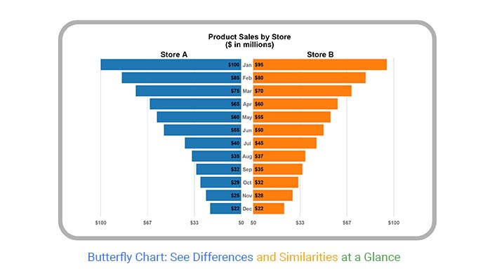
Ever wondered how to show two sets of data side by side clearly? The Butterfly Chart might be your answer. This chart, also known as the Tornado Chart, is an efficient way to compare two different datasets. It’s straightforward and eye-catching, making it perfect for presentations and reports.
So, what exactly is a Butterfly Chart? Picture two bar charts facing each other, sharing a common axis in the middle. One dataset extends to the left, the other to the right. This side-by-side layout helps you see differences and similarities at a glance.


Why use a Butterfly Chart? It’s great for visualizing data like population distributions, survey results, or any scenario where you need a clear comparison between two groups. The simplicity and clarity of the Butterfly Chart make it a powerful tool for data analysts, marketers, and anyone needing to present comparative data effectively.
First…
Ever wondered how to compare two sets of data side by side? Butterfly Charts are your answer. They’re simple yet effective tools for visualizing data. Picture two bar charts facing each other. That’s a Butterfly Chart. It’s perfect for seeing differences and similarities at a glance.
Definition: A Butterfly Chart is a visual tool. It shows two sets of data side by side. Imagine a butterfly’s wings. Each wing is a bar. The middle is the axis. This helps compare data clearly and simply.
Data can be messy and hard to interpret. Butterfly Charts and Tornado Graphs make this process easier. They take complicated numbers and turn them into clear visuals. This helps you understand the data quickly. Think of them as your go-to tools for making sense of data chaos.
Butterfly Charts do more than look good. They help in making decisions. By comparing data side-by-side bar chart, you see the bigger picture. This can guide strategies and improve outcomes. It’s a practical tool for anyone dealing with data regularly.
Ready to become a Butterfly Chart pro? This guide will take you from basics to advanced data visualization techniques. You’ll learn how to create, read, and use Butterfly Charts effectively. Each section is packed with tips and insights. By the end, you’ll be a Butterfly Chart master.
The central axis is the spine of the butterfly. It’s the middle line that divides the chart. Each side mirrors the other. This makes it easy to compare the data at a glance.
The wings are where the magic happens. On each side of the central axis, data spreads out like wings. One side might show sales in North America, and the other side shows sales in Europe. You see both sets of data, side by side, instantly.
Colors are your secret weapon in visual storytelling, making your charts not only pop but also instantly comprehensible. For instance, using blue for one set of data and red for another can make differences leap off the page. By choosing the best colors for graphs, you enhance the clarity of your visual narrative, ensuring that even at a glance, your audience can effortlessly distinguish between data sets and grasp key insights quickly.
Labels are the words that explain your data. They should be clear and short. Think of them as the signposts that guide you through the chart. Good labels make your chart easy to understand.
Butterfly Charts help in finance. They show past and future data side by side. This helps in predicting trends. You can see where things are heading and plan better.
In healthcare analytics, Butterfly Charts are a powerful tool for visualizing population data. Picture age groups on one side and gender on the other, creating a mirrored effect that brings demographic trends into sharp focus. This layout not only highlights population shifts but also enhances your ability to make data-driven decisions. By using Butterfly Charts, you transform complex demographic data into a clear, insightful narrative, making it easier to understand trends and plan effectively.
The market analysis becomes easier with Butterfly Charts. They show consumer data clearly. You can compare buying habits, preferences, or any other metric side by side. This helps in identifying patterns and making better business decisions.
ChartExpo simplifies the creation of Butterfly Charts as well as Scatter plot visualizations. With its user-friendly interface, you can quickly produce professional, data-driven charts that make complex insights easy to understand.
ChartExpo’s integration with popular platforms like Google Sheets, Excel, and Power BI means you don’t need to start from scratch. It supports data updates, so your charts are always up-to-date.
Explore ChartExpo’s tutorial section. Practice makes perfect. Use templates to save time and ensure consistency across your charts, especially when working with comparison-heavy visuals like a Segmented bar graph. Experiment with different styles to find what suits your data best.
Unlock the power of visualization with a stunning butterfly chart. See how this unique chart type brings balance and clarity to your data, making comparisons more intuitive and impactful. Dive into the world of butterfly charts and watch your data come to life with vibrant, dynamic visuals.
The following video will help you to create the Butterfly Chart in Microsoft Excel.


The following video will help you to create the Butterfly Chart in Google Sheets.
First, get your data ready through data wrangling. Clean it up and ensure it’s complete with no missing values. Organize your numbers neatly in two columns; these will be your left and right wings. Think of it like sorting your toys – everything in its place.
Now, set up your framework. Open your favorite charting tool. Create two bar charts – one for each wing. Place them side by side. This is your canvas. You’re ready to start creating.
Input your values. Watch your butterfly start to take shape. Adjust the scales so both sides are even. If one side is heavier, it throws off the balance. Think of it like a seesaw – both sides need to match up.
Colors matter. Choose a scheme that’s easy on the eyes. Too many colors can confuse. Pick a palette that helps your data stand out. Think of it like dressing for a party – coordinated and stylish.
Balance is key. Ensure both sides of your chart are proportional. If one side dominates, your message gets lost. It’s like balancing a scale – keep it even.
Fonts should be clear and readable. No fancy scripts. Stick to simple, clean fonts. Your goal is clarity. Imagine reading a book with messy handwriting – not fun, right?
Labels should inform, not clutter. Keep them short and to the point. Too many words can overwhelm you. Think of it like a road sign – clear and concise directions.
Don’t overload your chart with too much data. Less is more. Focus on the most important points. It’s like packing for a trip – take only what you need.
Make sure both sides use the same scale. If they don’t, comparisons will be off. Imagine comparing apples to oranges – doesn’t work, does it?
Avoid confusion. Use clear labels and informative legends. Make sure your audience knows what they’re looking at. Think of it like giving directions – clarity is key.
Looking at a Butterfly Chart, you can see patterns emerge. Data on each side can show trends that might be missed in other types of charts. Spot these patterns and see how they move together or apart.
Butterfly Charts lets you compare two sets of data side by side, which helps you see differences and similarities without causing an overload of information. By placing related data on opposite sides, you can quickly conclude and make informed decisions.
Outliers can tell a story. In Butterfly Charts, these stand out easily. Identifying these points can lead to deeper insights into your data.
Once you’ve spotted trends and outliers through trend analysis, it’s time to act. Use the insights from your Butterfly Chart to make informed decisions. Whether it’s shaping business strategy or guiding research, these charts can illuminate the path forward. By leveraging trend analysis, Butterfly Charts transform data into actionable insights, empowering you to take strategic steps with confidence.
Butterfly Charts aren’t limited to one point in time. You can use them to compare data over different periods. This helps track changes and predict future trends.
Sometimes, one Butterfly Chart isn’t enough. Compare multiple charts to get a broader view. This technique is useful when you have complex data and need to see how different sets interact.
Butterfly Charts can be more than visual tools. Combine them with statistical analysis for deeper insights. This blend of visuals and numbers provides a fuller understanding of your data.
Data isn’t always perfect. Butterfly Charts can highlight gaps. Use techniques to fill in missing data or adjust for inconsistencies, ensuring your data analysis stays on track.
Different data sets might have different scales. Normalize your data to make comparisons easier. This keeps your Butterfly Chart balanced and your insights clear.
Tracking profits and losses can get messy, but Butterfly Charts simplify the process. As the best graph to show profit and loss, one side displays profits, and the other shows losses. This clear split allows you to spot trends quickly and make informed decisions. By using Butterfly Charts, you can effortlessly visualize the ups and downs of your financial data, turning complex figures into a clear, actionable story.
Budgeting can feel like a tug-of-war. Butterfly Charts help you balance resources by showing where money goes and where it should go. They highlight discrepancies and make it simpler to allocate funds effectively.
Investors need to see where their money is spread. Butterfly Charts display portfolio distributions. One side can show current investments, the other potential changes. This makes it easier to tweak investments for better returns.
Understanding age distributions in health studies is vital. Butterfly Charts make this simple. One side shows the number of males, the other females, across age groups. This helps in identifying trends and making better health decisions.
Health equity matters. Butterfly Charts compare health outcomes across different groups. One side could show outcomes for one group, the other side for another. This helps in spotting disparities and working towards equality.
Doctors need clear patient data to make decisions. Butterfly Charts present patient profiles effectively. They can compare symptoms, treatments, and outcomes on either side. This clarity leads to better patient care.
Know your market inside out. Butterfly Charts segment customers. One side could show one demographic, the other side another. This helps in tailoring strategies to meet different needs.
What do customers prefer? Butterfly Charts show product preferences across demographics. One side shows one group’s choices, the other side another group’s. This comparison helps in refining product offerings.
Survey data can be overwhelming. Butterfly Charts make sense of it. They display responses side by side, making patterns easy to spot. This helps in understanding customer opinions and improving services.
Butterfly Charts are your best friend when sharing insights. Start with a story. What’s the main message? Use the chart to highlight it. Show how one side compares to the other. This visual trick makes numbers easier to understand.
Butterfly Charts can back up your points. If you’re talking about sales trends, show a chart. It makes your argument stronger. The chart is a visual proof that speaks louder than words.
Direct attention where it matters. Use colors to highlight key areas. Point out the main sections. Keep the audience’s eyes on the critical parts of the chart.
Start by explaining the chart. What do the two sides represent? Why is it called a Butterfly Chart? Give a quick overview before diving in. This sets the stage for easy understanding.
Think about questions your audience might ask. Prepare answers in advance. This shows you’re ready and keeps the data presentation smooth.
Tech issues happen. Be ready. Have a backup plan. If the chart won’t load, have screenshots ready. Stay calm and keep things moving.
Different formats need different approaches. For a live presentation, keep it simple. For a report, add more details. Tailor the chart to fit the medium.
If the audience seems lost, pause and clarify. Repeat key points. Use simple language. Make sure everyone follows along.
Butterfly Charts are perfect for comparing two related sets of data. They’re great for visualizing differences, such as survey results between two groups, sales performance across two regions, or any scenario where a side-by-side comparison is needed.
Butterfly Charts are useful because they make it easy to see differences and similarities between two data sets. Their side-by-side structure highlights contrasts and patterns, helping you draw insights quickly.
Yes, you can customize Butterfly Charts to fit your needs. You can change colors, add labels, and adjust the axis to better display your data. Customization helps make the chart more readable and tailored to your specific comparison.
No, Butterfly Charts are designed to be easy to read. By placing the data sets side by side, they make comparisons straightforward. However, keeping the design clean and avoiding clutter is key to maintaining readability.
To interpret a Butterfly Chart, look at the length of the bars on each side. Longer bars indicate higher values. By comparing the bars, you can see which data set has higher or lower values for each category.
One common pitfall is overcrowding the chart with too many categories, which can make it hard to read. Another is failing to label the axes and bars clearly. Keeping the chart simple and well-labeled helps avoid these issues.
Butterfly Charts are best for comparing data sets at a single point in time. For showing trends over time, line charts or bar charts with time series data are more effective. However, you can use a series of Butterfly Charts to show snapshots of data at different times.
Butterfly Charts help in decision-making by providing a clear comparison between two data sets. This clarity allows for quick identification of strengths, weaknesses, and trends, facilitating informed decisions.
Absolutely! Butterfly Charts are versatile and can be used in various fields such as business, healthcare, education, and more. Any situation that requires comparing two sets of data can benefit from a Butterfly Chart.
Typically, Butterfly Charts compare two data sets. For more complex comparisons, other types of charts might be better. But for a simple side-by-side look, two sets are ideal.
You’ve traveled from caterpillar to butterfly in chart-making! Remember when we started with the basics? You learned what a Butterfly Chart is and why it’s useful. Next, you dove into building one, step-by-step.
You picked the right data, chose the best format, and made it visually appealing. Then, you explored advanced tips to make your charts even better, just like using skills matrix templates to organize and enhance your analysis. Along the way, you saw real-world examples and success stories.
Think about how far you’ve come. You’ve turned data into clear, engaging visuals. Your skills have grown, and so has your confidence. You’re ready to use Butterfly Charts to make data come alive.
Now, you’re ready to fly solo. Keep exploring new ways to use Butterfly Charts. Try them in different fields. Test new ideas. Don’t be afraid to experiment. Data visualization is a field with endless possibilities.
Remember, each chart you create is a chance to learn. You’ll find new tricks, discover better methods, and continue to improve. Stay curious and keep pushing the limits. There’s always something new to learn, a better way to present your data.
Butterfly Charts are more than tools – they’re bridges to understanding. They help people see trends and make decisions. Your charts can make a difference. They can clarify complex data and tell a story.
Think of each chart as a legacy. It’s your contribution to clearer, more understandable data. Every time you use a Butterfly Chart, you’re helping others see the bigger picture.
In wrapping up this guide, know that your journey with Butterfly Charts doesn’t end here. It’s the beginning of a path full of discovery and innovation. Go on, spread your wings, and let your data soar!
How much did you enjoy this article?


Calculate accounts receivable turnover ratio to measure credit collection speed, improve cash flow, and strengthen your financial strategy. Read on!

Change Management KPIs are the key to tracking adoption, performance, and ROI during transitions. Find out which metrics matter. Read on!

Data collection methods and techniques determine the quality of every insight you act on. Explore key approaches for gathering reliable data. Read on!


