Categories
By ChartExpo Content Team
Bad data leads to bad decisions. Good data leads to success. The choice is simple.
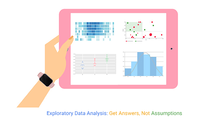
Exploratory data analysis makes sense of raw numbers. It finds trends, reveals inconsistencies, and checks assumptions before predictions take shape. Skipping this step risks bad models, poor insights, and costly mistakes.


Think of it as a reality check. Before running forecasts or trusting AI models, test the data. Is it reliable? Are there gaps? Does the story make sense? These questions separate good analysis from flawed conclusions.
Decisions built on bad data fail. Exploratory data analysis prevents that failure. It turns scattered information into a foundation for clear, reliable insights.
Read on to learn how it works and why it matters.
Exploratory Data Analysis, or EDA, is an approach in statistics that performs initial investigations on data. It uses graphical and quantitative techniques to summarize data characteristics.
Why bother with EDA? It helps uncover patterns, spot anomalies, frame hypotheses, and check assumptions through visual and statistical methods. This approach is vital because it ensures that the findings from the data are valid and applicable.
Without EDA, you risk making decisions based on misleading data trends.
John Tukey introduced EDA in the 1970s, significantly shifting how statisticians gather insights from data. Before his influence, statistical methods heavily relied on confirming theories rather than discovering them.
Tukey’s techniques fostered an environment where data could speak for itself, through visualization and transformation methods. His legacy lies in the robust, creative analytics that drive modern data exploration, emphasizing that data analysis is not just a means to confirm what is already assumed but to uncover the unexpected.
“The greatest value of a picture is when it forces us to notice what we never expected.” — John Tukey
EDA acts as a critical bridge between raw data and valuable business intelligence. By cleaning, transforming, and modeling data, EDA allows businesses to make well-informed decisions.
Think of EDA as the process that prepares data for further analysis, akin to setting the stage before the main act of predictive analytics. It’s the groundwork that ensures the data reflects real-world complexities before they’re used in strategic decision-making.
Skipping EDA and jumping straight into predictive modeling is like building a house without a blueprint.
The dangers? You might overlook essential variables or misunderstand the data structure. EDA provides a safety net to identify errors in data collection or processing stages.
It ensures the quality and suitability of data for prediction, safeguarding against inaccurate or unethical conclusions based on poorly understood datasets.
EDA is not a one-and-done deal. It’s about iterative refinement and skepticism. Great analysts circle back, question initial findings, and dig deeper.
Each round of EDA peels back a layer, offering more detailed insights. This iterative process is crucial because data often holds deeper truths that aren’t apparent on the first pass. It’s about challenging your findings and refining your insights until the data has truly revealed its story.
Graphical methods in EDA, such as Histograms, Scatter plot chart, and Box plot, are akin to using a magnifying glass. They bring data to life and make it easier to spot trends and outliers visually.
A histogram helps us see the distribution of data, revealing peaks and gaps that might go unnoticed in a table of numbers.
Scatter plots illuminate the relationship between two variables, highlighting any correlational patterns.
Box plots provide a concise summary of sample data, efficiently identifying the range, median, and outliers. Each of these tools turns raw data into a visual story, making complex information more accessible.
While graphical analysis captures the eye, non-graphical methods anchor the EDA process with solid statistics. Summary statistics such as mean, median, and variance give us a numerical foundation to describe and infer data properties.
The mean offers a quick snapshot of the central tendency, while the median provides a midpoint that resists distortion by outliers.
Variance measures data spread, telling us about the consistency of data points around the mean. These statistics are essential tools, offering a quick, accurate glimpse into the data’s heart without visual interpretation.
Deciding between graphical and non-graphical EDA methods depends on your specific goals and the data’s nature.
Use graphical methods when you need a clear visual summary of the data, ideal for presentations or initial data exploration. They help in understanding complex patterns quickly and intuitively.
Non-graphical methods are your go-to when you require precise numerical answers and summaries of your data set. They are particularly useful in formal reporting or when validating assumptions statistically.
This comparison bar chart aids in choosing between graphical and non-graphical EDA methods. It aligns various data analysis objectives with the most appropriate EDA technique.
For instance, if the goal is to understand the distribution of a single variable, a histogram (graphical) might be more useful than calculating the mean (non-graphical).
Conversely, if we need to summarize the central tendency in a report, the mean or median (non-graphical) would be more appropriate. This chart serves as a handy reference, aligning tools with tasks to streamline the EDA process.
The following video will help you to do Exploratory Data Analysis in Microsoft Excel.
The following video will help you create a Sankey chart for Exploratory Data Analysis in Google Sheets.
The following video will help you to do Exploratory Data Analysis in Power BI.
When tackling EDA, start by organizing your datasets. This means scrubbing the data of errors and missing values.
Imagine you’re a detective sifting through clues. Each piece of data must be accurate for a successful analysis. First, remove duplicate entries to avoid skewed results. Then, fill in or discard any gaps in your data. This step sets the stage for reliable outcomes in later analyses.
Visual tools are your best friends in spotting trends and odd data points. Use graphs like scatter plots and box plots to see where your data points lie. It’s like using a magnifying glass to find clues in a mystery novel.
These visual aids help pinpoint areas that require more detailed investigation or reveal unexpected patterns that could lead to insightful conclusions.
Before diving into predictive modeling, it’s vital to understand the relationships between variables.
Use correlation matrices to see how variables interact with each other, and a correlation matrix in Excel can help visualize these connections clearly. Is there a strong link between your variables? It’s similar to piecing together a puzzle. Each piece must fit perfectly to reveal the bigger picture, guiding your machine learning strategies effectively.
Challenge your assumptions to ensure they don’t cloud your analysis. Statistical tests, such as T-tests or ANOVAs, are tools to validate these assumptions.
Think of it as cross-examining witnesses in a court case. You’re verifying the reliability of the information before presenting it in your final report. This critical step helps maintain the integrity of your conclusions.
Data analysis isn’t a one-off task. It’s a cycle of reviewing, questioning, and refining your findings. With each iteration, ask different questions or adjust your methods. It’s like editing a draft in writing. Each revision brings new insights and polishes your final output, enhancing the accuracy and depth of your analysis.
A retail chain faced high return rates, impacting profits. By using EDA, the company identified that sizing inconsistencies across products confused customers. They adjusted their product descriptions and sizing guides accordingly.
This action reduced return rates significantly, boosting customer satisfaction and profitability. It shows how effective data analysis directly solves business problems.
A Mosaic plot offers a vivid snapshot of your categorical data distribution. It highlights inconsistencies and gaps almost as if they’re missing pieces in a board game.
Each colored block represents different data categories, making it easier to spot areas needing attention. This visual representation aids in quickly identifying and addressing data quality issues.
What happens when data is dirty? Missing values can skew results, leading to faulty analyses. Duplicated entries confuse, creating a mirage of data that might not actually exist. Incorrect values? They’re perhaps the most deceptive, leading you to make decisions on false premises.
EDA tools have a knack for flagging these problems. By employing techniques like data profiling and cleansing, EDA ensures that you’re working with the cleanest dataset possible. This is crucial because clean data forms the backbone of reliable analysis.
Imagine making a decision based on a trend that doesn’t exist. Scary, right? That’s what happens when EDA is not conducted thoroughly. Bad EDA might overlook subtle but critical data anomalies, leading businesses to chase after false trends.
This is a disaster in the making, especially in sectors like finance or healthcare, where decisions impact millions. Effective EDA acts as a safeguard, scrutinizing every trend and ensuring that what you see in your data is the truth, not just a data artifact.
Let’s talk numbers—big numbers. A finance firm nearly faced a multi-million blunder due to overlooked data anomalies. Thankfully, an early EDA intervention saved the day. By diving into their data with advanced analytical tools, the firm could identify the misleading data before it translated into a financial fiasco.
This story isn’t just about the money saved; it’s about the power of proactive EDA in averting potential disasters. It serves as a stark reminder that in the data world, vigilance is key.
Ever seen a box and whisker plot? It’s a simple yet powerful tool in EDA for spotting outliers in data. The box represents the central quartiles of the dataset while the whiskers extend to show the rest of the distribution, except for outliers, which are marked separately.
This visual tool makes it easy to see when something’s amiss, such as a sales region performing way out of line with others. By quickly identifying these outliers, businesses can investigate and address issues much faster, keeping operations smooth and efficient.
In the bustling world of retail, staying ahead is key. Imagine a tool that not only peeks into customer preferences but also tailors pricing strategies with precision.
That’s where EDA shines. By dissecting customer data, businesses can identify unique customer segments. This segmentation allows for targeted marketing, ensuring that promotions reach the most receptive audiences.
Furthermore, EDA aids in understanding price sensitivity within each segment, enabling dynamic pricing strategies that maximize profits without sacrificing sales volume.
Picture a financial landscape where anomalies wave red flags as they occur. EDA plays detective here, scrutinizing transactional data for patterns that deviate from the norm. This proactive analysis is vital in the finance sector, where identifying irregularities quickly can prevent substantial losses.
By setting up systems that continuously analyze transaction data, companies can detect potential fraud early, safeguarding both their assets and their customer trust.
In the critical arena of healthcare, the accuracy of clinical trials can be a matter of life or death. EDA provides a backbone for validating these trials. It sifts through vast amounts of data to confirm if the trial results are reliable or if they’ve been skewed by variables unnoticed at the outset.
This rigorous analysis ensures that the conclusions drawn from clinical trials are sound, paving the way for safer medical treatments.
Visualize a warehouse where every item is accounted for and supply perfectly matches demand. EDA makes this scenario possible through meticulous analysis of inventory data. It helps businesses predict the most accurate stock levels needed, reducing overhead costs associated with overstocking and minimizing lost sales due to understocking.
This fine-tuned inventory forecasting is crucial for maintaining efficient operations and high customer satisfaction.
Imagine a chart that highlights which EDA techniques pack the most punch. A Pareto chart does just that, enabling businesses to see which methods will give them the most bang for their buck.
By focusing on the techniques that address the largest issues, companies can more effectively allocate resources, ensuring that their analytical efforts are both efficient and impactful.
Exploratory data analytics shines in pinpointing high-value customers. This technique sifts through data to reveal patterns and trends. It highlights who your big spenders are and what attracts them.
For businesses, this means a chance to direct their efforts toward the most profitable segments. It’s not just about finding new customers but recognizing and cultivating the potential within existing ones.
Clustering and segmentation often get confused, but they serve different purposes. Clustering groups customers based on similarities in their data without prior labels.
Segmentation, on the other hand, involves dividing a customer base into groups based on predefined criteria. Choosing between them depends on your business goals. If you’re looking to discover new, unknown groups, clustering is your go-to.
For targeting specific, known characteristics, segmentation works best.
A SaaS company used EDA to keep more customers engaged. By analyzing usage data, the company identified features that were key to customer satisfaction.
They then developed targeted interventions for at-risk customers, such as personalized tutorials or enhanced support. This proactive approach led to a significant uptick in customer retention. It shows the power of data in transforming customer satisfaction strategies.
Visual tools like the clustered column chart make data easy to understand at a glance. This type of chart is perfect for displaying how different customer segments perform across various metrics. It can reveal, for instance, which segments are most profitable or have the highest engagement levels.
For businesses, this visual breakdown can inform more nuanced and effective marketing strategies.
In data, not all that glitters is gold. Some odd data points are just noise—meaningless distractions. EDA uses techniques like clustering and regression analysis to sift the valuable from the useless. By analyzing the context and clustering similar data points, EDA identifies if an outlier truly matters.
This method helps data scientists decide which oddities warrant a closer look. It’s like finding a needle in a haystack that turns out to be the key to a puzzle.
Deciding whether to investigate an outlier involves a few key steps. First, assess the impact. Does this data point affect your overall analysis? Next, check consistency. Is this an isolated event, or part of a trend? Finally, consider the source. Could there be an error in data collection or entry?
By systematically evaluating outliers with these questions, you can efficiently direct your investigative efforts.
In today’s data-driven world, the stakes are high. Incorrect data can lead to costly mistakes. EDA plays a vital role in identifying errors and potential fraud. By examining data patterns and anomalies, EDA detects inconsistencies that may indicate fraud or errors.
This preemptive analysis is crucial in preventing misinformation from leading to financial losses or skewed results.
Consider a global bank plagued by fraudulent transactions. By applying EDA, the bank identified unusual patterns in transaction data that were not obvious at first glance.
Analysts were able to flag these transactions for further investigation, significantly reducing fraud losses. This real-world application shows how effective EDA can be in a practical setting.
Scatter plots are a powerful tool in EDA. They visually represent data, allowing analysts to spot outliers quickly. In our bank example, a scatter plot could show the amount and frequency of transactions for each account. Points clustered away from the main group could indicate potential fraud.
This visual tool makes it easier for analysts to pinpoint which transactions may need a closer look.
One common error in data analysis is starting modeling without preliminary exploratory steps. This can lead to models that don’t accurately represent the data. To fix this, always start with EDA. This process includes summarizing main characteristics with visuals.
Engage in this step to uncover underlying patterns, spot anomalies, and test assumptions with the help of statistical figures.
Overfitting occurs when your model learns the detail and noise in the training data to an extent that it negatively impacts the performance of the model on new data. This is often a result of using poor quality data.
The solution? Improve data quality and use techniques like cross-validation to ensure that your model generalizes well to unseen data.
Using inappropriate data visualizations can confuse rather than clarify your data’s story. If your visualization doesn’t match your data type or the story you want to tell, it can mislead the audience.
Be sure to match your visualization type to your specific data and analysis needs. Clustered Stacked Bar Charts are great for comparisons, while multi-axis line charts work well for trends.
It’s easy to fall into the trap of assuming that correlation implies causation. Just because two variables move together does not mean one causes the other. To avoid this mistake, always look deeper. Perform experiments or statistical tests designed to understand whether a true causal relationship exists.
Often, outliers are seen as data points to be discarded. However, they can sometimes be the most valuable pieces of data. They could indicate a new trend or highlight errors in data collection. Analyze outliers to determine their cause and decide how to handle them based on their source and impact on your analysis.
A Waterfall chart effectively illustrates how sequential decisions impacted the financial health of a company. It can clearly show initial financial status, followed by incremental decreases or increases due to specific actions.
For a company that suffered losses due to poor EDA, each bar could represent financial changes tied to specific analytical errors, providing clear visual feedback on the impact of each mistake.
The risk of “false accuracy” in AI models is a significant concern in the field of data science. False accuracy occurs when a model appears to perform well during testing but fails in real-world scenarios.
This can be largely attributed to overfitting or biased training data. EDA addresses these issues by providing a bird’s-eye view of the dataset, helping to spot any irregularities or biases in the data that could lead to skewed predictions.
By applying various statistical tests and visualization techniques, EDA helps to uncover hidden patterns or relationships that might influence the model’s behavior. This preemptive scrutiny ensures that the model’s predictions are not just accurate but also unbiased and reflective of real-world conditions.
Additionally, EDA encourages the use of cross-validation techniques that further validate the model’s effectiveness across different subsets of data. This not only enhances the model’s robustness but also its ability to generalize well across various conditions and datasets.
Exploratory statistics serve as an early warning system in the development of AI models. By applying these techniques early in the model testing phase, data scientists can identify models that might underperform. This early detection is crucial in preventing resource wastage on models with limited potential.
Statistical tools in EDA, such as hypothesis testing and confidence intervals, provide insights into the model’s assumptions and the likelihood of those assumptions holding true in real-world applications. Such statistical evaluations are essential in verifying the model’s integrity and operational viability.
Moreover, exploratory statistics enable the simulation of different deployment scenarios, testing how the model would perform under various conditions. This flexibility allows for adjustments and fine-tuning, significantly enhancing the model’s resilience and adaptability.
Neglecting EDA can lead to substantial business costs. A poorly performing algorithm not only fails to deliver on its intended outcomes but can also lead to misguided decisions based on inaccurate predictions. These decisions can have dire financial consequences, tarnish the company’s reputation, and lead to loss of customer trust.
The financial implications of an underperforming AI can be vast, especially in sectors like finance, healthcare, and retail, where decision-making relies heavily on data accuracy. Investing in thorough EDA processes helps mitigate these risks by ensuring the data fed into the models is well-prepped, representative of the problem space, and free from underlying biases.
Additionally, bad EDA can lead to legal and ethical issues, especially if the AI’s decisions disproportionately affect certain groups. Proper EDA practices include ethical considerations, ensuring that the models operate fairly and justly.
A slope chart effectively illustrates the improvement in model performance following a rigorous EDA. The chart shows two points for each model: one before EDA and one after.
This visual representation clearly displays how models that undergo thorough exploratory analysis before deployment perform significantly better, emphasizing the value of EDA in the AI and machine learning pipeline.
Starting with EDA is not just good practice; it’s essential. This process uncovers the underlying structure of the data, highlights missing values, and identifies outliers.
Think of EDA as your data’s background check. It ensures that you know what you’re working with, smoothing out potential bumps in the ML (Machine Learning) road ahead. Without this step, your ML algorithms might misinterpret noise as patterns, leading to unreliable results. Always remember, solid foundations lead to sturdy buildings.
When you focus on data-driven insights, your AI becomes more than just a number cruncher; it turns into a reliable predictor of real-world outcomes. By prioritizing EDA, you allow the actual data to guide the model’s development.
This approach roots your AI in reality, enhancing its accuracy and trustworthiness. It’s like using a map drawn from the terrain itself rather than one imagined by an artist. The closer the map reflects the landscape, the better your journey will be.
Ignoring EDA can be costly. Consider AI systems that failed spectacularly because they were trained on noisy, unexamined data. These systems made decisions based on flawed insights, leading to real-world consequences.
From financial losses to reputational damage, the price of skipping EDA can be enormous. It’s a classic case of penny wise, pound foolish.
Imagine a gauge chart with a needle swinging dramatically towards “High Performance.” That’s the visual impact of integrating EDA in your AI projects. This chart isn’t just for show; it quantifies how crucial EDA is.
By measuring model performance with or without EDA, the difference becomes starkly apparent. It’s a simple yet powerful demonstration of why EDA should never be an afterthought in AI development.
Data must be understood before making forecasts. Predictive models fail without proper groundwork. EDA helps businesses grasp data trends, spot errors, and clean records before making decisions.
Raw data contains noise. Messy information skews predictions and misguides strategies. EDA identifies missing values, incorrect entries, and redundant records, preventing misleading conclusions.
Skipping EDA means working with unreliable data. Businesses risk making choices based on flawed assumptions. Proper analysis ensures accuracy before deeper analysis begins.
Bad data wastes money. Incorrect records cause forecasting errors, supply chain issues, and misplaced investments. EDA highlights inconsistencies before they impact operations.
Decisions based on poor data lead to losses. Inaccurate customer insights cause marketing failures. Flawed financial data results in miscalculated risks.
Fixing errors later is expensive. If bad data influences strategy, reversing actions takes time and money. Early detection prevents unnecessary setbacks.
EDA exposes insights often overlooked. Trends, correlations, and inconsistencies appear when data is analyzed. These patterns help companies identify opportunities or potential risks.
Unusual values signal red flags. Outliers may indicate fraud, reporting errors, or operational inefficiencies. Spotting them early helps avoid costly mistakes.
Unexpected trends provide competitive advantages. Finding hidden relationships in data leads to better forecasting and informed decision-making.
Charts and graphs clarify data. Numbers alone can be confusing. Visuals transform raw figures into easy-to-understand insights.
Executives need fast, clear information. EDA uses visual tools like histograms, scatter plots, and heatmaps to highlight key findings. These tools make trends obvious.
Stakeholders align better with visuals. Seeing trends on a chart makes discussions more productive. A well-placed visualization ensures key messages are clear.
Decisions based on bad analysis lead to failure. Skipping EDA means relying on incomplete, incorrect, or skewed data. Businesses risk acting on false trends.
Flawed models damage long-term planning. Predictive models built on unverified data lead to incorrect forecasts. Errors multiply, making decisions unreliable.
Data-driven strategies need solid groundwork. EDA ensures clean, structured information before modeling begins. Skipping this step creates more problems later.
Data without analysis is a liability. Patterns go unnoticed, errors slip through, and decisions fail. Without a structured approach, businesses risk acting on misleading insights.
EDA turns raw numbers into clarity. It validates data, highlights trends, and ensures models are built on a solid foundation. Graphical and statistical methods work together to expose hidden relationships, anomalies, and inconsistencies.
Skipping this step leads to wasted resources, bad forecasts, and costly mistakes. Companies that prioritize thorough data exploration make smarter decisions, minimize risks, and gain a competitive edge.
Your data tells a story. Make sure it’s the right one.
How much did you enjoy this article?


Calculate accounts receivable turnover ratio to measure credit collection speed, improve cash flow, and strengthen your financial strategy. Read on!

Change Management KPIs are the key to tracking adoption, performance, and ROI during transitions. Find out which metrics matter. Read on!

Data collection methods and techniques determine the quality of every insight you act on. Explore key approaches for gathering reliable data. Read on!


