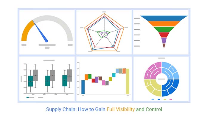
Categories
By ChartExpo Content Team
In today’s fast-paced business environment, managing your supply chain effectively can make or break your success. Supply chains are the backbone of any operation, but without full visibility, you’re left guessing when something goes wrong. This is where data visualization come into play, helping you take control of every moving part in your supply chain.


Think about it – without a clear view of how goods, finances, and data flow across your network, decisions become little more than educated guesses. You might not know where delays are happening or why costs are rising. But with the right supply chain tools, you can track every detail, giving you the insight needed to tackle issues before they escalate.
Imagine having a roadmap for your supply chain, where every link in the chain is clear. You can spot bottlenecks, see where inventory is piling up, and fine-tune your operations in real-time. Supply chain management isn’t just about moving goods – it’s about making data-driven decisions that lead to efficiency, savings, and growth.
Ready to take charge of your supply chain?
First…
Staying on top of your supply chain means having full visibility into every corner of it. But let’s face it – most businesses struggle with this. Without a clear picture, you’re left guessing where things are going wrong. That’s where Sankey Diagrams come into play.
These diagrams are like a roadmap for your supply chain. They give you a detailed view of how goods, finances, and data flow across your network. You can see the volume of materials moving through each stage, whether it’s from suppliers, manufacturers, or distributors. Imagine being able to track every piece of the puzzle – now you can.
Let’s say you’re trying to figure out why deliveries are getting delayed. With a Sankey Diagram, it’s simple to identify bottlenecks. You can see exactly where things are slowing down, so you can fix it fast. By visualizing the flow, for example energy flow diagram, you can also spot redundancies or areas that need more resources.
Managing inventory feels like walking a tightrope. Overstocking eats up your cash and storage, while understocking leads to angry customers and missed sales. The good news? You can get a better handle on it by visualizing your data.
Heatmaps are your go-to tool here. By using a Heatmap, you can get a clear picture of inventory levels across different locations, product categories, and even time frames. You can also spot trends, like when certain products are overstocked in one warehouse but running low elsewhere.
When you pair historical sales data with your inventory heatmap, it’s a game changer. You can see how well your stock is aligned with actual demand. And if you notice certain patterns – like seasonal spikes – you can adjust your inventory strategy to avoid getting stuck with too much or too little.
Predicting demand is hard. But getting it wrong? That can cost you big time. The key to staying ahead is finding patterns in your data that help you make better predictions. A Multi-Axis Line Chart gives you the tools to do just that.
This chart lets you see historical demand, sales forecasts, and actual sales all at once. It’s like having three sets of eyes on the same problem. You can easily compare what you expected versus what really happened, and that’s how you catch forecasting mistakes early.
Another perk? You can overlay external factors like economic data or even weather conditions on the chart. This gives you deeper insights into what’s driving demand and helps you fine-tune your forecasts even further.
Transportation and logistics are often where supply chains bleed money. Whether it’s choosing the wrong carrier or planning inefficient routes, these mistakes add up. What you need is a clear way to compare transportation options – and that’s where Clustered Bar Charts can help.
These charts let you stack up multiple factors like cost, time, and reliability side by side. Want to know which carrier offers the fastest service at the lowest price? This chart will show you.
Sometimes, the cheapest option isn’t the best when time is a priority. But with this kind of comparison, you can make smarter decisions that balance both cost and speed. You can even add filters to see how different types of cargo perform across various routes or carriers.
Supply chains are vulnerable to a range of risks, from supplier failures to natural disasters. And while you can’t control everything, you can be better prepared. A Radar Chart gives you a complete view of the risks across your supply chain.
By plotting different types of risks – like geopolitical or financial – on a radar chart, you can easily compare their likelihood and impact. You’ll know exactly where your weak spots are and what needs attention.
Risks don’t stay the same forever. That’s why it’s helpful to track how risks evolve. Radar charts can incorporate historical data, so you can see if certain risks are increasing or decreasing over time. This lets you adjust your strategy and resources accordingly.
Not all suppliers are created equal. Some consistently deliver on time, while others cause delays or send low-quality goods. How do you keep track of who’s doing what? A Scatter Graph is the answer.
Scatter plots let you evaluate suppliers based on multiple performance metrics – things like quality, delivery speed, and cost. The data points tell a story, and by looking at the patterns, you can quickly identify top performers and those who might need a little nudge to improve.
You can even adjust the size of the data points to represent order volume. This way, you’re not just tracking performance – you’re seeing which suppliers matter most to your overall business. Focus on your biggest contributors and make sure they’re meeting your standards.
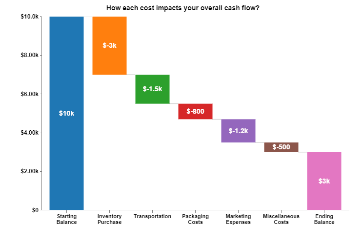
Managing cash flow is essential for any supply chain. Without it, even the best operations can grind to a halt. A Waterfall Chart helps you break down your cash inflows and outflows, so you know exactly where your money’s going.
This chart shows you how each cost impacts your overall cash flow, from purchasing inventory to paying for transportation. If you’re looking for ways to cut costs, the Waterfall chart will show you where to start.
By understanding how cash flows through your supply chain, you can renegotiate payment terms with suppliers or adjust inventory levels to free up cash when you need it most.


Suppliers are the backbone of your supply chain. When one underperforms, it throws everything off balance. You need a clear way to track and compare suppliers to ensure they’re meeting your standards. That’s where Clustered Column Charts come in handy.
With a Clustered Column Chart, you can track key metrics like delivery times, defect rates, and costs across your suppliers. This makes it easy to see which suppliers are hitting the mark and which ones need improvement.
By having a clear visual analytics, you can hold suppliers accountable for their performance. This chart gives you the data you need to make tough decisions about whether to improve relationships or move on to more reliable partners.
Managing inventory across multiple stages of your supply chain is no easy task. You need to keep track of stock at suppliers, manufacturers, distributors, and retailers, all at once. A Stacked Bar Chart makes this juggling act easier by giving you a visual breakdown of inventory at each stage.
With a Stacked Bar Chart, you can spot imbalances quickly. Maybe your distributors are running low while your manufacturers are overstocked. This chart gives you the insight you need to keep stock levels balanced throughout your supply chain.
The best part? You can use the data from the Clustered Stacked Bar Chart to fine-tune your reordering process. Instead of placing blanket orders, you’ll know exactly which stage needs more stock and when.
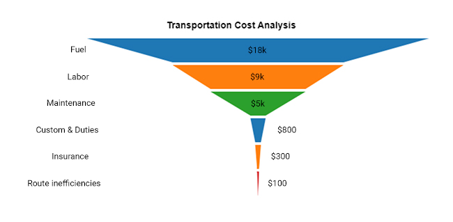
When it comes to transportation, the expenses can add up quickly – fuel, labor, maintenance, and route inefficiencies all eat away at your profits. It’s easy to lose sight of where the biggest costs are coming from without the right tools. This is where Funnel Charts come in handy.
A Funnel Chart allows you to visualize costs at each stage of your transportation process. You’ll see exactly where the money is going, making it easy to spot the largest expenses. For example, you might find that fuel costs are spiking in certain regions, or maybe maintenance is taking up more than its fair share of the budget.
Once you have a clear view of the costs at each stage, it becomes easier to find savings. You might realize that optimizing routes or renegotiating contracts with carriers could shave off a good chunk of your expenses. The Funnel Chart will make it crystal clear where to start.
Returns are a headache for any supply chain, but they’re also inevitable. How you manage returns can make the difference between keeping customers satisfied or driving up costs. A Pareto Analysis is a valuable tool for understanding why products are being returned, allowing you to focus on the root causes.
By using a Pareto Chart, you can quickly see which issues account for most returns – whether it’s defects, wrong items, or damaged goods. Once you know what’s driving returns, you can take targeted steps to reduce them.
With a clear picture of what’s causing returns, you can work on improving the process. Maybe you need better quality control, such as using a Control chart in Excel to monitor and analyze key metrics, or perhaps clearer shipping instructions will help reduce the number of damaged items. Either way, you’ll be able to make more informed decisions that cut down on costs and keep your customers coming back.
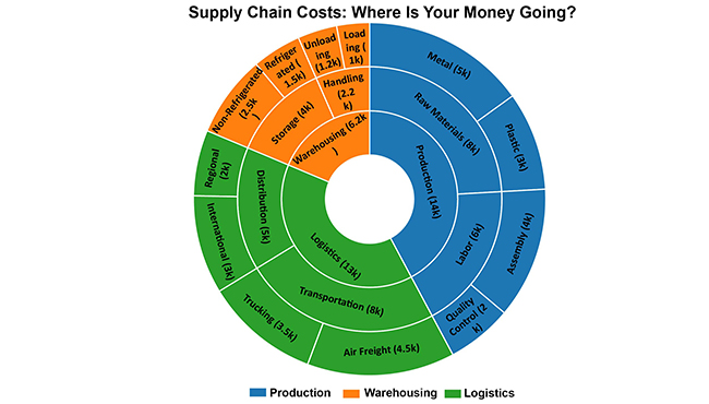
Understanding your supply chain costs is key to making smarter decisions. But when costs are scattered across different stages – production, warehousing, logistics – it’s hard to see the full picture. A Sunburst Chart gives you a bird’s-eye view of costs across the entire supply chain, broken down into manageable segments.
The Sunburst Chart visualizes costs in a circular format, with each layer representing a different part of the supply chain. You can drill down into specific areas, such as transportation or inventory, to see where the biggest expenses are hiding.
With this chart, you’ll be able to pinpoint which areas of your supply chain are driving up costs. Are transportation fees taking a big bite out of your budget? Maybe it’s warehousing costs that need a second look. Once you’ve identified the problem areas, you can develop targeted strategies to bring those costs down.
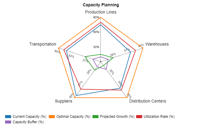
Capacity planning can make or break your ability to scale. If you don’t have the right capacity in place, you’ll face bottlenecks that slow down production and frustrate customers. On the flip side, too much capacity means wasted resources. A Spider Chart helps you visualize capacity across different parts of your supply chain, from production lines to warehouses.
The Spider Chart spreads out different metrics, KPIs, such as labor utilization, equipment efficiency, and output rates, so you can compare them side by side. This gives you a clear picture of where you have room to grow and where things are stretched too thin.
Once you’ve mapped out your capacity, you can make data-driven decisions about where to invest. Maybe one of your facilities is running at full capacity, while another has room to grow. By shifting resources or investing in the right areas, you can ensure your supply chain is ready to handle increasing demand without hitting roadblocks.
In the fast-paced world of supply chain management, you can’t afford to wait for data to trickle in. Real-time data is a game changer. When you have access to live metrics, you can make immediate adjustments before small issues snowball into bigger problems. Gauge Charts are the perfect tool for monitoring key performance indicators (KPIs) in real time.
Gauge Charts let you track metrics like inventory levels, transportation costs, and delivery times, all in one place. You’ll know right away if something is out of sync – whether it’s inventory running low or a delay in shipping – so you can act fast.
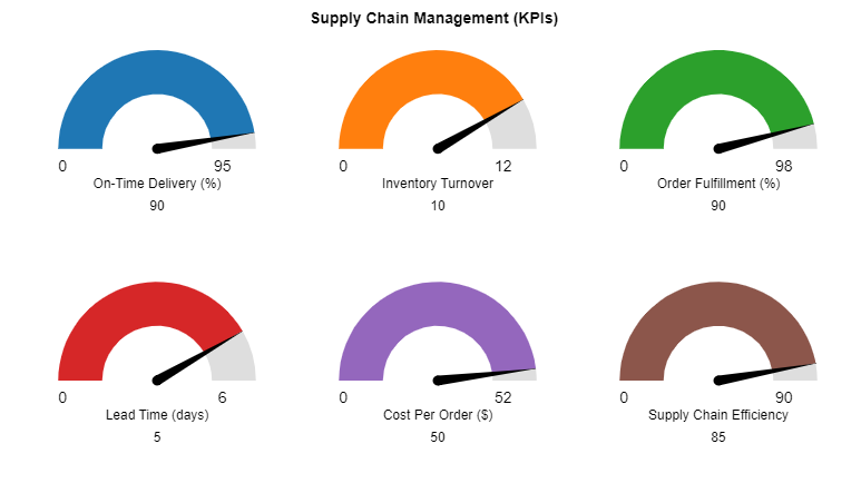
With real-time data, you don’t have to guess what’s going on. You can see how your supply chain is performing at any given moment and make quick decisions to keep everything on track. Whether it’s rerouting a shipment or adjusting inventory levels, Gauge Charts help you stay ahead of the curve.
Striking the right balance in your inventory is one of the most challenging parts of supply chain management. Overstocking ties up your capital and warehouse space, while understocking leads to missed sales and frustrated customers. But you don’t have to guess your way through it anymore. A Dot Plot Chart gives you the clear view you need to make smarter decisions.
With a Dot Plot Chart, you can visualize inventory levels across multiple products and locations. This helps you see patterns – whether certain products are consistently overstocked or specific locations always run out. It’s all about spotting trends that aren’t obvious in regular reports.
Once you know where you’re overstocked or understocked, you can adjust your inventory strategy to avoid problems. Maybe one product always flies off the shelves during a certain season, but another sits collecting dust. By analyzing these patterns, you’ll know exactly when and where to ramp up or scale back.
Long and unpredictable lead times from suppliers can throw off your entire supply chain, leading to delays and missed deadlines. But how do you know which suppliers are consistent and which ones are all over the map? A Box and Whisker Plot gives you a clear view of lead time variability, helping you spot which suppliers are delivering on time and which are causing delays.
With a Box and Whisker Plot, you can see the range of lead times for each supplier. Reliable suppliers will have narrow ranges, while less consistent ones will have wider variability. This lets you track patterns and take action where necessary.
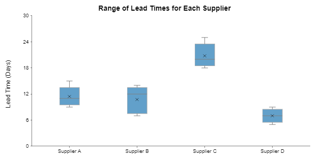
Armed with this data, you can have more informed discussions with suppliers. If a supplier consistently delivers late, you might consider renegotiating terms or looking for alternatives. And for those suppliers who perform well, you can build stronger, more reliable partnerships.
The supply chain is like a relay race, where goods pass through different stages before reaching you. It starts with raw materials, moves through production, and finally, the products land in your hands. Every link in the chain – from suppliers to manufacturers, to transporters and retailers – plays a role in making sure things move smoothly. Think of it as the behind-the-scenes team that keeps the show going.
Supply chain logistics is the part of the process that makes sure the right product gets to the right place at the right time. It’s about managing the movement of goods – storage, shipping, and handling, all while keeping costs down. Logistics is the engine that powers the supply chain, making sure everything arrives on time without missing a beat.
Supply chain strategy is the big plan behind all the moving parts. It’s like a roadmap that tells businesses how to organize and run their supply chain for maximum efficiency. Whether a company wants to be fast, cheap, or flexible, the strategy is what helps them figure out the best way to get products from point A to point B, while staying competitive.
The supply chain does the heavy lifting to make sure products get made, moved, and delivered. It’s responsible for coordinating all the different players – suppliers, manufacturers, warehouses, and more. Without the supply chain, businesses wouldn’t be able to meet customer demand or stay competitive. It keeps everything running like clockwork, so you don’t have to think twice about how that product ended up in your hands.
Supply chain visual analytics turns data into pictures. It helps you see the flow of goods, spot problems, and find opportunities. Instead of reading endless charts and tables, you get an instant snapshot of how things are moving. It’s a clearer way to understand your entire supply chain.
It saves you time by showing everything at once. If there’s a delay or bottleneck, you’ll see it immediately. No more guessing. It also helps you plan better. With a quick look, you know where things are and where they’re going wrong.
Real-time data means you’re never behind. You can react to issues as they happen, not after the fact. Let’s say a shipment is delayed – visual analytics will flag it right away, and you can make quick adjustments. This gives you the edge in managing the supply chain efficiently.
It simplifies choices. Instead of staring at endless rows of numbers, you get clear visuals. This helps your team make decisions faster because the data is easier to understand. You’ll spot patterns that would be hard to find otherwise.
Start by collecting the data you already have. Then, pick a tool that fits your needs. You can begin small – just visualize one part of your supply chain. As you get comfortable, you can expand it to cover more.
A big mistake is relying only on outdated data. Make sure your tool provides real-time or near-real-time updates. Also, don’t ignore the details – sometimes the small issues can become big problems. Keep an eye on all areas, not just the big ones.
At the end of the day, optimizing your supply chain comes down to one thing: having a clear, actionable view of what’s going on. Without the right visualizations, you’re operating in the dark. By using tools like Sankey Diagrams, Heatmaps, Spider Charts, and more, you can transform complex supply chain data into easy-to-understand insights.
And with ChartExpo, you don’t need to be a data expert to get started. ChartExpo makes it easy to create powerful visualizations that give you a comprehensive view of your supply chain’s performance. From tracking inventory levels to managing supplier performance, the right charts can give you the edge you need to make smarter decisions.
By leveraging these tools, you’ll not only streamline your supply chain operations but also drive growth, cut costs, and stay ahead of the competition. You’ve got the data – now it’s time to visualize it and take your supply chain to the next level.
How much did you enjoy this article?


Calculate accounts receivable turnover ratio to measure credit collection speed, improve cash flow, and strengthen your financial strategy. Read on!

Change Management KPIs are the key to tracking adoption, performance, and ROI during transitions. Find out which metrics matter. Read on!

Data collection methods and techniques determine the quality of every insight you act on. Explore key approaches for gathering reliable data. Read on!


