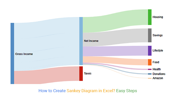
• Home
  • Tools dropdown img
    • Spreadsheet Charts

      • ChartExpo for Google Sheets
      • ChartExpo for Microsoft Excel
    • Power BI Charts

      • Power BI Custom Visuals by ChartExpo
    • Word Cloud

  • Charts dropdown img
    • Chart Category

      • Bar Charts
      • Circle Graphs
      • Column Charts
      • Combo Charts
      • Comparison Charts
      • Line Graphs
      • PPC Charts
      • Sentiment Analysis Charts
      • Survey Charts
    • Chart Type

      • Box and Whisker Plot
      • Clustered Bar Chart
      • Clustered Column Chart
      • Comparison Bar Chart
      • Control Chart
      • CSAT Survey Bar Chart
      • CSAT Survey Chart
      • Dot Plot Chart
      • Double Bar Graph
      • Funnel Chart
      • Gauge Chart
      • Likert Scale Chart
      • Matrix Chart
      • Multi Axis Line Chart
      • Overlapping Bar Chart
      • Pareto Chart
      • Radar Chart
      • Radial Bar Chart
      • Sankey Diagram
      • Scatter Plot Chart
      • Slope Chart
      • Sunburst Chart
      • Tornado Chart
      • Waterfall Chart
      • Word Cloud
    • Google Sheets
      Microsoft Excel
  • Services
  • Pricing
  • Contact us
  • Blog
  • Support dropdown img
      • Gallery
      • Videos
      • Contact us
      • FAQs
      • Resources
    • Please feel free to contact us

      atsupport@chartexpo.com

Categories
All Data Visualizations Data Analytics Surveys
Add-ons/
  • Google Sheets
  • Microsoft Excel
  • Power BI
All Data Visualizations Data Analytics Surveys
Add-ons
  • Google Sheets
  • Microsoft Excel
  • Power BI

We use cookies

This website uses cookies to provide better user experience and user's session management.
By continuing visiting this website you consent the use of these cookies.

Ok

ChartExpo Survey


Home > Blog > Microsoft Excel

How to Create Sankey Diagram in Excel? Easy Steps

A “Sankey Diagram” is a type of flow diagram that visualizes the flow of resources, energy, or information within a system. Sankey diagrams are particularly useful for showing the distribution and flow of resources between different components or processes.

sankey diagram in excel

Data has become the story of the day in organizations and academic institutions almost every sector of our government functions with data. Imagine what it would be like if every sector did not utilize data. Think about this for a moment, and you will realize that data is the heartbeat of everything you do.

This fact can be evident to you as a data analyst. What is crucial is how you can present your data to interested parties.

An exemplary data visualization diagram will compel your audience to answer this question. How the audience reacts to your presentation is crucial to your success.

To analyze data critically, one of the best visualizations you can use is the Sankey Diagram. Do you want to know how to create a Sankey Diagram in Excel? The secret is through the simple steps we will cover.

In this blog, you will learn:

Table of Contents:

  1. What is a Sankey Diagram in Excel?
  2. History of Sankey Diagram
  3. What are the Components of a Sankey Diagram in Excel?
  4. Top 5 Sankey Diagram Examples
  5. The Best Sankey Diagram Generator
  6. How to Create a Sankey Diagram in Excel?
  7. How to Edit a Sankey Chart in Excel using Sankey Chart Creator?
  8. Create a Multi-Level Sankey Diagram in Excel
  9. Video Tutorial: How to Make a Sankey Chart in Excel?
  10. Why should you use the Sankey Graph in Excel?
  11. Application of Sankey Chart in Excel
  12. What Types of Data Can Be Visualized Using Charts?
  13. Limitations
  14. FAQs
  15. Wrap up

Let’s begin by knowing what a Sankey Diagram is.

What is a Sankey Diagram in Excel?

Definition: A Sankey Diagram is a visualization diagram that presents data with value sets from one point to another.

Here is an interesting historical fact about a Sankey Diagram. An engineer around the 1890s called Matthew Sankey discovered the chart. The engineer found it by studying how a steam engine conducts energy.

The bottom line is that you can also use a Sankey Diagram to visualize information related to energy or income flow.

With these fun facts in mind, let’s jump right into the components of a Sankey Diagram you need to know about.

History of Sankey Diagram

The Sankey diagram, first introduced by Irish engineer Matthew Henry Sankey in 1898, was initially used to illustrate energy flows in steam engines. Over time, its application expanded to various fields, including economics, environmental science, and business, due to its ability to visualize the flow of resources, costs, or data.

The diagram’s key feature is the proportional arrows that represent quantities, allowing viewers to easily understand relationships and track movement across processes or systems. Today, Sankey diagrams are widely used in data visualization for their clarity and effectiveness in conveying complex information.

What are the Components of a Sankey Diagram in Excel?

Every statistical diagram has unique components that are crucial in providing insights. Well, a Sankey Diagram is one of those charts.

Let’s take a closer look at some of these components:

Nodes:

They look like bars in a standard bar chart. The size of the node represents the value of the variables.

Flows:

The nodes in a Sankey chart in Excel are connected with flow path structures called links. Flows connect one node to another with a source name.

In addition, flows have a target node that serves as an ending point.

Drop-offs:

This is a type of flow. Its unique feature is that it does not have a target node.

You will realize from the components we have just listed for you that a Sankey Chart is not stylish. It is one of the most detailed charts in Excel you will come across.

A suitable Sankey Diagram will appear as shown below.

sankey diagram maker

You can use this chart from the diagram above to explain insights to your audience. For instance, you can define the expenses of different departments and where they spent this money to gain valuable insights at a glance.

The diagram also uses nodes and links to establish relationships between crucial metrics in your data. Such a diagram can win an investor’s heart who wants to be part of your business.

sankey diagram creator

To have such a Sankey Diagram, you require a Sankey Diagram Generator. This diagram has your back if you have a history of dealing with tiresome data.

Here is the secret?

The key distinction between you and other data analysis is that you don’t need to code at all. Every visualization you require can be accomplished within a few clicks. With such a tool, data visualization becomes straightforward with minimal obstacles.

Do you want to know more about this Sankey Diagram Generator? Before discussing it, we will show you some of the best Sankey Chart examples. We have to use the Sankey diagram in Excel using sample data.

Sankey Diagram Excel Components at a Glance
Component Description Role in Sankey Diagram Excel
Node Represents entities or categories Starting or ending point for data flows
Flow (Link) Connects two nodes with a width proportional to the value Visualizes quantity transfer between nodes
Drop-off A type of flow with no destination node Highlights data loss or process leakage
Source Node Starting point of a flow Indicates the origin of value or resource
Target Node End point of a flow Destination of the transferred quantity
Value Numeric weight of a flow Determines the flow thickness in the diagram
Color Coding Visual distinction of nodes/flows Aids in tracking and interpretation
Hierarchy Level Node’s position in the multi-step flow Supports layered, multi-level diagrams

Top 5 Sankey Diagram Examples

Plenty of data visualizations can be used to represent the flow of resources or information between multiple entities. These are particularly useful for illustrating the distribution, allocation, or transition of quantities such as energy, materials, costs, or other resources.

Now we will discuss some of the most commonly used examples of Sankey Diagram, which are as follows:

  1. Job Application Analysis Example
  2. Sentiment Analysis Example
  3. Presenting Financial Flows Example
  4. Package Delivery Analysis Example
  5. Store Order Analysis Example

Example #1: Job Application Analysis

sankey diagram example job application analysis

Recruiting is one of the undertakings that can produce monstrous data. As a human resource professional, you’ve got to track requests for employment until the onboarding stage.

The data produced en route can help inform future decision-making processes. This is where this chart becomes very important. The chart can assist you with refining recruiting data into significant insights by visualizing the whole data flow of the Job Application Tracker system.

What’s more, this can save lots of hours, which you can use to unwind or execute different assignments.

The visualization above tracks the job application flow from the recruitment phase to onboarding.

Example #2: Sentiment Analysis

sankey chart example sentiment analysis

You can use the chart to track the sentiments of a particular niche market towards a brand or its offerings.

The Sankey Diagram Example above tracks market sentiments toward a fast-food brand.

Example #3: Presenting Financial Flows

sankey graph example government financial flows

You can use this Sankey diagram to track and analyze the cash flow from cash sources to the final recipients.

Example #4: Package Delivery Analysis

sankey diagram example package delivery analysis

The Sankey Diagram example above tracks the packages from dispatch to the intended consumers. The final recipients are segmented based on their country of residence.

Example #5: Store Order Analysis

sankey chart examples

The chart can also be used to track online store orders to prevent problems, such as loss of packages along the way. Also, you can use the Sankey Diagram example to track products sold based on their respective brands.

Common Use Cases of Sankey Diagram in Excel
Use Case How Sankey Diagram Helps Why Excel is Ideal
Job Application Funnel Visualizes applicant flow from application to hiring stages Easily integrates with HR tracking spreadsheets
Energy Flow Analysis Displays energy input, conversion, and losses in one view Supports detailed utility data tables
Financial Budget Breakdown Shows fund allocation and spending across departments Commonly used for budgeting and finance modeling
Website User Journey Tracks visitor navigation paths and drop-offs Combines well with exported analytics data
Supply Chain Mapping Illustrates movement from supplier to customer Excel is often used for logistics planning
Marketing Funnel Analysis Visualizes lead conversion stages Integrates with CRM exports and campaign data
Product Order Flow Tracks orders from placement to delivery Useful for eCommerce order management data
Resource Allocation in Projects Maps team/task/resource usage over time Fits project tracking spreadsheets
Survey Result Segmentation Breaks down answers by audience segments Excel often used for raw survey data
Revenue Stream Breakdown Visualizes income sources and distribution Common for small business revenue tracking

The Best Sankey Diagram Generator

We now know what a Sankey Diagram is. The next step is to understand what the Sankey Diagram Generator is.

To satisfy your curiosity, we have an incredible Sankey Diagram Generator available. The Sankey diagram maker is called ChartExpo.

The reasons why we recommend ChartExpo to you are:

  • Affordability
  • User Interface friendliness
  • Quality of the charts by the Sankey Diagram Generator

ChartExpo has an incredible score in the factors we have briefly discussed.

This Sankey diagram builder has fantastic features, such as a user-friendly interface that can favor most users.

That’s not all.

It means you don’t need sophisticated programming or coding knowledge to work around the Sankey chart generator. This Sankey chart builder will help you obtain meaningful insights from your bulky data.

Also, this Sankey diagram creator makes Sankey Charts that you can easily interpret, even for an audience that is not familiar with non-technical topics.

Key Features of ChartExpo for Sankey Diagram Excel
Feature Description Benefit for Excel Users
No Coding Required Create Sankey diagrams via simple UI steps Accessible for non-technical users
Excel Add-in Installs directly into Excel Seamless workflow within Excel environment
Multi-Level Support Handles complex flow hierarchies Great for detailed data stories
Editable Charts Customize colors, labels, and titles Tailor visuals for different audiences
Fast Rendering Generates charts in seconds Ideal for time-sensitive reporting
Cross-Browser Compatibility Works with all major browsers Smooth performance for online Excel users
Affordable Pricing Low-cost subscription model Budget-friendly for SMBs and individuals
Drag-and-Drop Data Mapping Simple data linking to nodes and flows Reduces setup errors and speeds up design
High-Quality Visual Output Clean, presentation-ready visuals Enhances stakeholder communication
Supports Large Data Sets Handles extensive flows with ease Useful for enterprise-level Excel reports

How to Create a Sankey Diagram in Excel? Complete Step-by-Step Guide with an Example

Before we get down to business, here is a fun fact you need to know about Excel.

Excel has billions of users because it is our most common spreadsheet. With this spreadsheet in your office tool, you can create a Sankey graph in Excel. Here is the truth: an Excel worksheet does not have a Sankey diagram in its list of graphs. Excel is limited to a few basic charts.

But don’t lose hope just yet. There is a solution to our problem. You want to know what it is. Let’s get to it.

What is the solution?

Think about this for a moment. If Excel does not have a Sankey chart, how can we create one? One of the crucial actions you can take is to supercharge it with an Excel add-in for creating a Sankey diagram.

One of the add-ins of particular interest is called ChartExpo. This add-in cannot let you down when visualizing your data. In other words, we can refer to it as a Sankey diagram generator in Excel.

Furthermore, ChartExpo is an incredible Sankey Diagram creator that you can install in your Excel.

This Sankey Diagram Online Generator is friendly to any browser of your choice. It guarantees a stable browsing activity as you use the add-in to draw your charts and graphs.

In addition, ChartExpo is an affordable add-in for most users. When you want to use it, you won’t incur any cost. It is available for you to use in your data analysis.

Let us explain ChartExpo and how it can help you as a data analyst.

What is ChartExpo?

In brief, ChartExpo is an add-in that utilizes cloud-hosting features to create data visualizations. This add-in to your Excel worksheet allows you to create many graphical presentations. It is one of the simplest add-ins for your Excel charts.

But that is not all.

You do not need a fancy manual to work your way around the add-in. This is because it takes quick and easy steps to create a chart of your choice. If you ever find yourself in a dilemma about which chart to use, ChartExpo has got you covered. It is a unique Sankey diagram generator in Excel.

Let us dig deeper using a practical example of how to make a Sankey Diagram in Excel.

This section will use a Sankey Chart in Excel to visualize the table below.

Energy Type Main Source Source type Energy Source Usage End-User Mega Watt
Agricultural waste Bio-conversion Solid Thermal generation Losses in the process Lost 3.5
Agricultural waste Bio-conversion Solid Thermal generation Electricity grid Industry 5.1
Agricultural waste Bio-conversion Solid Thermal generation Electricity grid HVAC Commercial 3.6
Agricultural waste Bio-conversion Solid Thermal generation Electricity grid HVAC homes 2.6
Agricultural waste Bio-conversion Solid Thermal generation Electricity grid Appliances Commercial 3.4
Agricultural waste Bio-conversion Solid Thermal generation Electricity grid Appliances homes 1.4
Other waste Bio-conversion Solid Thermal generation Losses in the process Lost 5.0
Other waste Bio-conversion Solid Thermal generation Electricity grid Industry 3.8
Other waste Bio-conversion Solid Thermal generation Electricity grid HVAC Commercial 4.7
Other waste Bio-conversion Solid Thermal generation Electricity grid HVAC homes 3.4
Other waste Bio-conversion Solid Thermal generation Electricity grid Appliances Commercial 5.2
Other waste Bio-conversion Solid Thermal generation Electricity grid Appliances homes 1.8
Marina algae Bio-conversion Solid Thermal generation Losses in the process Lost 0.5
Marina algae Bio-conversion Solid Thermal generation Electricity grid Industry 0.4
Marina algae Bio-conversion Solid Thermal generation Electricity grid HVAC Commercial 0.6
Marina algae Bio-conversion Solid Thermal generation Electricity grid HVAC homes 0.4
Marina algae Bio-conversion Solid Thermal generation Electricity grid Appliances Commercial 0.6
Marina algae Bio-conversion Solid Thermal generation Electricity grid Appliances homes 0.4
Biomass import Bio-conversion Solid Thermal generation Losses in the process Lost 0.3
Biomass import Bio-conversion Solid Thermal generation Electricity grid Industry 0.5
Biomass import Bio-conversion Solid Thermal generation Electricity grid HVAC Commercial 0.6
Biomass import Bio-conversion Solid Thermal generation Electricity grid HVAC homes 0.2
Biomass import Bio-conversion Solid Thermal generation Electricity grid Appliances Commercial 0.4
Biomass import Bio-conversion Solid Thermal generation Electricity grid Appliances homes 0.1
Nuclear reserves Nuclear Plant Solid Thermal generation Losses in the process Lost 35.0
Nuclear reserves Nuclear Plant Solid Thermal generation Electricity grid Industry 9.1
Nuclear reserves Nuclear Plant Solid Thermal generation Electricity grid HVAC Commercial 5.6
Nuclear reserves Nuclear Plant Solid Thermal generation Electricity grid HVAC homes 4.2
Nuclear reserves Nuclear Plant Solid Thermal generation Electricity grid Appliances Commercial 7.7
Nuclear reserves Nuclear Plant Solid Thermal generation Electricity grid Appliances homes 2.8
Gas reserves Natural Gas Gas Thermal generation Losses in the process Lost 3.6
Gas reserves Natural Gas Gas Thermal generation Electricity grid Industry 5.9
Gas reserves Natural Gas Gas Thermal generation Electricity grid HVAC Commercial 5.5
Gas reserves Natural Gas Gas Thermal generation Electricity grid HVAC homes 3.4
Gas reserves Natural Gas Gas Thermal generation Electricity grid Appliances Commercial 5.1
Gas reserves Natural Gas Gas Thermal generation Electricity grid Appliances homes 2.5

To get started with the Sankey Diagram in Excel, install the ChartExpo add-in for Excel from this link.

  • Click on your Excel spreadsheet to open your workbook.
  • On your worksheet menu, click on Insert.
  • The Insert menu will display the My Apps.
insert chartexpo in excel
  • Select the ChartExpo add-in and click the Insert.
open chartexpo in excel
  • Click on the “Sankey Chart” in the list of available charts in Excel, as shown below.
search sankey chart in excel
  • After selecting the data, click on the Create Chart From Selection button, as shown below.
create sankey chart in excel
  • Check out the final Sankey Diagram below.
how to make a Sankey graph in excel

How to Edit a Sankey Chart in Excel using Sankey Chart Creator?

You can edit the Sankey chart in Excel with the colors you choose and add a heading. Click Edit Chart.

edit Sankey diagram in excel

Here are some of the insights from your table that will appear like this in your Sankey Diagram.

Amount of Energy Used

Sankey chart in excel example

Energy from Nuclear Sources

Sankey chart in excel template
In the above example, we used the Sankey chart as an Energy flow diagram to visualize the flow of energy from sources to users.

Create a Multi-Level Sankey Diagram in Excel using Sankey Chart Maker

You can create a multi-level Sankey in Excel if your data has a lot of information. Let’s take the example we mentioned above. How easily we were able to create the Multi-level Sankey Chart in Excel in a few clicks because we had the data available in multiple layers.

multi-level Sankey in excel

You can comfortably create a Sankey Diagram in Excel from the example above. As a data analyst for your power company, you can help stakeholders understand the long-term plans for power supply.

Video Tutorial: How to Make a Sankey Chart in Excel?

In the following video, you will learn how to make a Sankey Chart in Excel without any coding in a few clicks using Sankey Chart Creator.

With many visual presentations in ChartExpo, why did we use Sankey in Excel to visualize your data? Let’s jump right into those reasons.

Why should you use the Sankey Graph in Excel?

Using a Sankey diagram to represent your data lets you see it from different levels.

  • A Sankey diagram in an Excel spreadsheet allows you to evaluate complex metrics graphically. Additionally, you can draw attention to one element of your data story for your audience.
  • It can assist you in visualizing customer behavior and opportunities provided by influential contributors from a business perspective.
  • A Sankey Diagram in Excel is essential in getting stakeholders to implement your ideas when presenting a project to management.
  • Make your Sankey graph in Excel simple to read for the audience when utilizing it to illustrate your point. Make sure your Sankey in Excel doesn’t mislead your readers.

Application of Sankey Chart in Excel

Where can we use Sankey Charts in Excel? This is the one thing we need to ask ourselves. You can use a Sankey Diagram in Excel to see data that seems like a flow, such as:

  • Presenting survey results
  • A website’s customer base for digital marketing
  • Supply chain administration
  • Visualizing hierarchical data
  • Energy Administration
  • Visualizing the customer journey
  • Revenue information, particularly for budgetary and cash flow analysis.
Real-World Scenarios Using Sankey Diagram Excel
Scenario Description Value of Using Excel
Marketing Campaign Performance Tracks conversions across channels Combine with campaign data in Excel sheets
Energy Consumption in Manufacturing Maps energy usage and losses Leverage industrial data logs stored in Excel
Public Budget Allocation Visualizes government spending flows Integrate with open financial datasets
University Admissions Process Tracks applications to enrollment Excel is widely used in academic reporting
Hospital Patient Journey Maps patient movement from ER to discharge Useful for hospital operations in Excel
Insurance Claims Workflow Shows progression from claim to settlement Excel supports actuarial and claims data
Logistics and Freight Routing Displays package flow from the hub to the delivery Logistics often operate from Excel manifests
Call Center Interaction Flow Visualizes call routing and resolutions Excel tracks service metrics and logs
Water Distribution Network Maps flow from the source to usage points Excel can store municipal infrastructure data
Retail Customer Journey Tracks shoppers from the entrance to the checkout Aligns with POS and behavior data in Excel

What Types of Data Can Be Visualized Using Sankey Charts?

Many people seem to get worried about identifying the specific type of data mainly used by Sankey Diagram examples.

This is a question that needs a lot of interpretation to eliminate confusion. The reality is that Sankey Diagram examples are mainly used to identify weighted networks, such as flows.

In other words, your data should have flow-like attributes.

The diagram’s nodes are depicted in two or more categories that represent various data stages. Once you’ve outlined your data properly, it becomes easier to analyze it and generate essential insights.

These diagrams are magnificent, especially in communicating flow systems. They can assist with uncovering examples and help in investigating, tracking down bottlenecks, or showing clients how cycles flow.

Plus, they prove to be useful, particularly in addressing large volumes of data.

The flow of data through a system, a process, or even a decision process can undoubtedly be examined for in-depth insights.

While investigating what is happening, it’s frequently challenging to get to the root of a problem. A Sankey Diagram example can show where the issue exists and what it might mean for the general framework.

Types of Data Best Visualized with Sankey Diagram Excel
Data Type Why Sankey Diagram Is Effective How Excel Supports It
Flow-Based Data Clearly shows direction and magnitude of movement Excel handles structured flow tables well
Multi-Stage Processes Captures transitions between steps or phases Ideal for tracking progression in rows
Hierarchical Data Displays layered relationships in complex systems Excel supports multi-column hierarchies
Resource Allocation Visualizes input-to-output relationships Budget/resource data is often managed in Excel
Network Traffic Tracks data flow between nodes Network logs are often exported to Excel
Energy Consumption Maps source-to-use energy flows Compatible with grid and consumption logs
Conversion Funnels Visualizes drop-off and transition rates CRM and marketing tools export to Excel
Supply Chain Distribution Shows material flow from source to delivery Inventory and logistics use Excel
Survey Branching Logic Depicts response paths and patterns Survey platforms often export Excel data
Financial Transfers Illustrates the movement of funds between accounts Widely used in finance spreadsheets

So, when should you not use this diagram?

Limitations of Sankey Diagram

The main issue with using Sankey Diagram examples is that they will not always be accurate.

Also, the key role of this chart is to illustrate the flow of data in a system. So, it won’t depict the overall user experience.

For example, let’s assume you intend to determine the number of people placed on a waitlist for an upcoming flight. And besides, you’ve added the number of passengers and their seating preferences. The extraneous data is likely to skew the diagram and make it less accurate.

FAQs About Sankey Diagram

What is a Sankey Diagram?

A “Sankey Diagram” is a type of flow diagram that visualizes the flow of resources, energy, or information within a system. Sankey diagrams are particularly useful for showing the distribution and flow of resources between different components or processes.

How do I create a Sankey chart in Excel?

To create a Sankey Chart in Excel in a few clicks without any coding, follow the simple steps below.

  • Step 1: Open your Excel Application.
  • Step 2: Click Insert>My Apps>ChartExpo for Excel.
  • Step 3: Look for the Sankey Chart in the charts list.
  • Step 4: Select your data and click Create Chart From Selection.
  • Step 5: You will get the Sankey Chart in Excel, which you can edit and customize.

To better learn with the help of images, you can read our blog above, or you can watch a video tutorial here.

Can you make a Sankey diagram in Excel?

Yes, you can achieve this by downloading and installing an Excel add-in for creating a Sankey diagram called ChartExpo. This is because Excel lacks chart templates for Sankey.

ChartExpo has several templates, including a Sankey Diagram. With ChartExpo, you can create a Sankey Visualization in Excel.

Can you provide examples of Sankey diagrams in energy management?

Sankey diagram examples are commonly used in energy management to visualize the flow of energy within a system. An example of a Sankey Diagram could illustrate the distribution of energy sources, losses in transmission, and final energy consumption in a building or industrial process.

Wrap Up

Let’s recap everything we have discussed.

We now know that Sankey Charts in Excel are among the best charts you can employ to capture your audience’s interest in your data story.

You now know how to make a Sankey diagram in Excel. If you’re working in Google Sheets, we’ve covered the steps to make a Sankey Diagram in Google Sheets.

Power BI users can also leverage similar features by following our guide on Power BI Sankey Diagrams.

Sankey Diagrams in Excel are impressively simple to read and evaluate insights, as we have also discovered.

The most admirable feature of the Sankey graph in Excel that we now know is that it can draw attention to the critical details of your data story for the audience.

How much did you enjoy this article?

ExcelAd2
Start Free Trial!
122040

Related articles

next previous
Microsoft Excel12 min read

Key Performance Indicators in Healthcare for Better Insights

Key Performance Indicators in healthcare track patient care and efficiency. Learn about these KPIs, top examples, and how to use them to improve outcomes.

Microsoft Excel10 min read

BMI Calculation Formula in Excel for Better Fitness Insights

The BMI calculation formula in Excel helps track and analyze body mass index. Explore step-by-step instructions and tips to simplify BMI tracking in Excel.

Microsoft Excel29 min read

How to Create a Tornado Chart in Excel? A Complete Guide

Click to learn how to plot a Tornado Chart in Excel using easy-to-follow steps. Also, we’ll address the following question: what is a Tornado Diagram?

Microsoft Excel14 min read

How to Create a Scatter Plot in Excel with 3 Variables?

Click to discover how to create a Scatter Plot in Excel with 3 variables. We’ll also address the following question: why do we use Scatter Plot Graph?

Microsoft Excel12 min read

Construction Budget Spreadsheet for Better Planning

A construction budget spreadsheet helps track expenses and control costs. This blog explores benefits, top templates, and tips for better budgeting in Excel.

ChartExpo logo

Turn Data into Visual
Stories

CHARTEXPO

  • Home
  • Gallery
  • Videos
  • Services
  • Pricing
  • Contact us
  • FAQs
  • Privacy policy
  • Terms of Service
  • Sitemap

TOOLS

  • ChartExpo for Google Sheets
  • ChartExpo for Microsoft Excel
  • Power BI Custom Visuals by ChartExpo
  • Word Cloud

CATEGORIES

  • Bar Charts
  • Circle Graphs
  • Column Charts
  • Combo Charts
  • Comparison Charts
  • Line Graphs
  • PPC Charts
  • Sentiment Analysis Charts
  • Survey Charts

TOP CHARTS

  • Sankey Diagram
  • Likert Scale Chart
  • Comparison Bar Chart
  • Pareto Chart
  • Funnel Chart
  • Gauge Chart
  • Radar Chart
  • Radial Bar Chart
  • Sunburst Chart
  • see more
  • Scatter Plot Chart
  • CSAT Survey Bar Chart
  • CSAT Survey Chart
  • Dot Plot Chart
  • Double Bar Graph
  • Matrix Chart
  • Multi Axis Line Chart
  • Overlapping Bar Chart
  • Control Chart
  • Slope Chart
  • Clustered Bar Chart
  • Clustered Column Chart
  • Box and Whisker Plot
  • Tornado Chart
  • Waterfall Chart
  • Word Cloud
  • see less

RESOURCES

  • Blog
  • Resources
  • YouTube
SIGN UP FOR UPDATES

We wouldn't dream of spamming you or selling your info.

© 2025 ChartExpo, all rights reserved.