Categories
Organizing and forming insights hierarchically is one of the tactics you can use to make your data stories credible.


Our brains are engineered to identify order and rank in visual content promptly. So, you need hierarchical data visualization charts to create compelling narratives for your audiences (and readers).
Why?
The hierarchy charts display insights into data in a particular order. The order can either be bottom-up or top-down. The tested and proven chart for displaying hierarchical data is a Sankey Diagram.
You won’t find ready-made hierarchical charts in Excel. So, if you’re a devoted user of the spreadsheet application, you’ve got to explore other options.
It turns out you don’t have to do away with Excel. You can download and install an add-in to access a ready-made hierarchical data visualization chart.
In this blog, you’ll learn the following:
Before we delve into the how-to guide, we’ll address the following question: what is a hierarchical data visualization chart?
The word “Hierarchy” is in fact from the Greek word ‘hierarchy,’ which is interpreted as the “rule of a high priest.”
In today’s world, hierarchy is a structure of values (titles, objects, positions, etc.) in which each value is placed above, below, or equal to others.
In data analytics, hierarchical data visualization charts are used to display insights into data in a certain order. The hierarchy can be top-down or bottom-up, depending on your needs or liking.
The charts are amazingly noteworthy in data analysis because they uncover unseen patterns and relationships in your data.
A typical example of hierarchical data visualization is the file and folder system found on your computer. Usually, there are parent folders with sub-folders, which are somehow linked, depending on your criteria.
Another illustrative is a Mekko chart example, which provides a visual representation of data across multiple dimensions, similar to how folders and sub-folders are organized and related to each other.
Hierarchical data visualization charts are one of the powerful types of charts that create rank-like impressions in our brains. Each data point is represented by a node in the tree, and each node may have a pool of sub-nodes (also known as child nodes).
The association between the parent and the child nodes creates a tree network, which provides hierarchical insights.
In the coming section, we’ll take you through the best chart for representing hierarchical data.
The tested and proven chart for displaying insights into hierarchical data is a Sankey Diagram.
You can use Sankey Charts to visualize data with hierarchical and flow-like attributes, such as material, energy, cost, etc.

This chart draws the reader’s attention to the enormous flows and other insights. Besides, the visualization design uses links and nodes to uncover hidden insights into relationships between critical metrics.
The size of a node is directly proportional to the number of data points under analysis. A flow that’s twice as wide represents double the value of the metric. You need a Sankey diagram in Excel to access this visualization for data storytelling.
The hierarchical data visualization chart provides you with a 360-degree view of your data, irrespective of its complexity and volume. And it accomplishes this by transforming complex, raw data into insights for your data stories.
Use the Sankey Diagram to identify the areas that need urgent improvement in your business, such as customer satisfaction.
The visualization design is made up of the following:
In the coming section, we’ll take you through how to create a hierarchical data visualization in Excel.
Excel is a trusted data visualization tool because it’s familiar to many. However, the spreadsheet application lacks ready-made hierarchical data visualization charts.
We understand switching tools is not an easy task.
Therefore, we’re not advocating you ditch Excel in favor of other expensive hierarchical data visualization chart makers.
There’s an easy-to-use and amazingly affordable visualization tool that comes as an add-in you can easily install in your app to access ready-made charts in Excel. The tool is called ChartExpo.
So, what is ChartExpo?
ChartExpo is an incredibly intuitive add-in you can easily install in your Excel without watching hours of YouTube tutorials.
With many ready-to-go visualizations, the hierarchical data visualization chart generator turns your complex, raw data into easy-to-interpret and visually appealing hierarchical data visualization diagrams that tell data stories in real time.
More benefits
In the coming section, we’ll take you through how to visualize hierarchical data using ChartExpo add-in.
You don’t want to miss this!


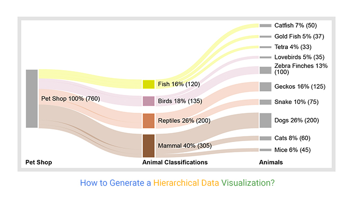
This section will use a hierarchical data visualization chart (Sankey Diagram) to display insights into the table below.
| Pet Shop | Animals Type | Animals | Counts |
| Pet Shop | Fish | Catfish | 50 |
| Pet Shop | Fish | Gold Fish | 37 |
| Pet Shop | Fish | Tetra | 33 |
| Pet Shop | Mammal | Dogs | 200 |
| Pet Shop | Mammal | Cats | 60 |
| Pet Shop | Mammal | Mice | 45 |
| Pet Shop | Reptiles | Geckos | 125 |
| Pet Shop | Reptiles | Snake | 75 |
| Pet Shop | Birds | Zebra Finches | 100 |
| Pet Shop | Birds | Lovebirds | 35 |


In the coming section, we will tell you how to create a hierarchal data visualization/Sankey diagram in Excel.


In the coming section, we’ll address the benefits of using hierarchical data visualization charts.
You’ll agree when we say extracting insights from spreadsheets and tables is ‘so 20th century’. Yes, it’s time-consuming and mentally exhausting.
You need intuitive tools to be fully data-driven. Yes, you read that right. You need tools that crunch massive hierarchical datasets for you and produce charts that are easy to read.
In our case, you need an easy-to-use hierarchical data visualization maker to access Sankey.
The charts like a Tree Map provide you with a view of your hierarchical data, irrespective of its complexity and volume. It achieves this by shifting complex, raw data into insights for your data stories.
Use this chart to recognize the areas that need crucial improvement in your business, such as customer satisfaction.
You can use hierarchical data visualization charts to transform raw and bulky data sets into insights. They achieve the task by providing in-depth information on patterns and relationships between key data points.
Also, you can easily infer the best and worst-performing metrics by simply examining the top and bottom of the hierarchy.
The relationship between the parent and the child nodes forms a tree network, which provides hierarchical insights.
Other benefits include
Imagine using the tables and spreadsheets to explain emerging patterns and other significant insights about a hospital to your audience.
How would they respond? Would you get buy-in after presenting the table to them?
This means a compelling data story loaded with easy-to-interpret charts can empower quicker decision-making.
Visualizing data helps pinpoint relationships and patterns between metrics. Exploring these patterns enables you to save immense resources, such as time, by focusing only on areas that need urgent action.
So, you need to create a compelling story with insights extracted from the raw data.
People love stories. Yes, and this is because they appeal to emotions.
The tested and proven chart for displaying hierarchical data is a Sankey Diagram.
You can use the chart to visualize data with hierarchical and flow-like attributes, such as material, energy, cost, etc.
This chart uses links and nodes to uncover hidden insights into relationships between critical metrics.
The best way to display or visualize hierarchical data is by using the Sankey Diagram.
You can use the Sankey chart to visualize data with hierarchical and flow-like attributes, such as material, energy, cost, etc. This chart uses links and nodes to uncover hidden insights into relationships between critical metrics.
In data analytics, hierarchical data visualization charts are used to display insights into data in a certain order.
The hierarchy can be top-down or bottom-up depending on your preference.
The charts are incredibly significant in data analysis because they uncover hidden patterns and relationships in your data.
Organizing insights hierarchically is one of the strategies you can use to make your data stories persuasive.
Remember, our brains are engineered to recognize order and rank in visual content instantly. So, you need hierarchical data visualization charts to create compelling narratives for your audiences (and readers).
Why?
The hierarchy charts display insights into data in a particular order. The order can either be bottom-up or the other way around. The tested and proven chart for displaying hierarchical data is a Sankey Diagram.
You won’t find ready-made hierarchical charts in your Excel. So, if you’re an ardent user of the spreadsheet application, you’ve got to explore other options.
It turns out you don’t have to do away with Excel.
So, what’s the solution?
We recommend you install third-party apps, such as ChartExpo, to access a ready-to-use hierarchical data visualization chart.
ChartExpo is an add-in for Excel that’s loaded with insightful and ready-to-go hierarchical data visualization charts, such as the Sankey Diagram. You don’t need programming or coding skills to use ChartExpo.
More benefits
Sign up for a 7-day free trial today to access ready-made hierarchical data visualization charts, such as the Sankey Diagram, that are easy to interpret and visually appealing to your target audience.
How much did you enjoy this article?


Calculate accounts receivable turnover ratio to measure credit collection speed, improve cash flow, and strengthen your financial strategy. Read on!

Change Management KPIs are the key to tracking adoption, performance, and ROI during transitions. Find out which metrics matter. Read on!

Data collection methods and techniques determine the quality of every insight you act on. Explore key approaches for gathering reliable data. Read on!


