Categories
Correlation Charts are tested and proven visualizations for displaying patterns, outliers, trends, and relationships in your data.

These charts are amazingly easy to read and interpret because they use dots to display insights.
Yes, you can quickly tell a trend or pattern by the orientation of the dots.
For instance, if the dots increase from left to right, the relationship between the metrics under study is positive.
Conversely, if the dots decrease from right to left, the relationship between the metrics under study is negative.
Creating Correlation Graphs is a massive leap toward presenting data in a compelling form.
Data with no narrative to simplify is boring.
Yes, you read that right.
But stories have an emotional appeal. So, learning to make a Correlation Chart is an incredibly powerful addition to your data storytelling tools.
This exercise can be difficult, especially if you’re an Excel user.
Excel has ready-to-go Correlation Graphs but you have to go through difficult steps for plotting and customizing such charts.
You can access ready-to-go and insightful Correlation Graphs, such as Scatter Plots, by installing a particular add-in into your Excel.
Keep reading because you don’t want to miss this.
In this blog, you’ll learn:
Before jumping right into the how-to guide, we’ll address the following question: what is a Correlation Chart?
Definition: A Correlation Chart in Excel takes your data set and transforms it into dots on a coordinate plane, typically X and Y-axes.
Besides, it allows you to study the relationship between the two variables in your data.
Check out the example below.
Let’s assume your goal is to measure daily temperatures. Ideally, one variable will represent the time (hourly periods). And the other one will represent temperature.
As you plot the data in a Correlation Chart in Excel, you’ll see how temperatures vary as each hour passes. The dependent variable (temperature) appears along the Y-axis, while the X-axis represents the independent variable (time).
You may notice that as you approach midday, the temperatures rise steadily. And during the evening, the average temperatures go down.
One of the primary reasons seasoned data visualization experts prefer Correlation Charts over Pie and Bar Charts is their minimalist design.
For instance, each new data point creates a new bar in a Bar Chart.
Imagine you have hundreds of data points. This implies you’ll end up with hundreds of bars, which are too many to display simultaneously.
Conversely, the X and Y Axis Chart, also known as the Correlation Chart in Excel, can display all this data without obscuring key insights. So, the size of the data sets does not matter as long as you use this graph.
The beauty of this chart is that it maps lots of data within a single view, which allows you to discover hidden patterns, shifts, outliers, and trends.
So, why should you use a Correlation Chart?
Use a Correlation Chart in Excel to enjoy the benefits below.
Seasoned data visualization experts use a Correlation Chart in Excel to test whether a relationship exists between key data points
Essentially, the visualization chart can help you to test data-based hypotheses.
Check out an example below.
An office manager theorizes that more training makes employees more productive. He or she can easily test this hypothesis by comparing the training to the staff’s output.
The go-to chart for the task above is a Correlation Chart, such as a Scatter Plot.
Let’s assume there is a positive relationship between output and training. The manager in question can use this insight in deciding whether to invest more in training.
If there’s no correlation, it’s time to cut back on the training and associated costs
The power of a Correlation Chart in Excel to assess whether relationships between data points exist is unmatched. It doesn’t matter whether you have a large dataset, a Correlation Chart can help you reveal patterns and trends.
Let’s assume you already know a correlation exists. A Correlation Chart is still valuable.
It gets better.
You can easily see whether this is a positive or negative correlation in your data. A positive relationship means both metrics increase together
This signals that increasing one of your data points causes the other to rise.
A negative relationship means your key data points move in opposite directions. So, increasing one variable will cause the other to decrease.
Your data points’ patterns and trends determine whether the relationship is negative or positive.
A Correlation Chart in Excel can help you uncover the strength of the correlation.
For instance, weak correlations will likely appear closer to a no-correlation pattern. Conversely, a stronger relationship shows data in a precise pattern or trend.
The strength of the relationship between key data points can help you determine the validity and significance of the relationship.
The chart is straightforward to read.
This is because it uses dots to show patterns and relationships between the metrics under study.
Also, it packs immense insights using limited space. So, the chances of clutter are minimal.
In the coming section, we’ll address the following question: What does the correlation Coefficient tell you?
Let’s assume a real estate agent is interested in establishing the relationship between square footage and market prices.
While the visualization may not drill down and show all the variables, such as location, it can provide insights into how the two metrics relate.
Other questions you can address using a Correlation Chart in Excel include:
A positive relationship means the variables change together in the same direction. On the other hand, a negative correlation means data points change together in opposite directions.
In the ensuing section, we’ll address the following question: how do you visualize correlation?

Excel is one of the best tools for visualization among business owners. But plotting correlation charts has a few hustle steps in Excel.
We’re not advising you to do away with Excel.
There’s an affordable tool that comes as an add-in you can easily install in Excel to access a ready-to-go Correlation Chart, such as a Scatter plot in Excel with 3-variables.
The application is called ChartExpo.
What is ChartExpo?
ChartExpo is an add-in you can easily install in your Excel to access ready-made and visually appealing Correlation Charts.
In the coming section, we’ll address the following question: how do you make a Correlation Chart in Excel?
You don’t want to miss this.
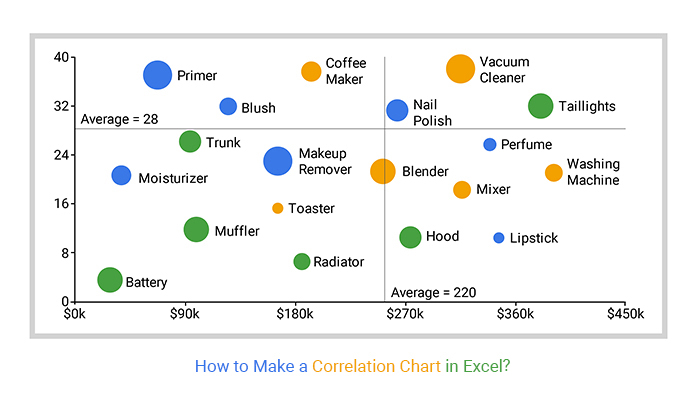
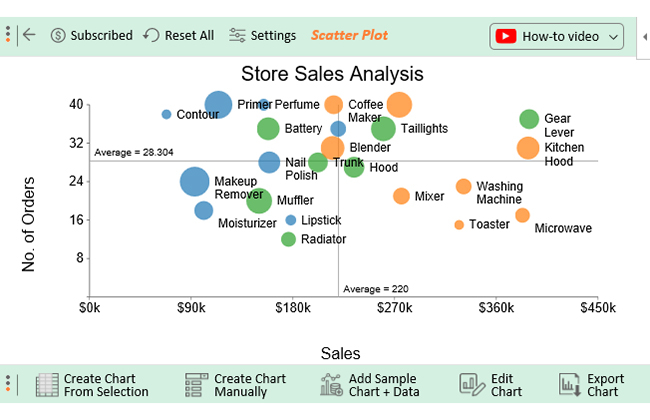
This section will use a Correlation Chart, namely a Scatter Plot in Excel, to visualize the data below.
Let’s dive in.
| Products | Category | Sales | No. of Orders | In Stock |
| Primer | Cosmetic | 114 | 40 | 35 |
| Lipstick | Cosmetic | 178 | 16 | 18 |
| Blush | Cosmetic | 220 | 35 | 23 |
| Moisturizer | Cosmetic | 101 | 18 | 26 |
| Perfume | Cosmetic | 154 | 40 | 19 |
| Contour | Cosmetic | 68 | 38 | 17 |
| Makeup Remover | Cosmetic | 93 | 24 | 37 |
| Nail Polish | Cosmetic | 159 | 28 | 29 |
| Mixer | Electronics | 276 | 21 | 24 |
| Coffee Maker | Electronics | 216 | 40 | 26 |
| Kitchen Hood | Electronics | 388 | 31 | 30 |
| Vacuum Cleaner | Electronics | 274 | 40 | 33 |
| Washing Machine | Electronics | 331 | 23 | 23 |
| Microwave | Electronics | 383 | 17 | 22 |
| Toaster | Electronics | 327 | 15 | 17 |
| Blender | Electronics | 215 | 31 | 31 |
| Gear Lever | Car Parts | 389 | 37 | 27 |
| Hood | Car Parts | 234 | 27 | 28 |
| Trunk | Car Parts | 202 | 28 | 27 |
| Taillights | Car Parts | 260 | 35 | 32 |
| Battery | Car Parts | 158 | 35 | 30 |
| Muffler | Car Parts | 150 | 20 | 33 |
| Radiator | Car Parts | 176 | 12 | 22 |
To get started with ChartExpo in Excel, follow the steps below:


A Correlation Chart in Excel takes your data set and transforms it into dots on a coordinate plane, typically X and Y-axes.
You can use this chart to display numerical data pairs. Besides, it allows you to study the relationship between the two variables in your data.
One of the primary reasons seasoned data visualization experts prefer Correlation Charts over other charts is their minimalist design.
For instance, each new data point creates a new bar in a Bar Chart. Imagine you have hundreds of data points. This implies you’ll end up with hundreds of bars.
A positive relationship means the critical data points change together in the same direction. For instance, profit and revenue positively correlate if they grow simultaneously in an incremental pattern.
On the other hand, a negative correlation means data points change together in opposite directions.

Correlation Charts are tested and proven visualizations for displaying outliers, trends, and relationships in data.
These charts are amazingly easy to read and interpret because they use dots to display insights.
Yes, you can quickly tell a trend or pattern by the orientation of the dots.
For instance, if the dots increase from left to right, the relationship between the metrics under study is positive.
On the other hand, if the dots decrease from left to right, the relationship between the metrics under study is negative.
How much did you enjoy this article?


Learn how to create a Control chart in Excel to track process stability, detect unusual variation early, and improve data-driven decision-making.
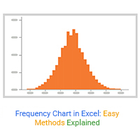
Learn how to create and use frequency charts in Excel to simplify data analysis, visualize distributions, and make better business decisions with clear insights.

Learn what box plot outliers in Excel are, how to detect them using the IQR method, and how to interpret them with real-world examples and Excel use cases.