Categories
By ChartExpo Content Team
Ever stumbled upon a Mekko Chart and wondered what’s the fuss about?
Let’s explore this intriguing chart type, also known as a Marimekko Chart. The beauty of a Mekko Chart isn’t just in its ability to catch your eye, but in how it turns complex data into a canvas of color and proportion, making it a favorite in the toolbox of data visualization specialists.
Whether you’re a data scientist, a business analyst, or a curious mind, Mekko Charts offers a unique way to explore and present data. They combine the depth of data analysis with the clarity of visual storytelling, making them useful and engaging in various data visualization challenges.
Mekko Charts are not just about displaying data; they’re about telling a story where size and scale matter just as much as the individual data points themselves. They challenge the viewer to think dimensionally and can turn a simple data review session into a strategic discussion.
So next time you’re sifting through complex datasets, consider giving Mekko Charts a go – they might just reveal the big picture you’re trying to paint.
First…
A Mekko Chart, also known as a Marimekko Chart, is like a bar chart on a creativity spree.
Imagine a stacked bar chart that decided to show not just the segments of data but also their relative weights. The width of each bar in a Mekko Chart is variable and proportional to the total of the data it represents, giving you two dimensions of data: the segment sizes and their proportions to the whole.
This makes the Mekko Chart a powerful tool for comparing multiple categories and their subcategories at a glance.
The name “Marimekko” nods to its stylistic roots in the vibrant, bold patterns of Marimekko fabrics from Finland, popular in the 1960s. The design was so impactful that it made its way from textiles to data, offering a visual feast that can communicate complex information efficiently and engagingly.
The chart’s ability to simultaneously display part-to-whole relationships across different categories lends itself well to analytics for agencies, making it a popular choice for presenting varied datasets like market segmentation or financial distributions in business and marketing analysis.
The Mekko Chart might remind you of its cousins – the stacked bar chart and the treemap.
Like stacked bars, Mekko Charts display layers of data but differ by varying both the width and height of bars, adding a dimension of analysis that is typically volume or value-based.
Compared to treemaps, which also visualize hierarchical data with nested rectangles, Mekko Charts maintain a strict x-axis alignment that can be easier to read and compare because of their orderly structure.
Mekko Graphs are powerful tools for visualizing data, especially in business contexts. Their unique ability to represent two or more variables simultaneously makes them stand out.
In a Mekko Graph, the height of each segment represents the value of a particular variable, which is crucial for understanding what a data analyst does. For instance, if you’re looking at market share by company, each segment’s height indicates the percentage share each company holds. This visual cue helps quickly grasp how dominant or marginal each player is in the market.
The width of each segment signifies the relative proportion of another variable. For instance, in a market share example, the width might represent market size or total revenue. This dual-axis representation allows for a more comprehensive view of the data, making it easier to understand both the size and significance of different segments.
Additionally, when analyzing concepts such as marginal revenue vs marginal cost, this visualization helps in grasping the relationship between these two economic indicators and their impact on overall market dynamics.
The true power of Mekko Graphs lies in combining these two dimensions. It allows for a multi-faceted view of data. For example, you can see not only how much market share a company has (height) but also how significant the market is in terms of revenue (width). This can highlight market segments that are large but dominated by a few players, or vice versa.
Mekko Charts can segment data within each bar, stacking multiple categories within the same bar. This feature is useful for visualizing parts of a whole within different segments, giving a layered insight into the data. For instance, within each company’s market share (height), you could stack segments to show revenue from different product lines (width), providing a granular view of performance.
The combined use of height and width creates a visually impactful chart. It can immediately draw attention to key areas, such as which segments dominate and which are less significant. This is especially useful in presentations where quick, clear communication of complex data is crucial.
Mekko Graphs are unique tools in data visualization. Their distinctive layout can convey complex information clearly and concisely. Let’s dive into what makes these graphs stand out and how they compare to traditional charts regarding visual impact and cognitive load.
Mekko Graphs are visually striking. They use colored blocks to represent data, where both the width and height of each block are significant. This dual encoding allows for the representation of two variables simultaneously.
For example, in a market share analysis, the width of each block could show the market size, while the height displays the market share of each competitor. This layered data presentation is both engaging and informative design.
Traditional charts like bar or pie charts often struggle with this level of detail. A bar chart might show market share, but it can’t effectively convey the relative market size without additional data points or annotations.
Pie charts can become cluttered and hard to read when there are many segments, especially if the differences between segments are small.
Mekko Graphs, while powerful, do come with a higher cognitive load.
Interpreting them requires understanding the significance of both dimensions. This can be more demanding than reading a single-variable chart. However, this complexity can be managed with thoughtful design and clear labeling.
The cognitive load is justified by the depth of insight Mekko Graphs provide. They allow for quick comparisons between different categories and subcategories, revealing patterns and trends that might be missed in simpler charts. This makes them valuable for detailed data analysis and strategic decision-making.
Using a Marimekko Chart can transform how you analyze and present data, providing clear, actionable insights that drive better decision-making. In short, they make your data more digestible and your strategies more impactful.
Marimekko Charts allow you to compare several variables simultaneously. Imagine trying to understand market share distribution across different regions and segments. A Marimekko Chart does this in one clear, visual snapshot.
They simplify complex data, making it easy to spot trends and patterns. For example, in a sales analysis, you can see which product categories dominate specific markets and how each segment contributes to overall sales.
By presenting data in a consolidated view, Marimekko Charts help in strategic planning. They highlight areas needing attention and those performing well, guiding where to allocate resources effectively.
Mekko Charts stand out from other charts due to their ability to show relationships between two categorical variables along two dimensions. Let’s break down what makes them different and why you might want to use them over other types of charts.
Mekko Charts: Display data in two dimensions. The width of each column shows the size of a category, while the height shows a second variable within that category. This allows you to compare both the size and the composition of each category at the same time. It’s like seeing a full profile of your data in one glance.
Other Charts: Most other charts, like bar charts or pie charts, typically show data in one dimension. Bar charts, for example, show the size of categories along a single axis. Pie charts show the proportions of a whole but can’t effectively show how different categories compare in multiple dimensions.
Mekko Charts: Excellent for visualizing part-to-whole relationships and comparisons between categories. They make it easy to see both the relative size of categories and the proportion of subcategories within them. For instance, in market analysis, you can see not just the total market share but also how different segments of that market compare with each competitor.
Other Charts: While stacked bar charts can also show part-to-whole relationships, they don’t convey the size of the overall category as clearly. Pie charts are limited to showing proportions and can’t effectively handle multiple dimensions. Treemaps can show hierarchical data but often lack the intuitive clarity of Mekko Charts.
Mekko Charts: Can handle dense datasets without becoming cluttered. The proportional layout ensures that even small segments are visible and informative. This makes them particularly useful for presenting complex data clearly and concisely.
Other Charts: Charts like line graphs or scatter plots excel at showing trends and distributions but can become overcrowded when dealing with many categories or dense data. Pie charts and simple bar charts struggle with data density, often becoming hard to read when too many categories are involved.
When it comes to creating Mekko Charts, the right software can make all the difference. By choosing the right tool such as ChartExpo, and following these steps, you’ll be able to create detailed, insightful Mekko Charts that can drive better decision-making and provide a clearer picture of your data landscape.
For those who need advanced features and user-friendly interfaces, ChartExpo is a solid choice. It provides templates and easy integration with Microsoft Excel and Google Sheets, making it accessible for those who prefer not to code.
Selecting the right variables is the first step. Your variables should be categorical, meaning they represent distinct groups or categories. Common uses include market segmentation, sales data, or demographic information. Ensure the categories you choose are relevant to your analysis and provide valuable insights.
Before you start, structure your data in a table with two dimensions – categories and subcategories – and one measure, which represents the values or percentages for each subcategory. This step is crucial as it lays the foundation for your Mekko Chart.
For instance, if you’re analyzing market share, your table might include columns for regions, product types, and corresponding market share percentages.
Mekko Charts rely on the proportional sizes of categories. Therefore, it’s essential to calculate the proportions or percentages of each category accurately. This will determine the width and height of the bars in your chart. Each segment’s width should reflect its proportion within the total dataset, while the height shows the value within its category.
To ensure clarity, minimize overlapping segments. Overlapping can confuse the viewer and obscure important data. Arrange segments carefully and adjust proportions if necessary to keep your chart clean and easy to interpret.
Labels are vital for understanding the chart. Place them strategically inside or outside the segments to maximize readability and avoid clutter. Leader lines can help connect labels to their respective segments without overcrowding the chart.
Colors play a significant role in differentiating segments. Choose distinct, contrasting colors for each segment to aid in visual separation. A consistent color scheme enhances clarity and prevents confusion, making it easier for viewers to interpret the chart quickly.
Finally, test your chart to ensure it’s understandable. Gather feedback and be ready to iterate on the design. Adjustments may be necessary to improve clarity and effectiveness. An easily interpretable chart is the goal, so be open to revisions based on user feedback.
Follow these steps to create Mekko Charts in Excel using ChartExpo and glean valuable insights.


Marimekko Charts can be tricky, but they’re great for showing complex data. Let’s dive into some techniques to boost their readability and highlight key data insights.
Colors make or break a Marimekko Chart. Here’s how to pick the right ones:
Let’s put these ideas into practice with a step-by-step approach:
Make your axis titles clear and concise. They should immediately inform the viewer about the dimensions of your data. For instance, use titles like “Market Segments” for the horizontal axis and “Revenue Share” for the vertical axis. Clarity at a glance is key.
Directly label your segments. Placing labels inside the segments helps, but be wary of clutter. Use abbreviations or initials for longer names, and provide a legend if necessary. Ensure the labels are legible by choosing contrasting colors for text and background.
Interactive tooltips are a game-changer. They allow you to include detailed information without cluttering the chart. When the user hovers over a segment, the tooltip can display additional data such as exact values, percentage contributions, or trends. This keeps your chart clean and informative.
Use consistent and meaningful colors. Assign specific colors to certain categories across your charts to create a visual narrative that’s easy to follow. For instance, if you’re representing different product lines, use a unique color for each line consistently.
Keep it simple. Information overload can make your chart confusing, so avoid cluttering it with excessive text or decorative elements. Stick to the essentials. Every element on your chart should serve a purpose. If it doesn’t add value, leave it out.
Test your chart’s readability. Show your Marimekko Chart to someone unfamiliar with the data and ask them to interpret it. Their feedback will help you refine your labels and layout for maximum clarity and impact.
By following these best practices, you can turn your Marimekko Charts into powerful tools for data communication, making complex information accessible and engaging for your audience.
Boosting user engagement with Marimekko Charts is easier than you think. By adding interactive elements like tooltips, clickable segments, and dynamic drill-downs, you can transform a static chart into an engaging, informative tool. Let’s break it down.
Tooltips are like mini information booths that pop up when you hover over a section of your chart. They provide additional data without cluttering the visual space. Here’s how you can integrate them:
Clickable segments turn your Marimekko Chart into an interactive experience. Users can click on different sections to drill down into more detailed views.
Dynamic drill-downs allow users to explore data at various levels, from broad overviews to granular details.
Mekko Graphics offers a way to visualize complex data, revealing insights that might be missed with other chart types. Here’s how you can leverage these charts for business strategy and market analysis.
Mekko Graphics are useful for visualizing complex data. They help businesses see multi-dimensional data in one chart. This makes them great for market segmentation, competitive analysis, and strategic planning.
Scenario: A company wants to understand its market better. They have data on customer demographics, purchasing habits, and regional sales.
Solution: By using Mekko Graphics, they can visualize all this data in one place. The width of each column represents the size of the market segment. The height of each segment within a column shows the proportion of customers in that segment.
Outcome: The company can easily see which customer segments are the largest and most profitable. This helps them focus their marketing efforts more effectively.
Scenario: A business is trying to gauge its position relative to competitors. They have data on market share, product lines, and regional performance.
Solution: Mekko Graphics displays this information. Each column represents a different competitor, with the width showing the total market share and the height showing the product line breakdown.
Outcome: The business quickly identifies areas where they are strong and where they need to improve. This visual tool helps them craft strategies to gain a competitive edge.
Scenario: A company is planning its strategy for the next fiscal year. They have data on past performance, market trends, and projected growth.
Solution: By incorporating Mekko Graphics, they can visualize all these factors together. The chart helps them see the relationships between different variables, like how market trends affect their growth.
Outcome: The strategic planning team can make more informed decisions. They can easily spot trends and make predictions about future performance, leading to more robust strategic plans.
Mekko Graphics simplifies complex data into an easy-to-understand visual format. This helps businesses make better, faster decisions. They are essential for anyone who needs to understand and act on multi-dimensional data.
Mekko Graphics are versatile tools that can significantly enhance data visualization in the public sector and education. By effectively using these charts, organizations can gain deeper insights, make more informed decisions, and ultimately improve outcomes. Whether it’s analyzing policy impacts, managing budgets, or understanding demographic trends, Mekko Charts provide a clear and comprehensive view of complex data.
In the public sector, Mekko Graphics are invaluable for policy analysis, budgeting, and demographic studies. Here’s how:
In education, Mekko Graphics can help administrators and educators analyze and present data in a more understandable format. Here are a few examples:
Marimekko Charts are fantastic for visualizing complex, multi-dimensional data. They’re like a stacked bar chart on steroids, showing the proportional relationships between two or more categorical variables.
To master Marimekko Plots, start by integrating various data sources. Here’s how:
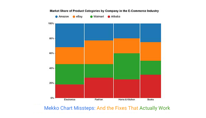
Mekko Charts are great for visualizing categorical data across multiple dimensions. But, they can be tricky. Here’s a guide to help you troubleshoot common issues.
Problem: It’s hard to compare areas directly because our brains are better at comparing heights.
Solution: Provide additional context with labels. Clearly label each block with its value. This way, even if the area is tricky to interpret, the numbers will be clear. Also, consider adding a legend to explain the color coding used for different categories.
Problem: Rectangles aren’t aligned to a common baseline, making comparisons tough.
Solution: Use a consistent baseline wherever possible. If that’s not feasible, make sure to guide the reader’s eye with dotted lines or other visual aids that can help in comparing heights or widths across categories.
Problem: The chart gets cluttered and hard to read with too many categories.
Solution: Limit the number of categories. Break down the data into multiple charts if necessary. It’s better to have several clear, readable charts than one cluttered mess. Use filters to allow viewers to focus on specific categories one at a time.
Problem: Colors and labels can sometimes be confusing or too similar, leading to misinterpretation.
Solution: Use a distinct color scheme. Avoid using too many similar colors. Ensure that labels are readable and not overlapping. Tooltips can also help provide additional information without cluttering the chart.
Problem: Mekko Charts can’t display negative values, which limits their use.
Solution: If you need to show negative values, consider alternative chart types, like a stacked bar chart, which can handle both positive and negative values. This is also a strong alternative of Pie chart when you need better flexibility in displaying comparisons. Or, you can use separate charts for positive and negative data to maintain clarity and improve readability.
To ensure Mekko Charts are effective and not misleading, it’s crucial to properly adjust scales and proportions.
Accuracy and consistency are crucial when creating Mekko Charts for recurring reports. Let’s explore best practices to ensure your Mekko Charts are uniform and standardized.
Templates are your best friend. They provide a consistent starting point for every chart, ensuring uniformity. When setting up your template:
Your data needs to be clean and normalized. Before creating a chart, ensure all data points are:
Before finalizing, always:
Mekko Chart is an insightful tool for anyone looking to make sense of complex data. It offers clarity, efficiency, and depth, making it indispensable in data visualization. Next time you’re wrestling with multifaceted data, give a Mekko Chart a try ”“ it might be the key to unlocking new insights.
Mekko Charts excel at showing multiple variables in one chart. Imagine you need to compare market share by region and product category simultaneously. A Mekko Chart handles this with ease, giving you a clear picture of complex data. Each segment’s width and height tell a story, offering insights at a glance.
These charts make it easy to spot trends and patterns. By representing data in two dimensions, they allow for quick comparisons. You can see which segments dominate and which are lagging, helping you focus your analysis on where it matters most.
In a single chart, you can pack a lot of information without clutter. Mekko Charts use space efficiently, making them ideal for presentations. They keep your slides clean and informative, avoiding the dreaded “wall of numbers” effect.
While Mekko Charts can provide valuable insights by showcasing complex data relationships, their complexity, and visual clutter make them less user-friendly. They are best used sparingly and for specific data visualization needs where their strengths outweigh their disadvantages.
Mekko Charts are often hard to read and understand. They rely on the audience’s ability to compare areas, not just heights or lengths, which can be tricky. People are generally better at estimating distances than areas. As the number of rectangles increases, comparing different sections becomes even more challenging.
These charts can become visually cluttered, especially when there are many categories or subcategories. This clutter makes it hard to separate individual proportions accurately and can lead to confusion and misinterpretation.
Mekko Charts have practical limitations on the number of subcategories they can display before the visualization becomes too complex. Comparisons are most effective between subcategories at the bottom or higher baselines. As you move away from these baselines, judging differences becomes harder.
Mekko Charts cannot display negative values or combine absolute and relative values. This limitation can be a significant drawback for datasets that include negative numbers or require a mix of value types.
Placing labels in a Mekko Chart can be difficult due to the overlapping and varying sizes of the segments. This challenge can lead to labels that are hard to read or interpret, further complicating the chart.
These charts are not ideal for analyzing trends over time. Their primary strength is showing distribution and relationships within a single dataset. For time-based data analysis, other chart types, like line charts are more appropriate.
The future of data visualization with Mekko Charts is exciting. As AI, big data, and machine learning continue to advance, these charts will become more sophisticated, interactive, and user-friendly, offering unparalleled insights into complex datasets. Get ready for a revolution in how we visualize and understand our data!
AI is transforming data visualization tools by automating chart creation. Imagine AI for data analysis analyzing your dataset and automatically suggesting the best Mekko Chart configurations. This advancement makes it easier for users, especially those who aren’t data experts, to leverage data visualization tools and generate insightful visualizations quickly.
Big data is another game-changer. With the ability to process and visualize massive datasets, Mekko Charts will handle more complex and granular data. This means businesses can visualize intricate market segments, customer behaviors, and product performance with greater detail and accuracy.
Machine learning (ML) can enhance Mekko Charts by identifying patterns and trends that might not be immediately obvious. For example, ML algorithms can highlight correlations between different variables in the chart, offering deeper insights and aiding in more informed decision-making.
Reading a Mekko Chart involves understanding the blocks’ width and height. Each block represents a category, with its width indicating the proportion of a whole, while the height shows subcategory values. Start by analyzing the total market size, then dive into segments and subsegments to identify patterns and correlations.
Mekko Charts can become cluttered if there are too many categories or segments. They might be difficult to interpret if not designed carefully. Ensure your data is well-organized, and use clear labeling to enhance readability.
Use a Mekko Chart to compare grouped data and visualize category items within these groups. They’re particularly effective for displaying market segmentation, industry profit pools, supply chain profitability, and growth by region.
No, Mekko Charts are not well-suited for negative values. They are designed to display positive, proportional data, and introducing negative values can disrupt the clarity and interpretation of the chart.
Mekko Charts are not your average bar graphs. They are dynamic and powerful tools for data visualization. Imagine transforming complex datasets into clear, visual stories that drive action. That’s what Mekko Charts offers. They don’t just present data; they make it sing.
The true magic lies in their ability to highlight insights that might otherwise be hidden. They make it easier to spot trends, compare categories, and make informed decisions quickly. This is the kind of tool that turns data into a narrative, compelling, and actionable.
So, embrace the Mekko Chart. Let it transform your data storytelling, bringing insights to life and making your data-driven decisions sharper and more effective.
It’s more than a chart; it’s a revelation.
How much did you enjoy this article?


Calculate accounts receivable turnover ratio to measure credit collection speed, improve cash flow, and strengthen your financial strategy. Read on!

Change Management KPIs are the key to tracking adoption, performance, and ROI during transitions. Find out which metrics matter. Read on!

Data collection methods and techniques determine the quality of every insight you act on. Explore key approaches for gathering reliable data. Read on!


