Categories
Analyzing part-to-whole relationships of key variables within your data is easier said than done. The situation is further made worse by the increase in the size of data.


You need a chart that’s primarily designed to help show comparison insights between categories within your data without clutter. Tables are not recommended, especially if the size of your data is enormous.
In other words, you need a Stacked Bar Chart in Excel with multiple datasets.
The visualization design can help you display how a variable is divided into smaller sub-variables. Each bar in a Stacked Bar Chart Excel represents the whole. And the segments within the bars represent different parts that contribute to the whole.
Data visualization tools, such as Excel, come with a pretty basic Excel Stacked Bar Chart. Essentially, you have to perform multiple customizations, which takes a significant amount of time.
It turns out you can transform Excel into a reliable tool by installing a particular third-party add-on (we’ll talk about it later in the blog).
In this blog, you’ll learn:
Before we dive right into the how-to guide, let’s define the visualization design.
Definition: The Stacked Bar Chart in Excel with multiple data is essentially an extension of the standard Bar Chart. Each bar in this chart is divided into several sub-bars stacked end-to-end.

The Stacked Bar Chart with multiple data points is best suited for tracking the trends of key data points over time. Besides, it outperforms other visualization designs in displaying part-to-whole relationships. If we have negative and positive data series, then a Stacked waterfall chart in Excel becomes invaluable.
This type of chart elegantly showcases the cumulative effect of both positive and negative values, offering a comprehensive view of the overall trend and the individual contributions of each data point
Why?
This chart is easy to read and interpret. Besides, it can handle bulky data without appearing cluttered. You can leverage the Segmented bar graph to display how the composition of the subcategories changes over time.
How to make a Stacked Bar Chart in Excel with multiple data sets should never be a stressful or time-consuming affair. Keep reading to discover more.
In the following video, you will learn how to create a stacked bar chart in Excel with multiple groups:
In the next section, we’ll explore the types of Stacked Bar Chart Excel with multiple datasets and how you can use them to gain more from your raw data.
There are 3 different types of Stacked Bar Charts in Excel with multiple data, namely:
The Simple Stacked Bar chart places the absolute value of each subcategory after or over the previous one.
You can use the graph to show the absolute value of each subcategory and its totals relative to the aggregate value of the category. To create a graph from a table, simply input your data and select the appropriate chart type. Usually, the bars will have varying heights or lengths.
Like a typical Bar Chart, the bars in this visualization design can be oriented horizontally (with primary categories on the vertical axis) or vertically (with primary categories on the horizontal axis).
Take a look at the tabular data below. Can you extract meaningful insights from the look of the table?
| Locations | Q1 | Q2 | Q3 | Q4 |
| Boston | 825 | 705 | 421 | 759 |
| Austin | 1026 | 616 | 510 | 678 |
| Miami | 641 | 617 | 608 | 392 |
Now, note the difference after visualizing the data (above).

Suppose variables in your data represent the whole that has been subdivided into parts across two major categorical variables. In this case, your go-to hierarchical data visualization should be the Hierarchical Stacked Bar Chart.
A Hierarchical Stacked Bar Chart in Excel is made up of bars split into subcategories. Each of the primary bars may have a similar height but vary within subcategories. The aforementioned is easier, especially when comparing multiple categories for in-depth insights.
Take a look at the data below. Can you extract meaningful insights without taking time?
| Locations | Brands | Q1 | Q2 | Q3 | Q4 |
| Boston | Mobile | 536 | 399 | 318 | 475 |
| Boston | TV | 289 | 306 | 103 | 284 |
| Austin | Mobile | 680 | 431 | 369 | 509 |
| Austin | TV | 346 | 185 | 141 | 169 |
| Miami | Mobile | 368 | 439 | 230 | 279 |
| Miami | TV | 273 | 178 | 378 | 113 |
Now, note the difference after visualizing the data (above).

The key advantage of a Stacked Bar Chart Excel with multiple datasets is that you can display subcategories within bars without using extra charts.
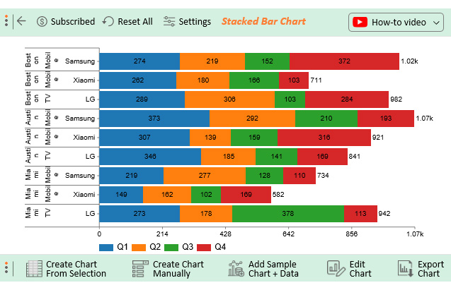
Take a look at the data below. Can you tell what’s going on without the aid of a chart?
| Locations | Products | Brands | Q1 | Q2 | Q3 | Q4 |
| Boston | Mobile | Samsung | 274 | 219 | 152 | 372 |
| Boston | Mobile | Xiaomi | 262 | 180 | 166 | 103 |
| Boston | TV | LG | 289 | 306 | 103 | 284 |
| Austin | Mobile | Samsung | 373 | 292 | 210 | 193 |
| Austin | Mobile | Xiaomi | 307 | 139 | 159 | 316 |
| Austin | TV | LG | 346 | 185 | 141 | 169 |
| Miami | Mobile | Samsung | 219 | 277 | 128 | 110 |
| Miami | Mobile | Xiaomi | 149 | 162 | 102 | 169 |
| Miami | TV | LG | 273 | 178 | 378 | 113 |
Note the difference after using a visualization design to display insights into the tabular data (above).

Each primary bar in a Percentage Stacked Bar is scaled to have the same height. But its subcategories have varying heights depending on their respective numerical values in a percentage bar graph.
Each subcategory with a Percentage Bar Chart adds up to 100%.
The similar heights of each primary bar create a baseline at the top of the chart, which eases interpretation.
Making a Stacked Bar Chart in Excel with multiple data sets should never be a nerve-wracking affair. Keep reading to discover more.

To get the most from the Stacked Bar Chart Excel with multiple data sets, incorporate high-contrast colors to ease interpretation. Avoid almost similar colors because they may distort the composition of the respective bars. Using a multicolored bar graph helps you to understand data better.
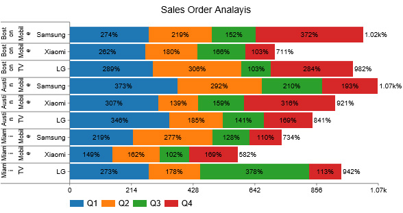
Furthermore, numerical values should be indicated within or above each subcategory to facilitate comparison. In cases involving Multivariate Analysis, these annotations can be particularly helpful for understanding complex relationships. However, be sure to use them judiciously to avoid visual clutter
Excel has built-in charts you can use to extract insights from your raw data.
How to create a stacked bar chart in Excel with multiple groups?
However, you’ll never find a ready-to-use Stacked Bar Diagram with multiple datasets for your analysis. The most viable option available for you is to download and install a particular third-party add-in to access a ready-made Stacked Bar Graph Excel or the same as this Side-By-Side Bar graph in Excel.
You don’t have to ditch the spreadsheet tool that’s highly familiar to you.
We recommend you try the ChartExpo add-in for Excel for the reasons listed below.
ChartExpo does not require coding or programming skills, unlike other data visualization tools. More so, it has an ultra-friendly UI for everyone to use.
This tool comes pre-loaded with many Excel charts to offset the missing ones in Excel. Use ChartExpo to produce charts that are incredibly easy to read and understand.
How to make a Stacked Bar Chart in Excel with multiple datasets should never be time-consuming. Use ChartExpo to overcome this. You’ll learn more about this cutting-edge tool in the next section.
So, what is ChartExpo?
ChartExpo comes as an add-in for Excel for Mac.
Essentially, it turns your Excel into a reliable data visualization tool capable of delivering hidden insights into your data, irrespective of the size or complexity.
The premium Chart maker comes with a 7-day free trial.
The key benefit of ChartExpo is that it produces charts that are easy to read and interpret. More so, it allows you to save charts like Histogram in the world’s most recognized formats, namely PNG and JPG.
ChartExpo is cloud-hosted, which makes it extremely light. You have a 100% guarantee that your computer or Excel won’t be slowed down.
How to Install ChartExpo in Excel?
As we said, how to make a Stacked Bar Chart in Excel with multiple data should never be time-intensive. Use ChartExpo as your go-to tool to access ready-made charts for your data stories.
You can directly install ChartExpo in Excel by clicking on the following link: “Charts for Microsoft Excel”.
Once it is successfully installed, to get started with ChartExpo, follow the steps below.


We’ll visualize the table below using a Stacked Bar Chart in ChartExpo.
| Locations | Products | Brands | Q1 | Q2 | Q3 | Q4 |
| Boston | Mobile | Samsung | 274 | 219 | 152 | 372 |
| Boston | Mobile | Xiaomi | 262 | 180 | 166 | 103 |
| Boston | TV | LG | 289 | 306 | 103 | 284 |
| Austin | Mobile | Samsung | 373 | 292 | 210 | 193 |
| Austin | Mobile | Xiaomi | 307 | 139 | 159 | 316 |
| Austin | TV | LG | 346 | 185 | 141 | 169 |
| Miami | Mobile | Samsung | 219 | 277 | 128 | 110 |
| Miami | Mobile | Xiaomi | 149 | 162 | 102 | 169 |
| Miami | TV | LG | 273 | 178 | 378 | 113 |


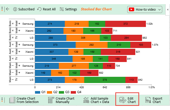
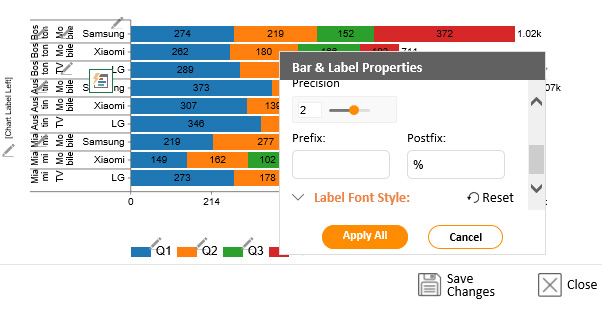
To change the Stacked Bar Chart in Excel with multiple data type, follow the instructions below.


How to make a Stacked Bar Chart in Excel with multiple data does not have to be time-consuming. Take advantage of ChartExpo to supercharge your Excel today.
The key objective of the Excel Stacked Bar Chart with different data is to help you gain insights into the levels of categorical variables in your data.
The chart is plotted for each level of the categorical variable. More so, each bar’s length indicates the value of the variable under study.
Use this chart if your goal is to display the relative composition of key data points. You can also use the Stacked Bar Chart in Excel or the Clustered Stacked Bar Chart with multiple data series to compare and analyze insights into key data points.
How to make a Stacked Bar Chart in Excel with multiple data should never be a time-consuming or nerve-wracking affair. Keep reading to discover more.
Freemium data visualization tools, such as Excel, lack ready-made and visually appealing Stacked Bar Chart Excel. You can transform your Excel into a visualization juggernaut by downloading and installing third-party add-ons, such as ChartExpo.
You can use ChartExpo to create Stacked Bar Charts in Excel in a few clicks by following the simple procedure below.
To structure data for a stacked bar chart in Excel, list categories in the first column and each series you want to stack in separate columns to the right. Each row should represent one category with its series values, making it easy for Excel to stack them in the chart.
Extracting part-to-whole insights is not a walk in the park.
You need a specialized data visualization chart to extract reliable insights to succeed. In other words, you need this Chart.
Use this chart if your objective is to display hidden insights within subcategories and their relationship to aggregate values in your data.
Excel should not be your go-to visualization tool if you want to leverage the chart for in-depth insights. The spreadsheet application lacks ready-to-use and visually appealing charts.
How to make a Stacked Bar Chart in Excel with multiple datasets should never be a complex or overwhelming task.
We recommend you install third-party apps, such as ChartExpo, into your Excel to access ready-made and visually appealing charts.
ChartExpo is an Excel-based add-in with insightful and easy-to-interpret Charts, plus many more advanced visualization designs.
You don’t require programming skills to visualize your data using the tool in Excel.
Sign up for a 7-day free trial today to access easy-to-interpret, ready-made, and visually appealing charts for your data stories.
Related Article:
How to Make a Stacked Bar Chart in Google Sheets
How much did you enjoy this article?


Learn how to use sparklines in Excel to quickly visualize trends inside cells. Discover types, creation steps, customization, use cases, benefits, and best practices.

Learn what a confidence interval graph is, how to create it in Excel, and how to interpret results to make more reliable, data-driven decisions.

A correlation matrix in Excel helps identify relationships between variables. Learn how to create, read, and use it for effective data analysis.


