Categories
By ChartExpo Content Team
Picture a tool that lets you see multiple datasets at once. The Stacked Bar Diagram does exactly that. It’s a powerful way to compare parts of a whole across different categories. Each bar is divided into segments, showing the composition of each category. This visualization helps you grasp complex data effortlessly.
The beauty of the Stacked Bar Diagram lies in its simplicity. By stacking segments within bars, you can quickly compare totals and individual components. It’s like having a double layer of insights in a single glance. This efficiency makes the Stacked Bar Diagram a favorite among analysts and decision-makers.
Why choose a Stacked Bar Diagram over other Diagrams? It provides a clear, comparative view of data, showing how different segments contribute to the total. This is crucial for understanding proportions and trends over time or across categories. With a Stacked Bar Diagram, you don’t just see data; you know it.
First…
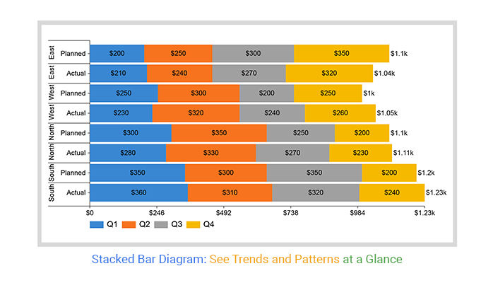
A Stacked Bar Diagram is a type of diagram used to show parts of a whole. Each bar represents a total value, with segments inside the bar showing sub-values or categories. These segments are “stacked” on top of each other, making it easy to compare the total values and the breakdown of each category.
Imagine you have lots of data, and you need to make sense of it quickly. A Stacked Bar Diagram does this job well. By stacking segments, it turns numbers into a visual story that’s easy to grasp. You can see the big picture and the details at the same time. This transformation helps you understand complex data sets without feeling overwhelmed.
Now, let’s break down the parts of a Stacked Bar Diagram.
Understanding these parts helps you read and create a Stacked Bar Diagram more effectively.
When should you use a Stacked Bar Diagram? There are several key moments. First, when you need to show parts of a whole, it’s handy in comparing different groups and how their parts stack up against each other. For example, showing sales data for different products over time works well with this diagram. Another great use is when you need to show changes in data composition over time. This helps in tracking trends and seeing how different parts grow or shrink.
A stacked Bar Diagram has its strengths and weaknesses. They are great for comparing totals and parts at a glance. They can show how different segments contribute to the total and changes over time are clear and easy to follow. But, they also have limits. If there are too many segments, the diagram can get cluttered. It can be hard to compare segments across bars if they are not aligned. This can make precise comparisons tricky.
Getting data ready is the first step. Clean and organize it. Ensure it’s in a format that works well with a Stacked Bar Diagram. Arrange your data in rows and columns. Each row should represent a category. Each column should show different segments of the stacked bar.
For example, if you’re tracking sales by region and product, your rows would list regions. Your columns would show product categories. This setup makes it easy to see the distribution of products sold in each region. The goal is to create a clear, organized structure. This sets the stage for a smooth creation process.
Choosing the right categories is crucial. Your categories should be clear and relevant. They need to tell a story and provide insights. Think about what you want to show. If you’re displaying sales data, your categories might include different products or services. Subcategories could be the regions or periods.
For example, if your main category is “Product Type,” your subcategories could be “Region” or “Quarter.” This breakdown helps your audience understand the data at a glance. The right categories make your Stacked Bar Diagram not just informative, but insightful.
Start with a rough sketch. This helps you plan your diagram before diving into the details. Begin with the axes. The horizontal axis (x-axis) typically represents categories. The vertical axis (y-axis) shows values.
Next, decide how to place your segments. Each segment within a bar should be easy to distinguish, similar to a Segmented bar graph. Use different colors or shades. Ensure the segments are proportional to their values. Labels are important too. Label your axes clearly and place segment labels where they fit best.
For example, if you’re illustrating quarterly sales by product, your x-axis will show quarters, and your y-axis will show sales figures. Each bar will represent a quarter, divided into segments for each product.
You can create a stacked bar diagram in your favorite spreadsheet. Follow the steps below to create a stacked bar diagram.
Steps to Make a Stacked Bar Diagram in Microsoft Excel:
The following video will help you create a stacked bar diagram in Microsoft Excel.


The following video will help you create a Stacked Bar Diagram in Google Sheets.
Color is powerful. The right palette can make your Stacked Bar Diagram pop and tell a story. But choose wisely – colors must enhance, not confuse. Stick to a cohesive color scheme. Use shades that contrast enough to differentiate segments but blend well to avoid jarring transitions.
Think about colorblind users. Online tools can help pick accessible palettes. Limit the number of colors. Too many can be overwhelming. Three to five colors usually work best. Also, match colors to your data’s theme. For example, greens for growth metrics or blues for water-related data. Keep it simple and meaningful.
Labels can make or break your Stacked Bar Diagram. They must be clear, concise, and strategically placed. Start with the basics: label each bar and segment clearly. Use readable fonts and sizes. Avoid fancy fonts that can be hard to read at a glance.
Placement is key. Position labels where they don’t clutter the diagram. Consider placing them inside segments if space allows. If not, use leader lines to connect labels to their segments. Ensure labels don’t overlap. If data is too dense, use legends to explain.
Use abbreviations sparingly. If your audience can easily understand them, go for it. Otherwise, stick to full terms. The goal is to make your diagram as intuitive as possible.
Spacing and proportions in your diagram affect readability. Too tight, and it looks cramped. Too loose, and it wastes space. Aim for a balanced layout. Ensure consistent spacing between bars. This consistency makes your diagram look clean and professional.
Proportions matter, too. Each segment’s size should accurately reflect the data. Avoid distorting the bars to fit the design. The visual representation should be true to the data.
Pay attention to margins and padding. Enough white space around the diagram helps focus attention. But don’t go overboard – keep the visual balance. Properly spaced elements make your diagram easy to interpret and pleasant to look at.
A stacked Bar Diagram can get messy. When you have many segments, it’s hard to read the values accurately. To tackle this, start by using contrasting colors for each segment. This makes it easier to distinguish between them.
Consider adding data labels directly on the segments. This saves your audience from guessing the values. Use horizontal bars if the segment names are long. This way, the names are readable without tilting your head.
Lastly, keep your legend simple. Place it close to the diagram, so readers don’t have to hunt for it. With these steps, your Stacked Bar Diagram will be clear and easy to understand.
Large datasets can turn your diagram into a confusing mess. To avoid this, limit the number of segments. Focus on the most important data points. Combine smaller segments into an “Other” category. This keeps the diagram clean and focused.
Use a consistent scale for all bars. Inconsistent scales can mislead readers, create misleading charts, and confuse them. If the data range is too wide, consider using a logarithmic scale. This can help in managing large variations in data values.
Interactive diagrams are a great way to manage clutter. Allow users to filter and zoom in on specific parts of the data. This way, they can explore the information without getting overwhelmed.
Accurate data representation is key. Misleading Stacked Bar diagrams can cause mistrust. Always use proportional segments. A 50% segment should look like half the bar, not more or less.
Avoid using 3D effects. They can distort the data and mislead your audience. Stick to 2D representations for clarity.
Check your data source and ensure it’s reliable. Double-check the numbers before creating the diagram. This ensures that the data you’re presenting is correct and trustworthy.
Alignment is key. If bars aren’t aligned properly, comparisons become a guessing game. To make things easier, ensure that your bars start at the same base. This way, your audience can quickly compare segments without getting lost.
One technique is to use a consistent color scheme. Each category or segment should have the same color across all bars. This consistency helps the viewer’s brain make quick connections.
Another trick is to arrange your data logically. For example, if you’re showing sales data in a Side-By-Side Bar Chart, arrange the bars in chronological order. This simple step helps your audience follow the progression of data without confusion.
Consistency is your secret weapon. When segment sizes vary, it’s hard to make accurate comparisons. Keep segment sizes uniform to ensure clarity.
To achieve this, use a fixed scale for all your bars. This way, a segment representing 10 units on one bar looks the same on another bar. It helps in avoiding visual distortions.
Avoid unnecessary gaps between bars. Tighten up the spacing to make comparisons quicker. Your goal is to present data in a way that anyone can understand with a glance.
You can make your Stacked Bar diagram in Google Sheets more informative with smart annotations. Start by highlighting key data points. You can use simple labels to mark totals or changes over time. Keep them brief so they don’t clutter your diagram and contribute to information overload.
Try using color-coded annotations that match your segments. This visual link helps the reader easily connect the note with the corresponding part of the bar.
To make your diagram even clearer, focus on information design by adding callouts for significant values. These can show trends, compare segments, or highlight important data. Just ensure these callouts are straightforward and placed strategically to avoid overwhelming the viewer with too much information.
Adjusting the space between segments in your Stacked Bar Diagram can greatly improve readability. Narrow gaps might make your diagram look cramped, while wider ones can highlight individual parts more clearly.
Experiment with different spacings to find what works best. For instance, if segments are closely related, you might want a smaller gap. If you’re comparing distinct categories, a wider gap can make the differences more apparent.
Remember, the goal is clarity. The right spacing helps readers quickly grasp the data without feeling overwhelmed.
Take your Stacked Bar Diagram to the next level with advanced design elements. First, think about using gradient fills. These can add depth and make your segments stand out.
Incorporate textures to differentiate between segments. This can be particularly useful if you have many similar colors. Patterns like stripes or dots can add visual interest and help distinguish data.
Interactive elements can also be game-changers. If you’re presenting digitally, consider incorporating hover effects or clickable segments in visualizations like Stacked Bar diagrams or Clustered stacked bar diagrams that reveal more details. This approach engages the viewer and provides deeper insights.
Know the story you want to tell. Focus on the message you want your diagram to convey.
Ask someone else to review your diagram. If they can’t understand it quickly, revise it.
Less is more. Avoid adding too many data series. Stick to the most relevant information.
Ensure the diagram is balanced. Avoid making one section too dominant unless it’s intentional.
Ensure color choices are accessible. Test your diagram for color blindness accessibility.
Too much data can make your diagram messy. Limit the number of categories and series.
Avoid using colors that are too similar. This can make sections hard to differentiate.
Never skip labels. Every section should be clearly labeled to avoid confusion.
Ensure scales are accurate and consistent. Misleading scales can distort the data.
A global retail company wanted to understand regional sales differences. They used Stacked Bar Diagrams as part of their descriptive analytics to visualize sales data. Each bar represented a country, with segments for different product lines.
This approach allowed the company to see which products were popular in which regions. They adjusted their marketing strategies accordingly, boosting sales by 15%.
A tech company conducted a customer satisfaction survey. They used Stacked Bar Diagrams to present the data. Each bar showed satisfaction levels across different age groups. The visual clarity helped the company identify areas for improvement. They made targeted changes, increasing overall satisfaction by 10%.
A major retail chain was facing stagnating sales. They needed a clear picture of their performance across regions. Using a stacked bar diagram, they visualized sales data for each store.
Each bar represented a store, with segments for different product categories, similar to insights seen in a percentage bar graph for clearer proportional comparison. This visualization highlighted underperforming areas. The company focused its efforts on these regions, revamping marketing strategies. The result? A 20% increase in sales over six months.
A hospital wanted to assess the effectiveness of different treatments for heart disease. They used a Stacked Bar Diagram to visualize patient recovery rates. Each bar represented a treatment method, with segments showing recovery rates over time. This clear visualization helped the hospital identify the most effective treatments. By focusing resources on these treatments, they improved patient outcomes by 25%.
A software development firm struggled with project delays. They needed a way to track task completion across multiple projects. A stacked Bar Diagram provided the solution. Each bar represented a project, with segments for task completion status. This visualization helped managers identify bottlenecks and allocate resources more effectively. As a result, project completion times improved by 30%.
Problem: Bars don’t line up correctly.
Solution: Check your data for consistency. Ensure all categories are present for each group. Align your axis labels and scales. Verify that your plotting tool settings match your data structure.
Problem: Bars overlap, making it hard to read.
Solution: Adjust the bar width. Increase the space between bars. Consider switching to a different visualization if the overlap persists.
Problem: Some categories or data points are missing from the diagram.
Solution: Review your dataset to ensure all necessary data is included. Double-check your data source and formatting. Fill in or correct missing values before plotting.
Problem: Colors for the same category vary across the diagram.
Solution: Standardize your color scheme. Use a consistent color palette. Verify that your plotting tool applies colors correctly.
Problem: Axis labels or category names are hard to read.
Solution: Adjust the font size and style. Rotate labels for better visibility. Simplify the text to make it clear and concise.
Problem: Readers misinterpret the data shown.
Solution: Add a legend to explain the categories. Use clear, descriptive titles and labels. Provide context for the data.
Problem: The scale makes it hard to compare values accurately.
Solution: Use a consistent scale for all bars. Avoid truncating the axis. Ensure the scale starts at zero to maintain accurate comparisons.
Problem: The diagram is cluttered with too much data.
Solution: Simplify the diagram by reducing the number of categories or data points. Group similar data together. Use summaries or averages where appropriate.
Start with the base of the bar. Each section of the bar adds up to the total value. Look at the colors or patterns to see what each part represents. Compare different bars to see how the parts differ between categories.
Use it when you want to show how different parts make up a whole across multiple categories. It’s useful for seeing both the total and the breakdown of data.
It’s good for showing the composition of data and comparing totals at the same time. It’s also compact, so it fits a lot of information in one diagram.
If there are too many parts, it can get messy and hard to read. Small differences between parts can also be hard to spot.
Gather your data and decide what categories and parts you want to show. Use software or tools to input your data and create the diagram. Make sure each part is clearly labeled and the colors or patterns are distinct.
Keep it simple and focused. Use distinct colors or patterns for each part. Make sure labels are clear and the data is accurate. A clean, simple design makes it easier to understand.
It might be too cluttered. Too many segments can make it hard to see what’s going on. Simplify your data or break it into multiple diagrams if needed. Clear labels and distinct colors also help.
It works best for comparing parts of a whole across categories. It’s not ideal for showing trends over time or very complex data sets. Choose the right diagram for your data to ensure clarity.
Look at the length of each part within the bars. Longer parts represent larger values. Compare the same parts across different bars to see variations.
Many software options are available, such as ChartExpo. Choose one that allows you to easily input data and customize the design.
It’s great for showing how different parts make up a whole and comparing these across categories. It provides a clear visual that can be more insightful than a simple bar chart or pie chart for some datasets.
Yes, they can become cluttered if there are too many segments or bars. It might also be hard to compare segments that aren’t aligned. For detailed comparisons, consider other charts like side-by-side bar charts.
You’ve traveled a long way in mastering Stacked Bar Diagrams. We covered the basics, the construction, and the best practices. You now understand the importance of each component. You’ve seen how to interpret and analyze these diagrams, making them a powerful tool in your data visualization toolkit.
We explored how to build a Stacked Bar Diagram step by step. You learned about setting up your data, choosing the right categories, and ensuring clarity and readability. We delved into common pitfalls and how to avoid them. By now, you should feel confident in your ability to create and analyze Stacked Bar Diagrams, turning complex data into clear, actionable insights.
Don’t stop here. Keep practicing. The more you work with Stacked Bar Diagrams, the better you’ll get. Try different datasets. Experiment with various configurations. Each time you create a new diagram, you’ll learn something new.
Remember, mastery comes with practice. Apply the techniques and best practices we discussed. Don’t be afraid to make mistakes; they’re part of the learning process. Your skills will improve, and your confidence will grow.
Keep pushing your boundaries. You’ve got this.
How much did you enjoy this article?


Calculate accounts receivable turnover ratio to measure credit collection speed, improve cash flow, and strengthen your financial strategy. Read on!

Change Management KPIs are the key to tracking adoption, performance, and ROI during transitions. Find out which metrics matter. Read on!

Data collection methods and techniques determine the quality of every insight you act on. Explore key approaches for gathering reliable data. Read on!


