Categories
Data visualization is the go-to method when you want quick insights into your raw data. However, not any type of visualization design can be used in your data storytelling.


Some charts are designed to visualize information in an exploratory way. Others are designed to display the composition of sub-variables contributing to the whole of your data.
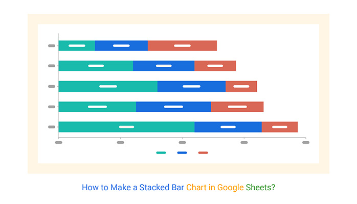
So if your goal is to display part-to-whole relationships in your data, your go-to chart should be the Stacked Bar Chart.
Popular and widely used visualization tools, such as Google Sheets, lack ready-made Charts.
But you can transform the spreadsheet into a reliable tool by installing third-party add-ons to access visually appealing and how to make Stacked Bar charts in Google Sheets.
In this blog, you’ll learn:
Before we delve right into the how-to guide, let’s define the chart we’ll be talking about throughout the blog.
Definition: A Stacked Bar Chart is a variant of the Bar Graphs you can use to compare individual data points relative to aggregate values.

A typical Bar Chart compares individual data points. Conversely, in a Stacked Bar Chart, each bar is divided into several sub-bars stacked end to end. More so, each subsection in the bars has the same color to make formatting easier.
The chart allows you to see even minor changes in key variables in your data points. Use a Stacked Bar Chart if your goal is to compare key variables in your raw data.
A Stacked Bar Chart in Google Sheets uses bars to display key data points across a range of different dimensional values.
Take a look at the tabular data below. Can you provide insights into the data without taking significant amounts of time?
| Subjects | 2018 | 2019 | 2020 |
| Mathematics | 60 | 80 | 90 |
| Chemistry | 75 | 50 | 40 |
| Physics | 60 | 70 | 75 |
| Computer | 70 | 60 | 50 |
| Biology | 80 | 50 | 45 |
| English | 50 | 75 | 80 |
| Arts | 70 | 50 | 45 |
| Economics | 80 | 60 | 70 |
Now, note the difference after visualizing the data using this chart.
We hope you’ll note why we use this chart to visualize data with more than two numerical columns.

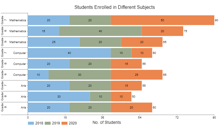
Let’s take a look at a different example. Can you provide a meaningful conclusion from the data set below?
| Class | Subjects | 2018 | 2019 | 2020 |
| Grade-7 | Mathematics | 20 | 20 | 50 |
| Grade-8 | Mathematics | 15 | 40 | 20 |
| Grade-9 | Mathematics | 25 | 20 | 20 |
| Grade-7 | Computer | 40 | 10 | 10 |
| Grade-8 | Computer | 20 | 20 | 15 |
| Grade-9 | Computer | 10 | 30 | 25 |
| Grade-7 | Arts | 20 | 20 | 15 |
| Grade-8 | Arts | 30 | 10 | 10 |
| Grade-9 | Arts | 20 | 20 | 20 |
You’ll agree when we say that raw data is better served when visualized with easy-to-interpret visualization designs, such as the Stacked Bar Diagram.
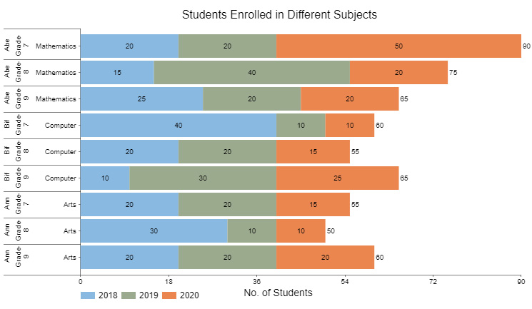
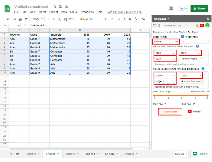
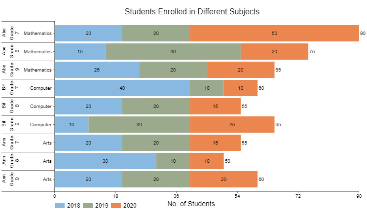
Check out our final example below. How convenient is it for you to tell a story from the tabular data below?
| Teacher | Class | Subjects | 2018 | 2019 | 2020 |
| Abe | Grade-7 | Mathematics | 20 | 20 | 50 |
| Abe | Grade-8 | Mathematics | 15 | 40 | 20 |
| Abe | Grade-9 | Mathematics | 25 | 20 | 20 |
| Bif | Grade-7 | Computer | 40 | 10 | 10 |
| Bif | Grade-8 | Computer | 20 | 20 | 15 |
| Bif | Grade-9 | Computer | 10 | 30 | 25 |
| Ann | Grade-7 | Arts | 20 | 20 | 15 |
| Ann | Grade-8 | Arts | 30 | 10 | 10 |
| Ann | Grade-9 | Arts | 20 | 20 | 20 |
After visualizing the data above, you can easily point out the most and least popular subjects among the students based on their enrollment rates.
For instance, Mathematics was the most enrolled subject in 2020 among seventh graders.
Before creating your stacked bar chart, ensure your data is properly organized.
Label each column with appropriate headers to ensure data is well-organized.
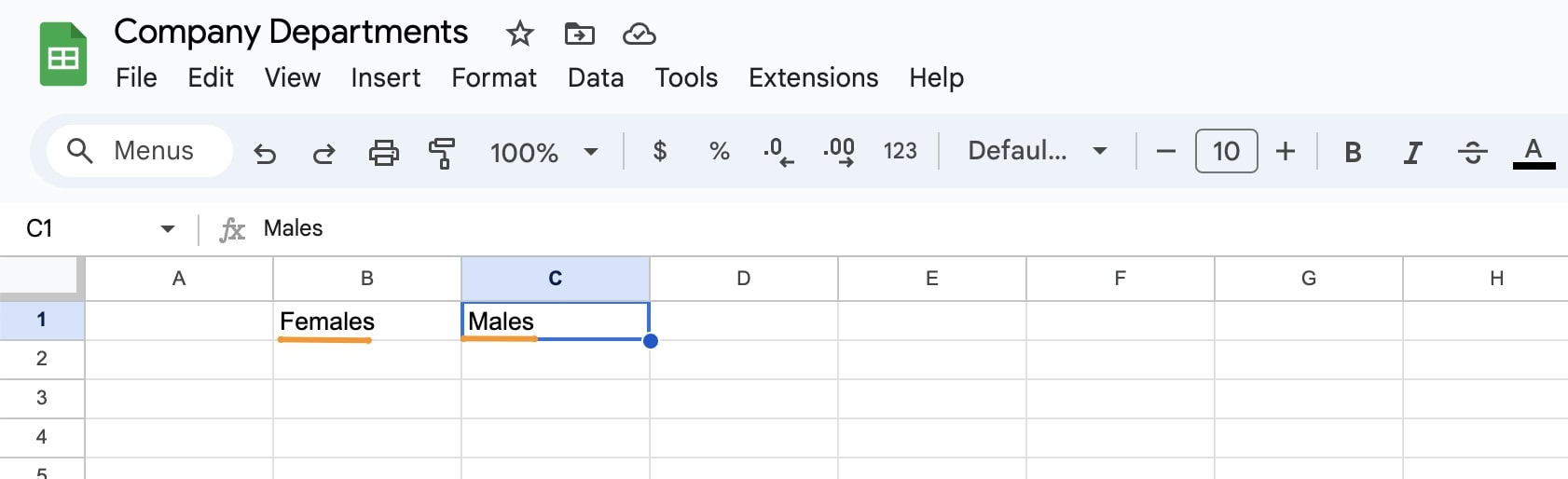
Enter the relevant data into your Google Sheets.
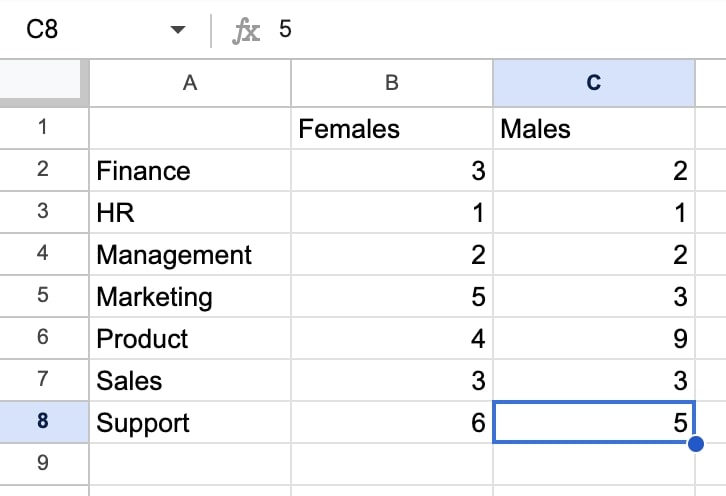
Ensure all data entries are formatted correctly for accurate chart visualization.
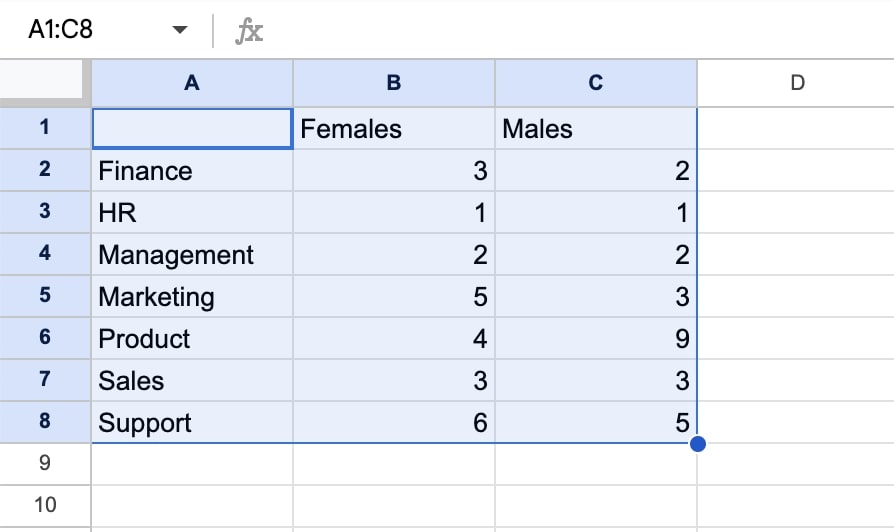
Highlight the data range you want to represent in your stacked bar chart.
In the toolbar, click on “Insert” and then choose “Chart” to add one to your sheet.
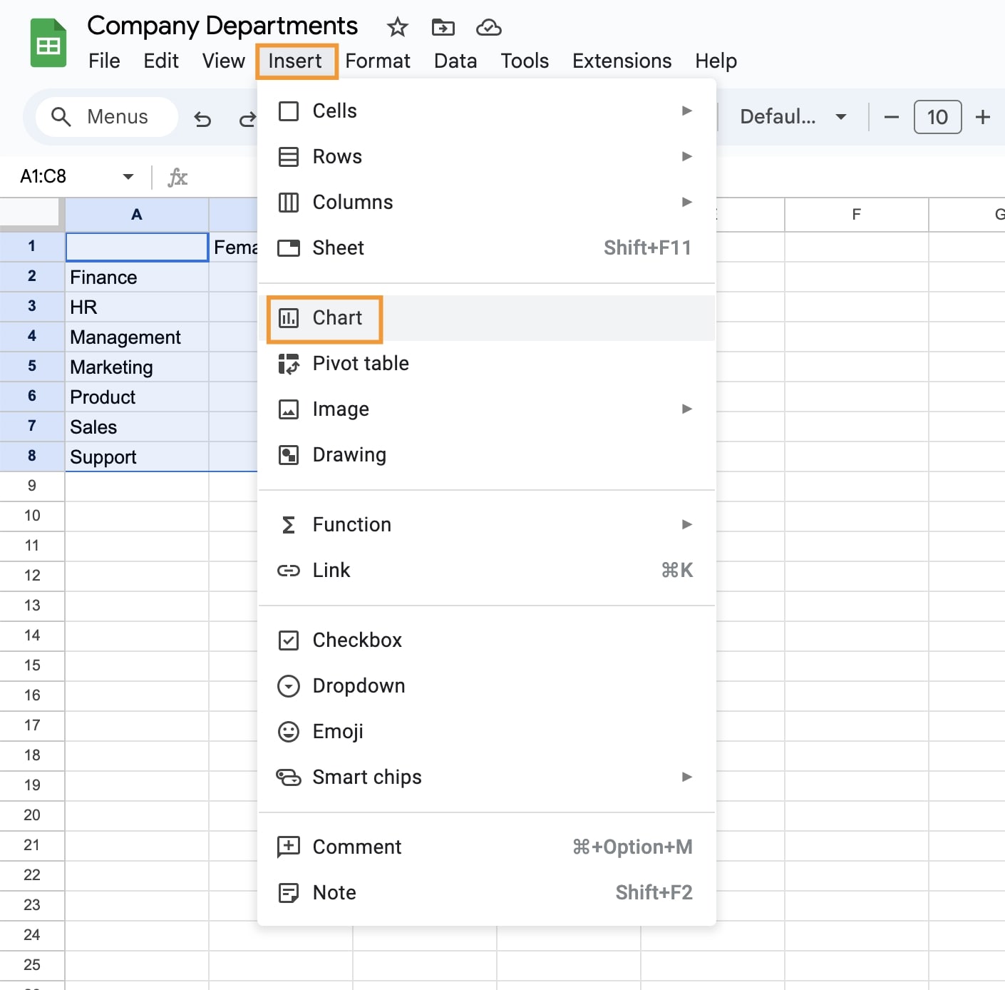
In the chart editor, select “Stacked Bar Chart” as the chart type.
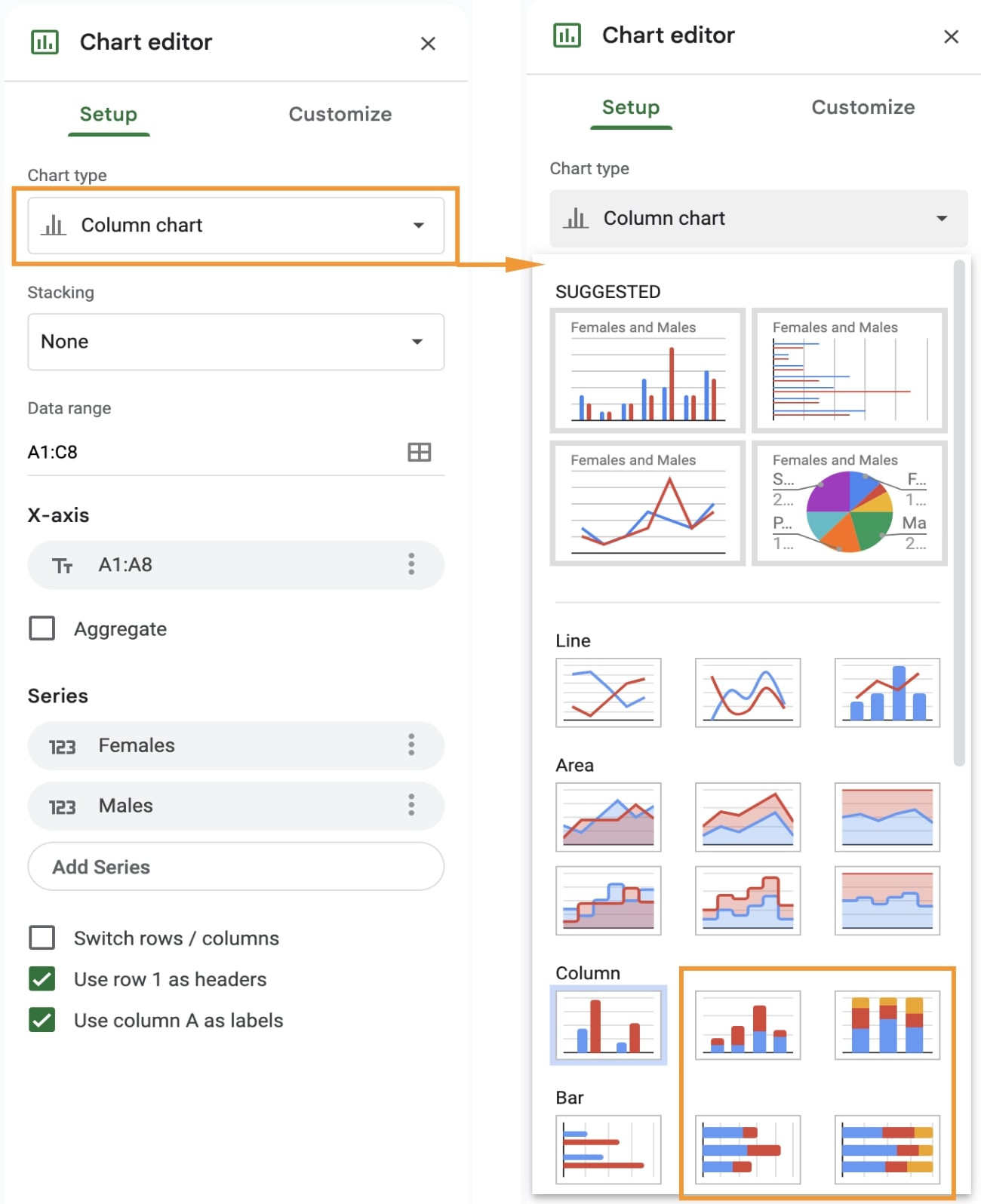
Drag and resize the chart to fit your workspace.
Click on the chart to open the editor for customization.
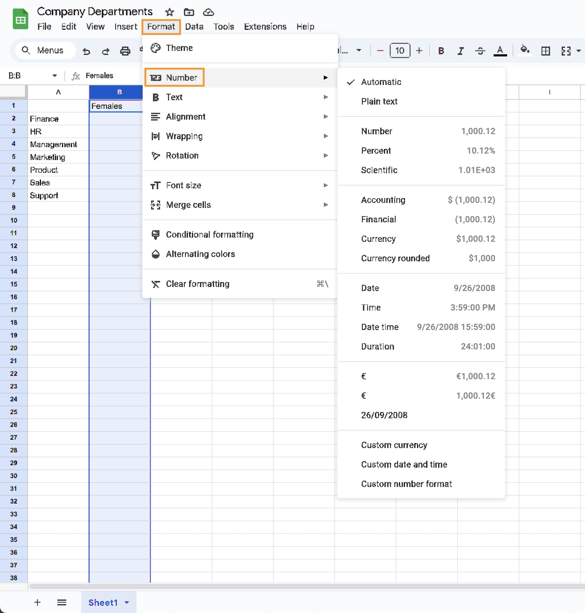
Go to the “Customize” tab in the chart editor to personalize the appearance.
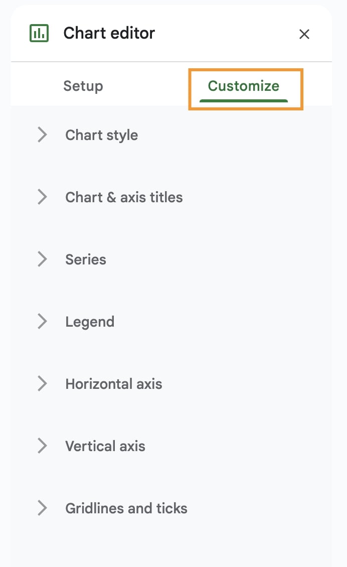
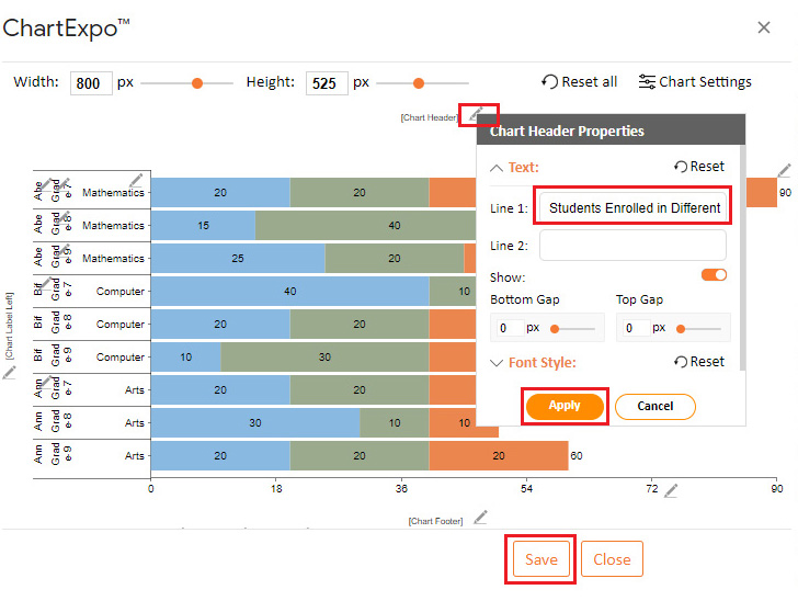
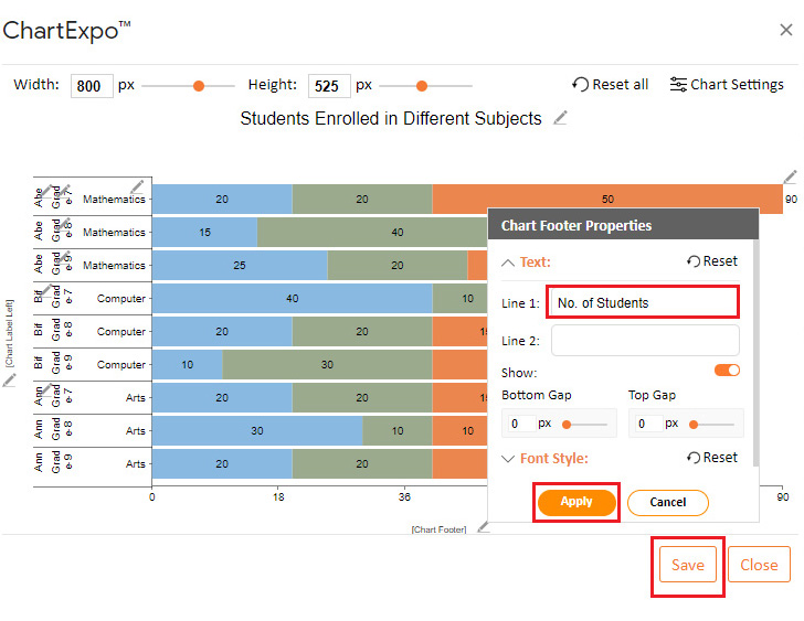
Add or modify the titles to make the chart more informative.
Edit the legend’s placement and style for better clarity.
Adjust the colors for each series to improve the visual differentiation.
Your stacked bar chart is now complete and ready for use, providing a clear visual summary of your data.
Data visualization designs, such as Stacked Bar Charts in Google Sheets, make it easier for business owners and professionals to make reliable decisions. Google Sheets has built-in charts you can use to extract answers from your data.
However, you’ll never find a ready-to-use simple Stacked Bar or a Clustered Stacked Bar Chart in Google Sheets for your analysis. The most viable option available for you is installing a particular third-party add-on (we’ll talk about it later) to access ready-made graphs.
You don’t need to replace Google Sheets with other expensive tools.
We recommend trying the ChartExpo add-on for Google Sheets for the reasons listed below.
ChartExpo does not require coding or programming skills, unlike other data visualization-based add-ons. More so, it has an ultra-friendly user interface (UI) for everyone to use.
This tool comes pre-loaded with many advanced charts to offset the missing ones in Google Sheets. Use ChartExpo to produce charts that are incredibly easy to read and understand.
Use ChartExpo to overcome this. You’ll learn more about this cutting-edge tool in the next section.
So what is ChartExpo?
ChartExpo comes as an add-on for Google Sheets. Essentially, it turns your Google Sheets into a usable data visualization tool capable of delivering hidden insights into your data, including creating a Pareto chart in Google Sheets, irrespective of the size or complexity.
The premium Stacked Bar graph maker comes with a 7-day free trial period.
The key benefit of ChartExpo is the fact that it produces charts that are easy to read and interpret. More so, it allows you to save charts in the world’s most recognized formats, namely PNG and JPG.


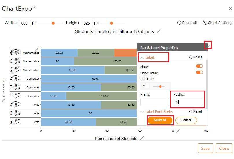
You can customize the chart by clicking on the Edit Chart button as shown above. How to make this chart in Google Sheets is not complex. ChartExpo makes the whole process seamless and easy.
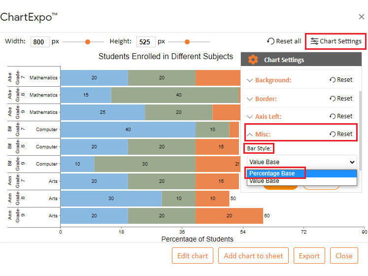
To change the legend of the Stacked Bar Chart, follow the simple steps below.


Take advantage of ChartExpo to supercharge your Google Sheets today. You can also use ChartExpo to Create Stacked Bar Charts in Excel.
Stacked bar charts are perfect for showing how individual components contribute to the total value of a category. Each bar represents a total, and the segments within the bar display the proportion of each subcategory, making it easy to understand the composition of the data.
They allow you to compare both the totals and the individual subcategories across different groups in a single chart. This is especially useful when analyzing data with multiple dimensions, such as sales by product and region.
Stacked bar charts display multiple data series in a single chart, saving space compared to using multiple standard bar charts. This makes them ideal for dashboards or reports with limited space.
When used with time-series data, stacked bar charts can effectively show how the composition of a total changes over time. For example, you can track monthly sales contributions from different product categories.
Google Sheets makes it simple to create and customize stacked bar charts. You can easily adjust colors, add data labels, and format axes to make the chart more informative and visually appealing.
Bar Charts are ineffective because they provide general features of the data. Besides, they show very little about the data at a micro-level.
They leave a lot to the imagination of the viewer. Visualizing continuous data types using Bar Charts is challenging compared to ordinal and nominal types.
Bar Charts are best suited to visualize categorical data due to their simplicity and general structure. You can use the graph if your goal is to display the comparison insights into categorical data types.
To make your charts easier to interpret, use highly contrasting colors to create a variation effect.
Visualizing data with more than two columns of numerical values is easier said than done.
To succeed, you need the best-suited graph to extract reliable insights. In other words, you need this chart.
Displaying hidden insights within sub-categories is one of the major reasons why we use charts in analysis.
Google Sheets should not be your go-to visualization tool if you want to leverage the Stacked Bar Graph for in-depth insights. The application lacks ready-to-use and visually appealing charts.
We recommend you install third-party apps, such as ChartExpo into your Google Sheets to access ready-made and visually appealing charts.
ChartExpo is an add-on with insightful and easy-to-interpret Stacked Bar Charts, plus over 50 more visualization designs. You don’t require programming skills to visualize your data using the application.
Sign up for a 7-day free trial today to access ready-made and visually appealing charts for your data story.
How much did you enjoy this article?


SUMPRODUCT in Google Sheets handles multi-condition calculations without extra columns. Master its syntax, uses, and errors. Read on!

An annual budget template in Google Sheets organizes your yearly finances, tracks every dollar, and reveals spending patterns. Read on!

Learn the best graph to show profit and loss with practical examples and use cases. Discover how to visualize your business data, track trends, and make smarter financial decisions.


