• Home
  • Tools dropdown img
    • Spreadsheet Charts

      • ChartExpo for Google Sheets
      • ChartExpo for Microsoft Excel
    • Power BI Charts

      • Power BI Custom Visuals by ChartExpo
    • Word Cloud

  • Charts dropdown img
    • Chart Category

      • Bar Charts
      • Circle Graphs
      • Column Charts
      • Combo Charts
      • Comparison Charts
      • Line Graphs
      • PPC Charts
      • Sentiment Analysis Charts
      • Survey Charts
    • Chart Type

      • Box and Whisker Plot
      • Clustered Bar Chart
      • Clustered Column Chart
      • Comparison Bar Chart
      • Control Chart
      • CSAT Survey Bar Chart
      • CSAT Survey Chart
      • Dot Plot Chart
      • Double Bar Graph
      • Funnel Chart
      • Gauge Chart
      • Likert Scale Chart
      • Matrix Chart
      • Multi Axis Line Chart
      • Overlapping Bar Chart
      • Pareto Chart
      • Radar Chart
      • Radial Bar Chart
      • Sankey Diagram
      • Scatter Plot Chart
      • Slope Chart
      • Sunburst Chart
      • Tornado Chart
      • Waterfall Chart
      • Word Cloud
    • Google Sheets
      Microsoft Excel
  • Services
  • Pricing
  • Contact us
  • Blog
  • Support dropdown img
      • Gallery
      • Videos
      • Contact us
      • FAQs
      • Resources
    • Please feel free to contact us

      atsupport@chartexpo.com

Categories
All Data Visualizations Data Analytics Surveys
Add-ons/
  • Google Sheets
  • Microsoft Excel
  • Power BI
All Data Visualizations Data Analytics Surveys
Add-ons
  • Google Sheets
  • Microsoft Excel
  • Power BI

We use cookies

This website uses cookies to provide better user experience and user's session management.
By continuing visiting this website you consent the use of these cookies.

Ok

ChartExpo Survey


Home > Blog > Microsoft Excel

How to Add Axis Labels in Excel?

It is exciting to create charts that display information in an eye-catching way. However, it can be frustrating when the labels on the axes are missing or look dull.

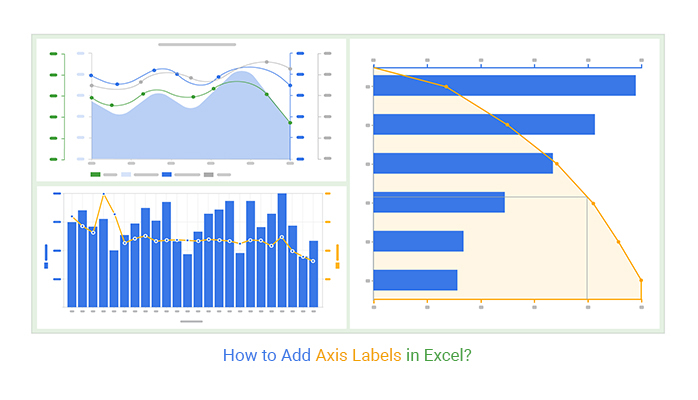
“How to Add Axis Labels in Excel?”

how to add axis labels in Excel

Honestly, nobody wants to spend their precious time trying to decipher a chart that resembles hieroglyphics.

This guide will show you how to effortlessly add axis labels to your chart. We’ll not only show you how to add axis labels in Excel. You’ll also learn how to create custom labels and format text and numbers.

Table of Contents:

  1. What are Axis Labels in Excel?
  2. Why Axis Labels in Excel are Important?
  3. Excel Chart Types Requiring Accurate Axis Labels
  4. Practical Example For Showing How to Add Axis Titles in Excel
  5. How to Add Units and Symbols to Enhance Labels?
  6. How to Add Axis Labels in Excel: Step-By-Step
  7. Change Axis Labels in a Chart
  8. Change the Text of the Axis Labels
  9. Make Label text that’s Different From the Worksheet Labels
  10. How to Change the Format of Text and Numbers in Labels?
  11. Tips to Improve Axis Labels in Excel
  12. Wrap Up

What are Axis Labels in Excel?

Definition: In Excel, Axis labels are textual indicators that identify key divisions on a chart, providing essential information about the data. The category labels tell you what groups or categories you’re looking at, while the value labels show you the actual numbers on the chart.  So, they’re like little helpers that make sure you know exactly what you’re seeing in your chart.

Together, these labels contribute to the clarity and understanding of the information presented in the chart. These labels act as navigational guides, ensuring that the audience can easily comprehend and interpret the insights presented in the charts.

Why Axis Labels in Excel are Important?

Adding axis labels might seem like a mundane task. But it can make a significant difference in the effectiveness and interest of your charts.

It is like giving your chart a voice – it allows your audience to understand what’s being presented. Furthermore, it makes your chart more informative and engaging.

Excel Chart Types Requiring Accurate Axis Labels

Excel offers various types of charts and graphs that can be used for data analysis, presentation, and reporting. Choosing the right chart can make all the difference in effectively communicating your data to your audience. Here are the best Excel charts for data analysis where you how to add axis labels in Excel to improve chart readability.

  • Multi-Axis Line Chart

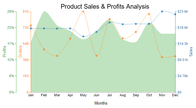
A Multi-Axis Line Chart is a versatile visualization that showcases numerous data sets simultaneously. The chart has a single x-axis that represents time or any other variable. Each data set has its y-axis, which is distinctly labeled. Furthermore, each line is plotted against its corresponding y-axis, providing a comprehensive representation of large data sets.

Example

Below is a product’s sales and profits data.

Months Orders Sales Profits
Jan 756 18766 18
Feb 485 18788 29
Mar 412 18743 24
Apr 607 18788 22
May 915 16406 19
Jun 413 17765 22
Jul 828 20532 26
Aug 611 20016 19
Sep 683 20122 18
Oct 886 20125 25
Nov 397 23783 21
Dec 408 22942 21

Here is the Multi-Axis Line Chart visualization of this data.

Multi-Axis Line Chart in how to add axis labels in Excel
  • Pareto Chart

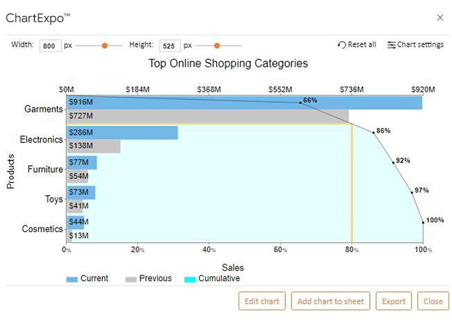
A Pareto Chart combines a bar graph and a line graph to display data hierarchically. It is named after Vilfredo Pareto, who invented the 80/20 rule. He noticed that 80% of the wealth in Italy was owned by 20% of the population.

This chart helps to identify the most significant factors in a data set. The bars represent the size of each category, while the line represents the cumulative percentage.

Example

Below are sales data for the current and previous year’s products.

Products Current Previous
Garments 916 727
Electronics 286 138
Cosmetics 44 13
Toys 73 41
Furniture 77 54

You can observe how the Pareto Chart maps this data to an insightful visualization by adding axis labels.

Pareto Chart in how to add axis labels in Excel
  • Double Axis Line Graph and Bar Chart

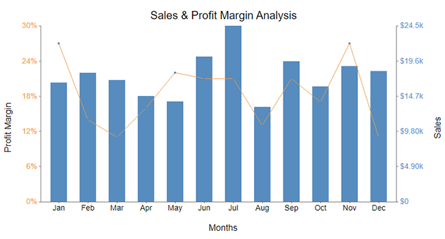
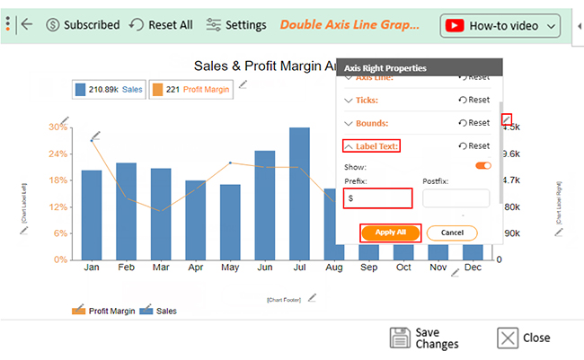
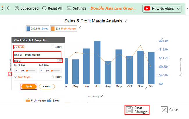
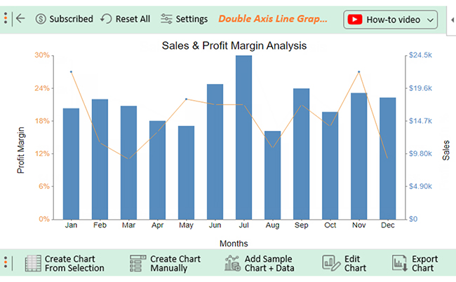
The Double Axis Line Graph and Bar Chart combines a Line Graph and a Bar Chart. It boasts dual y-axes positioned on either side for enhanced clarity. The left y-axis is dedicated to the Bar Chart, while the right y-axis is for the Line Graph. This chart is ideal for displaying two sets of data with different measurement units.

Example

Let’s say you have the monthly revenue data below.

Months Sales Profit Margin %
Jan 16600 27
Feb 17964 14
Mar 16955 11
Apr 14726 16
May 13972 22
Jun 20216 21
Jul 24506 21
Aug 13216 13
Sep 19569 21
Oct 16064 17
Nov 18897 27
Dec 18205 11

Below is the Double Axis Line Graph and Bar Chart of your data.

Double Axis Line Chart in how to add axis labels in Excel
In the next section, we will show you how to create visualizations and how to add axis labels in Excel.

Practical Example For Showing How to Add Axis Titles in Excel

What if?  You are tired of wrestling with complex data and struggling to create eye-catching charts in Excel?

How to Add Axis Titles in Excel?

I have a solution for you ChartExpo for Excel.

Say goodbye to mundane spreadsheets and embrace a whole new world of charting possibilities with the ChartExpo add-in for Excel Mac. ChartExpo revolutionizes your Excel experience by taking you into the realm of creativity and visualization.

With features like the Multi-Axis Chart in Excel, you can effortlessly create insightful charts that will leave your audience mesmerized.

Benefits of Using ChartExpo

  • User-friendly interface: ChartExpo streamlines the chart creation process with its intuitive interface. This makes it effortless for users of all skill levels, novices, and experts to create insightful charts.
  • A diverse array of chart types: ChartExpo offers an extensive range of chart types to cater to your specific data and insights. Whether you need column charts, pie charts, line charts, scatter plots, or more, ChartExpo has you covered.
  • Customization: ChartExpo empowers you to modify every chart design element. Thus, you can ensure that your charts align perfectly with your unique style and preferences.
  • Affordable: ChartExpo delivers exceptional value for money. It has a complimentary 7-day trial period and an affordable $10 monthly subscription.

How to Install ChartExpo in Excel?

  1. Open your Excel application.
  2. Open the worksheet and click the “Insert” menu.
  3. You’ll see the “My Apps” option.
  4. In the office Add-ins window, click “Store” and search for ChartExpo on my Apps Store.
  5. Click the “Add” button to install ChartExpo in your Excel.

ChartExpo charts and graphs are available both in Google Sheets and Microsoft Excel. Please use the following CTA’s to install the tool of your choice and create beautiful visualizations in a few clicks in your favorite tool.

You can also add horizontal and vertical axes by following this guide: “How to Craft an Accurate X and Y Axis Chart in Excel?”

Let’s show you how to add axis labels in Excel charts with the help of an example.

Example

Let’s say you have sales and profit margin data below.

Months Sales Profit Margin %
Jan 16600 27
Feb 17964 14
Mar 16955 11
Apr 14726 16
May 13972 22
Jun 20216 21
Jul 24506 21
Aug 13216 13
Sep 19569 21
Oct 16064 17
Nov 18897 27
Dec 18205 11

This data has a secondary axis. Therefore, we use the Double Axis Line Graph and Bar Chart to analyze it efficiently.

How?

Follow these steps to create a Double Axis Line Graph and Bar Chart in Excel with ChartExpo.

  • To get started with ChartExpo, install ChartExpo in Excel.
  • Now Click on My Apps from the INSERT menu.
insert chartexpo in excel
  • Choose ChartExpo from My Apps, then click Insert.
open chartexpo in excel
  • Once it loads, choose the “Double Axis Line Graph and Bar Chart” from the charts list.
search double axis line graph and bar chart in excel
  • Click the “Create Chart From Selection” button after selecting the data from the sheet, as shown.
create double axis line graph and bar chart in excel
  • ChartExpo will generate the visualization below for you.
edit double axis line graph and bar chart in excel
  • If you want to have the title of the chart, click on Edit Chart, as shown in the above image.
  • To change the title of the chart, click on the pencil icon that is available very next to Chart Header.
  • It will open the properties dialog. Under the Text section, you can add a heading in Line 1 and enable the Show option. Give the appropriate title of your chart and click on the Apply button.
set double axis line graph and bar chart in excel
  • Click the highlighted pencil icon to change the color of the right Y-Axis on the chart.
  • Expand the “Font Style” properties, then choose the desired color for the axis.
change double axis line graph and bar chart in excel

How to Add Units and Symbols to Enhance Labels?

  • Let’s add a postfix (e.g., % Sign) to the numeric values in the chart.
  • Expand the “Label Text” property and add the postfix. Then click the “Apply All” button.
update double axis line graph and bar chart in excel
  • To change the color of the left Y-axis, click the highlighted pencil icon.
  • Expand the “Font Style” properties, then choose the desired color for the axis.
settings double axis line graph and bar chart in excel
  • Let’s add a prefix (e.g., $ Sign) to the numeric values in the chart.
  • Expand the “Label Text” property and add the prefix value. Then click the “Apply All” button.
configure double axis line graph and bar chart in excel

How to Add Axis Labels in Excel: Step-By-Step

  • Let’s add label properties on the left axis.
  • Click the pencil icon located next to “Chart Label Left.”
  • This will open a properties dialog where you can add a heading under the “Text” section.
  • In the “Line 1” field, enter the appropriate label and enable the “Show” option. Click the “Apply” button to save the changes.
  • To ensure the changes remain, click the “Save Changes” button.
save double axis line graph and bar chart in excel
  • The final chart will appear below.
how to make a graph in Excel

Insights

  • Despite January’s lackluster sales performance, the profit margin reached its peak during the same month.
  • July marked the pinnacle of sales achievement, with record-breaking numbers.
  • In August, both profit margin and sales experienced a significant decline, raising concerns and warranting attention.

Change Axis Labels in a Chart

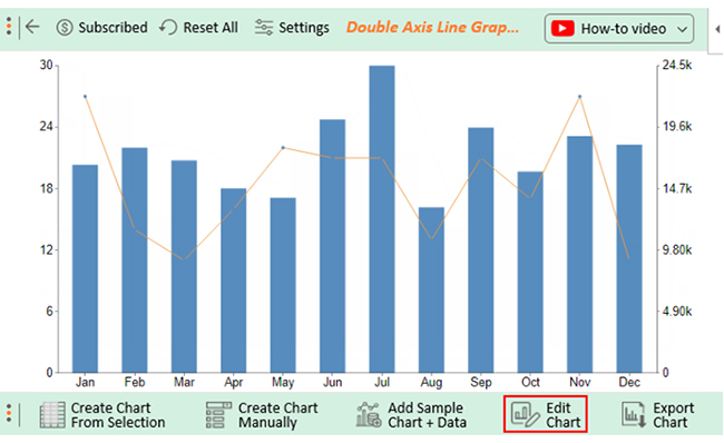
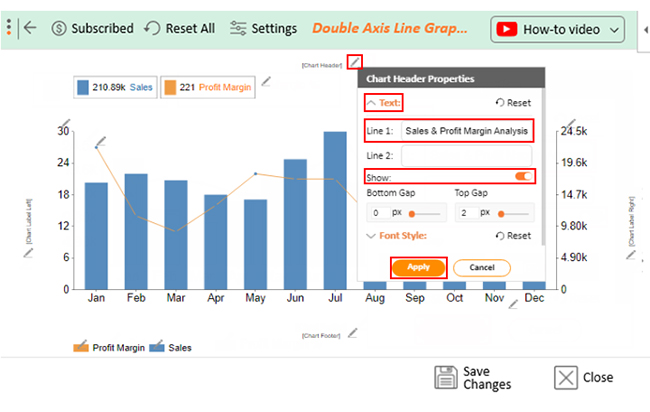
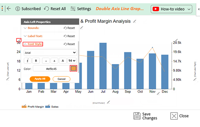
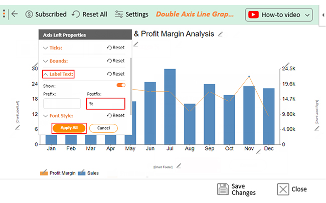
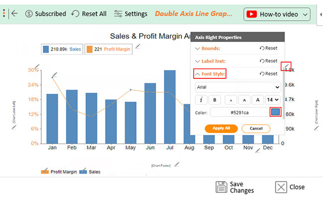
To change axis labels in a chart in Excel, follow these steps:

  1. Click on the chart to select it.
  2. Go to the “Chart Design” or “Chart Tools” tab at the top of the Excel window.
  3. Click on “Select Data” in the “Data” group.
  4. In the “Select Data Source” dialog box, you can edit the axis labels by clicking on the “Edit” button next to the Axis Labels box.
  5. In the “Axis Labels” dialog box, you can enter the new range for your axis labels or select the cells containing the labels directly in your worksheet.
  6. Click “OK” to apply the changes and close the dialog boxes.
  7. Your chart will now display the updated axis labels based on your changes.

Change the Text of the Axis Labels

To change the text of the axis labels in Excel, you can follow these steps:

  1. Click on the axis labels (the text on the x-axis or y-axis) that you want to change. This will select the axis labels.
  2. Once the axis labels are selected, click a second time on the specific label you want to change. This will allow you to edit the text directly within the chart.
  3. Alternatively, you can also click on the axis labels once to select them and then click on the formula bar at the top of the Excel window. From there, you can directly edit the text of the selected axis labels.
  4. After editing the text, press Enter to confirm the changes.

Make Label text that’s Different From the Worksheet Labels

To make label text different from the worksheet labels in Excel, you can use custom axis labels. Here’s how:

  1. Click on the chart to select it.
  2. Right-click on the axis label you want to change and select “Format Axis” from the context menu.
  3. In the Format Axis pane or dialog box, navigate to the “Axis Options” or “Labels” section.
  4. Look for the option to set “Label Position” or “Label Alignment” and choose “Custom” or “Specify Interval Unit.”
  5. Enter the custom label text you want to use for each axis label.
  6. Click “OK” or “Apply” to confirm the changes.

How to Change the Format of Text and Numbers in Labels?

To change the format of text and numbers in labels in Excel, follow these steps:

  1. Click on the chart to select it.
  2. Right-click on the label you want to format (such as axis labels or data labels) and choose “Format [Label Type]” from the context menu. For example, if you want to format axis labels, right-click on one of the axis labels and select “Format Axis Labels.”
  3. In the Format Axis Labels (or Format Data Labels) pane or dialog box that appears, navigate to the options related to text formatting. These options may vary depending on the type of label you’re formatting.
  4. Adjust the font, font size, font color, alignment, and other formatting settings as desired.
  5. If you want to format numbers specifically, such as changing the number format or adding a prefix/suffix, look for options related to number formatting.
  6. Preview the changes in the chart to ensure they appear as intended.
  7. Once you’re satisfied with the formatting, close the Format pane or dialog box to apply the changes.

Tips to Improve Axis Labels in Excel

  • Select the appropriate chart type: Excel offers various chart types, such as column charts, lines, pie, bars, and scatter plots. Choose the chart type that best suits your data and the message you want to convey.
  • Keep it Simple: Avoid using too many colors, labels, and data sets. A cluttered chart can be challenging to read and understand.
  • Use descriptive titles and labels: Your chart’s title and labels should be descriptive and easy to understand. Most importantly, avoid using abbreviations and acronyms that your audience may not be familiar with.
  • Highlight key data points: Highlight key data points using different colors or labels. This will help your audience focus on the most important information.
  • Select suitable colors: Use colors that are easy on the eyes and complement each other. Avoid using too many colors or bright colors that may distract your audience.

FAQs

How do I add labels to the axis in Excel for Mac?

To add axis data labels, use ChartExpo for Excel. ChartExpo allows you to input or modify the labels to represent your data accurately.

  1. Open your Excel document.
  2. Select a chart or graph.
  3. Right-click on the X or Y axis.
  4. Select “Format Axis” from the menu.
  5. Enter a label in the “Axis Title” box.
  6. Click “OK”

How do I create an axis label range in Excel?

Here’s how to create an axis label range in Excel: 
  1. Select the Design tab
  2. Select Data
  3. Select Select Data in the Data group
  4. Click Edit in the Horizontal (Category) Axis Labels dialog box
  5. Enter the cell references for the x-axis in the Axis label range
  6. Select the range using the mouse
  7. Click OK

How do I add a label to a graph in Excel?

To add a label to your chart in Excel:

  1. Select the chart and go to the “Chart Elements” tab.
  2. Click the “Legend” button and choose the desired location for the legend.
  3. Customize the legend’s appearance and labels from the “Format Legend” options.

Wrap Up

In conclusion, how to add axis labels in Excel is fundamental to creating clear and meaningful charts. Axis labels provide context and understanding of the data points displayed on the chart. This enables viewers to interpret and analyze the information effectively.

You can easily add axis labels to your Excel charts by following the steps outlined in this guide. Consequently, enhances their clarity and usability.

Remember to choose descriptive and easily understandable labels. Also, customize the appearance of the labels to align with your chart’s design. Finally, consider adding additional information or explanations to provide further context.

Additionally, we explored some of the best Excel charts for data analysis. These include the Multi-Axis Line Chart, Pareto Chart, Double Axis Line Graph, and Bar Chart. Each chart type has its unique purpose and can be used to convey different insights effectively.

To simplify the chart creation process and unlock a world of creative possibilities, use ChartExpo for Excel.

Why ChartExpo?

It has a user-friendly interface, diverse chart types, extensive customization options, and affordable pricing.

How much did you enjoy this article?

ExcelAd2
Start Free Trial!
126729

Related articles

next previous
Microsoft Excel8 min read

Excel Task Tracker Template for Smarter Task Insights

Task tracker template in Excel organizes tasks, tracks deadlines, and boosts efficiency. Learn its benefits, and explore expert tips to simplify task management.

Microsoft Excel10 min read

Invoice Tracker Template in Excel for Better Insights

An invoice tracker Excel template helps track invoices, due dates, and payments. Learn how to use this template for better financial management.

Microsoft Excel12 min read

Key Performance Indicators in Healthcare for Better Insights

Key Performance Indicators in healthcare track patient care and efficiency. Learn about these KPIs, top examples, and how to use them to improve outcomes.

Microsoft Excel10 min read

BMI Calculation Formula in Excel for Better Fitness Insights

The BMI calculation formula in Excel helps track and analyze body mass index. Explore step-by-step instructions and tips to simplify BMI tracking in Excel.

Microsoft Excel29 min read

How to Create a Tornado Chart in Excel? A Complete Guide

Click to learn how to plot a Tornado Chart in Excel using easy-to-follow steps. Also, we’ll address the following question: what is a Tornado Diagram?

ChartExpo logo

Turn Data into Visual
Stories

CHARTEXPO

  • Home
  • Gallery
  • Videos
  • Services
  • Pricing
  • Contact us
  • FAQs
  • Privacy policy
  • Terms of Service
  • Sitemap

TOOLS

  • ChartExpo for Google Sheets
  • ChartExpo for Microsoft Excel
  • Power BI Custom Visuals by ChartExpo
  • Word Cloud

CATEGORIES

  • Bar Charts
  • Circle Graphs
  • Column Charts
  • Combo Charts
  • Comparison Charts
  • Line Graphs
  • PPC Charts
  • Sentiment Analysis Charts
  • Survey Charts

TOP CHARTS

  • Sankey Diagram
  • Likert Scale Chart
  • Comparison Bar Chart
  • Pareto Chart
  • Funnel Chart
  • Gauge Chart
  • Radar Chart
  • Radial Bar Chart
  • Sunburst Chart
  • see more
  • Scatter Plot Chart
  • CSAT Survey Bar Chart
  • CSAT Survey Chart
  • Dot Plot Chart
  • Double Bar Graph
  • Matrix Chart
  • Multi Axis Line Chart
  • Overlapping Bar Chart
  • Control Chart
  • Slope Chart
  • Clustered Bar Chart
  • Clustered Column Chart
  • Box and Whisker Plot
  • Tornado Chart
  • Waterfall Chart
  • Word Cloud
  • see less

RESOURCES

  • Blog
  • Resources
  • YouTube
SIGN UP FOR UPDATES

We wouldn't dream of spamming you or selling your info.

© 2025 ChartExpo, all rights reserved.