Categories
Displaying insights into two different variables within data should never be a time-consuming affair.


The number of charts you can use to visualize data is vast. The odds of using the wrong charts to visualize complex data are high.
The visualization design that we recommend you display two varying variables in a data set is a Multi-Axis Chart in Excel.
The chart (above) can save you space and make your data visualization dashboard lean. In other words, it can perform a task usually done by two different charts.
You cannot find ready-made and visually appealing Multi Axis Line Charts in Excel.
It turns out you actually don’t have to do away with Excel. You can supercharge it by installing a particular add-in to access a ready-to-use and visually appealing Multi Axis Chart in Excel.
In this blog, you’ll discover:
Before delving into the how-to guide, we’ll address the following question: what is a Multi-Axis Chart?
Definition: A Multi-Axis Chart in Excel uses two axes to illustrate the relationships between two variables with different magnitudes and scales of measurement.

If you want to use limited space in your data visualization dashboard, your go-to visualization design should be a Multi-Axis Line Chart.
The visualization design uses continuous and categorical data. And it makes sense only when there’s a meaningful relationship between key data points.
In the coming section, we’ll address the advantages of using a Multi-Axis Chart.
The Multi-Axis Line Chart is a visualization design that displays information using two distinct straight lines and a secondary axis. You can use the chart to display the trends and patterns of key variables in your data.
The visualization design is amazingly easy to read and interpret. Besides, it displays a lot of insights using limited space.
You can use the chart to display the trend of key data points over time. Also, it’s ideal if your goal is to show small changes.
You can easily display more than two data columns on this chart.
Avoid the following when plotting a Multi-Axis Chart in Excel.
When the Dual Axis Line Chart is missing certain data points, gaps in the record may be interpreted as phantom values.
Ensure your data is clear of gaps and errors that may distort the interpretation of the chart.
In a standard multi-axis line Chart, each point is connected to the next with a straight-line segment. However, there may be the aesthetic temptation to link all of the points smoothly, fitting a curve that goes through all of the points at once.
This may distort the insights displayed by the visualization design.
In the coming section, you’ll discover how to add a secondary axis in Excel Charts.
Excel is a trusted data visualization tool because it’s familiar to many. However, the spreadsheet application lacks a ready-made multi-axis chart.
We understand switching tools is not an easy task.
This is why we’re not advocating you ditch Excel in favor of other expensive data visualization tools.
There’s an easy-to-use and amazingly affordable visualization tool that comes as an add-in you can easily install in your app to access a ready-made Multi Axis Chart. The tool is called ChartExpo.
So, what is ChartExpo?
ChartExpo is an incredibly intuitive add-in for Excel that you can easily install without watching hours of YouTube tutorials. With ChartExpo, you can effortlessly create dual/double-axis charts, x and y-axis charts, or multi-axis charts using the chart maker.
With many ready-to-go visualizations, the Dual Axis Chart in Excel generator turns your complex, raw data into compelling, easy-to-interpret, and visually appealing charts in Excel that tell data stories in real-time.
More benefits
In the coming section, we’ll take you through how to visualize data using a Multi-Axis Chart in Excel using the ChartExpo chart add-in for Excel.
You don’t want to miss this!
This section will use a Multi-Axis Chart in Excel to display insights into the table below.
| Month | Laptop | TV | Mobile | Tablet |
| Jan | 45 | 60 | 40 | 35 |
| Feb | 60 | 80 | 30 | 70 |
| Mar | 55 | 65 | 50 | 55 |
| Apr | 35 | 70 | 55 | 80 |
| May | 55 | 55 | 70 | 55 |
| Jun | 75 | 85 | 20 | 90 |
| Jul | 60 | 50 | 55 | 70 |
| Aug | 40 | 30 | 80 | 35 |
| Sep | 50 | 55 | 60 | 40 |
| Oct | 80 | 75 | 20 | 60 |
| Nov | 30 | 50 | 65 | 55 |
| Dec | 25 | 30 | 35 | 50 |


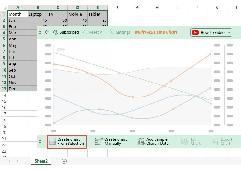


You can also create a Multi-axis Line chart in Google Sheets using the ChartExpo add-in for Google Sheets.
In the following video, you will learn How to Create a Multi-Axis Chart in Excel.
No, Excel lacks ready-made chart templates you can use to plot a chart with more than two axes. You don’t have to do away with the spreadsheet app.
Download and install particular third-party add-ons, such as ChartExpo, to access ready-made and visually appealing Excel charts with more than two axes.
A Combined Axis Graph merges two or more measures into a single axis. This means you can display insights into multiple variables using the same chart.
The Multi-Axis Chart comes with two or more y-axis and a single x-axis. The two charts are amazingly easy to read and interpret.
Charts with a secondary axis can help you emphasize the key data points within categories. More so, you can make comparisons between categories using a highly contrasting color scheme.
If you want to use limited space in your data visualization dashboard, your go-to visualization design should be a Multi-Axis Line Chart.
Displaying insights into two different variables within data should never be a time-consuming affair.
The number of charts you can use to visualize data is vast. The odds of using the wrong charts to visualize complex data are high.
The visualization design that we recommend you display two varying variables in a data set is a Multi-Axis Chart in Excel.
The chart (above) can save you space and make your data visualization dashboard lean. In other words, it can perform a task usually done by two different charts.
You cannot find ready-made and visually appealing Multi Axis Charts in Excel.
So, what’s the solution?
We recommend you install third-party apps, such as ChartExpo, to access ready-to-use Multi Axis Chart in Excel.
ChartExpo is an add-in for Excel that’s loaded with insightful and ready-to-go Multi Axis Line charts. You don’t need programming or coding skills to use ChartExpo.
More benefits
Sign up for a 7-day free trial today to access ready-made Multi Axis Charts in Excel that are easy to interpret and visually appealing to your target audience.
How much did you enjoy this article?


Learn how to use sparklines in Excel to quickly visualize trends inside cells. Discover types, creation steps, customization, use cases, benefits, and best practices.

Learn what a confidence interval graph is, how to create it in Excel, and how to interpret results to make more reliable, data-driven decisions.

A correlation matrix in Excel helps identify relationships between variables. Learn how to create, read, and use it for effective data analysis.


