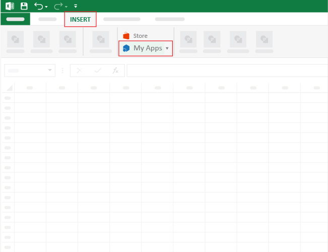
Categories
Embark on the journey of effective data visualization as we delve into the intricacies of how to make a Line graph in Excel with two sets of data.
Navigating the vast sea of information can be overwhelming, but fear not, as we guide you through the process of creating a Dual Axis Line Chart in Excel.
The chart mentioned above can save you space and make your data visualization dashboard lean. In other words, it can perform a task usually done by two different charts.
However, Excel does not natively support the Dual Axis Line Chart.
Yes, you read that right.
It turns out you don’t have to do away with Excel. You can supercharge the application by installing a particular add-in to access a ready-to-use and visually appealing Dual Axis Line Chart.
It can help analyze changes over time. Creating a line graph with two sets of data in Excel allows you to visualize changes over time for both data sets, often alongside quick views like a sparkline in Excel. It’s useful for spotting small or continuous trends that a bar graph might miss.
It can help compare data sets. Line graphs enable the comparison of two sets of data side by side. By plotting them together, you can easily see increases, decreases, or differences in trends.
It can help analyze future trends. Line graphs also make it easier to forecast future patterns or trends based on historical data, making them ideal for predictions like sales forecasting.
Excel does not natively support the Dual Axis Line Chart.
In other words, one of the options available to you is plotting the X and Y Axis charts manually, which is incredibly time-intensive.
You don’t have to undergo all this.
Download and install a particular third-party add-in into your Excel to access ready-made Dual Axis Line Charts.
There are thousands of add-ins purposely designed for Excel. To simplify things, we tested over 60 data visualization-based add-ins.
We narrowed down our results based on the following factors:
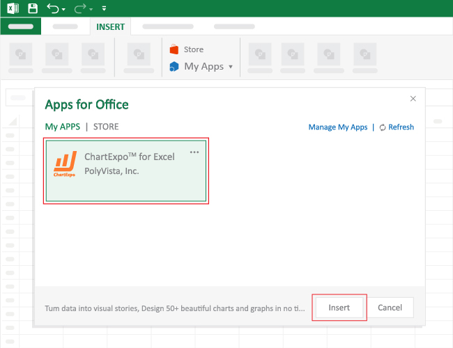
The Excel add-in that met all our conditions is ChartExpo.
The tool comes with ready-made charts that need minimum editing.
Let’s take a closer look at ChartExpo.
ChartExpo is an Excel add-in with an ultra-friendly user interface to ensure that any professional can visualize data, irrespective of their coding or programming skills.
How to make a Line Graph in Excel with two sets of data should never throw a curveball at you. Keep reading to discover more.

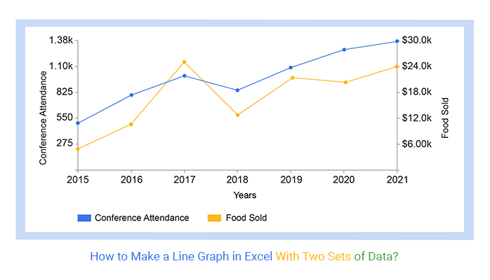
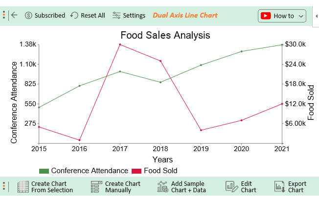
This section will use a Dual Axis Line Chart (a variant of Line Graphs with two sets of data) to display insights into the table below.
| Months | Conference Attendance | Food Sold |
| 2015 | 500 | 5000 |
| 2016 | 800 | 1000 |
| 2017 | 1000 | 30000 |
| 2018 | 850 | 25000 |
| 2019 | 1089 | 4000 |
| 2020 | 1279 | 7000 |
| 2021 | 1371 | 12000 |

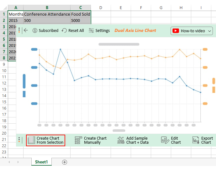
How to plot a Graph for your data stories should never be a complex process. Use ChartExpo to enjoy a seamless process.
Creating this graph in Excel with two sets of data can be beneficial for various reasons. Here are some advantages:
This makes it easy to compare trends between two sets of data. You can quickly observe the relationship between the variables and identify any patterns or correlations.
If you have two related sets of data, a line graph can help highlight the differences between them. You can easily spot where one set diverges or converges to the other.
Line charts, including the Multi-Axis Chart in Excel, are effective in visualizing relationships between variables. When you have two sets of data, this type of chart allows you to easily see how changes in one variable correspond to changes in the other.
These graphs are particularly useful for displaying data over time. If both sets of data involve time-related variables, a graph allows you to track changes in both variables simultaneously.
These graphs provide a clear and concise representation of patterns and trends in data, especially when trying to communicate complex relationships between two sets of variables. Knowing how to make a graph from a table enhances your ability to visualize and interpret data effectively.
When dealing with two sets of data on one graph, it’s important to present the information in a clear and meaningful way. Here are some tips to enhance the effectiveness of your graph:
A Dual Axis Line Chart is a variant of Line Graphs you can use to display comparison insights into key metrics. You can use the chart to extract trend and pattern insights into raw data.
The x-axis mostly depicts time (years, months, days, weeks, etc.)
As we said, displaying insights into two different variables within data is not an easy undertaking.
You can easily be overwhelmed or get lost in the sea of data.
The number of charts you can use to visualize data is vast. The odds of using the wrong charts to visualize complex data are high.
The Line Chart variant we recommend is a Dual Axis Line Chart.
The chart can save you space and make your data visualization dashboard lean. In other words, it can perform a task usually done by two different charts.
Excel is one of the handy data visualization tools among business owners and professionals worldwide. But it comes with basic Graph variants, such as Dual Axis Line Charts.
And this means you’ve got to spend extra time and effort editing your charts.
We’re not recommending you do away with the data visualization application.
So, what’s the solution?
We recommend installing third-party apps, such as ChartExpo, in Excel to access ready-to-use Dual Axis Line Charts.
ChartExpo is an add-in for Excel that’s loaded with insightful and ready-to-go Dual Axis Graphs, plus many more advanced charts. You don’t need programming or coding skills to use ChartExpo.
How to make a Line Graph in Excel with two data sets should never be a stressful affair.
Sign up for a 7-day free trial today to access ready-made Dual Axis Line Charts that are easy to interpret and visually appealing to your target audience.
How much did you enjoy this article?


Learn how to use sparklines in Excel to quickly visualize trends inside cells. Discover types, creation steps, customization, use cases, benefits, and best practices.

Learn what a confidence interval graph is, how to create it in Excel, and how to interpret results to make more reliable, data-driven decisions.

A correlation matrix in Excel helps identify relationships between variables. Learn how to create, read, and use it for effective data analysis.


