Categories
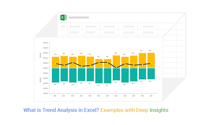
Conducting trend analysis in Excel is crucial for uncovering patterns in your data, predicting future outcomes, and making informed decisions.
Whether you’re analyzing financial metrics or tracking business performance, Excel provides powerful tools to help you identify trends and take strategic actions.
It provides significant insights into whether key metrics are on a growth or decline path. You can easily know whether key data points are down or up-trending.
In this guide, we’ll walk you through the process of performing trend analysis in Excel, showcasing various chart types and practical examples.


Some of the tested and proven charts for trend analysis in Excel are:
The visualization designs (mentioned above) are amazingly easy to interpret. Besides, you can use these charts to create compelling data stories.
Excel is a popular data visualization choice among professionals and business owners worldwide. However, the application produces very basic trend analysis-oriented charts.
In other words, you’ve got to spend more time editing the chart to fit your requirements.
It turns out you can download and install a particular add-in to access ready-made and visually stunning trend analysis charts, such as Multi Axis Line, X and Y-Axis Chart, Sentiment Trend, Area Line, and Line Charts.
In this blog post, you’ll learn the following:
Before jumping into the how-to guide, let’s address the following question: what is trend analysis?
Definition: Assume you want to evaluate the current position of your business and make predictions.
What do you resort to?
You analyze data from the recent past, right?
Now that’s what we refer to as trend analysis.
Trend analysis involves analyzing data to spot patterns and foresee future developments. You analyze metrics like revenue, costs, customer feedback, and market and industry movements.
Additionally, you can make a graph from a table to further aid in visualizing and understanding these trends.
It applies across various industries, including commerce, finance, economics, and advertising. It exposes hidden patterns in the data. This is useful for spotting potential growth or trouble spots.
Trend analysis in Excel is forecasting a pattern of key variables using past data.
For instance, you can use past data on market activity to forecast a bull or bear market by analyzing it with different types of charts. The analysis is based on the idea that what has happened in the past is likely to happen in the future. There are three main types of trends:
A trend is a general direction of key data points in a specified time. Trends can be both upward and downward. While there is no specified minimum time required for a direction to be a trend, the longer it is, the more notable the trend.
Keep reading because we’ll address the following question in the coming section: what is the formula for trend analysis?
Check out the formula of trend analysis in Excel below:
Trend analysis percentage = (Figure of the previous period – Figure of the current period)/Total of both figures
The current performance is considered greater if its current percentages are greater than the previous year’s percentage.
One of the significant benefits of trend analysis in Excel is you can predict the future using data on past actions.
For instance, it’s possible to forecast your future cash flow based on past data. Besides forecasting future performance, you can use the methodology to create reliable projections for your business through data storytelling, which enhances the narrative and visual representation of your data like dot plots, making it easier to understand and act upon.
In the coming section, we’ll highlight some use cases of trend analysis.
Here are some trend analysis examples to illustrate the best charts and graphs for your analysis.
A Run Chart tracks the progress of a process over time, regardless of whether the process is improving or declining. The chart makes it easy to identify patterns and trends in data.
Run charts and Area charts are also useful because they show you the relationship between different process variables. By examining the individual data points, you can see how alterations to the process have affected the trend. This can help you zero in on areas in need of improvement.
You can also track team or department performance with a Run Chart or a Tornado Chart. By using these charts, you can compare their performance and see how they measure against each other.
Here is data on weekly mobile charger rejections. We can use a Run Chart to analyze the trends of these rejections.
| Weeks | Quantity |
| Week-1 | 121 |
| Week-2 | 131 |
| Week-3 | 132 |
| Week-4 | 125 |
| Week-5 | 141 |
| Week-6 | 126 |
| Week-7 | 126 |
| Week-8 | 130 |
| Week-9 | 143 |
| Week-10 | 146 |
| Week-11 | 148 |
| Week-12 | 151 |
| Week-13 | 152 |
| Week-14 | 156 |
| Week-15 | 157 |
| Week-16 | 155 |
| Week-17 | 157 |
| Week-18 | 143 |
| Week-19 | 131 |
| Week-20 | 127 |
This Run Chart shows the rejection trend’s mean value.

Trend analysis works well with the Double Axis Line Graph, Bar Chart, and Multi-Axis Chart in Excel. It provides comprehensive data analysis and facilitates the identification of correlations between various data sets.
Additionally, it aids in identifying any sudden changes, enabling you to take prompt corrective actions.
You can also use it for decision-making and performance enhancement.
Here is an example of monthly revenue data.
| Months | Revenue | Profit Margin |
| Jan | 7000 | 6 |
| Feb | 2000 | 8 |
| Mar | 4000 | 9 |
| Apr | 3100 | 15 |
| May | 1800 | 16 |
| Jun | 1900 | 18 |
| Jul | 3000 | 8 |
| Aug | 2000 | 10 |
| Sep | 4000 | 5 |
| Oct | 3000 | 24 |
| Nov | 1600 | 18 |
| Dec | 1200 | 10 |
This is the Double Axis Line Graph and Bar Chart visualization of the revenue data.

Trend analysis is best performed using a Multi-Axis Line Chart. You can plot multiple lines on the same graph. This facilitates the examination of data sets for similarities and differences over time.
Using the Multi-Axis Line Chart, you can compare various timeframes. This aids in your comprehension of the data’s timely variation. Contrasting various timeframes makes it easy to identify trends and patterns.
Below is the yearly sales data of a certain store. We can use an X and Y Axis Chart to perform trend analysis and determine the yearly sales performance.
| Months | Orders | Sales | Profits |
| Jan | 756 | 18766 | 18 |
| Feb | 485 | 18788 | 29 |
| Mar | 412 | 18743 | 24 |
| Apr | 607 | 18788 | 22 |
| May | 915 | 16406 | 19 |
| Jun | 413 | 17765 | 22 |
| Jul | 828 | 20532 | 26 |
| Aug | 611 | 20016 | 19 |
| Sep | 683 | 20122 | 18 |
| Oct | 886 | 20125 | 25 |
| Nov | 397 | 23783 | 21 |
| Dec | 408 | 22942 | 21 |
Below is the Multi-Axis Line Chart of the data.

The Sentiment Trend Graph allows you to identify the direction of any trend. It is especially useful in analyzing customer sentiment. Thus, helpful in understanding the customer experience and how it changes over time.
You can spot areas where customers are satisfied or dissatisfied by tracking customer sentiment scores.
This can be especially valuable for understanding how customer experience has changed in the following situations;
Assume this is your business’s current and previous year sales orders.
| Months | Current Year | Previous Year |
| Jan | 8000 | 7000 |
| Feb | 10000 | 12000 |
| Mar | 14000 | 10000 |
| Apr | 5000 | 8000 |
| May | 15000 | 12000 |
| Jun | 16000 | 15000 |
| Jul | 8000 | 10000 |
| Aug | 8000 | 5000 |
| Sep | 18000 | 15000 |
| Oct | 6000 | 8000 |
| Nov | 12000 | 10000 |
| Dec | 15000 | 8000 |
You can analyze the sales order trends with a Sentiment Trend Graph, as shown below.

Forex traders are among the professionals who use trend analysis to extract actionable insights to inform their strategies, often supported by quick visuals like a sparkline in Excel to track price movements.
They conduct the process using a variety of technical indicators together with patterns of the price action curve. Some of these indicators include:
Moving averages strategies involve entering into long or short positions when the short-term MA curve crosses above or below a long-term MA curve.
Momentum indicator strategies involve entering into trade positions when the price action curve shows momentum signs and exiting when it wanes.
Trendlines and chart pattern strategies involve entering long or short positions when the price action curve is trending higher or lower.
Some of the tested and proven charts and graphs for visualizing general trends in your data are:
A Stacked waterfall chart is a dynamic mosaic of data, sculpted from the interplay of stacked bars, each bearing witness to the evolutionary journey of numerical narratives.
With meticulous precision, the Stacked Waterfall or Waterfall chart unveils the cumulative tale of sequential changes, painting a vivid portrait of trends, transitions, and transformative moments within complex datasets.
Like a symphony conductor orchestrating a crescendo, it harmonizes disparate elements, guiding analysts through the symphony of data with clarity and insight, much like understanding what a data analyst does to uncover meaningful patterns and trends.
A Line Chart is a visualization design that displays information as a series of data points connected by straight lines.

You can use the chart to extract trends and patterns insights into raw data. The x-axis mainly depicts time (years, months, days, weeks, etc.)
How to conduct Trend analysis in Excel should never be a nerve-wracking or time-intensive affair. Keep reading to learn more.
An Area Chart is a visualization design that uses a line graph and color combination to display pattern and trend insights into key data points in a specified period.

The chart shares similarities with the Line Graph. In both visualization designs, key data points are connected via lines. However, the chart uses color, unlike the Line Graphs.
The Area Chart in Excel is best suited for displaying patterns and trends of key data points.
Use the visualization design to:
Use a Sentiment Trend Chart to demonstrate the trend of sentiments. The chart is amazingly critical, especially if your goal is to show the growth and decline of key variables.

The line curve in the chart shows the overall pattern and trend of a key variable over a specified period. The Sentiment Trend Graph is one of the best-suited charts for trend analysis in Excel.
Use a Dual Axis Line Chart if your goal is to display insights into varying metrics.

The visualization design uses two different axes to illustrate the relationships between two variables. All the key data points are connected by a straight line to depict the overall pattern and trend.
In a typical line chart, there are x and y axes.
As the name suggests, the chart is made up of bars and lines, plus two varying axes.

Use the visualization design if your goal is to display insights into two varying metrics for in-depth insights. The role of line curves is to depict your data’s overall patterns and trends.
The chart comes in handy in trend analysis in an Excel spreadsheet.
A Multi-Axis Line Chart is made up of Line and Area Charts. Besides, it has two varying y-axes with different scales.

You can use the chart to display insights into two or more insights.
Keep reading because we’ll address the following in the coming section: how to do Trend Analysis in Excel.
Excel generates very basic trend analysis-based charts, such as the Multi-Axis Line Chart and so other charts like Mekko Charts. This means you’ve got to spend extra effort and time editing the chart.
You don’t have to undergo all this.
Download and install a specific third-party add-in into your Excel Mac to access ready-made charts for trend analysis, including Tornado charts.
There are thousands of add-ins purposely designed for Excel. To simplify things, we tested over 60 data visualization-based add-ins.
We narrowed down our results based on the following factors:
The Excel add-in that met all our conditions is ChartExpo.
The tool comes with ready-made charts in Excel that need minimum editing.
Let’s take a closer look at ChartExpo.
ChartExpo is an Excel-based add-in with an ultra-friendly user interface to ensure that any professional can visualize data, irrespective of their coding or programming skills.
How to conduct a trend analysis in Excel should never throw a curveball at you. Keep reading to discover more.
This section will use a Multi-Axis Line Chart in Excel to display insights into the table below:
| Year | Purchase | Sales | Expenses | Profit |
| 2016 | 100,000 | 150,000 | 30,000 | 20,000 |
| 2017 | 60,000 | 100,000 | 30,000 | 10,000 |
| 2018 | 140,000 | 200,000 | 38,000 | 22,000 |
| 2019 | 120,000 | 180,000 | 54,000 | 6,000 |
| 2020 | 130,000 | 200,000 | 56,000 | 14,000 |
| 2021 | 130,000 | 180,000 | 40,000 | 10,000 |
To install ChartExpo into your Excel, click the following link.


This section will use a Sentiment Trend graph to display insights into the table below:
| Months | Current Year | Previous Year |
| Jan | 8000 | 7000 |
| Feb | 10000 | 12000 |
| Mar | 14000 | 10000 |
| Apr | 5000 | 8000 |
| May | 15000 | 12000 |
| Jun | 16000 | 15000 |
| Jul | 8000 | 10000 |
| Aug | 8000 | 5000 |
| Sep | 18000 | 15000 |
| Oct | 6000 | 8000 |
| Nov | 12000 | 10000 |
| Dec | 15000 | 8000 |


In the following video, you will learn how to do Trend analysis in Excel using a Multi-Axis line chart.
Trend analysis can help you measure your business’s financial performance over a specific time. Besides, you can use the process to support your decision-making process.
One of the significant benefits of trend analysis is that you can compare the performance of varying variables.
You can leverage trend-based charts to assess your firm’s weaknesses and strengths, identify gaps, and implement changes for more success.
Trend analysis can help you understand your company’s short-term liquidity position. Also, you can easily measure the long-term solvency of your business.
Companies leverage historical data to predict customer whims, product booms, and industry transformations.
Imagine setting goals based on outdated information. Trend analysis acts as a time machine, revealing what lies ahead (think autonomous vehicles impacting transportation or AI revolutionizing healthcare).
By anticipating these changes, businesses can set achievable and relevant goals, such as developing self-driving car technology or investing in AI-powered healthcare solutions. Integrating self-service reporting into your strategy allows you to continuously monitor these trends and adjust your goals in real-time, ensuring you’re always ahead of the curve.
Whether navigating economic downturns or adapting to regulatory changes, proactive strategy adjustments, fueled by trend analysis, mitigate market-driven risks.
Trend analysis assists in optimizing resource allocation by identifying areas of growth or decline. Businesses can allocate resources more efficiently by focusing on areas with potential for expansion or improvement.
Whether navigating changing regulations or capitalizing on environmental concerns, embracing emerging trends positions companies for market leadership.
Trend analysis in Excel is forecasting a pattern of key variables using past data. For instance, you can use past data on market activity to forecast a bull or bear market.
The analysis is based on the idea that what has happened in the past is likely to happen in the future.
The key role of financial ratio analysis is to compare your brand with others in its peer group. You can use the ratio analysis to compare the company’s performance using certain KPIs over time. On the other hand, trend analysis is the practice of collecting data to analyze its pattern.
Common trends include
Trend analysis can be applied to almost any data set with a temporal component.
In conclusion, mastering trend analysis in Excel is essential for any professional aiming to make data-driven decisions.
By leveraging Excel’s built-in tools and advanced add-ins like ChartExpo, you can uncover deep insights and predict future trends with accuracy.
Whether you’re tracking sales performance or forecasting financial outcomes, Excel provides a robust platform for your analysis needs.
Trend analysis in Excel is forecasting a pattern of key variables using past data. You can use past data on market activity to forecast a bull or bear market.
The analysis is based on the idea that what has happened in the past is likely to happen in the future. There are 3 main types of trends, namely the short trend, intermediate trend, and long-term trend.
How to do trend analysis in Excel should never stress you or even consume a lot of your time.
Sign up for a 7-day free trial of ChartExpo today and take your trend analysis to the next level.
How much did you enjoy this article?


Learn how to use sparklines in Excel to quickly visualize trends inside cells. Discover types, creation steps, customization, use cases, benefits, and best practices.

Learn what a confidence interval graph is, how to create it in Excel, and how to interpret results to make more reliable, data-driven decisions.

A correlation matrix in Excel helps identify relationships between variables. Learn how to create, read, and use it for effective data analysis.


