See the Change, Not
Just the Numbers
Track how each gain and loss builds your final outcome,
giving you insights you can act on.
Google Sheets
Microsoft Excel
Free 7-day trial (no purchase necessary). Pricing starts at $10 per month.
 ChartExpo for Google Sheets is
 used by 700,000+ users worldwide!


How to Install YouTube Videos
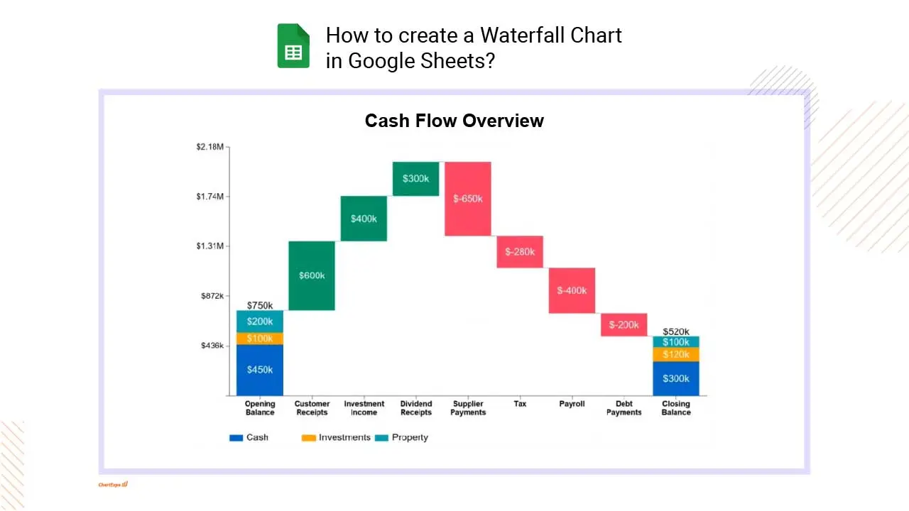
How to create a Waterfall Chart
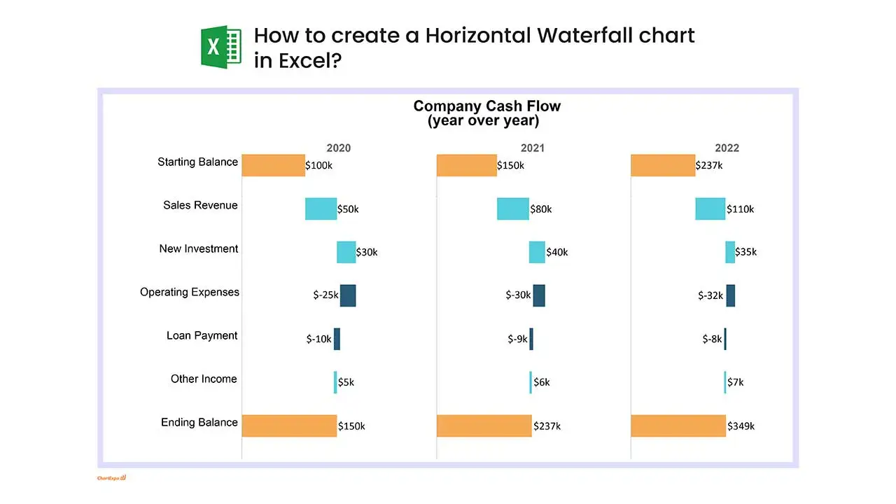
Waterfall Chart Excel: How-to
Here's how-to create a Waterfall Chart in Excel:
-
Install the Add-in: Install the ChartExpo add-in for Excel from the Microsoft AppSource store; it also supports legacy workflows often refered to as waterfall chart xls.
-
Prepare your Data: For a normal Waterfall, include one categorical column (labels) and one numeric column (values).
-
Load ChartExpo: Click the “Add-ins” icon and select ChartExpo to begin building a waterfall graph Excel.
-
Select Waterfall Chart: Choose the Waterfall Chart from the available charts, which produces a bridge chart Excel view showing changes from start to finish.
-
Select the Data: In Excel, highlight the cells with your data, including headers, so everything maps cleanly to an Excel waterfall diagram.
-
Create the Waterfall Chart: Click “Create Chart From Selection” to create waterfall graph in Excel and generate the visualization.
-
Customize: Adjust colors, header, stats, and design options to polish a waterfall slide in Excel or a waterfall report Excel.
-
Export: Export the Waterfall in formats like PNG, PDF, SVG, etc., for presentation and reports, sharing the final waterfall plot Excel.
Waterfall Chart Google Sheets: How-to
Here's how-to create a Waterfall Chart in Google Sheets:
-
Install the Add-on: Install the ChartExpo add-on for Google Sheets from the Google Workspace Marketspace store. This is the first step in How to create a waterfall chart in Google Sheets.
-
Prepare your Data: For a normal waterfall chart Google Sheets setup, your data should include one categorical column (e.g., categories or labels) and one numeric column (values). For a stacked waterfall chart Google Sheets, just add an extra categorical column to define the stacks within each column.
-
Access Extensions: Select and launch ChartExpo from the “Extensions” menu.
-
Select Waterfall Chart: Select the Waterfall Chart from the list of available charts.
-
Map your Data Fields: In the sidebar dialog, select the columns containing your data.
-
Create the Waterfall Chart: Click “Create Chart” button and generate an insightful Waterfall Chart.
-
Customize: Customize the chart with colors, header, stats, and design options.
-
Export: Export your Waterfall Chart in multiple formats (PNG, PDF,SVG, etc.) for presentations and reports across your waterfall sheets projects
What is a Waterfall Chart?
Waterfall Chart is a column-based visual that explains how a starting total changes, step by step, into an ending total. Each step shows an increase or decrease, so the cumulative effect stays obvious. Many teams call it a Waterfall Graph or a Waterfall Diagram, and some vendors label the same idea a Bridge Chart. It’s built for variance stories: budget to actual, revenue drivers, or cash movement. When the steps are chosen well, the narrative reads like arithmetic instead of detective work.
Key Characteristics of a Waterfall Chart
- Designed to show cumulative change, not raw categories, so each bar depends on the step before it and the sequence stays non‑negotiable.
- Uses floating columns with connectors, which keeps the sequence readable in a Vertical Waterfall Chart layout even when step sizes vary a lot.
- Color signals direction and meaning: up, down, and totals, so viewers don’t misread a reversal or mistake a subtotal for a driver.
- Works in a Horizontal Waterfall Chart when labels are long and space is tight, which is common on dashboard tiles and narrow exports.
- Often called a Bridge Chart or even a Cascade Chart, and the name Waterfall Graph still pops up in finance decks for the same structure.
How Does a Waterfall Chart Work?
In practice, the visual is a running-total ledger. A Waterfall Plot turns each driver into a bar, so a Waterfall Chart example can be read in order, not guessed. When the math is right, the end total matches without a footnote
- Start with a baseline value that anchors the first total bar and sets the scale.
- Add each positive or negative change as its own floating bar with a clear label.
- Insert intermediate subtotals when the steps naturally group together, like revenue versus cost.
- Connect bars to show how one step feeds the next, even with gaps between floating columns.
- End with the final total that reconciles back to the starting point and closes the story.
When Should You Use a Waterfall Chart?
Use this visual when a single number needs an audit trail, not a debate. It works best when each step has an owner and a stable definition. It also fits Waterfall reporting, where stakeholders want to see drivers, not a black-box total.
- Explaining the change between two values, like plan versus actual margin, without burying drivers in notes.
- Showing part-to-whole contributions while preserving sequence, so offsets and reversals stay obvious.
- Visualizing gains and losses clearly, including cases where an increase is later reduced by churn.
- Presenting step-by-step financial movement, such as cash in and cash out, with subtotals for buckets.
- Sharing a second Waterfall Plot when the same story repeats each month and needs consistency.
Advantages of Waterfall Charts
The main win is accountability: every step has a name and a size. That makes reviews faster and calmer, because the conversation starts with drivers instead of theories.
- Highlights individual contributions clearly, so big movers don’t hide in averages, rollups, or blended KPIs.
- Handles both positive and negative values without forcing mental math or separate visuals for adds versus cuts.
- Strong for financial and variance analysis, where totals must reconcile cleanly to a ledger or a controlled measure.
- Simplifies complex change scenarios by keeping the sequence explicit, which reduces misinterpretation by non-analysts.
- Plays well alongside a Waterfall Graph in the same report pack, for quick cross-checks and stakeholder confidence.
Disadvantages of Waterfall Charts
This format can look confident while quietly lying, especially with sloppy grouping. And when every department adds “just one more step,” the visual becomes a barcode nobody trusts.
- Not ideal for direct category comparisons; a simple ranking visual is faster to read and easier to scan.
- Can oversimplify complex datasets by forcing drivers into a single path, even when causes overlap.
- Small changes may lose visibility when a few steps dominate the scale, so minor drivers get ignored.
- Becomes cluttered with many steps, which defeats the point of storytelling and invites annotation overload.
- A mislabeled Waterfall Graph invites bad decisions, because totals still appear to reconcile even when the driver logic is wrong.
Common Uses of Waterfall Charts
Most teams reach for this format when numbers must reconcile and explanations must be quick. It shows where the delta came from, which keeps meetings shorter and spreadsheets calmer. Used well, it also reduces follow-up questions, because the drivers are visible on the face of the visual.
- Finance: profit, loss, and cash flow bridges tied to Waterfall reporting packs and close routines.
- Project management: budget changes tracked across scope updates, change orders, and approvals.
- Inventory tracking: starting stock, receipts, shrink, and ending stock totals for operational reviews.
- Revenue and cost breakdowns: price, volume, mix, discount, and cost drivers that map to controllable levers.
- Performance variance analysis: KPI movement by driver, with clean subtotals that match the narrative.
Alternatives to a Waterfall Chart
When the story is simple, simpler visuals win and refresh faster. For flow-heavy paths, a Cascade Chart can feel forced, so other options may read cleaner to executives. The decision should follow the question, not the template library.
- Bar Charts for simple comparisons across categories when order and accumulation don’t matter.
- Stacked Bar Charts for composition analysis when the focus is proportions, not sequential drivers.
- Line Charts for trends over time with many data points, especially when seasonality is the real story.
- Area Charts for cumulative change when steps don’t need labels and the goal is shape, not attribution.
- Sankey Charts for flow-based relationships across stages, like conversion funnels with multiple paths.
Future of Waterfall Charts
Expect more of these visuals inside interactive dashboards, not static slides. Modern BI tools already support drill-down on each step, which keeps leaders from asking for “the same chart, but by region.” Automation will matter more than artistry: dynamic step lists, parameterized groupings, and alerts when drivers shift. Better defaults for labels and totals will reduce the usual formatting churn. At the same time, teams are standardizing variance definitions across tools, so results match between Excel and governed datasets. A well-built Waterfall Diagram will stay relevant because finance and ops still speak in deltas and reconciliations.
Advanced Tips for An Effective Waterfall Chart
- Start and end totals: use solid bars to clearly show the opening value and final outcome.
- Intermediate changes: display floating bars that connect sequentially to illustrate step-by-step increases and decreases.
- Color consistency: apply a clear scheme for positive, negative, and total values to improve instant recognition.
- Data labels and annotations: add clear values and brief notes to explain significant changes or small variations.
- Data integrity: ensure all intermediate values correctly add up to the final total to maintain accuracy and trust.
Common Mistakes to Avoid in a Waterfall Chart
- Overloading the visual with too many steps, so the driver list becomes noise and the takeaway disappears.
- Using inconsistent colors, which makes increases look like decreases at a glance and breaks trust fast.
- Skipping clear total bars, or forgetting to label the start and end points that anchor interpretation.
- Leaving labels vague, because “Other” always becomes “What is other?” in the first five seconds.
- Ignoring negative values, then acting surprised when totals don’t reconcile in Waterfall reporting reviews.
- Relying on a Waterfall Chart template without checking sorting, grouping rules, and subtotal placement.
Waterfall Charts with Other Tools vs ChartExpo
Most spreadsheet and BI tools can build this visual, but the setup is often manual: sorting the steps, calculating running totals, and babysitting labels. That’s fine for a one-off, but it’s fragile when the data refreshes. ChartExpo behaves more like a Waterfall Chart maker: it guides setup and reduces hand-built formulas, while still allowing customization when the default isn’t enough.
| Criteria | Other Tools | ChartExpo |
|---|---|---|
| Setup effort | Manual data shaping and helper columns | Guided configuration with fewer helper steps |
| Level of automation | Depends on formulas and careful ranges | More automated once the data schema is stable |
| Risk of errors | Higher when steps change or ranges shift | Lower when rules are defined up front |
| Customization flexibility | Broad, but time-consuming | Strong, with guardrails on structure |
| Scalability with large datasets | Can slow down and become brittle | Handles larger tables with less rework |
| Ease of interpretation | Varies by author discipline | More consistent labeling and totals |
Tools to Create a Waterfall Chart
Tool choice matters less than repeatability and governance. If the visual is part of a monthly close or executive pack, pick options that survive refreshes.
ChartExpo for Excel
ChartExpo for Excel fits teams living in Microsoft 365, where data tables and pivots are already the workflow. It supports building a Waterfall Chart in Excel from structured ranges, with controls for step order, totals, and color rules. It also helps standardize formatting across teams, which reduces the “why does this month look different?” question.
ChartExpo for Google Sheets
ChartExpo for Google Sheets works well for shared models, especially when multiple analysts touch the same file. It can create a Waterfall Chart in Google Sheets while keeping calculations in the sheet, not hidden in a script. Using a consistent Waterfall Chart template inside Sheets also makes handoffs less painful.
Waterfall Chart in Power BI
Power BI is a strong choice when the steps need filtering, drill-through, and governed datasets. A Waterfall Chart in Power BI can be wired to measures, so totals stay correct as slicers change. For quick validation, pairing it with a Waterfall Graph view of the same measures catches modeling mistakes early.
FAQs
What is a Waterfall Chart used for?
A Waterfall Chart is used to explain how a total changes from start to finish through named drivers. It’s common in budget-to-actual reviews, margin bridges, and cash movement.
What is the difference between a Bar Chart and a Waterfall Chart?
A Bar Chart compares categories quickly. This format shows dependent steps that build on each other, so order matters. When the question is “which is bigger,” use bars. When the question is “what changed and why,” use the bridge-style visual.
What makes a good Waterfall Chart design?
A good design keeps steps limited, labels specific, and totals obvious. Group minor items into meaningful buckets, then show subtotals so the story has chapters. One clean Waterfall Chart example beats five messy ones, even if the messy ones feel “complete.”
Are Waterfall Diagrams still relevant today?
Yes. A Waterfall Diagram still earns a place in modern BI because leaders ask for reconciliations, not just trends. With interactive filters and drill-down, the visual becomes more useful. The key is governance: consistent definitions, stable step logic, and clear totals.
ChartExpo Pricing
ChartExpo for
Google Sheets
$10*
per month
(no purchase necessary)
*pricing starts at $10
per user per month.
Only in-app purchase available
ChartExpo for Google Sheets
single-user purchase video.
ChartExpo for Google Sheets
domain-users purchase video.
ChartExpo for Google Sheets
single-user installation video.
ChartExpo for Google Sheets
admin installation video.
ChartExpo for
Microsoft Excel
$10*
per month
(no purchase necessary)
*pricing starts at $10
per user per month.
Only in-app purchase available
ChartExpo for Excel single-user
purchase video.
ChartExpo for Excel domain-users purchase video.
ChartExpo for Excel single-user
installation video.
ChartExpo for Excel admin
installation video.
Custom Pricing
Videos
5:58

5:57

5:16
5:57
5:26
Blogs
Private Equity Waterfall to Uncover Key Insights
Discover the private equity waterfall model and analyze it in Excel. This blog compares the American vs. European models for smarter investment decisions.
Price Volume Mix Analysis: How to Present It Visually
Click here to understand price volume mix analysis and its impact on revenue. Learn about how to calculate and apply it using Excel and variance analysis.
How to Create a Stacked Waterfall Chart in Excel?
Discover how to build and customize a stacked waterfall chart in Excel. Ideal for showing positive and negative values across categories or time.
What is Running Total in Excel for Smarter Insights?
Learn how to use running total in Excel to track sales, expenses, & performance. Simplify workflow, analyze trends, & manage data efficiently for smart insights.