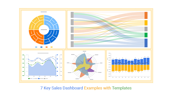
Categories
Sales analytics play a crucial role in monitoring and improving sales performance. Organizations rely on sales dashboards to make sense of the vast amount of sales data. These visual representations provide real-time insights into key sales metrics. Consequently, it allows sales teams to track progress, identify trends, and make data-driven decisions.


With sales dashboards design, you can be the Da Vinci of decision-making, strategizing your way to success.
But wait.
Have you ever wondered how to turn boredom-inducing spreadsheets into a symphony of success?
You have come to the right place.
We’re about to dissect dashboards that make pie charts cooler than ice cream. From revenue rockets to conversion carousels, prepare to be schooled in the art of visualizing victories.
We will explore some effective sales dashboard examples that showcase the art of sales analytics. Concurrently, delve into the key components and visualizations that make these dashboards effective in driving sales success.
This sales analytics journey will make you fall in love with numbers all over again.
Definition: A sales dashboard is a visual representation of sales data. It provides a graphical view of important metrics, allowing salespeople to filter information based on different periods. Integrating the dashboard with a CRM Analytics system can benefit non-sales departments like marketing. Moreover, choosing relevant key metrics and KPIs using a CRM Analytics platform ensures accuracy and integration with sales software.
Sales dashboards are essential tools that provide a visual representation of key performance metrics, enabling businesses to track sales performance in real-time. By consolidating data from various sources, these dashboards offer insights into trends, helping teams identify strengths and areas for improvement.
This not only fosters accountability but also enhances collaboration among sales teams. Ultimately, sales dashboards design facilitate data-driven decision-making, allowing organizations to optimize strategies and drive revenue growth effectively.
A clear and intuitive design allows users to navigate the dashboard effortlessly, ensuring they can easily locate important information without confusion.
Including key performance indicators (KPIs) such as sales revenue, conversion rates, and customer acquisition costs help provide insights that are critical for evaluating sales performance.
Timely updates ensure that sales teams have access to the latest information, enabling them to respond quickly to changes in performance and market dynamics.
Utilizing various charts, graphs, and visual elements aids in conveying trends and patterns effectively, making complex data more understandable at a glance.
Allowing users to customize the dashboard according to their specific needs and preferences ensures they can focus on the insights that matter most to them, enhancing their overall experience.
The sales dashboard example below is centered on various sales metrics. It provides a concise overview of current and past sales, allowing for easy comparison.
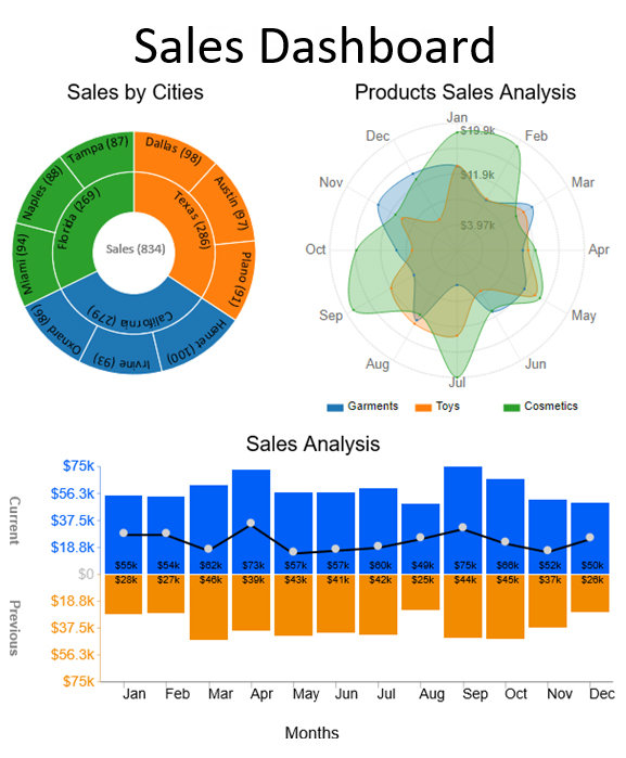
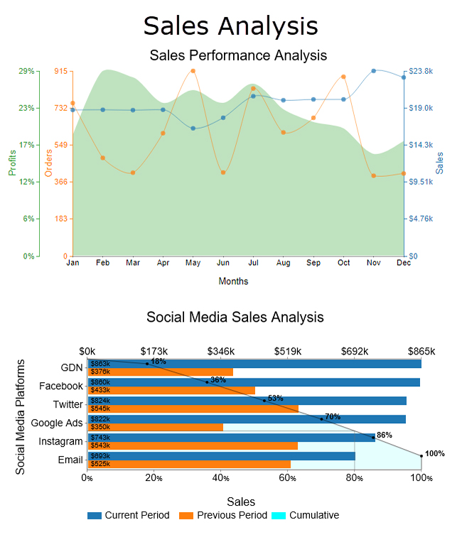
The sales dashboard design below consists of a Multi-Axis Line Chart and a Pareto Chart. These visualizations indicate how strong your business performance is.
A Sales Pipeline Dashboard provides a visual representation of the sales process, tracking opportunities from initial contact to closing. It helps sales teams monitor each stage, including prospecting, qualifying, proposing, negotiating, and closing deals.
By consolidating key metrics like conversion rates, deal sizes, sales velocity, and sales follow-up statistics, the dashboard empowers data-driven decision-making, enhances collaboration, and increases accountability.

The Sales Territory Assignments dashboard displays the distribution of sales territories among team members. This tool helps visualize how territories are assigned, ensuring balanced workloads and optimal coverage.
By analyzing performance metrics by territory, managers can make informed decisions about reassigning territories or adjusting strategies to improve sales effectiveness in underperforming areas.
A Lead Generation Dashboard focuses on tracking the sources and quality of leads entering the sales funnel. It provides insights into conversion rates, cost per lead, and the effectiveness of various marketing campaigns. By understanding which channels yield the best leads, businesses can allocate their marketing budget more efficiently.
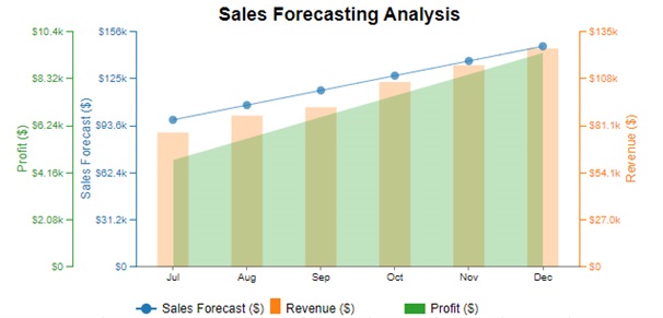
The Sales Forecasting Dashboard predicts future sales based on historical data and market trends. This tool uses various forecasting methods to provide estimates for upcoming periods, enabling companies to set realistic goals and make informed strategic decisions regarding inventory, staffing, and budgeting.
The Product Sales Dashboard tracks the sales performance of different products or services. It provides insights into best-selling items, sales trends over time, and customer preferences. This information is invaluable for inventory management and product development, as it helps businesses focus on high-demand products and phase out underperformers.
Like a perfectly tailored suit, the right charts can make your sales dashboard stand out. Consequently, empowers you to conquer the sales universe. Here are some charts that will transform your sales game from zero to hero.
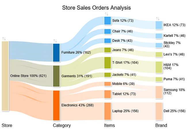
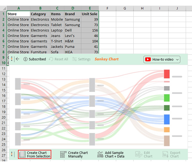
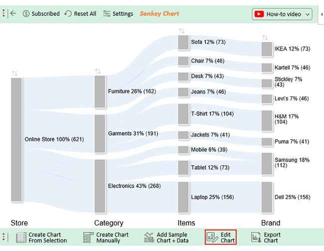
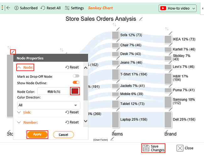
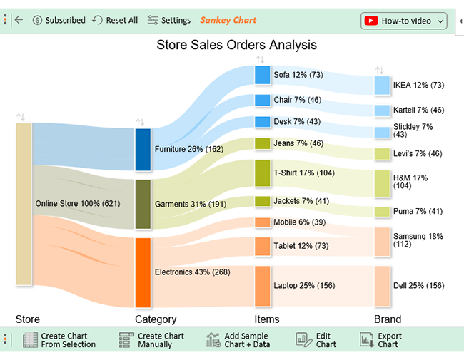
A Sankey Diagram is a flow diagram that visualizes data flow through a system. It uses arrows of different widths to represent the quantity or value of the flow at each stage. The width of the arrows is proportional to the amount represented.
Sankey diagrams provide a clear and intuitive way to analyze and understand flow patterns. At the same time, identify areas of inefficiency or improvement.
Assume you have online store sales data below.
| Store | Category | Items | Brand | Unit Sole |
| Online Store | Electronics | Mobile | Samsung | 39 |
| Online Store | Electronics | Tablet | Samsung | 73 |
| Online Store | Electronics | Laptop | Dell | 156 |
| Online Store | Garments | Jeans | Levi’s | 46 |
| Online Store | Garments | T-Shirt | H&M | 104 |
| Online Store | Garments | Jackets | Puma | 41 |
| Online Store | Furniture | Sofa | IKEA | 73 |
| Online Store | furniture | Chair | Kartell | 46 |
| Online Store | furniture | Desk | Stickley | 43 |
You can map this data on a Sankey Chart, as shown below.
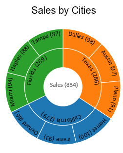
A Chart displays hierarchical data using concentric circles. Each circle segment represents a category or subcategory. The innermost circle shows the main category and the subsequent rings show subcategories. The size of each segment corresponds to its proportion within the whole, and colors help to differentiate segments.
A Sunburst Chart is useful for visualizing the composition and proportion of data at different hierarchical levels. Therefore, you can use it to show the breakdown of sales by region, as in the example below.
| Categories | States | Country | Total Sales |
| Sales | California | Irvine | 93 |
| Sales | California | Hemet | 100 |
| Sales | California | Oxnard | 86 |
| Sales | Texas | Austin | 97 |
| Sales | Texas | Dallas | 98 |
| Sales | Texas | Plano | 91 |
| Sales | Florida | Miami | 94 |
| Sales | Florida | Tampa | 87 |
| Sales | Florida | Naples | 88 |
Below is the Chart visualization of the sales data above.
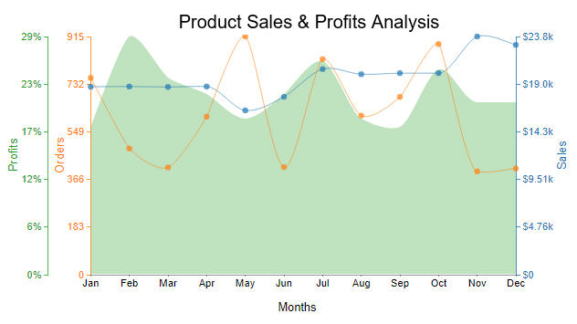
A Multi-Axis Line Chart utilizes multiple axes, providing greater flexibility in displaying and comparing data. Like other multiple or stacked line charts, it allows for representing different data sets. However, the distinct feature of a Multi-Axis Line Chart lies in its ability to accommodate multiple axes. Consequently, it enables the visualization of diverse data structures such as labels and axis positions.
This interactive chart is particularly useful when showcasing data with varying scales is needed. Or when different data series require separate axes for accurate interpretation.
Let’s say you have order, sales, and profit data as in the table below.
| Months | Orders | Sales | Profits | |
| Jan | 756 | 18766 | 18 | |
| Feb | 485 | 18788 | 29 | |
| Mar | 412 | 18743 | 24 | |
| Apr | 607 | 18788 | 22 | |
| May | 915 | 16406 | 19 | |
| Jun | 413 | 17765 | 22 | |
| Jul | 828 | 20532 | 26 | |
| Aug | 611 | 20016 | 19 | |
| Sep | 683 | 20122 | 18 | |
| Oct | 886 | 20125 | 25 | |
| Nov | 397 | 23783 | 21 | |
| Dec | 408 | 22942 | 21 | |
You can visualize this data on a Multi-Axis Line Chart, each category with its own axis.
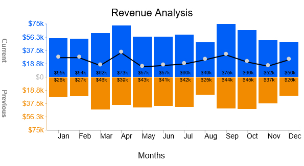
A Trend Chart shows the direction and magnitude of change over a specific period. It consists of a horizontal axis representing time and a vertical axis representing the measured variable. The data points are plotted on the chart. Then, a line or curve is drawn connecting these points to illustrate the trend.
Assume you have the revenue data table below.
| Months | Current | Previous |
| Jan | 55000 | 28000 |
| Feb | 54000 | 27000 |
| Mar | 62000 | 46000 |
| Apr | 73000 | 39000 |
| May | 57000 | 43000 |
| Jun | 57000 | 41000 |
| Jul | 60000 | 42000 |
| Aug | 49000 | 25000 |
| Sep | 75000 | 44000 |
| Oct | 66000 | 45000 |
| Nov | 52000 | 37000 |
| Dec | 50000 | 26000 |
You can visualize this data on a Trend Chart, as shown below, to make gleaning insights easy.
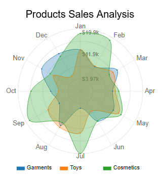
A Radar Chart is a graphical representation of multivariate data on a two-dimensional plane. It consists of a series of spokes, or radii, that extend from a central point, creating a polygonal shape. This chart is particularly useful for comparing different categories’ relative performance or characteristics across multiple dimensions.
Let’s say you have sales data as tabulated below.
| Months | Garments | Electronics | Cosmetics |
| Jan | 13147 | 32289 | 18388 |
| Feb | 9047 | 29305 | 18692 |
| Mar | 13493 | 21696 | 10639 |
| Apr | 10260 | 24357 | 12218 |
| May | 12127 | 28597 | 14936 |
| Jun | 11048 | 23525 | 10915 |
| Jul | 5435 | 32997 | 19854 |
| Aug | 12624 | 25003 | 11609 |
| Sep | 7768 | 33472 | 18657 |
| Oct | 9459 | 29548 | 15701 |
| Nov | 14201 | 28118 | 11120 |
| Dec | 13790 | 26850 | 12802 |
You can map this data on a Radar Chart, as shown below, to make analysis a breeze.
Are you looking to take your sales tracking to the next level?
Look no further than ChartExpo, the ultimate solution for creating insightful sales dashboards in Excel. ChartExpo effortlessly transforms raw sales data into insightful and interactive charts, making the gleaning of insights a breeze.
You can confidently say goodbye to clunky and outdated spreadsheets. ChartExpo offers sleek and professional sales dashboards design that brings any form of data to life.
Benefits of Using ChartExpo
How to Install ChartExpo in Excel?
ChartExpo charts are available both in Google Sheets and Microsoft Excel. Please use the following CTA’s to install the tool of your choice and create beautiful visualizations in a few clicks in your favorite tool.
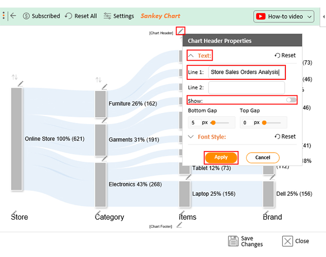
Let me show you how to create a Sankey Diagram visualization for your sales data with ChartExpo.


Select a dashboard template that fits your business needs, such as revenue tracking, sales performance, or pipeline analysis. Ensure it includes key metrics like total sales, conversion rates, and customer acquisition.
Upload or connect your sales data source, whether it’s an Excel file, Google Sheets, or a CRM like Salesforce. Make sure your data is structured correctly for accurate visualization.
Adjust charts, tables, and widgets to highlight the most important sales KPIs. Modify colors, labels, and formats to match your business branding and reporting style.
Review the dashboard to identify sales trends, bottlenecks, and high-performing areas. Use filters and drill-down options to gain deeper insights into different time periods or sales teams.
Export the dashboard as a PDF, image, or live report to share with your team. Automate updates to ensure real-time data visibility, enabling informed decision-making.
Establish specific goals for your sales dashboard design. Identify the key performance indicators (KPIs) that matter most to your sales team and leadership. This clarity will help you focus on relevant metrics like revenue targets, conversion rates, and lead sources.
Incorporate charts, graphs, and heat maps to present data visually. Effective visualizations enhance understanding and enable users to quickly grasp insights and trends analysis, making the dashboard more intuitive and user-friendly.
Avoid clutter by concentrating on the most critical KPIs. A clean and straightforward layout allows users to navigate the dashboard easily, ensuring they can find the information they need without feeling overwhelmed by excessive data.
Integrate your dashboard with real-time data sources to provide up-to-date information. Access to current metrics enables sales teams to make informed decisions promptly and respond effectively to opportunities and challenges.
Continuously evaluate the effectiveness of your dashboard. Regular updates based on user feedback and evolving business needs will keep it relevant and aligned with your sales objectives, ensuring it remains a valuable tool for your team.
Sales dashboards provide live data updates, allowing teams to monitor sales performance, revenue, and conversion rates instantly. This helps businesses respond quickly to changes, identify issues early, and capitalize on new opportunities.
With clear visual reports and key metrics, businesses can identify trends, spot bottlenecks, and optimize sales strategies. Data-backed insights reduce guesswork and enable more effective decision-making, leading to higher profitability.
Dashboards help sales teams prioritize leads, track progress, and measure individual and team performance. By having instant access to their targets and achievements, sales reps stay motivated, improve efficiency, and close more deals.
By analyzing historical sales data using a finance dashboard in Excel, businesses can predict future trends, set realistic sales targets, and optimize resource allocation. Accurate forecasting reduces financial risks and helps organizations plan better for growth.
A centralized sales dashboard ensures all stakeholders have access to the same real-time data, improving communication and alignment between sales, marketing, and leadership teams. This fosters a data-driven culture and enhances teamwork.
A sales performance dashboard template is a pre-designed visual layout that showcases essential sales metrics and data. It offers a structured framework to present information like revenue, customer trends, and product performance. Consequently, it aids businesses in monitoring and analyzing their sales performance effectively.
To create a sales performance dashboard:
No, a sales performance dashboard is valuable for businesses of all sizes. It aids in tracking sales performance, identifying trends, and making informed decisions. Small companies can benefit by optimizing sales strategies and achieving growth, just like larger corporations.
Sales analytics dashboards are powerful tools that help to monitor sales performance and make data-driven decisions. These dashboards simplify sales management by providing real-time analytics and insights in one central place.
Their allure lies not only in their aesthetic finesse but also in their potential to unravel market intricacies. From revenue trends to the intricate alleyways of customer behavior, these dashboards illuminate the path forward.
They provide valuable insights that help teams set goals, identify areas of improvement, and create effective sales strategies. Therefore, with a well-designed sales performance dashboard, you can stay on top of your sales KPIs and drive success.
Moreover, sales analytics dashboards facilitate communication and collaboration within the sales team and across departments. With real-time data updates, everyone can stay informed and make data-driven decisions.
As technology dances with business acumen, one thing is clear – sales analytics thrive on these dashboards.
ChartExpo provides a range of sales dashboard templates and visualizations to help create best-in-class sales analytics dashboards. With ChartExpo, you can easily visualize your sales metrics and set specific goals and targets.
How much did you enjoy this article?


Calculate accounts receivable turnover ratio to measure credit collection speed, improve cash flow, and strengthen your financial strategy. Read on!

Change Management KPIs are the key to tracking adoption, performance, and ROI during transitions. Find out which metrics matter. Read on!

Data collection methods and techniques determine the quality of every insight you act on. Explore key approaches for gathering reliable data. Read on!


