Categories
Any successful business relies heavily on its sales pipeline. Many sales managers have sales pipeline briefings with their sales staff several times per month.


And what are the results?
Most businesses that have defined a formal sales process have revenue growth. So, whether you’re a small business owner, an entrepreneur, or a salesperson, you need a sales pipeline to track your sales pipeline accurately.
But there is a lot of room for improvement. Why? Many organizations do poorly control their sales pipelines and, unfortunately, are working below their potential.
So how can this be improved? When you employ the right tools. Tools and strategies like Excel will create detailed sales pipeline reports that can give you a good understanding of your current sales performance.
In this guide, you’ll learn how to use Excel to create accurate sales pipeline reports to help you track your sales and make informed decisions about your business. You’ll learn how to set up the worksheet, enter data, and generate an accurate report. You’ll also learn how to identify problems in your sales process and make the necessary changes to ensure success.
Definition: A sales pipeline is a visual representation of your sales process. It allows you to see where your sales team is in the sales cycle from beginning to end. You can use the sales pipeline to predict your company’s revenue during a specific period.
The sales pipeline will help you to determine which stage of the sales process is taking longer than expected and why. You can also use it to decide what needs to be done to move sales forward.
Besides, the sales pipeline is an essential part of any marketing strategy. It helps you forecast your future sales to make the necessary adjustments to increase revenue and stay on track with your budget.
There are many different sales pipeline models. They are usually customized to the needs of various businesses and industries. One effective way to visualize these models.
The Mekko chart can also illustrate the various stages of the sales cycle and their durations, complementing the most common sales pipeline model: the canned pipeline. This model shows the various stages of the sales cycle and the duration each stage typically takes.
Understanding Sales Pipeline Report refers to the process of analyzing a structured visual representation of potential sales opportunities at various stages in the sales cycle.
This report helps businesses track leads, measure conversion rates, identify bottlenecks, and analyze sales follow-up statistics to understand engagement across different pipeline stages. It also helps forecast revenue based on the movement of deals through the pipeline. As a result, it provides deeper insights into sales performance, team efficiency, and areas for improvement.
In this video, you’ll learn how to create a Sales Pipeline Report in Excel.


Sales pipeline analysis is reviewing your monthly sales reports and data to determine what needs to be done to improve sales. It allows you to track the sales process from start to finish and forecast future sales.
You can use sales pipeline analysis to improve your current sales process and forecast future sales. You can use sales pipeline analysis to determine which sales stage is taking longer than expected and why.
You can also use it to identify the main challenges in your sales process and make the necessary changes to ensure success. A sales pipeline analysis report can help you understand what is happening in your sales cycle from beginning to end.
You can use this information to make informed decisions about your marketing strategy, pricing, and other sales aspects. It will also help you determine the amount of revenue you can expect during a certain period.
You can use various charts and graphs to create a sales pipeline report. Some of the most popular charts used in sales pipeline reports are:
A funnel chart is great for analyzing the sales process and determining the main challenges affecting sales. It can help you see which stage of the sales cycle is taking longer than expected and why. With the use of a package called ChartExpo, creating attractive funnel diagrams like the one below is simple.

A bar chart is another useful tool to create a sales pipeline report. It allows you to see different sales metrics, such as the number of leads received, the number of sales made, etc. Each stage of your sales process is represented by a horizontal slice that runs the length of the visualization.
To build a sales pipeline, utilize a stacked bar chart as well as a clustered stacked bar chart like the one below.

Sales forecasting is another approach to looking for gaps. Periodic sales predictions show whether you’ll miss, reach, or exceed a monthly or quarterly goal if you’re working toward one (which you should be).
Alternatively, the Waterfall chart effectively increases the overall value of the opportunities currently in your pipeline (as well as qualified leads, if you’d like) by the likelihood that those deals will close.

Alternatively, Sankey charts can be used to display the proper customer flow.

You know a sales pipeline is crucial to expand your clientele and scale your company. However, if you’re starting a business, you might not need to invest in new tools, like a CRM.
You need to follow these steps:
However, Excel’s limited data visualization capabilities can only partially assist you in understanding the data from your slope chart, and your time is valuable.
Using a data visualization tool like ChartExpo is simple enough. Instead of providing hundreds of connectors that only extract a small number of datasets, you can use the ChartExpo chart add-in for Excel to create interactive charts in Excel, like Sankey Chart, Waterfall Chart, Stacked Bar Diagram, and Funnel Chart with only a few clicks and without any scripting, giving your audience access to crucial insights at a glance.
Let’s say you have sales data for your business and want to examine the sales pipeline with the data below. Using a Sankey diagram in Excel can help you visualize how leads and revenue flow through each stage of the process.
| Leads | Pitched | Consideration | Close | Retarget | Size |
| Lead | Opportunity | Qualified | Sold | Customers Retained | 140 |
| Lead | Opportunity | Qualified | Sold | Customers Retained | 232 |
| Lead | Opportunity | Qualified | Sold | Customers Retained | 213 |
| Lead | Opportunity | Qualified | Sold | Customers Retained | 215 |
| Lead | Opportunity | Qualified | Sold | Customers Retained | 142 |
| Lead | Opportunity | Qualified | Sold | Customers Lost | 258 |
| Lead | Opportunity | Qualified | Sold | Customers Lost | 547 |
| Lead | Opportunity | Qualified | No Sale | 123 | |
| Lead | Opportunity | Qualified | No Sale | 214 | |
| Lead | Opportunity | Qualified | No Sale | 305 | |
| Lead | Opportunity | Qualified | No Sale | 369 | |
| Lead | Opportunity | Qualified | No Sale | 142 | |
| Lead | Opportunity | Not Qualified | 334 | ||
| Lead | Opportunity | Not Qualified | 120 | ||
| Lead | Opportunity | Not Qualified | 344 | ||
| Lead | Opportunity | Not Qualified | 109 | ||
| Lead | Opportunity | Not Qualified | 324 | ||
| Lead | Opportunity | Not Qualified | 218 | ||
| Lead | Rejection | 292 | |||
| Lead | Rejection | 325 | |||
| Lead | Opportunity | Qualified | Sold | Customers Retained | 413 |
| Lead | Opportunity | Qualified | Sold | Customers Retained | 284 |
| Lead | Rejection | 355 | |||
| Lead | Rejection | 396 | |||
| Lead | Opportunity | Qualified | Sold | Customers Retained | 82 |
| Lead | Opportunity | Qualified | Sold | Customers Retained | 150 |
| Lead | Opportunity | Qualified | Sold | Customers Retained | 278 |
| Lead | Opportunity | Qualified | Sold | Customers Retained | 202 |
| Lead | Opportunity | Qualified | Sold | Customers Retained | 398 |
| Lead | Rejection | 429 |


This sort of chart lets you assess the sales of your business and can help you expand your company to achieve the highest potential ROI. You can quickly see the sales pipeline of the company from this chart, which can help you optimize your firm’s products.
While the sales pipeline reporting may seem like a simple task, you should keep a few things in mind to ensure it is accurate and helpful.
As the sales manager, you know the importance of having an updated and accurate sales pipeline reporting. This report is essential for:
Establish well-structured sales stages that align with your business process. This ensures consistency and helps sales teams track leads effectively, reducing the chances of deals getting stuck.
Keep the sales pipeline up to date by reviewing and adjusting deal statuses frequently. This improves sales analytics and forecasting accuracy and prevents outdated opportunities from skewing reports.
Not all leads are equal. Prioritize those with the highest conversion potential by using lead scoring techniques. This allows sales teams to focus their efforts on prospects most likely to close.
Track essential pipeline metrics like conversion rates, deal velocity, and win rates. Analyzing these KPIs helps identify trends, optimize strategies, and improve overall sales efficiency.
Leverage CRM tools and automation to minimize manual tasks, improve follow-ups, and ensure seamless lead nurturing. Automation enhances productivity and allows sales teams to focus on closing deals.
A sales pipeline is a visual representation of your sales process. It allows you to see where your sales team is in the sales cycle from beginning to end. You can also use the sales pipeline to predict the amount of revenue your company is going to bring in during a certain period.
The sales pipeline will help you to determine which stage of the sales process is taking longer than expected and why. You can also use it to decide what needs to be done to move sales forward.
The procedure a client travels through and the way your sales and marketing team interacts with them at each stage are described in a sales pipeline. However, the sales funnel visualizes a customer’s journey from first coming into contact with your brand to making a purchase decision, which is distinct from sales pipelines.
A sales pipeline visually outlines the steps a sales opportunity takes, starting from the initial contact to the final deal closure. It usually includes stages such as Prospecting, Qualification, Proposal, and Closing, with opportunities advancing through each phase as they progress.
Creating a sales pipeline in Excel can be a daunting task. But with the ChartExpo add-in, you can create a powerful sales pipeline report in just a few clicks.
The ChartExpo add-in is designed to make creating and managing sales pipelines an easy process. It comes with a variety of features that allow you to quickly create and manage your sales pipeline. It also comes with a range of visual features that allow you to quickly and easily view your sales data.
With the ChartExpo add-in, you can also create easy-to-read charts and graphs that will help you track and monitor your sales progress. All in all, the ChartExpo add-in is a great way to save you time and effort.
With the ChartExpo add-in, creating a sales pipeline report in Excel has never been easier.
How much did you enjoy this article?


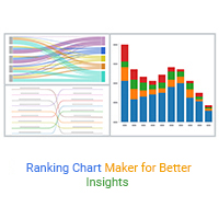
A ranking chart maker helps turn data into clear rankings for fast comparison. Learn Excel steps, examples, and tools to improve data visualization.
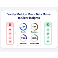
Vanity metrics can mislead teams into tracking numbers that never drive results. Discover what makes a metric truly actionable. Read on!
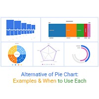
Explore the best Alternative of Pie Chart to improve clarity and accuracy in data visualization. Compare charts like bar, sunburst, and treemap with real use cases.