Categories
Picture yourself in charge of the sales of a business in Houston. You are reviewing the monthly sales statistics to understand the performance of the business.


Manual data analysis and interpretation is a time-consuming process, though. As a result, it requires a significant amount of time and energy.
How can you streamline the process?
Do not worry. Monthly sales reports templates have the solution.
Month-wise sales report templates allow you to analyze your sales data. With these templates, you can identify patterns, trends, and areas of improvement.
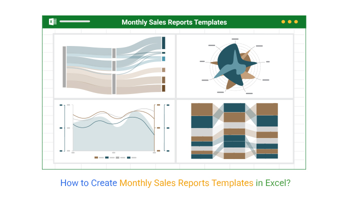
Let’s look at the monthly sales reports and how to create monthly sales report templates in Excel.
Definition: A monthly sales report template is a pre-designed document in Excel, Google Sheets, or another tool that helps businesses track and analyze sales performance over a one-month period. It typically includes key metrics such as total sales, revenue by product or channel, customer segments, and progress toward monthly targets.
By using a template, you can quickly organize raw sales data into clear Excel charts, tables, or graphs. This makes it easier to spot trends, evaluate performance, and make data-driven decisions for future strategies. Templates also save time since the structure and formulas are already built, allowing you to focus on analysis instead of setup.
A monthly sales report template in Excel is valuable because it simplifies the process of tracking and analyzing sales data over one month. Excel provides ready-to-use functions, formulas, and charts, including a Waterfall chart in Excel, that make it easy to organize raw sales numbers into meaningful insights.
With an Excel template, you can:
The following are some of the crucial metrics to include in a sales report template:
A good monthly sales report template is simple, accurate, and designed to turn raw data into clear insights. It should include essential metrics like total sales, performance against targets, product or regional breakdowns, and conversion rates.
Visual elements such as charts and graphs make trends easier to understand, while built-in formulas ensure accuracy and save time. The best templates are also customizable, allowing businesses to adjust them for different products, teams, or time periods, and they include month-over-month or year-over-year comparisons to highlight growth opportunities.
A Radar Chart is a powerful tool for presenting sales data. It is also known as a Spider Graph or Star Chart. It shows how different variables compare to each other over a period. It is especially useful when comparing sales performance across multiple products or regions.
Using the Radar Chart, you can easily spot trends and patterns in the sales figures. You can also use it to assess how well one sales team or product does compared to another.
The axes of the chart are structured around the circumference of a circle. It shows different aspects of sales along the axes.
Let’s say you want to present this sales data.
| Months | TVs | Smart Phones | Computers |
| Jan | 80 | 100 | 50 |
| Feb | 65 | 60 | 55 |
| Mar | 75 | 95 | 51 |
| Apr | 80 | 75 | 40 |
| May | 90 | 100 | 45 |
| Jun | 85 | 60 | 30 |
| Jul | 65 | 95 | 39 |
| Aug | 70 | 75 | 45 |
| Sep | 80 | 109 | 56 |
| Oct | 93 | 80 | 39 |
| Nov | 99 | 109 | 48 |
| Dec | 80 | 75 | 44 |
Here is the Radar Chart created from your data.

A Comparison Bar Chart is a useful tool for displaying sales data. It makes it simple to compare the sales of two or more products over a particular period.
It comprises a succession of bars labeled with the product name and sales figures. The bars can be positioned vertically or horizontally, depending on the data. This makes it simple to compare the sales of each product and spot trends.
Let’s say you have the sales data below.
| Months | Name | Sales |
| March | Alan | 90 |
| March | David | 82 |
| March | Lewis | 66 |
| March | Boris | 72 |
| April | Alan | 85 |
| April | David | 62 |
| April | Lewis | 50 |
| April | Boris | 73 |
| May | Alan | 40 |
| May | David | 60 |
| May | Lewis | 80 |
| May | Boris | 76 |
Here is the Comparison Bar Chart created from your data.

The Sankey Chart presents the sales flow from the client to the business. It presents the customer’s journey from the initial contact to the purchase and delivery.
It also provides information on how successful a customer’s buying journey was, highlighting insights from sales follow-up statistics and indicating places where you can improve sales.
The Sankey Chart displays the sales report in an easy-to-understand format.
You can also use the chart to compare different sales channels and methods. As a result, you can decide which ones to prioritize.
It also aids in detecting changes in trends or performance.
Let’s visualize the data below on a Sankey Chart.
| Sales Source | Sales Owner | Duration | Sale Status | Sales |
| Website | Website Visit | 1-2 Minutes | Qualified | 39 |
| Website | Website Visit | 1-2 Minutes | New | 73 |
| Website | Website Visit | 3-4 Minutes | Nurturing | 156 |
| Website | Consideration | 1-2 Minutes | New | 46 |
| Website | Consideration | 3-4 Minutes | Qualified | 104 |
| Website | Consideration | 3-4 Minutes | Nurturing | 41 |
| Website | Purchase | 1-2 Minutes | Qualified | 73 |
| Website | Purchase | 1-2 Minutes | Nurturing | 46 |
| Website | Purchase | 3-4 Minutes | Nurturing | 43 |
Here is the final visualization for the data.

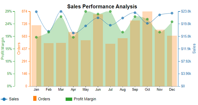
A Multi-Axis Line Chart is a useful feature in monthly sales report templates because it lets you compare two or more metrics on the same chart with different scales.
For example, you can track total sales revenue on one axis and number of units sold or conversion rates on another. This makes it easier to spot relationships between metrics and identify patterns over time.
By adding a Multi-Axis Line Chart to your Excel month-wise sales report template, you can present complex data in a simple, visual format that helps decision-makers understand performance at a glance.
Start with a blank workbook and label it as Monthly Sales Report. This will be your base template for entering and tracking sales data.
Set up clear headers such as Date, Sales Rep, Product/Service, Units Sold, Revenue, Region, and Sales Target. These fields ensure that all key information is captured consistently.
Fill in the monthly sales transactions under each column. Be consistent with formats (e.g., currency for revenue, whole numbers for units) to make calculations easier.
Use Excel formulas like =SUM() for total sales, =AVERAGE() for average revenue, and =SUMIF() for region or product-specific analysis. This turns raw data into meaningful insights.
Include a column for Sales vs. Target so you can quickly see whether monthly goals were met. Conditional formatting (e.g., green for achieved, red for missed) makes results stand out.
Visualize the data with bar charts, line charts, or even a multi-axis line chart. These visuals make trends and patterns easier to spot and communicate.
Once your report is set up, go to File > Save As and save it as an Excel Template (.xltx). This way, you can simply update the numbers each month without rebuilding the structure.
Excel is one of the most used visualization instruments. However, the spreadsheet application lacks ready-to-use analytical report-based charts, such as a Scatter plot, Sankey Charts, Mosaic plots, and Pareto Charts.
We’re not advising you to do away with Excel in favor of other expensive tools.
This is because there’s an amazingly affordable visualization tool that comes as an add-in you can easily install in Excel to access insightful and ready-to-use analytical report-based charts, including Mekko charts. The tool is called ChartExpo.
So, what is ChartExpo?
ChartExpo is an add-in you can easily install in your Excel.
With many ready-to-go financial charts and a monthly sales graph Excel template, ChartExpo turns complex, raw data into easy-to-interpret, visually appealing, report-ready visuals that tell clear data stories in real time.
More benefits
How to Install ChartExpo in Excel?
ChartExpo charts and graphs are available both in Google Sheets and Microsoft Excel. Please use the following CTA’s to install the tool of your choice and create beautiful visualizations in a few clicks in your favorite tool.
Let’s use example 3 to demonstrate how to create a Sankey chart in Excel.


A monthly sales report documents the success or failure of a business’s sales efforts over a given month. It is useful for identifying problem areas and gaining insights into the overall sales performance.
A sales report template should include metrics that comprehensively overview the business’s sales performance.
These key metrics include:
To compile accurate data for a sales report, you need to scrutinize the month’s sales activity. It has to provide an overall sales summary and a detailed sales analysis by category. It should also highlight emerging trends and patterns.
You can create a monthly sales report in Excel with ChartExpo. It enables you to create an informative and appealing sales report. It also enables you to customize your report by changing colors and labels.
You can understand the dynamics of your sales better with the help of monthly sales reports. They can point out areas of opportunity and improvement.
Metrics like revenue, sales channels, and customer feedback can shed light on buying patterns.
With monthly sales report templates, you can easily analyze sales data. You can present sales data with the use of charts and graphs.
ChartExpo enables you to create a monthly sales report in Excel with insightful charts and graphs.
Creating monthly sales reports is a demanding task. But with the right tools and resources, it can be simple.
With the tips and techniques in this blog post, you can create a successful sales report in no time.
How much did you enjoy this article?


Calculate accounts receivable turnover ratio to measure credit collection speed, improve cash flow, and strengthen your financial strategy. Read on!

Change Management KPIs are the key to tracking adoption, performance, and ROI during transitions. Find out which metrics matter. Read on!

Data collection methods and techniques determine the quality of every insight you act on. Explore key approaches for gathering reliable data. Read on!


