Categories

Calculate accounts receivable turnover ratio to measure credit collection speed, improve cash flow, and strengthen your financial strategy. Read on!

Measuring Workforce Productivity helps businesses track performance and boost efficiency. Explore key methods, formulas, and metrics. Read on!
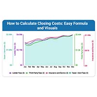
How to calculate closing costs correctly before any deal closes. Compare fees, plan your budget, and stay in control. Read on now!