Categories
By ChartExpo Content Team
Imagine you’re at an art gallery, where instead of paintings, there are arrays of colored tiles. Each tile represents a slice of data, and the size and color of each tile reflect different categorical values. This is the essence of a Mosaic Plot.


Mosaic Plot is like a bar chart that got a creative makeover. By arranging these tiles, a Mosaic Plot helps you visually dissect the interactions between multiple categorical variables, turning raw data into a vivid tableau that’s easy to digest and analyze.
By using a Mosaic Plot, you transform numbers into narratives, making it not only a powerful tool for statistical analysis but also a compelling storyteller in your data visualization arsenal.
Whether you’re a marketer, a data scientist, or a student, mastering Mosaic Plot can add a new layer of depth to your analytical capabilities, turning complex data sets into understandable and actionable insights.
Definition: A Mosaic Plot is a graphical representation used in statistics to visualize categorical data. Think of it as a checkerboard where each square’s size is proportional to the frequency of a category. The plot’s beauty lies in its ability to show proportions and relationships between two or more categorical variables at a glance.
Simply put, a Mosaic Plot visually breaks down and compares different categories of data. It’s not just about looking at the data; it’s about looking through it.
Because it’s not just about seeing the data; it’s about immediately understanding it. This visualization doesn’t just lay out the ‘what’ of the data; it also highlights the ‘how’ and ‘why,’ offering insights into patterns and anomalies that might go unnoticed in traditional bar charts or tables. Whether you’re comparing sales data across different regions or analyzing survey responses, Mosaic Plots provides clarity at a glance, making your data analysis as effective as it is efficient.
Ever wondered how a single visual could simplify your complex data analysis? Introducing the Mosaic Plot. This vibrant tool is not just about pretty visuals; it’s your data’s best narrative, offering powerful visual analytics that tells stories through proportions and patterns. Why stick to traditional bar or line charts when you can see the exact interaction between different categories at a glance?
Imagine trying to decipher a spreadsheet filled with numbers versus looking at a colorful, segmented bar graph that instantly shows you how variables interact. Mosaic Plots transform overwhelming datasets into understandable visuals.
Need to compare groups? Check. Identify outliers? Double-check. Mosaic Plots not only reveal the obvious but also uncover hidden trends in your data, making them invaluable for in-depth analysis.
Whether it’s market research, customer feedback, or any multivariate analysis, these plots allow for quick and effective comparisons across different categories and their subcategories.
Ditch the headache of comparing percentages across groups. Mosaic Plots make it a breeze by adjusting tile sizes according to the data proportions. Instantly see which category outweighs the other, which one is lagging behind – all at a glance.
Are two variables friends or just acquaintances? Mosaic Plots reveal the strength and nature of relationships between categories. Perfect for catching hidden patterns that could be the key to your next big decision.
Why wade through tables of figures when a Mosaic Plot can help you avoid Analysis Paralysis by providing the gist in a less cluttered, more digestible format? It’s about making the most out of every pixel of your plot.
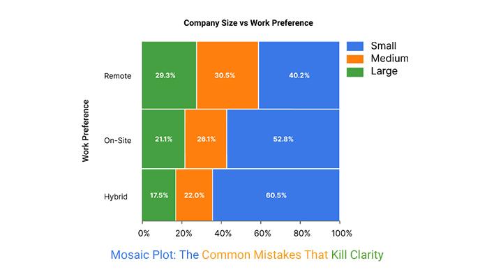
Mosaic plots can tell clear stories—if built right. Use fewer categories so each block stays readable. Always label axes and include a legend. Keep your color scheme simple and consistent. Sort the variables to highlight useful patterns. Make sure proportions reflect real data.
Avoid cramming too much into one chart. Combine small or low-frequency categories when needed. Use tooltips or interactivity for tight spaces. Stick to one metric per plot. Each decision shapes how well people understand what they see.
| Element | Mosaic Plot Best Practice | Why It Matters |
| Category Count | Limit categories to keep blocks readable | Too many values shrink boxes beyond recognition |
| Labeling | Add axis labels and legends | Helps users know what each section represents |
| Color Use | Use consistent, simple color schemes | Guides attention and avoids confusion |
| Variable Order | Sort categories meaningfully | Helps show patterns or differences clearly |
| Proportion Accuracy | Make sure block sizes match actual data | Maintains chart integrity |
| Whitespace Balance | Avoid tight packing that hides detail | Improves visual clarity |
| Combine Small Groups | Group minor categories when needed | Prevents clutter from rare values |
| Tooltip/Interaction | Add tooltips for exact values | Makes dense charts easier to read |
| One Metric Per Plot | Focus on one measure at a time | Keeps the message clean and focused |
| Legend Placement | Place the legend where it’s easy to spot | Reduces confusion and chart scanning time |
First off, let’s clear up some terminology. Whether you call it a Mosaic Plot, Mosaic Chart, or Mosaic Graph, you’re talking about the same visualization tool that helps reveal the complex relationships between categorical variables. It’s like a snapshot of data diversity, each segment telling its own story within a larger narrative.
But why the different names? It’s all about the context. In academic circles, particularly in statistics, “Mosaic Graph” is the go-to term, respected for its precision in describing this specific method of showing data relationships.
In the business realm, however, where presentations and quick reads reign supreme, you might hear “Mosaic Chart” more frequently – it’s just a bit catchier for the corporate ear. A frequency chart in Excel is similarly used across both academic and business settings to represent how often values occur in a dataset.
Professionally, the use varies widely, too. Marketers might use Mosaic Plots to segment customer data visually, revealing patterns that could drive sales strategies. Statisticians, on the other hand, might delve into more nuanced analysis, using the plots to test hypotheses about independence or correlation between variables.
Ever wondered how to transform overwhelming data into something you can actually understand at a glance? That’s where Mosaic Diagrams come into play. These nifty charts aren’t just about pretty squares and colors; they offer a powerhouse of insights – let’s explore how.
The axes in a Mosaic Plot are foundational. They categorize your data and dictate the flow of your story. Think of them as the plot’s backbone, structuring the entire visualization.
Each tile, or rectangle, represents a data category. The area of each tile corresponds to the proportion of data falling into that category. Bigger blocks mean more data – a simple yet effective way to grasp relationships at a glance.
Color breathes life into the mosaic. Choosing the right palette can make or break your diagram. Opt for colors that contrast well for clarity but are harmonious enough to keep your diagram from becoming a visual cacophony.
Layout is the unsung hero. A well-thought-out layout ensures that the viewer’s eye flows smoothly across the data, making complex relationships easier to digest. Consider the balance and alignment of tiles to guide the viewer’s journey through the data.
Creating a Mosaic Plot involves careful consideration of each element. Start with defining your axes to set the stage. Next, determine the tile sizes based on your data’s proportions. Choose a color scheme that enhances understanding, not just aesthetics. Finally, lay out your tiles to tell the story clearly and compellingly.
Why does any of this matter? Mosaic diagrams are not just about presenting data; they’re about presenting insights. They transform raw numbers into a visual story that’s not only accessible but also engaging. Use them to highlight anomalies, trends, and patterns that might go unnoticed in traditional charts.
Imagine we’re examining a dataset on pet ownership, categorized by animal type and owner’s age group. Here’s how we’d apply our design principles:
Choosing the right type of Mosaic Plot isn’t just about what looks best on your report. It’s about how the data should communicate with your audience. Are they hands-on? Go interactive. Do they need a quick, clear snapshot? Static is your friend.
| Chart Type | Description | Typical Use Case |
| Static Mosaic Plot | Basic chart with fixed layout showing proportions across categories | Printed reports, simple categorical comparisons |
| Dynamic Mosaic Plot | Changes over time or input, but not user-controlled | Tracking survey trends or time-based changes in categorical data |
| Interactive Mosaic Plot | Allows user interaction—hover, click, filter—for deeper exploration | Dashboards, web apps, exploratory data analysis |
| Nested Mosaic Plot | Layers one category within another to show hierarchy | Understanding subgroup behavior in multilevel data |
| Grouped Mosaic Plot | Shows multiple mosaic plots side by side for comparison | Comparing categorical patterns across groups, regions, or time periods |
ChartExpo is your go-to tool, not just for its user-friendliness but for its robust functionality that turns complex data into comprehensible and appealing visual stories. It’s a plug-and-play tool that integrates seamlessly with platforms like Excel or Google Sheets, ensuring you don’t have to stray from your familiar data analysis environment.
Follow these steps to create a Mosaic Plot in Excel using ChartExpo and glean valuable insights.


Practical application of theoretical knowledge is the backbone of skill enhancement in any professional field. This is particularly true for data visualization techniques like Mosaic Plots and other data visualization tools, which have broad applications across various industries. By examining specific sector case studies, we can better understand how these techniques directly impact decision-making and strategic planning.
In the healthcare sector, Mosaic Plots are instrumental in visualizing complex patient data within healthcare data analysis. For instance, imagine a hospital that tracks patient outcomes based on a range of treatments and demographic factors.
By employing a Mosaic Plot, the hospital can easily identify patterns in treatment efficacy and patient recovery rates. This not only helps in tailoring patient care but also in streamlining hospital operations, potentially reducing costs and improving patient outcomes.
In marketing, understanding consumer behavior is paramount. Mosaic Plots provide a clear visualization of the relationship between various demographic factors and consumer preferences or buying behaviors. For example, a marketing agency might use a Mosaic Plot to analyze the effectiveness of different advertising campaigns across various age groups and geographical locations. This allows marketers to optimize their strategies and focus resources on the most effective channels and demographics.
Financial analysts can utilize Mosaic Plots to analyze the diversity and risks associated with investment portfolios. By mapping investments across different sectors and correlating them with market volatility and returns, analysts can offer clearer advice to clients about risk distribution and potential return on investments.
Understanding what a data analyst does is crucial here, as these professionals use such visual tools to make complex financial data more digestible and actionable for both analysts and clients.
In the realm of public policy, Mosaic Plots can illuminate the effectiveness of various policy decisions across different regions and population groups. For example, a government agency could visualize the impact of educational reforms or health initiatives, identifying which demographics benefit most and which are underserved. This data-driven approach supports more informed policy-making that can address the specific needs of different community segments.
The practical application of Mosaic Plots across these diverse industries demonstrates their versatility and impact. By converting complex datasets into understandable and visually engaging formats, decision-makers can derive actionable insights more efficiently. This not only enhances individual skills but also propels organizations toward more informed and effective operational strategies.
Mastering data interpretation requires more than just running numbers; it demands understanding the story behind the data and transforming it into actionable insights. One powerful visual tool in this regard is the Mosaic Plot. This statistical visualization helps discern patterns and relationships in categorical data, providing a clear picture of how variables interact on a large scale.
Let’s dive into how you can leverage Mosaic Plots to enhance your data interpretation skills:
At its core, a Mosaic Plot reveals the strength of relationships between categorical variables. By adjusting the size and color of tiles within the plot, it highlights which combinations of categories are most prevalent. This visual clue can prompt a deeper investigation into why certain patterns emerge, guiding strategic decisions more effectively than raw numbers ever could.
For anyone swamped by the complexities of multi-dimensional data, Mosaic Plots can simplify these into digestible visuals. This is particularly useful in marketing analytics, where understanding consumer behavior across different segments is crucial. By visualizing these segments through a Mosaic Plot, you can quickly identify which groups to target and with what strategies, making your campaigns far more focused and efficient.
Unlike traditional bar graphs or pie charts, Mosaic Plots are designed to make comparisons intuitive. For example, if analyzing user engagement across various platforms, a Mosaic Plot can immediately show which platform retains users best and which demographics are the most active. This rapid comparison speeds up the analytical process, allowing you to react swiftly to emerging trends.
The greatest strength of a Mosaic Plot lies in its ability to present statistical evidence visually. This makes it an excellent tool for presentations to stakeholders who may not be familiar with statistical jargon. Seeing the data presented in a clear and compelling way can help persuade decision-makers of the need for a proposed strategy or action.
Start with gradients. Yes, these aren’t just for your Instagram filters! Gradients can illustrate intensity and transition in your data, guiding the viewer’s eye smoothly across the plot. Imagine a gradient that shifts from cool to warm hues to show frequency, density, or progression in your data sets. It’s not just pretty; it’s informative, showing where to focus at a glance.
Next, let’s chat about interactive legends. Toss out static legends that sit in the corner. Why not make them clickable? By interacting with the legend, viewers can highlight specific categories or variables directly on the plot, making complex data sets much simpler to navigate. Click on a legend entry, and bam – watch parts of your Mosaic Plot light up or dim to streamline comparison and analysis. It’s like having a remote control for your data!
Animations – don’t scroll past this yet! Animations in a Mosaic Plot can be a game changer, especially when presenting changes over time or the flow of data through different categories. They can transform static visualizations into dynamic stories. Think of a plot that animates the transition of market share among products over several years. This isn’t just a chart; it’s a narrative unfolding before your eyes.
Remember, the key is not to overdo it. Use these enhancements to make your data clearer, not clutter it up. Each element should invite deeper understanding and keep your audience locked in, not scratching their heads.
When working with massive data sets, the challenge isn’t just to visualize the data but to do it efficiently. But how do you tweak a Mosaic Plot to avoid the plot thickening, quite literally, under the weight of data?
When the data is too dense, breaking it down hierarchically can help maintain clarity. Start with a broad overview and allow viewers to drill down into more detailed views based on their areas of interest. This not only makes your Mosaic Plot more interactive but also prevents information overload.
Mosaic plots shine at showing how categories interact. You can see patterns fast. Block sizes make frequency and proportions easy to compare. But too many categories turn it into a jigsaw puzzle. Small rectangles shrink labels. Colors can distract instead of help. Without sorting, patterns get buried. Keep it clean, or it loses meaning.
| Aspect | Mosaic Plot – Pros | Mosaic Plot – Cons |
| Visual Comparison | Easy to compare category frequencies and relationships | Hard to read with many small blocks |
| Space Usage | Uses space efficiently to show multiple variables | Labels can overlap or go missing |
| Data Insight | Highlights patterns, gaps, and associations | Doesn’t explain the “why” behind the data |
| Proportional Display | Area size reflects actual values | Misleading if proportions are off |
| Multivariable Analysis | Handles more than two variables visually | Becomes cluttered with too many variables |
Think of a Mosaic Plot as your gateway to expertise. With each tile, each color, and each slice, you’re building a narrative. The secret? It’s all in how you arrange these pieces. Place them right, and voila, your data’s telling tales, making complex patterns as clear as day!
Dashboards are the champions of the data world. Want to turn your data into a dashboard that not only informs but also engages? Start with the right tools – Mosaic Plot online tools, to be precise. Here’s a guide:
Your dashboard should be as easy to navigate as your favorite smartphone app. If your grandma can’t figure it out, it’s too complex!
Use color to guide, not confuse. Each hue should have a purpose.
Allow users to click, hover, and drill down. Engagement skyrockets when users can interact with their data.


Mosaic Plots are a brilliant way to visualize complex categorical data. Here’s why they rock:
Imagine trying to understand a zoo of categories at a glance. Mosaic Plots make this easy. They break down and display the relationship between different categorical variables in a single, colorful, and easy-to-understand chart. This simplification of complex data is like turning a wild jungle into a well-organized garden.
Each rectangle in a Mosaic Plot represents a proportion relative to the whole, much like pieces of a pie chart, but for more complex comparisons. This proportional view allows for quick visual assessments of which categories are more significant or require more attention.
Because of their colorful and geometric nature, Mosaic Plots are not only informative but also visually appealing. They capture the viewer’s interest quickly, making them excellent tools for presentations where you need to make an impact without boring your audience to tears.
While many charts falter at multi-dimensional analysis, Mosaic Plots shine. They can display interactions between two or more categorical variables without breaking a sweat. This ability makes them invaluable for exploring and presenting data relationships that might be too complex for other types of charts.
With a good color scheme and clear labeling, Mosaic Plots can convey a lot of information at a glance, allowing audiences to interpret the data quickly and accurately. They provide a straightforward way to compare the relative frequencies of categories, making them a favorite for market research and demographic studies.
Mosaic Plots, with their colorful, checkered appearance, can at first glance seem like a handy tool for displaying complex categorical data. However, let’s dive into some not-so-pretty truths about these statistical visuals.
At their worst, Mosaic Plots can become a jumbled mess. With too many categories or disproportionate data segments, they turn into a visual labyrinth that’s more confusing than clarifying. Ever tried finding your way in a maze with too many turns? That’s a Mosaic Plot gone wrong.
The effectiveness of a Mosaic Plot heavily depends on the size of the data segments. Too small, and they’re easily overlooked; too large, and they dwarf other important data. It’s like trying to balance a seesaw, but with data.
Color is a critical component of Mosaic Plots. Misuse it, and you plunge your audience into a swamp of confusion. Imagine trying to read a book where the characters randomly change names mid-chapter. Not so helpful, right?
Mosaic Plots are strictly categorical. They don’t play nice with continuous data. This limitation is akin to attending a potluck where everyone brings dessert – delightful but not particularly balanced.
Mosaic plots work well for spotting patterns in categorical data. They’re handy for checking how variables relate, like age and purchase type. You’ll see imbalance and association fast.
But skip them if you’ve got lots of categories or tiny segments. The chart gets hard to read, and the message gets lost. If users need to track trends over time or compare exact values, pick something else. Mosaic plots can also be considered in situations where you’re looking for an alternative of Pie chart, especially when comparing proportions across multiple categories in a clearer way.
However, they are not always the best fit. Mosaic plots shine in the right spot—but fall apart in the wrong one.
| Scenario | Use Mosaic Plot | Avoid Mosaic Plot |
| Analyzing Categorical Relationships | Great for showing how two or more categories interact | Not useful for numeric or continuous data |
| Detecting Proportional Imbalance | Works well to highlight unequal distributions or skewed segments | Hard to see detail if block sizes are nearly equal |
| Survey or Demographic Analysis | Effective for showing breakdowns by group, age, region, etc. | Not ideal if the data includes many small sub-groups |
| Comparing Multiple Categories | Helps visualize category combinations and overlaps | Gets cluttered with too many variables or values |
| Visual Summary of Counts | Area size reflects count or frequency clearly | Avoid if you need exact numbers or trend lines |
Let’s crack it, step-by-step. Mosaic Plots might not be your go-to for a chill evening, but they sure can be illuminating once you get the hang of them.
Mosaic plots get messy fast when there are too many categories squeezed in. Trim down the groups or merge the minor ones to keep it readable. Forgetting labels? That’s a one-way ticket to confusion—always tag sections and add a legend.
Using random colors doesn’t help either. Stick to a color scheme that guides the eye. And don’t ignore the order of variables. Swapping rows and columns can reveal patterns you’d otherwise miss. A clean mosaic plot makes comparisons easier, not harder. Keep it sharp, simple, and sorted.
| Mosaic Plot – Errors | Description | How to Fix |
| Too Many Categories | Overloading with too many values makes rectangles too small to read | Limit categories or group less important ones together |
| No Labeling or Legends | Missing or unclear labels confuse the meaning of each block | Add clear labels and include a legend for categories |
| Incorrect Proportions | Manual errors or bad data can misrepresent the sizes of blocks | Use verified data and tools that calculate proportions correctly |
| Ignoring Variable Order | Poor order of variables hides relationships or patterns | Order variables to emphasize key comparisons or insights |
| Bad Color Use | Clashing or excessive colors reduce readability | Use limited, contrasting colors with purpose |
| Overlapping Text | Text within small rectangles becomes unreadable | Use tooltips, interactive features, or place labels outside the plot |
Insights from the data viz gurus suggest big things on the horizon.
Experts predict that as data becomes more complex, the simplicity of Mosaic Plots will be a sanctuary for those overwhelmed by multi-dimensional chaos. “They bring clarity to the clutter,” says one seasoned analyst.
Because your time matters. Because you need insights, not just information. And because in the world of data analysis, being able to quickly and clearly visualize complex relationships isn’t just nice, it’s necessary.
Armed with a Mosaic Plot, you’re not just making decisions; you’re making informed decisions. This tool helps you pinpoint where the issues are, where the potential lies, and what steps you might consider next.
Pull out a Mosaic Plot when you’ve got multiple categories to compare, and you need to understand how they interact. Whether it’s survey data, sales figures across different regions, or anything else where you need to see the big picture at a glance, Mosaic Plots are your best bet.
Unlike bar charts that just show quantities, Mosaic Plots give you the “how” and the “why” behind the data. They are particularly handy when you need to analyze categorical data without getting bogged down by complexity.
To wrap it up, the Mosaic Plot is more than just a pretty face in the world of data visualization. It’s a robust tool that brings significant value to any analytical toolkit. By converting complex categorical relationships into visual stories, Mosaic Plots not only enhance understanding but also engagement.
Whether you’re a marketer trying to understand customer segments, a healthcare professional looking at patient data, or anyone in between, the Mosaic Plot is like having a magnifying glass over the crucial parts of your categorical data. It’s not just about seeing the data; it’s about seeing through it.
Engage with this tool, explore its features, and let the insights guide you. Mosaic Plots aren’t just about presenting data; they’re about empowering decision-makers.
How much did you enjoy this article?


Calculate accounts receivable turnover ratio to measure credit collection speed, improve cash flow, and strengthen your financial strategy. Read on!

Change Management KPIs are the key to tracking adoption, performance, and ROI during transitions. Find out which metrics matter. Read on!

Data collection methods and techniques determine the quality of every insight you act on. Explore key approaches for gathering reliable data. Read on!


