Categories
By ChartExpo Content Team
Imagine standing at a crossroads, each path representing a different variable in your dataset. Multivariate analysis helps you navigate these paths, revealing hidden relationships and patterns. It’s a powerful tool that lets you see the bigger picture.
Multivariate analysis isn’t magic; it’s mathematics. It allows you to uncover patterns and relationships within your data. You can make informed decisions backed by solid evidence by analyzing several variables simultaneously. It’s not about looking at data in isolation but understanding how different factors interact.
The power of multivariate analysis lies in its ability to simplify complexity. Whether working with large datasets in business, science, or social research, this technique helps you gain insights that single-variable analysis might miss. It’s about revealing the hidden stories in your data and making sense of the chaos.
First…
Imagine looking at data through a new lens that reveals deeper connections and patterns. That’s a multivariate analysis. It’s a technique used to understand relationships between multiple variables simultaneously.
You don’t focus on just one aspect; you examine how various factors interact and influence each other. For instance, instead of analyzing sales data based only on time, you consider time, product category, region, and marketing efforts together. This approach provides a richer, more comprehensive view of the data, uncovering insights you might miss otherwise.
Single-variable analysis can be useful, but it has its limits. Multivariate analysis allows you to see the bigger picture. For example, in healthcare analytics, it’s not enough to look at the impact of diet on health. You also need to consider exercise, genetic factors, and lifestyle choices.
Multivariate analysis lets you account for these complexities. It helps you make better decisions by showing how different factors interplay and affect outcomes. This deeper understanding can lead to more accurate predictions and strategies.
Whether you’re just starting or have years of experience, multivariate analysis has something to offer.
Beginners can use it to gain a broad understanding of their data, while seasoned analysts can dive deep into intricate patterns and relationships.
Businesses can use it to refine marketing strategies, researchers can explore complex scientific questions, and educators can analyze student performance from multiple angles.
The beauty of multivariate analysis is its versatility and adaptability to various fields and expertise levels.
Multivariate analysis isn’t as scary as it sounds. Think of it as a way to understand how different things work together. Imagine you’re a detective, but instead of looking for clues, you’re looking for patterns in data.
This technique helps you see how multiple factors are connected and can prevent “Analysis Paralysis” by providing clear insights and reducing the overwhelm of too much information.
For example, in studying customer behavior, you might look at age, income, and purchase history together. Multivariate analysis lets you do that, revealing insights that you wouldn’t get by looking at each factor alone.
When should you use multivariate analysis? Whenever you have data that involves multiple variables. It’s perfect for understanding complex relationships.
Say you’re analyzing the performance of students in a school. You’ll want to consider their grades, attendance, and extracurricular activities all at once. Multivariate methods help you see how these factors interact and influence each other.
It’s like having a map that shows you the entire landscape instead of just one path. In the context of data democratization, this approach ensures that a wider audience can access and interpret these insights, empowering educators and administrators to make more informed decisions.
Multivariate analysis shines in many fields.
In marketing, it helps understand customer preferences by considering demographics, buying habits, and social media interactions together.
In healthcare, it’s used to study the effects of treatments by analyzing patients’ age, lifestyle, and medical history.
It’s also powerful in finance for risk assessment by looking at various economic indicators simultaneously. Wherever data is rich and complex, multivariate analysis is your go-to tool.
There are two main paths in multivariate analysis: exploration and confirmation.
Exploratory methods help you find patterns without any prior assumptions. It’s like going on a treasure hunt with no map, looking for anything interesting.
Confirmatory methods, on the other hand, test hypotheses you already have. Here, you’re a detective verifying clues to solve a mystery.
Both paths are crucial, depending on whether you’re discovering new insights or testing existing theories.
Understanding relationships in your data is key. Dependence methods, like regression analysis, focus on how one variable affects another. It’s useful for predicting outcomes, like how studying time affects test scores.
Interdependence methods, like cluster analysis, look at how variables group naturally, without focusing on cause and effect. This helps in segmenting customers into different groups based on similar behaviors. Knowing when to use each method is essential for effective analysis.
PCA is like cleaning out your closet. You reduce clutter by keeping only the essentials. It helps you focus on the most important variables, simplifying complex data. This technique is invaluable when you have too many variables to handle, making analysis more manageable and insightful.
Factor Analysis digs deeper to find hidden connections. It’s like discovering secret tunnels in a maze. By identifying underlying factors that explain observed patterns, helps in understanding complex phenomena, especially in fields like psychology and social sciences.
Clustering is all about finding natural groupings in your data. It’s like sorting a bag of mixed candies by flavor. This method is widely used in market segmentation, customer profiling, and even in biology for classifying species based on genetic similarities.
When you dive into the deep pool of multivariate data, traditional bar charts and pie charts just don’t cut it. They can’t capture the intricate relationships and patterns. You need tools that go beyond, capturing the essence of your data’s complexity.
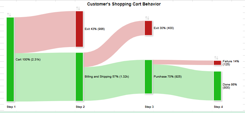
Sankey Diagrams are your go-to when showing how different variables interact. Think of them as a roadmap for your data, guiding you through the twists and turns of intricate relationships.
Sankey Diagrams shine in scenarios where connections matter. They are perfect for visualizing data like website navigation paths, customer journeys, or network traffic.
Start simple. Choose your key variables, map out their interactions, and use ChartExpo to create your flow diagram. Each step brings clarity to the complex web of your data.
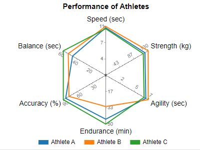
Spider Charts, or Multi Axis Radar Charts, are ideal for comparing multiple variables across different categories. They look complex but are straightforward once you get the hang of them.
Ensure your Multi Axis Radar Charts are readable. Use distinct colors and labels, and avoid overcrowding. Simplicity in design enhances clarity.
Gather your data, choose the variables you want to compare and plot them on a Spider Chart. This visualization highlights where variables stand out or fall short.
Scatter Chart are perfect for exploring correlations. They show how one variable changes about another, helping you spot trends and relationships.
Keep your Scatter Plots clean. Use trend lines to highlight correlations and ensure your axes are clearly labeled.
Plot your data points, add trend lines, and interpret the relationships. This approach can reveal insights hidden in your data.
Heat Maps are great for showing data density. They use color gradients to indicate intensity, making patterns easy to spot.
Choose your color scales wisely. High contrast helps in distinguishing different data densities and ensures your map is not cluttered.
Input your data, select the areas of interest, and apply a color gradient. This visualization method highlights hotspots and patterns effectively.
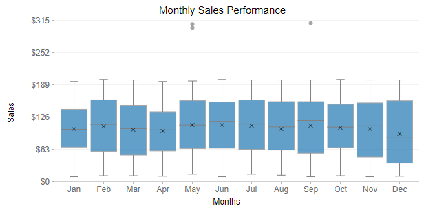
Box Plots, or Box and Whisker Plots, are essential for comparing distributions and spotting outliers. They summarize key statistics like the median, quartiles, and extremes.
Use Box Plots to compare multiple groups side by side. Highlight outliers and note their implications for your data analysis.
Gather your data, plot your boxes and whiskers, and interpret the spread and outliers. This helps in understanding the variation within your data.
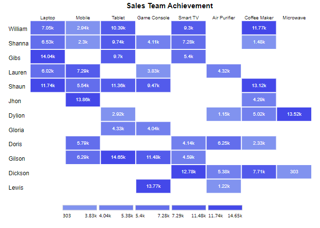
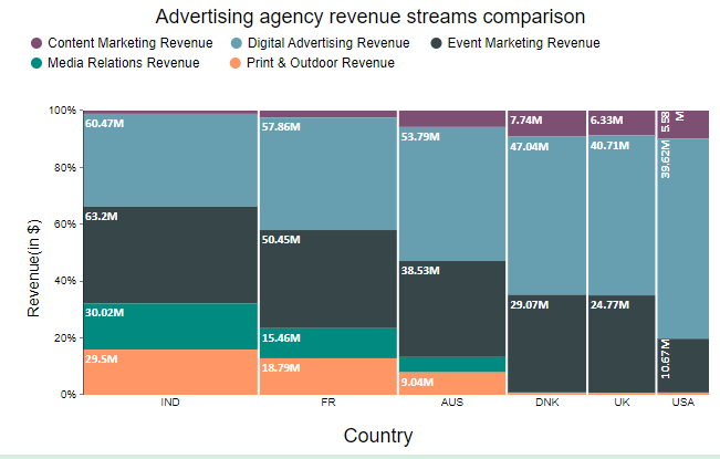
A Clustered Stacked Bar Chart helps visualize proportions across multiple categories. It shows how different segments contribute to the whole.
Use distinct colors for different categories, keep the design simple, and ensure your legend is clear. This makes your chart easy to read.
Input your data, group and stack your categories, and interpret the proportions. This method helps in comparing different segments within your data.
Mosaic Plots are ideal for exploring relationships between categorical data. They show the proportions of different categories as part of a whole.
Keep your plot simple and color-coded. Clear labels and a clean design enhance readability.
Select your categories, plot the mosaic, and interpret the relationships. This visualization helps in understanding how different categories interact.
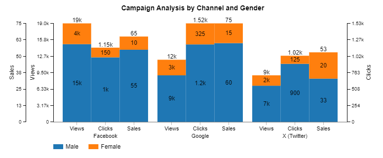
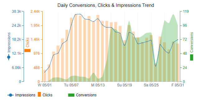
Multi Axis Line Charts are great for showing trends over time. When dealing with multiple metrics, they help in comparing how each metric evolves.
Use distinct lines and colors for each metric. Avoid clutter by limiting the number of lines in one chart.
Plot your metrics over time, compare the trends, and interpret the data. This helps in understanding how different factors change about each other.
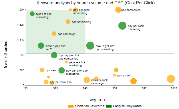
Bubble Charts add a third dimension to scatter plots by varying the size of the data points, similar to how dot plot analysis can reveal patterns in data distribution. They are perfect for comparing three variables at once.
Choose your variables wisely and use size and color to add depth to your data points. Ensure your chart remains uncluttered and easy to interpret.
Select your variables, plot the bubbles, and interpret their sizes and positions. This method offers a rich view of your data’s multidimensional relationships.

You can create a Multivariate Chart in your favorite spreadsheet. Follow the steps below to create a Multivariate Chart.


Understanding multivariate analysis starts with grasping key metrics. Focus on coefficients, p-values, and R-squared. These numbers tell the story of your data. Coefficients show the relationship between variables. P-values indicate significance. R-squared measures fit. Each metric adds a piece to your data puzzle.
Is your model reliable? Check the goodness of fit. Look at residual plots and R-squared values. Are the residuals randomly scattered? If yes, your model fits well. Also, consider the significance. P-values less than 0.05 usually mean your results are significant. This step ensures your analysis is solid.
Once you have your stats, look for patterns. Are variables moving together or apart? Identify positive and negative relationships. Use correlation matrices and scatter plots. These tools help visualize connections and make sense of complex data.
Raw data is just the beginning. Transform it into actionable insights. Start by summarizing key findings. Highlight important metrics. Use visualizations to make data clear. This step bridges the gap between data and decision-making.
Numbers alone don’t tell a story. You need to craft a narrative. Explain what the data means in simple terms. Use anecdotes and real-life examples. This approach makes your findings relatable and engaging. Remember, a good story helps people understand and remember your insights.
Tailor your message to your audience. Use plain language for non-experts. Stick to key points and avoid jargon. For technical audiences, include detailed stats and methods. Always use visuals to support your message. Clear, targeted communication ensures everyone understands your analysis.
Imagine combining factor analysis and multiple regression into one powerful tool. That’s SEM for you. SEM helps you understand the complex relationships between variables, considering both direct and indirect effects. Picture it as constructing a detailed map of how different factors interact in your data.
PLS regression is like having a crystal ball for your data. It’s great for when you have many predictors and need to forecast outcomes accurately. By finding the fundamental relations between predictors and responses, PLS gives you a clear picture of what’s likely to happen next.
Ever wanted to visualize similarities or dissimilarities in data? MDS turns abstract data into concrete visual maps. It’s like turning a list of distances between cities into a geographic map. You’ll see patterns and relationships in your data that were invisible before.
Blending classic statistical methods with machine learning opens new doors. Traditional techniques provide a solid foundation, while machine learning adds flexibility and power. This combo can handle complex datasets and uncover insights that neither could find alone.
Ensemble methods, like random forests and boosting, combine multiple models to improve predictions. Think of it as getting advice from a panel of experts rather than relying on a single opinion. These methods reduce errors and boost accuracy, making your predictions more reliable.
Neural networks are like the brain of AI. They can learn from vast amounts of data, identifying intricate patterns and relationships. Whether it’s image recognition, speech processing, or predicting financial trends, neural networks handle it all. They adapt and improve as they process more data, making them indispensable for modern multivariate analysis.
Ever wondered why some customers seem to buy everything while others hardly buy anything? Cluster analysis can help. By grouping customers based on their purchasing behavior, you can identify distinct segments.
These segments reveal insights into who your high-value customers are and what makes them tick. You can then focus your marketing efforts on these groups, driving growth and increasing sales.
Sometimes, the most profitable market segments aren’t the most obvious ones. Multivariate analysis helps you find these hidden gems. By examining various factors such as purchasing habits, demographics, and feedback, you can uncover segments that have been overlooked.
Targeting these segments can open up new revenue streams and boost your bottom line.
In today’s market, personalization is key. Multivariate analysis allows you to tailor your strategies on a large scale. By understanding the unique preferences and behaviors of different customer groups, you can create personalized marketing campaigns that resonate with each segment.
This approach increases customer satisfaction and loyalty, driving long-term success.
Financial markets are full of uncertainties. Factor analysis helps you identify the key drivers behind these uncertainties. By analyzing multiple variables, you can pinpoint the factors that have the most significant impact on financial performance. This insight enables better decision-making and risk management, helping you navigate the financial landscape with confidence.
Predicting financial outcomes is challenging but essential. Multivariate analysis makes this task easier by building predictive models using multiple variables. These models can forecast future trends and outcomes with greater accuracy. Armed with this information, you can make informed decisions that enhance your financial stability and growth.
Protecting your assets requires a robust risk management strategy. Multivariate analysis enhances this strategy by providing a comprehensive view of potential risks. By analyzing various risk factors simultaneously, you can develop strategies to mitigate these risks effectively. This proactive approach ensures your assets are well-protected against potential threats.
Multicollinearity can throw a wrench in your analysis. It occurs when predictor variables are too closely related. This can make it hard to determine the effect of each predictor. You can detect it using variance inflation factors (VIF). If VIF is high, it indicates multicollinearity. To fix it, try removing or combining correlated variables. Ridge regression can also help.
Finding the right balance between complexity and simplicity is key. A model that’s too complex may overfit the data, capturing noise instead of the actual signal. A simpler model may not capture enough detail. Use techniques like cross-validation to find that sweet spot. This way, your model remains useful for new data.
Interpreting results accurately is vital. Look out for spurious relationships, which can mislead your conclusions. Use residual plots to check the fit of your model. Ensure your results make sense in the context of your data. When in doubt, consult a domain expert to verify your interpretations.
Cross-validation is your friend. It helps ensure your model is reliable. Split your data into training and test sets multiple times, and assess the model’s performance on each split. This helps in verifying that your results are not dependent on a particular subset of data. Techniques like k-fold cross-validation can provide a robust measure of your model’s performance.
Sensitivity analysis tests how your model’s outcomes change with variations in input. It’s like stress-testing your model. This helps you understand the robustness of your findings. By tweaking inputs and observing the effects, you can identify which variables significantly impact the outcome. This can guide you in making more informed decisions.
Data and numbers are crucial, but human insight adds value. Experts can provide context that data alone can’t. Use their knowledge to refine your models.
For instance, an expert might highlight variables you hadn’t considered or suggest relationships that data might miss. This collaborative approach enhances the accuracy and relevance of your analysis.
Bias in data is like a hidden landmine. It skews results and leads to unfair conclusions. When you’re dealing with multivariate analysis, this issue becomes even more critical. Start by checking your data sources. Are they diverse and representative? Use algorithms that can detect and mitigate bias. Remember, your goal is to present an unbiased truth. If your data is flawed, so are your results.
Privacy isn’t just a legal requirement; it’s a moral duty. In multivariate analysis, you often deal with sensitive data. This could include personal information that’s not meant for the public eye. Use encryption and anonymization techniques. Make sure your data storage practices are secure. By protecting individual privacy, you uphold the trust placed in you by your data subjects.
With great data comes great responsibility. Reporting your findings accurately is essential. Avoid cherry-picking results to fit a narrative. Present all relevant outcomes, even if they don’t support your initial hypothesis. Transparency builds credibility. Be honest about your methods, limitations, and any potential conflicts of interest.
Multivariate analysis is evolving at lightning speed. Keep an eye on new software that simplifies complex calculations. Machine learning and AI are becoming integral parts of the process. These technologies can handle larger datasets and find patterns faster than traditional methods. Stay updated to leverage these tools effectively.
AI for data analytics is a game-changer in multivariate analysis. It automates routine tasks, allowing you to focus on interpreting results. AI algorithms can detect subtle patterns and correlations that humans might miss. However, it’s vital to understand the underlying mechanisms of these algorithms to avoid blind trust. AI should augment, not replace, human expertise.
The future demands new skills. Proficiency in coding and familiarity with AI tools will be crucial. Data visualization skills will help you understandably present complex findings. Continuous learning is key. Stay curious and keep refining your skills to stay ahead in this dynamic field.
Unlike univariate or bivariate analyses, which focus on one or two variables, multivariate analysis handles many variables at once. Think of it as a group discussion versus a one-on-one chat. The insights are richer and more nuanced.
Absolutely! It’s used in:
Let’s debunk a few myths:
By revealing hidden patterns and relationships, multivariate analysis empowers you to make informed decisions. Whether you’re optimizing marketing strategies or improving healthcare outcomes, this method provides the insights needed to drive success.
While powerful, Multivariate Analysis isn’t foolproof. It requires a good understanding of statistical methods and careful data preparation. Misinterpretation of results due to overfitting or multicollinearity can lead to erroneous conclusions.
Yes, many tools offer automation features. However, human oversight is crucial to ensure the validity and relevance of the analysis. Automated tools can speed up the process, but they can’t replace expert judgment.
Embrace the power of multivariate analysis to unlock deeper insights. This technique lets you explore the relationships between multiple variables simultaneously. You gain a more comprehensive view of your data, enabling better decision-making and strategy development.
Equip yourself with essential multivariate techniques like Principal Component Analysis (PCA), Factor Analysis, and Cluster Analysis. Each method serves a unique purpose. PCA reduces data complexity, Factor Analysis uncovers underlying factors, and Cluster Analysis groups similar data points. These tools are invaluable across various fields, from market research to genetics.
To implement multivariate analysis effectively, follow these best practices:
Shift your perspective to see data in multiple dimensions. This mindset helps you uncover patterns and relationships that single-variable analysis might miss. Think of it as adding depth and richness to your data story.
Stay ahead by continuously developing your multivariate analysis skills. Engage in regular practice, take online courses, and read the latest research. Join data science communities to exchange knowledge and keep your skills sharp.
Your journey with multivariate analysis is ongoing. Embrace each challenge as a learning opportunity. Stay curious and open-minded. As you deepen your understanding, you’ll find new ways to apply these techniques to solve complex problems.
How much did you enjoy this article?


Calculate accounts receivable turnover ratio to measure credit collection speed, improve cash flow, and strengthen your financial strategy. Read on!

Change Management KPIs are the key to tracking adoption, performance, and ROI during transitions. Find out which metrics matter. Read on!

Data collection methods and techniques determine the quality of every insight you act on. Explore key approaches for gathering reliable data. Read on!


