Categories
How to Add a Trendline in Excel: Reveal patterns and predict trends with a simple line. Visualizing your data’s direction becomes effortless with Excel’s trendline feature.
Whether you’re tracking sales over time, monitoring website traffic, or analyzing any numerical dataset, adding a trendline in Excel can uncover underlying patterns and even help forecast future values.
You don’t need to be a data scientist or Excel expert to use this feature. Adding a trendline in Excel is straightforward, and in just a few simple steps, you can highlight trends, simplify complex data, and make informed decisions.
By the end of this guide, you’ll know exactly how to add a trendline in Excel, customize it, and analyze it effectively—turning raw numbers into clear, actionable insights.
Let’s get started.
Definition: A Trendline in Excel is a graphical representation that shows the general direction or pattern of a dataset over time. It’s a line added to a chart, usually a line, column, or Scatter plot, that highlights trends, correlations, or tendencies in your data.
Trendlines can be linear, exponential, logarithmic, polynomial, or moving averages, depending on the type of data and the insights you want to uncover. They help you identify patterns, forecast future values, and make data-driven decisions with ease, without manually analyzing complex datasets.
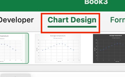
In Excel 2019, 2016, and 2013, adding a trendline is a straightforward three-step process:
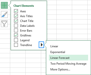
Tip: You can add a trendline by right-clicking on the data series and selecting ‘Add Trendline.
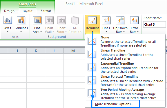
To add a trendline in Excel 2010, follow these steps:
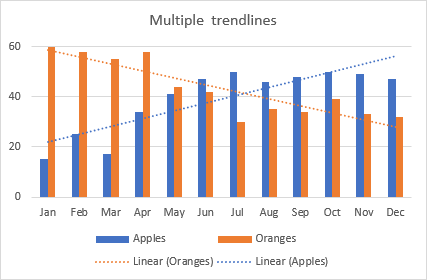
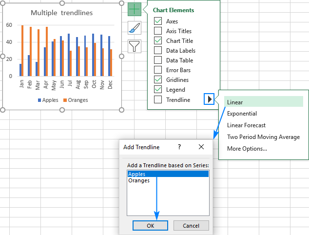
Microsoft Excel supports adding several trendlines to a chart. Here’s how to manage two common situations:
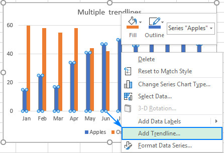
As a result, each data series will display its trendline in the corresponding color.
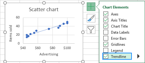
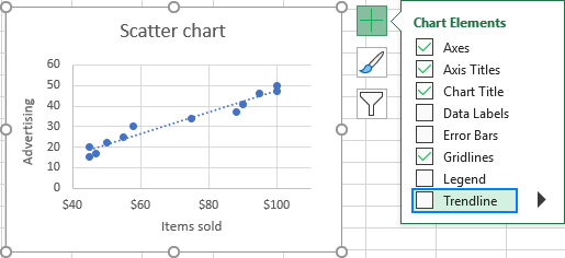
Click the chart elements button, then click the arrow beside Trendline, and choose the trendline type you want. Excel will list all data series in the chart. Choose the one you need and click OK.
Why and when, you may ask, are these lines so darn useful?
Let’s find out:
| Trendline Type | Description | When to Use / Use Case | Example |
| Linear | A straight line that best fits the data points | Data changes at a constant rate over time | Monthly website traffic is increasing steadily |
| Exponential | Curved line showing rapid growth or decay | Data with accelerating growth or decline | Compound interest growth, viral social media shares |
| Logarithmic | Rapid initial change, then levels off | Data with a fast start that slows down over time | Technology adoption curves, saturation-type data |
| Polynomial / Power | Curved line capturing multiple peaks and troughs | Nonlinear data with fluctuations | Stock market prices, product sales with seasonal ups and downs |
| Moving Average | Smooths out short-term fluctuations | Highlight the underlying trend in noisy data | Daily sales with high volatility |
| Time Series Trendline | Line for data collected over equal time intervals | Historical data analysis, detecting seasonality | Historical stock prices, temperature changes over the years |
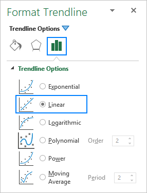
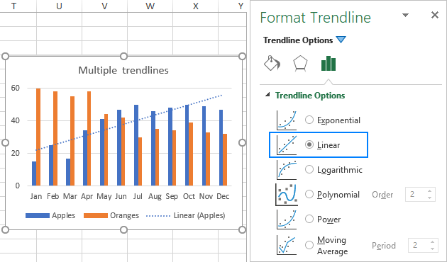
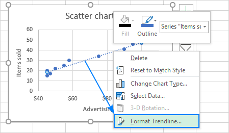
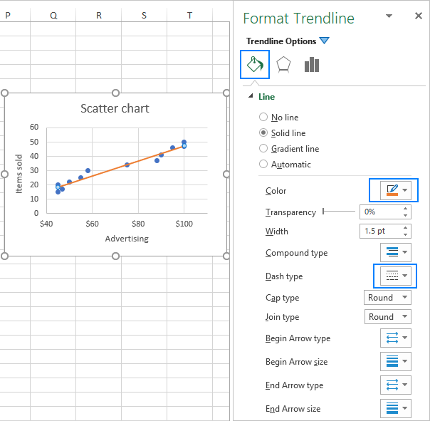
To enhance the clarity and interpretability of your graph, you might want to adjust the default appearance of a trendline. Right-click on the trendline and choose ‘Format Trendline…’ or simply double-click the trendline to access the Format Trendline pane.
In the pane, go to the Fill & Line tab where you can customize the color, width, and dash style of your trendline. For example, you can switch it from a dashed line to a solid line.
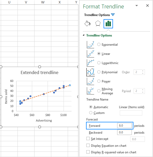
To extend the trendline into the future or past, follow these steps:
For example, you can extend the trendline 8 periods beyond the last data point.
To remove a trendline from your chart, right-click the trendline and select ‘Delete.’
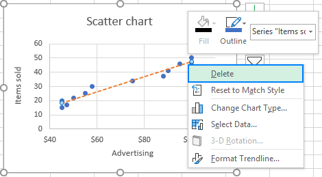
or click the Chart Elements button and uncheck the Trendline box.
In either method, Excel will immediately remove the trendline from the chart.
Here’s the linear trendline formula in Excel:
y=mx+b
To add a trendline in Excel on a Mac:
In Excel, you can quickly add a trendline by selecting your chart and then pressing “Alt” + “J” + “T” on a PC. Or “Fn” + “Option” + “Command” + “T” on a Mac. This keyboard shortcut streamlines the process for convenience.
Excel calculates a trendline using various mathematical methods. For linear trendlines, it uses the least-squares method. This method finds the line that minimizes the sum of squared differences between data points and the line. Other trendline types employ specific equations and algorithms suited to their respective patterns.
Yes. Excel trendlines can project future values based on historical data, helping you forecast trends and make predictions.
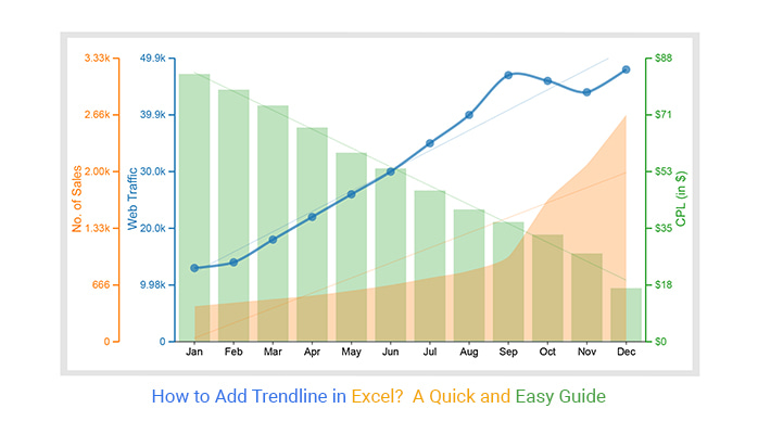
Adding trendlines in Excel is more than just drawing a line—it’s about uncovering patterns, simplifying complex data, and making forecasts that drive decisions. Whether you’re analyzing sales trends, website traffic, or any time-based dataset, trendlines help you identify relationships, predict future values, and communicate insights clearly.
Excel makes it easy to add trendlines with a few clicks, letting you choose from linear, exponential, logarithmic, and other types depending on your data and objectives. However, for more advanced visualization and customization, tools like ChartExpo can provide ready-made trendline charts, saving time and enhancing interpretability.
Mastering trendlines empowers you to turn raw data into actionable insights. Start applying them today and let your data tell its story with clarity and precision.
How much did you enjoy this article?


Discover 11 cool Excel charts and graphs and learn how to turn raw data into clear insights for better analysis, reporting, and decisions.
Learn how to create a Control chart in Excel to track process stability, detect unusual variation early, and improve data-driven decision-making.
Learn how to create and use frequency charts in Excel to simplify data analysis, visualize distributions, and make better business decisions with clear insights.