Categories
When running a business, you find yourself interested in the latest trends in other industries. This can help you stay ahead of the competition.


As a business owner, you also want to familiarize yourself with your business trends over time. All you need is a visualization that can help you with the answers you need.
This is where trend chart examples come in.
They are easy-to-interpret visualizations that help you stay updated with the latest trends. Still, you can keep tabs on your business performance over time.
This blog will help you understand the different trend chart examples you can use to visualize your business data.
Let’s get started.
A trend chart example is a visualization that displays how data shifts over time.
You can easily identify trends in your business which can help you forecast your business’ future. Many forex traders use trend charts to predict future prices of currencies.
Let’s briefly take a look at some trend chart examples.
A Sentiment Trend Chart is a trend analysis graph that visualizes data over time with positive and negative responses. You can use this chart to show a variable trend over time.
You can show customer satisfaction and dissatisfaction levels. The same chart can show a trend and its sentiment simultaneously.

This trend graph example is a line chart that can plot data using multiple axes. You can plot various data sets with different scale ranges and different units.
With a Multi-Axis Chart, you can show trends over time of various variables.

Dual Axis Line Chart uses two axes to display a relationship between two variables of different magnitudes. This relationship is called a correlation.
With this chart, you can uncover hidden insights, such as trends and patterns in your data.

This chart, also known as a line graph with multiple lines, is essential in revealing relationships and trends across multiple datasets. It comprises several data points connected using line segments, allowing for clear visual comparisons and insights into the variations over time.

With the help of trend charts, such as dot plots in Google Sheets, you can easily spot patterns or emerging trends in your business. They can help you embrace changes or take action on various recommendations.
Patterns make sense when you visualize them using trend charts and graphs. You can easily identify correlated parameters.
Trend charts are amazingly straightforward in their use. Your audience can easily understand the data you display and make conclusions.
Due to their simplicity, they can easily compel your audience to take action on your recommendations.
The human brain process processes visual images faster than text. With a trend chart, your brain can process its insights faster than raw data.
This helps your audience make decisions faster and shorten your lengthy business meeting.
One of the objectives of a trend chart is to create a compelling data story for your audience. Your target audience needs persuasion in making decisions.
In persuading your audience to agree with a particular decision, you must show them an engaging visualization. A trend chart can help you communicate engagingly to convey your message.
There are several data trends examples where you can apply trend charts. We will focus on two of the most important ones.
In survey storytelling, you use data insights in trend charts, including Tornado charts, to tell a story to your audience. This story can be about other individuals’ opinions and views regarding a brand or business.
People can have positive sentiments or negative sentiments about a brand. Trend charts such as Sentiment Trend Charts can easily tell if people’s views about a business are either positive or negative.
You can use video data storytelling, including YouTube analytics, to track your metrics and give a compelling data story to your audience.
For instance, you can have a YouTube video, and you want to know how many people like and dislike your video. Leveraging YouTube analytics, combined with a trend graph example, lets you gain insights into how many people liked your video in a specific month.


In the modern world, more tools now help you visualize data effortlessly, saving valuable time when it comes to understanding your numbers. Google Sheets stands out as one of the best spreadsheet tools for creating visuals like a Scatter plot and turning raw data into clear insights.
The solution is to supercharge it with an add-on called ChartExpo. It is an easy-to-use interface that you can use to create numerous trend charts.
With ChartExpo, you can customize your trend charts to align with your data stories. You don’t have to sweat obtaining critical insights from your data.
Let’s assume you own an e-commerce store. You want to see the sentiments of your target market about your brand.
You survey the Thank You Page of your website. You want to know if your customers like or dislike your services in terms of the following:
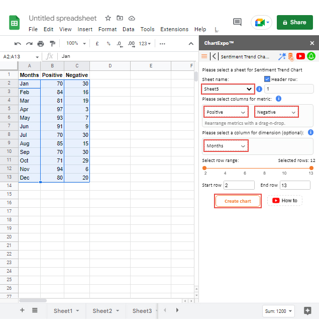
Assume you have arranged your data in the table below.
| Months | Positive | Negative |
| Jan | 70 | 30 |
| Feb | 84 | 16 |
| Mar | 81 | 19 |
| Apr | 97 | 3 |
| May | 93 | 7 |
| Jun | 91 | 9 |
| Jul | 70 | 30 |
| Aug | 85 | 15 |
| Sep | 70 | 30 |
| Oct | 71 | 29 |
| Nov | 94 | 6 |
| Dec | 80 | 20 |
Let’s use one of the trend chart examples in visualizing the above data. Let’s use a Sentiment Trend Chart.
To get started with ChartExpo, install ChartExpo in Google Sheets from this link.
Let’s follow the simple steps below to obtain a Sentiment Trend Chart:


This is an upward or downward pattern in your data in a specified period.
A trend can also help to predict how your business can shift in the future. This can help you take action to ensure your company has a positive direction.
The best way to show trends in a chart is to have all the essential elements of a trend chart. One of the elements is a trend line showing your data’s ups and downs.
An appropriate time frame is also suitable because trends are measured against time.
The best chart for trends is the Sentiment Trend Chart. This chart has the essential elements of a trend chart, and it can help you identify the sentiments of your target market with time.
It contains a trend line that helps you observe your data’s upward and downward trends.
Let’s recap.
In identifying the latest trends and patterns in your business, one of the best charts you can use is a trend chart.
We have answered the question, what is a trend graph? Still, you have learned the various advantages you can gain from using such charts.
You have learned about the various trend chart examples you can use to visualize your data story. The primary focus was on the Sentiment Trend Chart because it is one of the easy-to-use charts.
You have understood the best tool you can use to create trend charts in Google Sheets. You have grasped how to supercharge your Google Sheets add-in called ChartExpo, in which you can access beautiful trend charts.
You have learned from the example how to create a trend chart with ChartExpo. Now it’s your turn to do it by yourself.
Sign up for a 7-day free trial today with ChartExpo and get to give a compelling data story with a trend chart.
How much did you enjoy this article?


Calculate accounts receivable turnover ratio to measure credit collection speed, improve cash flow, and strengthen your financial strategy. Read on!

Change Management KPIs are the key to tracking adoption, performance, and ROI during transitions. Find out which metrics matter. Read on!

Data collection methods and techniques determine the quality of every insight you act on. Explore key approaches for gathering reliable data. Read on!


