• Home
  • Tools dropdown img
    • Spreadsheet Charts

      • ChartExpo for Google Sheets
      • ChartExpo for Microsoft Excel
    • Power BI Charts

      • Power BI Custom Visuals by ChartExpo
    • Word Cloud

  • Charts dropdown img
    • Chart Category

      • Bar Charts
      • Circle Graphs
      • Column Charts
      • Combo Charts
      • Comparison Charts
      • Line Graphs
      • PPC Charts
      • Sentiment Analysis Charts
      • Survey Charts
    • Chart Type

      • Box and Whisker Plot
      • Clustered Bar Chart
      • Clustered Column Chart
      • Comparison Bar Chart
      • Control Chart
      • CSAT Survey Bar Chart
      • CSAT Survey Chart
      • Dot Plot Chart
      • Double Bar Graph
      • Funnel Chart
      • Gauge Chart
      • Likert Scale Chart
      • Matrix Chart
      • Multi Axis Line Chart
      • Overlapping Bar Chart
      • Pareto Chart
      • Radar Chart
      • Radial Bar Chart
      • Sankey Diagram
      • Scatter Plot Chart
      • Slope Chart
      • Sunburst Chart
      • Tornado Chart
      • Waterfall Chart
      • Word Cloud
    • Google Sheets
      Microsoft Excel
  • Services
  • Pricing
  • Contact us
  • Blog
  • Support dropdown img
      • Gallery
      • Videos
      • Contact us
      • FAQs
      • Resources
    • Please feel free to contact us

      atsupport@chartexpo.com

Categories
All Data Visualizations Data Analytics Surveys
Add-ons/
  • Google Sheets
  • Microsoft Excel
  • Power BI
All Data Visualizations Data Analytics Surveys
Add-ons
  • Google Sheets
  • Microsoft Excel
  • Power BI

We use cookies

This website uses cookies to provide better user experience and user's session management.
By continuing visiting this website you consent the use of these cookies.

Ok

ChartExpo Survey


Home > Blog > Google Sheets

How to Make a Line Graph with Multiple Lines in Google Sheets?

Line graphs are arguably among the most straightforward visualization designs you can use to visualize your data in Google Sheets.

You can use them to understand key data points in depth.

how to make a line graph with multiple lines in google sheets

There are three variants of Line Graphs you can use in your data stories, namely:

  • Dual Axis Line Chart
  • Area Line Chart
  • Multi Series Line Chart

It’s relatively straightforward to plot Line Charts with two data columns. However, it becomes a complex process when you have more than two data columns.

You cannot find ready-made Line Graphs in Google Sheets. The spreadsheet tool comes with pretty basic charts that need more time and effort to edit. Besides, Google Sheets lacks a huge chunk of the charts highlighted above.

It turns out you don’t have to do away with Google Sheets. You can supercharge it by installing third-party add-ons to access ready-to-use and visually appealing Line Graphs.

In this blog, you’ll learn the following:

Table of Content:

  1. What is a Line Graph in Google Sheets?
  2. Video Tutorial: How to Create Graph with Multiple Lines in Google Sheets
  3. Why Do we use line graphs in Google Sheets?
  4. Types And Uses of Line Graphs in Google Sheets
  5. How to Make a Line Graph in Google Sheets?
  6. The Line Graph Maker With Multiple Lines in Google Sheets
  7. How to Make a Line Graph with Multiple Lines in Google Sheets?
    • Step 1: Prepare Your Data
    • Step 2: Install Chart Add-in
    • Step 3: Add New Chart
    • Step 4: Select Multi-Series Line Chart From List
    • Step 5: Add Data in Your Chart
    • Step 6: Customizing the Graph
    • Step 7: Final Line Graph With Multiple Lines
  8. Tips to Making a Line Chart With Multiple Lines in Google Sheets
  9. Line Chart With Multiple Lines in Google Sheets: Limitations
  10. FAQs About Google Sheets Multiple Line Graph
  11. Wrap Up

Before we delve right into the how-to guide, let’s explore the significance of visualization designs, such as Line graphs with multiple lines.

What is a Line Graph in Google Sheets?

Definition: A Line Chart is a visualization design that displays information as a series of data points connected by straight lines. You can use the chart to extract trends and patterns insights into raw data.

what is a line graph 009

How to make a Line Graph with multiple lines in Google Sheets should never be a nerve-wracking or time-intensive affair. Keep reading to learn more.

Video Tutorial: How to Create Line Graph with Multiple Lines in Google Sheets?

Why Do we use line graphs in Google Sheets?

  1. Trend Analysis: Line graphs effectively showcase trends over time, allowing users to easily identify patterns, peaks, and troughs in data sets.
  2. Clear Comparisons: They enable straightforward comparisons between multiple data series, helping users visualize how different datasets relate to one another.
  3. Simplicity: Line graphs are easy to understand and interpret, making them accessible for users at all skill levels.
  4. Continuous Data Representation: They are ideal for displaying continuous data, as they connect individual data points with lines, illustrating changes smoothly over intervals.
  5. Dynamic Updates: In Google Sheets, line graphs automatically update when the underlying data changes, ensuring that visualizations reflect the most current information.

Types And Uses-Cases of Multiple Lines Graph in Google Sheets

  1. Dual-axis Line Chart

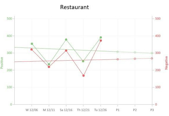
A Dual Axis Line Chart combines a column and line chart to help you compare two variables in your data. The visualization design uses two axes to display the relationships between two variables with varying magnitudes and scales.

dual axis line chart in google sheets 009

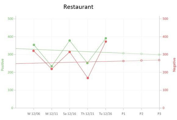
The green lines show positive values (growth) while the red ones show a decline or negative values

Benefits & Uses

  1. You can easily plot the Dual Axis Chart to illustrate the relationship between two different variables in your data.
  2. The chart can display a lot of information with limited space. This means you don’t have to clutter your dashboard with multiple graphs.

How to Make a Line Graph with multiple lines in Google Sheets, such as Dual Axis Charts, should never stress you. Keep reading to learn more.

    1. Area Line Chart

You can use the Area Line Graphs to track changes in your data in a given period. Line Graphs are strategically positioned to track minute changes in variables better than Bar Charts.

area line chart in google sheets 009

Benefits & Uses

  1. The Area Line Chart is incredibly easy to plot and interpret.
  2. Also, the chart can easily be understood by a wider variety of audiences.
  3. You can count on the Area Line Chart if your goal is to extract insights into bulky and complex data sets.

How to make a Line Graph with multiple lines in Google Sheets, such as Area Line Charts, should never stress you. Keep reading to learn more.

  1. Multi Series Line Chart

A Multi Series Line Chart is a visualization design that groups data points based on their values.

line graph with multiple lines 009

Besides, it uses a combination of lines and dots to depict patterns and trends on key variables. You can easily spot the presence or absence of a relationship between two variables in your data. To highlight insights, always use different colors for the markers. Additionally, understanding how to make a graph from a table can enhance your ability to visualize and analyze data effectively.

Multi Series Line Charts are valuable in providing insights into correlations between key variables.

The correlation between the variables is considered to be strong if it’s possible to draw a (nearly) straight line between the markers on the chart. Conversely, if the markers are distributed evenly, the correlation is low or equal to zero.

Benefits & Uses

  • You can easily plot the Multi Series Line Chart to illustrate the relationship between two different variables in your data.
  • The chart can display a lot of information using limited space.

How to Make a Line Graph in Google Sheets?

Step 1: Organizing the Data

To create a multiple-line graph in Google Sheets, first, arrange each data set you want to represent as a separate line in its own column. This ensures Google Sheets can accurately plot the graph.

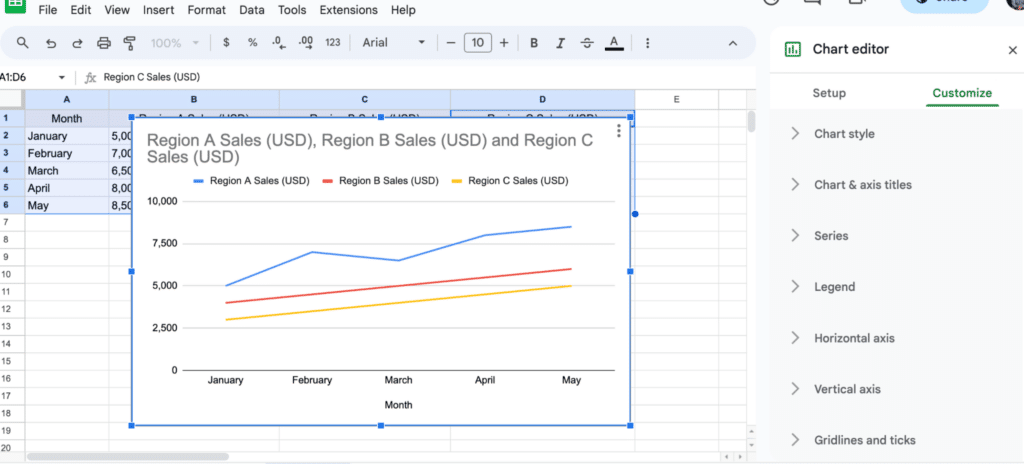
For example, let’s use monthly sales data for three regions (Region A, B, and C).

line graph with multiple lines 1

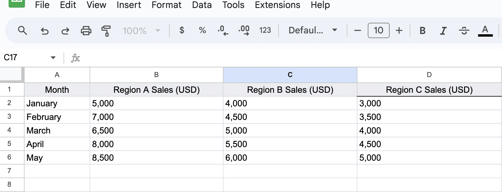
Ensure your data is properly arranged by region, with each column representing a different region. This allows the chart to accurately reflect the data for each region.

Step 2: Creating the Graph

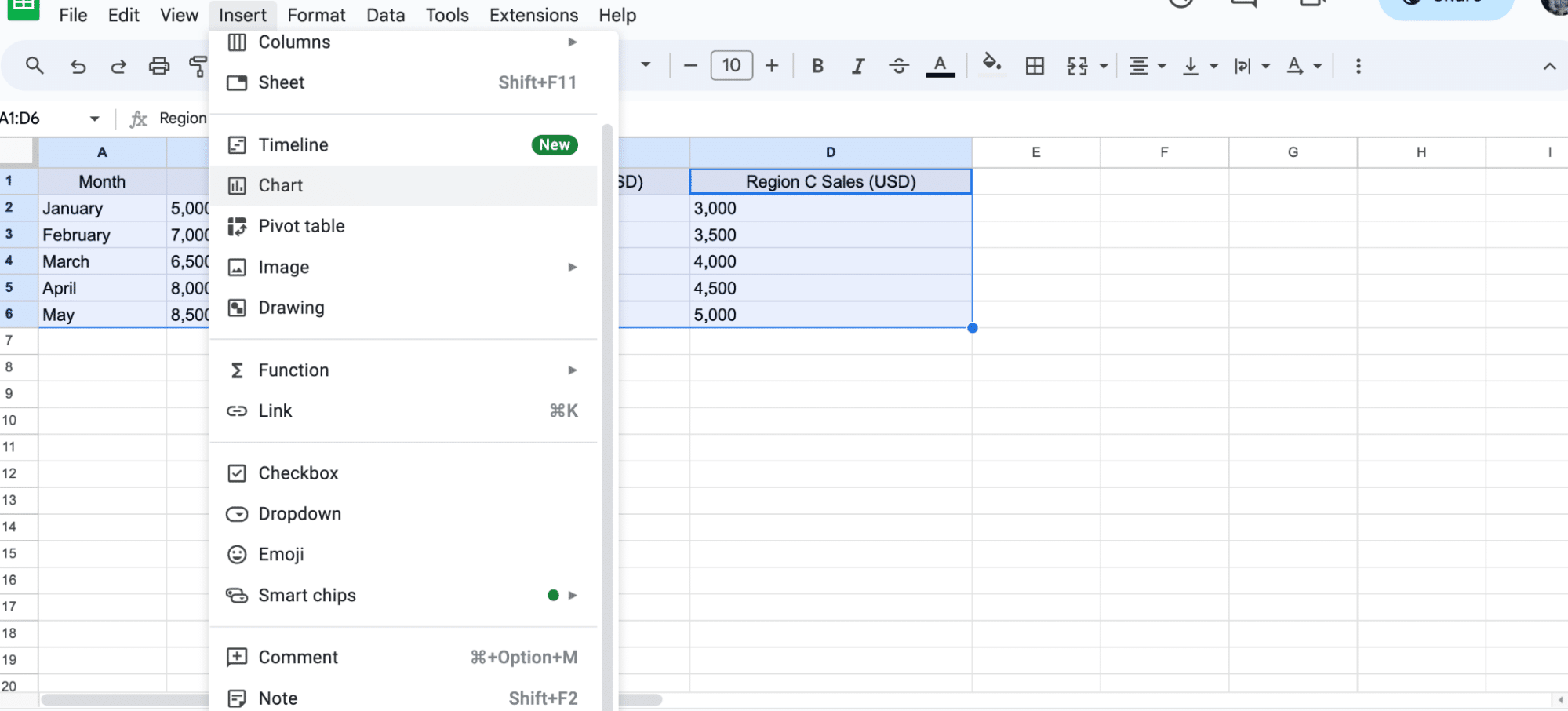
Once your data is ready, select the entire dataset, including all regions.

line graph with multiple lines 2

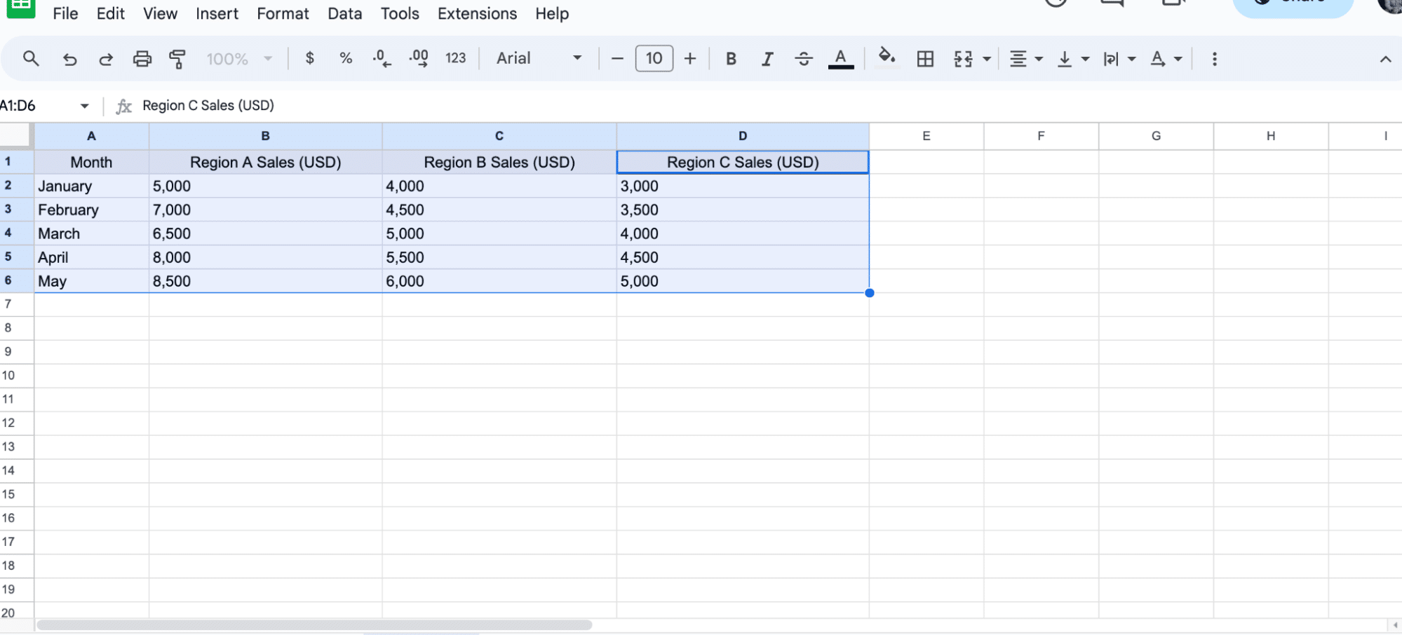
Then, navigate to the top menu and click on ‘Insert’ > ‘Chart.’

line graph with multiple lines 3

Google Sheets will automatically generate a chart based on your selected data.

line graph with multiple lines 4

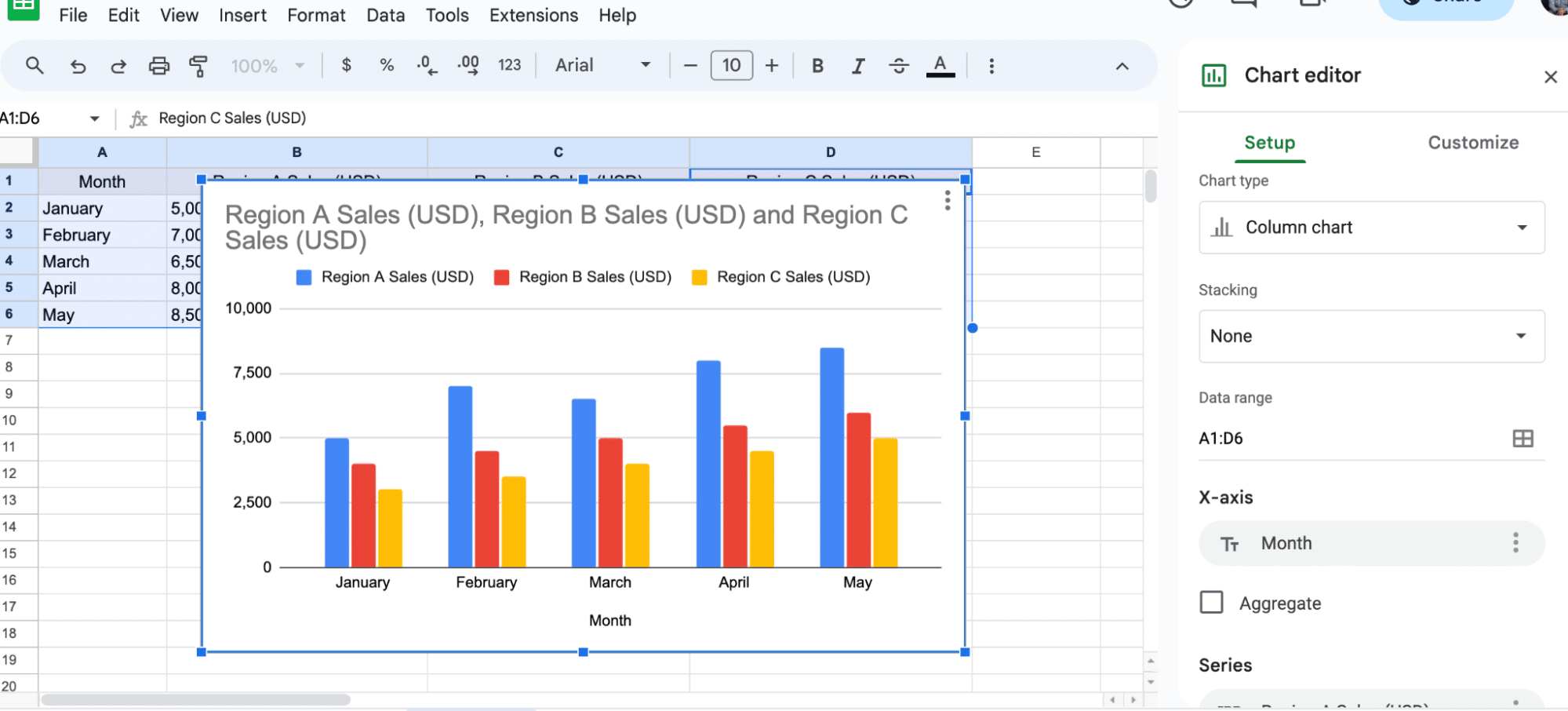
To change the chart type, go to the drop-down menu under ‘Chart type’.

line graph with multiple lines 5

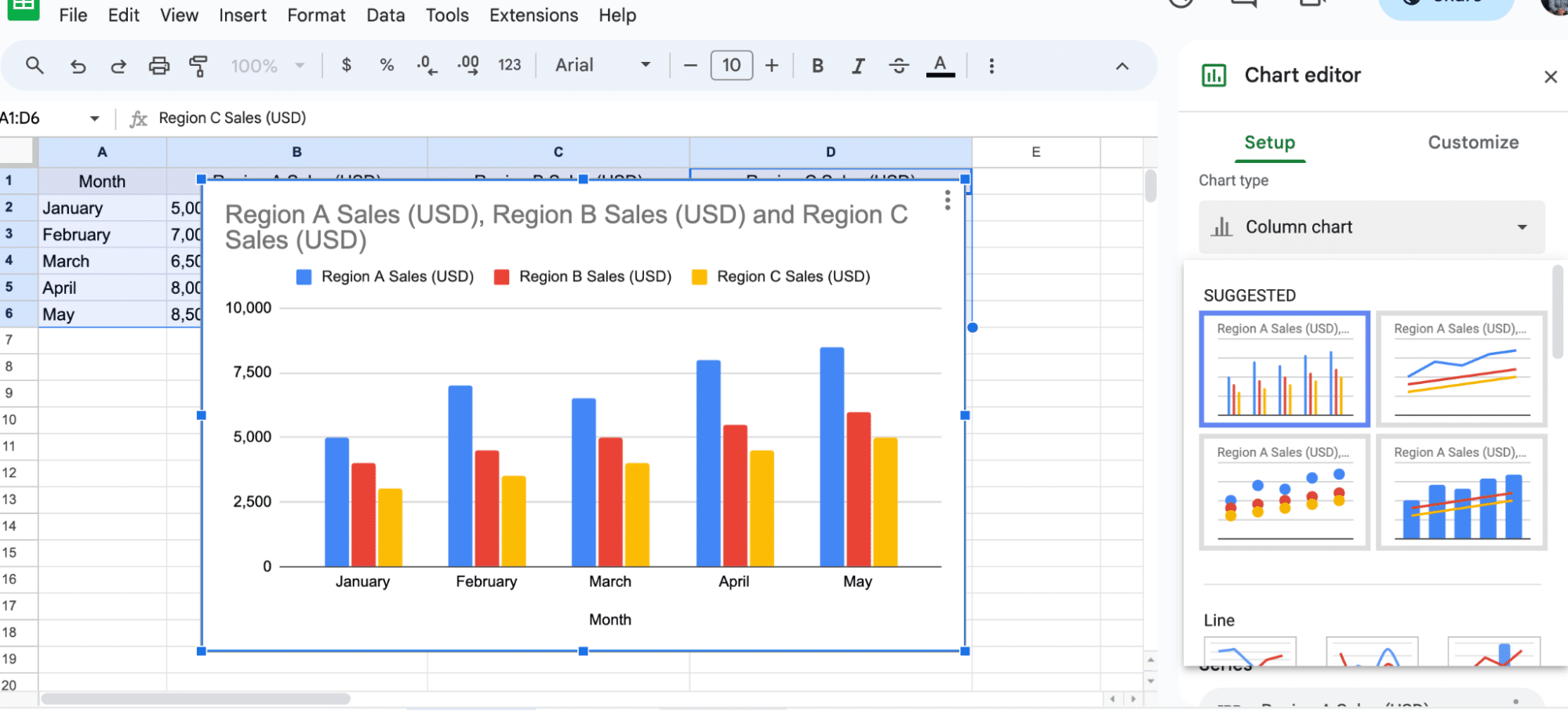
Select a line chart. Your chart will automatically update to reflect the new type.

line graph with multiple lines 6

Step 3: Customizing the Graph

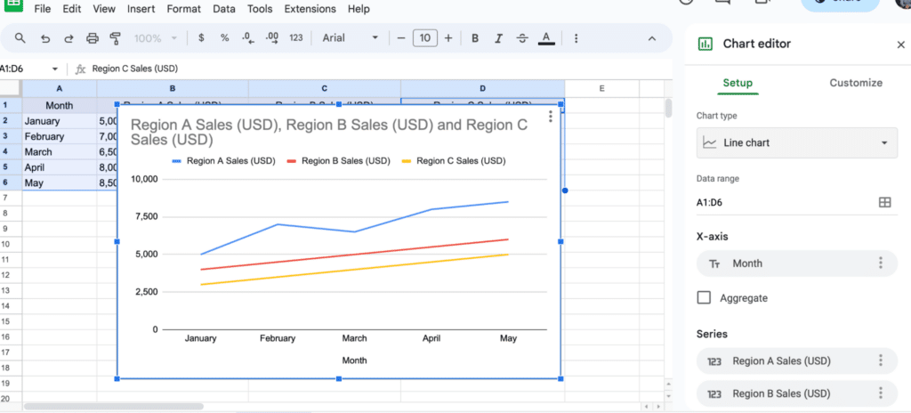
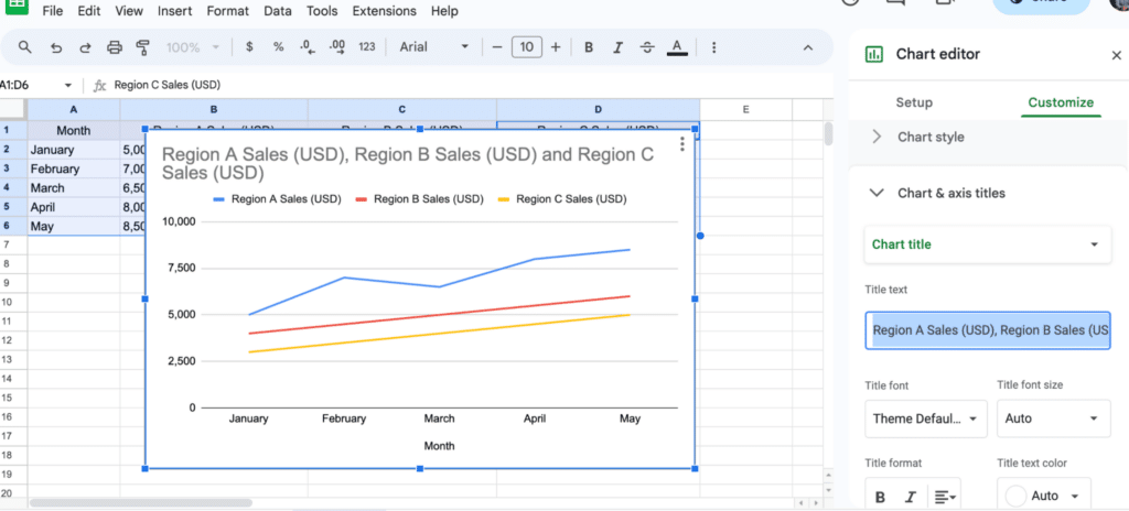
Next, you can customize your graph by adjusting titles, axis labels, and color schemes.

To modify the title, click on the ‘Customize’ tab in the Chart editor.

line graph with multiple lines 7

Under ‘Chart & axis titles.

line graph with multiple lines 8

Change the chart title to ‘Regional Sales Data’ and press enter.

Your chart title will be updated immediately.

line graph with multiple lines 9

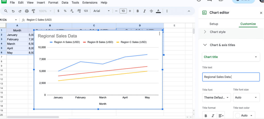
With these steps, you can easily create a visually clear multi-line graph to display your data.

How to make a Line Graph with multiple lines in Google Sheets should never consume your valuable time or even stress you.

The Line Graph Maker With Multiple Lines in Google Sheets

Google Sheets is one of the go-to data visualization tools for businesses and professionals.

However, this freemium spreadsheet tool comes with very basic Line Charts, which require a lot of extra work in terms of editing. Also, it lacks a sizeable number of Line Charts with multiple lines (highlighted earlier).

Well, you don’t have to do away with the spreadsheet app.

You can turn Google Sheets into a reliable data visualization tool loaded with advanced charts by installing third-party apps, such as ChartExpo.

As we said, how to make a Line Graph with multiple lines in Google Sheets should never be a time-intensive task. Keep reading to learn more.

Why ChartExpo?

ChartExpo is a Chart maker that comes as an add-on you can easily install in your Google Sheets.

With advanced visualizations such as Sankey Diagram, Control Chart, Pareto Chart, Radar Chart, and many more, ChartExpo turns your complex, raw data into compelling, easy-to-digest, visual renderings that tell the story of your data.

With just a few clicks, this Line Chart generator produces simple and clear visualization designs.

Yes, ChartExpo generates charts in Google Sheets that are amazingly easy to interpret, even for non-technical audiences.

How to Make a Line Graph with Multiple Lines in Google Sheets?

ChartExpo is a Google Sheets add-on that lightens your data visualization task.

More so, it has a super-intuitive user interface (UI) to provide you easy access to Line Graph with multiple lines, such as Multi Series Line Chart.

As mentioned earlier, Line Charts are best suited for showing trends since changes against time take a linear approach. Population growth, demand forecasts, and units sold are all examples of linear data types.

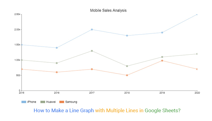
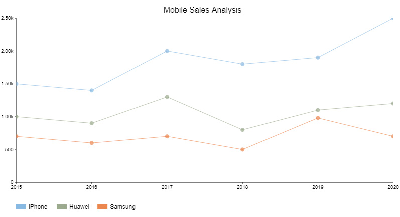
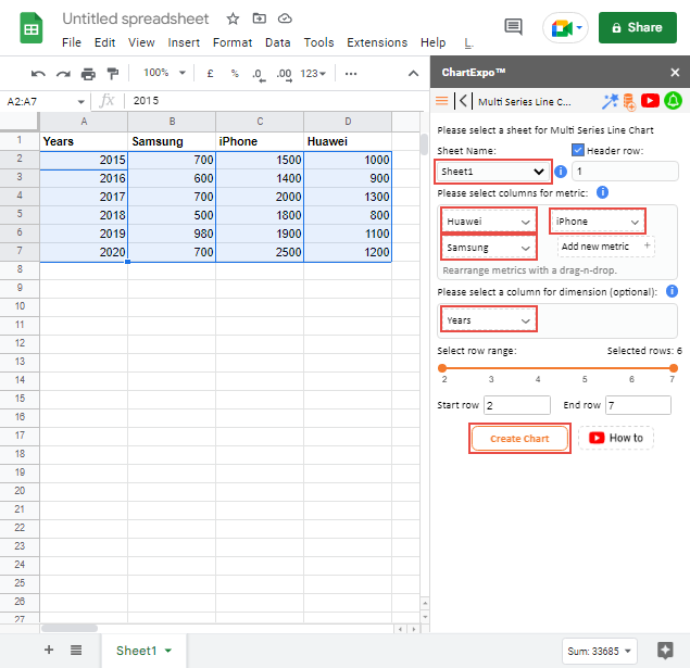
In this example, we’ll use the Multi Series Line Chart to visualize the tabular data below.

Note the table below has more than 2 data columns, which makes Multi Series Line Chart the best-suited visualization design.

Step 1: Prepare Your Data

Year Samsung iPhone Huawei
2015 700 1500 1000
2016 600 1400 900
2017 700 2000 1300
2018 500 1800 800
2019 980 1900 1100
2020 700 2500 1200

Step 2: Install Add-in in Google Sheet

open chartexpo in google sheets

Step 3: Add a New Chart

add new chart in google sheets

Step 4: Select Multi Series Line Chart From List

list of charts graphs google sheets

Step 5: Add Data in Your Chart

search multi series line graph in google sheets 009

Step 6: Customizing the Graph

make a line graph with multiple lines 009

Step 7: Final Line Graph With Multiple Lines

line graph with multiple lines 009

Insights:

  • Between 2015 and 2020, the best-selling mobile phone brand was the iPhone. It’s on an uptrend pattern.
  • Conversely, during the same period, the worst-selling phone brand was Samsung. It’s on a downward trend in terms of performance.

Tips to Making a Line Chart With Multiple Lines in Google Sheets

  1. Organize Your Data: Structure your data with categories in the first column and values in adjacent columns. This helps Google Sheets accurately interpret your data.
  2. Use Clear Labels: Clearly label your x-axis and y-axis. Descriptive titles enhance understanding and make it easier for viewers to grasp what the chart represents.
  3. Choose the Right Chart Type: Select the “Line Chart” option from the Chart Editor. Google Sheets offers various line chart styles, including smooth lines or markers, to enhance readability.
  4. Customize for Clarity: Utilize customization options to adjust colors, line thickness, and data point markers. This improves visual appeal and helps emphasize key data points.
  5. Add a Legend: If your chart includes multiple data series, include a legend to identify each line. This is crucial for clarity and helps users understand the data set corresponding to each line.

Line Chart With Multiple Lines in Google Sheets: Limitations

  1. Data Size Limitations: Google Sheets has a limit on the number of rows and columns, which can restrict the amount of data you can visualize.
  2. Customization Constraints: While Google Sheets offers basic customization options, it lacks advanced charting features found in specialized data visualization software, limiting design flexibility.
  3. Performance Issues: With larger datasets or complex charts, Google Sheets may experience performance lags, leading to delays in rendering charts or interacting with the data.
  4. Limited Chart Types: Google Sheets primarily supports standard line charts and a few variations. More complex visualizations, like dual-axis line charts or combination charts, may not be easily achievable.
  5. Data Refresh: Unlike some dedicated analytics tools, Google Sheets doesn’t automatically update charts with real-time data unless manually refreshed, which can hinder dynamic reporting.

FAQs About Google Sheets Multiple Line Graph

What is meant by the Line Diagram?

A Line Graph is a graphical display of information that changes continuously over time. Within the chart, there are various data points connected by a straight line.

You can use the visualization type to track continuous changes in key variables within your raw data.

What is the Line Chart in statistics?

A Line Chart is a visual comparison of two or more variables displayed on the x and y-axes on a Cartesian plane.

Use this chart if you want to emphasize changes in values for one variable (plotted on the vertical axis) relative to a second variable (plotted on the horizontal).

Wrap Up

What is a Line Graph?

Well, it’s a visualization design that you can use to display relationships and pattern insights into your raw data.

There are 3 variants of Line Graphs with multiple lines you can leverage in your data analysis, namely:

  • Dual Axis Line Chart
  • Area Line Chart
  • Multi Series Line Chart

Let’s talk about Google Sheets because it’s one of the most popular spreadsheet apps around. The aforementioned spreadsheet application comes with pretty basic Line Charts, which require extra time in terms of customizations.

How to Make a Line Graph with multiple lines in Google Sheets should not stress you or consume your valuable time.

There’s an add-on that supercharges Google Sheets to produce ready-made and visually stunning Line Graphs. This easy-to-use and affordable tool is called ChartExpo.

So why do over 40,000-plus users love ChartExpo?

  • ChartExpo comes loaded with over 50 charts all for just $10 a month.
  • This incredibly affordable tool has a full set of tools, including a graph maker, chart templates, and a data widget library, you can easily create data visualizations of different types

Sign up for ChartExpo today to create ready-to-use and visually stunning Line Graphs with multiple lines.

How much did you enjoy this article?

GSAd1
Start Free Trial!
117756

Related articles

next previous
Google Sheets9 min read

Google Workspace Marketplace for Boosting Insights

Google Workspace Marketplace provides apps to enhance Gmail, Drive, and Docs. Learn about this tool and how to improve data visualization and analysis.

Google Sheets12 min read

Google Sheets CRM Templates for Insightful Decisions

Google Sheets CRM templates help businesses track contacts, sales, and customer data. Learn their benefits, setup steps, and expert tips to boost efficiency.

Google Sheets10 min read

Histogram Chart in Google Sheets: A Quick Walkthrough

A Google Sheets Histogram makes data visualization simple by revealing patterns. Learn how to create, customize, and optimize histograms for better insight.

Google Sheets10 min read

Google Sheets Amortization Schedule with Clear Visuals

A Google Sheets Amortization Schedule tracks loan payments, interest, and balances. Learn how to create your schedule for better loan management.

Google Sheets11 min read

Google Sheet Profit and Loss Template for Financial Success

Google Sheet profit and loss template simplifies tracking income and expenses. Learn tips and steps for using this template for better financial management.

ChartExpo logo

Turn Data into Visual
Stories

CHARTEXPO

  • Home
  • Gallery
  • Videos
  • Services
  • Pricing
  • Contact us
  • FAQs
  • Privacy policy
  • Terms of Service
  • Sitemap

TOOLS

  • ChartExpo for Google Sheets
  • ChartExpo for Microsoft Excel
  • Power BI Custom Visuals by ChartExpo
  • Word Cloud

CATEGORIES

  • Bar Charts
  • Circle Graphs
  • Column Charts
  • Combo Charts
  • Comparison Charts
  • Line Graphs
  • PPC Charts
  • Sentiment Analysis Charts
  • Survey Charts

TOP CHARTS

  • Sankey Diagram
  • Likert Scale Chart
  • Comparison Bar Chart
  • Pareto Chart
  • Funnel Chart
  • Gauge Chart
  • Radar Chart
  • Radial Bar Chart
  • Sunburst Chart
  • see more
  • Scatter Plot Chart
  • CSAT Survey Bar Chart
  • CSAT Survey Chart
  • Dot Plot Chart
  • Double Bar Graph
  • Matrix Chart
  • Multi Axis Line Chart
  • Overlapping Bar Chart
  • Control Chart
  • Slope Chart
  • Clustered Bar Chart
  • Clustered Column Chart
  • Box and Whisker Plot
  • Tornado Chart
  • Waterfall Chart
  • Word Cloud
  • see less

RESOURCES

  • Blog
  • Resources
  • YouTube
SIGN UP FOR UPDATES

We wouldn't dream of spamming you or selling your info.

© 2025 ChartExpo, all rights reserved.