Categories
Data visualization is essential to any business. Why? It can help you communicate a clear message to your audience. In this case, your audience can be potential investors and customers.

When you use charts to simplify your complex data story, you will achieve better results by the end of the day. In this context, our focus is on charts and graphs that show trends over time.
In assessing your business’s progress over time, it is essential to have a chart for trends. It can help you interpret results to know what points to improve.
Therefore, you must research extensively in seeking the best chart for your business analysis. You will need a chart to show growth. You need to ask yourself, why do I need this chart? Will it help assess my business progress?
This blog will help you answer these questions. You will learn about the best chart to show trends over time.
Let’s get this journey started with some essential topics.
This visualization is the best chart to show trends over time.
As a business person, you can use this visualization to emphasize a difference in your business over time.
Line charts contain two variables. One is on the vertical axis, and the other is on the horizontal axis. When analyzing your data, the vertical axis variable is always constant, while the horizontal axis variable changes with time.
You can use a line chart to show that change is taking place in your enterprise. The line on the chart will move from left to right. When changes take place, the slope can either move up or down.
The variables in your business that change with time will be on the horizontal axis. This is essential so that it helps you measure your business trend with time.
For more complex relationships, such as interactions between different variables or departments, a Chord diagram can be employed to visualize the flow and connections, providing deeper insights into how changes in one area impact others
In your data analysis, you can determine the interval size depending on the data you have. On the other hand, the vertical axis will comprise a statistical summary, such as the average value of variables in the horizontal axis. When using a slope chart, this approach can help visualize changes and trends effectively.
Examples of line charts include:
Below is an example of a Multi-Axis Line Chart.

Below is an example of a Multi Series Line Chart.

Below is an example of a Dual Axis Line Chart.

A combo chart is a visualization that can combine two line graphs, one column graph, or a column chart and a line graph. It is the best graph to show trends over time.
You can make a combo chart with one or more datasets displaying common insight. Combo charts answer your data questions: What are the trends for categorical data?
Combo charts include information that is relevant to your analysis. These charts can effectively double or triple your insights for your audience. They are one of the best ways your audience can identify trends over time.
Some of the combo charts include:
Below is an example of a Sentiment Trend Chart.

Below is an example of a Line with an Area Chart.

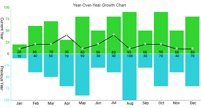
Below is an example of a Double Axis Line & Bar Chart.

A comparison chart is a diagram that shows the differences and relationships between particular quantities.
You can use a Comparison Chart to compare key data points in your data story. It is considered the best graph to show profit and loss and is also useful for trend analysis.
For instance, you can compare sales revenue and profits in a specific period. This will help you to understand the variables in your business that are helping you grow.
As a customer, you can use a comparison chart to compare different products before buying them. For example, you can compare the price of one product with other brands before purchasing.
That’s not all.
You can also use comparison charts in digital marketing. For instance, you can compare attribution sources to establish the primary traffic source.
Some of the comparison charts include:
Below is an example of a Radar Chart.

Below is an example of a Comparison Bar Chart.

Our example analyzes different furniture sales from January to December.
Below is a table showing sales of different furniture assets.
| Months | Sales | Discount |
| Jan | 261988 | 13 |
| Feb | 340101 | 15 |
| Mar | 311109 | 11 |
| Apr | 324322 | 16 |
| May | 274149 | 13 |
| Jun | 303201 | 16 |
| Jul | 286410 | 15 |
| Aug | 255421 | 16 |
| Sep | 301838 | 14 |
| Oct | 261933 | 10 |
| Nov | 321448 | 15 |
| Dec | 308679 | 13 |
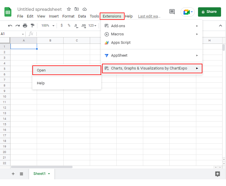
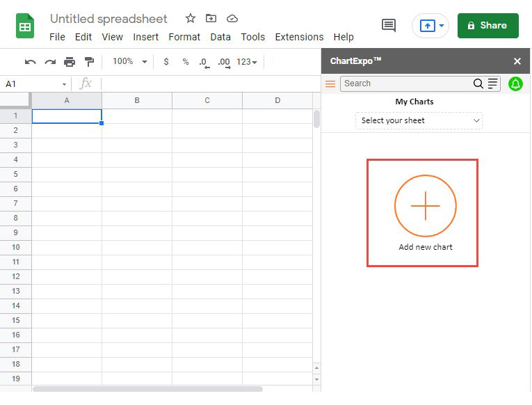
Start by Installing ChartExpo in your Google Sheets add-on by clicking on this link.


Then, scroll through the numerous chart templates until you see the Dual Axis Line Chart.


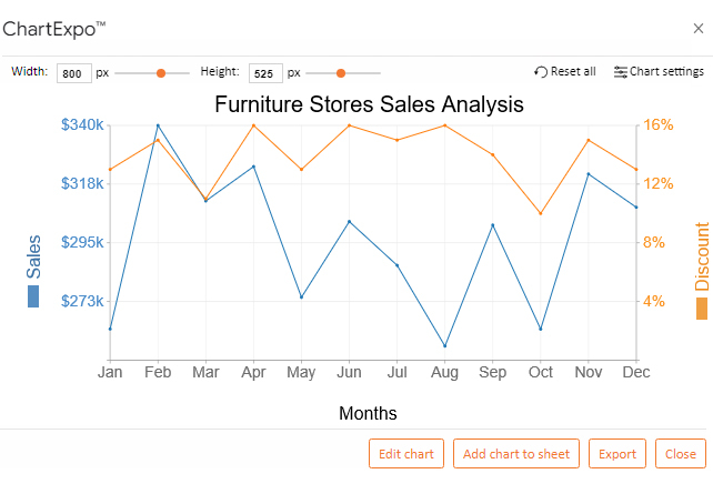
What are some of the insights we can obtain from our dual-axis line chart? Let’s find out.
The data in the table shows the furniture sales in different months.
The dual-axis line chart allows us to easily see trends over time between the months.
It’s as easy as that. We now have the best chart for trend analysis.
Let’s identify some simple guidelines to help you choose the best chart to show trends over time.
For your data presentation to be effective, it is crucial to identify your audience. With this in mind, you will know the type of data visualization to present to them.
If your audience comprises skilled execution marketers, it becomes easy for you to present charts and graphs because they are already familiar.
You cannot present a chart that your audience cannot comprehend. It becomes confusing to track trends over time. To address this, consider using one of the best graphs for showing trends, and explore chart add-ins for Excel Mac to enhance your charting capabilities.
Therefore, you need to present a straightforward visualization when dealing with a general audience. You will need the best chart to show change over time like a dot plot. Some of these charts include:
These charts are simple, and you can use them for your general audience another option is a funnel chart.
On the other hand, you can use these charts for an experienced audience:
Data visualization will require your skill in using colors effectively. If you are a marketer, you can understand how essential colors are in determining your brand.
It becomes easy for the public and your clients to recognize your brand because of the colors you identify yourself with. Your audience will also acknowledge you with the data as your brand.
When you visualize your data for your audience, retain your color schemes. The graphs and charts you use in your presentation must have an effective color scheme.
This strategy can help your audience identify different trends over time. Why? It’s because you distributed your brand colors on other variables. In creating the best chart to show trends over time, choose colors wisely.
Let’s now take a look at some of the compelling ways you can show change over time.
When you plot your best chart to show change over time, let zero be the starting point at the baseline. This strategy will help your audience see a variation in bar lengths.
A zero baseline will help your audience compare various bar lengths. They can see the change over time and will conclude that the data you present is credible.
A challenge can arise if your chart has a scale gap, especially when figuring out how to plot a graph from a table. Your audience cannot tell which is the starting point, leading to misrepresentation.
Why? Your bar lengths and actual values are not in harmony. This will lead to your audience making inaccurate conclusions about your presentation.
When presenting your data with a trend over time, you must show your audience that change is progressive.
In plotting your data, you must decide on the order your bars will follow. In most cases, you will find data analysts using the longest bars and the start and the shortest bars as you approach the end.
However, your audience can compare the bar lengths regardless of the order they follow. It can take your audience time to track progress over time. That is why you must sort your bars so that your audience does not move their eyes back and forth in tracking trends over time.
When using the best graph to show change over time, it is essential to use color effectively. Excel and Google Sheets help you use various colors in your charts.
When you don’t use colors effectively, you can distract your audience. They can interpret the colors you used inappropriately, which will not help you communicate your insights.
To avoid such cases, you must use colors effectively. When you want your audience to focus on a particular timeframe in your business, use a different color from your default color.
Your goal is to ensure that your data presentation is straightforward. This strategy helps your audience understand your insights.
How you arrange your bars in your charts is integral in making your presentation simple. Only in a natural order, such as age and time, will your bars appear in ascending or descending orders of data values.
It is also essential to avoid using alphabetical setups in arranging your bars.
In your best chart to show trends over time, avoid using many labels on your visualization. It will make it untidy and challenging for your audience to follow.
You must eliminate irrelevant elements unrelated to the insights you want to communicate. It would help if you labeled every bar in your chart with what it represents.
This strategy will help your audience identify trends over time with ease. Your visualization will have no visual clutter and look appealing to your audience.
You must have a reasonable chart size in your best charts to show trends. Have a standard width for each of your bars.
Also, have a consistent space between your bars. Your audience will easily track changes over time in your topic of interest.
The line chart shows trends over time. They include:
Combo Charts show trends over time. They include:
Comparison Charts include:
A line chart is the best way. Many data analysts prefer line charts to other graphs.
This is because line charts show differences in variables. They compare data and show trends by revealing highs and lows. A line chart is your best pick for displaying your business trends over time.
In a nutshell, we have realized that it is not easy to interpret raw data. This is because it has no structure, so you cannot identify trends over time.
However, we have seen the importance of using line graphs in displaying changes over time. Straight lines connect the data points in your line graphs. These lines can help you observe an increase and decrease in sales over time.
As a business person, you must use line charts to track the trends of your business with time. You can make future predictions for your business with a line chart.
Your interest should be communicating meaningful insights to your audience. Ensure that you use the effective methods we have discussed, such as a zero baseline and effective use of colors.
With the help of ChartExpo, you can access several line charts for your data analysis. You can access the best chart to show trends over time.
Now it is your turn to give it a go. Start a 7-day free trial and access the best graphs to show trends in your business.