Categories
By ChartExpo Content Team
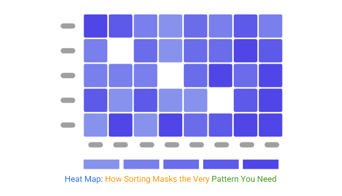
You thought you saw the spike. Turns out, you saw the sort.
That’s the kind of trick a heat map can pull without blinking. Sort the rows, and what looks like a clear trend is often nothing but a reshuffle. That red block you panicked over? Might be old. Or filtered wrong. Or worse, sorted for visual pop, not decision flow.
A heat map feels exact. It looks sharp, structured, and smart. But it lies fast. Smooth gradients blur cliffs. Bright colors scream urgency without backing it up. Your team sees a pattern and starts acting. But there’s no pattern. Just noise that looked neat.
A heat map isn’t built to impress. It’s built to guide action. But when you sort for beauty, group rows manually, or bend an axis to tell a cleaner story, you wreck the whole point. You kill trust. And if you need to explain every tile, you’ve already lost the room.
This guide shows how heat maps go wrong. And how to make them work.
You think you’ve nailed it. The data seems to spell out a clear story, a path that screams “follow me.” But then reality hits. You realize you’ve been chasing shadows, patterns that only masquerade as truth. It’s the classic case of mistaking noise for signal, where your grid whispers sweet nothings that lead nowhere significant. You thought you saw it, but it wasn’t there at all.
This happens when the grid looks too perfect, too neat, and too convincing. It’s like seeing a mirage in the desert and believing it’s an oasis. The truth lies in the details, the anomalies that don’t fit the pretty picture. Those are the real gold, the moments when the grid breaks and reveals what’s hiding underneath. It’s about embracing the chaos, and the messiness, and finding the pattern that truly matters.
| Heat Map Noise vs Actionable Signal | ||
| Visual Pattern | Validation Result | Signal Type |
| Random checkerboard pattern | No statistical correlation | Noise |
| Diagonal warm-color trend | Linked to row sort order | Noise |
| Sudden cold tile in Q3 | Matches reported outage | Actionable Signal |
| Wavy color variation across segments | Caused by seasonal grouping | Noise |
| Red spike in churn rate | Aligned with feedback spike | Actionable Signal |
| Alternating intensity in region tiles | Due to manual grouping | Noise |
| The sharp dip in usage tile | Matches system downtime log | Actionable Signal |
| Horizontal streak of red | Visual artifact from resolution | Noise |
| Concentrated dark tile on revenue | Confirmed drop in product line | Actionable Signal |
| Mirrored green-blue shifts | No data source supports symmetry | Noise |
Sorting can be a double-edged sword. You arrange everything neatly, thinking it clarifies the chaos. Then comes the moment of clarity, the spike is just a trick of the sort order. It’s like rearranging your bookshelf and thinking you’ve read more than you have. You’re left with a polished look that hides the messy reality of uneven data.
When you sort, you risk imposing order where there is none. The real insight often hides in the unsorted, raw view that exposes true spikes and troughs. That’s where the real value lies, in the jagged, the unpredictable, the raw reality that a sort tries to smooth over. You need to let the data breathe in its natural state to see where it truly peaks.
Ever rearranged your bookshelf, only to realize you can’t find a thing? That’s what happens with one misplaced column. Suddenly, everything reads backward, and what once made sense becomes a jumble. It’s a simple slip, but the impact is profound: a single column out of place, and your whole narrative flips.
This isn’t just about neatness; it’s about integrity. That column was a linchpin, a piece of the puzzle that held everything together. Without it, the rest crumbles and becomes noise. The fix? A new perspective. Sometimes, you’ve got to step back and let the data guide you, not the other way around. When the pieces fall into place, it’s not just alignment; it’s clarity.
Red screams urgency, but it’s not always right. People see red and panic, thinking something needs fixing. The color isn’t the problem; it’s the lack of context. Without clear action points, that red just sits there, inciting stress rather than solutions.
Why does this matter? Because decisions shouldn’t be made on color alone. It’s like having a fire alarm without a fire. The real power lies in understanding what the data says. The numbers should be the focus, not the palette.
| Visual vs. Actionable Heat Maps | ||
| Visual Cue (Heat Map Tile) | Initial Emotional Interpretation | Actual Data Insight |
| Bright Red in Q2 Revenue Tile | Urgent revenue drop | Seasonal dip, within expected range |
| Dark Blue in Support Tickets Tile | All clear, low ticket volume | Data lag due to reporting delay |
| Yellow Spike in Churn Rate Tile | Moderate concern | Sharp churn increase requires escalation |
| Red Tile in Server Uptime Tile | System failure alert | Planned maintenance window |
| Orange Cluster in User Signups | Potential marketing success | Skew from referral promo spike |
| Green Gradient in Cost per Acquisition | Optimized performance | Under-reporting due to a misclassified source |
| Faded Purple in Sales by Region | Stable market behavior | Missed territory update, now outdated |
Fancy grids can fool at first glance. They look complete, like a masterpiece on a gallery wall. But then comes the question that exposes their emptiness: “What now?” Without actionable insights, it’s all for show.
Imagine presenting a stunning chart, only to falter when probed for details. It’s the difference between having a map and knowing how to use it. A grid needs to point the way to action, not just sit pretty.
Ever told someone to glance at your perfect grid, only to see them never return? It’s not their fault. If the grid doesn’t speak volumes, they’ll move on. A quick look should ignite curiosity, not apathy.
The goal is to create something that sticks, that demands a second look. When the grid fails, it’s a sign that it didn’t offer enough value. It should be a call to action, not a fleeting thought.
Urgency isn’t about bright colors; it’s in the data itself. Ratios tell the story, revealing where attention is needed. A bold color might catch the eye, but it’s the numbers that drive action.
When the ratios are right, the grid becomes a tool for decision-making. It highlights priorities and demands where they’re needed. Colors can mislead, but numbers keep things real, steering the conversation toward meaningful action.
| Heat Map Color Intensity vs Real Urgency | ||
| Heat Map Color Intensity | Metric Value | Actual Urgency Level |
| Bright Red | Error rate: 1.2% | Low (below threshold) |
| Soft Yellow | Churn risk: 18% | Moderate (approaching action level) |
| Deep Orange | Server latency: 240ms | Low (within SLA) |
| Light Green | Satisfaction score: 3.5/5 | High (needs attention) |
| Dark Blue | Revenue change: -11% | Critical (unexpected drop) |
| Muted Pink | Support tickets: 22 | Low (weekly average) |
| Vivid Purple | Retention rate: 82% | High (very positive) |
| Bright Yellow | Bug reports: 5 | Moderate (product launch week) |
| Intense Red | Conversion rate: 3.1% | Critical (below target) |
| Pale Orange | Marketing spend variance: 2% | Low (controlled variance) |
Ever tried to make a grid look pretty only for it to mislead everyone? Those neat bins you set up might look good, but they often hide the real story. A splash of color here and a tidy row there, and suddenly, the behavior you needed to see is lost. Sure, the grid gets a nod for aesthetics, but when it comes to explaining actual dynamics, it falls flat.
When you focus on appearance over function, crucial behavior patterns slip through the cracks. It’s tempting to arrange data for visual appeal, but that’s not the goal. You want insights, not just eye candy. When behavior gets sidelined, decisions based on those grids often miss the mark, leaving everyone scratching their heads in the next meeting. Get the behavior first; let the beauty follow.
Grouping similar rows can be a trap. You think you’re simplifying, but in reality, you’re masking differences that matter. Manual grouping sounds like control, but it often leads to a false sense of understanding. Those rows that look alike? They might hold the key to the insights you’re missing.
When rows are grouped manually, subtle but vital distinctions can disappear. It’s like trying to fit every piece into the same puzzle shape. The problem is, not every piece belongs there. These misleading rows can lead to decisions that don’t align with reality. They promise clarity but deliver confusion, making decision-makers second guess what they thought they understood.
Axes are tricky. You tweak them to fit your narrative and then forget the adjustments. But when someone else reads your grid, the narrative collapses. The axis trick you used to highlight certain data can backfire when it distorts the actual story. You thought you were clarifying, but now it’s just chaos.
When the axis gets manipulated, even unintentionally, the whole data set can become skewed. What seemed like a small change can lead to significant misunderstandings. It’s like setting a trap for yourself. The next time the grid is shared, everyone’s left puzzled, and it all leads back to that forgotten tweak. It’s a lesson in humility, never underestimate the power of an overlooked axis adjustment.
| Axis Settings and Heat Map Distortion | ||
| Axis Configuration | Data Displayed | Distortion Effect |
| Y-Axis: 0 to 100% | Conversion rate: 5% to 15% | Trend appears minor |
| Y-Axis: 5% to 15% | Conversion rate: 5% to 15% | Trend looks extreme |
| X-Axis grouped by month | Sales spikes in March | Trend smoothed out |
| X-Axis grouped by week | Same sales data | Spikes become visible |
| Logarithmic scale on Y-Axis | Traffic growth | Sudden jumps look flat |
| Linear scale on Y-Axis | Same traffic data | Growth appears exaggerated |
| Y-Axis flipped | Revenue drops | Drop shown as rise |
| Custom Axis: 20 to 40 | Metric range: 18 to 45 | Edge data clipped or lost |
| Auto Axis Scaling | Support ticket volume | Minor fluctuations look major |
| Fixed Axis: 0 to 100 | Same support data | Visual differences minimized |
Color ramps can be a sneaky culprit. They make sharp data changes look as smooth as butter. You’re looking at a cliff, but the ramp turns it into a gentle slope. The eye sees what it wants, not what’s real. It’s like taking a mountain and making it look like a hill. Suddenly, your critical drop-off is a mild decline. That illusion isn’t harmless. It leads to bad calls, and nobody wants to explain that mistake.
You might think a color ramp is helping. It’s not. It’s masking the truth. It makes tiny changes look big, and big ones look tiny. Your audience sees a gentle shift, not the jarring drop-off it is. Decisions based on these illusions? Dangerous. They can send projects in the wrong direction while everyone thinks they’re on track.
Contrast is supposed to highlight. Without labels, it’s like putting a spotlight on the wrong actor. Your eyes go where the contrast is, but without direction, it’s misleading. It’s like a map without street names. You think you know where you’re going, but you’re lost. Decisions are made on what stands out, not what’s important.
Even the best contrast needs context. You see a dark spot, assume it’s crucial, but it’s just a distraction. It’s like mistaking a shadow for a hole. You guide your team towards it, only to find it is nothing. This not only wastes time but erodes trust. The team starts questioning every call, and soon, they’re questioning you.
Legends are there to guide, but they can’t fix what’s fundamentally wrong. If your data’s off, a legend’s just lipstick on a pig. It won’t change the fact that people are seeing what they want, not what’s there. Just because it’s labeled doesn’t mean it’s understood. You might label the pieces, but if the map’s wrong, the whole thing’s a puzzle missing its key.
Assumptions can break everything. You think you’ve got clarity, but you’re building on sand. Legends give meaning to colors but can’t correct faulty foundations. They can’t explain away contradictions or fill gaps in understanding. Instead, they can make errors look legit, and that’s a problem nobody wants to face.
Gradients are meant to show flow, but without context, they’re misleading. They smooth out the bumps and make everything look seamless. But life isn’t seamless, and neither is data. Without knowing the story behind the gradient, you’re left guessing. It’s like reading a book with missing chapters. You fill in the blanks with assumptions, not facts.
Context is king. Even the prettiest gradient can’t stand alone. It needs a narrative, a reason for its existence. Without it, you’re painting by numbers but missing the picture. People don’t ask about the gradient. They ask why it matters. Without context, you’re left explaining, not showing. And in high-stakes meetings, showing wins every time.
Ever been in a meeting where you’re pointing at every single tile, hoping the message sticks? It’s a sign the grid missed the mark. When you find yourself explaining each piece, it’s like handing out a map with no legend. The audience should be able to see the story without a guided tour.
The key is self-explanatory design. Each tile should leap out with its tale, no footnotes are needed. When the grid speaks for itself, your audience isn’t just passive, they’re engaged. They nod, they get it, and they move on to what matters. Your job? Make sure they don’t need you to decipher the message.
Picture this: a grid with more colors than a painter’s palette. Too many shades can turn clarity into chaos. Instead of highlighting differences, it blurs them. When everything screams for attention, nothing truly stands out. It’s like a symphony where every instrument plays at once.
Simplify the palette. Choose colors that guide the eye, not overwhelm it. A few strategic shades can tell a more compelling story than a rainbow ever could. When the grid speaks with fewer colors, the message finds its voice. The result? Clearer insights and fewer questions from the room.
Quiet grids have a way of sneaking up on you. They don’t shout for attention, but once you see them, they’re unforgettable. It’s the subtlety that makes them powerful. Instead of blaring the obvious, they whisper what’s important, and those whispers become impossible to ignore.
The simplicity of a quiet grid is its strength. It doesn’t need volume to be heard. When your data doesn’t try too hard, it allows the real patterns to emerge. And in that simplicity, it commands respect. The room doesn’t fill with questions; it fills with understanding.
Clarity isn’t about dumbing down. It’s about making the truth visible at a glance. A well-designed grid doesn’t need bells and whistles; it needs precision. When everyone in the room can see the data’s story without a hint, you’ve hit the mark.
The goal is to make complexity look straightforward. It’s not about stripping down detail, but presenting it in an inherently obvious way. When your grid achieves this, it doesn’t just inform, it enlightens. And that’s when you know you’ve created something valuable.
When you’re in strategy, you’re all about seeing the big picture. Those patterns, trends, and flow? That’s your bread and butter. You need a tool that paints the broad strokes without missing the small details. But operations? They’re hunting for outliers. That one hiccup throws off the whole process. They need a map that highlights anomalies, not just the general flow. Each team has its lens, and the trick is crafting a tool that fits both visions.
Here’s the kicker, trying to serve both strategy and ops with the same view might leave both feeling underserved. You want clarity, but you also want specificity. That’s where a well-designed, tailored view comes into play. It’s like handing over a magic lens that reveals exactly what each team needs without cluttering the view with unnecessary noise. That’s where the real power of customization steps in, delivering exactly what’s needed to each user.
Finance and product teams are different beasts. Finance sees numbers, trends, and projections. They’re hunting for precision, the kind that turns into bottom-line results. Product teams? They thrive on insights that drive innovation. What seems like a small blip to finance might be a revelation for a product, sparking the next big idea. It’s not about seeing more, it’s about seeing what matters.
When a detail passes unnoticed by finance, it might be the spark product needs. A slight change in user behavior or a new pattern in usage data can shift product priorities. It’s about ensuring each team has a view that speaks their language. The key is building maps that translate raw data into stories that resonate with each audience, making sure every insight finds its rightful home.
A one-size-fits-all approach sounds efficient, but it often falls flat. When a map tries to be everything for everyone, it ends up being nothing for anyone. A generic view means critical insights get buried under irrelevant data. People stop looking because it’s just too much work to find what they need.
Creating a map that’s used once and forgotten is a waste of time and effort. The goal is to build something people keep coming back to. It’s about creating something that feels tailored, specific, and, most importantly, useful. By focusing on what each user truly needs, you create maps that become indispensable tools, not just another piece of data to scroll past.
| Heat Map Interpretations by Audience Role | ||
| Audience Role | Heat Map Focus | Common Misinterpretation |
| Strategy Lead | Trend over time | Misses key outliers that affect near-term planning |
| Operations Manager | Process bottlenecks | Assumes visual hotspots are current |
| Finance Analyst | Cost fluctuations | Overweight visual outliers, regardless of the value scale |
| Product Manager | User engagement levels | Mistakes design noise for real churn signals |
| Customer Support | Complaint distribution | Reads aggregated spikes as individual cases |
| Marketing Lead | Campaign performance | Misreads seasonality as underperformance |
| Executive | KPI summary zones | Focuses on color contrast instead of ratio movement |
| Engineering Lead | System alerts | Assumes issue severity from color, not underlying logs |
| Sales Director | Regional lead activity | Takes visual inactivity as poor performance |
| Data Analyst | All data layers | Assumes the viewer understands dimension stacking |
It’s easy to think that adding more features or data points makes a tool better. But sometimes, it’s not about more, it’s about better. Under-customizing is the real issue. When you don’t tailor the map to the specific needs of its users, you’re left with something that feels lacking. People want precision, not excess.
Instead of piling on more, focus on sharpening the view. Tailor the map to the unique needs of each user. It’s about stripping away the unnecessary and highlighting the essential. When you under-customize, you miss the chance to create something truly impactful. A map that fits its user perfectly is far more valuable than one that tries to be everything to everyone. It’s about precision, clarity, and relevance, every time, for every user.
Ever been caught off guard by a chart that was supposed to be your ally? That glaring red block on your map might scream urgency, but it’s just an outdated remnant. A stale data point that’s lingered past its expiration date. When your visuals don’t reflect the latest intel, you’re not just misinforming your team; you’re risking your credibility. It’s like showing up to a meeting with yesterday’s news.
Staying current is the name of the game. Regular updates are key to avoiding those embarrassing moments when someone points out the glaring error. You need a system that consistently refreshes your data. Your audience should see the real story, not yesterday’s headlines. This approach lets you walk into any meeting with confidence. No more outdated blocks. Just accurate, up-to-the-minute insights.
A vibrant display might catch the eye, but it doesn’t always guide decisions. When you organize your grid to dazzle rather than inform, you’re setting yourself up for failure. Sure, those bright colors look great at first glance, but what do they tell you? If they don’t lead to action, they’re just noise.
Focusing on decision flow means prioritizing clarity over flair. It’s about organizing your information to highlight what’s important, not just what’s pretty. This way, your team doesn’t have to sift through a sea of colors to find meaning. They get the story immediately. Clear and direct. Your visuals should be a map leading straight to the next move, not a confusing array of distractions.
Ever blamed a cell for derailing your whole analysis, only to find out it wasn’t the cell at all? Sometimes, it’s not the data that’s faulty, it’s the way you’re viewing it. A misapplied filter can twist your entire narrative. What seemed glaringly wrong might actually be perfectly fine, just lost in translation.
Getting it right means double-checking those filters. Ensure they’re set to reveal the truth, not distort it. It’s about precision in your setup. When every cell is seen in its true context, the whole picture changes. Suddenly, what seemed off is now a key piece of the puzzle. You’re not just fixing a mistake; you’re uncovering a truth that’s been there all along.
| Heat Map Filtering Impact Table | ||
| Filter Applied | Effect on Tile Visibility | Interpretive Risk |
| Date: Last 7 days | Hides older spikes in churn | False stability |
| Region: North America | Excludes high-performing APAC tiles | Underestimates total gain |
| Channel: Email only | Suppresses social engagement drop | Incomplete campaign view |
| User Type: Logged-in users | Omits anonymous activity surge | Skewed retention insight |
| Product Line: Premium | Hides underperformance in the basic tier | Misleading success story |
| Device: Mobile | Excludes desktop load-time failures | Hidden tech debt |
| Excluding null values | Removes tiles for failed imports | Data quality issues go unnoticed |
| Status: Active only | Suppresses churned user trends | False sense of growth |
| Time of Day: Business hours | Masks overnight service failures | Ops blindspot |
| Source: Direct traffic | Hides ad-driven conversion tiles | Misattributed success |
You’ve got a grid. Seems solid, right? But look closer. That middle row, the one that looks so calm, so smooth? It’s a mirage. Beneath that surface, churn is bubbling away, quietly messing up your metrics. You think you’ve got a handle on it, but this sneaky churn is what slipped through when you weren’t looking.
We’ve been there, staring at what we thought was a stable line. Only to find out, it’s where the real trouble was hiding. Correcting for this isn’t about smoothing things over; it’s about digging deeper. You’ve got to peel back the layers until what’s happening is clear as day. That’s when you stop guessing and start knowing.
Gradients look pretty, don’t they? They give a nice flow, like a gentle wave across your data. But here’s the catch: they’re sneaky. They smooth over the sharp edges, the real breakpoints where action needs to happen. Those transitions can trick you into thinking everything’s gradual when it’s not.
We learned this the hard way. We thought we saw a steady climb, only to realize it was a cliff just waiting to trip us up. The fix? Ditch the smooth and embrace the stark. Highlight those shifts, and suddenly, the path forward becomes obvious. That’s when you stop reacting and start preventing.
Noise is easy to dismiss. It’s random, messy, and often ignored. But patterns? They’re seductive. People see a pattern and their brains light up with recognition, even when the pattern’s a fake. It’s how we’re wired, but it can lead us astray.
We got caught in this trap, trusting the wrong patterns. It’s a common misstep, but once you recognize it, you’re halfway to the solution. The key is learning to trust the data, not the illusion. Strip away the façade, and what’s left is the truth you can act on. That’s where real progress happens.
| Fake Heat Map Patterns vs True Outliers | ||
| Visual Pattern | Validation Outcome | Insight Classification |
| Diagonal stripe across metrics | Correlated to sorting, not time | Fake pattern |
| Isolated red cell in bottom-left | Backed by an audit log of the failure event | True outlier |
| Symmetrical heat across rows | No statistical deviation in the data | Fake pattern |
| The abrupt change in a single tile | Matches reported a downtime window | True outlier |
| Checkerboard contrast across months | Caused by reporting frequency mismatch | Fake pattern |
| Single-region revenue spike | Confirmed promo in that region | True outlier |
| Zigzag across user types | Artifact of row order manipulation | Fake pattern |
| Dark cluster in late weeks | Matches churn in the beta test group | True outlier |
| Mirrored red zones on top and bottom | The same dataset is shown twice in error | Fake pattern |
| Drop-off in user sessions | Tied to the mobile app crash | True outlier |
Ever stare at something so long your brain fills in the blanks? That’s what happens here. Your eye adjusts, the details blur, and poof, the truth’s gone. This isn’t just an oversight; it’s a natural tendency that can have real consequences.
We’ve been blinded by this before, thinking we saw the whole picture. It’s a wake-up call to always question what’s in front of you. Reset your view, challenge your assumptions, and the real story reappears. That’s when you’re not just looking at data; you’re seeing what’s actually there.
Funnels can be deceptive. At first glance, they might seem like they’re just gradually declining. But step back a bit, and the picture changes. Those slight drops hint at deeper issues. Maybe it’s a flawed call to action or a misaligned user path. It’s not just the numbers that need a closer look; it’s the flow. When the flow stumbles, users vanish. Suddenly, what seemed like a minor loss was a gaping hole.
Zooming out reveals the truth. You start to see patterns that weren’t obvious before. It’s not just about the numbers decreasing. It’s about understanding why they do. Is there a step in the process that users find confusing? Or perhaps a page that loads slower than a snail’s pace? Identifying these issues early can turn an apparent decline into an opportunity to improve and retain more users.
Seeing the same pattern over and over might feel reassuring. But don’t be fooled. It’s not always a sign of stability or retention. Often, it’s leakage in disguise. Users might be looping back, stuck in a cycle. They’re not staying because they want to; they can’t find the way forward. It’s less about loyalty and more about a maze with no exit.
Here’s where you dig deeper. Repeating patterns aren’t just about the same users returning. It’s about understanding why they’re not progressing. Are they dropping off at the same point? Are they unclear on what’s next? Recognizing these signs is the first step to fixing the path and ensuring users move forward instead of spinning in circles.
Pointing fingers at onboarding is easy. But sometimes, the root cause lies elsewhere. The sequence of events matters more than the introduction. If the steps following onboarding don’t align, users get lost. It’s not the welcome mat that’s faulty; it’s the path afterward that needs attention. Poor sequencing can disrupt the journey, leaving users frustrated.
The real insight is in the order. Even a well-planned onboarding can’t cover a poorly organized process. Maybe the next step is too complex or missing altogether. When the sequence is right, the journey feels intuitive. Users move seamlessly from one stage to the next, making the entire experience smoother. It’s not about pointing blame; it’s about finding the real fix.
Underperformance isn’t always about doing poorly. Sometimes, it’s just scattered results. Segments might not be failing; they’re just not aligned. Different groups have different needs, and lumping them together can lead to misleading conclusions. It’s not about performance; it’s about focus. Each segment requires tailored attention to thrive.
Understanding this dispersion is key. Just because segments don’t fit neatly doesn’t mean they’re underperforming. They might need specific tweaks or a different approach altogether. When you recognize this, you can address their unique needs and watch them flourish. It’s not about forcing them into a mold; it’s about giving each the spotlight they deserve.
Most folks craft grids to please the eyes, not the brain. They chase symmetry and neatness, forgetting that real insights lie in the rough edges. When you focus on aesthetics, you miss the hidden truths that data can reveal. Instead of smoothing everything over, let the grid show the raw and the real. This isn’t about making it pretty; it’s about making it powerful.
Challenge the status quo. When the grid looks too perfect, it often hides more than it shows. Embrace the discomfort of outliers and anomalies. These are the sparks that ignite real discussions. When your heat map feels uncomfortable, it’s working. It pushes the team to ask the tough questions and dig deeper.
Chasing trends is tempting. They’re obvious, they’re easy, and they make you feel like you’re in control. But the real story often hides in the fractures. Those little breaks that don’t quite fit the pattern? They’re your goldmine. They tell you where the system is failing and where the opportunities lie.
Look at the cracks. They reveal risks before they become disasters. Trends are the big picture, but fractures are where you find the action. Don’t let the smooth curves fool you. Find the breaks, and you’ll find the leverage points you need to make a difference.
Color schemes can deceive. They give a false sense of security when, in reality, things aren’t aligned. A bright palette can distract from the misalignments lurking beneath the surface. Don’t rely on color to fix what’s fundamentally off. If your data isn’t telling the right story, no amount of shading will help.
Focus on the alignment of your data. Check if the numbers match the narrative you want to tell. If they don’t, no color can save you. It’s about making sure your information is in sync with your objectives and your audience’s needs. Get that right, and the rest will follow.
Decay is natural. But when paired with impact, it tells a compelling story. The slow fade of attention or resources can seem trivial until you connect it with the outcomes it affects. Highlight these connections in your grid. Show how a small dip in one area leads to a larger issue elsewhere.
The impact is what matters. When you see decay, ask what it means for the bottom line. Connect the dots for your team. Once they see the direct impact, the grid becomes more than just a visual; it becomes a tool for decision-making. That’s when your map truly delivers.
When the data is clear, the argument shifts. Instead of debating the numbers, the conversation turns to action. This is where you want to be. The grid should lead to discussions about strategy and next steps. It’s not about defending the data; it’s about deciding what to do with it.
The right grid ends debates and starts planning sessions. People stop questioning the data and start focusing on solutions. That’s the power of getting it right. It’s not just about showing information; it’s about inspiring movement. Use the grid to guide the team toward action, not just understanding.
A heat map isn’t about colors. It’s about clarity. If the grid needs you to explain it, then it’s not doing its job.
Red doesn’t always mean act. Smooth doesn’t mean stable. A perfect layout might hide broken logic. If the heat map doesn’t shift behavior, it’s noise.
Trust what the numbers say, not what the colors suggest. Look for breaks, not trends. Focus on the ratios, not the palette. Let the patterns prove themselves before they lead you.
Every grid you build has one job: help someone decide what to do next. If it can’t do that alone, fix it.
The best heat map is the one that starts the right argument.
How much did you enjoy this article?


Calculate accounts receivable turnover ratio to measure credit collection speed, improve cash flow, and strengthen your financial strategy. Read on!

Change Management KPIs are the key to tracking adoption, performance, and ROI during transitions. Find out which metrics matter. Read on!

Data collection methods and techniques determine the quality of every insight you act on. Explore key approaches for gathering reliable data. Read on!


