Categories
Sensitivity analysis is a method employed in business and other fields to examine how alterations in variables affect outcomes. It helps assess the responsiveness of a model or system to changes in input parameters.


In marketing, sensitivity analysis enables managers to gauge the influence of factors such as pricing, advertising budgets, market share, and customer acquisition costs on key performance indicators or objectives.
The process involves systematically adjusting these input variables while observing how the changes affect the overall outcome. The goal is to identify which factors have the most significant influence on the results and understand how robust or vulnerable a marketing strategy or model is to variations in these factors.
In this blog, you will learn:
Definition: Imagine playing a game where every move you make shifts the outcome in unexpected ways. That’s what businesses face daily. They live in a world full of “what-ifs.” What if costs go up? What if the market changes? Here’s where sensitivity analysis comes into play.
The Magic Behind the Scenes
At its core, sensitivity analysis is like a crystal ball for businesses. It answers the big question: How do different variables impact our goals? Think of it as a method to peer into the future of a project, considering all the twists and turns that different factors can take.
A Closer Look at How It Works
Here’s how it unfolds: you pick a factor, maybe it’s the price of materials or customer traffic. Change that one factor and watch the ripples affect your project’s outcome. It’s like adjusting the dials on a complex machine, observing how each tweak can lead to success or challenges.
To sum up, sensitivity analysis is your business compass, guiding you through the complex world of financial decision-making. It helps you play the ‘what-if’ game effectively, understand the impact of variables, and make decisions that steer your business in the right direction. It’s not just about numbers; it’s about understanding the stories those numbers tell and using them to chart a successful course for your business.
Sensitivity Analysis is a technique used to determine how different variables impact a specific outcome in a model. It helps assess the effect of changing input values on the final result, making it useful for risk assessment, decision-making, and forecasting.
Sensitivity analysis is essential because it evaluates how changes in input variables impact outcomes, helping identify key drivers and assess risks. It validates models, supports scenario planning, and improves decision-making by highlighting uncertainties. This ensures resource optimization and better preparation for varying conditions.
Sensitivity analysis is used when you need to evaluate how changes in input variables affect an outcome. It is ideal for risk assessment, decision-making under uncertainty, optimizing resource allocation, validating models, and exploring “what-if analysis” scenarios. It’s especially useful in financial modeling, project planning, and forecasting to identify key factors influencing results.
Sensitivity analysis examines how changes in input variables impact a model’s outcome. By systematically varying inputs and observing the effects, it identifies which factors significantly influence results. This helps in decision-making, risk assessment, and optimizing processes across fields like finance, engineering, and business.
Sensitivity analysis is a multifaceted tool, offering a range of methods to understand and predict the impact of variables on outcomes. From the focused approach of local and global analyses to detailed methods like scenario analysis and Monte Carlo simulations, it provides a comprehensive toolkit for exploring the what-ifs in any model or system.
Let’s start our exploration with a look at two fundamental types of sensitivity analysis: local and global. Local sensitivity analysis is like taking a magnifying glass to each parameter of your model, examining them one at a time while keeping the rest constant. Imagine you’re fine-tuning a race car; you’d tweak one part at a time to see how it affects the car’s performance, without altering anything else.
On the other hand, global sensitivity analysis is the big-picture approach. It’s like orchestrating a symphony where you have to understand how every instrument contributes to the overall sound. In more technical terms, global sensitivity analysis is used in complex modeling scenarios, employing techniques such as Monte Carlo simulations. This method doesn’t just look at individual parameters but considers the collective impact of all variables on the outcome.
One variable analysis stands as the most straightforward method in sensitivity analysis. It’s like testing the waters by changing one aspect at a time. You adjust one variable in your model, see how it changes the outcome, and then repeat the process with another variable. It’s a step-by-step guide to understanding the influence of each component in your model.
Imagine you’re writing different endings for a story that’s what scenario analysis is all about. It creates various scenarios by altering input variables and observes how these changes sculpt the results of your model. Each scenario is a different tale, showing how multiple assumptions can lead to diverse outcomes. It helps ensure that your model or system is robust and adapts well to change.
Tornado diagrams are the visual storytellers of sensitivity analysis. They show how different input variables impact the outcomes. Variables are listed in order of their influence, creating a tornado-like shape on the graph. This method makes it easier to see which factors are the most impactful at a glance.
Scatter plot charts are like the constellations in the night sky of data analysis. They plot multiple variables at once, showing how input values on the x-axis relate to outcomes on the y-axis. Each point on the plot is a unique combination of input and output, revealing patterns and trends in the relationship between variables.
Lastly, the Monte Carlo simulation is like rolling the dice multiple times to see all possible outcomes. It generates a plethora of random samples within the range of your input variables, each leading to different outcomes. This technique allows you to explore a broad spectrum of possibilities, providing a comprehensive view of the sensitivity and uncertainty in your model.
| Aspect | Sensitivity Analysis | Scenario Analysis |
| Definition | Examines how changes in individual input variables affect outcomes. | Explores the impact of different sets of assumptions or scenarios on outcomes. |
| Focus | One variable at a time. | Multiple variables simultaneously in a holistic scenario. |
| Purpose | Identifies key variables and their impact. | Evaluates outcomes under different potential scenarios. |
| Approach | Systematic and incremental adjustment of inputs. | Defines and analyzes specific “what-if” scenarios. |
| Application | Risk assessment for isolated factors. | Strategic planning for broader uncertainties. |
| Example | Analyzing how price changes affect profit. | Assessing business outcomes under best-case, worst-case, and likely scenarios. |
Here are Some Sensitivity Analysis Examples in Real-Life:
In disease modeling, sensitivity analysis helps determine how different factors—such as transmission rates, vaccination coverage, or population immunity—affect the spread of a disease. Public health officials use it to predict outbreaks and develop effective intervention strategies.
Financial analysts use sensitivity analysis to evaluate investment risks by testing how changes in interest rates, inflation, or market fluctuations impact stock prices, portfolio returns, or company valuations. It helps investors make informed decisions under uncertain conditions.
In statistical modeling, sensitivity analysis assesses how variations in input data impact model predictions. For instance, in regression analysis, changing predictor variables slightly can reveal how robust the model is to fluctuations in data.
Researchers use sensitivity analysis to validate their findings by testing how changes in assumptions or data inputs affect study conclusions. This is common in social sciences, clinical trials, and experimental research to ensure reliability.
Project managers apply sensitivity analysis to assess risks and uncertainties in budgeting, resource allocation, and scheduling. By adjusting cost estimates or task durations, they can predict potential delays and optimize project plans for better efficiency.
In the universe of Sensitivity Analysis, not all variables are created equal. Some are the power players, the MVPs of your decision-making game. Identify and prioritize them. Imagine you’re baking a cake; the flour matters more than the vanilla extract. Similarly, focus your analysis on the variables that can make or break your cake, I mean, decision.
Sensitivity Analysis isn’t about predicting the future; it’s about preparing for it. Create different scenarios, like a director plotting alternate endings. What if the market crashes? What if a new competitor emerges? By envisioning these scenarios, you’re not just a decision-maker; you’re a decision visionary.
Elementary, my dear Watson! Gather relevant data like Sherlock gathers clues. The more precise your information, the sharper your analysis. You wouldn’t solve a mystery with vague clues, and you shouldn’t make decisions with ambiguous data.
Channel your inner architect and construct a model that mirrors your reality. Plug in your variables, and let the model dance. It’s like building a Lego castle each piece is crucial, and the stability of your decision structure depends on it.
Numbers may be cold, but visuals warm things up. Visualize your result with a Tornado Chart. It’s not about impressing others with complex data; it’s about making the data accessible and relatable, turning you into the Picasso of decision-making.
You don’t need a crystal ball to interpret results; you need a Sherlockian mindset. Analyze how changes in variables impact your outcomes. Is there a domino effect? Are there variables that send shockwaves through your results? It’s not just about seeing; it’s about understanding.
In the world of Sensitivity Analysis, iteration is your trusty sidekick. This isn’t a one-time show; it’s an ongoing symphony. Refine your model, update your variables, and embrace the dynamic nature of decision-making. It’s not about perfection; it’s about progress.
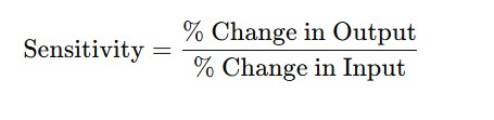
The Sensitivity Analysis Formula is typically expressed as:
Ever wonder how project managers tackle the whirlwind of risks in a project? Enter the Tornado Chart. It’s not just a fancy name; it’s a powerful tool. Picture this: a chart that gives you a bird’s-eye view of various factors causing uncertainty and variation in project outcomes. It’s like having a crystal ball that shows you the stormy and calm parts of your project journey.
Imagine a chart shaped like a tornado, hence the name. It’s a wizard in the world of sensitivity analysis, assessing how different variables sway the project’s fate. Think of it as a scale, weighing which factors are heavy hitters in the project’s success or failure.
Tornado Charts don’t just highlight the risk factors; they measure their impact. Picture a scale showing the weight of each risk. It’s a roadmap for navigating the storm, helping you decide which risks to steer clear of and which to brace for. This tool doesn’t just point out the risks; it’s a strategist, guiding you to focus on what truly matters for the project’s success.
Think of a Tornado Chart as a comprehensive list of what could go wrong in your project. Miss out on a potential issue, and you’re risking a blind spot. It’s like having a checklist for success, ensuring you’ve covered all bases to enhance your chances of winning against project risks.
These charts are more than just risk assessors; they’re pattern-finders. With their unique shape, they highlight the project’s bright spots and areas needing attention. It’s like having a guide to focus your efforts for the best possible outcomes.
Google Sheets lacks ready-made Sensitivity-based Graphs, such as Tornado Charts but you can use ChartExpo (a data visualization tool)
We’re not advocating you ditch Google Sheets in favor of other expensive data visualization tools.
There’s an easy-to-use and amazingly affordable visualization tool that comes as an add-in you can easily install in your Google Sheets with ready-made sensitivity analysis-oriented charts. The tool is called ChartExpo.
In the coming section, we’ll take you through how to install and use ChartExpo in your Google Sheets for conducting sensitivity analysis.
You don’t want to miss this!
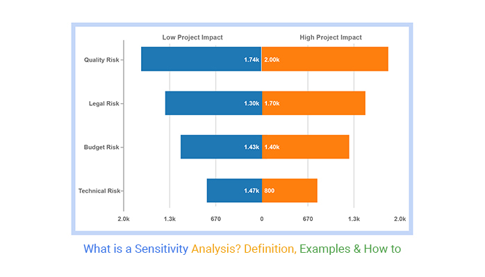
We’ll visualize the data below using a Tornado Chart.
You don’t want to miss this.
| Risk | Low Project Impact | High Project Impact |
| Quality Risk | 1742 | 2000 |
| Legal Risk | 1300 | 1700 |
| Technical Risk | 1468 | 80 |
| Budget Risk | 1426 | 1402 |
Install the ChartExpo add-in for Google Sheets from this link.


At its heart, sensitivity analysis is a what-if game. Imagine you’re a detective with a magnifying glass, examining how independent factors sway the dependent factor. It’s like predicting the future but under specific, controlled conditions.
Picture sensitivity analysis as a finely tuned instrument. It gauges how a dependent variable reacts to the fluctuating values of independent variables. It’s like a dance between the variables as one moves, the other responds. This analysis sheds light on how an independent variable’s uncertainty introduces a certain level of uncertainty into a financial model.
It’s akin to a financial crystal ball. Analysts use this technique to predict what happens to a model or assumption if the conditions change. Think of it as a stress test for financial models.
Just as a data analyst examines trends and patterns to provide actionable insights, this technique helps us understand how models behave when independent variables start to wobble. This insight is invaluable in the financial world, where understanding the ebb and flow of variables is key.
Sensitivity analysis comes in two flavors: local and global.
It all boils down to a financial model in Excel. The analyst picks the key variables that influence the outcome and plays around with different combinations of these independent variables. It’s like a puzzle, where changing one piece can alter the whole picture.
In conclusion, financial sensitivity analysis is a dynamic and versatile tool, essential for navigating the uncertainties of the financial world. It allows for a deeper understanding of how changes in one area can ripple through a financial model, helping decision-makers prepare for various scenarios.
Sensitivity Analysis lets you peek into the future of your business. It’s like a magic wand for entrepreneurs and managers. This tool plays “what if” with your business numbers. Think of it as a method to predict the outcome of a decision based on changing assumptions.
Business is a sea of uncertainty. Here’s where Sensitivity Analysis comes in as a lighthouse. It helps steer clear of risks and grab opportunities. It’s all about understanding how changes in key factors – like sales volume, costs, and other critical elements – impact profitability. Want to know what happens if you hike up your product price by 10%? Sensitivity Analysis has got your back.
So, what makes your business tick? These are your key drivers. Real estate folks watch prices per square foot, manufacturers keep an eye on raw material costs, and media companies track advertising trends. Sensitivity Analysis helps you focus on these drivers. It prepares you for both the storms and the rainbows in your business landscape.
Here’s the thing. Sensitivity Analysis is more than just a bunch of numbers. It tells a story. A story of what could happen in various business scenarios. It’s like having a script for different versions of your business’s future. And the best part? You get to write the ending.
Decision-making in business is tough. Sensitivity Analysis makes it easier. It’s like having a roadmap when you’re lost in the wilderness of business decisions. It helps you understand the impact of each factor on your business outcomes. This analysis is not just about avoiding pitfalls; it’s about exploring new paths to success.
In the business world, Sensitivity Analysis is a star player. It’s crucial because it highlights both risks and opportunities. It’s a tool that sharpens your decision-making skills. It helps you understand how tweaks in your business model can lead to big changes. In a nutshell, Sensitivity Analysis is your business’s best friend in an unpredictable world.
With Sensitivity Analysis, you’re not just running a business; you’re leading it into the future.
Before starting sensitivity analysis, ensure you have a clear understanding of what you’re testing. Determine the key variables that could impact your model and outline the outcomes you want to assess.
Choose the right technique for sensitivity analysis. Options include Monte Carlo simulations, Tornado diagrams, or what-if analysis. The selection depends on the complexity of the model and the type of uncertainty involved.
When performing sensitivity analysis, it’s crucial to use realistic data and assumptions. Overly optimistic or pessimistic inputs may lead to skewed results, affecting decision-making.
Sensitivity analysis should not be a one-time process. Reassess the model periodically, especially when new data becomes available, to ensure that the findings are still relevant and accurate.
Visual representation, such as sensitivity graphs or Tornado charts, can make it easier to communicate the impact of different variables. This helps stakeholders quickly grasp which inputs are most influential in the model’s outcome.


Sensitivity analysis determines how different values of an independent variable affect a particular dependent variable under a given set of assumptions.
Besides, it examines how various sources of uncertainty in a mathematical model contribute to the model’s overall uncertainty.
The methodology can be categorized into two, namely local and
global sensitivity analyses.
The term local’ indicates that the derivatives are taken at a single point. This method is apt for simple cost functions.
Global sensitivity analysis is implemented using Monte Carlo techniques. Also, it uses global samples to explore data variables.
In a nutshell, sensitivity analysis is a key player in the strategic game of business. It offers a peek into the future, helping businesses brace for impact or seize opportunities. With this tool, companies can navigate the unpredictable waters of the market with more confidence and clarity.
It empowers better decision-making, ensures reliable predictions, highlights improvement areas, and boosts the credibility of financial models. While it’s not a crystal ball, it’s the next best thing in a world where the only constant changes. With its blend of insight and foresight, this Analysis is an indispensable ally in the quest for business success.
Related Article:
How to Do Sensitivity Analysis in Excel?
How much did you enjoy this article?


Calculate accounts receivable turnover ratio to measure credit collection speed, improve cash flow, and strengthen your financial strategy. Read on!

Change Management KPIs are the key to tracking adoption, performance, and ROI during transitions. Find out which metrics matter. Read on!

Data collection methods and techniques determine the quality of every insight you act on. Explore key approaches for gathering reliable data. Read on!


