Categories
This type of analysis entails probing the influence of independent variables on the dependent ones in data.
You can use the technique to easily predict outcomes when an analysis is performed under certain conditions. As an investor, you can easily evaluate all the factors that may negatively affect the growth of your investments using this methodology.
So, how can you establish the relationship between dependent and independent factors in your data?
This is where sensitivity analysis charts, such as the Tornado Graph, come in.
The charts are straightforward to read and interpret. Besides, you can easily integrate them into your data storytelling to cement credibility.
Sensitivity Analysis in Excel cannot be done from its default chart library.
You don’t have to do away with the Excel spreadsheet. Supercharge its usability by installing a particular third-party application into your spreadsheet to access ready-to-use and visually appealing Tornado Charts.
In this blog, you’ll learn the following:
Sensitivity analysis in Excel determines how different values of an independent variable affect a particular dependent variable under a given set of assumptions.
In other words, how various sources of uncertainty in a mathematical model contribute to the model’s overall uncertainty. This technique is used within specific boundaries that depend on one or more input variables.
You can use this insightful chart to uncover hidden correlational relationships in your raw business data. A confidence interval graph in Excel can also support this by showing the reliability of your estimates.
Interpreting sensitivity analysis in Excel is incredibly easy.
The key to interpreting this chart is to always remember that independent variables (metrics) are found on the horizontal axis (x-axis). And, the dependent variables are situated on the vertical axis (y-axis) in a Cartesian plane.
Use a sensitivity analysis Excel chart to identify the general trend of the key variables in your raw data.
Data points in this chart are grouped based on how close their values are, which makes it easier to identify outliers. However, you should be cautious about relying on these outliers for decision-making, as they can contribute to misleading data visualization and may not accurately represent the overall trends.
Interestingly, the nature of the correlations can also be estimated based on a specified confidence level.
Sensitivity analysis in Excel is widely used by seasoned data visualization experts to display the causal relationships between two variables.
The relationship between variables can be positive or negative.
It can be used to help make predictions about the share prices of public companies.
Some of the variables that affect stock prices include:
The analysis can be refined for future stock prices by making different assumptions or adding different variables.
This model can also be used to determine the effect that changes in interest rates have on bond prices. In this case, the interest rates are the independent variable, while bond prices are the dependent variable.
Doing a sensitivity analysis in Excel should never be time-consuming for you. In the coming section, we’ll address the power of visual analytics and data analysis in economic forecasting and planning.
It is used in the business world and the field of economics. Also, it’s commonly used by financial analysts and economists and is also known as a what-if analysis.
Sensitivity analysis in Excel entails probing the relationship between key variables in data
Use sensitivity analysis-based charts to extract relationship insights you cannot see using tables and visualization designs, such as Bar Charts.
Seasoned visualization experts use this analysis mainly to test hypotheses. This occurs during the initial stages of data visualization. If you want to extract micro insights in your bulky data, give this chart a try.
The financial model determines how key metrics are affected based on changes in other factors known as input variables. This model is also referred to as what-if or simulation analysis. It is a way to predict the outcome of a decision given a certain range of variables.
By creating a given set of variables, an analyst can determine how changes in one variable affect the outcome.
Both the target and input or independent and dependent variables are fully analyzed when it is conducted. The person doing the analysis looks at how the variables move as well as how the target is affected by the input variable. For more insights on how to utilize these methods, refer to various visualization story examples that showcase practical applications and outcomes.
In the coming section, we’ll discuss the advantages and weaknesses of doing sensitivity analysis in Excel.
In the real world, all variables are related to each other.
For example, both inflation and market interest rates affect bond prices. Our analysis will consider how much a change in inflation will affect the bond price. And how a change in market interest rate will affect bond prices.
But it won’t consider how a change in inflation will affect the market interest rate or vice versa. This is actually an incomplete analysis.
We’re now at the heart of the blog: How to do Sensitivity Analysis in Excel. You don’t want to miss this.
Excel is a trusted data visualization tool because it’s familiar and has been there for decades.
However, the spreadsheet application lacks ready-made sensitivity analysis-based charts, such as the Tornado Chart.
We understand switching tools is not an easy task.
This is why we’re not advocating you ditch Excel in favor of other expensive data visualization tools.
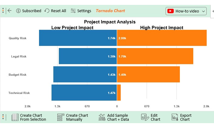
There’s an easy-to-use and amazingly affordable visualization tool that comes as an add-in for Excel which you can easily install in your app to access ready-made sensitivity analysis-based graphs, such as Tornado Graph. The tool is called ChartExpo.
How to make a sensitivity analysis graph in Excel should never overwhelm you. Keep reading to discover more.
So, what is ChartExpo?
ChartExpo is an incredibly intuitive add-in you can easily install in your Excel.
With many ready-to-go visualizations, including butterfly charts, the sensitivity analysis charts generator turns your complex, raw data into compelling, easy-to-digest visual renderings that tell the performance review stories in real time.
In the coming section, we’ll take you through how to do sensitivity analysis in Excel using the ChartExpo add-in.
You don’t want to miss this!


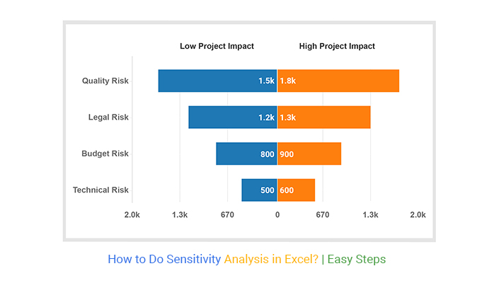
This section will use a Tornado Chart (one of the tested and recommended charts for sensitivity analysis).
| Risk | Low Project Impact |
High Project Impact |
| Quality Risk | 1742 | 2000 |
| Legal Risk | 1300 | 1700 |
| Technical Risk | 1468 | 80 |
| Budget Risk | 1426 | 1402 |


Absolutely! ChartExpo is an add-in for Excel which allow you to visually represent sensitivity analysis in Excel.
Yes, you can perform sensitivity analysis in Excel. It involves changing one variable at a time to see how it impacts the overall result.
Sensitivity analysis in Excel entails probing the influence of independent factors on dependent factors in data. You can use the technique to easily predict outcomes when the analysis is performed under certain conditions.
So, how can you establish the relationship between dependent and independent factors in your data?
This is where graphs, such as Tornado Graph, come in.
The charts are incredibly easy to read and interpret. Besides, you can easily integrate them into your data storytelling to cement credibility.
Excel does not support sensitivity analysis in Excel default charts library. You actually don’t have to do away with the Excel spreadsheet.
So, what’s the solution?
We recommend you install third-party apps, such as ChartExpo, to access ready-to-use sensitivity analysis graphs.
ChartExpo is an add-in for Excel that’s loaded with insightful and ready-to-go charts, such as Tornado Graph. You don’t need programming or coding skills to use ChartExpo.
Now how to do sensitivity analysis in Excel should never stress you.
Sign up for a 7-day free trial today to access ready-made charts that are easy to interpret and visually appealing to your target audience.
How much did you enjoy this article?


Learn how to use sparklines in Excel to quickly visualize trends inside cells. Discover types, creation steps, customization, use cases, benefits, and best practices.

Learn what a confidence interval graph is, how to create it in Excel, and how to interpret results to make more reliable, data-driven decisions.

A correlation matrix in Excel helps identify relationships between variables. Learn how to create, read, and use it for effective data analysis.


