Categories
By ChartExpo Content Team
Picture this: you’re sorting through your photo album, not by flipping through pages, but by zooming out to see your memories categorized into neat, color-coded rectangles, each size representing the number of photos in each category – family, friends, vacations, and so forth. That’s essentially what a Treemap does with data!
If you wanted to see which areas of your life you’ve captured the most, a quick look at the Treemap’s larger rectangles would tell you instantly.
Similarly, a marketer could use a Treemap to identify which products are performing best based on sales volume visualized by rectangle size.
So, next time you’re sifting through complex data or need a clear visual of hierarchies and proportions, think of using a Treemap. It might just make your data analysis as easy as pie – though, technically, it’s more like a well-organized quilt of information!
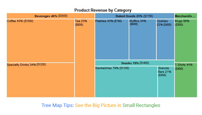
A Treemap is a visualization tool that displays hierarchical data through nested rectangles. Each rectangle’s size is proportional to the data point’s value, making it super handy to see which items are the big players at a glance.
A Tree Map is a visualization tool that displays hierarchical data as a set of nested rectangles. Each branch of the tree is given a rectangle, which is then tiled with smaller rectangles representing sub-branches.
Size and color variations among the rectangles can represent different quantitative variables, helping viewers to compare data points intuitively. It’s like having a bird’s-eye view of your data landscape, making complex structures digestible and engaging. Perfect for presenting vast information in a compact and visually appealing way!
Tree Maps shine in displaying “part-to-whole” relationships. That means you can see how individual segments stack up against the entire dataset at a glance. They arrange these rectangles to optimize space and make the data easy to read. And here’s the kicker: each rectangle, or ‘node’, can hold a treasure trove of information, not just one or two data points.
In the early ’90s, Professor Ben Shneiderman from the University of Maryland unveiled Tree Maps. He designed this chart to display extensive computer file directories efficiently, ensuring they didn’t hog your screen real estate.
Imagine you’ve got a bunch of folders on your computer – some are packed with files, others, not so much. Treemapping helps you see all that info at a glance. It’s like taking your whole file system and squishing it into a neat rectangle on your screen. Every little rectangle inside the big one shows a folder or a file, sized just right so you can tell how big it is compared to everything else. And with a dash of color, you can instantly tell which ones are taking up too much space or just right.
Treemapping isn’t just for cleaning up your digital mess. It’s a champ at showing any kind of data where things are broken down into categories and subcategories – like sales in regions, or how much space apps are gobbling up on your phone. It lets you spot the big players without breaking a sweat, making it a favorite for anyone who needs to get a handle on complex info fast.
Why does this matter? Well, imagine navigating a file system or analyzing disk space usage – Treemapping turns a mundane task into a journey of discovery.
Or consider portfolio analysis in finance, where Treemaps help investors quickly visualize where their money’s working hardest.
Treemapping shines when there’s a mountain of data to conquer. It lets you see the forest and the trees, revealing patterns, trends, and outliers that might otherwise stay hidden in traditional charts. It’s like having a bird’s-eye view of data landscapes, where insights form peaks and valleys, waiting to be explored.
So, the next time you find yourself lost in spreadsheets or endless reports, think of Treemapping as your data compass, guiding you through the complex wilderness of numbers and categories, straight to the insights that matter.
Imagine walking through a digital art gallery, where instead of paintings, you encounter a variety of rectangles of different sizes and colors, neatly arranged in a large frame. Each rectangle’s size is proportional to the data point’s value, making it easy to compare quantities and observe patterns at a glance. The different colors often represent different categories, adding an additional layer of information to the visualization.
At its core, a Treemap displays hierarchical data as a set of nested rectangles. Each rectangle, or ‘block,’ represents a slice of data, with its size reflecting a quantitative variable, such as sales volume or population size. The beauty of a Treemap lies in its ability to show parts of a whole at a glance, making it a go-to for spotting trends and outliers without breaking a sweat.
Starting with a big box, which encapsulates the entire data set, the Treemap algorithm divides this space into rectangles that represent the top-level categories. Each of these rectangles is then sliced further down into smaller rectangles, corresponding to sub-categories, and so on. This nesting continues until the smallest categories are tiny rectangles tucked inside their parent categories.
Think of colors as the storytellers in Treemaps. Each hue stands for a different category or metric, painting a picture that’s easy to decode. This chromatic differentiation helps viewers to distinguish between data segments swiftly and spot patterns that might go unnoticed in a more monochrome or textual presentation.
Crafting a Treemap isn’t just about hacking data into rectangles. It’s an artful balance between size, shape, and readability. The aim is to keep the aspect ratio (the ratio of width to height) of rectangles as square as possible. Why? More square-like shapes are easier on the eyes and make comparisons less of a headache.
When crafting Treemaps, clarity, and usability should always be at the forefront of design. Here’s how to make your Treemaps not only functional but user-friendly:
Use well-defined borders around higher-level categories to facilitate quick identification of main groupings. This visual distinction helps users navigate the Treemap efficiently.
Implement high-contrast text within the Treemap rectangles to guarantee that labels are easily readable, enhancing overall accessibility and user experience.
Introduce a visually distinctive state upon hovering or tapping a rectangle. This feature confirms to users that they are examining the correct data point, adding to the interactivity and precision of data exploration.
When a rectangle is selected, display additional details, such as names and variable values in an overlay. This allows for deeper data drilling and adds a layer of detail that can be crucial for thorough data analysis.
Imagine trying to figure out which product categories are your top performers or which regions are lagging in sales. With a traditional bar graph, you’d be squinting at lines or bars, flipping back and forth between pages. But a Treemap lays it all out in one visually intuitive space. Bigger rectangles catch your eye immediately – those are your high rollers! Smaller ones? They might need a bit more love.
This isn’t just about making pretty pictures. Treemaps can drive actionable insights. They force you to notice the big players and the underdogs, helping you decide where to focus your efforts. Need to trim down a budget? Start with the smallest rectangles. Want to capitalize on growth? Those big blocks are your golden tickets.
Businesses often use Tree Maps to display product market shares within a company. For example, a software company might use a Tree Map to show the sales distribution among its various products. Larger rectangles represent more sales, providing a quick visual insight into which products are performing well.
Digital marketers utilize Tree Maps to analyze website traffic sources. Different sections of the Tree Map might represent different traffic sources like direct visits, social media referrals, and search engine traffic, giving a quick overview of which channels are most effective.
Financial departments might use Tree Maps to illustrate how a company’s budget is distributed across different departments. This can help in quickly identifying which areas are receiving the most funds and which might need reevaluation.
You’ll need a set of hierarchical data. Think of it as needing a main category (like a country) that breaks down into smaller categories (like states).
ChartExpo can help you whip up a Treemap in no time.
Load your data into the tool. This usually involves a bit of clicking.
Here’s where you make it pretty. Adjust colors to make categories stand out. Think of it as dressing up your data for a night out!
Adjust the labels, scale, and perhaps the tooltips for that extra layer of detail. It’s like fine-tuning your car’s engine but for your Treemap.
Now that your Treemap is ready, what does it tell you? Share your insights in a way that even your grandma would get it.
A Tree Map template is a blueprint for creating a Tree Map chart. It provides a predefined layout where data can be plugged in, facilitating quick and effective data visualization without the need to design the chart from scratch. This template is highly useful in contexts where data needs to be displayed compactly, and comparisons between different parts need to be made clear and immediate.
Tree Map templates are particularly useful in business and finance for portfolio analysis, resource allocation, and performance tracking, among other applications. They enable decision-makers to swiftly assess and act on data-driven insights, enhancing both strategic planning and operational efficiency.
Using a Treemap template is like having a map when you’re lost. It guides you on how to arrange your data efficiently, ensuring that important insights don’t get buried under a heap of numbers. Plus, it’s reusable. Set it up once, and apply it whenever you need a visual that packs a punch.
Confused about the difference between a “Tree Map” and a “Treemap diagram”? You’re not alone! Let’s break it down in a way that’s as straightforward as seeing a dog in a park””impossible to miss.
So, why the two names? It’s mainly about context and preference. “Treemap diagram” sounds a bit more formal and is likely to be favored in academic or professional settings. Meanwhile, “Tree Map” might pop up more casually.
Regardless of which term you pick, you’re still talking about the same helpful tool that lets you visualize complex data in a digestible format.
In essence, the terms “Tree Map” and “Treemap diagram” are used interchangeably to describe this visual tool that helps make sense of complex data through simple, colorful rectangles.
Reading a Treemap effectively allows you to quickly absorb complex hierarchical information and make data-driven decisions. With a bit of practice, you’ll be teasing out stories from Treemaps like an expert.
Typically, Treemaps are arranged so that the largest rectangles, which represent the most significant data points, are positioned either at the top or the left side of the diagram. Begin your analysis here. It’s like starting a book at the chapter that matters most.
Each rectangle’s size and color vary to illustrate different data points. Size generally reflects a quantitative measure, such as sales volume or frequency. Color might indicate a category type or performance metric, like growth rate or profit margin. So, a dark-colored, large rectangle might represent a high-performing, significant category within your dataset.
To get more specific insights, look at how the rectangles are nested. Each level of nesting represents a deeper layer in the data hierarchy. If you’re looking at sales data, for example, you might see continents at the top level, countries next, and then cities. Dive in until you find the level of detail you need.
If the Treemap is interactive, you can hover your mouse over a rectangle to get more details. Often, a tooltip will appear, displaying precise data values or additional information. It’s like having a mini-report at your fingertips.
Don’t forget to check out the legend (usually found alongside or below the Treemap), which explains what the colors and sizes represent. It’s like reading the map key before embarking on a treasure hunt.
You can create a Treemap using a chart creator in your favorite spreadsheet. Follow the steps below to create a Treemap.
The following video will help you to create a Treemap Chart in Google Sheets.


When it comes to the types of data you can throw into a Treemap, think numbers – positive numbers, to be precise. Treemaps thrive on numerical data. They use these numbers to size and color the rectangles, helping you visualize differences in magnitude at a glance. Here’s the catch: Treemaps prefer positivity.
For those using Treemaps in Excel on a Mac or Windows, you can enhance your experience with various add-ins for Excel Mac that can help you better manage and visualize your data.
Negative values? They’re out of the party. This visualization technique is all about representing quantities that add up – literally.
Treemaps are particularly adept at handling hierarchical data. This means they are terrific when you have a structured dataset where each segment or category is broken down into sub-categories. For instance, a corporate structure where departments are divided into teams or a product inventory is categorized by type, brand, and then individual products.
At the heart of a Treemap, there are two main types of data it visualizes:
This forms the segments of your Treemap. Each category and sub-category in your hierarchical data is represented as a distinct rectangle within the Treemap, making it easy to see the data breakdown at a glance.
This is used to determine the size of each rectangle in the Treemap. Typically, this could be sales figures, quantities, percentages, or any other metric that quantifies the elements of your categories. The bigger the number, the larger the rectangle.
Besides the primary hierarchical and numerical data, Treemaps can also use color coding effectively. Colors in a Treemap can represent different dimensions of data, such as performance metrics like growth rate, profitability, or saturation. This allows viewers to discern not just the size but the qualitative state of each category at a single glance.
When designing a Tree Map, think about what you need to show. Size could represent revenue, while color might show profit margin.
But beware; the devil is in the details! Too many colors or too much information can turn your neat chart into a chaotic mess. The trick is to keep it simple: meaningful colors, clear sizes, and maybe a touch of interaction, like hovering for more details.
A Treemap layout transforms traditional data tables into a colorful mosaic. Each rectangle in a Treemap represents a data point, with its size indicating the value – bigger means more significant. Color shades can further illustrate differences, like high to low, or categories from a dataset.
The space in a Treemap is split among the top-level categories. Each category then divides its allotted space among its subcategories. This continues down the hierarchy, creating a visually appealing and informative display similar to a Mosaic plot.
Colors enhance readability and insight. Imagine glancing at a Treemap of market data where rapidly growing stocks are green, and those tanking are red. Instant insights, right?
The size of each rectangle in a Treemap is proportional to its value. Bigger box? Bigger deal. This makes it incredibly easy to spot which items are the major players without diving into the nitty-gritty numbers.
Treemaps shine when illustrating how parts fit into a whole.
Imagine a bookstore’s annual sales carved up into colorful squares, each representing a genre’s slice of the pie – thrillers, biographies, science fiction, and more.
Add a layer for sub-genres, and you get a vivid picture: gothic novels under thrillers, celebrity memoirs under biographies, each a smaller square within its genre.
It’s like seeing the blueprint of reader preferences unfold before your eyes, with each section a key to understanding the bigger literary landscape.
Exploring beyond Treemaps can be like opening a new box of crayons – suddenly, you have a bunch of exciting alternatives to color your data visualization landscape. Sure, Treemaps are fantastic for overviewing hierarchical data with their neat, space-efficient boxes. But what if you want to spice things up?
Circle Packing is one such alternative, squeezing circles into a confined space – no square corners here! It’s like watching bubbles that somehow fit perfectly together, each bubble representing a chunk of your data. It’s not just pretty; it’s practical for spotting patterns based on size and grouping.
Then there’s the Sunburst Diagram, which fans out data like rays of sunlight. It works brilliantly when you’re digging deeper into layers, tracing paths from the center outward. It’s about peeling the onion, revealing layers without shedding tears!
In many cases, these advanced visual formats can also serve as an alternative of Pie chart, especially when you need a more detailed and hierarchical way to represent proportions instead of a simple circular breakdown.
And don’t forget about Network Diagrams. If your data involves interconnections or complex relationships, these diagrams can turn a tangled mess into a dance of nodes and links. Imagine mapping out your family tree in a way that actually makes sense at your next reunion!
Each of these tools reshapes how we see data, making the invisible visible. So, why stick to one when you can play around? Mixing it up could give you insights that were just not as obvious with Treemaps alone. After all, who doesn’t love a bit of variety in their visual storytelling toolkit?
While Treemaps enchant with their colorful mosaics of data, they have flaws.
Unlike lengths or positions that we grasp at a glance, areas – the bread and butter of Treemaps – demand more from our brains. Despite the promise of showcasing data hierarchies effectively, when it comes to making exact comparisons or spotting minor differences, Treemaps often lead to more squinting than enlightenment. This limitation becomes starkly apparent when precise value assessments are critical, turning these visual delights into potential visual deceits.
Treemaps thrive on structured, hierarchical information. Throw at them anything less structured, and they flounder, becoming as ordinary as a pie chart, notorious for its own set of perceptual issues. Without clear hierarchies, using a Treemap is akin to using a hammer on a screw – technically possible, but hardly efficient or effective.
The allure of fitting vast datasets into a single Treemap often leads to a cluttered, confusing display. Information overload can quickly set in when a Treemap attempts to organize thousands of data points.
The result? A dizzying array of rectangles can turn what should be a clear data presentation into a perplexing puzzle where both the forest and the trees are lost to the viewer.
If your data items are too similar in size, good luck finding the most significant bits. Treemaps thrive on contrast, not uniformity. Without clear, large discrepancies in size, identifying major items becomes a guessing game.
Treemaps shine when you need to compare proportions within the hierarchy in a compact and efficient way. They’re particularly nifty for spotting patterns in data at a glance””ideal for those of us who prefer a dash of simplicity with our morning coffee.
Ideal for displaying large datasets, Treemaps shine when you need to provide an overview while maintaining the ability to drill down into specific categories. They are particularly useful in scenarios like:
It’s not all sunshine and rainbows. Treemaps can get cluttered if there are too many layers or if the data spread is too uneven. In these cases, simpler visualizations like bar charts might be the way to go.
Treemaps aren’t just about squishing data into squares. They transform numbers into visually intuitive stories, making it easier for us to understand and analyze complex datasets. So, next time you’re up to your eyeballs in data, consider giving a Treemap a chance to tidy things up.
Treemaps transform complex hierarchical data into a clear and manageable visualization, making it easier to spot trends, understand proportions, and make informed decisions. They are an essential tool in the data visualization toolbox, adaptable across various contexts, from business intelligence to educational tools. Whether you’re managing large datasets or need a clear presentation format, Treemaps can provide valuable insights at a glance.
By using Treemaps, you’re not just showing numbers; you’re telling a story about how these numbers interact and relate to each other in the bigger picture. It’s about turning data into a visual narrative that’s easy to understand and engaging to explore.
How much did you enjoy this article?


Calculate accounts receivable turnover ratio to measure credit collection speed, improve cash flow, and strengthen your financial strategy. Read on!

Change Management KPIs are the key to tracking adoption, performance, and ROI during transitions. Find out which metrics matter. Read on!

Data collection methods and techniques determine the quality of every insight you act on. Explore key approaches for gathering reliable data. Read on!


