Categories
By ChartExpo Content Team
Have you ever looked at a chart and felt confused? Your eyes dart around, unsure where to land first. Important data gets buried, and you’re left guessing. This isn’t a minor issue—it’s a big problem. Confusion leads to missed insights, bad decisions, and wasted time.
The culprit? A lack of visual hierarchy.
Visual hierarchy solves this by guiding your viewer’s attention to what matters most. It’s the difference between a chaotic mess and a chart that communicates clearly. When done right, visual hierarchy directs the eyes effortlessly from one point to the next.


It helps highlight key data while keeping everything else in check. No more guessing. No more squinting. Just clear, fast understanding.
But problems with visual hierarchy are common. Too many colors, inconsistent spacing, or unclear labels can overwhelm your audience. Solutions lie in simple design choices: bold fonts, strategic colors, and logical positioning.
With the right visual hierarchy, your data comes alive. The important insights pop, connections make sense, and decisions happen faster.
Ready to make your charts clear and compelling? Visual hierarchy is your guide. Let’s explore how you can direct attention, clarify complexity, and make data easy to understand.
First…
Visual hierarchy is the arrangement of elements in a design to guide the viewer’s attention. It highlights the most important information first, followed by supporting details. In charts, visual hierarchy uses size, color, placement, and spacing to create a clear path for the eyes.
Without it, charts become cluttered and confusing, making it hard to find the key insights.
Charts packed with data are everywhere, but not all make an impact. Why? Because not all use visual hierarchy to highlight key insights.
For instance, consider a Pareto Analysis, where the most significant variables are shown larger and bolder, making them jump out at you. This direct visual cue helps viewers pinpoint critical information swiftly, making these charts invaluable for data-driven decision-making sessions.
Let’s face it, processing complex data can be mentally exhausting. By establishing a clear visual hierarchy, charts like the Tree Map simplify the viewer’s cognitive process. They categorize information into digestible chunks, using colors and sizes to denote different data groups.
This organization helps the brain process information more smoothly, reducing overload and making the data analysis process less intimidating.
Engagement is key, and nothing drives engagement better than a chart that communicates effectively.
Take the Heatmap, for instance; by using color saturation to demonstrate varying data levels, it keeps the viewer’s gaze focused on areas of interest. This not only holds attention but also makes the interaction with data more intuitive and meaningful.
By harnessing the power of visual hierarchy, visual analytics elevates charts from simple representations to strategic tools, enhancing understanding and driving informed decision-making.
The careful arrangement of visual elements ensures that they are not just seen but understood, making every chart not just a tool for data presentation, but a guide to insight.
When it comes to charts, think big to grab attention!
In a Clustered Column Chart, for instance, larger columns are immediately noticeable. This doesn’t just apply to width but also to height. Larger chart elements act as visual anchors, drawing the viewer’s eye and making it clear where to focus first.
This technique ensures that key data points stand out in the sea of information, making your chart not just a data display, but a story told visually.
Ever noticed how a splash of color draws your eye in a Heatmap or a Scatter Plot Chart? That’s visual hierarchy at play through color.
Using bright or contrasting colors effectively guides the viewer’s attention to critical data points or trends. Choosing the best colors for graphs isn’t just about aesthetics; it’s about purpose. Colors can differentiate data groups or highlight changes and trends, transforming your chart into a powerful communication tool.
In Western cultures, we start reading from the top left, and this habit carries over to how we view charts. Placing key information or pivotal data in the top-left corner or the center of a Funnel Chart or Mosaic Plot can significantly increase its visibility and impact.
This strategic placement ensures that the most crucial information catches the eye first, guiding viewers through the data in a logical flow.
Typography is not just for the books. In charts, like a Radar Chart or Histogram, the choice of font size and weight plays a pivotal role in directing viewer focus. Bold and large fonts make headlines in your data story, shouting for attention.
In contrast, smaller fonts serve as the fine print, providing additional, but not attention-stealing, details. Effective use of typography ensures that the chart communicates the data hierarchy clearly and efficiently.
When constructing a Sunburst Chart or a Tree Map, size matters. Enlarging significant data points enhances information design by drawing immediate attention and simplifying the absorption of key insights. Larger elements naturally stand out in the visual hierarchy, ensuring critical details are noticed quickly.
For instance, in a Tree Map, larger boxes can represent higher sales regions, instantly highlighting areas of interest without overwhelming the viewer.
Color is a powerful tool, especially in charts like the Heatmap or Mosaic Plot. By applying vibrant colors to key data, these elements pop against a more neutral background.
It’s not just about picking any bright color; it’s about selecting colors that contrast sharply with others nearby. This technique ensures that important points are easily distinguishable at a glance, guiding the viewer’s focus effortlessly.
Don’t underestimate the power of nothing! Whitespace, or the absence of data and graphics, plays a crucial role in charts like the Radar Chart or Histogram.
Effective use of whitespace around crucial data points or groups helps in reducing clutter and focusing the viewer’s attention exactly where you want it. It’s like having a breathing room around the most important part of the chart, which naturally draws the eye.
The way elements are aligned in a chart can significantly affect how information is perceived. For visualizations like the Funnel Chart or Sankey Diagram, aligning elements to create a flow that guides the viewer’s eye through the data smoothly is key.
Think of it as visual storytelling – you’re guiding the viewer through a narrative, from start to finish, using spatial positioning that makes logical sense and enhances comprehension.
The following video will help you create a Sankey Chart in Microsoft Excel.
The following video will help you to create a Sankey Chart in Google Sheets.
The following video will help you create a Sankey Chart in Microsoft Power BI.
Ever noticed how scatter plots can instantly grab your attention to the “odd one out?” That’s visual hierarchy at its best!
By making outliers bigger or bolder, these charts cleverly highlight the points that stray from the norm. It’s like having a visual shout-out saying, “Hey, look right here!” This trick works wonders in making sure the key data points pop out, ensuring they don’t get lost in the sea of information.
Heatmaps are fantastic for showing density or intensity of data. They use colors to communicate values—darker or more intense colors often represent higher values.
Imagine looking at a heatmap where the hot zones are in vibrant reds, drawing your eyes immediately to areas of peak activity or interest. This method effectively communicates priority areas in data sets, making complex data digestible at a glance.
Funnel charts are great for visualizing sequential stages, like sales processes. A clever trick here is using gradual changes in color intensity to guide the eye from the widest part (start) to the narrow end (conclusion) of the funnel.
This color shift not only marks progression but also subtly emphasizes how initial large quantities narrow down to critical outcomes.
Mosaic plots, or Marimekko charts, are a creative way to display data about different categories’ proportions. By varying the size of each tile within the chart, more significant categories can be made instantly visible, pushing lesser categories into the background.
It’s an intuitive way to provide a snapshot of relative importance and distribution across categories.
Radar charts, with their web-like appearance, offer a dynamic way to compare multiple variables. Using brighter shades or highlights on specific points of the web draws attention effectively to strengths or critical metrics within the data set, making the chart not only informative but also visually engaging.
These visual hierarchy techniques across different types of charts and graphs not only make data more accessible but also transform charts into compelling data stories. By guiding the viewer’s attention to key information, they amplify the impact and clarity of the data presented.
When you look at a chart, where do your eyes land first? Typically, it’s the top-left corner. This isn’t just a random preference—it’s how most of us are trained to read, starting from the top left and moving right.
In visual design, this is crucial. When placing the most important information in a chart, consider a Sunburst Chart or a Tree Map. These types of charts can effectively utilize the top-left area to highlight key data points, ensuring that the viewer’s journey through the data begins with the most impactful insights.
Ever wonder why some charts seem easier to read than others? It’s all about aligning with natural reading patterns. The Z-pattern is perfect for charts like the Mekko Chart or the Horizontal Waterfall Chart, where you want your audience to see critical data at both the top and bottom.
As viewers’ eyes naturally move in a Z shape across the chart, they can catch essential details quickly. On the other hand, the F-pattern works wonders with something like a Crosstab Chart, where depth of information is key.
This pattern caters to the natural tendency to scan from left to right and then down, making it ideal for detailed comparative data.
The center of a chart is like the center stage of a theater—it’s where you want your star data point to shine! Utilizing central focus points effectively can make or break a chart’s ability to communicate effectively.
In charts like the Radar Chart or the Scatter Plot, placing key data in the middle ensures it captures and holds the viewer’s attention. It’s not just about being in the middle; it’s about ensuring that this central point interacts seamlessly with other elements of the chart, creating a balanced and informative visual experience.
When crafting visuals like a Sankey Diagram or a Tree Map, choosing the right colors makes all the difference. Bright, vivid colors grab attention swiftly, making them perfect for highlighting critical data points.
Imagine a Sankey Diagram where flows crucial to your analysis shine in bright reds or intense blues, standing out against a more subdued palette. This method ensures that at a single glance, viewers are drawn to the most important information.
It’s tempting to make a chart as colorful as a carnival, but hold that thought! A muted background, think soft grays or light blues, allows your key data to pop without competing for attention.
Consider a Heatmap where varying shades of a single color indicate density: a light gray background ensures that even the subtlest hues are visible. This approach keeps the viewer’s eyes focused on the data itself, not on a busy or distracting canvas.
Consistency is king, especially in visuals like the Mosaic Plot or the Radar Chart, where color continuity across series can either clarify or confuse. By using a consistent color palette, you establish a visual language that viewers learn quickly and recall easily.
Let’s say each category in your Radar Chart is represented by a different hue; maintaining these colors throughout your presentation helps your audience keep track of each category without missing a beat. This strategy not only looks clean but also enhances comprehension and recall.
When you’re dealing with something like a Sunburst Chart or a Mosaic Plot, catching the viewer’s eye is key. Using bold fonts for your main titles or crucial labels does just that. It’s not just about making them thicker; it’s about making them stand out so they grab attention right away.
This is especially effective in visual displays where data segments originate from a central point and expand outward, as in the Sunburst Chart. Each layer of data can be quickly identified, ensuring that no viewer misses the critical insights you’re delivering.
Imagine looking at a Tornado Chart, where differences between two variables are immediately apparent. Now, if you use larger font sizes for the most significant data points, it doesn’t just highlight them; it screams their importance to the viewer.
This method ensures that even at a glance, your audience understands the major takeaways without getting lost in the details. Size matters, and bigger fonts can effectively guide viewers through a visual story, from the most impactful data down to the finer nuances.
Let’s talk about a Waterfall Chart, where each bar builds upon the last, clearly showing the cumulative effect of sequentially introduced positive or negative values.
Here, the alignment of your text can make or break the visual flow. Aligning your labels and titles strategically plays a pivotal role in maintaining a clean and organized look. It means aligning text to the left, right, or center, depending on what enhances readability and keeps the viewer’s eyes flowing naturally along the data path.
This careful placement of text aids in preventing visual clutter, making your chart not only informative but also aesthetically pleasing.
Imagine stepping into a room where everyone is yelling at you. Confusing, right? That’s exactly what happens when a chart over-highlights data. Each piece of data screams for your attention, causing the key message to get lost.
Consider a Pareto Chart where every single bar is a different, bright color. It might look festive, but it does little to convey which issues are the most critical. The solution? Simplify. Choose one or two elements to emphasize so your audience can quickly see what matters most.
Colors are great, but too many can turn a chart into a visual cacophony. For example, a Mosaic Plot with a rainbow spectrum might initially attract the eye, but it can quickly overwhelm the viewer, making it tough to understand the data relationships.
Stick to a limited palette. Use color purposefully to guide the viewer’s eye and group related data points, not just to make the chart “pop.”
Charts need a clear, consistent language of design. Inconsistent visual cues in a chart, such as varying line styles in a Multi Axis Line Chart or differing icon sizes in a Scatter Plot, can send mixed signals.
This inconsistency makes it harder for viewers to interpret the data or see the trends you want to highlight. Consistency in design elements like color, shape, and size is crucial for analyzing and interpreting data effectively, helping to create a coherent story that viewers can understand at a glance.
In tech dashboards, visual hierarchy is vital. Take a heatmap, for instance. It’s perfect for showing how users interact with different areas of an app. Brighter colors can highlight sections with more activity, guiding a manager’s eye quickly to user engagement hotspots.
It’s not just about seeing the data; it’s about seeing the story of the data. And that story could be the key to optimizing app features or fixing bugs that are ruining user experience.
Consider the magic of a waterfall chart in a financial report. This chart transforms complex financial data into a clear narrative. Starting from the initial revenue figure, it sequentially adds or subtracts values such as expenses, profits, or losses. Each bar’s start point is the previous bar’s end, making it simple to track changes over a period.
This method highlights crucial KPIs (Key Performance Indicators) like EBITDA or net profit, making them stand out in a report filled with numbers. This clarity is crucial for stakeholders who need to make quick, informed decisions.
For marketing professionals, understanding conversion trends is key. Enter the funnel chart. This chart is fantastic for visualizing the conversion process from initial contact to final sale. It narrows down at each stage, showing drop-off points clearly and helping marketers identify where potential customers are lost. By focusing on these areas, strategies can be adjusted to improve conversion rates, ultimately boosting sales and customer engagement.
Before diving into the design of your chart, it’s crucial to pinpoint what you’re trying to communicate. This key message is your anchor, guiding all subsequent decisions about your visualization. Ask yourself, what is the one thing I want my audience to take away from this chart? This clarity will shape everything from the type of chart you choose to the data you highlight.
Selecting the right type of chart can make or break your visual communication. For instance, if you’re looking to show parts of a whole, a Sunburst Chart provides a vivid representation, allowing viewers to grasp the breakdown at a glance.
On the other hand, if you’re focusing on hierarchical relationships in data, a Tree Map might be the perfect fit, as it organizes data naturally into nested categories, making complex information digestible.
Visual hierarchy in charts is all about guiding the viewer’s eye to what matters most. You can manipulate various elements like size, color, and position to highlight the key parts of your data:
Once your chart is built, don’t assume it’s perfect—test it. Show your visualization to a sample of your intended audience, and ask for their feedback. Do they understand the key message quickly? What catches their eye first? Use this insight to tweak and refine your chart.
This step might reveal surprising ways to improve clarity and impact, ensuring your final product effectively communicates your intended message.
Ever faced the headache of using overly complex chart-making tools? Say goodbye to that! ChartExpo offers simplicity from start to finish. Imagine this: you load your data, select your desired chart, and boom—insights displayed without a hitch. It’s perfect for those who want to focus on their data without getting bogged down by complicated software. Now, isn’t that a breath of fresh air?
Visual hierarchy isn’t just about making charts look good—it’s about making them work effectively. ChartExpo shines here by emphasizing the elements that matter most. Take the Heatmap, for instance. It immediately draws your eyes to the hottest spots with vibrant colors, making it easy to spot trends and outliers at a glance. This isn’t just about pretty pictures; it’s about making your data tell the story clearly and compellingly.
Different sectors need different storytelling tools, right? ChartExpo gets this! Whether you’re in tech or finance, there’s something for you. Need to track financial growth? Throw a Waterfall Chart into the mix. It breaks down the sequential impact of positive or negative values in a way that’s straightforward. Or maybe you’re after market segmentation insights? A Mosaic Plot will map that out for you, showing how different segments contribute to the whole. Customization is key, and with ChartExpo, your charts speak directly to your audience’s needs.
Visual hierarchy is essential in data visualization because it helps viewers quickly understand the main message. By directing attention to the most critical data points, it speeds up comprehension and decision-making. Without visual hierarchy, viewers struggle to find the important information, leading to confusion and wasted time.
You create visual hierarchy by adjusting the size, color, and placement of elements. Use larger or bolder text for key data points, and place important information where viewers naturally look first, such as the top left. Colors can highlight significant details, while spacing prevents clutter and keeps the chart easy to read. These techniques work together to guide the viewer’s eye through the data in a logical order.
Without visual hierarchy, charts become a mess of information with no clear direction. Viewers don’t know where to focus, and key insights get lost. This confusion leads to misunderstandings, delays in decision-making, and frustration. A chart without visual hierarchy fails to communicate its message effectively.
Color influences visual hierarchy by drawing attention to specific data points. Bright or contrasting colors highlight important details, while muted tones keep less critical information in the background. Consistent color use helps viewers understand relationships and patterns at a glance. However, too many colors can cause confusion, so it’s best to keep the palette simple and purposeful.
Spacing is important in visual hierarchy because it separates elements and reduces clutter. When data points are too close together, the chart becomes hard to read. Adding space helps group related information and makes the layout cleaner. This allows viewers to process the data more easily and focus on what matters most.
Yes, visual hierarchy can improve decision-making by making key insights stand out. When charts clearly direct attention to the most important data, viewers can quickly understand the message and act on it. Instead of getting lost in details, they see the main points right away, leading to faster and more accurate decisions.
The main elements of visual hierarchy are size, color, position, contrast, and spacing. Larger elements attract more attention, while bold colors emphasize key points. Placing critical data in prime spots, like the top left, ensures it gets noticed first. Contrast helps highlight differences, and spacing keeps the chart clean and readable.
Visual hierarchy simplifies complex data by organizing it in a clear and logical way. It highlights the most important information, helping viewers understand the main message quickly. By using size, color, and spacing strategically, visual hierarchy breaks down complicated charts into digestible parts, making the data easier to interpret.
Contrast plays a key role in visual hierarchy by making important elements stand out. Differences in color, size, or style create clear distinctions between key data points and background information. This helps guide the viewer’s eye to the most critical parts of the chart, improving clarity and understanding.
Visual hierarchy isn’t optional; it’s the key to making data clear and easy to understand. When used effectively, it directs attention, reduces confusion, and helps viewers make decisions faster. Without visual hierarchy, charts become chaotic, and important information gets lost.
Elements like size, color, position, and spacing work together to guide the eye. Larger fonts emphasize what matters most. Bold colors highlight key points. Strategic placement and spacing create order. These choices aren’t random — they’re intentional solutions to common design problems.
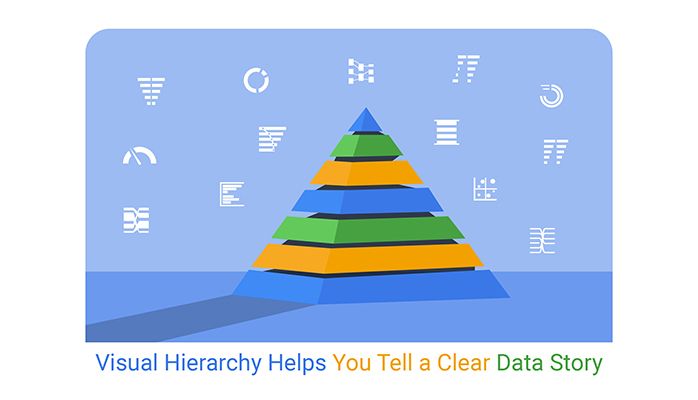
Every chart tells a story. Visual hierarchy makes sure that story is clear and meaningful. When your charts guide attention, your data delivers impact. Don’t let your insights get buried. Use visual hierarchy to make every chart a tool for understanding.
How much did you enjoy this article?


Calculate accounts receivable turnover ratio to measure credit collection speed, improve cash flow, and strengthen your financial strategy. Read on!

Change Management KPIs are the key to tracking adoption, performance, and ROI during transitions. Find out which metrics matter. Read on!

Data collection methods and techniques determine the quality of every insight you act on. Explore key approaches for gathering reliable data. Read on!


