Categories
By ChartExpo Content Team
Histograms don’t lie. But they do leave things out.
You trust the shape. You see the peaks. You assume the story is clear. But behind that smooth curve or tall bar, something might be missing. A wrong bin size, a default axis, or a quiet gap can turn insight into illusion.
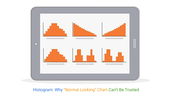
The problem isn’t the histogram itself. It’s how easily it hides things in plain sight. Small changes in setup can erase outliers, flatten spikes, or mislead with empty space. What looks normal could be anything but.
A histogram should speak clearly. It should show you what’s happening before your KPIs do. When built with care, it can flag risks early, guide decisions, and win trust. But if you’re using defaults, you might be showing a chart that needs you to explain what it failed to say.
| Histogram Shapes and Distribution Types | ||
| Histogram Shape | Likely Distribution Type | Real-world Meaning |
| Symmetrical bell curve | Normal distribution | Data clusters around the mean with few outliers |
| Right-skewed | Log-normal or exponential | The majority of values are low, with a few high outliers |
| Left-skewed | Reverse log-normal | The majority of values are high, with a few low outliers |
| Bimodal | Mixture distribution | Two distinct subgroups exist within the data |
| Uniform | Uniform distribution | All values occur with equal frequency |
| Multimodal | Complex or segmented distribution | Several distinct groupings or peaks exist |
| Tall narrow peak | Leptokurtic distribution | Low variability with strong central tendency |
| Flat wide peak | Platykurtic distribution | High variability with no strong central cluster |
Defaults can be convenient, but they’re not always your friend. Many visualization tools come with pre-set features that might distort your data’s story. For instance, automatic binning often doesn’t align with your data’s natural breaks. It’s like trying to fit a square peg in a round hole. Adjusting bin sizes can help your data speak more clearly.
Another default that often causes trouble is the axis limits. If they’re set too wide or too narrow, your data might look exaggerated or minimized. It’s like trying to view a city through a telescope. Adjusting these limits can provide a clearer view of your data landscape.
| Reasons Not to Use a Histogram | ||
| Reason | Explanation | Better Alternative |
| Data is categorical | Histograms require numerical data with continuous intervals | Use a bar chart |
| Small sample size | Histograms may exaggerate noise | Use dot plots or box plots |
| Real-time monitoring required | Histograms are static and do not update with live data | Use control charts or time-series plots |
| Need to compare exact values | Histograms show ranges, not precise individual values | Use dot plots or tables |
| Too few unique values | Sparse histograms with few bins offer no added value | Use column charts |
| Need to compare multiple groups directly | Overlaying many histograms can become unreadable | Use side-by-side box plots or small multiples |
| The data contains significant outliers | Histograms often mask or compress outliers | Use scatter plots or annotate separately |
| The viewer needs to see the data progression | Histograms do not show sequential or time-based change | Use line graphs |
Empty gaps in your visual might seem harmless, but they can be traps. They often appear when bin edges don’t line up with your data points. Imagine trying to park a car in a spot that’s too small. Frustrating, right? Aligning bins with your data helps avoid these visual pitfalls.
Misaligned bins can also create the illusion of missing data. It’s like showing up to a party and finding no one there, only to realize you got the date wrong. Proper alignment ensures your audience gets the full picture without any misleading gaps.
| Misuses of Histograms | ||
| Misuse | Consequence | How to Correct |
| Using a histogram for time series data | Misrepresents trends and misleads interpretation | Use line graphs or time series charts |
| Ignoring outliers | Critical data patterns are lost | Visualize separately or annotate histogram tails |
| Overlaying too many categories | The viewer cannot distinguish groups | Use small multiples or color-coded facets |
| Using different binning for comparison charts | Prevents fair visual comparison | Apply consistent binning across charts |
| Improper axis scaling | Distorts the visual importance of data clusters | Set axis ranges based on data context |
| Inconsistent bin widths | Misleads about frequency and spread | Use uniform bin widths unless justified |
| Applying a histogram to non-continuous data | Gives a false sense of continuity | Use bar charts for discrete categories |
| Lack of contextual explanation | Viewers misunderstand or misread the chart’s intent | Provide framing and labels before showing the histogram |
When you assume your data looks normal, you risk missing key insights. It’s easy to glance at a symmetrical shape and think everything’s fine. However, not every bell-shaped curve is normal. This assumption can lead to poor decisions, like thinking a cloudy day means rain without checking the forecast.
Relying on looks alone can lead to oversights. Sometimes, what seems like a normal distribution hides outliers or trends. Think of it as judging a book by its cover. Digging deeper into your data helps uncover the true story, keeping your audience engaged and informed.
| Limitations of Histograms | ||
| Limitation | Explanation | Impact |
| No exact values | Only shows frequency ranges, not specific data points | Users may misread frequencies as precise values |
| Static nature | Does not adapt to changing or real-time data | Misses dynamic shifts or recent anomalies |
| Poor comparability | Challenging to compare across multiple groups | Can lead to invalid conclusions |
| Sensitive to bin size | Results can vary widely with different bin counts | Inconsistent insights from the same dataset |
| Misleading visual symmetry | Symmetrical shapes may not represent normal distributions | Incorrect assumptions about data behavior |
| Data smoothing hides outliers | Peaks and anomalies can be flattened | Important deviations are missed |
| Ineffective for small data sets | Does not reveal the true distribution with limited points | False visual patterns can emerge |
| Requires numeric input | Categorical or qualitative data cannot be plotted | The user must preprocess or choose another chart type |
Peaks are like the tip of an iceberg. They hint at something larger beneath the surface. They can indicate a common value or occurrence. But the real questions begin once you notice these peaks. Why does this peak exist? What factors contribute to its height?
Asking the right questions is like peeling an onion. Each layer reveals more information. Peaks alone don’t provide answers. They are starting points. They invite curiosity. They make analysts dig deeper, seeking the underlying causes and implications.
| Clarifying Histogram Errors Through Examples | ||
| Error Type | What It Looks Like | Impact on Interpretation |
| Too few bins | Overly smooth histogram with minimal bars | Hides distribution peaks and local variation |
| Too many bins | Highly jagged histogram with excessive detail | Makes it hard to detect overall patterns |
| Non-uniform bin width | Irregularly spaced bars with uneven widths | Skews perception of frequency |
| Axis not starting at zero | The histogram appears more dramatic than it is | Exaggerates differences |
| Misaligned bins | Bars fall between actual data clusters | Suggests false data gaps |
| Missing labels | A histogram has unlabeled axes or bins | Viewer confusion about what is shown |
| Compressed outliers | Tall center bars, tiny outer bars barely visible | Minimizes the importance of rare but critical data |
| Overlay clutter | Multiple datasets overlaid with unclear color coding | Difficult to compare groups |
Smooth shapes can be deceiving. They often suggest normality or balance. But in reality, they might hide significant issues. A smooth curve might mask important variations. It’s easy to overlook problems when everything seems even.
Imagine a lake with a calm surface. It might seem peaceful, but underneath, there could be strong currents. Smooth shapes in data can be similar. They might cover discrepancies or outliers. Analysts need to probe further. They must explore the hidden depths to find the truth.
| Consequences of Ineffective Histogram Use | ||
| Mistake | Consequence | Real-world Risk |
| Over-smoothing | Misses key insights like spikes or dips | Ignoring fraud signals in financial data |
| Misaligned bins | Creates false gaps or a missing data impression | Missing product return cluster in QA data |
| Poor labeling | The viewer misinterprets the data scope or categories | Executive decisions based on wrong category insights |
| Too few bins | Oversimplifies data and hides trends | Failing to detect early warning signs in sales |
| Inconsistent binning across charts | Breaks comparability between groups | Misleading performance comparison between departments |
| Unlabeled outliers | Viewers overlook unusual values | Failure to detect risk in compliance reports |
| Improper axis limits | Magnifies or minimizes variation incorrectly | Investor misjudgment in financial dashboards |
| Static display of evolving data | Fails to reflect ongoing change | Delayed operational response in real-time systems |
Misinterpreting a histogram can lead to poor decisions. It’s like misreading a map and taking a wrong turn. A misunderstood shape can cause errors. For example, ignoring a small peak might overlook a growing trend.
Timing is crucial in data analysis. Making the wrong call at the wrong time can have serious consequences. It’s like arriving at a party when everyone’s leaving. Analysts need to be precise in their interpretations. They must ensure their conclusions align with reality.
| Histogram Shapes and What They Mean for Decision Making | ||
| Histogram Shape | Possible Cause | Recommended Action |
| Symmetrical bell shape | Data may be normally distributed | Proceed with statistical analysis assuming normality if supported |
| Right-skewed (long tail to the right) | Outliers or high values stretching the distribution | Investigate high-end drivers or anomalies |
| Left-skewed (long tail to the left) | Negative outliers or low-value skew | Check for data entry issues or underperformance |
| Bimodal | Two distinct groups in the data | Segment the dataset and analyze separately |
| Uniform (flat) | Data is evenly distributed | Consider other visualizations for deeper insight |
| Sharp peak (leptokurtic) | Data is tightly clustered around the mean | Examine for over-concentration or systemic bias |
| Flat peak (platykurtic) | Data widely spread | Assess for high variability and instability |
| Gap in distribution | Data quality issues or true absence | Validate missing values or explore segmentation |
| Multiple minor peaks | Subgroups or repeated patterns | Use segmentation or clustering for a deeper understanding |
The following video will help you create a Histogram in Microsoft Excel.
The following video will help you create a Histogram in Google Sheets.
| Pitfalls of Histograms and How to Avoid Them | ||
| Pitfall | How It Misleads | How to Avoid |
| Arbitrary binning | Skews the representation of the distribution | Use data-driven binning rules like Sturges or Freedman-Diaconis |
| Unequal bin widths | Creates visual bias and confusion | Use consistent bin widths unless justified |
| Assuming symmetry equals normality | May hide skew or multimodal traits | Test distribution with statistical tools |
| Too few bins | Hides important data variation | Add bins until the detail becomes informative |
| Too many bins | Adds noise and distracts from trends | Simplify bin count to highlight major patterns |
| No annotation of key data points | The viewer misses outliers or critical values | Label medians, outliers, and boundaries clearly |
| Using histograms on inappropriate data types | Leads to misleading or meaningless visuals | Ensure data is continuous and numerical |
| Neglecting axis scaling | Alter’s perceived importance of bars | Adjust the axis to reflect the true data spread |
Default settings often act like a one-size-fits-all shirt. It’s okay, but not perfect. In data visualization, these defaults can hide important details. Automatic binning might smooth out peaks, making them less obvious. You might miss a sudden spike or drop. This can lead to wrong conclusions.
Imagine baking a cake and ignoring the ingredient list. You’d end up with something bland or too sweet. The same goes for binning. When you adjust bins to match your data, you see the real picture. It’s like switching on a light in a dim room. Suddenly, hidden details jump out, making your analysis more accurate.
| Histogram Binning Effects Side-by-Side | ||
| Bin Count | Resulting Shape Description | Risk of Misinterpretation |
| 5 bins | Very smooth, wide bars with little detail | Hides clusters and local variations |
| 10 bins | Moderate detail, balanced readability | May still overlook narrow peaks |
| 20 bins | Detailed view with visible local changes | Requires explanation to avoid overwhelm |
| 30 bins | Highly segmented and potentially noisy | The viewer may fixate on random fluctuations |
| Uniform bins | Even spacing with consistent frequency intervals | Easy to compare, but may not match natural groupings |
| Non-uniform bins | Irregular spacing of bars | Distorts frequency perception |
| Automatically generated bins | Software-determined with unclear logic | May not align with data distribution |
| Custom bins based on domain knowledge | Tailored to specific thresholds or groupings | Most accurate but requires expertise |
More bins might sound better, like more toppings on a pizza. But sometimes it muddles the flavor. Too many bins can clutter your graph. You’ll see every tiny change, but lose the big picture. It’s like reading a book where every sentence is bold. You can’t focus on the story.
Think of it like a jigsaw puzzle. More pieces don’t mean a clearer image. In fact, you might lose sight of the main picture. It’s crucial to find a balance. Enough bins to show detail, but not too many to overwhelm. This balance helps you spot trends without getting lost in the weeds.
On the flip side, having too few bins can be like wearing sunglasses indoors. You block out the light and miss what’s really there. When bins are too wide, you might overlook important changes. It’s like painting with a broad brush. The fine details disappear.
Imagine summarizing a novel in a single sentence. Sure, you get the gist, but you miss the plot twists and character depth. Similarly, using too few bins hides the nuances. You’re left with a vague overview. To get a true picture, sometimes you need more detail. It’s about finding that sweet spot where clarity shines.
| Problems With Histograms | ||
| Problem | Why It Matters | Example Scenario |
| Misleading bin widths | Can hide peaks or smooth important variation | Sales spikes masked by wide bins |
| No standard bin rules | Causes inconsistency across reports | Different analysts get different insights from the same data |
| Visual clutter | Too many bins overwhelm interpretation | Detailed student score histogram with 50+ bins |
| Compressed outliers | Extreme values may be lost or underrepresented | Missed risk in financial data analysis |
| Axis misconfiguration | Alters the perception of distribution shape | The chart exaggerates the differences between departments |
| Unclear labeling | Leads to misinterpretation or confusion | The viewer assumes the incorrect bin meaning |
| Inconsistent scales | Hinders valid comparisons between histograms | The viewer believes trends that don’t exist |
| False symmetry | Suggests a normal distribution when not present | Skewed income data appears balanced |
| Empty bins from misalignment | Creates a false impression of data gaps | The viewer thinks there is missing data |
Picture this: A company nearly missed a major sales trend. Their initial histogram showed steady sales, which seemed normal. But something felt off. They decided to adjust the bins. The new graph revealed a huge $400K spike. It was hiding in the original setup.
This wasn’t just a fluke. It highlighted the power of binning. By tweaking the bins, they uncovered a critical sales event. This shift informed their strategy, helping them capitalize on the trend. It wasn’t magic, but smart data handling. It shows how the right bins can lead to better business decisions.
Labels are crucial for clarity. Ensure each bin has a clear label. Use meaningful titles that describe the data. A label should answer what the bin represents without further explanation. Avoid abbreviations or jargon that may confuse a first-time viewer.
Position labels in a way that doesn’t clutter the chart. Space them out evenly to prevent overlap. Use a legible font size. Too small and they become invisible. Too large and they dominate the chart. Striking the right balance is vital. This ensures viewers understand what each part of the chart represents.
The median is your central anchor. It shows where the middle lies in your data. Clearly mark it on your chart. This helps viewers grasp the data’s central tendency at a glance. Outliers tell their own story. They point out unusual values. Highlight them distinctly. This draws attention to anomalies without obscuring the rest of the data.
Boundaries help in understanding the spread. They define the range of your data. Clearly mark the start and end points. This provides context for how data is distributed. Together, medians, outliers, and boundaries give a complete picture. They make your chart informative and engaging.
Comparing multiple charts can be tricky. Keep it simple. Limit the number of charts on one page. Too many can overwhelm the viewer. Use a consistent scale across all charts. This ensures accurate comparison. If the scales differ, viewers may misinterpret the data.
Consider alignment. Place charts side by side for easy comparison. Use similar colors for matching categories. This aids in quick visual comparison. Highlight key differences with annotations. This draws attention to important insights without cluttering the chart.
| Histogram Interpretation Pitfalls | ||
| Mistaken Assumption | Why It’s Wrong | What to Check Instead |
| Symmetry means normal distribution | Many distributions look symmetric but are not statistically normal | Run a normality test |
| Tall bars mean more importance | Height reflects frequency, not significance | Check the data context and units |
| Flat shape means no pattern | Could indicate uniformity or poor binning | Try different bin counts |
| Single peak means one population | Averages can mask subgroups | Look for bimodality or clusters |
| An empty bin means no data issue | It may be caused by misaligned bins | Verify bin edges and alignment |
| The histogram shows exact values | It only shows frequency ranges | Use a detailed data view or scatter plot for precision |
| Overlapping histograms show an accurate comparison | Different bin scales mislead readers | Use matched bin settings for comparisons |
| Visual smoothness means accuracy | Smoothing may hide meaningful variation | Inspect raw data before drawing conclusions |
Averages can be deceptive. Two datasets can share the same mean but differ in spread. Think of it like two classes where everyone scores differently. The same average could mean one class has consistent scores, while the other varies wildly.
Spread shows us the diversity in data. It highlights outliers and variations. A tight spread indicates consistency, while a wide spread suggests diversity. Analysts must look beyond averages to truly understand data.
The center of data might seem calm. But the tails can be noisy. These tails often hold extreme values, which can skew results. Analysts must pay attention to them, as they can impact decisions.
Ignoring the tails is risky. They might represent rare but significant events. A quiet middle might suggest stability, but the tails can tell another story. This is crucial for risk assessment and planning.
Key Performance Indicators (KPIs) often focus on the middle. But segments at the edges can derail plans. These segments might not show in summaries, but can impact overall performance.
Analysts need to spot these hidden segments. They might be small, but they have significant effects. By identifying them, analysts can refine strategies and address potential issues before they escalate.
Imagine trying to read a book with half the words missing. Automatic binning does that to your data. It can lump important details into broad categories, leaving you with a vague story. You miss the nuances, those small but significant details that make all the difference.
Automatic choices can erase outliers or trends. This means you might miss a sudden spike or a crucial dip. You want to see every twist and turn in your data’s journey. Default binning can smooth over the wrinkles, leaving you with a misleadingly neat picture.
Smoothing can polish your data, but sometimes it polishes away the truth. It can make your graphs look pretty but less informative. It’s like cleaning a window so much that you can’t see through it anymore. Smoothing can hide the raw, real story your data’s trying to tell.
Every bump and dip in your data has a story. Smoothing can turn those into undetectable whispers. You lose the dramatic highs and lows that could point to significant events. Data should speak clearly, not be muffled by over-smoothing.
Imagine trying to capture a running cheetah with a still camera. Static histograms do that with your fast-moving data. They freeze a moment in time, which can be misleading in dynamic environments. You need tools that move with your data, not against it.
In fast-paced settings, data is always changing. Static visuals can’t keep up, and you might miss essential shifts. You need a setup that reflects real-time changes, keeping you informed and ready to react. Static visuals can leave you behind, out of sync with what’s really happening.
| Static vs. Dynamic Histogram Use Cases | ||
| Feature | Static Histogram | Dynamic Histogram |
| Update frequency | One-time snapshot | Continuously updated |
| Best for | Historical data analysis | Real-time monitoring |
| User interaction | Fixed display | Interactive with filters or sliders |
| Change detection | Requires manual comparison | Automatically reveals shifts |
| Data freshness | It may become outdated quickly | Always reflects the latest data |
| Technical complexity | Low | Higher (requires data stream integration) |
| Examples | Annual customer satisfaction summary | Live system performance dashboard |
| Use in reporting | Static documents or presentations | Dashboards or monitoring tools |
| Insight depth over time | Stable view | Evolves with context |
Shape drift in a histogram is a sly foe. It can indicate a shift in underlying data. This might not be obvious at first. Imagine a crowd slowly moving in one direction at a concert. At first, it’s subtle. But soon, the whole crowd shifts. By noticing this early, you can prevent the drop in performance that often follows.
Identifying shape drift involves watching for changes in distribution. The peaks and valleys of your histogram can tell a story. They might hint at changes in customer preferences or product performance. By catching these early, you can adjust strategies before they become problems. This early warning system keeps you ahead of potential pitfalls.
Overlaying segments within a histogram is like adding layers to a map. It helps reveal hidden movement in your data. This technique can uncover trends that aren’t visible at first glance. Think of it as peeling back layers to find what’s beneath. By segmenting the data, you can see how different groups behave.
This approach can highlight disparities within your data. While overall numbers might appear stable, segments can tell a different story. This helps in identifying which areas are changing and why. It provides clarity and direction for targeted action. By overlaying segments, you gain a deeper understanding of your data landscape.
Flat KPIs can be misleading. They might suggest stability, but beneath the surface, changes could be bubbling. Histograms offer a deeper insight. It’s like looking beneath still waters to see the currents below. These shifts in distribution can reveal trends that flat KPIs miss.
By focusing on histogram shifts, you gain a more nuanced view. They show you where to focus your attention, helping avoid complacency. This approach keeps you alert and informed, preventing the false sense of security that flat KPIs can bring. It’s a more dynamic way to monitor and understand your data.
In this case study, a company caught a shift in customer behavior six weeks before it hit their KPIs. They achieved this by monitoring changes in their histogram. By watching the shape change over time, they spotted a trend that was invisible in their KPIs. This early detection allowed them to adjust their strategy proactively.
The company used this insight to make informed decisions. They adapted their marketing approach and product offerings to align with the new trend. This proactive step prevented a potential dip in their performance. It showcases the power of using histograms for early warning. Watching the shape helped them stay ahead, proving the value of this approach.
Imagine opening a book to a random page and reading a paragraph. Confusing, right? The same goes for histograms. Before you reveal the bars, set the scene. Explain what the data is about and why it matters. This context turns abstract numbers into a meaningful narrative.
A histogram is just the backbone. The story you tell is the flesh and bones. Point out why the distribution looks the way it does. Highlight the peaks and valleys. Why is one bar taller than the others? What does it mean for your audience? This narrative guides them through the data, making the shapes and lines relevant and relatable.
Before you click “next” on your presentation, warm up your audience. Give them a sneak peek at what they’re about to see. This preamble sets expectations and prepares their minds to receive the data. When you frame the data beforehand, your audience knows what to look for.
Let them know about any surprises or key points they should focus on. Are there unusual spikes? Is there a trend they should notice? This preparation makes the data more digestible. It also keeps your audience engaged. They’re not just passive listeners; they’re active participants in understanding the data.
When you present a histogram, aim for decisions, not debates. You want your audience to see the data and feel confident in the conclusions they draw. The histogram should lead to clear insights that help in making informed choices.
Explain how the shapes translate into actionable steps. What does the peak suggest about customer behavior? How does the spread influence your next move? By connecting the visual data to specific actions, you guide your audience toward practical solutions. They leave the room ready to act, not argue.
It’s a challenge to present uncertainty without coming off as unsure. A histogram can be your ally here. It can express variability in data without making it look messy or unreliable. Use shaded areas or error bars to represent uncertainty. This method communicates variability clearly.
Also, consider using different shades or patterns to highlight varying levels of confidence in your data. This approach keeps the viewer informed while maintaining their trust in your analysis. It’s all about balance, showing the full picture without overwhelming.
| Histogram Element Checklist for Review | ||
| Element | What to Verify | Why It Matters |
| Bin count | Bins are neither too few nor too many | Balances detail with clarity |
| Bin width | Widths are uniform or clearly explained if variable | Ensures accurate frequency interpretation |
| Axis scales | Start at zero and are proportional | Prevents distortion of data magnitude |
| Labels | Axes and bins are clearly labeled | Supports viewer understanding without extra explanation |
| Title | Clearly explains what the histogram shows | Provides context at a glance |
| Legend | Included if comparing groups or colors | Clarifies what each visual element represents |
| Outliers | Visible or annotated | Ensures extreme values are not overlooked |
| Median or mean marker | Included if needed for reference | Helps readers understand the central tendency |
| Color use | Consistent and meaningful, not decorative | Enhances readability and avoids confusion |
| Annotation | Important features or anomalies highlighted | Draws attention to key insights |
| Data source | Mentioned or cited | Builds trust and transparency |
Risk is a part of any analysis, but you don’t want it to feel like a looming threat. The shape of a histogram can help highlight potential risks calmly. If your data has a long tail, it can signal outliers or risks. Use this shape to point out where caution is needed.
Highlight these areas with different colors or annotations. This technique draws attention without creating panic. Your goal is to inform and prepare, not to alarm. A well-structured histogram helps you achieve that balance.
Data should guide decisions, not leave people scratching their heads. A histogram can turn numbers into answers by clearly showing distributions and trends. Make sure your labels and axes are easy to understand. This clarity helps viewers see the conclusions at a glance.
Use annotations to highlight key points. This approach makes the histogram more than a bunch of bars. It becomes a narrative that answers questions and guides decisions. When data feels like an answer, it builds confidence and drives action.
The shape of your histogram can shift decisions, change outcomes, and steer strategy. But only if it’s built and read the right way.
Too many bins? You lose the story. Too few? You hide the truth. Wrong labels, bad axes, misaligned bins, each one pushes people toward the wrong conclusion. Trust breaks fast when the chart doesn’t match the reality.
A histogram shouldn’t stand on its own. It needs context. It needs a question. And it needs someone asking why that peak is there or why that gap matters. That’s how you get to the signal.
This isn’t about making charts. It’s about making decisions that don’t fall apart later.
Don’t let the shape fool you. Ask why it looks that way. Then ask again.
How much did you enjoy this article?


Calculate accounts receivable turnover ratio to measure credit collection speed, improve cash flow, and strengthen your financial strategy. Read on!

Change Management KPIs are the key to tracking adoption, performance, and ROI during transitions. Find out which metrics matter. Read on!

Data collection methods and techniques determine the quality of every insight you act on. Explore key approaches for gathering reliable data. Read on!


