• Home
  • Tools dropdown img
    • Spreadsheet Charts

      • ChartExpo for Google Sheets
      • ChartExpo for Microsoft Excel
    • Power BI Charts

      • Power BI Custom Visuals by ChartExpo
    • Word Cloud

  • Charts dropdown img
    • Chart Category

      • Bar Charts
      • Circle Graphs
      • Column Charts
      • Combo Charts
      • Comparison Charts
      • Line Graphs
      • PPC Charts
      • Sentiment Analysis Charts
      • Survey Charts
    • Chart Type

      • Box and Whisker Plot
      • Clustered Bar Chart
      • Clustered Column Chart
      • Comparison Bar Chart
      • Control Chart
      • CSAT Survey Bar Chart
      • CSAT Survey Chart
      • Dot Plot Chart
      • Double Bar Graph
      • Funnel Chart
      • Gauge Chart
      • Likert Scale Chart
      • Matrix Chart
      • Multi Axis Line Chart
      • Overlapping Bar Chart
      • Pareto Chart
      • Radar Chart
      • Radial Bar Chart
      • Sankey Diagram
      • Scatter Plot Chart
      • Slope Chart
      • Sunburst Chart
      • Tornado Chart
      • Waterfall Chart
      • Word Cloud
    • Google Sheets
      Microsoft Excel
  • Services
  • Pricing
  • Contact us
  • Blog
  • Support dropdown img
      • Gallery
      • Videos
      • Contact us
      • FAQs
      • Resources
    • Please feel free to contact us

      atsupport@chartexpo.com

Categories
All Data Visualizations Data Analytics Surveys
Add-ons/
  • Google Sheets
  • Microsoft Excel
  • Power BI
All Data Visualizations Data Analytics Surveys
Add-ons
  • Google Sheets
  • Microsoft Excel
  • Power BI

We use cookies

This website uses cookies to provide better user experience and user's session management.
By continuing visiting this website you consent the use of these cookies.

Ok

ChartExpo Survey


Home > Blog > Microsoft Excel

Navigating Revenue vs. EBITDA Trends: Strategic Insights

Revenue vs. EBITDA are two business performance metrics often discussed in boardrooms and financial reports. While they may sound similar, they represent different aspects of a company’s financial health.

Revenue vs EBITDA

Revenue, simply put, is the total amount of money a company generates from its sales or services. It’s the business’s lifeblood – the cash flowing in that keeps the lights on and the employees paid.

But revenue alone doesn’t tell the whole story. Thus, the role of EBITDA – the acronym that rolls off the tongue and confuses the best of us.

EBITDA stands for Earnings Before Interest, Taxes, Depreciation, and Amortization. In essence, it’s a measure of a company’s operational performance. It strips away non-operational expenses to give a clearer picture of its profitability.

Understanding the distinction between the two metrics is crucial for evaluating a company’s financial performance. And making informed business decisions.

So, how do you compare revenue vs. EBITDA?

Table of Content:

  1. What is EBITDA?
  2. How to calculate EBITDA?
  3. What is Revenue?
  4. Revenue vs. EBITDA: Differences
  5. How to Compare Revenue vs. EBITDA Business Performance Metrics?
  6. How to Examine Revenue vs. EBITDA?
  7. Wrap Up

Let’s find out.

What is EBITDA?

Definition: EBITDA is an acronym for Earnings Before Interest, Taxes, Depreciation, and Amortization. It is a financial metric measuring a company’s operational performance. This metric gauges profitability by excluding non-operating expenses, providing insight into core business success.

How to Calculate EBITDA?

EBITDA is determined by adding interest, taxes, depreciation, and amortization to the net income figure. It aids in comparing the operational efficiency of different companies and assessing their financial health.

What is Revenue?

Definition: Revenue, the business lifeblood, refers to the total income a company generates from its primary activities. It encompasses sales, services, and other operating activities, forming the top line on the income statement.

Revenue is a key indicator of a company’s financial performance and growth. Tracking revenue trends helps evaluate business success, customer demand, and market dynamics, guiding strategic decisions for sustainable profitability.

Revenue vs. EBITDA: Differences

Revenue vs. EBITDA may sound similar, but they dance to different tunes. Let’s unravel the differences between these two metrics.

  • Definition

Revenue, the cornerstone of financial metrics, is the comprehensive total income derived from a company’s primary business activities. This includes proceeds from sales, services, and other operational endeavors. Conversely, EBITDA, an acronym for earnings before interest, taxes, depreciation, and amortization, focuses on operational profitability. It subtracts specific expenses to offer a clearer picture of a company’s core performance.

  • Scope

Revenue paints a broad stroke, encompassing all income from the company’s diverse operations. In contrast, EBITDA narrows its focus, zeroing in on operational performance by deliberately excluding certain non-operating expenses.

  • Purpose

Revenue serves a broad purpose, indicating overall income and business activities. It is a vital metric for assessing a company’s financial health, growth trajectory, and market influence. In contrast, EBITDA is tailored to highlight operational efficiency, offering a metric useful for comparing companies across industries.

  • Influence of Expenses

Revenue, in its straightforward representation, doesn’t discriminate against any expenses. It reflects the total income before any deductions. Conversely, EBITDA strategically excludes interest, taxes, depreciation, and amortization, providing a purer perspective on the company’s operational efficiency.

  • Analytical Use

Revenue finds widespread use in overall financial analysis, aiding in assessing growth, market dynamics, and overall business activity. EBITDA, with its refined focus on operational efficiency, is particularly valuable for comparing companies. It is instrumental in capital-intensive industries where operational performance is crucial.

How to Compare Revenue vs. EBITDA Business Performance Metrics?

You may ask, “What makes this comparison so essential?”

Well, my curious friend, understanding EBITDA vs revenue is like unlocking the code to a company’s financial health. And here’s how you do it;

  1. Understand the definitions: First things first – begin by understanding the fundamental definitions of Revenue vs. EBITDA. Revenue is the total income from primary business activities, while EBITDA represents operational profitability, excluding specific expenses.
  2. Assess scale and growth: Evaluate the scale and growth of both metrics. Revenue showcases the overall size and expansion of business activities. In contrast, EBITDA offers insights into the growth of operational profitability.
  3. Analyze profitability: Delve into profitability analysis. Revenue provides a broad view of income, while EBITDA hones in on operational profitability by excluding certain expenses. Consequently, it allows a more precise assessment.
  4. Consider industry norms: Benchmark against industry norms and assess whether the metrics align with industry norms and standards.
  5. Look for trends: Study trends over time. Analyze how Revenue vs. EBITDA has evolved, identifying patterns that offer insights into the company’s financial trajectory.
  6. Assess profitability ratios: Evaluate profitability ratios derived from both Revenue vs. EBITDA. These ratios offer deeper insights into the efficiency and effectiveness of a company’s operations.
  7. Consider industry dynamics: Factor in industry dynamics for a comprehensive analysis. Depending on operational nuances, certain industries may prioritize Revenue over EBITDA or vice versa.
  8. Evaluate company strategy: Assess the company’s strategic approach. Understanding how Revenue vs. EBITDA aligns with the overall business strategy provides context to their significance.
  9. Use both metrics together: Recognize the synergy between Revenue vs. EBITDA. Utilize them together to understand the company’s financial health comprehensively.
  10. Consider other financial metrics: Broaden the scope by considering other financial metrics. Combining Revenue vs. EBITDA analysis with metrics like net income and cash flow enhances the depth of financial evaluation.

How to Examine Revenue vs. EBITDA?

Data visualization is the superhero cape of data analysis, rescuing us from the clutches of dull spreadsheets. It transforms mind-numbing numbers into eye-catching charts and graphs that tell compelling stories.

But alas, Excel falls short in the realm of visual enchantment.

This is where ChartExpo swoops in to save the day. Its superpowers unleash the true potential of revenue vs. EBITDA analysis, making data come alive with insights.

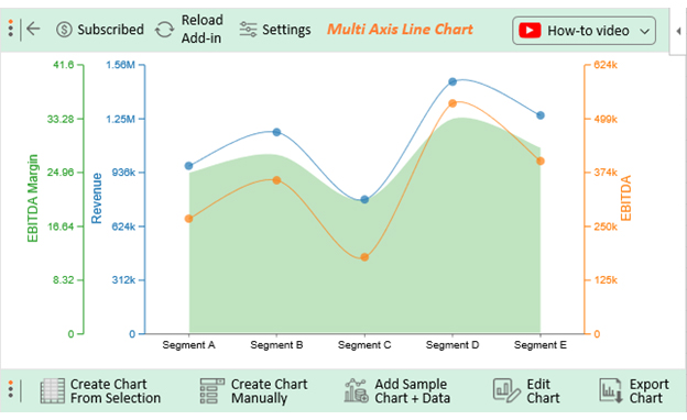
Let’s learn how to install ChartExpo in Excel

  1. Open your Excel application.
  2. Open the worksheet and click the “Insert” menu.
  3. You’ll see the “My Apps” option.
  4. In the office Add-ins window, click “Store” and search for ChartExpo on my Apps Store.
  5. Click the “Add” button to install ChartExpo in your Excel.

ChartExpo charts are available both in Google Sheets and Microsoft Excel. Please use the following CTA’s to install the tool of your choice and create beautiful visualizations in a few clicks in your favorite tool.

Example

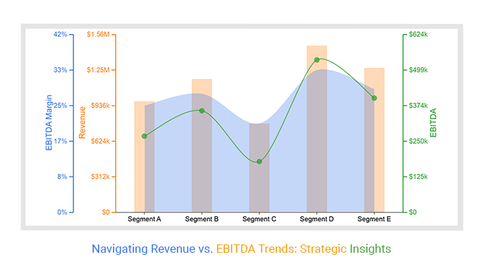
Assume you have the business financial data table below.

Business Segment Revenue EBITDA EBITDA Margin
Segment A 1000000 300000 30
Segment B 1200000 400000 33.33
Segment C 800000 200000 25
Segment D 1500000 600000 40
Segment E 1300000 450000 34.62

Follow these steps to visualize this data with ChartExpo and glean the Revenue vs. EBITDA insights.

  • To get started with ChartExpo, install ChartExpo in Excel.
  • Now Click on My Apps from the INSERT menu.
insert chartexpo in excel
  • Choose ChartExpo from My Apps, then click Insert.
open chartexpo in excel
  • Once it loads, scroll through the charts list to locate and choose the “Multi-Axis Line Chart”.
search multi axis line chart in excel
  • Click the “Create Chart From Selection” button after selecting the data from the sheet, as shown.
Create Chart From Selection ce483
  • ChartExpo will generate the visualization below for you.
Revenue vs EBITDA Design Template
  • Click on Settings and change the “Data Representation” of Revenue into Bar as follows.
Data Representation ce483
  • If you want to add anything to the chart, click the Edit Chart button:
Edit Chart ce483
  • Click the pencil icon next to the Chart Header to change the title.
  • It will open the properties dialog. Under the Text section, you can add a heading in Line 1 and enable Show.
  • Give the appropriate title of your chart and click the Apply button.
Apply Tittle on Chart ce483
  • Let’s add the Prefix (e.g., $ sign) with the “EBITDA” values.
  • Click the highlighted pencil icon. Expand the “Label” properties to add the Prefix value (e.g., $ sign).
Add Prefix Value To EBITDA ce483
  • Let’s add the $ sign with the “Revenue” values.
  • Click the highlighted pencil icon. Expand the “Label” properties to add the Prefix value ($ sign).
Add Prefix Value To Revenue ce483
  • You can change the precision value of the EBITDA Margin to zero:
Precision Value of the EBITDA ce483
  • Let’s add the % sign with the “EBITDA Margin” values.
  • Click the highlighted pencil icon. Expand the “Label” properties to add the Prefix value ($ sign).
Add Label The EBITDA ce483
  • Change the Legend shape of Revenue into a column and click the “Apply” button.
Change Legend Shape of Revenue ce483
  • Change the Legend shape of Cost of EBITDA to Line and Circle and click the “Apply” button.
Change Legend Shape of EBITDA ce483
  • Click the “Save Changes” button to persist the changes made to the chart.
Save All Changes ce483
  • Your final chart will look like the one below.
Final Revenue vs EBITDA

Insights

  • Leading the pack in EBITDA, Segment D takes the crown with an impressive $600,000, while Segment E follows closely with $450,000.
  • When it comes to EBITDA margins, Segment D maintains its supremacy with an impressive 40%, leaving Segment E in its wake at 34.62%.
  • Segment C reports the lowest figure at $200,000, accompanied by an EBITDA margin of 25%.
  • Dominating the revenue charts, Segment D secures the top spot with $1,500,000, trailed by Segment E with $1,300,000.

FAQs

What is EBITDA?

EBITDA, or Earnings Before Interest, Taxes, Depreciation, and Amortization, measures operational profitability, excluding specific expenses. It aids in comparing companies’ core performance and financial health.

Is EBITDA the same as revenue?

No, EBITDA and revenue differ. Revenue is total income, while EBITDA assesses operational profitability. EBITDA excludes non-operating expenses, providing a clearer view of operational performance.

What is a good ratio of EBITDA to revenue?

The ideal EBITDA-to-revenue ratio varies by industry. Generally, a 15-25% ratio is considered healthy. However, industries with higher capital expenditures may accept ratios outside this range.

Wrap Up

Comparing revenue vs. EBITDA provides a nuanced view of business health. Revenue, the top-line indicator, showcases a company’s scale and market presence. On the other hand, EBITDA, representing operational profitability, delves deeper into efficiency.

When comparing the two, consider their symbiotic relationship: high revenue doesn’t guarantee profitability. EBITDA complements revenue, offering insights into core operations by removing extraneous factors.

The revenue-to-EBITDA ratio offers a valuable benchmark. A healthy ratio varies across industries, emphasizing the need for contextual assessment. Too much reliance on revenue might obscure underlying profitability issues.

Ultimately, a balanced approach is key. Assessing revenue vs. EBITDA together reveals the true financial pulse. Striking the right balance ensures a robust understanding of a business’s overall performance. So, when navigating the financial landscape, remember: Revenue tells a story, but EBITDA unveils the plot’s intricacies.

Leveraging ChartExpo elevates the analysis of revenue vs. EBITDA metrics. Its diverse visualizations cater to varying business needs, simplifying complex data into actionable insights.

Get started with ChartExpo today to experience its prowess firsthand.

How much did you enjoy this article?

ExcelAd1
Start Free Trial!
131715

Related articles

next previous
Microsoft Excel10 min read

Invoice Tracker Template in Excel for Better Insights

An invoice tracker Excel template helps track invoices, due dates, and payments. Learn how to use this template for better financial management.

Microsoft Excel12 min read

Key Performance Indicators in Healthcare for Better Insights

Key Performance Indicators in healthcare track patient care and efficiency. Learn about these KPIs, top examples, and how to use them to improve outcomes.

Microsoft Excel10 min read

BMI Calculation Formula in Excel for Better Fitness Insights

The BMI calculation formula in Excel helps track and analyze body mass index. Explore step-by-step instructions and tips to simplify BMI tracking in Excel.

Microsoft Excel29 min read

How to Create a Tornado Chart in Excel? A Complete Guide

Click to learn how to plot a Tornado Chart in Excel using easy-to-follow steps. Also, we’ll address the following question: what is a Tornado Diagram?

Microsoft Excel14 min read

How to Create a Scatter Plot in Excel with 3 Variables?

Click to discover how to create a Scatter Plot in Excel with 3 variables. We’ll also address the following question: why do we use Scatter Plot Graph?

ChartExpo logo

Turn Data into Visual
Stories

CHARTEXPO

  • Home
  • Gallery
  • Videos
  • Services
  • Pricing
  • Contact us
  • FAQs
  • Privacy policy
  • Terms of Service
  • Sitemap

TOOLS

  • ChartExpo for Google Sheets
  • ChartExpo for Microsoft Excel
  • Power BI Custom Visuals by ChartExpo
  • Word Cloud

CATEGORIES

  • Bar Charts
  • Circle Graphs
  • Column Charts
  • Combo Charts
  • Comparison Charts
  • Line Graphs
  • PPC Charts
  • Sentiment Analysis Charts
  • Survey Charts

TOP CHARTS

  • Sankey Diagram
  • Likert Scale Chart
  • Comparison Bar Chart
  • Pareto Chart
  • Funnel Chart
  • Gauge Chart
  • Radar Chart
  • Radial Bar Chart
  • Sunburst Chart
  • see more
  • Scatter Plot Chart
  • CSAT Survey Bar Chart
  • CSAT Survey Chart
  • Dot Plot Chart
  • Double Bar Graph
  • Matrix Chart
  • Multi Axis Line Chart
  • Overlapping Bar Chart
  • Control Chart
  • Slope Chart
  • Clustered Bar Chart
  • Clustered Column Chart
  • Box and Whisker Plot
  • Tornado Chart
  • Waterfall Chart
  • Word Cloud
  • see less

RESOURCES

  • Blog
  • Resources
  • YouTube
SIGN UP FOR UPDATES

We wouldn't dream of spamming you or selling your info.

© 2025 ChartExpo, all rights reserved.